UX design can be a varied field with many factors to consider. So we put together this list of UX design principles to showcase product design in all its glory!
UX design is such a vast field. There’s things we all know and love, like cute little heart icons that turn red when clicked or tapped. But underneath the surface, lies a whole structure of work and effort that UX designers pour into their work.
Free UX Design Tool for web and mobile apps. Unlimited projects!

So what are the kind of factors that UX designers need to deal with when creating a new experience for users? What are the game rules that separate a good product from a terrible one? We put together this list of UX design principles that showcase what heroes UX designers truly are, as well as just how diverse the world of UX truly is. Check it out!
This is often the most mentioned UX design fundamental. It’s about learning to use our empathy and not our own opinions when it comes to making design decisions in any product. The fact is that designers have very high standards and always want to deliver the best – but this desire can lead them to make decisions based on what they want or prefer.
Truly good UX design is tailor-made for users, which means leaving our own preferences behind. The designer won’t be the one using the product. The user’s opinion, pain points, wants, preferences and needs are indeed crucial. It’s no wonder that design teams invest so much time and effort into getting to know users in the initial stages of the project.
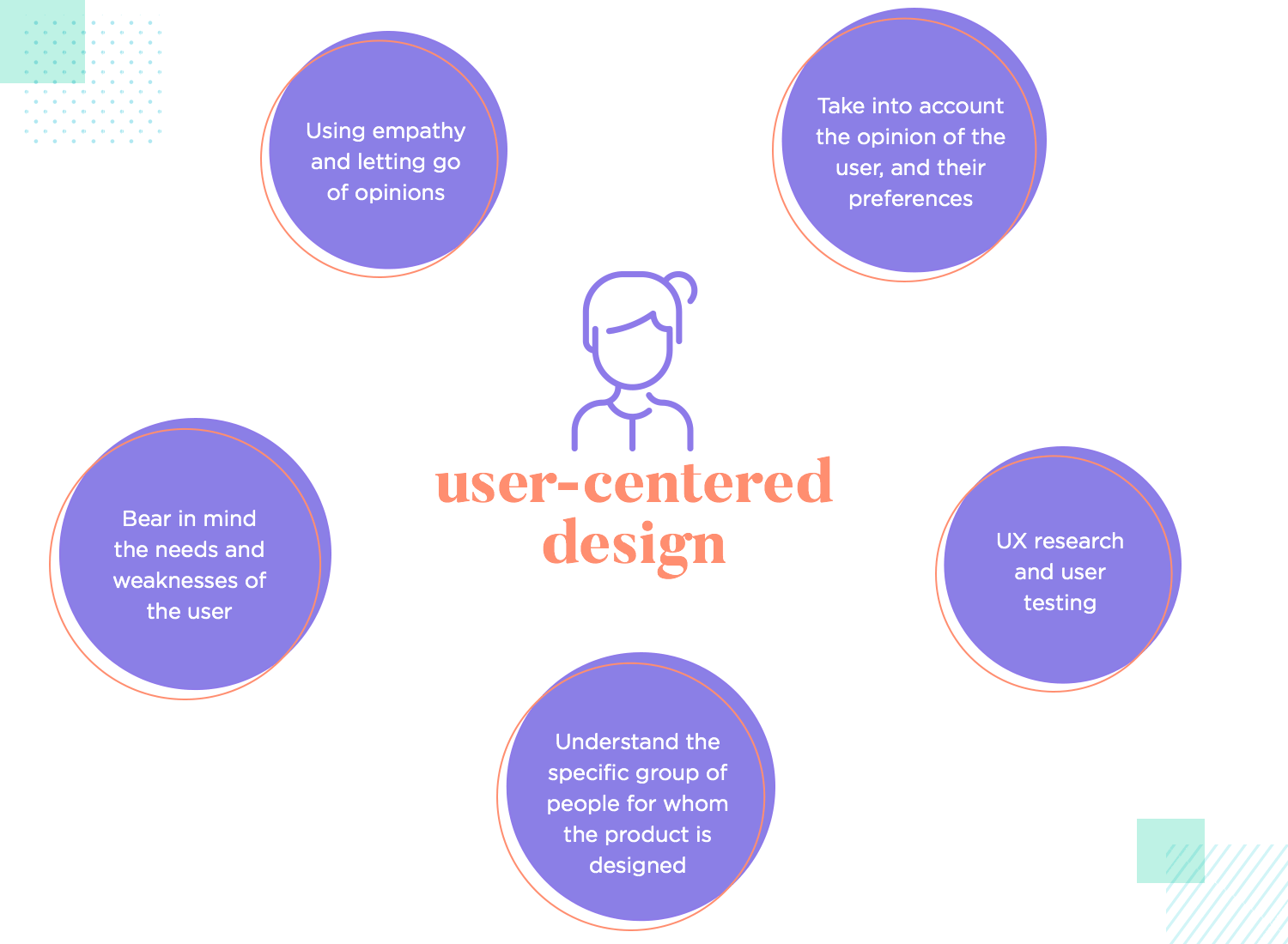
UX research focuses on getting to know the user, setting the stage for everything that follows. User testing is also another way to check how users respond to the design and see if their behavior is what the design team expected or not. In the UX game, the user has the final word. Always.
In fact, the very concept of user-centered design goes to the idea that designers always cater to the user’s needs. Here, designers make the distinction between designing things that any person can use and designing things for the user. It’s about knowing what that specific group of people need and reflecting their lives in the product design. It’s highly targeted and deeply subjective work where everything is done for the user, with empathy being a top skill in the UX mix.
For newbies, pinning down a definition of information architecture can be tough. This is about making sense of every screen and every piece of information the product will contain. Most people wouldn’t be able to use any product if everything was just thrown into a long list of topics and features. Most websites and apps have a careful structure that organizes everything neatly for users – usually from the big and important stuff to the small and secondary things.
The ultimate goal of information architecture is to help people understand what they’re looking at and help them find what they are looking for. This is usually done before any wireframing or prototyping, because it goes to the very foundation of the product. It forces design teams to consider what is most important, what users will need the most frequently and what can be stashed away so users can find it when they need it.
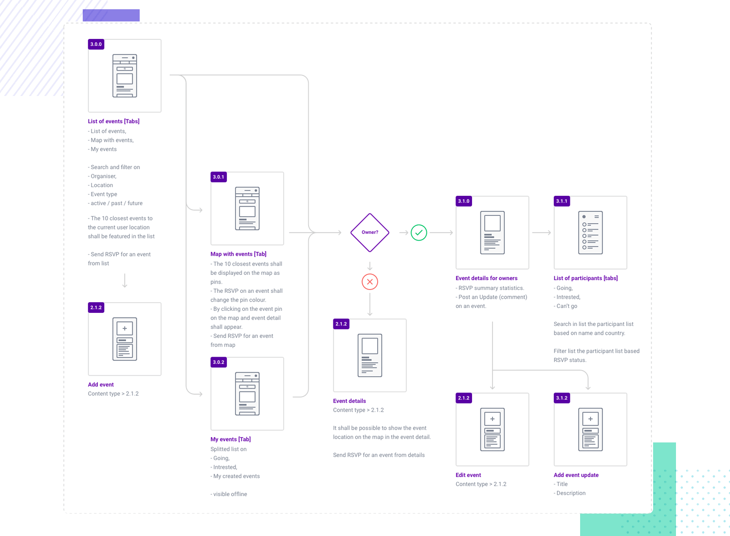
This general structure will go hand-in-hand with the navigation design of the product, which will help direct users to the right places and allow them to explore the product in a way that makes sense. Both the navigation and the IA try to get users to complete their tasks while using the least amount of cognitive effort. Heck, some designers say the true goal is to have users not even realize they’re using the navigation or the structure of the product to do their thing.
This is a crucial UX design principle, because it creates the pillars that will uphold the user experience as designers imagine it. Any big mistake or failure in this area and the entire product could be compromised. If users can’t find anything, can’t do anything and can’t move around in the product – is there any other way to describe it other than as a huge failure? Any designer worth their salt will dedicate lots of effort into creating a sound structure that can be built upon, precisely because of how important it is for users.
In the world of UX design, context is essential in more ways than one. As a UX design principle, no designer can be effective without context. People’s lives today are fast-paced and deeply complicated, just like their habits and problems. UX design is a people’s industry, which means that having context around everything is a must.
Designers will invest time into getting to know the user, laying down a path to success. This involves not just getting in the right mindset of putting the user in the center of the design. In fact, the first steps of the project tend to also include getting to know the problem the usr faces as well as the context that surrounds it.
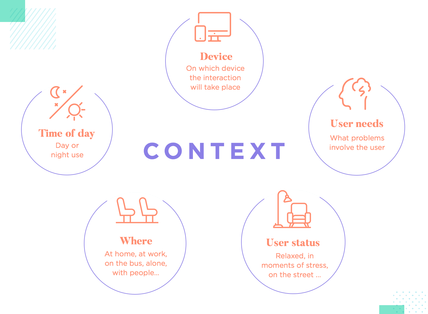
In theory, this UX principle goes to teach designers what other factors affect the user and influence the problem that the solution will tackle. In practice, this also includes knowing the context around the use of the solution. Things like what device the user will rely on, what situation will drive users to the product or any other factor that can touch the solution usage.
With that said, users need context too. In fact, most design teams will go out of their way to offer users some context that can help to smooth out any possible friction. A silly but common example is filling out forms. Let’s face it, no user truly enjoys filling out a form. There’s room for misinterpreting the questions or UI components – all of which add friction to the experience.
That’s why designers are so careful with form design. They create a form that minimizes the chances of error on behalf of the users by adding every bit of context they can. Be it with floating tags that tell users what to type in or by showing an example of a correct answer next to the question. Some designers use microinteractions for this same purpose of adding little hints to users, like a brief movement to indicate that something is clickable.
It’s common to see maintaining consistency as a key UX design principle. This has to do with making things easier for new users and creating a product that doesn’t require constant effort on the behalf of the user.
Consistency in UX design plays a key part in the learnability of a product. That is to say, that products that enjoy a consistent design can be picked up much faster by new users. Mainly, because users won’t need to learn the same things over and over – they will recall the first time and just use that memory as guidance.
In practice, being consistent with design implies using the right UI components and repeating them when needed as well as maintaining consistent behavior throughout the entire product. That is to say, for example, that buttons should all behave the exact same way when clicked or hovered over.
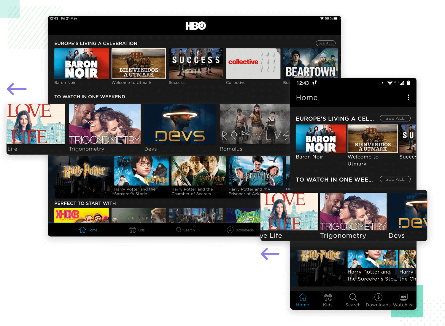
The main reasons why designers invest so much care into creating and maintaining consistency across their design include app abandonment rate, which so many of us fear. It’s no secret that the longer and steeper the learning curve of a product, the more people will walk away. In marketing, this is often referred to as holes in the sales funnel.
By being meticulous about the general consistency of the design and keeping an eye on the data, designers can see areas where things could be made easier for users. Essentially, design teams work to fill in these holes in the funnel, so that less and less users abandon the product before getting past the learning curve.
Free UX Design Tool for web and mobile apps. Unlimited projects!

Nielsen didn’t include user control in his 10 heuristics of web design for nothing. This UX design principle deals with the fact that users want to be in control of digital products, both for completing tasks and customizing things to suit their needs.
It’s true that design teams try to give users as much control as possible. This manifests itself in designs that allow users to undo things, change settings, customize the appearance of the UI, create shortcuts and so on. Users like to be able to mold the product so that it truly fits their needs, creating a complete unique experience. There’s power in that singularity.
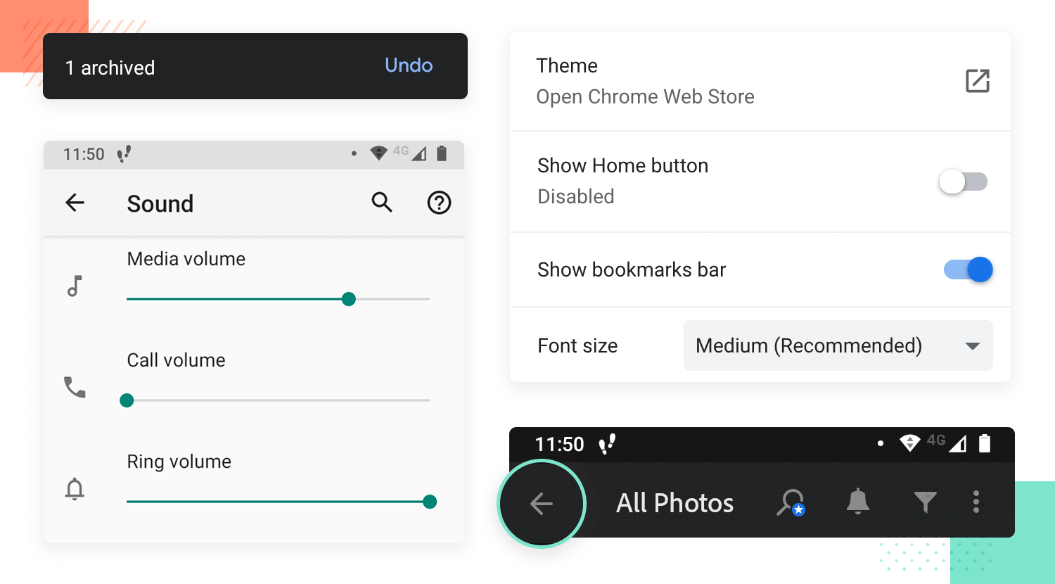
With all that said, there is such a thing as too much control. Past a certain point, users can become overwhelmed when too much depends on their choices or too many options are presented. This is known as the paradox of choice.
This paradox emerges from the fact that while people want to be in control, we all become overwhelmed when we have too much of it. It’s important as a UX principle that designers understand the margin where users are happy to be in charge. Most design teams will stop short of crossing the line into a realm where users stop enjoying themselves and start to become stressed. This is a skill that new designers have to master.
This is a classic UX design principle. There are so many reasons why designers are careful when it comes to the usability of their design – it’s literally a matter of life and death. If the IA of a product is a pillar, then so is the usability.
In the large scheme of things, establishing a high standard of usability is the best thing you can do for your users. This is about checking that users can complete tasks comfortably, that the product behaves properly and that it does its job. Much like the IA, if the usability fails then it’s likely the product will too. Usability, in broad strokes, ensures that users can use the product.
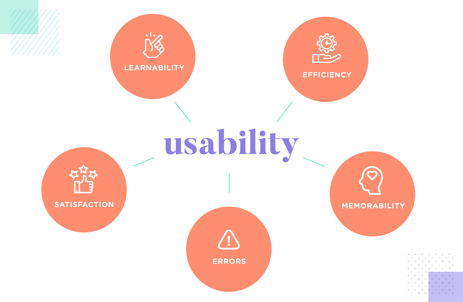
The main factor that can seem difficult to grasp for newbies is that usability doesn’t deal with black and white. In fact, most design teams will have wildly different standards as to what is “good usability”. Is it the time it takes users to complete a task? Is it the number of users the app loses within a certain window of days? Is it the amount of errors users make when completing a task?
The important thing with this UX design principle is that new designers understand the flexibility and importance of usability in their work. Yes, some teams have higher standards of usability that can be notoriously hard to reach. This flexibility can also allow for design teams to set the bar too low, making for a product that is prone to confused users or user abandonment.
This leads us to our next UX design principle: user testing.
Hand-in-hand with the concept of usability, we have user testing. This is how designers, quite literally, put their work to the test and is of paramount importance to new digital products. By using a series of methods of testing, design teams give their design to real users and study the outcome.
When the design ideas and concepts have been translated into a tangible prototype, designers will watch how real users interact with it. This can happen in many different ways, from simple A/B tests to full-blown moderated tests where users answer questions and complete tasks. This UX design principle is about validating the work done so far, ensuring that the team hasn’t deviated from the goal. This is a time for designers to compare user behavior and see if it matches their expectations.
Designers must know the theory of why user testing is so important and how it dictates the very future of the project. It’s surprisingly common for designers to find that things they were sure were perfect have terrible performance. Similarly, things that the design team was worried about disrupting the experience actually improve it and so on.
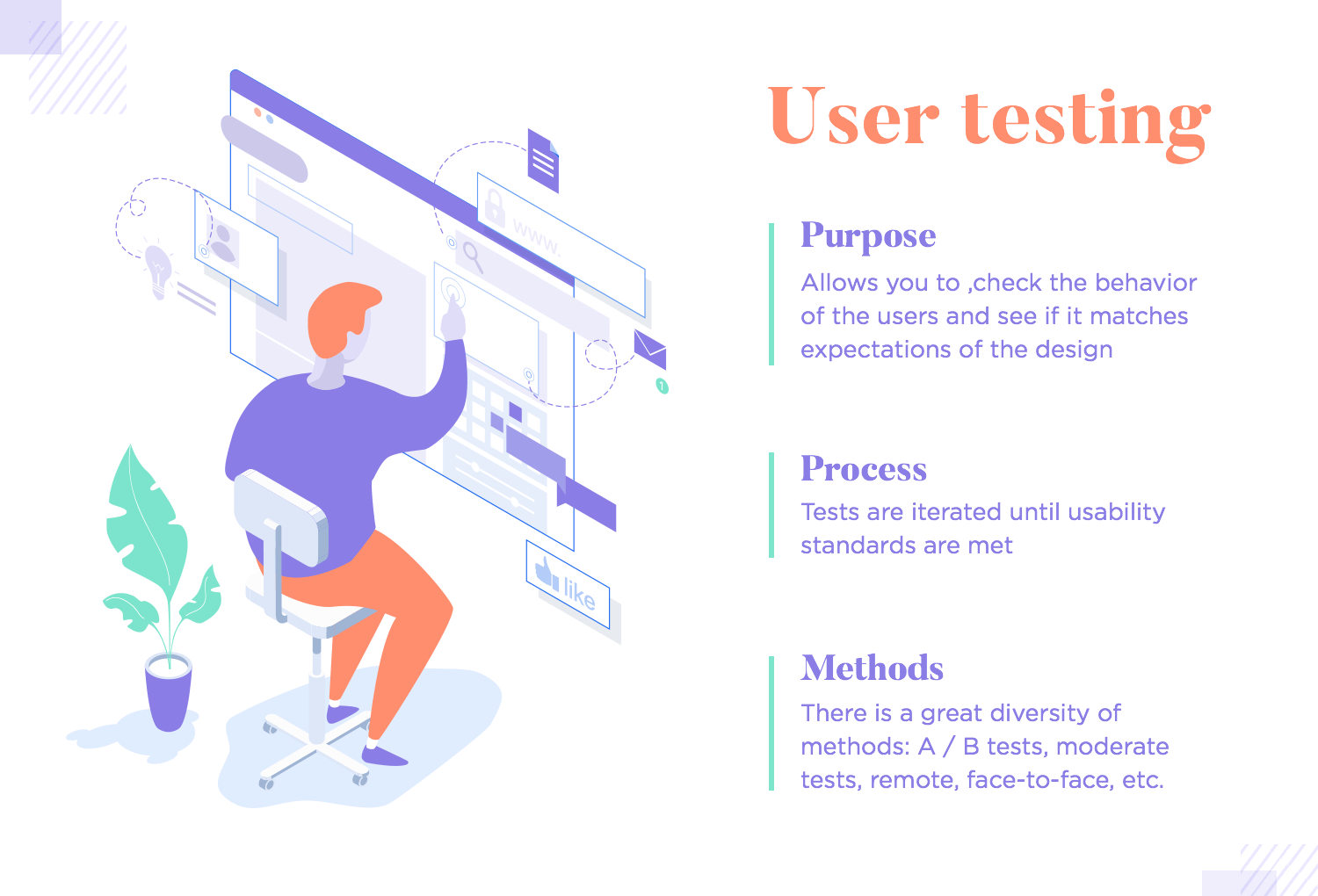
The theory of user testing surrounds the idea that iteration is a good thing in UX design. Testing usually happens in several rounds, with the team validating each of their steps before adding more detail to the prototype. With test results, come changes to the design. Once the changes are implemented, a new round of tests takes place. With this process, design teams improve on their work until their standards of usability have been met.
The practice of user testing can be surprisingly diverse and extensive. There’s a whole world out there of testing methods and testing tools. While this can seem a little overwhelming at first, most designers will find a certain combination of methods and tools that they’re comfortable with, creating a certain workflow that they follow project after project.
This UX design principle can seem a little silly at first, but trust us – it’s very important for new designers to understand. In the rush of creativity and the desire to create something unique, it can be easy for designers to unintentionally clutter their interface and even the product itself.
UX design shines its brightest when it offers a straightforward experience to users. Products that have too many features can lose their focus and dilute their allure. Screens that have too many elements become visually charged and create a negative experience for users. It’s important that design teams show restraint and prioritize the truly crucial bits.
This UX principle is even more important with the rise of mobile devices. Smartphones have very little screen real estate, which creates a unique challenge for design teams. Creating a layout that works, thinking of ingenious ways to stow away secondary elements and creating a pleasing interface take effort and creativity.
Visual hierarchy is how UX designers transmit to users the importance of elements within the product. Having a good hierarchy helps users’ eyes move across the interface and immediately understand the bits that are most important as well as how those relate to the others. Closely linked to layout design, visual hierarchy helps users to digest the information they come into contact with.
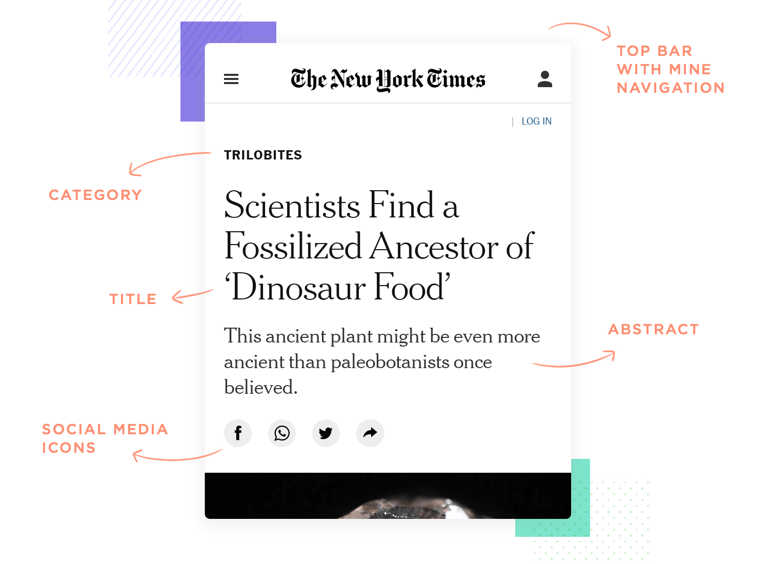
Before this was a thing in the world of UX, visual hierarchy was crucial to magazines and newspapers. By using visual cues, designers can establish a certain flow to the content and help readers to take it all in.
For UX designers, creating the hierarchy starts with the very sketching of ideas and continues until the finished design. Using all sorts of things from size and fonts to colors and proximity, the design team will create a hierarchy that clearly separates the primary from the secondary information.
A silly example includes primary buttons, such as “Send” in bright red. In contrast, secondary buttons will appear in grey or blend with the background and read “Undo” or “Go back”.
Free UX Design Tool for web and mobile apps. Unlimited projects!

The concept of mental models refers to the theory that humans create mental models of how the world around them works. Depending on the model, the person will think in a certain way and act in a certain way – making it a handy tool for UX designers.
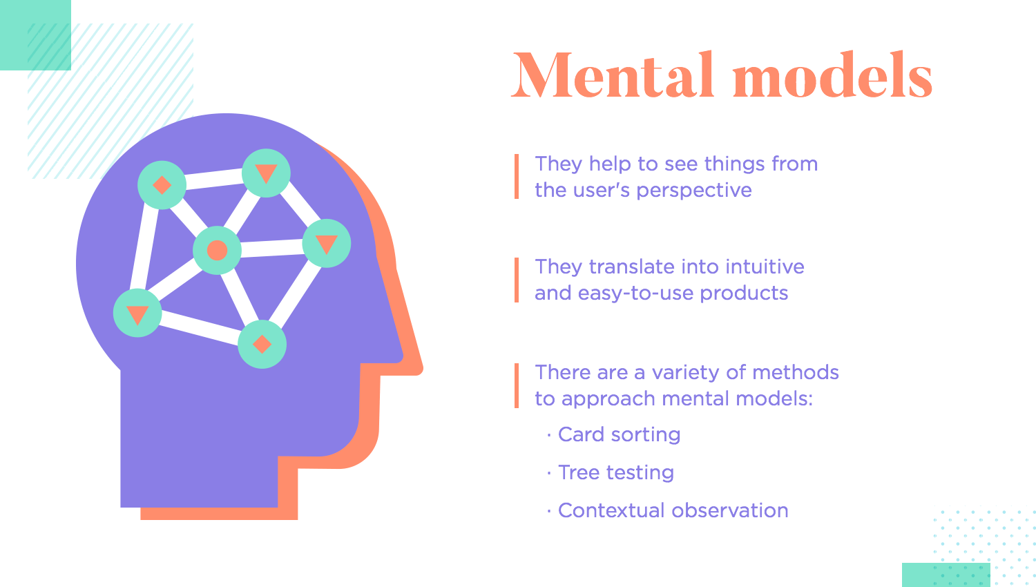
Creating a mental model for the user is another way in which design teams try to exercise their empathy. It’s a tool that helps them see things from the user’s perspective. Getting the mental model wrong can lead to issues like confused users who don’t understand the interface, high interaction costs and eventual abandonment of the product. Getting it right means an intuitive product that users don’t need to invest effort into using.
In order to match the mental model of users, designers can engage in many different types of research methods. Common ones include card sorting and close observation of user behavior. Big names in the UX game like Amazon and Google have this down, using their vast amounts of data to establish very specific mental models of their key users.
Storytelling as a UX design principle is creating a product that communicates efficiently with users. People love stories, with the marketing industry having a love for stories that sell items. In the world of UX, storytelling works in a more visual way. Using imagery, videos, animations and text, design teams can make it so that the entire screen talks to the user.
Visual storytelling in UX design is about evoking emotion and creating an impression on the user that will last. Big names like Audi, Tiffany or Sephora all use this in their digital platforms to establish and communicate a series of ideas and feelings to their users. While this can be a powerful way to transmit the brand identity or a new campaign, there are other uses for visual storytelling.
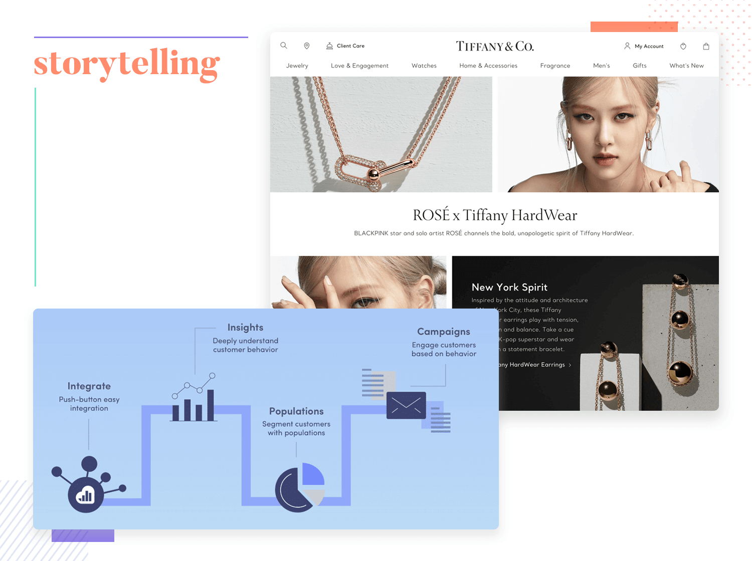
It can make data easier to comprehend – like infographics so often do. Coming up with a visual way to communicate complex data can be challenging but rewarding, like can be seen with dashboard design. Additionally, it can be a great way to approach the user onboarding and using that as a way to improve the learnability of the product.
This is something that any experienced designer will agree with, while giving us a sigh. A high-fidelity prototype is the end goal when it comes to any design project, but jumping straight into a prototyping tool and adding endless details from the get go is a mistake.
Most design teams will start dreaming up what a solution would look like and do with a simple pen and paper. They get many ideas down on paper and debate which one is the best approach to the layout and so on. From paper, the team creates a wireframe of the bare bones that showcases only the layout and basic functions. Slowly, details are added in and the team works their way up to a prototype.
But why all these steps? Why not just create a prototype that includes everything and cut down on time?
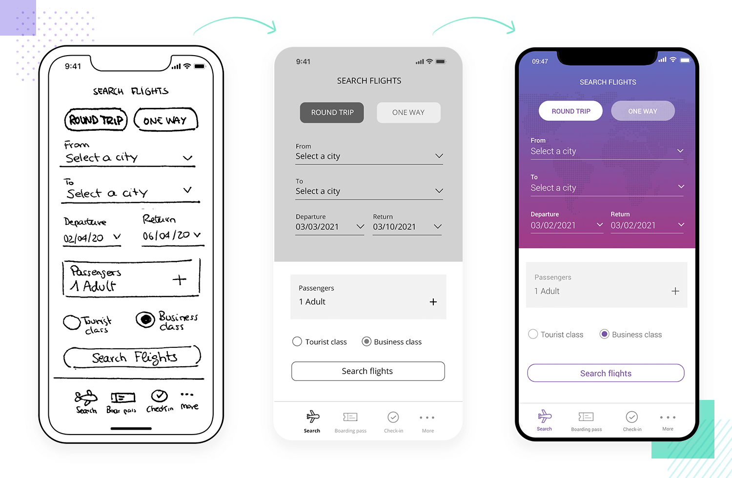
Truthfully, the main reason that design teams avoid doing that is because it’d create an even longer project – a rocky and expensive one at that. Creating everything in the fine details without any user testing would verge on killing the product in its crib. As much research as designers may have at their disposal, there are always surprises in user behavior.
Creating a product that fits the user like a glove takes iteration, testing and more iteration. UX design isn’t a linear process – it’s a cycle. Break that cycle and you could find yourself staring at your deadline with a finished prototype that users hate. Validating the design decisions made is non-negotiable, because it stabilizes the entire project. Yes, it feels like a slower process this way, but by the end you can have confidence in the performance of the product.
It’s easy to forget about accessibility when so much emphasis is placed on usability. However, designers need to do more than check that their key users can use the product. They ought to check that all their users can use the product, even those that suffer from some sort of disability.
Up until recently, very little was done to check the accessibility of digital products. It was considered unnecessary extra work for something that didn’t really compensate – but that’s changed. Both due to some new legislation as well as increasing demand for accessible products, most design teams now allocate resources to guarantee accessibility.
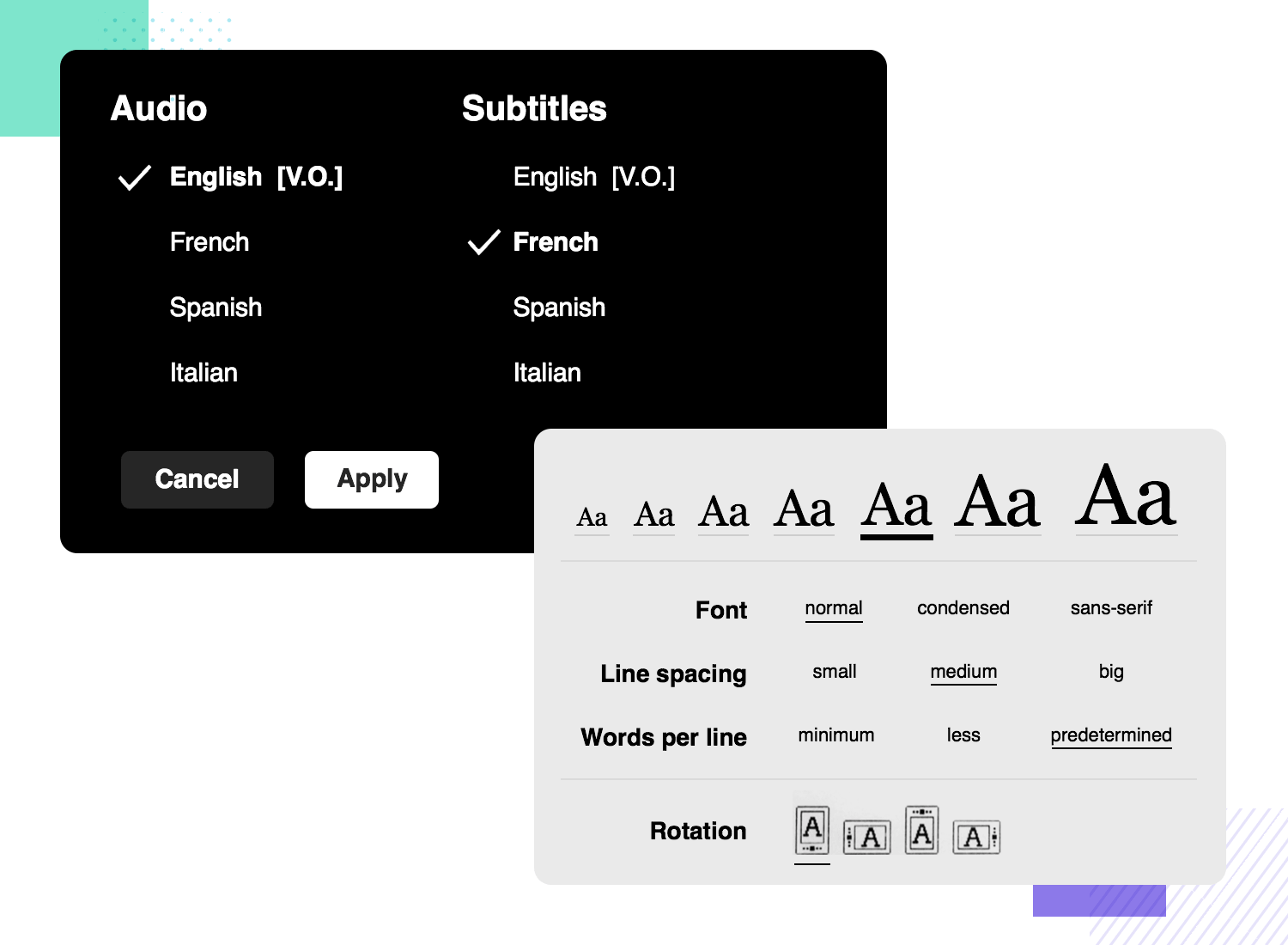
The fact remains that people with disabilities need digital products just like the rest of users out there. It is also a fact that many digital products out there don’t cater to this market, setting it apart as an untapped market for designers. This represents a great UX principle that also deals with an opportunity to offer all these users a good product that they can rely on.
From visual disabilities, cognitive disabilities or speech impediments – accessibility testing guarantees that these users can use your product comfortably. In practice, this can happen by using the right color contrast, using clear language and optimizing the product for assistive technology – like screen readers.
By now, we know that offering users a consistent design helps them get past that initial learning curve. Using the things your users already know can also work to shorten that curve and help them learn their way around the design.
For example, there are certain UI components that most users will immediately recognize. This means that they will instinctively know what that component will do and more or less how it will behave. Classic examples include the hamburger menu icon or radio buttons.
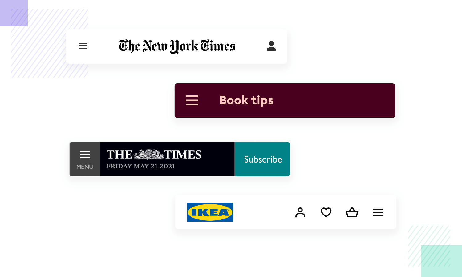
It’s great that designers will go out of their way to create something new, something truly unique. However, using the things that users already know doesn’t have to take away from that uniqueness. Experienced designers will use this familiarity to create something that while unique, is also intuitive and doesn’t require a lot of effort to be used.
Creating a product that doesn’t rely on familiarity at all can be a dangerous game, because it can easily overload users who don’t see anything they recognize. It makes for a huge learning curve that most of us wouldn’t be able to suffer.
Free UX Design Tool for web and mobile apps. Unlimited projects!

Deliverables, in UX design, are literal materials that can be delivered across the team that capture essential aspects of the project. These include big names like user personas, mental models, user journeys as well as wireframes and prototypes. They represent a tangible and concrete representation of something that would otherwise be entirely theoretical.
User personas, for example, capture the ideal user and give the design team a real face that they can relate to. It’s a material that guides the design, acting as something that designers can turn to for clarity and direction over and over. On a similar note, user journey maps help designers understand the specific steps that users need to take to complete a task. This helps designers to ensure that these steps can indeed be taken easily and that the entire thing flows well.
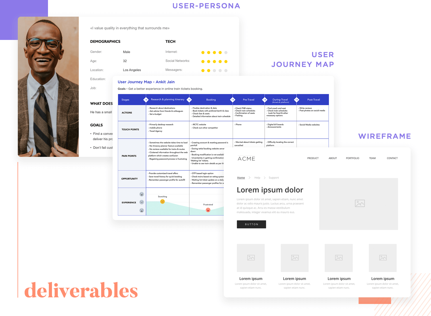
The role of the most prominent deliverables, wireframes and prototypes, are clear for all to see. They take the imaginary solution from the minds of designers and transform them into a real tangible design that users can interact with.
All of these UX deliverables play their part in the UX design dance. To an outsider, it may seem a bit silly to invest so much effort into something that no user will ever encounter. However, veterans see these deliverables as the precious resource that they are. They serve crucial functions and designers will need to lean on them all throughout the project.
This UX design principle may not seem sincere coming from us, but it’s undeniable. Like we mentioned before, a UX design process isn’t linear but instead a cycle. Sure, you can create a paper wireframe with nothing more than a pen and some creativity. But that paper wireframe is meant to be nothing more than a rehearsal, a means to an end. It’s never going to suffice if you want to test it with real people.
No matter what kind of product you’re creating, you will need a professional prototyping tool that allows you to first put the bare bones together and then add all the details you may need. Having a single tool that allows the design team to go from bare bones to full-scale fidelity can be the difference between a smooth project or a messy workflow.
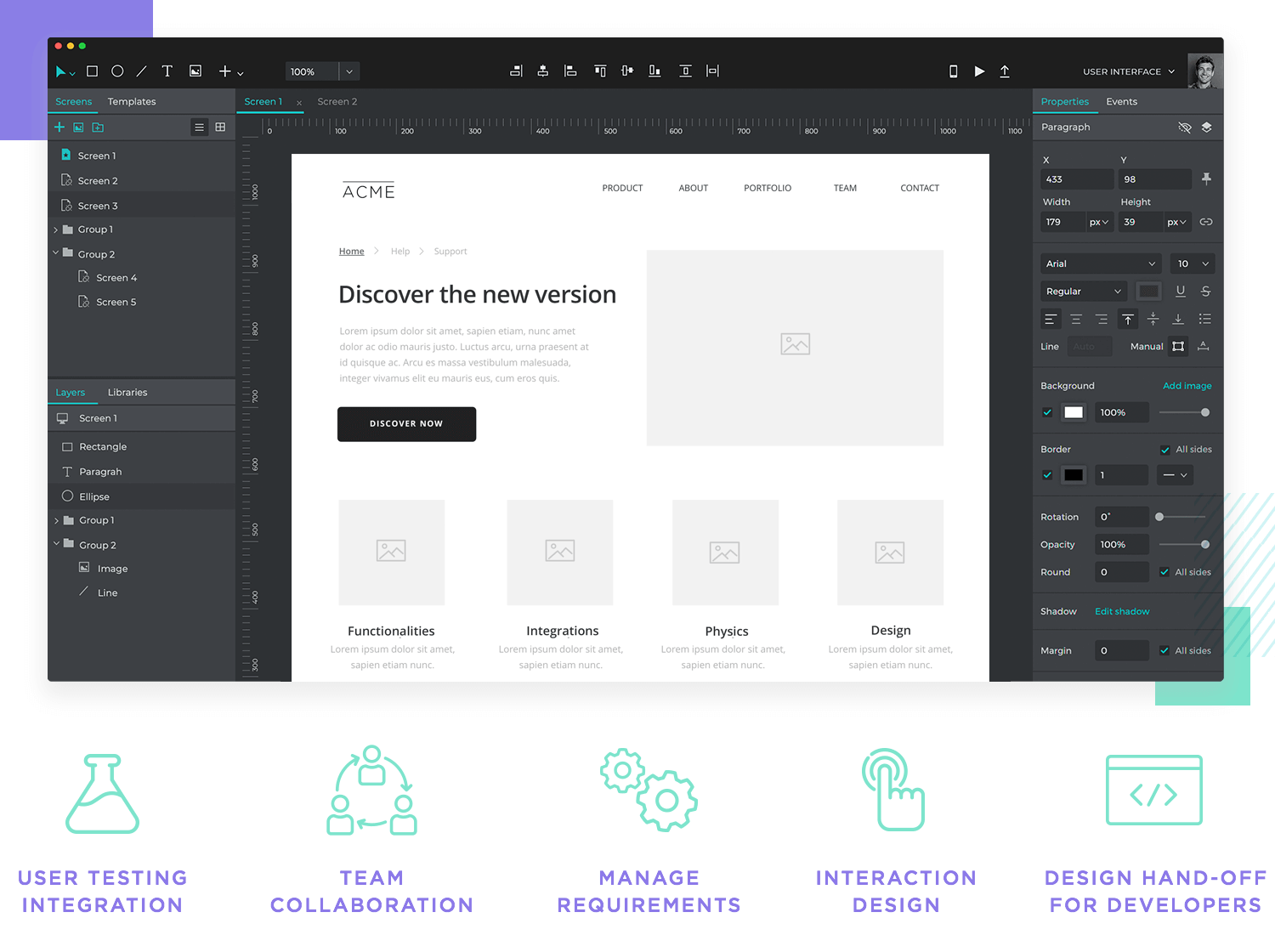
Most designers will require a few things from their main UX design tool: integrations with testing tools, team collaboration tools, some requirements management features, interaction design and development handoff features. Logically, the specific needs of the design team will vary from team to team but these pillars remain true for most. This is what designers need so that they don’t need several different tools for each stage of the prototype or wireframe.
Not to blow our own horn here, but Justinmind does offer all of those and then some. It’s not about getting a fancy prototyping tool that others can be impressed by. It’s about getting your designers a tool that allows them to go far beyond the mere expected without creating a logistical mess. If you don’t believe us, go check out our customers page – each person there will agree that there’s no true alternative to a professional tool.
The requirements are a crucial part of any UX project. It basically deals with all the key aspects of the product, listing out everything the solution needs to have and do. It’s the most important list of the entire project, acting as a map and a checklist at the same time.
Everything starts with gathering requirements and slowly creating that crucial list. This tends to take place as the design team or UX researchers do their homework on the user and the problem that the solution is tackling. And while simply putting a list together may sound easy, there’s a real challenge when it comes to keeping that list organized as the project advances.
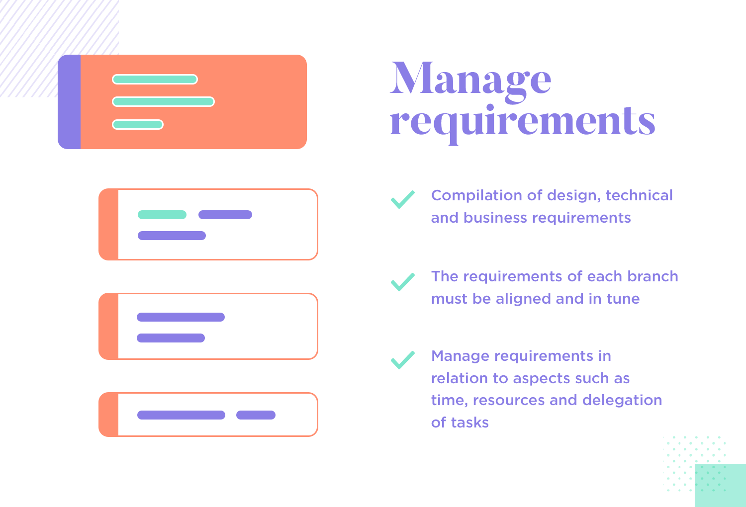
Aside from creating the list of requirements and slowly checking the checkboxes, there’s the issue of aligning the requirements. This UX design principle deals with all sorts of requirements, from design, technical and business aspects. It’s important to make sure that none of these requirements contradict each other, so that there are no terrible surprises down the road. These requirements need to be managed in close connection to things like the time allocation, resource allocation and task delegation.
One of the reasons why managing requirements is such an important and tricky thing includes the fact that things get messy when the team is deep in the project. There’s a cast amount of tasks to be done, things that need to be redone and several secondary factors that can affect the workflow of the design team. That’s why there are so many tools out there that aim to help design teams to keep track of the requirements all throughout the project – it’s complex stuff!
As we mentioned before, there’s a real difference between designing a website and a mobile app. The most obvious difference is the screen size, which means that all the visual hierarchy and information architecture will change from web to app. Users with mobile devices need an even more straightforward design, because they can get easily confused with things like navigation or buttons.
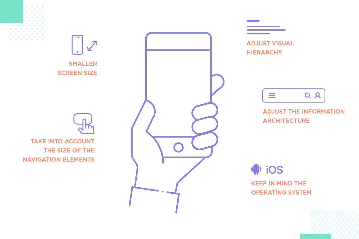
Mobile apps have, perhaps, even more factors that will affect the design decisions. Things like the operating system of the device, the context in which users will use the app and the extremely narrow margin of screen real estate all play a part in creating mobile apps. These factors are manifest in website design, but to a much lesser extent. It can be said that creating things for mobile apps is more difficult in just about every aspect – taking UX design to a whole new level.
And so, understanding the true differences in navigation design, user flows and other key aspects of mobile-based products is a crucial UX design principle. At this point in the game, there’s no alternative to investing true time and care into mobile apps. It’s just the way the industry is heading, and it shows no signs of changing any time soon.
Design patterns are basically layouts that have been tried and used by designers for years. These were created at one point in the past and design teams have been relying on them to create digital products ever since. Today, there’s entire websites dedicated to nothing more than listing design patterns. They’re reliable, easy to find and add practicality to the project by cutting down on design time.
Truthfully, design patterns are answers to common problems that UX designers face.
Things like solving the issue of users using different ways to communicate what they’re looking for in search bars. After all, humans each communicate in their own way. That’s why one of the single most used design patterns out there is the so-called “lazy format”. This is how designers make search bars accept many different terms and still manage to deliver what the user is looking for. A typical example of this can be seen every time anyone searches Google for anything.
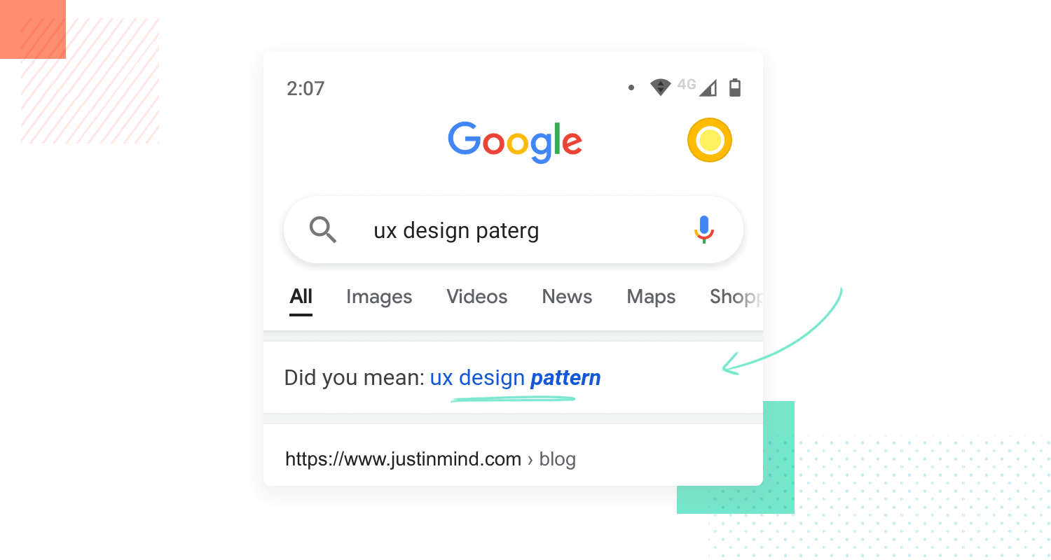
It’s understandable that to brand new designers, this may seem counterproductive. After all, the design industry is about creating new things and pushing boundaries, right? While that is true for most designs, UX design is slightly different. There’s the need for innovation that also comes with the need for usability as well as time restraints. Designers are expected to deliver products that solve problems quickly.
Hence, why UX design patterns are so widely used. UX designers face the same kind of problems over and over, making it necessary to have a list of possible ways to deal with them. Yes, you could come up with your own – but that’d represent lots of time, money and effort invested in something that could be done in a few moments for free. UX design is a creative industry, but it’s very closely connected to business and the art of budget management.
As a UX design principle, it’s always preferable to have the right tools. We already touched on this subject when we focused on having a professional prototyping tool – but that’s only one part of the puzzle.
It’s true that you should give your design team a single prototyping tool that can deal with both the simple wireframing and the intricate and detailed prototyping aspects of the project. Having a single source of truth can give your team a kind of clarity and efficiency that is difficult to attain when the wireframes and prototypes are scattered across multiple channels.
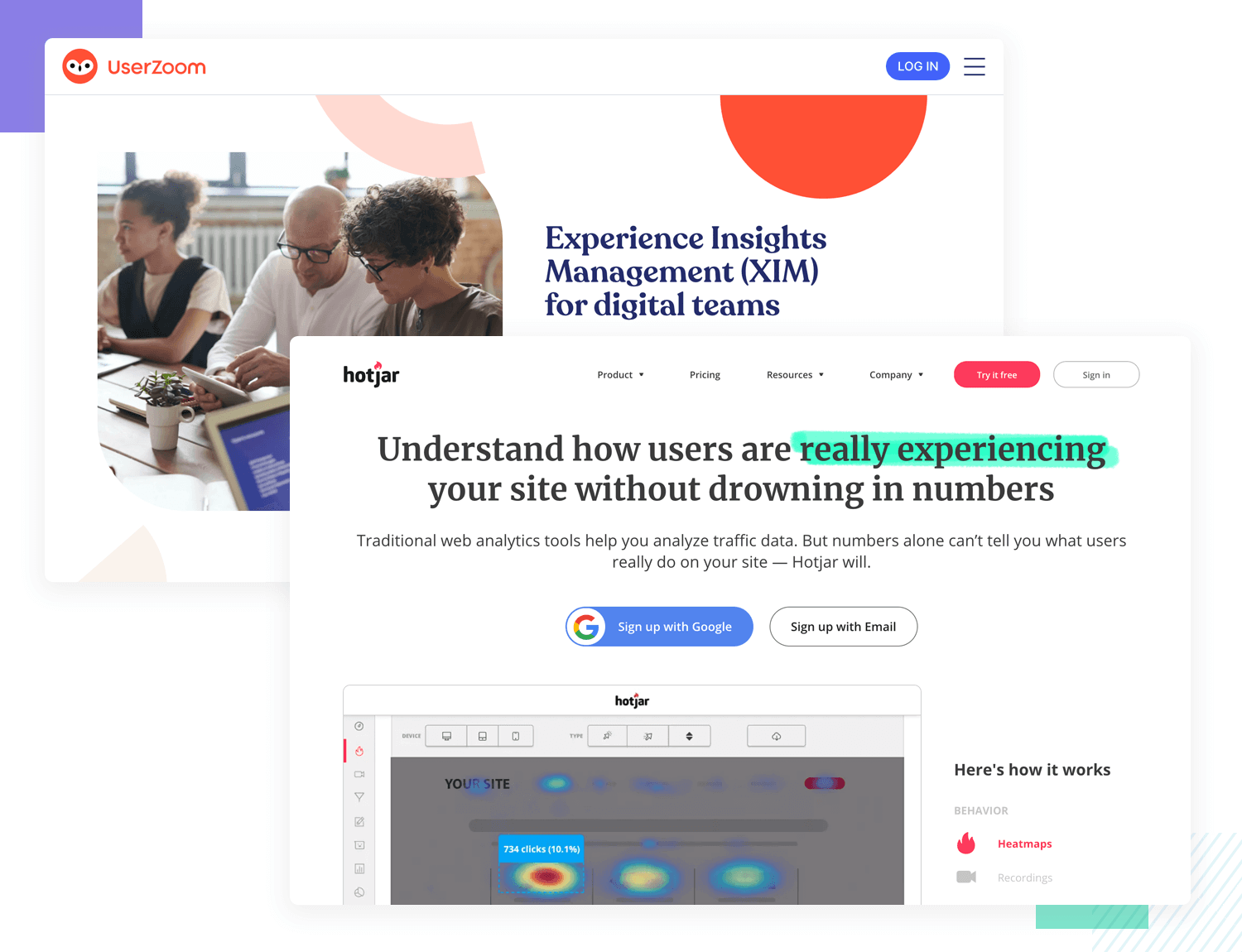
With that said, UX designers must wear many hats and that comes with the need for other tools as well. For example, one type of tool that all designers need is a top-quality user testing tool. Yes, you could do it all yourself by just keeping notes and writing down the data, but that’d be the equivalent of shooting your own project on the foot. Things get lost, details get overlooked and before you know it, the product reaches the finish line with all sorts of usability problems.
It’s no secret that budgeting a UX design project can be tough. So many factors need to be considered and in the midst of so many factors, allocating resources for design and testing tools can slip into the background. However, as a UX design principle, having the right tools is a must. Designers already do so much and need to deal with so much, having the right tools to manage tasks and test their work can make a true difference in the project.
UX design is its own world. There’s a sort of magic to how many different areas and topics UX design teams touch and work with. It’s fast, exciting and methodical work that can be exhilarating. We put together this little list of UX design principles in hopes of giving you an overview of the sector, but even we know that this only scratches the surface.
The very roots of UX design go back way before digital products and nobody knows just where it will lead us in the future. We do know, though, that whatever it brings us will definitely be interesting.
PROTOTYPE · COMMUNICATE · VALIDATE
ALL-IN-ONE PROTOTYPING TOOL FOR WEB AND MOBILE APPS
Related Content
 UX design portfolios are your chance to showcase your top skills and best work. Check out this post for awesome portfolio examples and websites!10 min Read
 Learn what paper prototypes are, how to make them and how they can help you design better products. Awesome examples and free templates inside!10 min Read
 In this comprehensive study, we dive deep into the world of web design tools, comparing features, pricing, ease of use, and more. Whether you're building a simple landing page or a complex e-commerce store, we've got you covered. Let's explore the best options and help you make an informed decision.30 min Read
