What is user-centered design in practice? How does any designer create user-centric products? Read on for the full story on what user-centered means!
User-centered design is all the talk in UX design. Ultimately, every designer dreams of creating a product that users truly love – and user-centered design seems like a great way to reach that goal. But what is user-centered design, really? What are some factors that separate user-centered products from the rest?
In this post, we set out to shine a new light in a familiar concept that can often confuse designers due to how often people throw the term “user-centered” around. Remember to keep your prototyping tool at hand in case you get struck with inspiration!
User-centered design (UCD) means that designers set out to create a product that reflects the user needs and preferences. But does that make all product design user-centered? Unfortunately, it doesn’t. The main reason for that is that some products are human-centered, while others are user-centered. What is the distinction between the two, you ask?
The real difference can seem small at first. All products are made for humans – but not all humans are your users. That means that simply designing for people isn’t enough, as human-centered design is likely to stay in the past. You have to design for the right people, for your people. This distinction has massive implications: user-centered design is all about a tailored experience for users.
“User-centered design (UCD) is an iterative design process in which designers focus on the users and their needs in each phase of the design process.”
IDF - on user-centered design
In practice, this means that designers need to get close and personal with users. One has to truly understand the pain points and mental models of the users – it’s not just about discovering the problem but also the context around that problem.
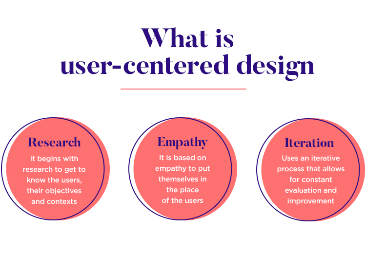
Think of user-centered design a bit like a philosophy or framework. It’s goal is to create overall better products – but in practice, its goal is to help the design team maintain focus on the user. In product design, staying loyal to the original vision can be difficult as things develop and many fall into the trap of designing for themselves as opposed to the user.
One of the main pillars of UCD is that users are involved in the product design from start to finish. Remember that in this game, it’s all about creating a tailored product for the user, which makes it necessary to have users actively participate in the design.
This involvement of users can seem a bit difficult to implement at first, with things such as observation sessions and interviews being potentially costly. But all this effort has benefits – the major one being that your product will have a much better chance at success. The closer you get to the user, the more you understand their pain points and feedback, the more likely they are to love your product. The bottom line? That all decisions have to be looked at through certain coloured lenses. It’s not what the design team thinks its best, but rather what the user thinks is best.
Errors can happen due to some technical issue, it’s true. But, they can also happen because of user actions – like a user that can’t properly fill out a form, and therefore can’t progress in their task. This has to do with a slight disconnection between what designers thought the experience would be and what the user actually experienced.
Surely, no designer out there wants to make a form that users can’t complete. If we take the form example from above, we’d likely find that the designers behind the form thought it was easy peasy – while the user experiences frustration and confusion.
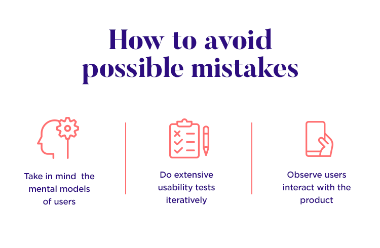
Things like respecting the mental models of users, carrying out a thorough usability test and observing plenty of users interacting with your product – they make a real difference. They help designers create products that work with users, that speak the user’s language. If we are truly careful to create a product that reflects users, there will be less errors in general – making for a safer and better product as a whole.
User-centered design is all about letting the numbers speak for themselves. This is a core principle that helps designers stay on track when it comes to letting users make the decisions – in this case, the data will tell you what users think.
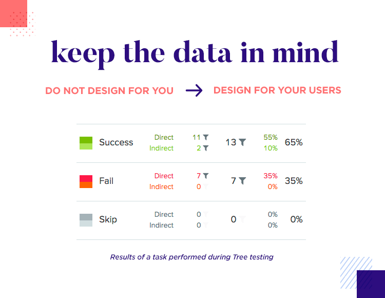
It’s crucial for UCD that designers never divert from what the data tells them, as this creates the perfect environment for designers to make decisions based on their own opinions. The good old trap of designing for yourself instead of designing for users!
This is why trendy new styles such as neumorphism have such a hard time becoming mainstream. The usage data just don’t allow for many apps to choose that kind of visuals.
Part of the beauty of user-centered design is that its principles can be applied to most design teams out there. Some teams apply the philosophy of UCD with the power of other popular design frameworks, like the Double Diamond Method or design thinking.
UCD comes with a certain mindset, helping designers keep track of what’s important. The main idea is that we seek to understand, we ideate and we put the solution to vigorous testing. This is a way of seeing the design process that can be adapted and implemented with Agile and Lean design teams, large teams in big companies or small design teams in a startup.
As you might have guessed, understanding the user and the user’s problems is absolutely crucial. User research is a necessary building block in user-centric products, with its findings both guiding and supporting all design decisions from this point on.
You want to define the crucial bits: who are you designing for? What problem do these users have? What is the context of this problem? This is the moment to find out as much as you can about the people you’ll be designing for, to start creating the mental image of the users. We advise that you take what you learn, and create the relevant user personas to help guide your team. If you already know the basics of personas, give our post on user persona templates a look.
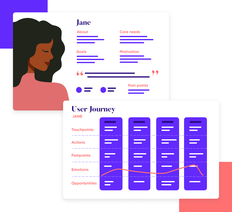
This initial phase can be seen in some shape or form in most design team’s processes. For example, Essi Salonen from Fjord shared with us that the discovery phase (of user research) can be difficult, precisely because it calls for the right mindset. It’s about working to extend your empathy, so you can find the real problem – but we’ll discuss that later on in the examples.
One thing to bear in mind at this stage, is that you want to narrow down on the context of use. This includes not just who the user is and what the problem is, but also all the context around the problem. When do they have this problem? What are the consequences? What would the benefits be if the problem in question was solved?
Once you’ve got a clear idea of who you’re designing for and what their problem is, you can start to slowly define what you could do to solve this problem. This is when you start to consider what factors you can influence with your product and how, both in technical and design terms. But something else comes into play here – aside from the design requirements, there are also business requirements.
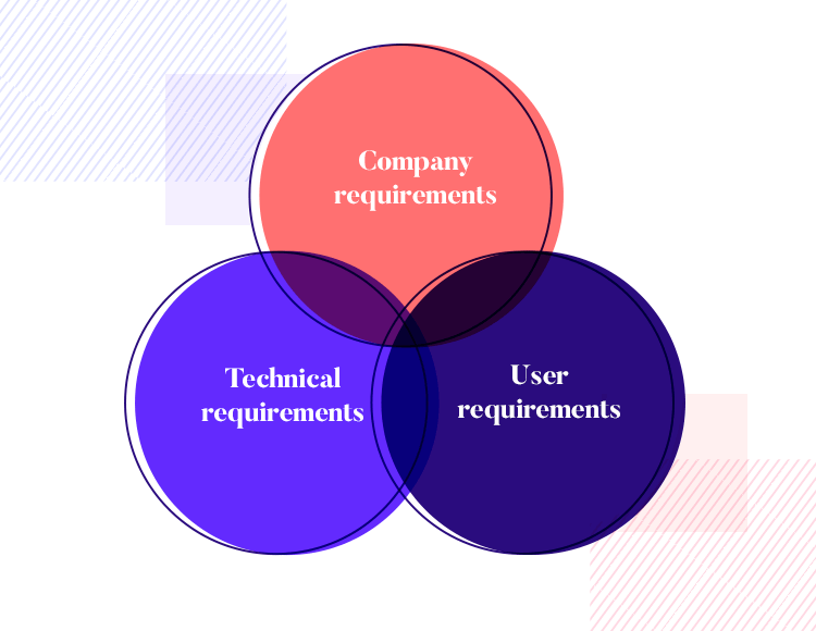
This is the moment to try and find common ground. While designers want to fix the problem in a certain way, this may not coincide with business stakeholders who seek to profit from the entire venture. It’s important for the overall health of the project that both sides agree on what the true requirements are, so that the project is sustainable in the long haul.
Right. Once we know what we’re doing and who we’re doing it for, comes the fun part: ideation. This is where designers get to play around and see how their ideas play out. This stage can be found all around the design industry, with each design team carrying the stage out in their own way.
Here at Justinmind, we’re all about quick wireframing of the initial bones – where we can appreciate the information architecture (IA) and general primary navigation design. Both the IA and the navigation will form the backbone of your product, so it’s important to take your time and get them right.
From there, it’s all about building on the design. When we say build, we mean in a user-centric way. This means that you need to validate your design every step of the way. Start out early, and test a lot. That’s why it’s important to start out with a wireframing tool for the bare bones early, so your team already has something tangible that you can test and validate.
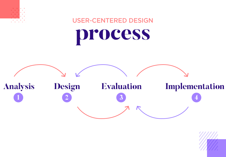
This is something that can confuse newbies and outsiders. In UX design, very few processes are actually linear. Much like the design thinking process, the user-centered design approach is a constant back-and-forth where you test each new aspect of the design: it either passes the test or it fails. When it fails, it’s important to understand where you went wrong and to respect the data. Remember that your point of view only matters to a certain extent – the bottom line is always the point of view of the user.
After all this, you finally have a high-fidelity prototype. While it may feel like the product has passed all of its tests, you’ll find that comparing the prototype to the requirements that you gathered with the stakeholders can cast a new light on your prototype.
Again, defining the line between this stage and the previous one can be tricky. Mainly, because each company does things in their own way.
Some actually compare the prototype and usability test results in this stage, while others simply focus on the usability testing. In broad strokes, seeing how your product measures up to the requirements is a good idea. It doesn’t have to take forever, but it can be validating to your team to see that the outcome does in fact check all the right boxes. You could also, however, say that usability studies should tell us all the answers we need.
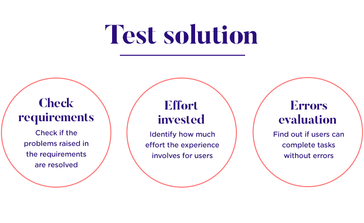
Whichever way your team goes about it, the general idea is that you carry out some rigorous testing to ultimately come to a conclusion on if the product does what it needs to. Does it actually solve the problem? How much effort do users need to put in the experience? Can users complete tasks without errors? What’s the conversion rate on each button?
The topic of testing your product is deserving of its own post, which is why we wrote an in-depth guide to user testing. Check it out for more details on what kind of answers you want to obtain, how you can go about it and how you can draw conclusions from the results.
User-centered design isn’t linear. One must approach the entire project as an endless cycle of ideation, implementation and testing. It’s common for design teams to create several versions of the same screen and test them against each other – the winner earns the place in the product. But even then, can the winning design be improved?
Part of having a user-centric product is accepting that mistakes happen. Each part of the design will need iteration again and again with slight variations between them because you want to learn. To understand how to take something that is good and make it better. Testing these details with real users can deliver surprising results, but they will save you a lot of headaches in the future.
This is why rapid prototyping is enjoying such popularity now. It’s a way to make sure you get your ideas down quickly and validate them straight away – which means making quick and cheap prototypes that are tested frequently.
So what does user-centered design look like in action? Let’s take a look at some teams and companies that have their brand of UCD, working to deliver products that matter.
Userzoom is a platform for usability studies that enjoys a massive popularity. Their product is carefully planned and executed, and it’s easy to see how they got there: by letting the data guide them. Think about it: user’s standards are higher than ever before, which is already a challenge to live up to. Userzoom has it even tougher: their users are UX designers.
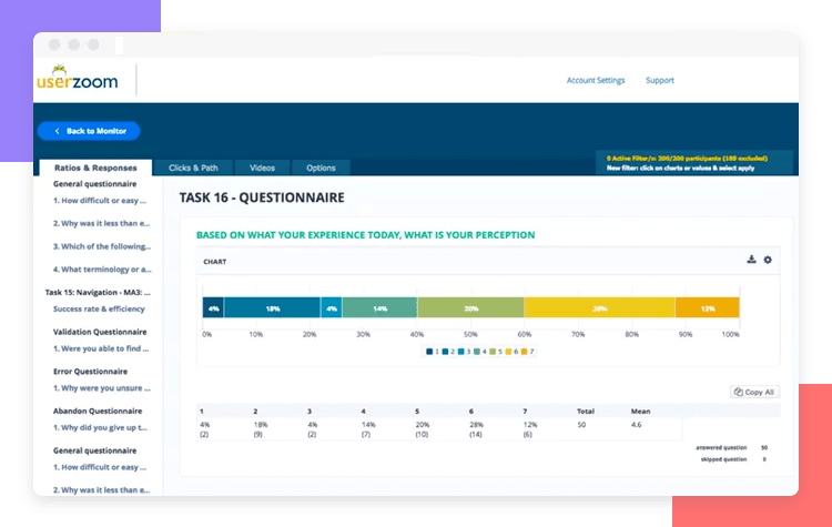
That’s why we loved getting together with Sarah Tannehill, Product manager, and Anna Barba, UX designer at Userzoom. Their entire design process is about using the data as a way to let users say what they want. Ultimately, that’s what user-centered design is all about.
Check out our talk with folks over at Userzoom: Userzoom: UX research for updates that matter.
Folks over at Fjord showed first-hand why the first few stages of the product development process are crucial. In our talk with Essi Salonen, Fjord and UX research, she gave us a great example of user-centered design applied to real-world problems.
Consider the following mission: to create a solution to the problem of newborn mortality in Nepal. Only too often, parents lost their children right at the beginning due to hypothermia and lack of access to medical attention. They were tasked with the honorable but difficult task of lowering the mortality rate.
As Essi shared with us, their original thought was of a low-cost incubator. It seemed like a good solution to the problem – until a discovery was made that changed their entire project. As it turns out, Nepal had plenty of incubators, most of which went by unused for long periods of time. The consequence? A new view of the actual problem: it wasn’t incubators, but the getting the newborns to the incubators in medical facilities.

The ultimate solution Fjord came up with was a carrier that insulated the newborn, giving parents a greater chance of reaching the hospital in time. That is user-centered design at its most simple – using research to get to the root of the problem.
Check out the full post for a fascinating story that shines a light not just on why defining the problem is crucial – but also how any team can cater to users in stressful situations. Essi walked us through a project for Welfare Children who were wards of the state for various reasons – making for a touching case study and shows that thoughtful design can change user’s lives.
We got together with David Luetger, UX designer, to hear about how qualitative data fuels prototyping at NASA. Among the many things to be designed out there, designing backend solutions for people in space has to be both the most complex and coolest thing.
However, the reason why we love this case study is that it highlights some crucial points when it comes to running tests and gathering data from users. It’s one of the most challenging things about getting information – to organize it in a way that helps us draw well-informed conclusions.
Coursera has grown to be a popular online learning platform, collaborating with all sorts of famous educational institutions around the world. That’s why we were so happy to get together with Geoff Schuller, Coursera’s Senior User Experience Designer on our Prototyping at Coursera interview.
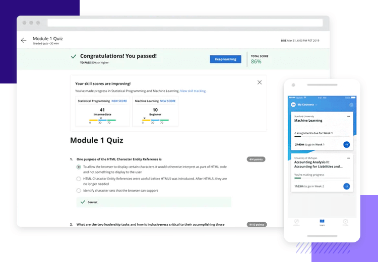
Together, we explored how Coursera uses prototyping to convert ideas into tangible things. We love this interview, because it reflects how Coursera got to be so popular – by delivering a user-centric product. Give the interview a read to see how Coursera tries to include usability testing at every point in the product design stage and how the design team handles new feature ideas!
We got together with Marek Szeszycki to see how GAP handles their prototyping and general UX process. The great thing about it? GAP applies lean experimentation – which can share a lot of traits with rapid prototyping.
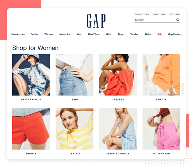
We love that Marek walks us through the design process, highlighting the need to get rid of bad ideas quickly – so that the good ones can be properly developed and studied. This links back to our point on how user-centered design can be adapted and implemented across different teams. For folks at GAP, lean experimentation was a path to user-centric retail design. Check out the full talk on Lean Experimentation – the future of retail UX?
It’s one of the most challenging aspects of usability testing: how do we measure usability? It’s not like counting coins or sheep – usability is an abstract concept. This can turn many newbies off when it comes to user testing products, but Measuring the User Experience is here to help us all.
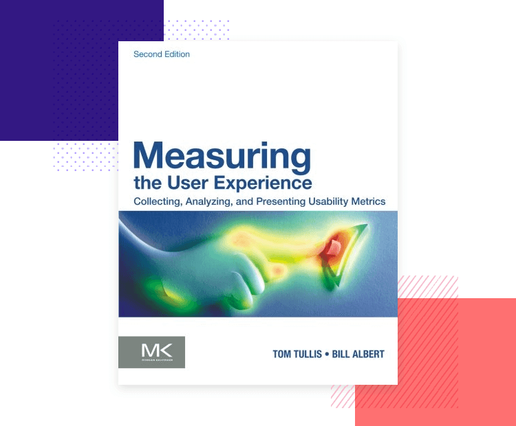
As you might have guessed, this book is all about testing the product and learning to listen to the data – crucial skills when creating a truly user-centric design.
This book isn’t necessarily about UX design, but it has so much to offer to designers. User-centric design depends entirely on our ability to understand the user, and create a whole product based on that understanding. That includes the need to put ourselves in users’ shoes and see life through their eyes – that skill has a name, and it is empathy.
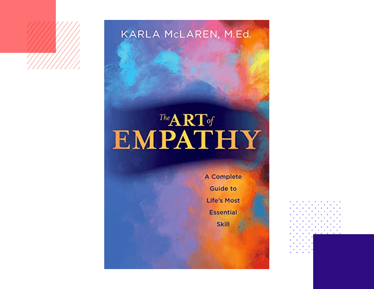
The Art of Empathy bases itself on one simple but key thought: empathy is a skill that can be learned over time. For a UX designer, that’s something that will consistently improve the initial stages of all projects and help the designer see past their own experience.
Rapid prototyping is a skill that can help designers deliver user-centric products. The main idea is that designers prototype a handful of ideas (as opposed to a single one), so that these ideas become something tangible and have context between each other.
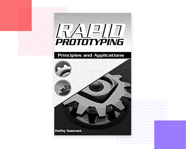
Rapid Prototyping sets out to help designers pick up a very useful skill: identifying key elements that need to be included in quick prototypes, while leaving less relevant elements for later. This helps designers make prototypes faster and more efficiently (driving the cost of each prototype down), and makes this book a must-have.
This book is all about understanding how the minds of users work, using neuroscience. It’s a very useful book that asks questions such as “why did the user click on this button?” or “what motivated the user to go back to the previous screen?”.
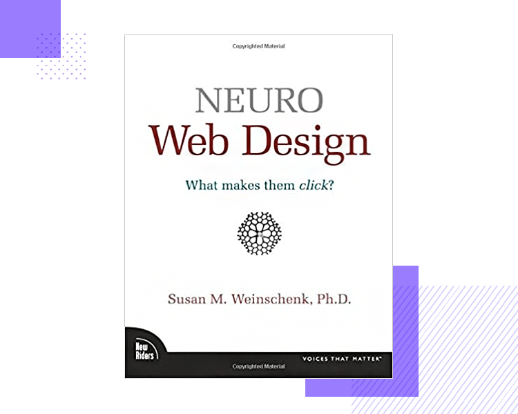
Neuro Web Design is all about using human psychology to create more persuasive products that can get users to the finish line. This can prove to be extremely useful to UX designers trying to deliver a user-centric product, as it boosts the ability to tailor the design to the right people.
This book isn’t just about user-centered design, but rather about using the Design Thinking Model to deliver user-centric designs. The book takes a firm stance that creativity isn’t a gift some of us are born with, but rather a skill that takes a lot of practice to develop. The main message is that creativity is within the reach of everyone – and frameworks can help us.
Graphic Design Thinking provides several such frameworks to help us develop our creativity, with accompanying case studies and examples that help put it all into perspective. We love that the book covers case studies and exercises for readers, making for an easy read and interactive experience.
User-centered design is a term that gets thrown around a lot, but it actually refers to a specific way of designing products that have a real impact. It’s all about focusing on the right problems and making decisions in the right way – structuring your process so you stay on-track.
In the end, your team is probably find a unique system that works well for you and that is ok – so long as you take the main idea of user-centered design with you. Ultimately it is users who tell you what works and what doesn’t, and learning to hear their voice through data is a crucial skill that will make you a designer with true insight in any project.
PROTOTYPE · COMMUNICATE · VALIDATE
ALL-IN-ONE PROTOTYPING TOOL FOR WEB AND MOBILE APPS
Related Content
 UX design portfolios are your chance to showcase your top skills and best work. Check out this post for awesome portfolio examples and websites!10 min Read
 Learn what paper prototypes are, how to make them and how they can help you design better products. Awesome examples and free templates inside!10 min Read
 In this comprehensive study, we dive deep into the world of web design tools, comparing features, pricing, ease of use, and more. Whether you're building a simple landing page or a complex e-commerce store, we've got you covered. Let's explore the best options and help you make an informed decision.30 min Read

