Designing a good user onboarding is the key to product growth and keeps users coming back. Read on for some best practices and awesome examples!
All users need a little guidance when they first come to use your product – it’s only natural that you take them by the hand around the key parts of your design. But a good user onboarding flow is much more than a simple tour of the product.
Design, prototype and test better user onboardings with Justinmind. It's Free. Unlimited projects!

You need to illustrate why the product is a good thing for the user, how they can make the most of it and help them get the ball rolling. You want to leave users feeling like they have known your product for a while, and they can start building up a habit of using your design in their everyday lives.
Big ask, right? Don’t worry, we’ve got you covered with 11 best practices to design awesome user onboarding experiences and thrown in 15 examples of popular products that got it right.
The user onboarding experience is the first user experience (FUX) a person has when they download your product and use it for the first time. It often takes the form of a brief walkthrough that demonstrates how to use the main features of the product in short, simple steps. The main point of a user onboarding flow is to promote user activation and user retention.
Activation means that your user understands what your app is about and how to use its main features. Retention means that your users have a significant motive to return to your app. Retention boils down to two things: the UX design of the product and the effectiveness of its user onboarding flow. If your user onboarding experience fails to activate and retain enough users, your product will never grow.
As a result, the user onboarding process is a crucial part of product development. There are 2.8 million apps available on Google Play and 2.2 million on the App Store. According to a study of the Google Play Store, most apps lose 77% of users within the first three days. Within 30 days, that number jumps to 90%. Just take a look at the graph below based on this study:
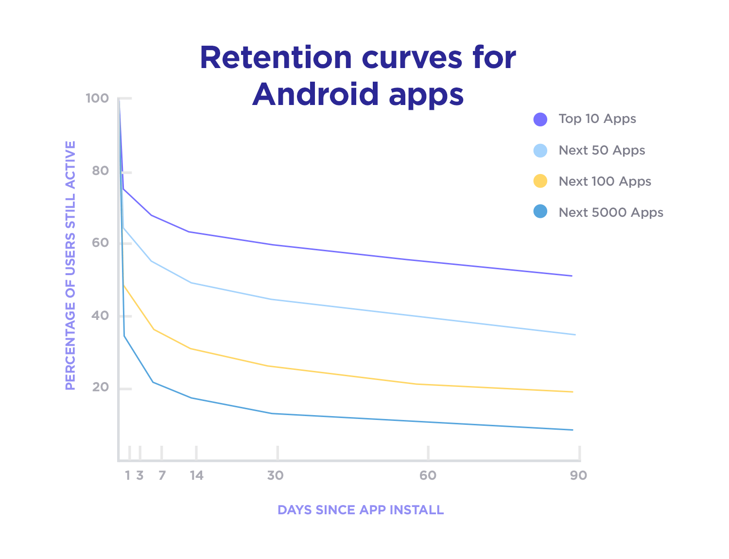
A market saturated with apps and users who are impatient in finding the right apps for them makes for some serious competition and pressure. But don’t fret – Justinmind to the rescue! The top ten apps lose only about 50% of new users over 90 days and below we’ve listed some best practices to help you break into that list!
Not all people are the same and users are people. But even though you’ll have quite a variety of users downloading your product, it’s possible to find a broad definition of who those people are. That is invaluable information when designing the user onboarding experience.
If you’re designing an onboarding feature, then we’ll assume you’ve already designed the bulk of the product features. Hopefully you will have taken the time to do some careful user research. For example, if you create user personas before you begin designing or in the early stages of the process, the user onboarding process is definitely the best time to refer back to them and ask yourself “how do I explain to Cynthia how this feature will help her?”
By investing time into creating a high-fidelity prototype, you can also double-check and make sure that your design truly reflects your target users.
We get it. You want to make a great first impression on your users. It’s tempting to reel people in by pandering to their expectations and promising to heal their pain before they even download the app. In fact, it’s also quite easy.
However, it also has huge downsides if you fail to deliver on those expectations. Failing to deliver means frustrated users who feel you’ve wasted their time and it’s a fast track to losing them forever. In short, be realistic and don’t make promises you can’t keep. Be realistic in your description on the App Store or Google Play, as well as throughout your onboarding process.
In fact, one of the ways you can be realistic is by immediately teaching your users how to use the main features of your product (which should be the features they downloaded it for).
Following the step above, the next aspect of your user onboarding process you want to have covered is how you’re going to present your product’s main features to your user. At Justinmind, we believe that for most products it’s best to adopt a function-oriented user onboarding approach. This approach revolves around experiential learning, that is, the learning-by-doing approach taken by David Kolb.
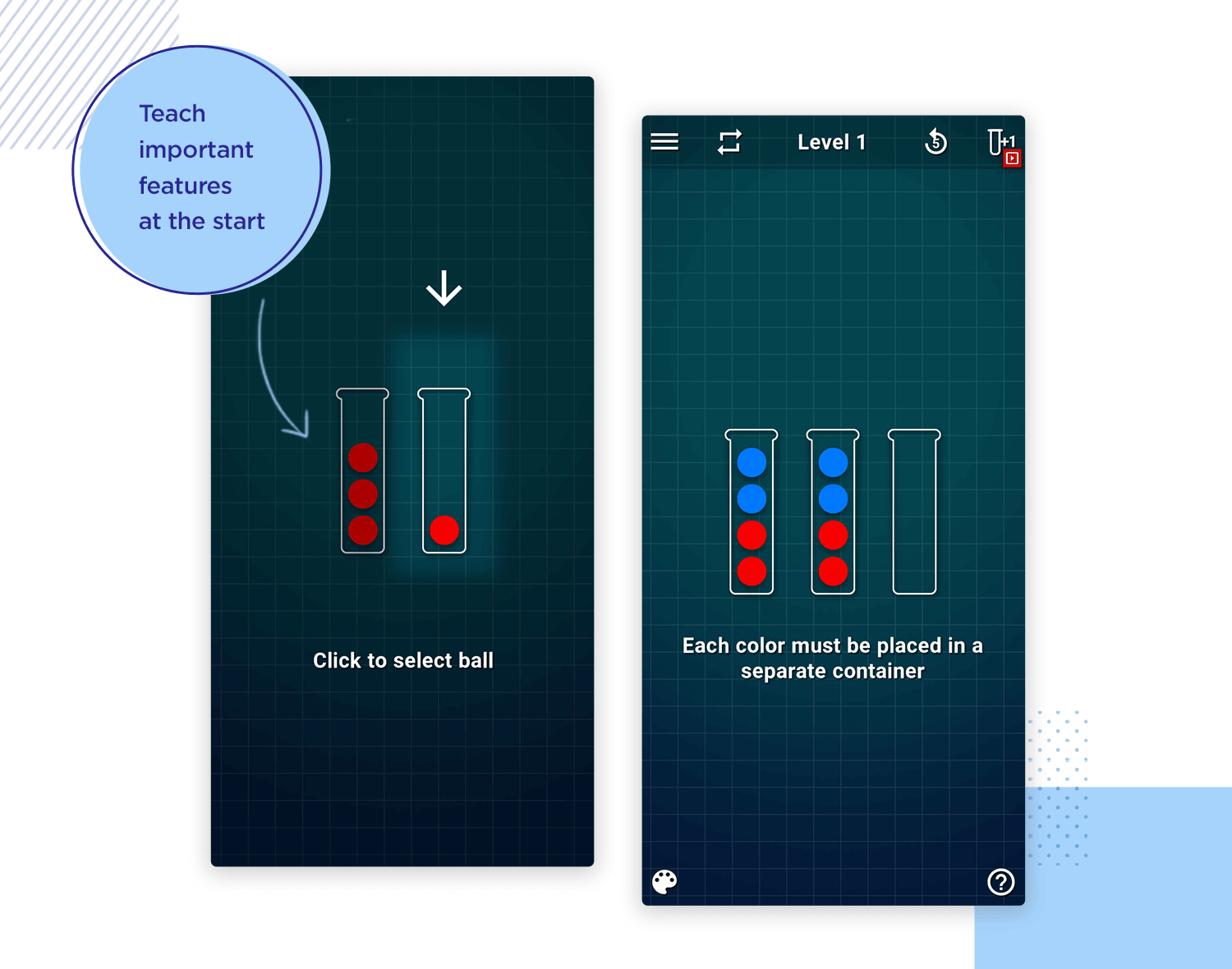
The fastest way to activate your users and teach them the basic functionalities of your app is to have them carry out at least one action, or all main actions of the app. These actions should be broken down into quick and easy steps. An example might be making them follow other users or save images they like.
Try to make the process fun, if you can, because this will have a positive reinforcing effect on your users. That takes us on to the next important step – the WOW and the AHA effects!
Surprise is a strong emotion. It can be positive or negative. Of course, during your user onboarding process, you want to try and opt for the former, which is the “WOW” effect!
Why is surprise important? Because creating an element of surprise can help you to establish an emotional link with your user and help them to learn the main features of your product faster. Think about treating them to some kind of animation each time they complete a successful action or even gamify the experience in a way they uncover features quickly, perhaps by adding a point-scoring system into the equation.
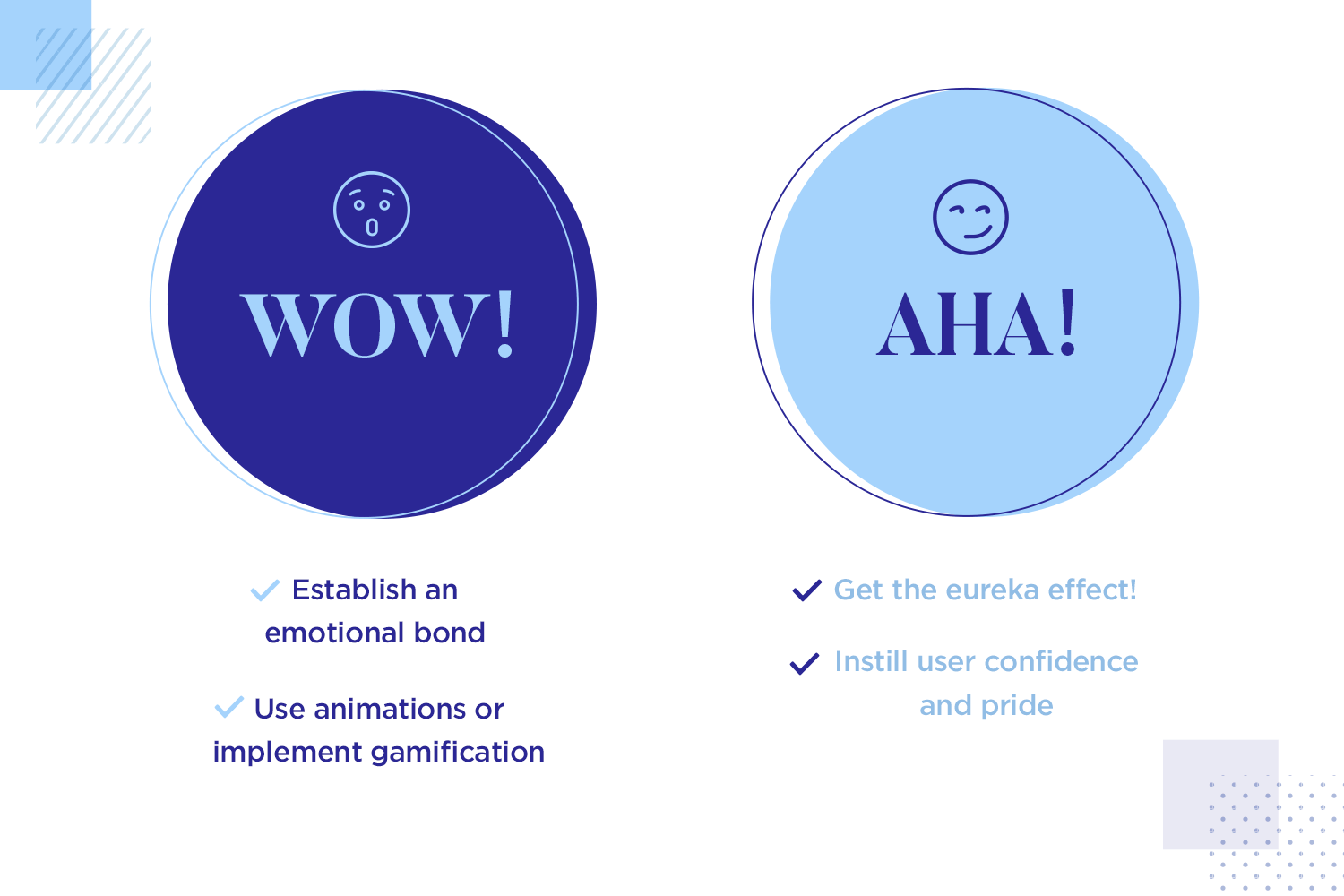
Furthermore, you might consider deploying the “AHA” effect, also known as the “eureka effect”, which is about instilling your user with confidence and pride in having discovered how to use a new feature or a new app.
Often, successful apps design features in a way that the user feels like they discovered them without any help. Think about reinforcing each successful completion of a step with a compliment, such as “awesome!” or “that was fast!”.
Sending push notifications to users can be a great way to get users to finish the onboarding process. But the risky thing about asking users’ permission to send notifications is the timing of your request for that authorization. This will have a direct impact on how many users agree and how many decline.
You need to wait until the user has a clear picture of why the product brings them certain advantages and how the product will help the user be a better version of themselves. Logically, this can be tough if your product needs the use of notifications to operate correctly as is the case with designing messenger apps. Sometimes, there’s no running away or postponing the request to send notifications.
Language learning app Babbel is a great example of how to do this successfully – check it out in our examples below!
Design, prototype and test better user onboardings with Justinmind. It's Free. Unlimited projects!

If you follow the first step and you have a clear idea of who your users are, then this one should be pretty straight forward.
Speaking in your users’ language helps the user onboarding process go much more smoothly. Not only does what your saying register faster in the user’s mind, but it also connects with them on a more personal and emotional level. But we’re not just talking about words – this extends to the general content of your user onboarding flow.
Use simple sentence structures, use images, sounds, animations and interactions that aim to invoke an emotional response in the user, however small. For example, if your app is geeky, you might want to include phrases like “may the force be with you” or “you shall not pass”. Sometimes wordplays of common phrases can be great to stoke enthusiasm. That brings us on to the importance of personality!
Make sure your user onboarding flow follows the same tone and visual design as the rest of your product. Think of things such as branding and brand identity. They often say it takes just a few seconds to form a first impression of someone. Users are just as prone to forming snap judgments when meeting your product for the first time, so you want that meeting to go well.
You want to introduce your users to the product’s personality straight away. It makes your brand seem more human. If users get a great first impression of your product, they’re more likely to share it on social media or speak about it to their friends, attracting more users. They’ll also be more likely to give it a higher rating on the App Store or Google Play.
For the best chances of making a great first impression, think of the language and tone you’ll use in the copy of the onboarding flow, along with the visual components that suit the branding.
Consider this: you’re excited about a new app you just downloaded because it’s going to fill a gaping hole in your life and solve all your problems, with two main features. You’re excited about the final goal and want to get there as fast as possible – anything that comes before that goal can feel like hours. Give them the opportunity to “discover” how to use these main features during your onboarding and you’re closer to the goal of user retention and activation.
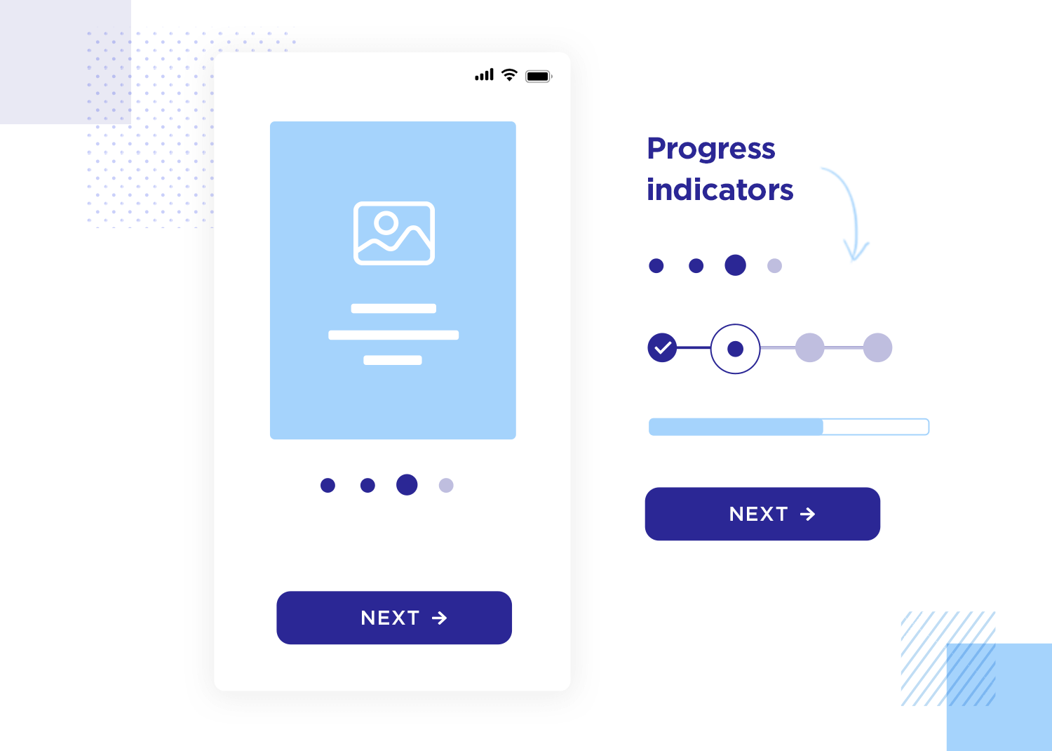
Consider having indicators of how long they have to go, such as progress bars or navigation icons with the remaining steps until the users are good to go. This will work to keep users from feeling restless and have them know just how close they are to the light at the end of the tunnel.
Learning to use anything for the first time can be demanding – learning to drive can be hard until it becomes second nature. Learning to use your app requires quite the cognitive effort on the user’s part.
That’s why your user onboarding experience needs to be very selective of what it shows the user. If you can, limit your flow to five or six screens or popups, making sure each screen has only one key message. After all, can you recall ever reading the 50-page manual that came with your washing machine? Ain’t nobody got time for that!
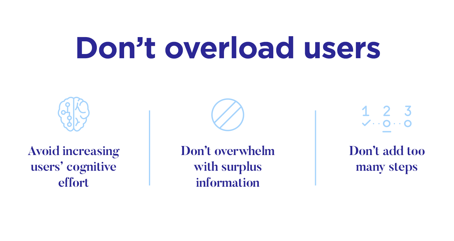
Additionally, if you need some important info from your user, make sure to ask for it immediately, then use it to personalize their experience with the rest of the app, but always be careful not to add too many steps.
For this tip, you’ll need to be careful and use it sparingly. As we saw from the quick user onboarding flow of WhatsApp, not all onboarding flows have so much information that you need to send emails or notifications to the user. But if your product does have some complexity to it, you may want to consider giving users a way to get better informed.
You can design a complementary side of the user onboarding by offering to send emails with short and visual guides on smaller features that didn’t quite make the cut of the onboarding flow. Furthermore, Youtube tutorials are a great way to illustrate how to use the product. They can offer in-depth information while not overloading the initial onboarding flow with too much detail.
Lastly, don’t try to bring users that haven’t finished the onboarding flow back with emails. Flooding users’ inboxes with reminders can backfire and cause the user to delete the app out of annoyance.
No one can expect to get it right the first time. As you know by now, designing a good user onboarding flow comes with many variables which the designer has to consider – all of which have some impact on the final onboarding flow. It’s normal and even recommended that you have several versions of the flow and that you test all of them.
Narrowing down what is truly crucial and what doesn’t need to be a part of the onboarding flow is difficult, and finding a way to convey that information is even more challenging.
User testing is a time to learn from your users. You want to pay attention to people’s reactions to every step of the onboarding – are they bored? Do they feel confused at any moment? You also want to note how users apply what they learned from onboarding to their first use of the product. Did they get lost even though they were shown the way in the onboarding?
Each little issue you notice should work as a building block for a better onboarding UX in the final product.
Design, prototype and test better user onboardings with Justinmind. It's Free. Unlimited projects!

Here at Justinmind, we’ve just updated our onboarding experience for first-time users. Now, when new users download our prototyping tool and open the desktop app, they are presented with two options: the traditional ‘full mode’ and ‘beginner mode’.
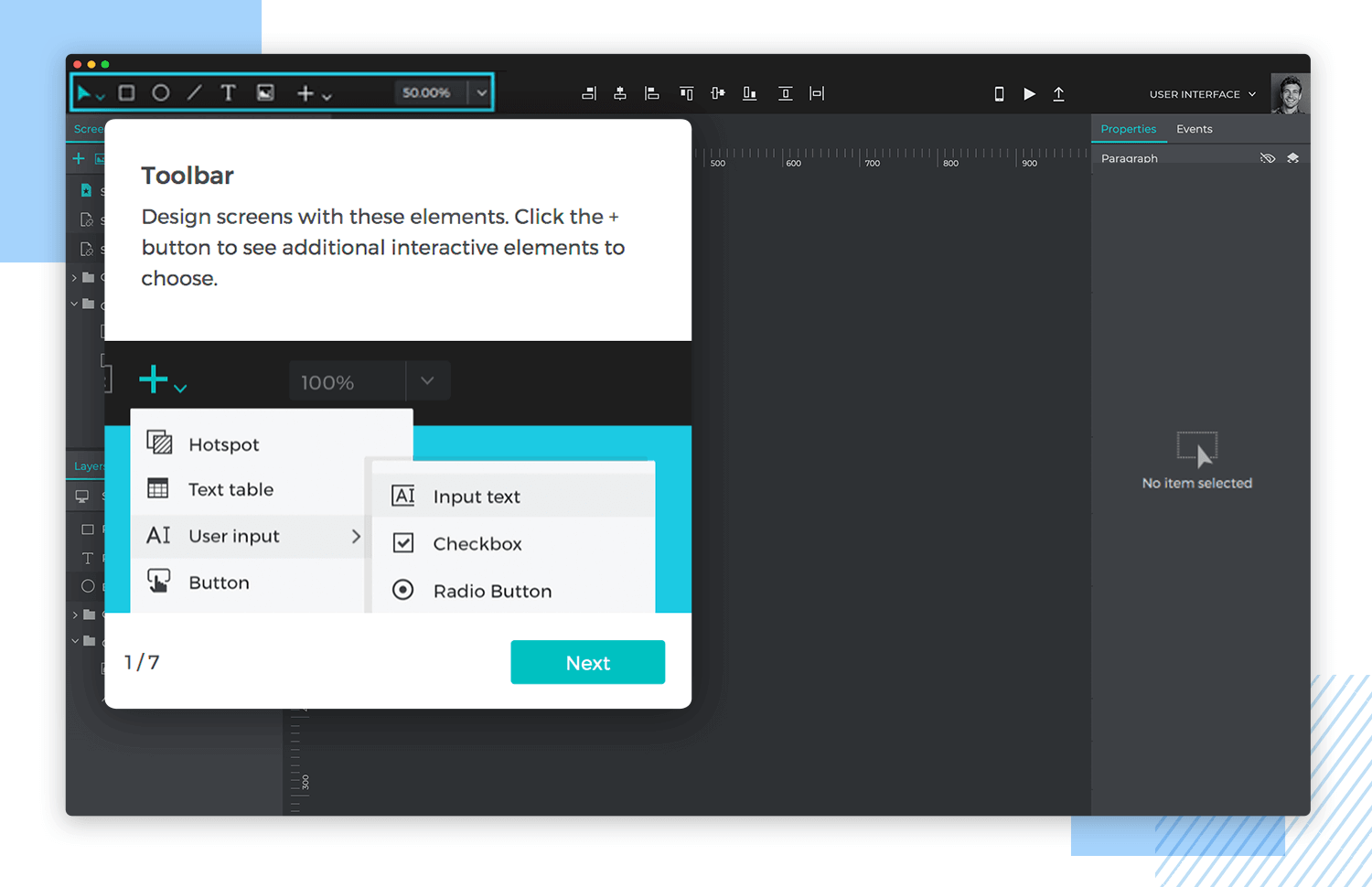
Full mode shows the full extent of the UI and all floating palettes and actions. Beginner mode guides users through the interface with interactive tooltips linked to our support section and YouTube tutorials. Beginner mode users are guided through features and floating palettes step by step and, once they feel up to speed, can easily switch to Full mode at any point.
By adapting the onboarding experience to different user abilities, we can create a Justinmind experience tailored to user needs.
When we interviewed Basecamp’s UI Designer Jonas Downey, he told us that his team aims to make Basecamp “an enjoyable collaborative space”. That design ideology is obvious from Basecamp’s onboarding process for new users.
Starting from a landing page with a distinctly approachable vibe (client testimonials and a distinctly homely design aesthetic), Basecamp moves users along a conveyor belt that includes account creation, and a personal note from Basecamp’s friendly-looking CEO.
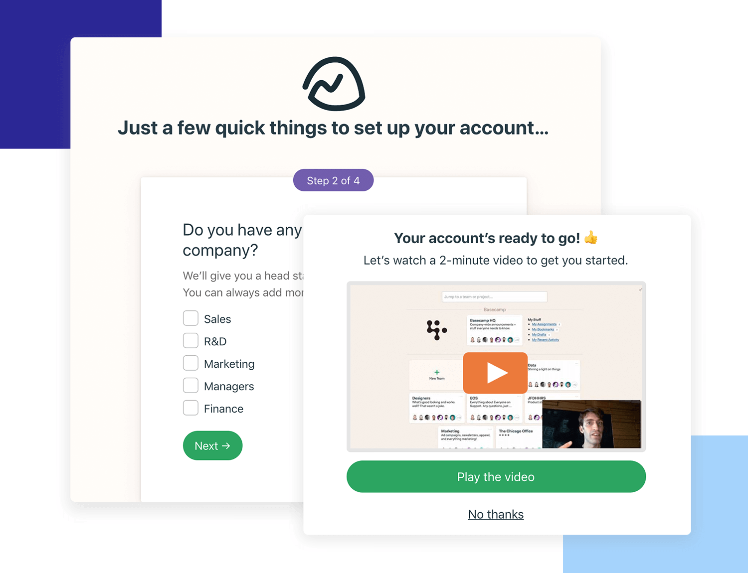
This is all great, but then comes the real onboarding juice: the flow asks new users which projects they’ve got going on right now and takes them straight over the project template they need. Say you want to set up a company HQ, a central point for shared documentation and news – Basecamp directs new users through that set up in three steps.
Basecamp also provides new users with sample projects on the Account page, which users can use as templates to build out their own projects. Users are encouraged to upload information, add members and start working with the tool almost without realizing it. The onboarding flow is unobtrusive, useful and helps boost retention by ensuring users upload documentation sooner rather than later.
Getting started with Netflix could be a nightmare for users: a potentially overwhelming number of movies and series to choose from, plus worries about data crunching and monthly payment, could make users reluctant to dive into the paid streaming service. Netflix cleverly assuages any uncertainties with its personalized onboarding flow. The landing page gets the payment thing out of the way first off, with the claim “Watch anywhere. Cancel anytime”.
With that out of the way they take users right along to an easy to understand pricing page – they also offer the first month free with no commitment. ‘Hooked’ author Nir Eyal, quoting Evernote’s CEO, points out that the free trial is a great tactic to get more paying users: “As usage increased over time, so did customers’ willingness to pay. After the first month only 0,5% of users paid for the service. …By month 33, 11% of users had started paying… At month 42, a remarkable 26% were paying for something they had previously used for free.”
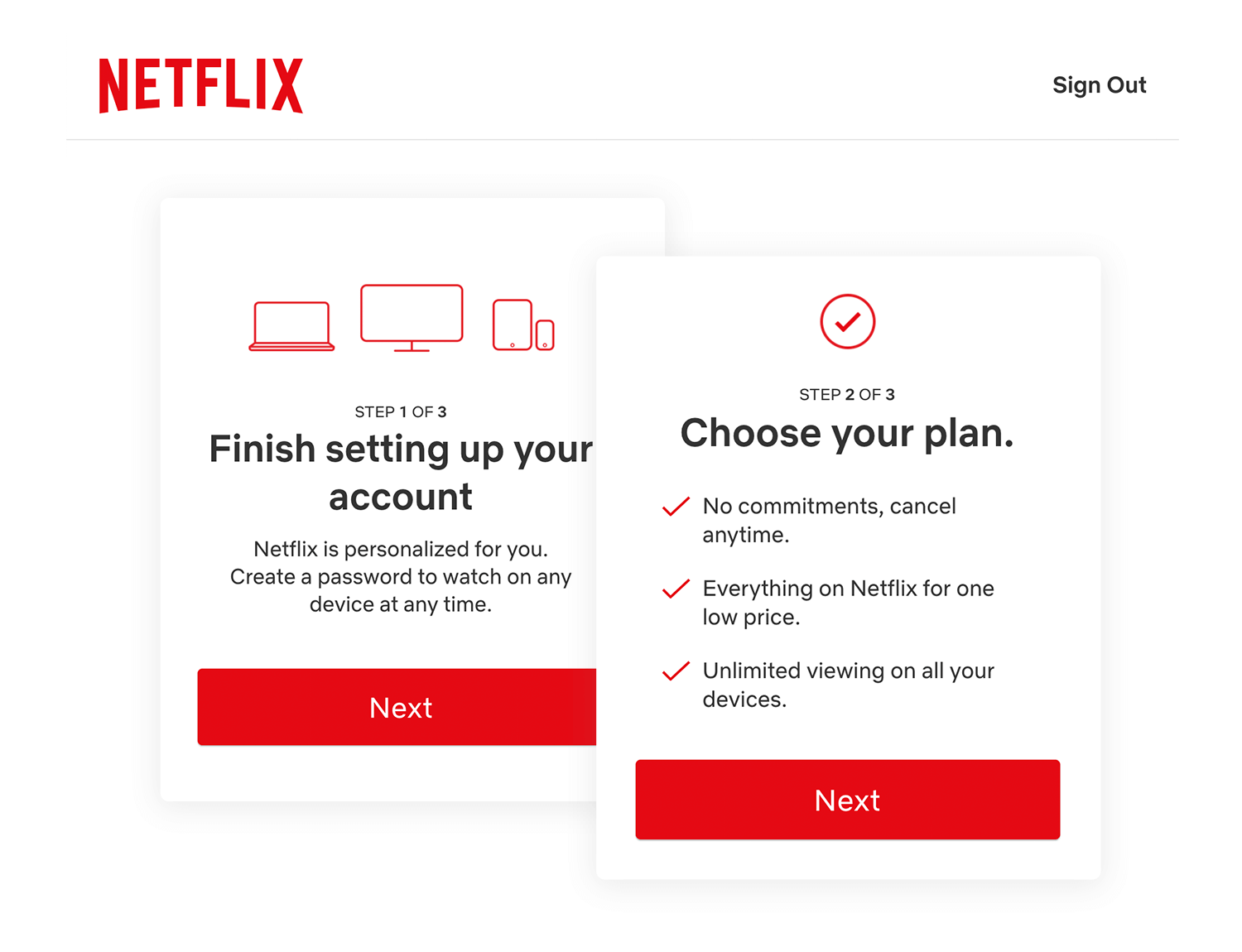
Savvy pricing presentation apart, Netflix’s user onboarding is strong on personalization. By asking new users to rate a selection of movies on a sliding scale, Netflix then algorithmically produces a list of recommended content in much the same way Amazon or Spotify does, to keep users moving through the app, discovering and engaging with content.
Dropbox makes it incredibly easy to both understand the product’s USP, and to get started on file saving and sharing. Once users create an account and open the web app, they are walked through the process of user verification, document uploading and sharing in only 7 steps – Dropbox designers have chosen to present these steps in a progress bar at the top of the interface, to relieve user anxiety about the complexity of the onboarding process.
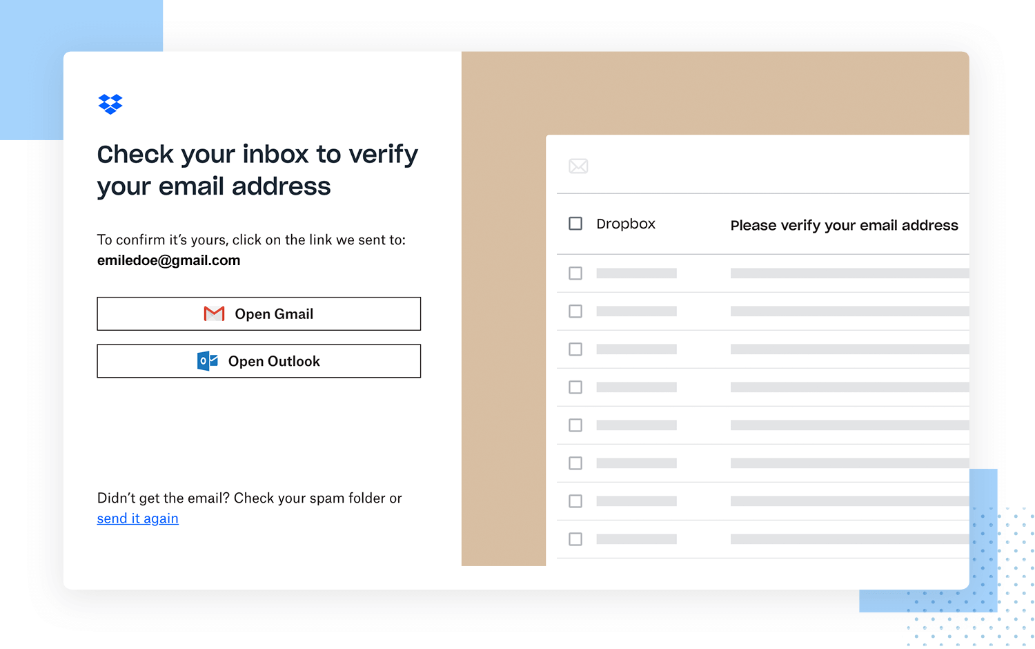
In terms of textual content, Dropbox’s onboarding process favors clarity over wise-cracking; however, branding opportunities are leveraged in the cute illustrations, which lighten the mood without obscuring basic functionality.
Language app Duolingo wastes no time in its onboarding process: users select their language and choose their goal right from the landing page. In asking new users to commit to a goal, Duolingo is cleverly tapping into behavioral science theories of goal achievement and commitment, in a bid to keep users engaged for longer.
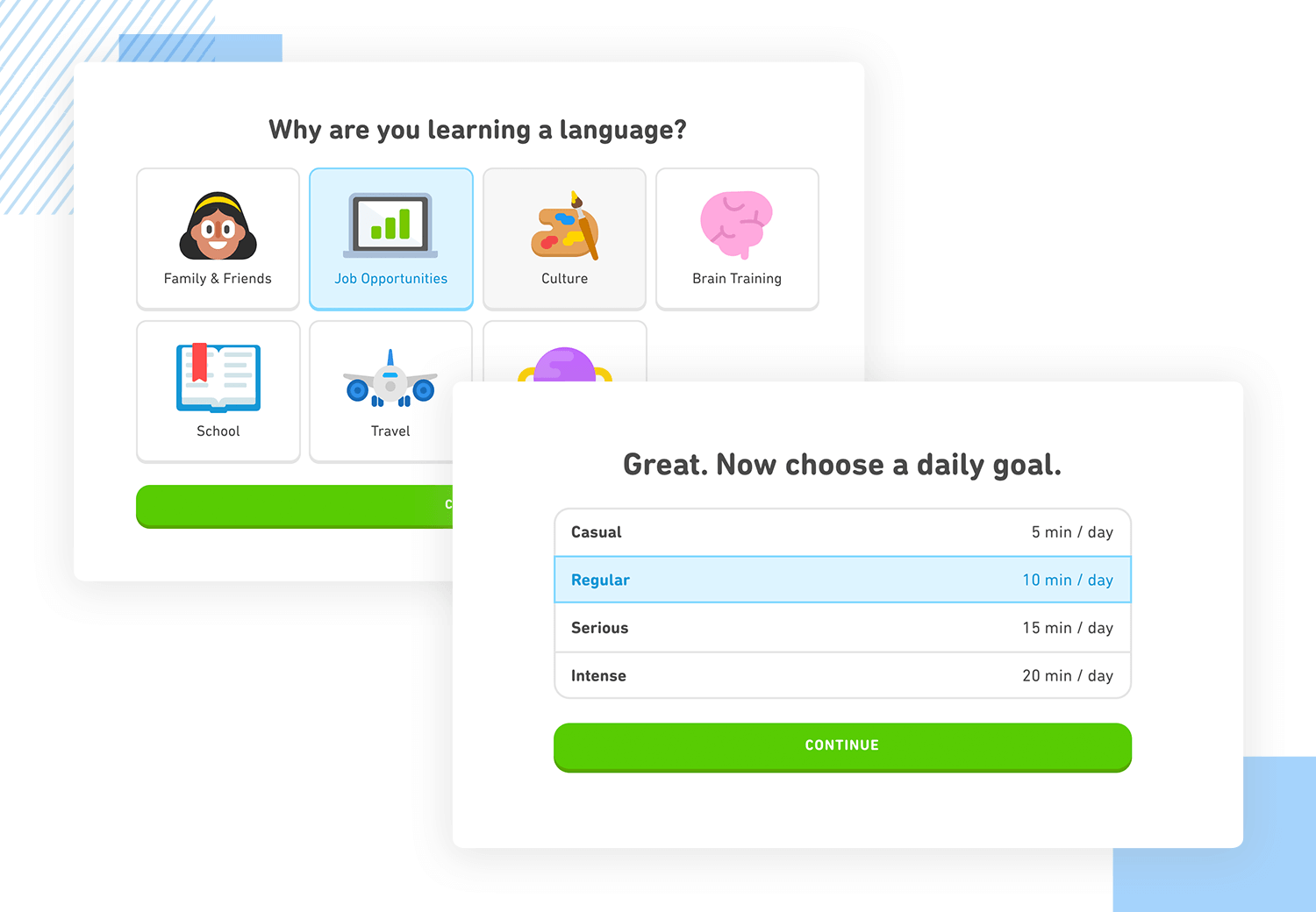
Kind of like Justinmind, Duolingo also provides new users with two options once they’ve set their language goal – they can start from the basics, or take a placement test. The experience thus becomes personalized at only the third interface step. Light-hearted tooltips then introduce the user to useful features based on their knowledge and chosen language.
Duolingo’s user onboarding aims to get users started as soon as possible, and within 10 clicks users are deep into language learning. By enabling users to get into core functionality from the start of their app experience, Duolingo presents itself as highly intuitive.
Many people who aren’t qualified or experienced designers will know of and love Canva. Not only does it offer people a quick way to design great logos and touch up images for a website, there is something to be learned from its user onboarding flow.
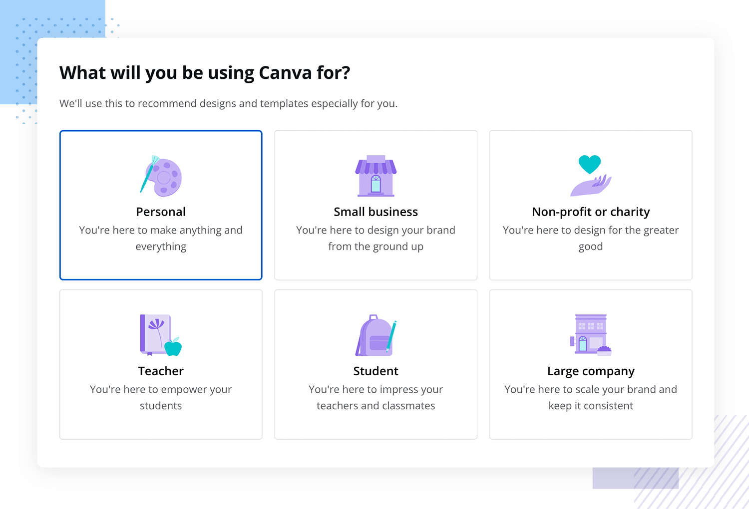
The real upside of Canva’s user onboarding flow is that it customizes the experience according to the user’s answers to the brief questions the platform presents. Why are they using Canva? What do they hope to create? What is their occupation? By adapting the flow to the user’s preferences or profession, the resulting tutorial resonates more deeply with all new users.
The tutorial takes the form of a brief video (with no audio) that shows you how to create a design you’re interested in, making the user interact with the tool immediately with little chance of users getting lost. The video shows users both how to operate the tool and the possibilities it brings to the table – the ability to create designs that were, until now, the domain of professional designers only.
One of most popular productivity tools out there, Evernote has quite the reputation for its great user onboarding flow. The reason why we love their onboarding experience is that it shows off all the key advantages and selling points the product has, while never crossing over to a long and boring onboarding flow that will lose users on the way.
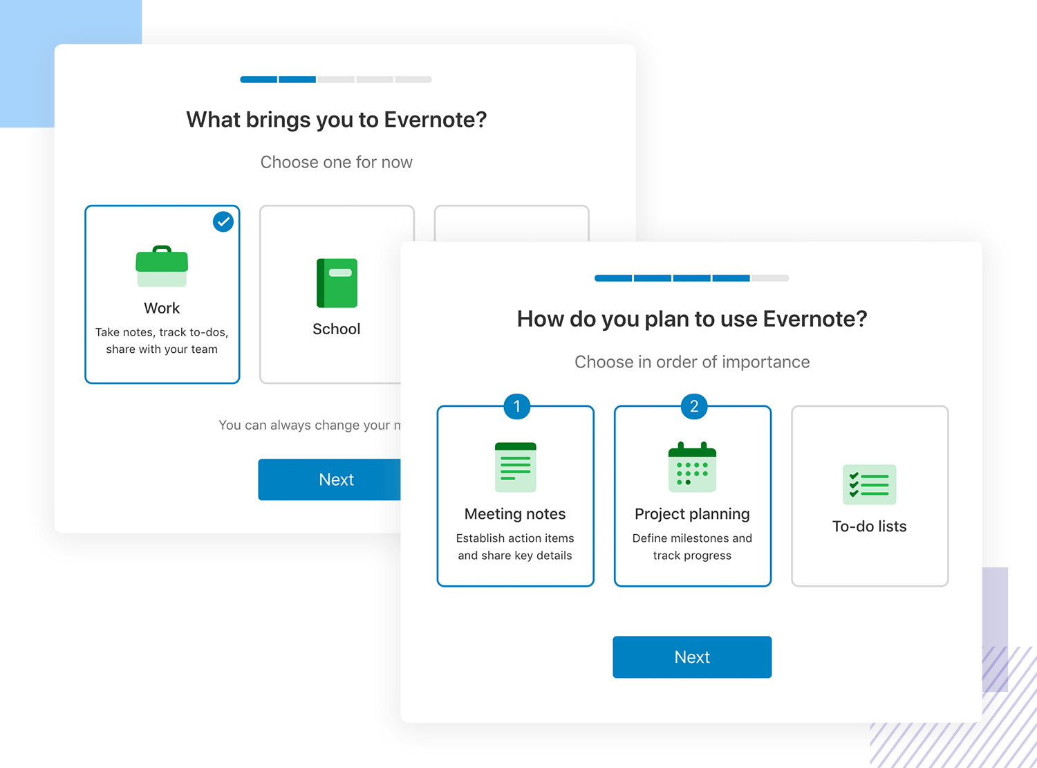
The initial part of the user onboarding reminds users of the big selling points of the tool, using great custom illustrations that add visual storytelling to the experience. The next part requires action from the user, where the tool takes the user by the hand on a short tour of the main features.
We love that Evernote gives users the option to bypass the onboarding experience altogether – with a product that stretches across several versions, you need to consider users that already have one of these versions. People that are used to the desktop version of Evernote are unlikely to need a tour of the mobile app – and forcing users down a certain path is always tricky.
Slack’s messaging platform is widely used in the corporate world due to how handy it is for team communication. Their onboarding experience is quick, to the point and interactive. Brand new users are asked to set up the basics such as the name for their Slack, and are then put into contact with a chatbot that walks them through the tour. The chatbot both shows the main features and asks for further information from the user – a clever way to get data from the user in a smooth, interactive way.
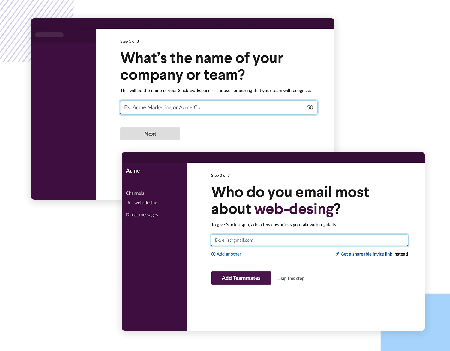
Popups are used to highlight all the most important features, leaving the user to discover the smaller functionalities in their own time. The microcopy is well thought out as it offers an explanation to every field users need to fill in, giving context to the effort demanded from users.
A great side of the user onboarding experience Slack has is the lack of unnecessary steps. There’s no asking for permission to send notifications, no verifying of emails or even setting up a password until users are settled into the tool. That way, users aren’t distracted by anything that can interrupt the onboarding flow.
Design, prototype and test better user onboardings with Justinmind. It's Free. Unlimited projects!

Lookout is a mobile security app that has a great interactive user onboarding experience. Instead of offering video tutorials or waves of emails with information on the tool, Lookout settles for a 4 question quiz.
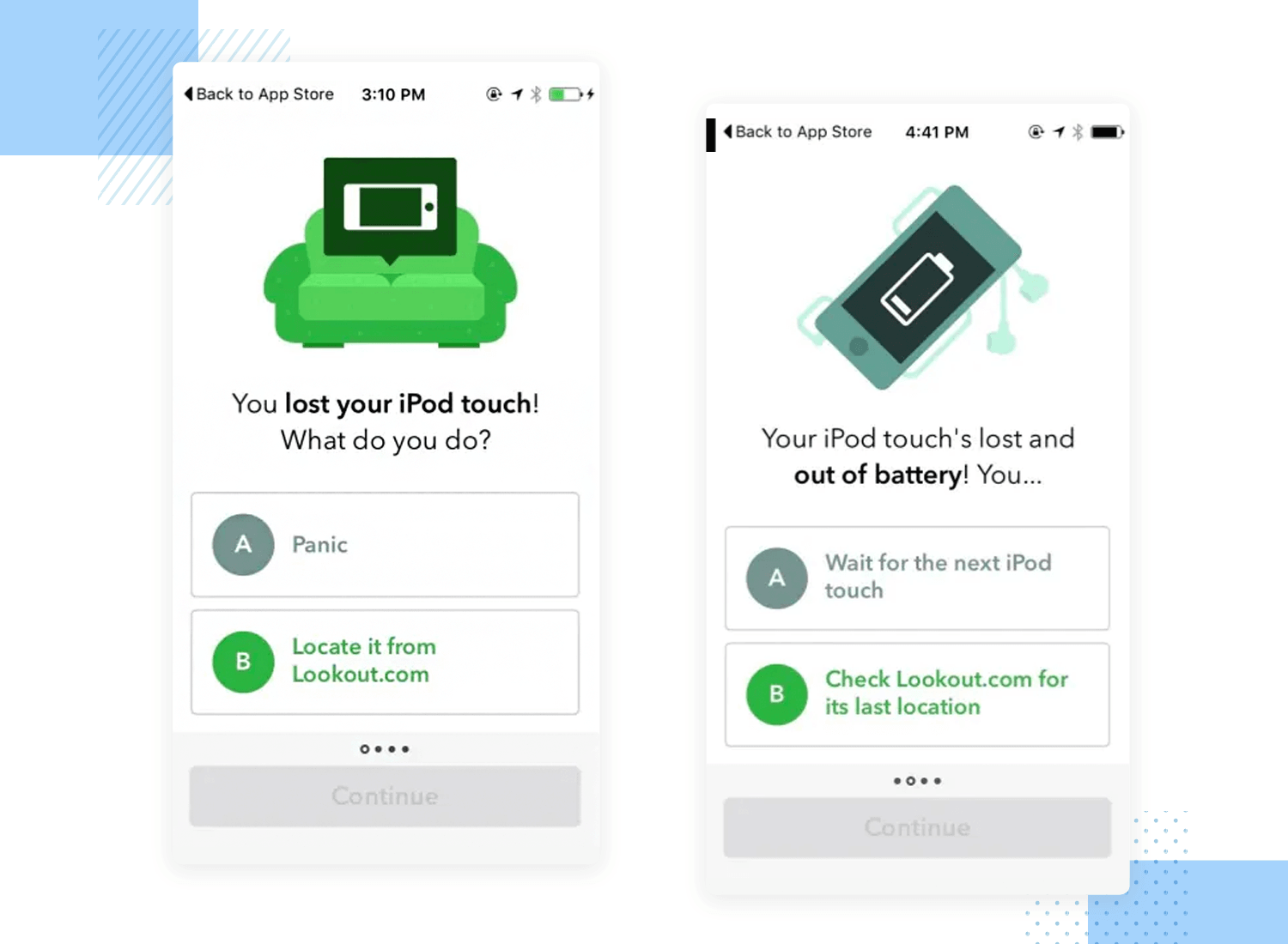
The quiz is smartly designed to highlight the key selling points of the tool, asking things such as what the user would do if they lost their iPod. Depending on the user’s reply, Lookout either links the correct answer to their corresponding feature or offers an explanation of why assuming the iPod is lost forever is not the only option – not when you have Lookout, that is.
WhatsApp, the world’s most commonly used messaging app bought by Facebook back in 2013, has an amazing user onboarding experience. Planning user onboarding in messaging apps can be tricky, mainly because the tool requires the user to insert quite a bit of personal data and grant the app permissions to do quite a bit.
The clear example is the struggle to get users to enter and validate their phone numbers in the platform, or grant access to their contacts or files. These steps can overwhelm the user, or make them sweat at the thought of giving so much liberty to the app. WhatsApp makes quick work out of the onboarding process, using clever ways to decrease the time this process takes.
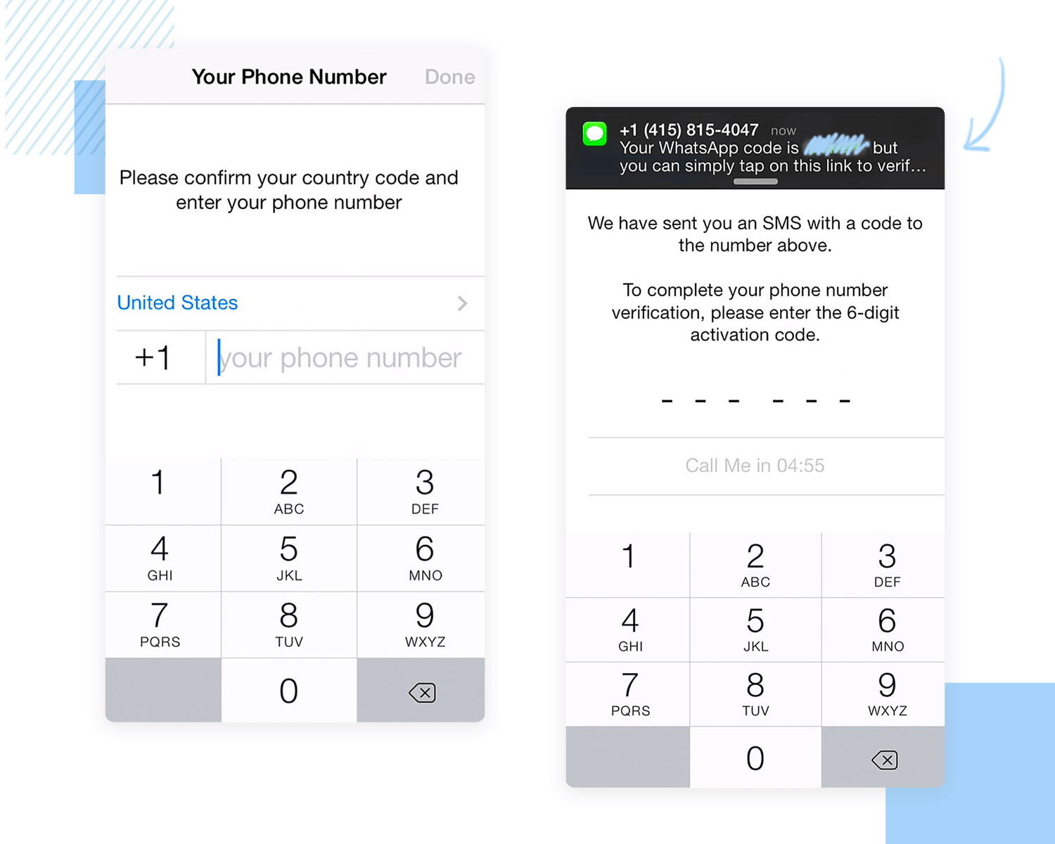
The best example is how WhatsApp can automatically detect the verification code sent to your phone, so users don’t have to go digging their messages for it. This is a great idea not only because it makes the whole thing easier for the user, but because it closes the window of distraction users see when they close the app to look for the message.
The user onboarding experience here is good because aside from the granting of permission to the app or inserting your phone number, there is very little the user actually needs to do. On the few steps the user needs to do something, there is always some text offering guidance or context to that action. This is a huge plus, especially when dealing with older users who aren’t necessarily tech-fluent.
Twitter is a brilliant example of the AHA effect in real life. It helps its users, whether young or old to understand immediately what Twitter is about by making them use its main features as soon as they download the app.
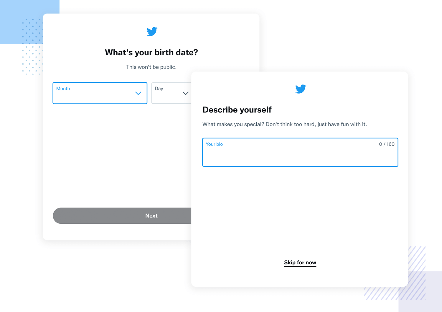
For example, as the user begins the onboarding process and after they have their account set up, the first thing they’re asked to do is follow new users. Immediately following 35 users and subsequently seeing their tweets pop up in your feed organized by date activates the AHA effect, as you quickly understand how the platform works.
In our opinion, Pinterest is among the best examples of a user onboarding experience that encompasses what values the main feature offers the user. As soon as the user signs up, they’re advised to select the categories and the pins that most interest them. BOOM! They’ve already learned about the core features that retain their most loyal user base.
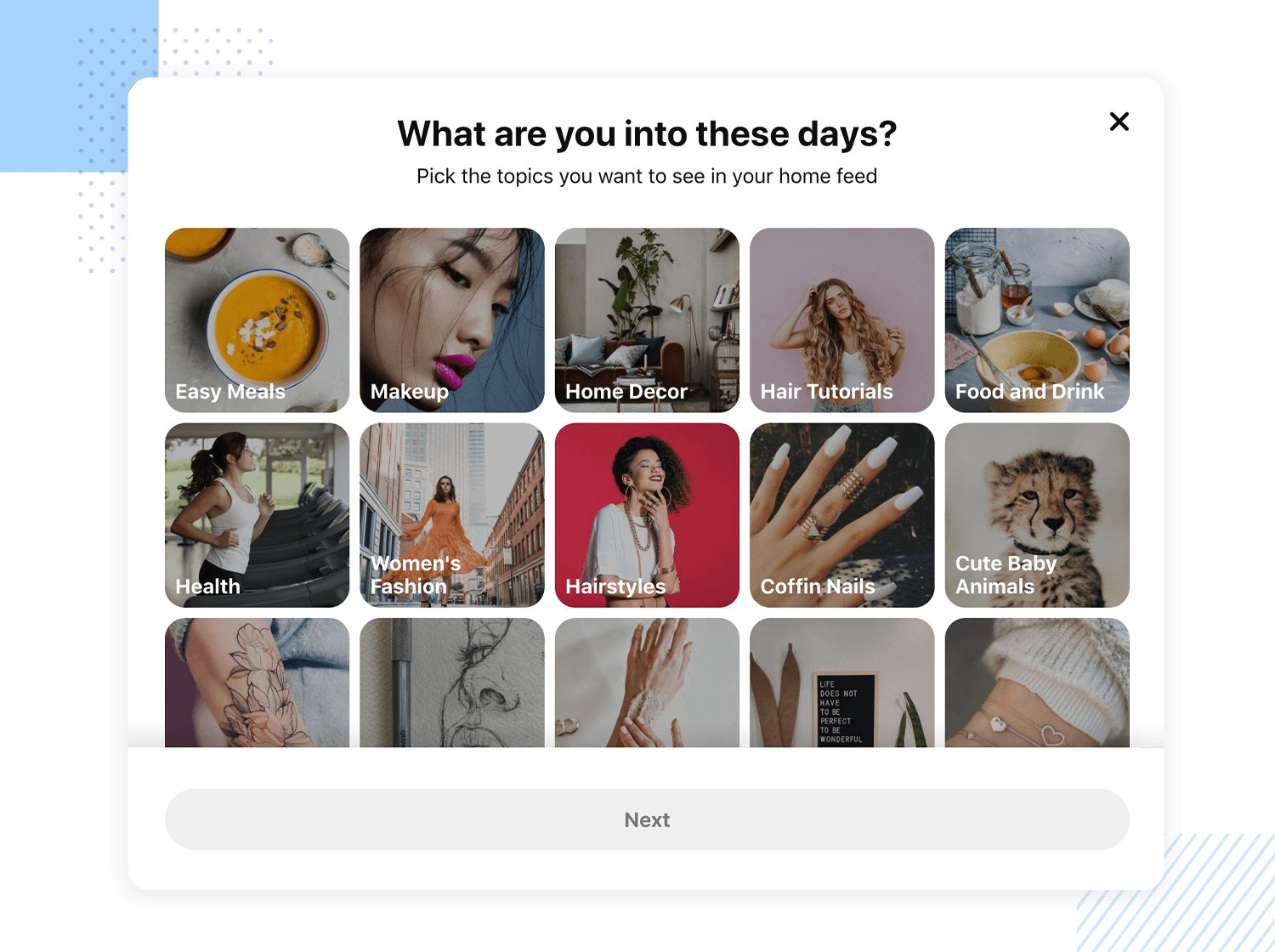
Pinterest also gently persuades app users to incorporate their browser button, they make sure that they are benefiting from the app even when they’re not currently logged in to the website. If they wish to not add the browser button, a brief modal explains what they’ll be missing out on.
We’ve included language learning app Babbel in this list of great onboarding examples because, not only is it a brilliant case of learning by doing, but also because of how it asks its first-time users permission to send push notifications!
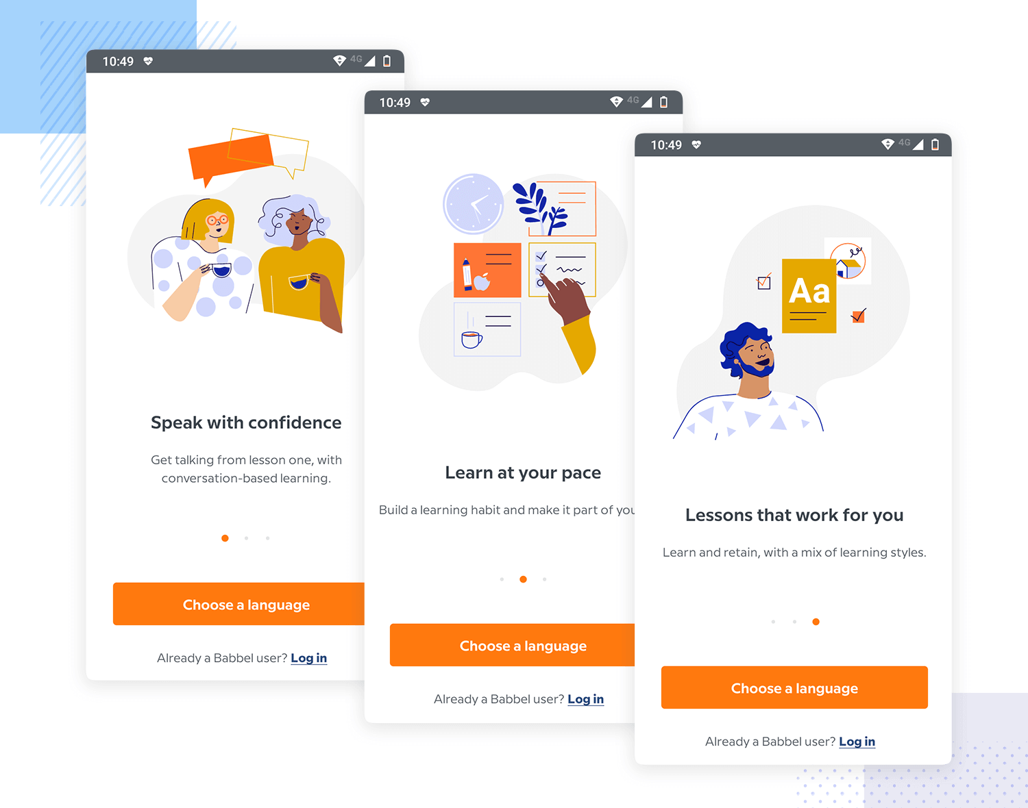
Babbel asks for permission to send push notifications very early in the user onboarding experience. It’s upfront and gets straight to the point. And it works because they use a technique called “mobile permission priming”. Their permission priming takes the form of a modal window that immediately states the benefits of allowing notifications: to stay on track with their language acquisition goals.
Instagram is another cool example of how to get user onboarding right, with their easy-to-navigate FUX.
As soon as the user downloads Instagram, they’re told to sign up to see photos and videos of their friends – already stating upfront one of the major benefits and retention features of the product.
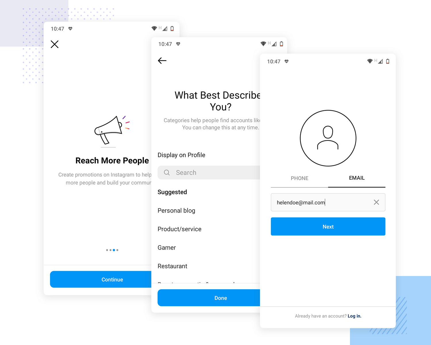
This sign up process in the user onboarding flow is done in three quick steps. First of all, the user can sign up with either their email ID or using their Facebook profile. After that, they’re already in the app’s home screen where they have an unobtrusive in-app guide. This guide lets users know, for example, that they can upload their first video or photo to their network by tapping the camera icon.
Quora is yet another example of user onboarding done right. Their process is quick, fun and to the point.
As soon as the user signs up, they’re invited to follow topics that interest them and then to find their friends with a modal window that pops up after they’ve selected the topics. They even include a checklist that lets you see how far you are in the onboarding process. It lists out which steps you still have to complete, such as “click on and read 3 stories” and “upvote a story you like”.
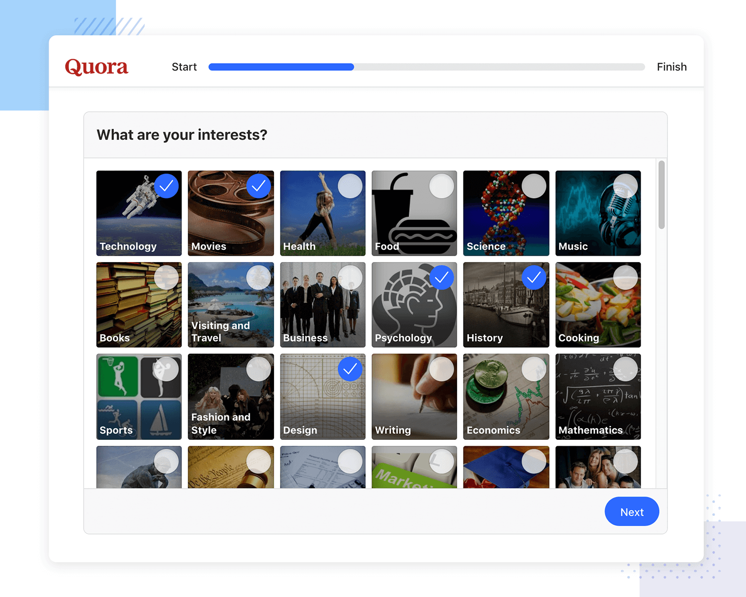
The checklist part of Quora’s user onboarding experience is a particularly interesting feature. Not only does it give the user an idea of when they’re fully done learning how to use the platform, but it also serves as a useful internal indicator for the what stage of activation the user is currently in.
Your user onboarding experience can make all the difference when it comes to user retention. It’s not a complete guarantee that your product will be successful in the long term, but if you skimp on this important stage, it is a guarantee that it will end up in your user’s trash can.
The best apps and websites dominate the market in part thanks to their tremendous onboarding experiences that help get users hooked from the start.
Every user onboarding flow differs based on the type of product it’s designed for but there’s always an optimal way to reel users in. We hope that the best practices and examples have given you some food for thought for your next user onboarding design!
Design, prototype and test better user onboardings with Justinmind. It's Free. Unlimited projects!

Related Content
 UX design portfolios are your chance to showcase your top skills and best work. Check out this post for awesome portfolio examples and websites!10 min Read
 Learn what paper prototypes are, how to make them and how they can help you design better products. Awesome examples and free templates inside!10 min Read
 In this comprehensive study, we dive deep into the world of web design tools, comparing features, pricing, ease of use, and more. Whether you're building a simple landing page or a complex e-commerce store, we've got you covered. Let's explore the best options and help you make an informed decision.30 min Read
