User journey maps help us navigate the sometimes choppy waters of UX design to get a usable product faster. Discover how they can work for you in this post!
Imagine you could have a design GPS that points to the user’s satisfaction as you prototype. Sounds good, right? Well that’s where user journey maps come in – or at least those that are well thought out!
Nowadays, digital products have come a long way in terms of usability. UXers often spend incalculable amounts of time conducting thorough user research before they even begin prototyping.
Start prototyping new apps today. Enjoy unlimited projects!
User journey maps are a great way of gathering all that research data and converting it into something meaningful that can act as an easy point of reference throughout the design process. It’s something that can bring teams together to get a usable product faster. In some cases, user journey maps can even serve as a cornerstone for further designs and iterations on your product.
In this post, we’ll explore exactly what user journey maps are, what part they play in the design thinking process and how to make them. Sound good? Let’s dive in!
Solving a problem for the user means first understanding what that problem is from the user’s perspective.
For that reason, the initial question isn’t how to help a user reach their goal, but in defining that goal itself – something which requires research. And lots of it. Determining the users’ pains and motivations will help you in understanding what their goals are.
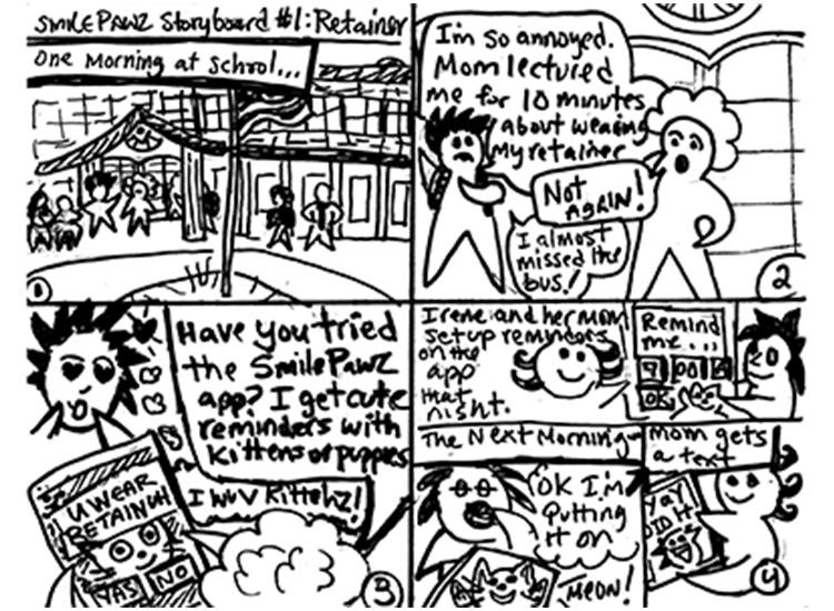
School Scenario by Lee Jordan
Then, imagine that once you have your user’s goal defined, you wish to map out the whole user experience: from feeling the need to achieve that goal, to discovering your product, using that product and finally – achieving their goal with that product.
Knowing the steps your user goes through, even before they discover your product, is highly useful. Having all this information condensed into one easily-comprehensible document is even better. That’s where user journey maps come in. You can think of them as being like the GPS in Google maps.
User journey maps are graphical representations of the processes your user goes through to achieve their goal with your product. Divided into various stages, these processes can be anything from downloading your app and creating an account or noticing and learning about a new feature on your app.
Each stage of a user journey map often contains the following information:
- A narrative of events the user goes through
- The user’s thoughts and emotions
- The user’s expectations
- Problems the user faces
- Design and business opportunities
User journey maps help prevent subjective hypothesis within a company about what the user needs and help facilitate a more user-centric design process. They’re a way of displaying solid, factual evidence in a way that’s easy to understand and remember as a basis for making design decisions. This evidence comes from data gathered from user research.
User journey maps are a visual representation of the events and emotions your user experiences as they engage with your product. This user protagonist is called an actor. Actors usually represent user personas – fictitious characters created from data gathered from interviewing and observing your target users.
Scenarios, on the other hand, are the situations the actor finds themselves in and the process they go through while trying to solve a problem so they can accomplish their goal using your product. Each scenario will have a timeline that’s divided into various stages.
User journey maps feature different phases or stages. The stages of a user journey map might look something like the following:
- Discovery stage
- Comparison stage
- Buying stage
- Usage stage
- Customer support stage
In each stage, user journey maps document thoughts and emotions, and sometimes, what they intend on doing in the next stage. They’re a discovery of how a user will react to and interface with a hypothetical product or product feature. They often include images and quotes based on the actor’s persona, along with a description of their actions.
Start prototyping new apps today. Enjoy unlimited projects!

Without the user, there’d be no product. There would be, you say? Then let me rephrase that – by designing a product with no users in mind, we are essentially designing a product that will have no users! That’s why we spend such a large part of the design process conducting user research.

User psychology by Nilanjan Debnath
So let’s say we’ve done our homework and gathered all the facts and statistics we need to design the perfect product – great…sure it’s time to get stuck in? The only problem comes in sorting this data into something memorable and that makes sense in the context of UI design. That’s why user journey maps are a good idea. They help to:
- Condense data
- Present insights and opportunities
- Keep things user centric
- Keep departments aligned
- Improve KPIs
- Reduce customer service
Let’s start with the fact that they help condense high volumes of data. The human mind memorizes stories much more easily than facts and figures. User journey maps are all about condensing and sorting in-depth user information in a digestible way that’s relevant to the current project at hand, by creating a story.
A good user journey map will help anyone who reads it to learn a wealth of information about how a certain person might interact with a hypothetical product or product feature. And much more effectively than if they were just presented with boring statistics. We can simultaneously learn what each user thinks and feels at each stage, along with how their actions are affected by these factors.
They also help put that data into context by matching it against your hypothetical solution (your app or website), thus helping you and your team gain valuable insights and identify opportunities for product design or improvement.
Meeple! - Number Cruncher, by Al Kurr
These opportunities might be certain ways of helping the user to achieve a certain goal, or even a brand new goal itself – something that never would have even occurred to the user. We can think of a user journey map as a kind of roadmap to solving a problem for the user.
Creating a user journey map is therefore the optimum way to maintain a user-centric approach that helps us make informed design decisions. It’s important that stakeholders, designers or even customer service agents avoid trying to imagine what the user wants.
Keeping teams aligned towards one common goal while developing a product is much easier with a user journey map. This is because they help various stakeholders to agree on certain processes and features as they are validated as being in the best interests of the user. Staying aligned to a common goal means that everyone is working in unison to achieve an agreed-upon outcome.
Hence, user journey maps prevent teams from working in “metric silos”, or communication vacuums, which ultimately leads to a fragmented product. This happens when teams don’t give enough importance to certain features, while dedicating too much time on ones that make less of a difference. A user journey map prevents this by serving as a guide to consult when certain directions or metrics are in doubt.

Moreover, user journey maps also help to spark conversation. They help promote debate about certain features and can be a way of helping to generate ideas in product meetings. In this way, you’re able to literally work with the user indirectly to come up with creative solutions.
Many companies consider user journey maps as a way to reduce the level of customer complaints and optimize customer service. And it makes sense too – if customer service is busy, in most cases, it’s usually because the user journey wasn’t thought out and too many things were just assumed. Using user journey maps helps you to predict and avoid certain problems before they become a reality.
Lastly, user journey maps act as a brilliant metric to monitor the KPIs of a team. It becomes a helpful way to check if certain checkpoints are being met in a product’s design and development stage.
Start prototyping new apps today. Enjoy unlimited projects!

First and foremost, before you go through with any plans for a user journey map, the most important thing is to get the necessary stakeholder buy-in.
User journey maps can demonstrate certain stages or certain processes a product should incorporate. However, not every stakeholder might agree to go through with creating a user journey from the start; they might just see it as a waste of time. Convincing them that this is a valuable use of time and resources is important. Showing stakeholders what a user journey map can help achieve can be enough to get them onboard.
Here are some points you can make:
Remember all that time and money we spent on carrying out that in depth user research? Well this will be a way of not just making sense of it, but also to condense it into an easily readable and memorable document that keeps everyone on the same page.
Remember those user personas we created with all that data? Those nice stories with pictures of people that are tacked to the wall? Well we got a use for them! We’re going to show exactly how they’re going to use our product and what we can do to help them.
Lastly, because all teams and individuals are aligned to the same goals, it’ll prevent problems and misunderstandings, or at the least, reduce their frequency!
Now that we’ve convinced the stakeholders, we’re ready to go through with the next step, and that’s creating an empathy map with all that user research that we gathered previously. We can gather all those surveys, user interviews and field research results, sort the answers by frequency and arrange them neatly into an empathy map.
Empathy maps are as the name suggests – they’re all about getting in the head of the user, nothing else. There’s no focus on the product at this stage. It’s about getting down the bare grassroots of the user’s experience.
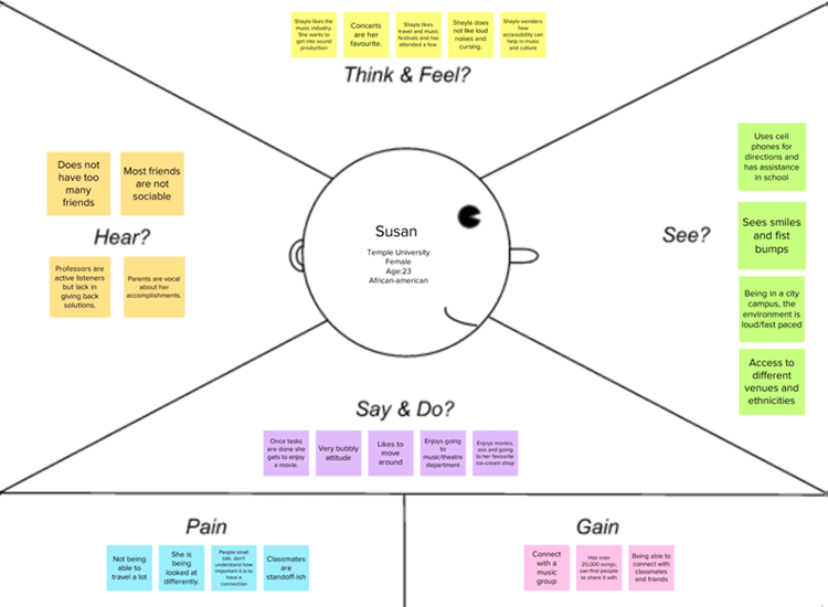
Student Empathy Map by Felix Alvarado
Empathy maps usually comprise four quadrants: thinks, says, does and feels. This information is organized based on results from user research carried out and is usually pasted onto each quadrant with post-it notes.
The next step is to create multiple empathy maps that represent segments of your user market and funnel them into user personas. This is where you’ll develop their story, such as their job, lifestyle, hobbies, pain points and motivations.
Imagine you’re in the process of designing a mobile banking app. You’ve done your user research and created your user personas. You’ve discovered a gap in the market for banking apps that allow you to breakdown your weekly grocery expenses. That is their motivation.
Based on research, your user personas might be a college student, Maire, and stay-at-home dad Paul who want to save money on groceries, albeit for different reasons.
Maire and Paul’s motivation is the same, even though the context is different. The pain points are are also fundamentally the same – they want to save money. Both might discover your app from ads on social media, but on different platforms. They’ll both have clear mental models on how they can download your app.
However, being a young millennial, Maire might have tried lots of different budgeting apps and have a good idea of the general layout of a banking or finance app. Paul, on the other hand, might be used to more traditional banking. He has his bank’s app on his cell phone, but only really uses it to check his balance.
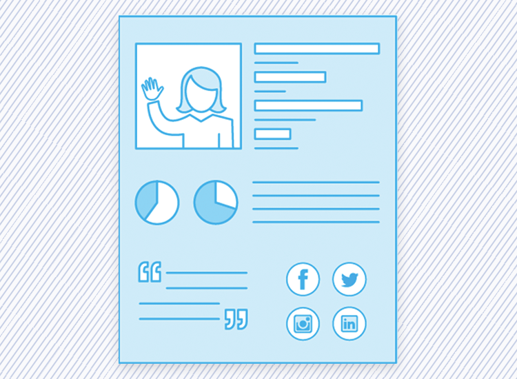
Meet Your Customer by Jen Hubbard
In each case, you’ll need to cater for both mental models. It’ll need to have a similar pattern to other highly downloaded banking apps on the market. However, it must still be intuitive enough for Paul to painlessly discover the new features of a challenger bank with budgeting features.
As a result, you’ll need to create two separate user journey maps for these two different personas. Throwing more than one persona into the mix adds complexity and conflicting information. Differences like these show why it’s crucial to make user journeys that are highly data driven. If such a high degree of this information were mere speculation, it would be asking for trouble.
Now imagine you’ve gotten your actors through stage one – they’ve downloaded your app. The next stage is the onboarding. They might have different emotions at that stage – Maire might not be feeling that impressed based on the apps that she’s tried before, whereas Paul might be excited but also filled with trepidation! The key is to keep both users hooked till they get to the next stage, which would be setting up a checking account.
Start prototyping new apps today. Enjoy unlimited projects!

User journey maps are your launchpad for a successful UI prototype. This is because they are a great lead in for drawing up user flows.
User flows, unlike user journey maps, contain the actual screens of your app as they would look when finished.
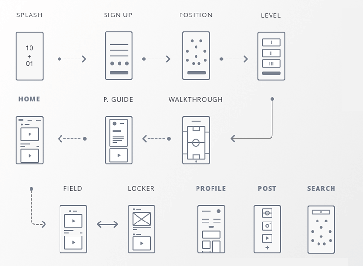
User Flow & Wireframes by Gonzalo Gelso
They don’t contain information about emotions or internal dialog. In the case of our mobile banking app example, the user flow would show a map of the various screens your users would have to navigate to set up a checking account and apply for a debit card.
User flows are great for helping design a UI based on the actors and scenarios in your user journey maps. They’re also great for unearthing any potential barriers that weren’t visible in the user journey map and for inspiring further ideas. They can also help map alternative user flows in your product, in addition to being a great visual to show to stakeholders.
User flows are a great way of getting all teams onboard with the final design of the app, bringing an even tighter-knit workflow to the table. This is because everyone has a solid idea of the goals they’re working towards.
You can either create your user flow in Justinmind’s website prototyping tool before or after your prototype. The interface for designing a user flow in Justinmind is simple, intuitive and works as a great deliverable.
Here are some great user journey map templates to kickstart the process. We’ve included some variety so you can decide the best way to represent your user research. You can also mix and match to create your own, taking inspiration from these templates.
Qualaroo does a visually simple, yet appealing and complete user journey map template that you can download for free.
In the header it groups together all the basic information about the actor, such as their user persona bio, the challenges (pains) they face, along with some attributes, i.e. tech savvy and patient. The events (stages), touchpoints and emotions are grouped into horizontal rows so that you can easily create a storyboard.
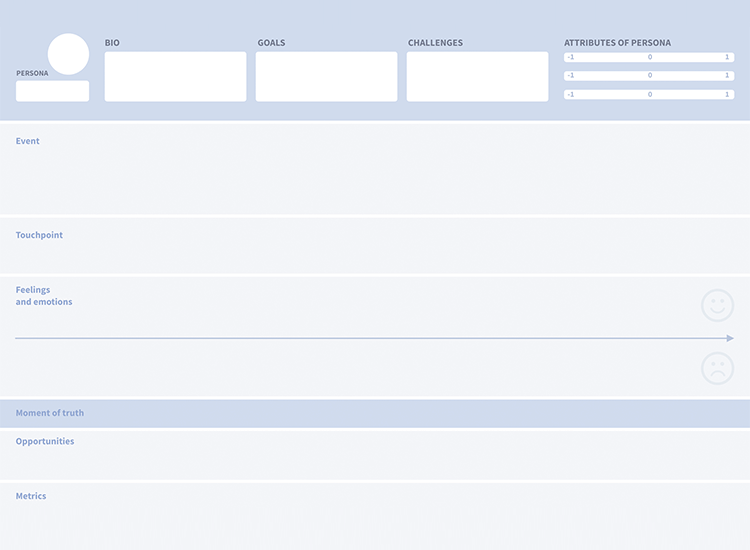
If you’ve never put together a user journey map before, then this is a great place to start because of the Qualaroo template’s simplicity.
On the Alexa blog you can find a succinct user journey map template which is also perfect for beginners. Originally intended to establish marketing gaps and opportunities, their customer journey map template fits any kind of beginning-to-end product experience for users.
Each column is clearly labeled to show the various stages of the journey, with the rows labeled to give context. For example, under the column “Awareness”, you can refer to what “Actions” the user takes in this stage.
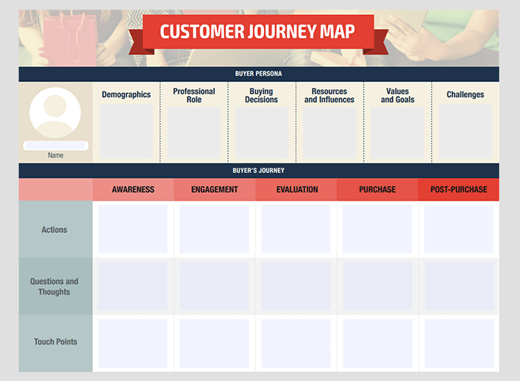
For example, they might become aware of your app by seeing a commercial on their Instagram feed. They might read some of the comments and download the app from the App Store or Google Play.
Start prototyping new apps today. Enjoy unlimited projects!

If you’re looking for a more detailed user journey map template that’s highly visual at the same time, Edraw do a brilliant free template that you can download as a PDF, and that you can later convert to a Word document.
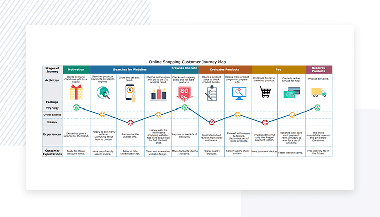
What we like about this user journey map is that it gives so much insight at each stage. It also contains images, as well as a graph with emojis that makes the information easy to understand at a glance. It also provides space to give plenty of detail for each stage for more in-depth reading.
Custellence’s customer journey map template is a great way of coming up with new solutions to existing problems, as well as exploring new opportunities. It’s also works well as a beginning-to-end customer journey.
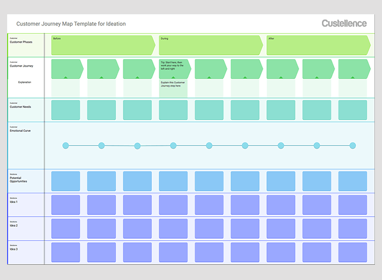
The stages are mapped into three main groups: before, during and after. It’s an ideal way of getting the full picture of your user’s experience even when they’re not using your product. It also contains an emotional curve to track the user’s emotions at each stage at a glance – something that’s always helpful to a UXer.
Mightybytes is a digital marketing agency that helps companies improve their website design, UX and their marketing content. They have a free user journey map template that you can download in PDF format.
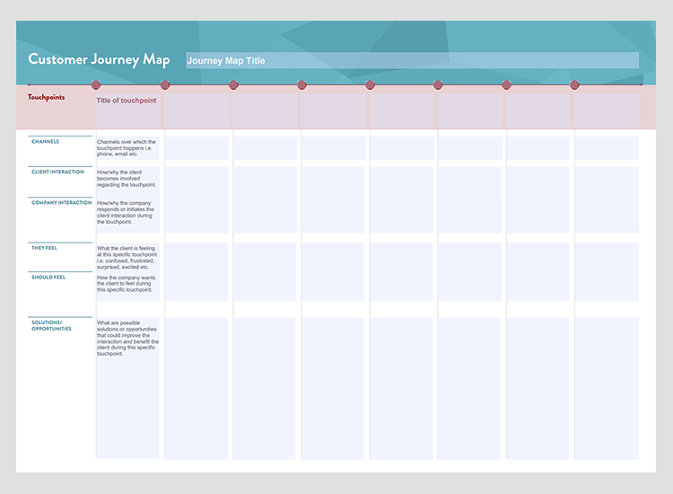
Smooth pastel colors, along with a simple table layout make this an easy template to look at and work with. Interestingly enough, the touchpoints are on the column labels and the other factors, such as channels, interactions and feelings are in the vertical labels. Normally, this is the opposite, making this template great if you want to pay special attention to the channels through which users interact with your product.
If you’d prefer to use a specially-designed tool to put your user journey map together, instead of starting with a template, why not one of the ones below? Each tool has a free version that lets you create a user journey map image to share with you colleagues and stakeholders, or include in a presentation.
With Venngage you can create a free account with Gmail or Facebook. You can then proceed to use their editor for free to create user journey maps. There are a myriad of templates available, and within the editor, you can edit the text, change the font, choose from over a hundred of their icons to add and preview it for a screenshot.
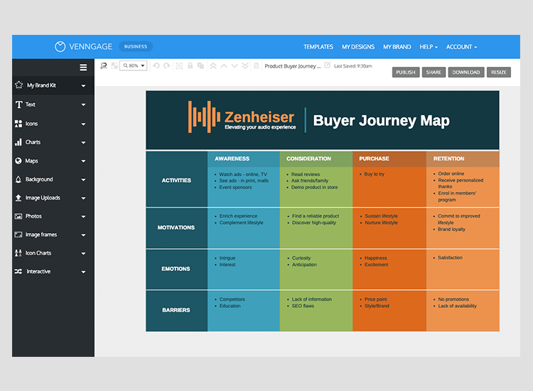
If you want to be able to share and distribute your user journey map as a PDF, you’ll have to purchase the premium option which is $19 monthly for an individual and $49 for their business plan.
Start prototyping new apps today. Enjoy unlimited projects!

Creately is a free web software tool that lets you edit their customer journey mapping templates for free and export your customer journey map as an image file. If you want to be able to download as a document or PDF, you’ll need to sign up to their personal plan which costs $5 a month or the team plan which sets you back by $25.
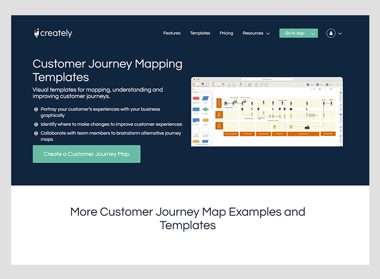
This tool also gives you access to a vast array of icons that you can use in your user journey map, as well as basic text editing features.
Lucidchart provides a great free user journey map editor that has an abundance of shapes, and text editor features to help you edit their template.
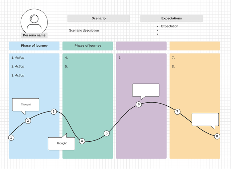
Their template includes the actor’s bio, along with a table listing the various stages such as awareness and evaluation. The vertical labels contain aspects that are typical of the empathy map, such as thinking, feeling and doing, but also for opportunities.
Another nice touch is that the shapes, arrows and lines available let your create flowcharts or many other sets of possible designs.
UXPRESSIA lets you edit their template of a user journey map using the free version of their tool. What we like about this template and editor is the simple and visually appealing nature of it.
The process by which you can edit the document is intuitive. You can click on any of the “neutral” emojis in the emotion curve to change the emotions to “joy”, “serenity” (if you can achieve serenity with a UI design then well done!). There’s a flow chart that lets you denote each stage of your user journey with an icon.
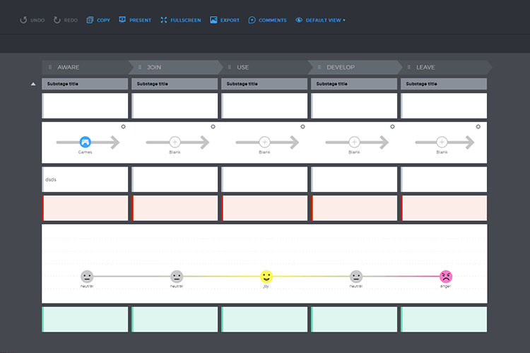
The best thing is that making a journey map with this tool lets you convey a wealth of information without it being overwhelming, letting you come away with a memorable PNG for your stakeholders for free.
Smaply is a user persona tool that you can avail of for free for up to 14 days without having to enter any credit card details.
The format of their user journey map template is relatively simple – you’re presented with three headers: pre-service, service, post-service, along with several rows of tabs. To these tabs you can add titles, descriptions and images.
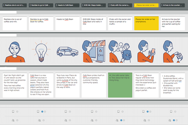
What we like about this tool is the low learning curve required to quickly get a user journey map drawn up.
User journey maps are crucial to the planning of your new app, website or feature. Though not always necessary, they serve as a guide throughout the design process. They provide you and your team with a deeper understanding of how your user persona would interface with your product. They therefore enhance your UI prototyping, giving you the opportunity to gain further insights into the usability of your design.
If you’ve taken the time to assemble a user persona, then it’s well worth creating a user journey map. Getting it right from the start is crucial and will help you avoid making massive errors further down the line.
PROTOTYPE · COMMUNICATE · VALIDATE
ALL-IN-ONE PROTOTYPING TOOL FOR WEB AND MOBILE APPS
Related Content
 UX design portfolios are your chance to showcase your top skills and best work. Check out this post for awesome portfolio examples and websites!10 min Read
 Learn what paper prototypes are, how to make them and how they can help you design better products. Awesome examples and free templates inside!10 min Read
 In this comprehensive study, we dive deep into the world of web design tools, comparing features, pricing, ease of use, and more. Whether you're building a simple landing page or a complex e-commerce store, we've got you covered. Let's explore the best options and help you make an informed decision.30 min Read
