What are microinteractions? How do they get users hooked and how do you use them? Here’s all you need to know
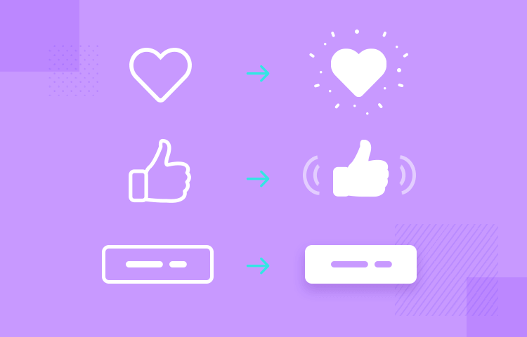
Ever heard the saying “sometimes, less is more”? With microinteractions, this statement couldn’t be truer. They come under the umbrella of interaction design and they’re all about the little details – subtle interactions whenever the user does something like a gesture on an app or a click on a website. Be it a little heart that pulsates when pressed or a thumbs up icon that turns blue after it’s selected.
Microinteractions are all around us because they boost the user experience. In fact, most of the time, you wouldn’t even realize you’re experiencing one, unless you’re a UX designer. Yet these little interactions start to shape the user experience, keeping us engaged, shedding clarity and sometimes even making us smile.
In this post, we’ll look at some great examples of what microinteractions can achieve when done right, as well as how to design microinteractions in a prototyping tool.
Developers don’t always shriek with delight when you ask them about microinteractions. They are, like the name suggests, a series of miniature interactions, and while they can add a little bit of extra work for the developer, the results really do pay off.
While any non-designer might even consider them not such a big deal, that actually couldn’t be further from the truth. Microinteractions UX helps us deploy a series of tiny steps to improve the user experience as a whole. Here’s why:
When done right, microinteractions stimulate dopamine release in the brain, creating small moments of delight.

These moments all contribute towards improving the user experience and increasing the likelihood that users will keep using your product. This helps boost your retention rates, and in the case of websites, the amount of returning traffic.
In growth hacking, these moments can also lead a WOW moment, which is the moment which is the point during the onboarding phase when a user establishes that your product is the right fit for them.
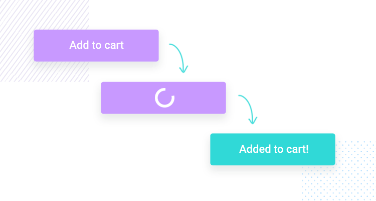
The great thing about microinteractions is that they also give us an opportunity to establish our brand personality, making a further impression on the user.
Additionally, microinteractions can boost usability, if done right. This is because they are a way of providing the user with constant feedback, by telling them both what the system is doing and letting them know when their actions have been successfully registered by the website or app.
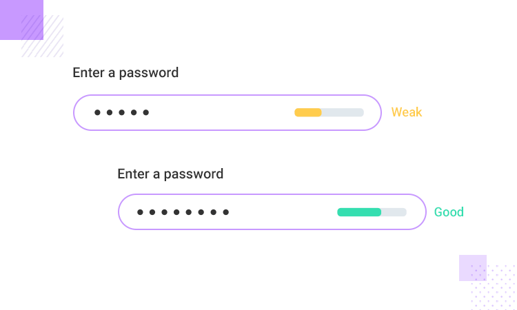
As a result, the whole user experience becomes more intuitive and interactive. This is something you can test and perfect with a high-fidelity prototype.
People often need to see a solution before you can convince them that it works. This is definitely the case with developers, clients and many other stakeholders on a development team.
That’s why it’s important to have a website prototyping tool to demonstrate your microinteractions in their full glory and to show exactly how and where they would help the user. Another good idea is to study presentation techniques so you can really sell the importance of microinteractions to your stakeholders. Below, we’ve included a section on how you can easily design your microinteractions in Justinmind to share with your development team and test on your users.
There are many types of microinteractions possible and the list keeps on growing with further advancements in technology. However, it’s important to be aware of the most fundamental microinteractions which are:
- Tap effects
- Swipe effects
- Tap and hold effects
- Scroll-into-view
- Pull-to-refresh
- Progress bar
- Errors
- Sound
- Button state changes
- Tactile
- Mouse over / hover effects
- Slide-in/out
- System feedback
- Page transitions (fade, explode, etc.)
Now let’s take a look at some great examples of the above microinteractions in action and how they look in real life.
Twitter provides us with a shining example of a microinteraction in the form of its little popping heart every time you like a comment. This useful little animation makes you feel not just a little bit more satisfied when you “heart” a tweet, but it also serves to inform you where and when you liked that particular comment.

If this microinteraction didn’t happen every time that you liked a comment, then you might not be sure if you pressed it by accident while scrolling or if you liked it previously. The fact that the animation happens in that moment, as opposed to the heart icon just turning red means that you understand and are receiving confirmation that it is indeed happening in that moment.
Also noteworthy of a mention in similar respect are Facebook’s reaction options. For example, if you wish to like a comment, you can just tap on the original thumbs up button to like something, the same icon that’s always been there to like posts and comments.
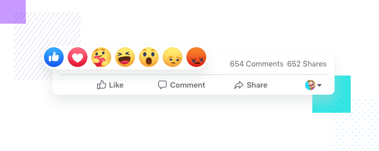
But if you tap and hold, you get a full list of interactions. To add a bit of extra pleasure in that moment, each of the emojis are animated and moving in real time, with the laughing emoji actually laughing. Tapping and holding takes a little longer than a tap, so facebook rewards the user by producing a list of fun, animated emojis.
This form microinteraction example shows how simple little details can make filling out a form that little bit more intuitive. For example, the currently active form, where the user is inputting text is highlighted slightly with its borders colored in blue.
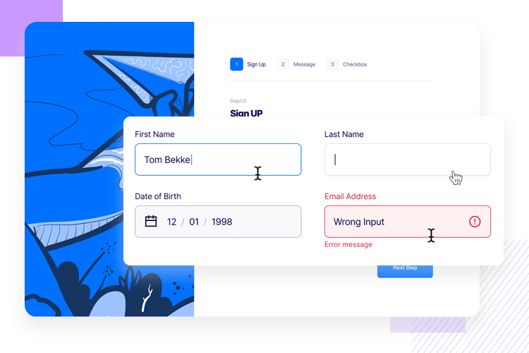
Highlighting the fields in this way is a great way to confirm that a field is actively selected and is ready to be written in. this can already be confirmed with the blinking line, but in a form full of fields, the more clarity, help and feedback that you can provide to the user the better.
Design Season UK have done their mouse over microinteractions very well. The interactions are subtle as microinteractions should aim to be. Links are underlined and when the user hovers the mouse over the link, the underline moves out slightly to reveal that a) the link is clickable and that b) they are about to click that link.
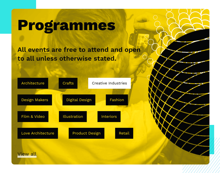
The buttons that define all of the categories that the user can select from turn from black backgrounds with yellow text and switch to a white background with black text. These mouse overs and hovers help reduce the cognitive load of the user just that little bit more, while also providing a smooth, pleasant and dynamic effect that isn’t jarring in any way.
Is your Tesla not enough on its own? Need some accessories for it too? Well that’s exactly what Hills offers. However, being the UX nerds we are, we’re more interested in their interesting use of mouse over microinteractions that change the cursor.
While there’s nothing mind-blowing going on, the fact that the cursor changes according to the action that can be taken on various elements on the page makes for a pretty dynamic and intuitive experience.
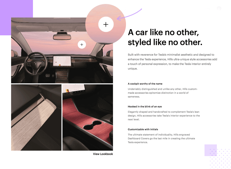
For example, the hero image is actually a carousel that the user can swipe. The cursor changes to reveal that the image can be dragged across the screen. Scroll down and mouse over more images and you’ll notice that there are further changes to the cursor based on the interactions that can take place. On some images it indicates that the image is a link that you can click or an image that can be zoomed in.
Hoostuite also gets mouse overs microinteractions right. A good example that they know what they’re doing is the neat mouse over effect that the user can notice as they hover the cursor over each card on their homepage which is found just below the fold.

The effect is subtle and non-jarring, with the cards jumping up slightly, almost like being pulled magnetically towards the cursor. This lets the user know that the cards are clickable and also informs that they’re about to click on the right one for the information that they need.
Nowadays, we’re never far from inspiration when it comes to interesting UX/UI design. This button microinteraction example demonstrates an interesting concept for clicking on a button to continue filling out their application for whatever it is they wanted to apply to.
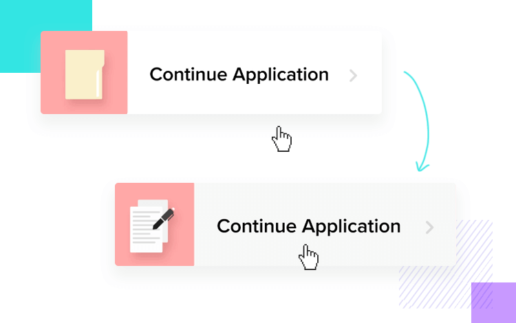
The designer takes it to the next level by adding in an element to the left which consists of a dynamic icon that changes from a folder to a form as the user mouses over the button. It not only indicates that it’s clickable but also takes what might have been a boring button and turned it into a micro moment of delight.
The Nike Training Club app is an interesting example of using tactile microinteractions to impart feedback to the user through Apple Watch’s haptic feedback feature. The NTC offers the user this feedback in the form of a vibration between sets and workouts.
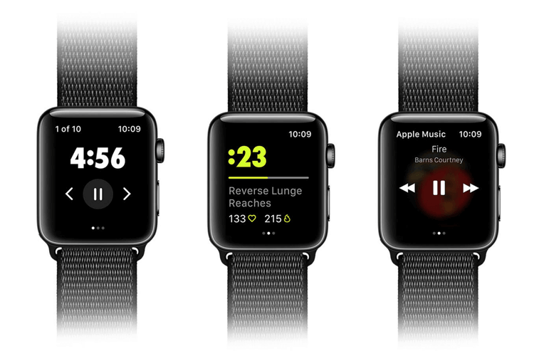
This is a useful way of letting the user know when it’s time to pause and check out their stats as while they’re exercising, it might not be practical to be constantly watching the screen. If you’re listening to pump-up music, you might not want it interrupted with pings and other noises. It also keeps the user engaged with the app and checking it constantly, without interrupting the flow of your workout.
This password error microinteraction makes it onto the list merely because it is an outstanding example of how to alert the user in a subtle and non-imposing way that they’ve got something wrong.
Combining motion animation, altering slightly the element by lifting the corner of it like it were a page to reveal an error symbol is a great way of letting the user know at a glance that something is wrong in a playful way.
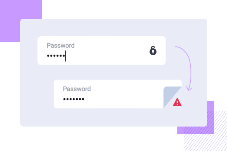
Sometimes, informing users with more than just one reaction is the best way to go. Especially if we consider that some users might have color deficiency and some may be in a hurry. as well as altering the element slightly.
Okay, we might not have to go to Mars tomorrow. Yet, while colonizing Mars might still seem like a distant chore at this stage, let’s take a moment to appreciate the use of scroll-into-view microinteractions on Colonization of Mars.
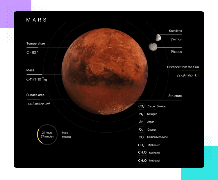
As the user scrolls down the page, the planet Mars literally expands. It indicates Mars getting nearer, as is the probability of possibly having to colonize it in the future. Scroll further down the page and you’re treated to a minimalist scroll-into-view microinteraction of short, digestible paragraphs of facts appearing and disappearing in black space (like the space up there!).
This is done in a way that the user feels like they’re discovering facts (like humans are discovering more about space) and therefore feels like a reward.
Taskade took the humble progress bar and turned it on its head, creating a microinteraction that causes pleasure, as opposed to a remedy for the pain of impatience. They haven’t changed the meaning that a progress bar conveys, which is progress, of course. Instead, they’ve simp;ly used it in a different way.

How it works is that the user creates their own checklist of items or tasks that need to get done and as they check each item off, the progress bar starts to fill in a little more with each item that’s checked, as well as crossing out the items.
Both the crossing out and the filling progress bar gives the user a sense of delight because they really feel like they’re getting stuff done. It also helps to give them an even better idea at a glance of how much work remains.
Everyone’s seen the spinner or circle loader before. This innovative spinner microinteraction takes it to the next level by including a 3D effect with multiple circles moving in and out of each other. The fact that it’s a little different means the user will be distracted from the painful impatience of waiting for a screen to load to admire the beautiful animation effect.
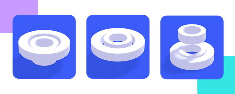
However, if we had one constructive bit of criticism for this 3D spinner, that would be that it should be slowed down a little, the fast movement creates a jarring effect and nauseating effect if it moves too fast.
The list wouldn’t be complete without mentioning the microinteractions of many messaging apps like WhatsApp, Slack, Discord and Skype that show that one of our contacts is writing to us or replying to a message.
The reason for this is that it is a great example of system feedback in that it lets the user know that they should be expecting a message from that person soon, so they’re not left in limbo about whether their message has been replied to.
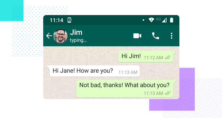
Another micro animation that some users either love or hate, is the blue double check from WhatsApp that confirms whether a contact has seen your message or not. It’s another brilliant example of system feedback from WhatsApp and gives us closure as to whether or not the person has read our message so that we can know that, even if they don’t respond in that moment, they’ve seen the contents of the message.
As a follow-on from the system feedback from messaging apps, HubSpot have their own take on the feature with their intent to create a delightful messaging bot that seems like it’s writing in real time. The user sends a query and three bouncing dots show that the bot is writing back to us.
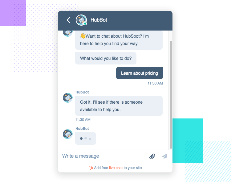
What’s interesting about this is that they could have just set the bot to reply instantly, as soon as the user enters in their comment. The fact that they delay it for a second or two, personalizes the experience and makes it seem like a chat with a human.
The Google Assistant has microinteractions for voice commands from the user. There are two notable microinteractions with the four colors that represent Google at the bottom of the screen.
The first microinteraction that happens is that the colors form little dots that bounce up and down to show that the assistant is listening when the user says “Hey Google”. Then, when the user starts to speak, the colors start to represent sound waves.
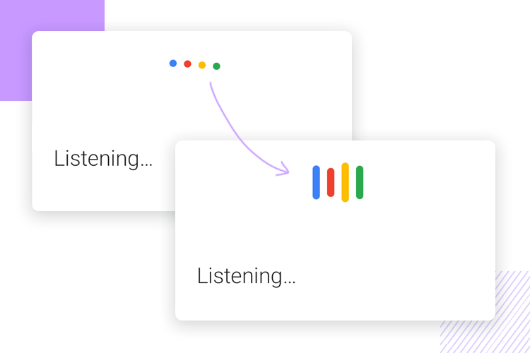
This is a great way of both confirming to the user that the app is both listening and receiving the voice commands and at the same, getting the unique branding of Google into the mix as well. Siri also has a similar feature, but with the soundwaves a bit more futuristic and neon-like, that initiate when the user starts to speak.
Gmail are a great example of the slide-in/slide-out menu because they created this awesome effect that slides the menu in from left to right slowly and gradually, rather than making it appear immediately which might cause the user to be unpleasantly surprised and overwhelmed with being suddenly being confronted with a menu full of options after tapping a simple hamburger icon.
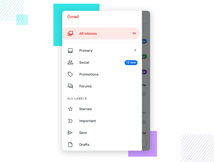
While it’s true that there are many apps out there, Gmail is one of the more memorable examples. Therefore it’s good as a benchmark for these types of microinteraction designs, especially since it’s made using the Material Design methodologies.
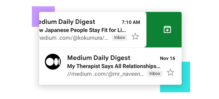
Another good example of a swipe effect is Gmails’s left-swipe microinteraction to archive an email. All the user has to do is swipe left on an email item in the inbox and an icon pops up with a color that stands out from the rest of the palette. This to highlight the fact that a decisive action has been taken, giving a real sense of accomplishment of getting things done.
Pull-to-refresh microinteraction designs are a reaction that users are typically accustomed to when they want to reload more content onto the screen or refresh it. They’re most often accompanied by a spinner, however, this isn’t a hard and fast rule, and as we can see from this animated microinteraction example, there is some leg room for innovation.
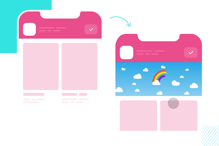
The main thing is that the animation have a looped effect, like this microinteraction that includes a dynamic looped rainbow effect, which is a nice treat for the user and inspires positivity while they wait for the new content to load and almost gives a sense of accomplishment at simply refreshing the page or screen.
This microinteraction example from tubik is another take on the pull-to-refresh microinteraction with an innovative, dynamic spinner design that warps into the company logo after a few seconds, just before loading the new content.
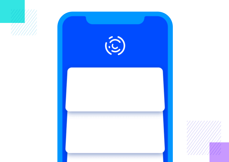
This is a great example of a microinteraction that serves to provide feedback to the user that things are happening quickly, and also takes the opportunity to turn it into a moment where they can reinforce their branding.
On the Google Pay app, all the cards that the user uploads are visible as soon as they open up the app and enter into the homescreen. They are presented with all their cards in a swipeable carousel.
This app is a great general example of how to implement a microinteraction in swipe gesture, which is slightly different to the Gmail example above. The cards swipe past at a realistic page similar to real life speeds. It also feels slightly less stressful than scrolling down through a list of credit cards because it almost takes on a playful effect.
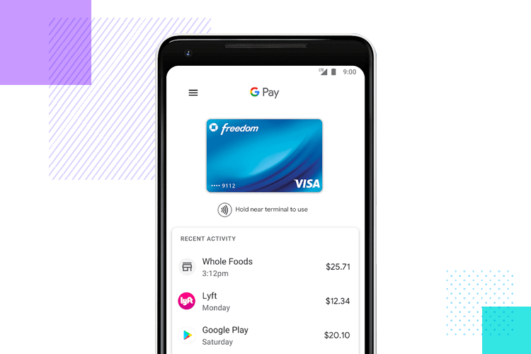
They’ve also paid attention to the kinds of situations a user might be in when using the app, suich as a queue at a checkout. The swipe microinteraction provides more immediacy than scrolling down to look for something.
The images in this scrolling microinteraction example offer up an interesting take on scrolling. When the user scrolls down through the page, the images on the page expand and gradually shrink when the page stops moving again. All this dynamic movement happens according to the speed at which the user is scrolling through the page.
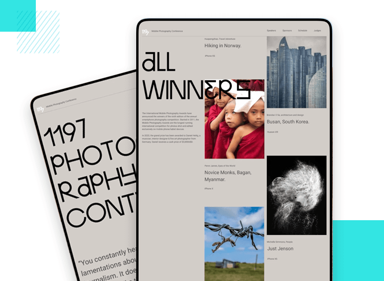
We like this microinteraction because it shows how even just a simple change can vastly improve the user experience on a site with a lot of content where an interaction such as scrolling would be important. It’s one of many microinteractions that can add up and make the app seem all that more engaging.
First of all, before we begin to think about implementing microinteractions throughout our product, it’s important to be clear on the right procedures. While there are generally no rules set in stone when it comes to UI/UX design, there are best practices.
Here are some of the following things you should bear in mind when designing microinteractions:
- Define what interaction will take place and how long it will last
- Don’t make a user mouse over an element to reveal more information
- Don’t drown your design in microinteractions
- Remember the differences between desktop and mobile interactions
- Try to keep the mobile and desktop experience as similar as possible
Lastly, thinking about each part or stage of the microinteraction is crucial for successful execution. Those are:
1. Triggers: will the user or the system trigger the microinteraction? If it’s the system, what input does it need?
2. Rules: what should happen when the user or system triggers your microinteraction? A tap, a click? A mouse over? A scroll?
3. Feedback: use your microinteraction to communicate what’s happening to your user. Is the page loading? Is the button clickable? Is there another user sending a message?
4. Loops and Modes: think ahead. should the microinteraction
still be possible after certain conditions have been met?
If a button is greyed out, should it still change color on mouse over?
Let’s look at a simple but familiar microinteraction. It’s something we are all so used to seeing, we hardly notice anymore: changing the style of links. We all know it. You hover the mouse over a link and it changes color to show it’s clickable.
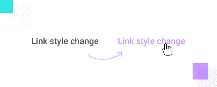
To get started, simply download Justinmind and open a new web prototype. Press the “t” key with your cursor pointing at the canvas, draw your text box and type something. You can also add text by clicking T on the toolbar. Feel free to name it “link style change” or something else that is descriptive. You can also select
Select the text element, and click on Add Event. You’ll find that triggers include a series of mouse triggers. Here you’ll want to select On Mouse Over. As for the action, click on Change Style.
At the bottom of the Events popup, you’ll notice a dropdown menu that reads “Select styles to change”. In this dropdown, make your way to Text and click on Color. Under the “Text color”, choose the color you want the link to change to.
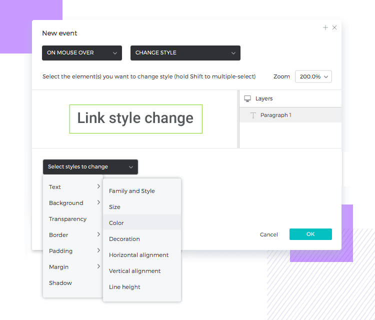
Lastly, just click OK. That’s it! If you hit the Simulate button and hover your cursor over the text, you’ll see it behave just like you planned.
This may be a silly microinteraction, but with only a few moments of your time, you’ve easily created a detail that helps users all around the internet.
Microinteractions are a UX designer’s best friend and it’s worth communicating their importance to stakeholders. They’re an almost invisible way of improving the quality of your users’ experience and, if implemented correctly, rarely ever get in the way. Knowing how and when to take advantage of these subtle interactions is crucial.
Use microinteractions to make your designs more intuitive and implement your brand’s personality. Use them to provide feedback to the user so they know their actions are being registered, and so they know what the system is doing in response to their actions.
Above all, look for ways to make those interactions as delightful as possible, but don’t overdo it! Think about how you can transform important but generic functions, such as loading, page refreshing, tapping, clicking and scrolling with small interactions. Find a way to turn these regular activities into moments of delight and you’ve won your UX.
