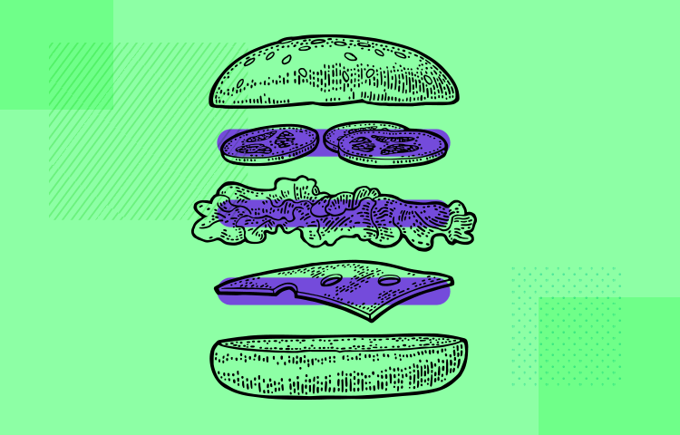
Is there still an appetite for the hamburger menu? In this post we look at modern examples and UX tips
There’s a thin line between love and hate. The hamburger menu has come under a lot of heat in the past few years and its use is still debatable to this day.
Nevertheless, this ubiquitous icon has now achieved an omnipresence that could almost be on a par with that of the magnifying glass for searches and the gear icon for settings.
Design and prototype web and mobile apps with Justinmind for Free. Unlimited projects!
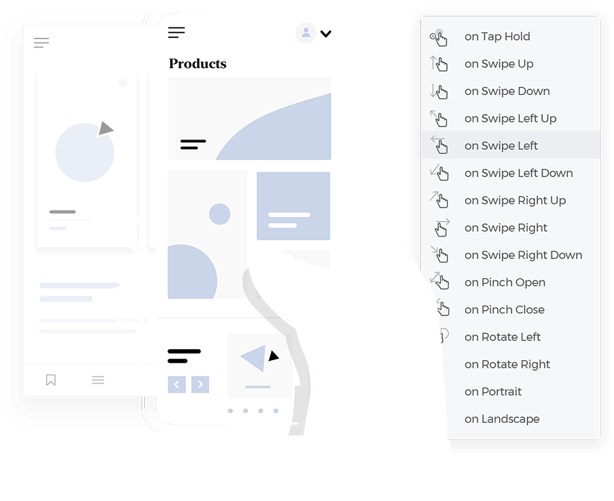
But just how did such a hotly contested icon end up becoming so popular in UI design? More importantly, should you be using it in your next designs and how? These are the questions we’re going to explore in this guide. Afterward, you should have a more solid idea of when to use hamburger menus when the time comes to bring out your wireframe tool. Tuck in!
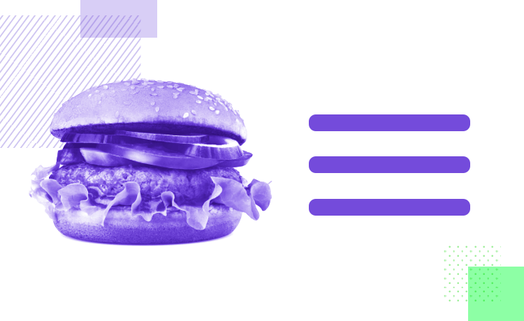
Spoiler: it’s not the menu you can find at your sloppy Joe’s or gastro bar with the delicious pulled pork recipe. It’s those three horizontal lines you see at the top corner of the screen on apps and responsive websites. Hence, when designers refer to the “hamburger menu” we’re actually talking about the icon which is used to collocate a load of menu options in one slide menu and stow them away.
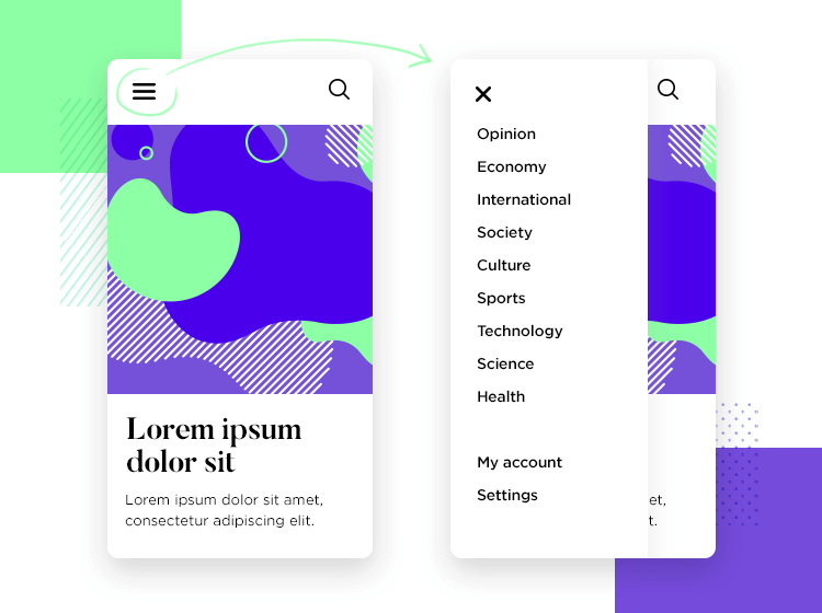
TIP: learn how you can prototype slide menus in Justinmind with our tutorial!
Yes, you read that right – literally “stow” them away to hide them from view. But why? The simple answer is screen real estate. To understand how the now ubiquitous hamburger menu icon of UI design has risen to such extreme levels of saturation in the web and app design industries, we need to start with its birthplace.
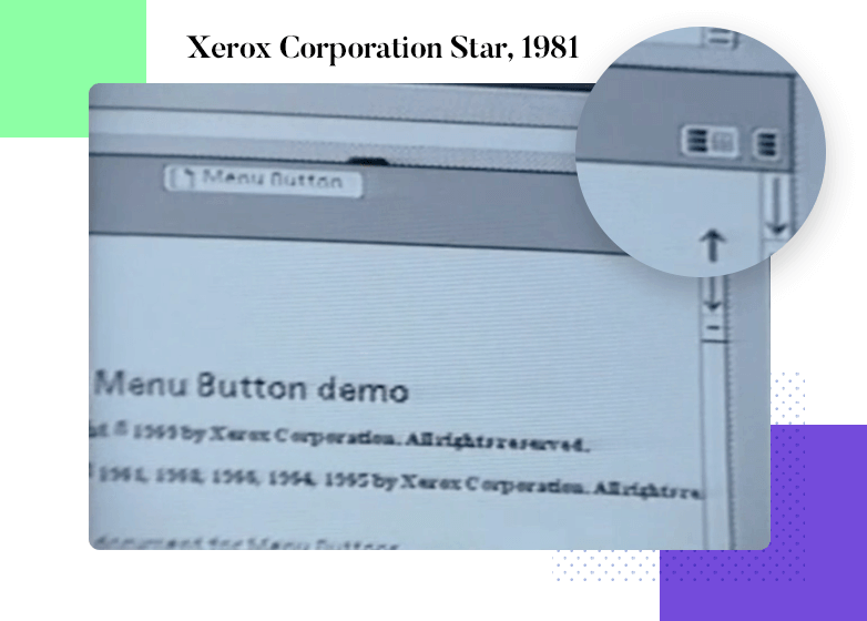
Back in the 80s, Norm Cox, the hamburger father, designed the Xerox Star personal workstation. He developed a four-lined icon to symbolize that a button opens up a list of items. The design world would later dub this icon the infamous “hamburger menu”. It would later go on to receive as much notoriety in the design world as Robin Hood in Sherwood Forest.
Norm stated that the hamburger menu originally had the purpose that many fly-out menus have when the user hovers over an element and right click to reveal the options. Quite a different kettle of fish, right? Then a couple of decades pass and we’re into the mid-noughties where smartphones are exploding onto the market. UI designers once again breathed new life into this icon and resuscitated it into the design lexicon. And all in the name of capitalizing on screen real estate for mobile devices.
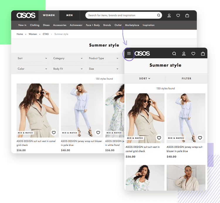
With the smaller resolution of mobile devices such as tablets and cell phones, having long top bar menus were often not an option. Squashing it all down and hiding it behind three lines soon started becoming the go-to design option for responsive menu design.
Great, right? A second chance for the hamburger menu. But it wasn’t welcome in all corners of the design world. In fact, it faced many enemies who rejected the idea of it, saying it was a controversial design element. They wished with all their might that the hamburger menu jumped aboard a time machine to the 80s and stayed there in Xerox.
Why so much hate for the humble hamburger menu? The answer lies in creating an extra step to see menu options. Anything requiring the user to go through an extra step is often seen as taboo in the design world.
But why? It all comes down to the sequential vs direct access debate. Sequential access involves the user discovering elements and content in stages which usually require some output on their behalf. On the other hand, if we allow our users direct access, it means that they see the content or link they want to click on immediately.
The hamburger menu is a brilliant example of this because, unlike conventional top-bar menus, the user doesn’t see all the options off the bat. This means that they have to tap or click first to see the options. On a conventional menu they can see all the options right away.
Another example of a UI design element is the typical carousel that shows several different pieces of content, usually image-based. It requires the user to tap, click or swipe through them. Due to this, they don’t come across all the content at once. But why is that bad? Because many designers maintain that it reduces “discoverability”, whereby certain features that you hide behind a hamburger menu, carousel or other element risks not being found at all.
Maybe you have a menu option that leads to a content category that is quite important for your user to see and will bring the most conversion of the website. This might go undiscovered if you hide it behind a hamburger menu or add an extra step in between.
Of course, the other glaringly obvious reason is that introducing an extra tap, swipe, click, tapdance, grin or whatever – all takes its toll on the user, a phenomenon called interaction cost. Yes, we said it: hamburger menus do increase interaction cost due to this extra stage in discovery.
However, when it comes to anything in design, we must have an open mind, especially when designing for the user, so don’t get too repulsed by the hamburger menu yet! It turns out that, in some cases, it can also have its benefits.
One of the most important things the hamburger menu has going for it is that it is a well-accepted mental model at this point. Users have become very used to seeing the hamburger menu and instantly know what it is for.
Another reason not to drop the hamburger menu too hastily is to realize that every app and website is different, and what doesn’t work for one might very well work for another. When might this be the case?
Design and prototype web and mobile apps with Justinmind for Free. Unlimited projects!

So, you aren’t swayed by the negativity and you’ve decided that you’ll probably be including the popular hamburger menu in your next design. However, before you go creating one with your prototyping tool, you should first be aware of the potential opportunities for UX points.
Imagine the core navigational elements and functions of your website or app are already visible and you have a few secondary options or subcategories that are not quite as important to the website’s conversion goals. If it’s not so important that users contact you or see your About section (this will vary depending on the website’s goals) then you might choose to hide them behind a hamburger menu to save some screen real estate.
On the other hand, maybe you do have space on the screen to feature these secondary features, yet you don’t want your screen to be too cluttered, as having an overly-cluttered screen can increase cognitive load on your user.
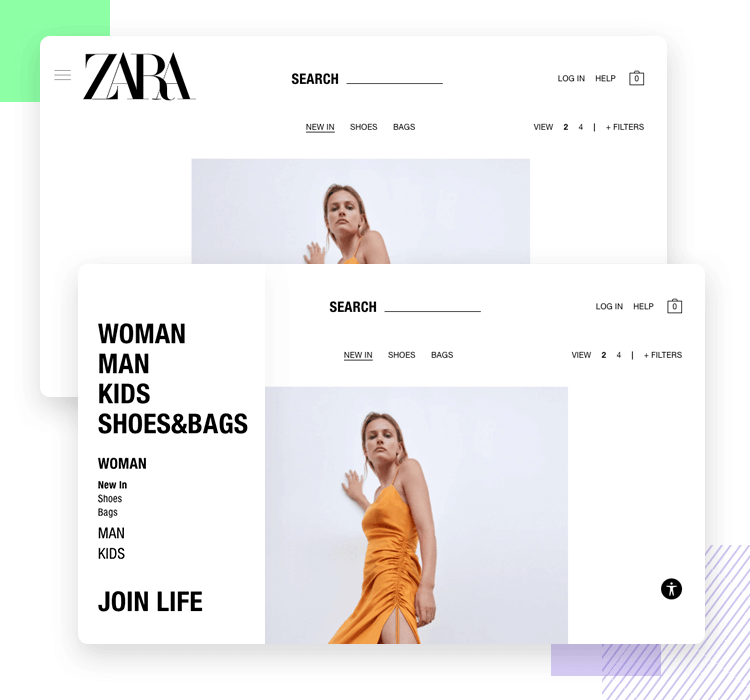
You may decide it’s best to show them the most important options (the ones they want to see first) and then hide the others behind the hamburger menu so not to overwhelm them with information. Afterall, users are several times more likely to make purchases on an ecommerce website when confronted with fewer options, according to a study on the demotivation of choice by Columbia University.
You shouldn’t use hamburger menus if the options, settings or features that it would conceal are important or central to the user experience. The general rule of thumb is that they are visible either on a top-bar or fixed tab bar. The reason for this is that the options should be open to direct discovery and shouldn’t therefore be hidden by a hamburger menu or stowed away.
Furthermore, imagine the user already has to make quite a few clicks that are central to the user experience or the goals of the website. It’s natural that you would want to reduce that extra step that comes in the form of a click or a tap wherever and whenever you can to reduce the interaction cost as a whole.
The last thing you want to do is place a hamburger menu in an area where it would interfere with a device, like the iPhone’s native navigation elements. This would make for terrible usability, as most users are used to navigating using these native options.
One problem that often arises when designers decide to opt for the hamburger menu route is that they face the dilemma of placing it either on the left or right of the screen. There are arguments in favor of both sides.
The argument for placing it on the left favors the fact native speakers of left-to-right languages tend to start with content left of the page in an F shape. Due to this fact, many menus have been placed on the left, also meaning users will tend to be accustomed to menus being on the left. In fact, Material Design guidelines, which refer to it as a “navigation drawer” point to the fact that you should do that for this very exact reason.
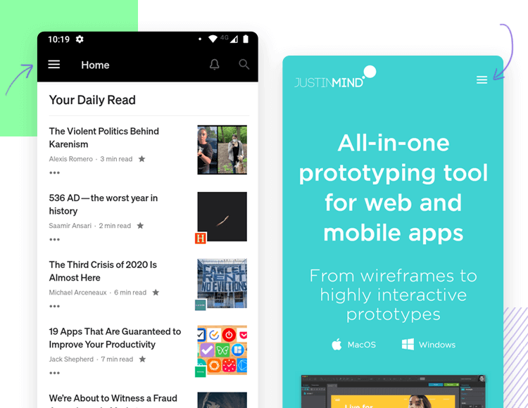
Conversely, we could also argue that, since the hamburger menu is now a well-known and accepted menu icon, including it on the right doesn’t necessarily represent too much of a problem in terms of finding the menu content. We could also argue that this is especially the case if the hamburger menu is hiding navigation options, menus and features that are of secondary importance. It would make sense then, that the more important content should then be dedicated to the left of the screen.
However, the other argument for placing the hamburger menu to the right is one of simple physical logistics. With smartphone devices, whose screens seem to get bigger every year, it’s more of a stretch for the user to bring their thumb up to the top left of the screen, causing them to have to change their grip. Placing it to the right slightly reduces this physical workload. However, even then, if the cell phone is very big, the user might be forced to have to change their grip anyway.
A great solution to this is having a floating hamburger menu button with a fixed position on the screen near to the bottom right of the screen as the user scrolls, providing easy access with just a tap of the thumb required. This dynamic hamburger menu also sends out the message to the user that there are options that the user will need to access as they progress throughout the app. It also helps you save a lot of screen real estate on mobile devices and helps create a more immersive experience.
However, this should be avoided if you were planning on including a “back to top” button, or else you’ll simply have to make a decision between the two. You don’t want your user accidentally pressing one when they meant to press the other.
If you do decide that the hamburger is the best way to go, then the general rule of thumb is that you only deploy it as your website scales down.
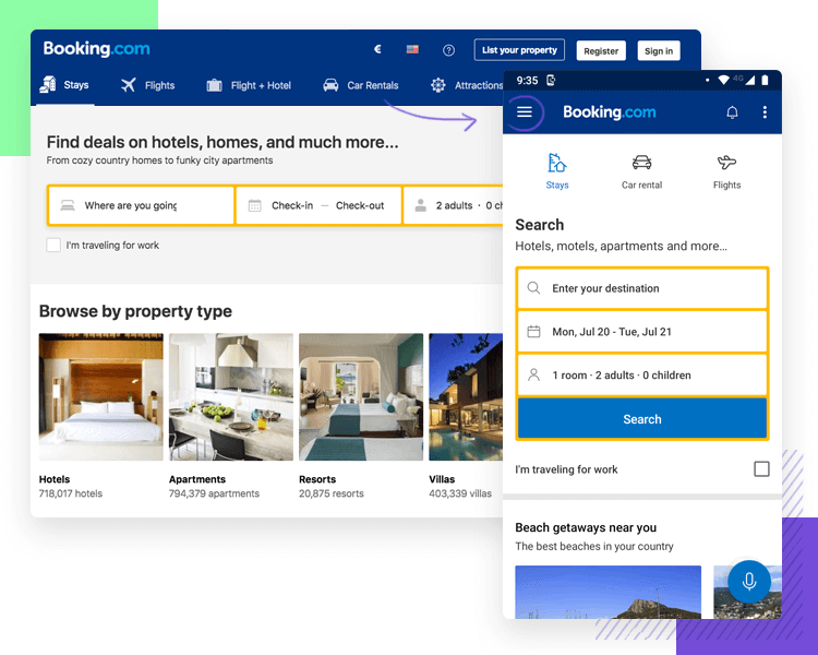
For example, let’s say that you’re designing a responsive website and it may not be possible to display the main menu at smaller resolutions, so you will deploy a hamburger menu for tablet and cell phone bandwidths. The idea is to squash everything into a hamburger menu as soon as the resolution drops to that of a tablet layout.
Another solution might be keeping a topbar menu and leaving the most fundamental navigational features, then placing a hamburger menu icon on the same bar to indicate that there are further “overflow” menu options available. This is a great way to save screen real estate while keeping the core navigational options readily discoverable and immediately available to the user.
Design and prototype web and mobile apps with Justinmind for Free. Unlimited projects!

We’ve established the ways in which we can please and displease our users with the hamburger menu. Now let’s look at a few examples of some of the most popular apps on the market that feed us the hamburger!
Ecommerce giant, Amazon’s app, is a great example of a popular ecommerce using the hamburger menu. The designers at Amazon have done their research and understand what the user is looking for as soon as they open up the app.
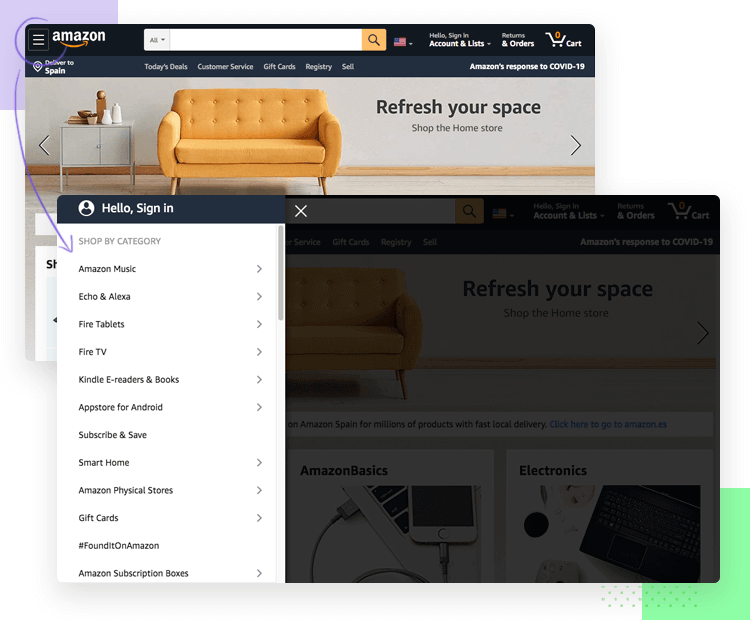
One of the first elements the user is presented with is a search bar to find the product they want, or they can keep scrolling down through the app to browse recommended products for them based on their previous purchases or wishlist items. Oftentimes, updating payment details, checking Wishlists or order tracking is secondary, yet still seems somehow intuitive under the basic hamburger menu.
The fastest messaging app on the market, Telegram also manages to put the hamburger menu to great use.
Apart from the instant messaging interface as the user opens up the app, everything else is stored under the hamburger menu at the top left of the screen. Options such as new groups, Secret Chats, New Channel, Calls and Saved Message can all be found here.
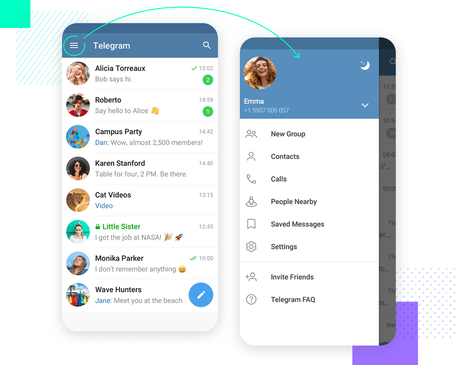
There’s something about the immediacy of arriving at the messaging interface with minimal distractions that seems so immersive. Like with Amazon, the fact that there were no menu options anywhere else, makes navigating to the hamburger menu for most tasks immediately intuitive.
Gamer messaging platform Discord has an interesting take on the hamburger menu. When inside a chat or a group, the user sees a hamburger menu at the top left corner, that allows them to exit the chat or group and go back see the other options available, which tend to be other chats and groups.
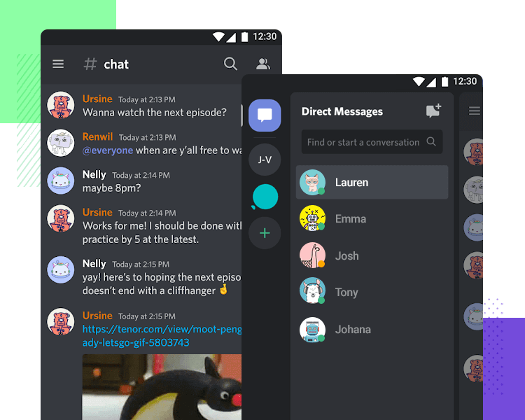
While these are not “options” per se, they are also not settings, which are more commonly associated with the gear icon. They are in fact the closest thing to navigation options the user has in the app. Using the hamburger menu instead of a back button to leave chats was quite an astute decision.
Amazon Alexa’s app hamburger menu has a unique shape but is instantly recognizable as a hamburger menu with extra or secondary options that the user can find at the top left of the screen.
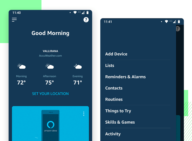
Listing their secondary options under the hamburger button was a wise choice, as the core navigational options are already directly visible, such as devices available and room groups.
Google Pay is another great example of a hamburger menu put to good use. Of course, the app’s main functions are to show the user’s cards available to pay. All other options are hidden from the main UI under a hamburger menu button.
Learn more about card UI design.
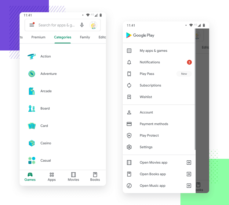
Why? Because as soon as the user opens Google Pay, they are normally in a busy situation, at the checkout of a shop, ready to fork over cash. The last thing they need are lots of distractions with secondary options.
Food delivery app Just Eat also does a good job with the hamburger menu. Just like with Google Pay, when hungry users open up the app, Order History, Settings and Help are probably not the first navigation options on their mind.
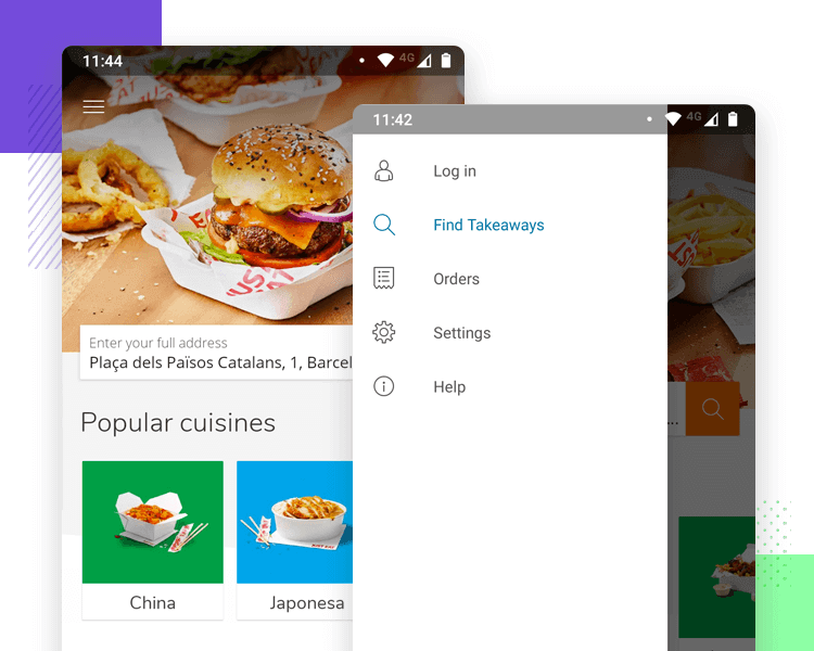
Instead, options like this are hidden behind a hamburger menu (the icon not an actual hamburger menu!) and the user is immediately invited to enter their address in a text field to prompt a list of locals close to them, or to browse a list of food genres.
LinkedIn’s app takes a rather unique approach to the hamburger menu as well. Rather than combining the icon with the text “menu”, they place their menu in the typical top left-hand corner but combine it with the user’s circular LinkedIn profile picture.
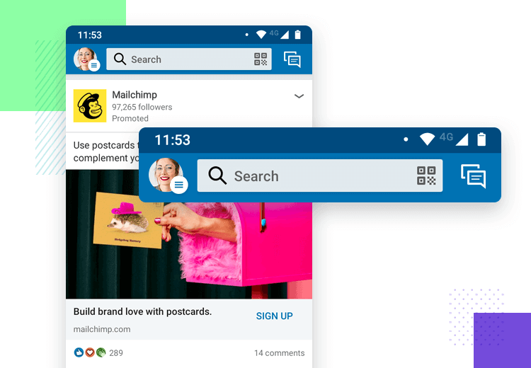
This immediately demonstrates to the user that there are options that are directly related to the user’s account and profile directly under the menu.
The Dropbox app’s core navigation options are very clear from the outset in their app: as soon as the user opens up the home section of the app, they see a list of all their files. They can also find all of the options pertaining to those files hidden under kebab menus directly beside each file.
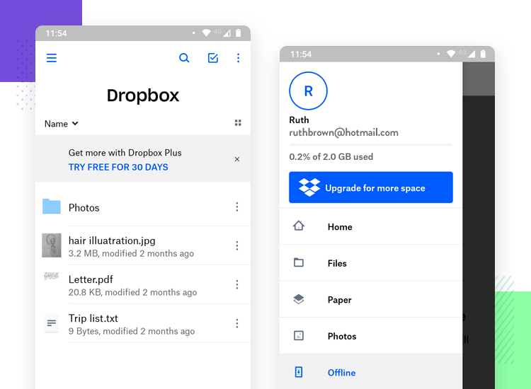
However, on the Android version, all the other options are arranged behind a you-guessed-it: a succinct hamburger menu. On tapping the hamburger menu, the user can see a list of further navigation options to filter their files, such as Files, Paper, Photos and Offline files.
Design and prototype web and mobile apps with Justinmind for Free. Unlimited projects!

Just like Dropbox, the Google Drive app makes showing the user all their most recent files a priority. Whether they were created with Google Docs or Google Sheets, it’s clear they show the user what they’re probably looking for first.
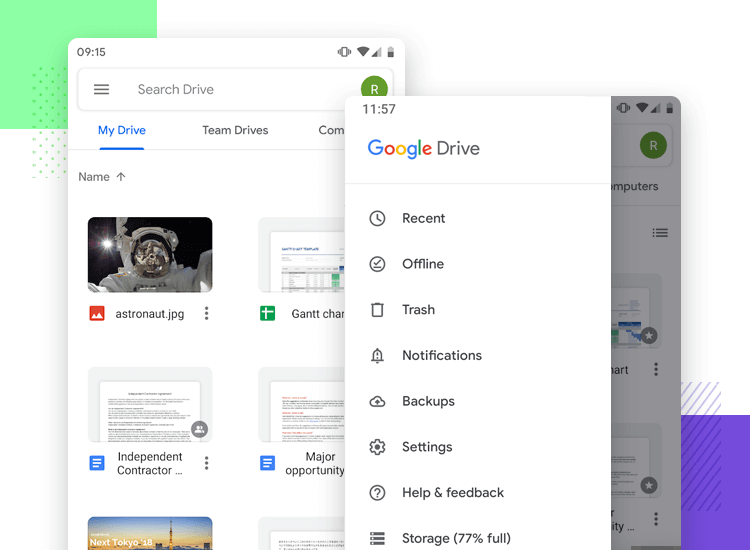
The rest of the secondary navigation options are hidden out of the way behind a hamburger menu, such as Recent, Offline, Bin, Notifications, Backups and other similar options, such as Settings.
In the Uber app, the whole screen is dedicated to helping the user find a car as soon as they open up the app. All the secondary options that the user might want to see are hidden out of view until they wish to see it by clicking on the hamburger icon on the top left.
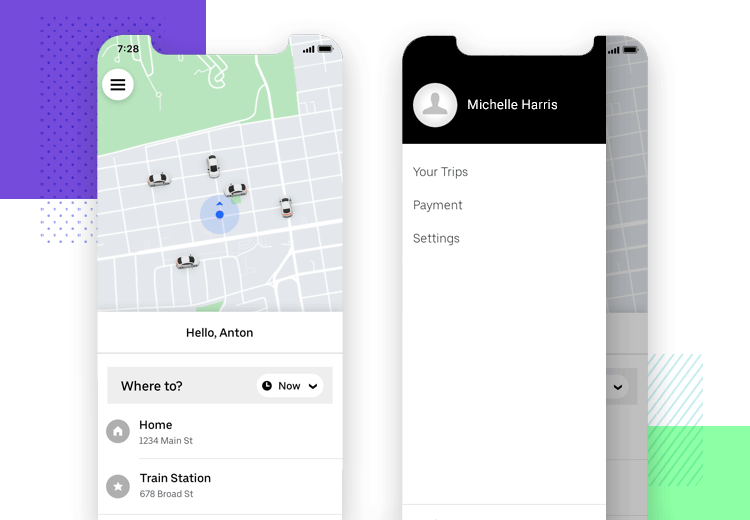
Afterall, options such as Settings and History are unlikely to be direct targets for the user each time they open up the app and are unlikely to be used each time they open the app.
Now it’s time to check out how some of the big names in web design have tackled the issue of the hamburger menu.
When scaling down their website to smaller resolutions, Shopify is clever in choosing to hide most of their navigation options behind a hamburger menu which they place to the top right of the screen.
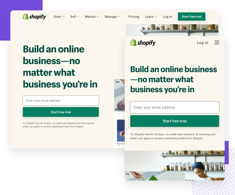
This is because the user is most likely to view the website version of Shopify before setting up an ecommerce site, even when browsing with a mobile device. The hamburger menu’s location at the right of the screen means it doesn’t obscure the logo on the left and leaves the user with one main task: to sign up and start a free trial!
Github, the most popular software development platform, scales down their website nicely and also uses a hamburger menu to strow the dashboard, pull requests issues and marketplace out of view. Why?
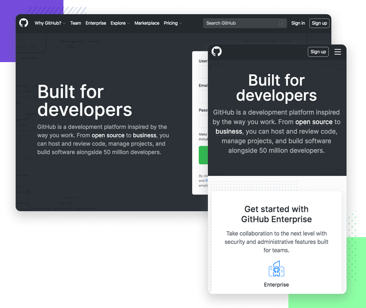
The main features of their homepage also tend to serve as the core navigation: “explore GitHub”, “Read the guide” “Start a project” and “Create a repository” are all call to actions to get the user to enjoy the main functions of the website.
We’re including NBC News in this list because they seem to apply the less orthodox method of including a hamburger menu on the desktop version of the site. As the site scales down to smaller resolutions, you’ll see they retain the same hamburger menu. But that’s not the only reason we chose this example.
NBC comes at the hamburger menu from the unique angle of user experience combined with journalism. On the menu top bar, they include the categories with stories that users are reading the most, and then bundle the less important categories into the hamburger menu.
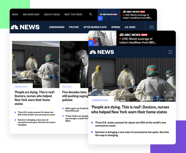
The clear order of preference for these stories starts from left to right. This preference becomes further evident as the website compresses to smaller resolutions, with one or two more options being hidden behind the hamburger menu, leaving just the three most important categories.
CSS Tricks demonstrate a great knowledge of sequential vs. direct access. On the desktop version, the user is free to discover and browse the different categories on the top bar menu, such as Articles, Videos, Almanac, Newsletter and more. To the right of these categories sits a search bar, for the user to look for whatever topic interests them, with different media being shown in the results.
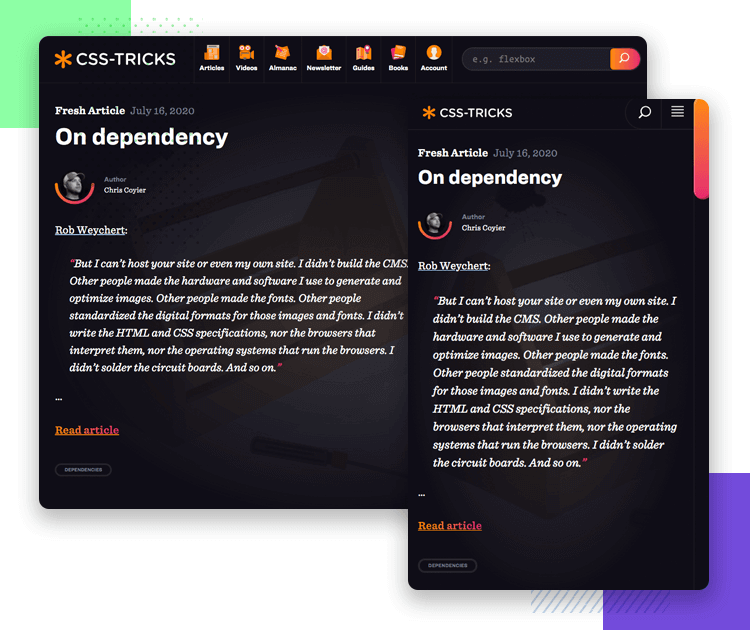
On the mobile version, all of these categories are compressed into a hamburger menu, just leaving the search bar. This shows that CSS Tricks understands the sense of immediacy (NNG) and urgency that users of mobile devices often require. When they go directly to websites, it’s often search for something specifically, rather than to browse.
Starbucks does a clean job of scaling down their website to mobile devices. On the desktop version of their website, we can see the menu options like rewards, gift cards, find a store and sign in.
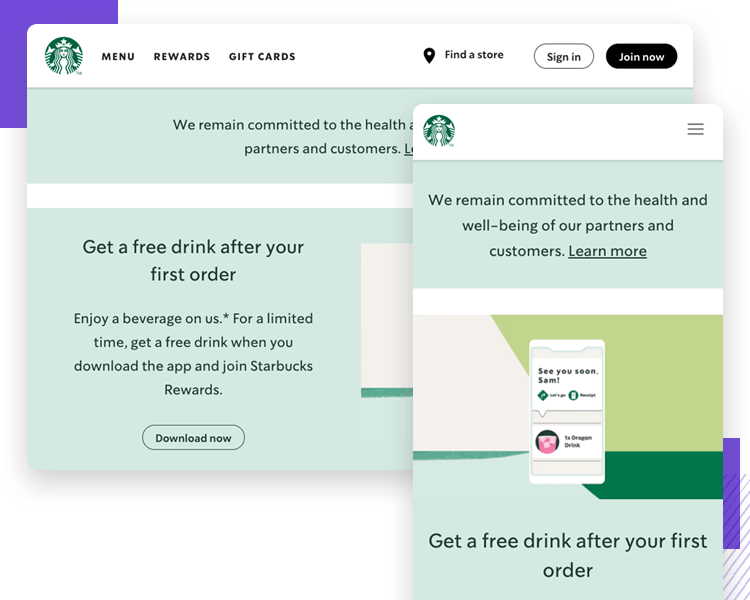
Yet on mobile, all of this is tidied away into a hamburger menu. And not to any apparent detriment to the user, who might be about to enter a starbucks store. Instead of wanting to see rewards, gift cards or sign in to their account, it’s more likely they’ll want to see what’s on offer that day, which is the main content they see on the succinct mobile version.
So should you use a hamburger menu in your next design? Like with most things in design, the answer is dependent on two factors: the type of website or app and your users.
Should your hamburger menu go on the left or right of the screen? Again, the answer is often subjective. To adopt a truly objective approach, we must tap into the minds of our users and understand their needs when using the app.
Lastly, and above all else: it all comes down to direct access. Whether or not to include a menu option or feature in a main menu or a hamburger menu will depend on its priority for your users.
Design and prototype web and mobile apps with Justinmind for Free. Unlimited projects!

Related Content
 Crafting landing pages that convert doesn't have to be tough. Here’s our snapshot of 30 landing page examples with awesome UX that nailed it!12 min Read
 How important are lists in UI design? How much do they affect usability and what’s the best way to design them? In this guide, we'll explore the elements that make up a great list UI design and look at some inspiring examples!15 min Read
 UI design examples that bring some serious inspiration. From parallex scrolling to delicate animations - this list has it all to get you inspired!8 min Read
