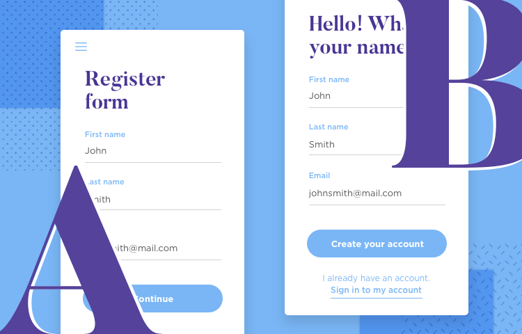
A/B testing is a crucial step towards a product that users can love - but what makes a split test accurate? Read on to find out.
There are many ways of testing and improving a design. Of those, A/B testing has soared to great popularity due to its ability to guide our decisions. It places data at the heart of design decisions, and manages to open a window into user’s behavior.
But what factors are involved in carrying out a split test? What kind of challenges do teams face when testing certain elements? How long does it take to get results?
While A/B testing is a method that can seem rather easy from a distance, it does have a few key characteristics that will impact the test results. To know all the basics along with some key insights into the world of A/B testing with prototypes and live products, read on!
A/B testing is one of the best ways to optimize your product. You can deploy it in conjunction with your website prototyping tool, or on a live website. In order for us to truly understand the role that A/B testing plays in the success of any given product, we have to first understand a few key concepts:
- Visitor potential: This refers to every single person who gets to your product. On a website, for example, this means that all visitors are potential customers.
- Conversion funnel: The difference between the total number of people who see your product, to the number of those people who actually do a particular task – like making a purchase.
- Conversion rate optimization: Refers to the ways we can improve our conversion funnel so that more people do the desired task. A/B testing is one popular method for this optimization.
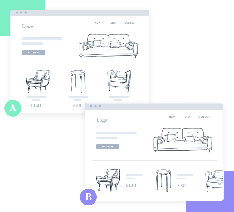
The popularity that A/B testing enjoys is, in part, because of the simplicity of the method. In broad strokes, A/B testing (also known as split testing) consists of making two versions of the same page and showing both to representative groups of users. This makes for an easy comparison in the performance of both versions, with the highest conversion rate usually being the winner.
It is worth mentioning that the conversion concept will vary depending on the product. It’s common for the conversion to refer to something of monetary value like a purchase – but it can refer to just about any task you want from users. This includes things like subscribing to a newsletter or even just following a simple link.
All products have some key metrics that generally contribute to the success or failure of the product. For example, ecommerce websites have been haunted by shopping cart abandonment – which is something that eats away at sales. A blog may have a very low number of people who sign up for its newsletter, even though it’s got CTAs all over the place and a healthy viewership.
These all represent key metrics that can, at the end of the day, make or break the product. Let’s go over some of the key ways that A/B testing can help you improve on all your key metrics and make for an overall better product.
No product is perfect, which means users experience certain pain points that have an impact on the experience – and the conversion. These weak spots make it more difficult for users to achieve their goal with the product, and can be as simple as a confusing microcopy on a button.
The important thing is to keep looking for these possible weak points that tend to result in leaks in your conversion funnel.
Great UX is all about helping users achieve their goal with the least friction possible. There are many ways that you can find these possible pain points, including classic methods such as eye tracking tests or heat maps.
A/B testing can help you better understand how you can solve these issues, by showing you which solution works better with your target users.
As digital marketers will tell designers with a sigh, getting your traffic to a healthy level is an uphill battle. The same can be said for downloads of any app you may produce. The real issue is that the digital realm is deeply competitive, and the trend is for this competition to only grow over time.
Your product is fighting for users with all the other products of that kind in the world – which makes it a crime for you not try to maximize the return on the traffic you do get. A/B testing is not just a way for you to identify large problems, but also areas for improvement.
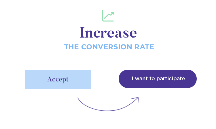
A simple example: Imagine a comparison between two CTAs that differ only in shape. The original may not have been a problem, but the new shape improves conversion. That is a ROI-boosting change, even if the difference is small in scale.
It can be difficult to understand why users prefer the things they do. It can be baffling to a designer to have an ugly CTA bring in more results than a visually pleasing one – but in the UX game, the user decides the rules. This brings us to the next big benefit of A/B testing.
Designers can’t anticipate what users will prefer. Just take Obama’s email marketing campaign for his 2012 re-election.
The marketing team tested many different subject lines, looking for the perfect one that would drive people to not just open the email – but to donate to the campaign too. They decided to keep testing and changing their emails until they found the right formula, and this researching culture led to massive results.
The funny thing that confused marketers in the campaign, was that ugly and short emails proved to work best. Subject lines along the likes of “Hey” or “It doesn’t have to be this way” were the ones that motivated people the most. These emails were so peculiar, that even John Stewart made jokes about them on his show.
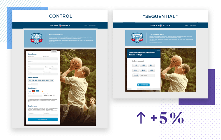
Here is the lesson learned. Marketers can hardly anticipate what will strike a chord with people, much like designers can’t guess what users will prefer. The important thing is to keep testing for the right path, so you can learn what users want.
For Obama, this resulted in $690 million in donations from email marketing alone. For designers, this often results in better conversions and products that users can enjoy without any friction. Data can make for powerful design. Often, not even users know for sure what they want. However, all users will know what they prefer when confronted with two different options – which makes A/B testing a designer’s best friend.
Right. We know that /B testing can be a powerful force when it comes to improving your product. But just how does one go about carrying out the tests? As it turns out, it all starts by doing some research.
Many researchers will be the first to admit that before any testing can be done, we have to understand the current state of affairs. That means that before you can start A/B testing and improving areas of your product, you first have to find and define those areas.
The first step is to start gathering data. If you’re working on a website, key data might include the pages that have the highest bounce rate, CTAs that work great and those that don’t work, or the pages where people stay for the longest. It’s important to get a real understanding of the general performance of the product, so that slowly but surely you start to see negative and positive patterns.
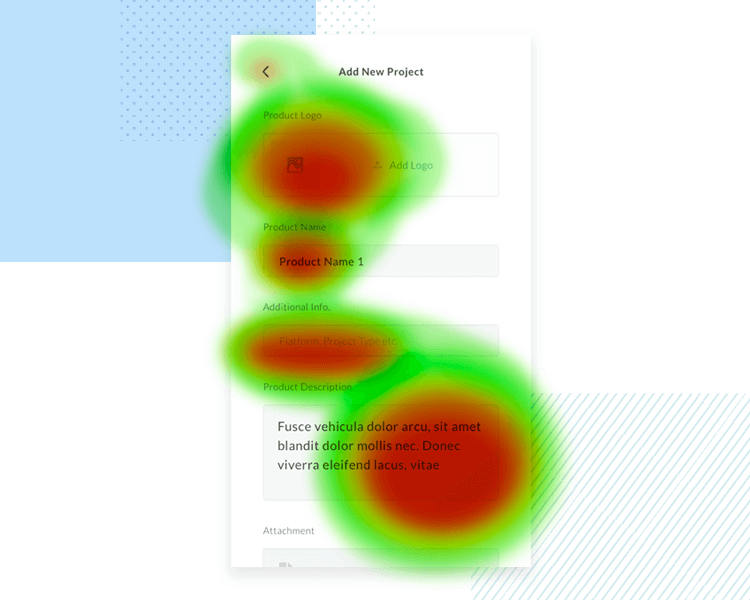
It’s smart to start out with tools like Google Analytics, checking things related to traffic. It’s going to give you lots of data to consider. From all this data, list out the pages that are most important and have the most potential or the most traffic. Once you have all of this, you can dive deeper and start checking elements and components in individual pages.
You can and should make use of many tools in order to see what users are doing in certain pages, such as why users aren’t clicking the CTA of an important product page. Good examples of tools include heatmaps, eye tracking studies, user recording sessions or user surveys. The key takeaway here is that you get close to users and identify the areas you can improve on.
We are firm believers in hypotheses here at Justinmind. A hypothesis is an assumption that is based on data, and can be tested and found to be true or not. In practice, that means going through all that data you now have and not just finding weak areas – but trying to find ways to solve the problem.

By looking at the data of that important product page we mentioned before, you may assume that the problem arises either from the CTA or from the product description. You know lots of users reach that page, but very few actually place the item in their carts.
Once you have a list of hypotheses, you can make a few considerations to each one. For example, if the issue in the product page is the CTA – how difficult would it be to test it? What can we change about it? What would the cost be? What’s the potential in fixing that issue?
A/B testing is easy in theory, but it can get a bit confusing. The possible solutions you’ll be creating now will be your variations. That is, different versions of the element you want to improve. There are two key concepts here, and both play a part in guaranteeing trustworthy results:
- Variations: It’s crucial that with each new version, only one thing is changed. Changing more than one thing with each version will smear your results. After all, a change in conversion could come from any of the changes, leaving you to test it again to find out what worked.
- Control: You need to keep your current version at hand, using it as one version that is tested against the new version.
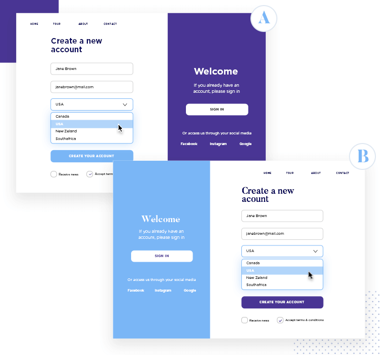
Stick to your hypotheses, and feel free to create as many versions as you see fit. Going back to our example of the product page, you could create 2, 3 or 15 different versions of the CTA and test each of them.
The important thing is that you test each of these versions against your current one, to safeguard accuracy.
After you get all your ducks in a row, all you have to do is actually run the tests. Thanks to the advanced A/B testing tools out there, this process is much simpler than it used to be. You can upload the two versions and find all the resulting data neatly organized for you in the tool itself.
The correct thing to do is to test all you can test. Precisely because nothing is ever perfect, you’ll always find room for improvement. Let’s say you’re satisfied with your first wave of testing. You find your conversion rate has improved by a considerable percentage, meaning you may be tempted to declare your A/B testing as officially over.
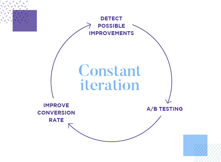
We encourage you to resist that effort. More and more design teams are coming to the conclusion that an A/B testing study should be periodical, and frequent. This goes against the notion that A/B tests ought to be done once every few years or only when red lights start flashing in the product’s performance.
By going back to testing, you make sure your product stays competitive, and offers an increasingly better experience.
Forming hypotheses can be tricky. You need to take all your data and establish something that will dictate the success or failure of your entire testing efforts. If the hypothesis is based on shaky data, or if it’s straight up unfounded, it will lead you to a dead end.
Imagine that you have a product page with a CTA that leaves a lot to be desired in terms of conversion. Instead of singling out the CTA and creating possible replacements, the entire team effort goes into changing the pictures of the product. It can be tricky to listen to the data and draw conclusions from it – but it’s absolutely crucial that you do.
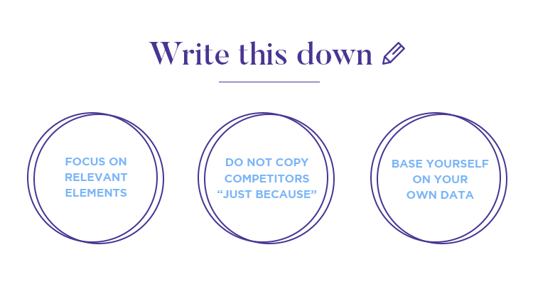
Another challenge is resisting the urge to copy what others have done to increase conversion. You need to be absolutely sure of the direction you want to take your testing, and basing yourself on another product is a recipe for disaster.
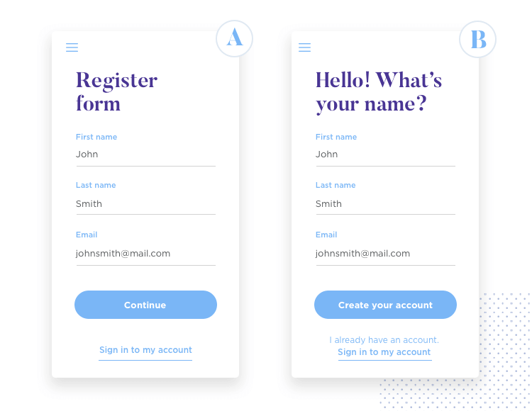
It’s ok to take the idea, such as revising your own sign-up form if a competitor changed theirs and found a massive jump in conversion. In this case, you can gather data on your own form and try to find ways to improve it. But just because a competitor removed a “First name” input, it doesn’t mean you should too. Always listen to your own data!
A/B testing seems pretty easy at first. The issue arises when we dive deep into the many factors at play in any given split test – and any one of them can go wrong, compromising the results. Let’s go over some of the key factors about these tests that you need to check, double-check – then check again.
Test duration will vary depending on what you’re testing, the traffic your product gets and current conversion rates, among other factors. It can be tricky to pin down the exact amount of days or hours your test should be online; allowing them to be online for too long or too little time will give you shaky results.

The good news is that there are spreadsheets that can help you calculate the duration of your test. Check out the VWO A/B test duration calculator for more.
Not all days are the same when it comes to your product. Running a test on days where traffic is at its highest isn’t the same as running them on days of low traffic. Things that are outside our control can make or break the accuracy of the test results, such as public holidays or big sales like Black Friday.
You have to keep in mind that A/B testing is all about comparison. However, for this comparison to be accurate, it needs to be a comparison between alikes or similar elements.
Yes, running the test is relatively easy. When one has all the information and pieces of the puzzle, it’s something you can carry out with confidence. Logically, running the actual test is only part of the battle. Once you have all the test results at hand, you have to do something with them.
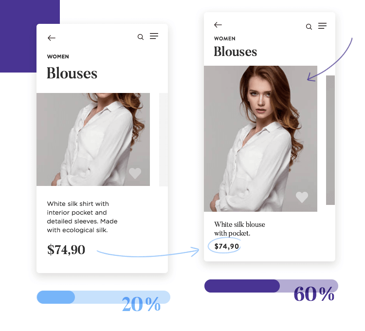
It’s a wonderful thing when there is a significant statistical difference between the two tested versions. But even when the answer is as clear as day, you don’t want to blindly implement it. It’s important that the team asks why that version won. It will likely guide you to a better defined image of your users and will help you in future tests and product modifications.
Statistics can often seem confusing to people. Many designers or marketers struggle to find learnings and insights from numbers – but it’s imperative that we do. There’s an important principle to be applied here, and it is that all tests will teach you something. You don’t always need a clear winner version to draw insights into users. Sometimes, no answer is a kind of answer.
It can be hard to decide what to do with “failed” tests. A/B testing is a versatile tool, and one that will always tell you something. In that sense, the only failed tests are those that are discarded before any conclusions are drawn.
Much like all other aspects of UX design, your A/B testing needs a process, a procedure or a defined workflow. Just like your design process needs to be planned and implemented with every new step, so does your UX research. There is a certain danger in trying to gather data, and forgetting that you’ll have to put that data to use.

Especially in the first stages of the testing, when you have to get a solid grasp on the current performance of your product. This phase is likely to see you use many different tools to get different types of data – so you gotta watch out for losing track of what you have. It’s imperative that you keep things organized.
Testing and testing again isn’t something most designers think of when they consider their design process. Bringing a product to life from a mere idea into a tangible product has many stages, of which testing is only a part of. With that said, testing is one of the most important parts of the entire process – and it’s not something that happens only once and is done with.
A/B testing, much like testing the design in general, should be revisited. You want to test to make sure you create something good for users, but you also want to keep testing – to stay competitive and keep your head above water. It helps to think of testing as a cycle as opposed to a single activity.

And so, every time you design something, even if it’s just a small part of an existing product, you want to test it. The simple reason for this is that not carrying out any A/B testing would imply guessing your way to a finished product – and data-driven design is proven to beat guesswork. Every time.
For more: Check out our interview with Yelp’s Product Designer on data-driven design. For another angle, take a look at our interview with NASA’s UX designer on qualitative data
The ideal result we want from this entire testing is to create a cycle where all design decisions are based on data. It’s nearly impossible to guess what users want – so don’t. Let them tell you. Formulate hypotheses as opposed to shooting out ideas, run tests instead of going in blind.
This may not seem as challenging as the other difficulties in this list, but we decided to include it. The main reason for that is that most designers aren’t all that familiar with SEO, and because SEO isn’t necessarily something designers would consider when A/B testing their product.
However, if your product is already online, minding the SEO details can spare you huge pain. Among the consequences of not considering SEO when testing, lies the ultimate nightmare for any of us: getting your website removed from Google. A/B testing will be the least of your problems then.
Your A/B testing will consist of offering visitors two versions of the same page. This may be a small detail, but it’s important that you make sure all pages (save the original one) have a canonical tag. That is for Google to understand that even though there are several pages with very similar content, you prefer Google to only take the original into account.
This will prevent Google from concluding that your website has duplicate content, which can seriously damage your ranking and website performance.
For more details: You can read more about it in Google Console’s article entitled Consolidate duplicate URLs.
The matter of redirects also plays a similar part in your testing. This is only in the case that your testing consists of different URLs for each variation. Since you’ll be needing a redirect anyway, it’s good to mind the details and let Google know that this redirect is only temporary – which means you’ll want the 302 redirect.
This way, Google will know to keep the original URL in its index as opposed to changing it to any of the new ones.
Installing a cycle of testing in your product requires organization and planning. It’s no good to approach testing without any structuring or workflow to help guide your actions. So let’s take a look at how you can manage this process and create a cycle that your team can rely on for direction.
During the first stage of gathering data on the performance of the product, you’re likely to encounter many things that could be revised. Especially with large websites, this list of possible tests and improvements is likely to be long. Approaching all of these at once would be a bad idea, as you’re likely to get swamped with data points, hypotheses and variations.
It’s better for you to take each of these pain points or friction points, and list them out. With each pain point, include your full hypotheses and how you’d like to test them, along with any observations on the potential that change has.
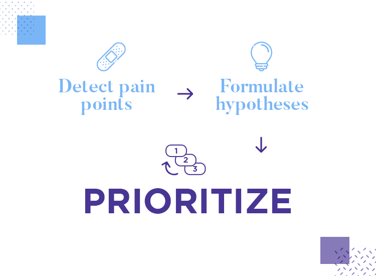
This list will evolve to be your backlog, full of tasks undone or things you want to take a closer look at with your A/B testing. In order for this list to become your backlog, you need to organize it by order of priority.
FYI: If you’re not sure how to go about prioritizing your backlog, consider formulating a framework. Optimizely has a wonderful guide on how to create a basic prioritization framework.
How you define your priority will depend on you and on your product. Perhaps your top priority will be the pain points with most revenue potential, or variations that harm the general traffic of your website. The method by which we decide what to prioritize is particular to each situation.
With your prioritized backlog, you’re likely to find that you have plenty of tests to carry out for the next few months. Now, it’s a matter of going through the backlog point by point, carrying out a series of A/B tests. Keep in mind all those little factors both external and internal that can impact the final statistics of the study.
Once your test is done, it’s time to interpret the results and take action based on your learnings. However, just because the testing has been carried out, it doesn’t mean your work here is done. With one new version as the winner, you have to find out why that version won and how you could improve that version even more.
But what about that research culture we mentioned earlier? As it turns out, your A/B testing is, ideally, something you’ll be doing again and again over time. And as such, it can be really handy to make a calendar so you can organize when to do what. Having an A/B testing calendar will also help you scale the entire testing process, so you can have a clear view of what has been done and what is left.
When creating this A/B testing calendar, keep in mind that it will have to include the same element more than once. This is so that you can revisit winning versions and keep improving on them even further – it may help to create a sort of cycle where once you reach the end of the backlog, you circle back to the top.

Another thing that is important for your testing calendar is that tests need to be spaced out properly. As we mentioned before, testing more than one element in the same page at the same time can result in confusing data – you won’t know which element was responsible for the test results.
Generally: Try to account for this in you calendar and refrain from running tests on the same page simultaneously.
Of course, if you want to scale your A/B testing and speed up the entire process, you can test two things at the same time – as long as they aren’t on the same page. Running a test on your signup form and your shopping cart at the same time is not an issue, because the tests won’t affect each other.
A/B testing is the typical feat the seems simple and easy at first glance – but it can be surprisingly complex. It is, however, a type of testing that tends to give us an objective view into user’s preferences.
When done correctly, split testing can push your conversion rate to new heights while not representing any risk to the product. Hopefully with this guide, you’ll have everything you need to orchestrate a comprehensive and accurate split test with confidence, resulting not just in a better product but also in happier users. Happy testing!
