Why do designers rely on UI patterns? Why are they so popular? Let's go over a classic and misunderstood aspect of UI design!
Patterns are something humans have dealt with for a long time. After all, it’s in our very nature to look for patterns in everything and use them to make sense of the world around us. When it comes to UI design, patterns have become a crucial tool for all design teams so get your favorite UI design tool ready to go – there’s about to be some serious inspiration.
Free UI Design Tool for individuals and teams. Unlimited projects!
But what is the role of UI patterns in a design process? Why do designers turn to them over and over? Let’s go over some of the best things about using patterns, the most widely used patterns in UI design today as well as a few wonderful pattern libraries!
Design usually deals with one primary problem, which the product itself seeks to solve. Aside from that problem, designers face many others that closely relate to human behavior. These problems can refer to users’ lack of time to search through many options. Or, the issue of displaying several campaigns simultaneously on the homepage or helping users log in to their account without writing all their information down.
No matter what specific problem the design team faces in their UI design, it’s likely that others have already faced it. In fact, there’s a whole library of solutions for these issues that tend to happen over and over again when we design digital products. These solutions are called design patterns, and they act as recurring solutions that designers can rely on.
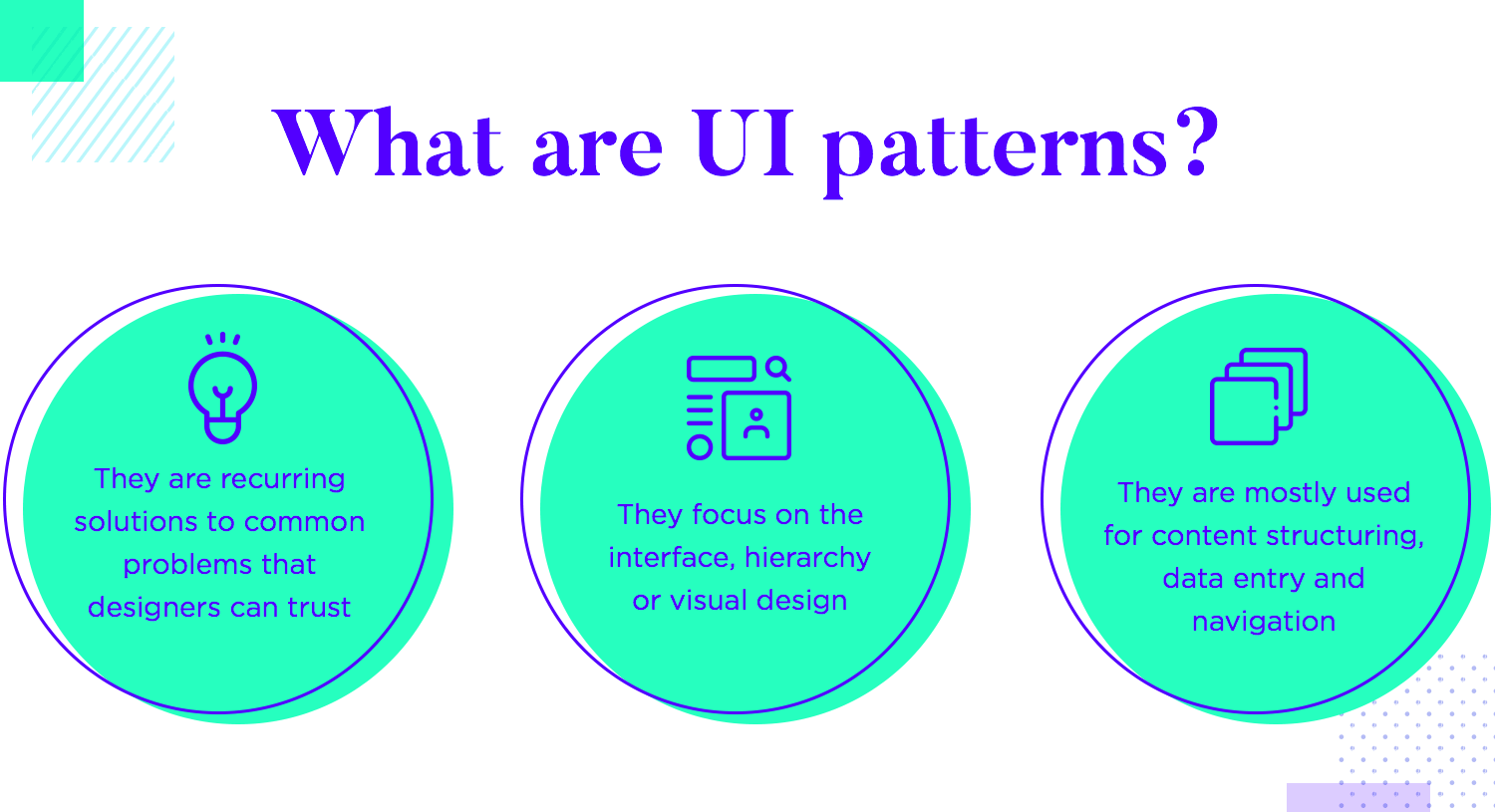
UI design patterns tend to touch on the following aspect of any product design: content structuring, data input and the navigation. It’s true that one can find available patterns on just about anything online, but if there are main areas where designers have learned that patterns just work – why not take advantage of it?
You can also learn to create data-heavy products with our post on dashboard design.
This pattern is particularly common among ecommerce platforms out there. The idea is that you don’t ask for the user to log in or to sign in until the actual checkout. It solves the problem of people who want to experience the website without the formal registration form.

This allows for new people to browse and add things to their cart, without ever worrying about creating an account. Ultimately, people are already invested by the time they reach the checkout. It makes more sense to ask for their log/sign in information at the point in time, when they already know what they want and have invested time into the selection of items.
Most users have become so used to breadcrumbs. We all know what they represent, with breadcrumbs becoming a classic in UI design. It solves the problem of letting the user know where they are within the structure of the product at all times, while also providing shortcuts to the higher levels of content.
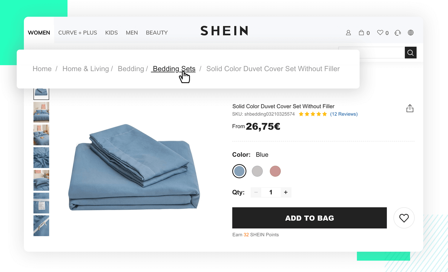
Breadcrumb navigation is commonly found in websites that hold a lot of content and information, like ecommerce platforms or editorial-style magazines and news journals. It works really well in products that have a clear hierarchy of information, representing an ill-suited option for websites that are small and only have a few pages.
People can often get lost in long processes. Things like long forms or checkout processes can stretch on, creating the issue of users becoming lost or losing interest or attention. They need guidance, something that resembles a road map.
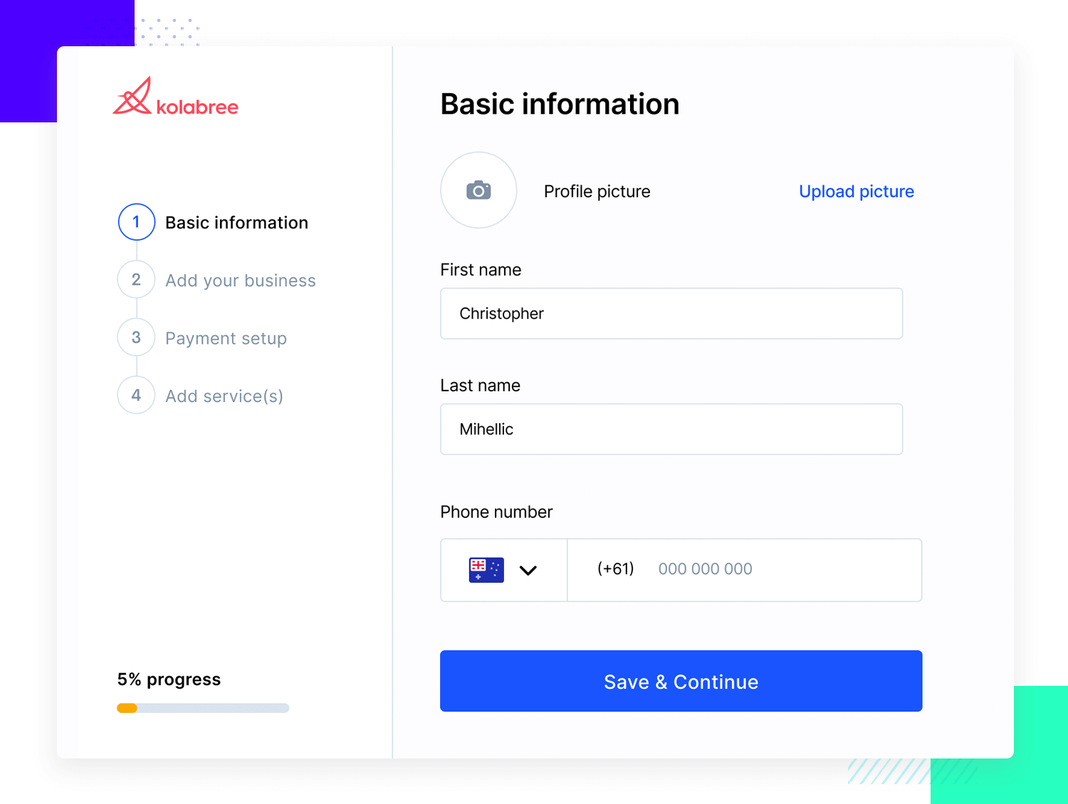
Many designers turn to the steps left pattern, which acts as a progress bar that lets users know where they stand and how much further they have to go. It has plenty of margin for designers to get creative, with the bars being made in the most ingenious ways while still getting the job done. They offer context to users who need it as well as acting as a light at the end of the tunnel for tired users.
UI cards are another design pattern that designers often rely on to display content. In theory, it solves the issue of displaying content that varies in form and length. With that said, having a cards system makes the most of the available space, both for web and mobile designs.
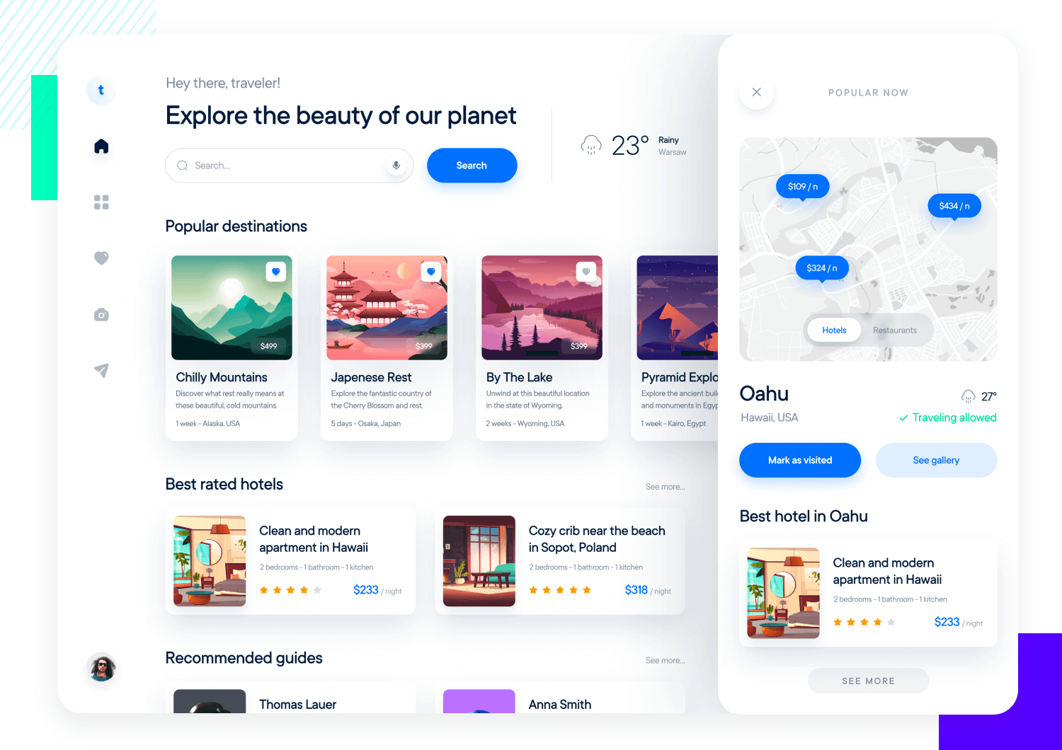
A card grid system works best when users are browsing as opposed to searching for a specific thing. It can be used to visually group digestible portions of information together, making it organized but not overwhelming to users. Designers can add interaction to the cards to elevate the design, as well as getting creative with the actual display in each card.
They are both intuitive and attractive, making for a type of design that pleases most users and offers a clear visual hierarchy.
Free UI Design Tool for individuals and teams. Unlimited projects!

Tabs are another design pattern that most of us have grown used to. There’s true familiarity given that this pattern is used in most web browsers. Tab navigation solves the problem of organizing content in a flat structure that shows the user where they are at all times.
Tabs are very practical when you want to categorize content in a way that makes it easy for users to explore them one at a time, as well as quickly changing tabs when need be.
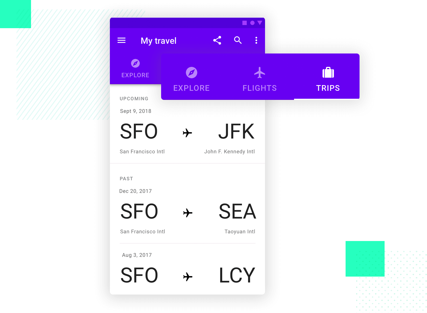
A few guidelines for using tabs include using the entire width of the screen for the tabs to maintain a visual balance. On top of that, be careful to use tabs only when there are many different categories or types of content at hand – a tab system for one or two categories doesn’t work well.
Both these patterns deal with feeding users content. On the one hand, we have the issue of content that can be exposed as a single continuous page which helps users to consume it without effort. That’s when continuous scrolling comes in. A great example is Facebook and its power to keep users scrolling down for long periods of time. It makes for a seamless experience that just keeps the ball rolling.
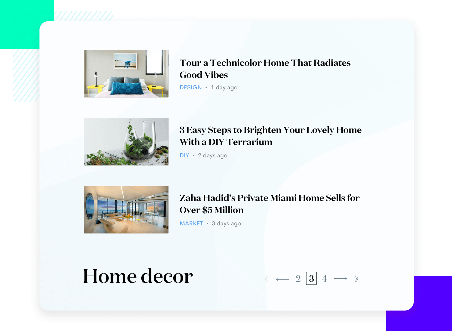
On the other hand, we have the issue of content that needs to be broken down into separate parts, making it easier to digest and comprehend. That’s when we turn to pagination. Usually, it comes with full control to move back and forth, both to the previous and next page as well as going directly to the very start or end of the content.
Another very commonly found design pattern: the fat footer. It mainly solves the problem of users who want to bypass the main navigation system and go directly to specific pages in the product.
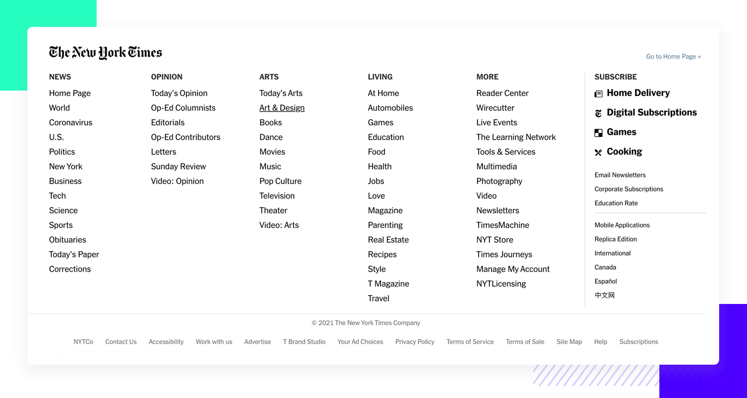
This pattern is often used for websites featuring specific pages that are more frequently visited than others, like a frequently asked questions page. It can be a useful way to add shortcuts without worrying about the general hierarchy of the website.
Modal windows are very common to find in the UI design of websites. Be it an online store or a blog, modals offer a great way to grab the user’s attention and get some reaction out of the user. This is usually used by designers in order to draw attention to sales, important newsletters and other things that require the user to either accept it or sign up for something.
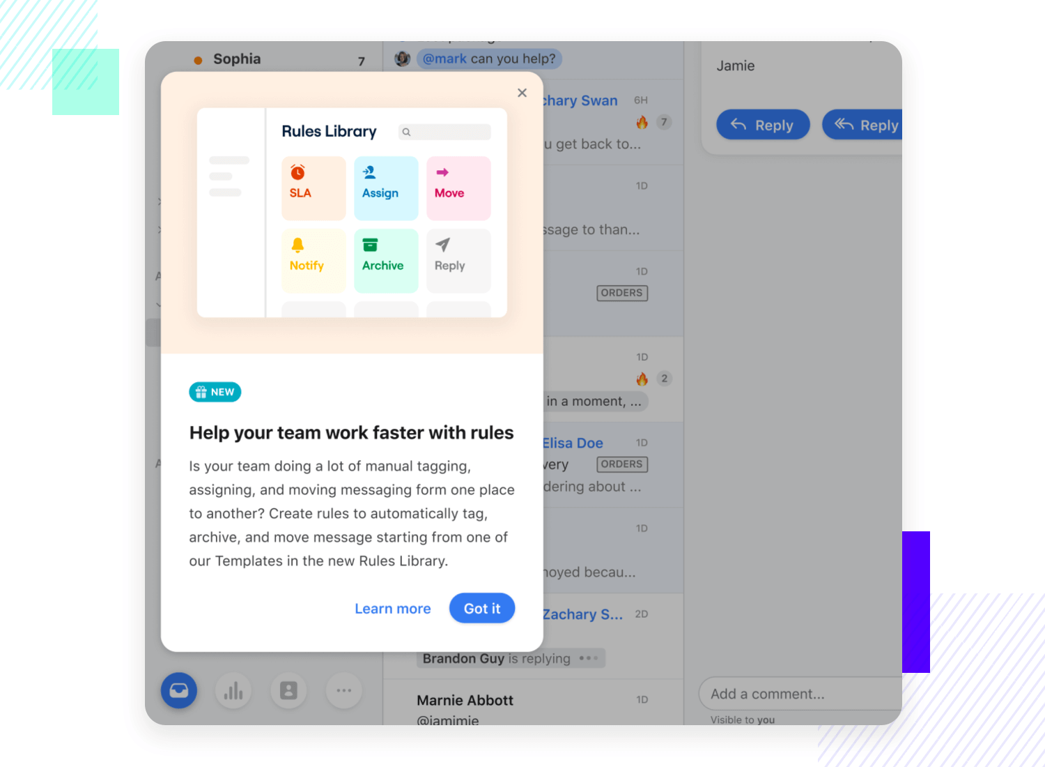
The thing about modals is that they’re a way of intentionally interrupting the user, right in the middle of a task. While this could be seen as a bad thing, because it distracts or takes away from the experience, many design teams stand by modals. They’re quick to go away and don’t pose a serious impediment for the UI of the website as a whole.
Much like other widely popular website design patterns, the carousel has its fans and haters. Some say that carousels are a bit outdated and are likely to disappear entirely in the near future, due to usability and performance issues. With that said, we can still see carousels in many websites around the web – which makes it a very much relevant UI pattern.
The main problem that carousels solve is that they allow users to see many options while focusing their full attention on only one of those options.
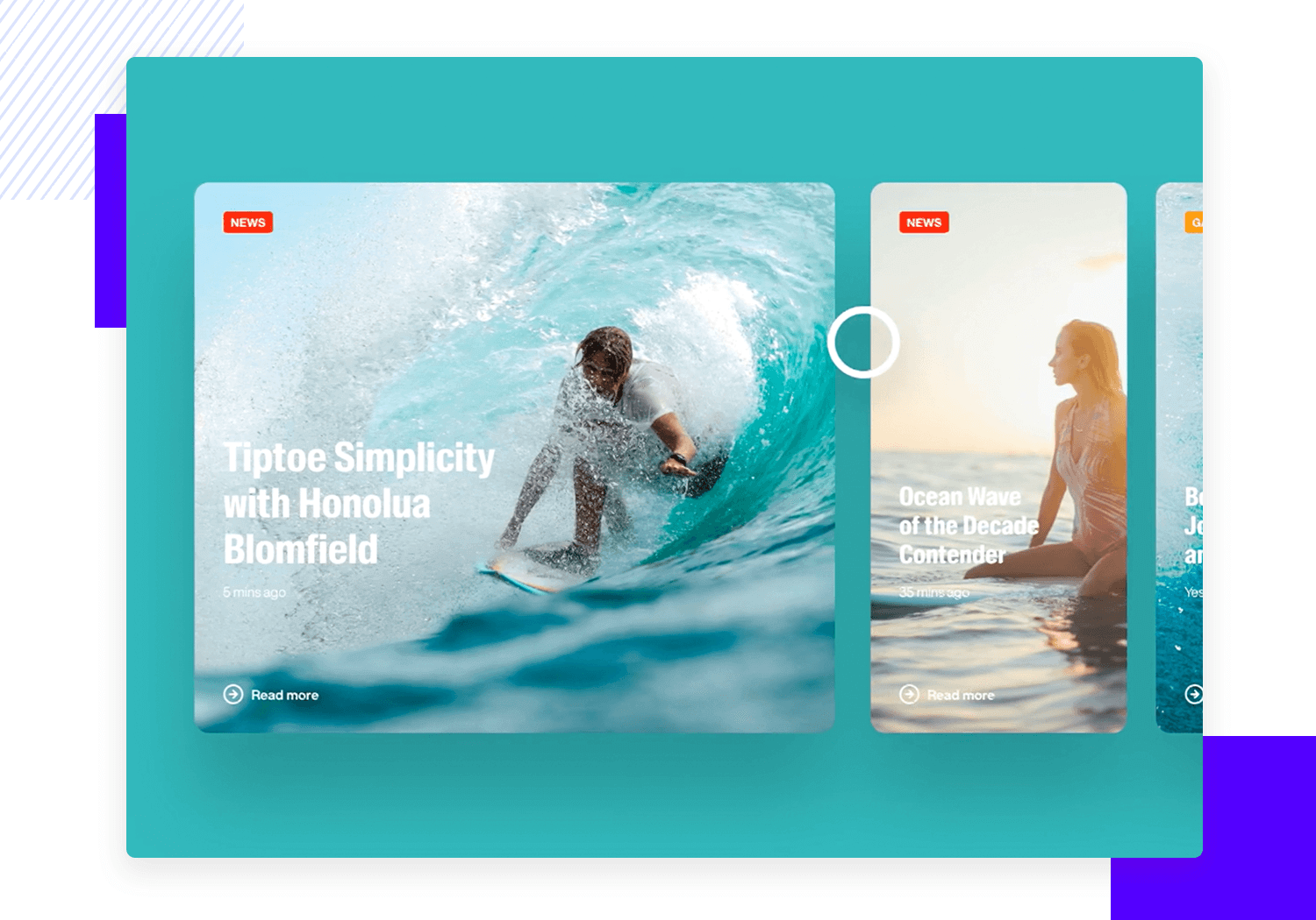
This means that carousels can be a rather persuasive way to approach the user, displaying your options in their full glory in hope that the user will select one of them. It can be handy because it takes up very little space while managing to show quite a few alternatives. It is a highly visual approach, which makes it a terrible option if the content you need to display isn’t visual in nature, like an Excel sheet or a written document.
Accordion menus are another design pattern we run into quite often when it comes to website UI design. More often than not, we’ll find an accordion menu functioning as the main navigation of a website, because it allows users to explore categories within the website while also discovering the sub-categories and lower-level content. It’s highly hierarchical and provides a very intuitive way of navigating websites that hold a lot of content.
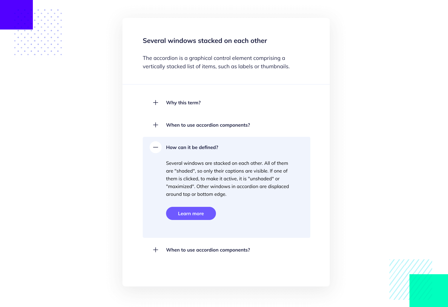
This is a great form of UI design for websites that have many sections and levels of content, since it conveys hierarchy and allows users to immediately understand the general structure of the website. You want to avoid the accordion menu, however, if the website has a small amount of content.
Free UI Design Tool for individuals and teams. Unlimited projects!

Ah, the hamburger menu. Particularly common in mobile apps, the hamburger menu has gotten both a following and a group of fierce critics. The epic 3 little lines that conjure the instantly recognizable icon are used to solve the problem of screen real estate on mobile devices.
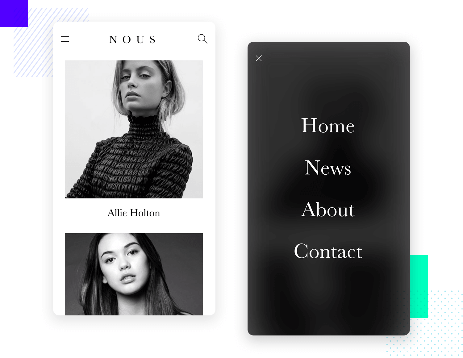
It’s undeniably practical. We can create a wholesome menu that can be stowed away so users can only expose it when they need it. There’s a certain interaction cost that comes with it, as well as some debate over the real usability that the hamburger menu brings to the table. Regardless of where you stand, there’s no overlooking the fact that most users will immediately know the icon, which is a massive benefit in its own right.
The forgiving format is all about working with what users give you. As we mentioned before, humans can be massively different from each other. This holds true to writing out data input, with people writing data in many different ways even when referring to the same item.
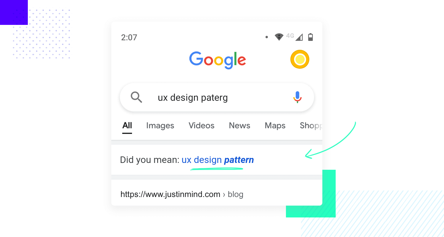
Things like ecommerce items or addresses and zones can have misspelled words, abbreviations and missing words that are important. That’s the issue that the forgiving format comes to solve, for all of our sakes.
In short, the forgiving format takes what users write out and works to interpret that, as opposed to correcting users or forcing them to change what they wrote. In order for this format to work, it needs to cover a specific topic – like an address search. That way, the system can connect the dots no matter how users express themselves, without frustrating the user or increasing their cognitive load.
Progressive disclosure is used very often in user onboarding as well as in complex settings. Mainly, it solves the problem of users wanting to focus on a task at hand without getting overwhelmed or distracted by other stuff.
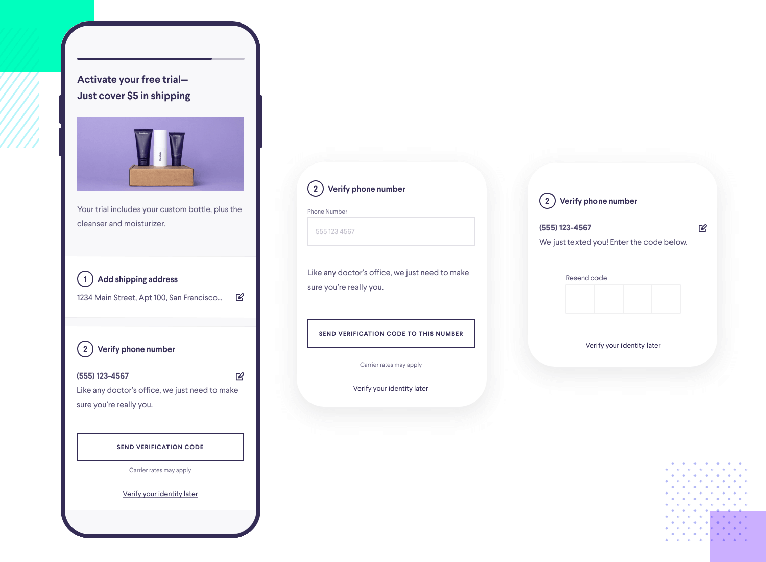
Working in a similar way to lazy registration, progressive disclosure is a way for us to allow users to become invested before they have to deal with things like registration or forms. It works well for products that need to introduce themselves to users slowly, focusing on the core features first. The result is a product that is much easier to use the first time around, prioritizing the attention of the user and creating a more efficient experience as a whole.
The splash screen is the very first thing that users see when they open an app on their mobile device. They can be easily overlooked or forgotten by users, since they only appear for a brief moment before the actual app home screen loads.
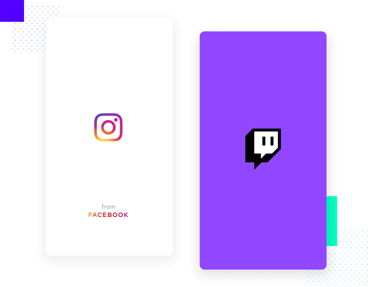
The splash screens basically solves the problem of keeping users satisfied while everything in the app loads, making that waiting time more entertaining. Some companies keep it simple with the logo and little else. Others go big and invest in intricate illustrations and beautiful visuals. Either way, this may be a small part of the UI design for mobile apps, but it’s an important opportunity to set the tone for the experience to come.
You can find some truly inspirational splash screen design examples in our post.
Free UI Design Tool for individuals and teams. Unlimited projects!

Product screens are the bread and butter of ecommerce platforms, both in web and app formats. The main issue that this pattern tackles is the simple fact that people need to know more details about items before they can decide to buy them. This is the moment for designers to showcase the product in all its glory, to make a true sales pitch using the design.
When it comes to the UI design of apps, the product screen is really about using design to make the content shine. Both in terms of highlighting the best of the item with visual pictures or videos, as well as making the description and CTA pop.
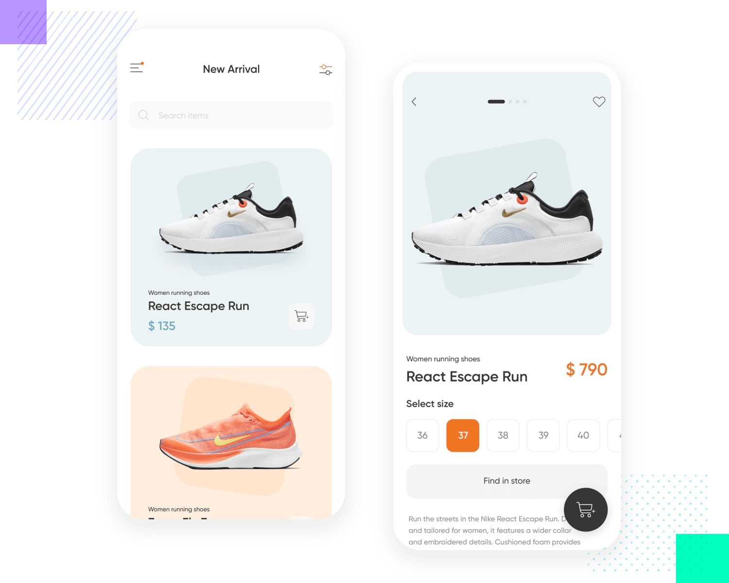
It’s worth mentioning that some of the most important factors at play here include visual hierarchy and balance, as well as the efficiency and conversion of the screen. Ultimately, product screens are meant to be persuasive and effective, which will all depend on how well you understand your key users and their mental models.
This is one that most users with smartphones will instantly know. The pull to refresh UI pattern solves the problem of users who want to see more information or wish to have a more up-to-date version of the content.
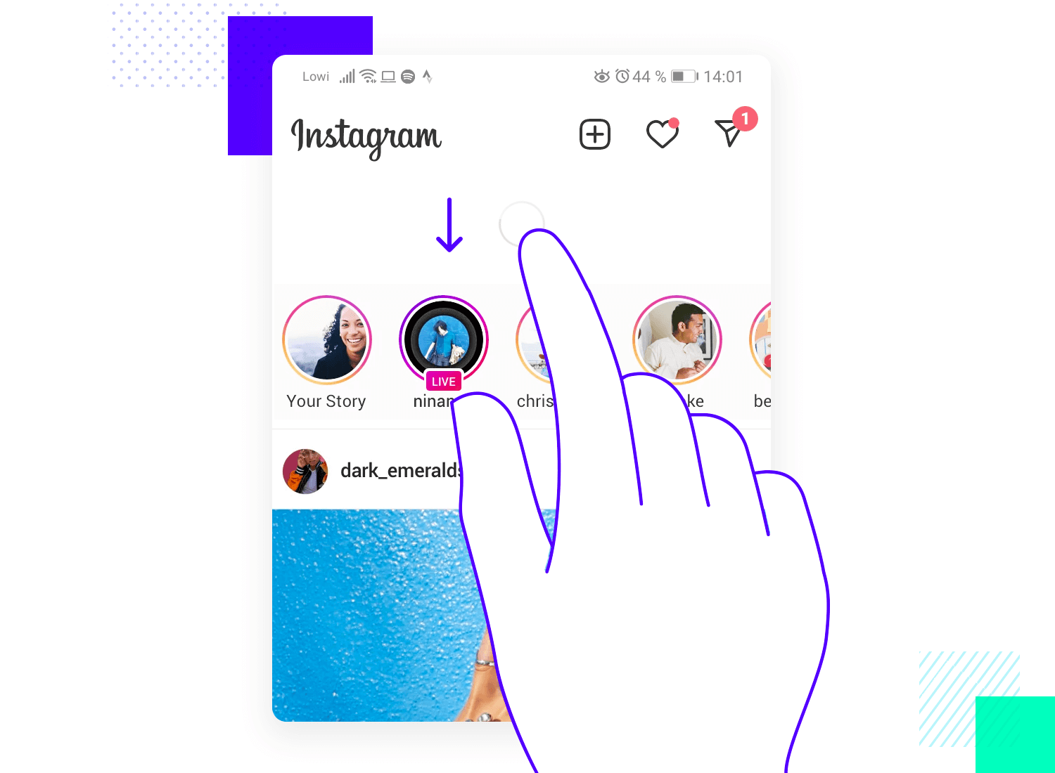
It’s been widely used in all sorts of mobile apps, from Facebook to CNN. It’s very practical, because it literally takes up no room in the UI at all, leaving that crucial screen real estate for more important elements. It’s highly intuitive, easy to spot and very efficient.
Reading on the phone is no longer just for a select few users, but for the vast majority. Having any sort of web app that offers a lot of reading content, be it Medium, The New York Times or Justinmind’s UX blog – reading on the go has never been so easy. And that is, in part, thanks to UI patterns like the Article List.
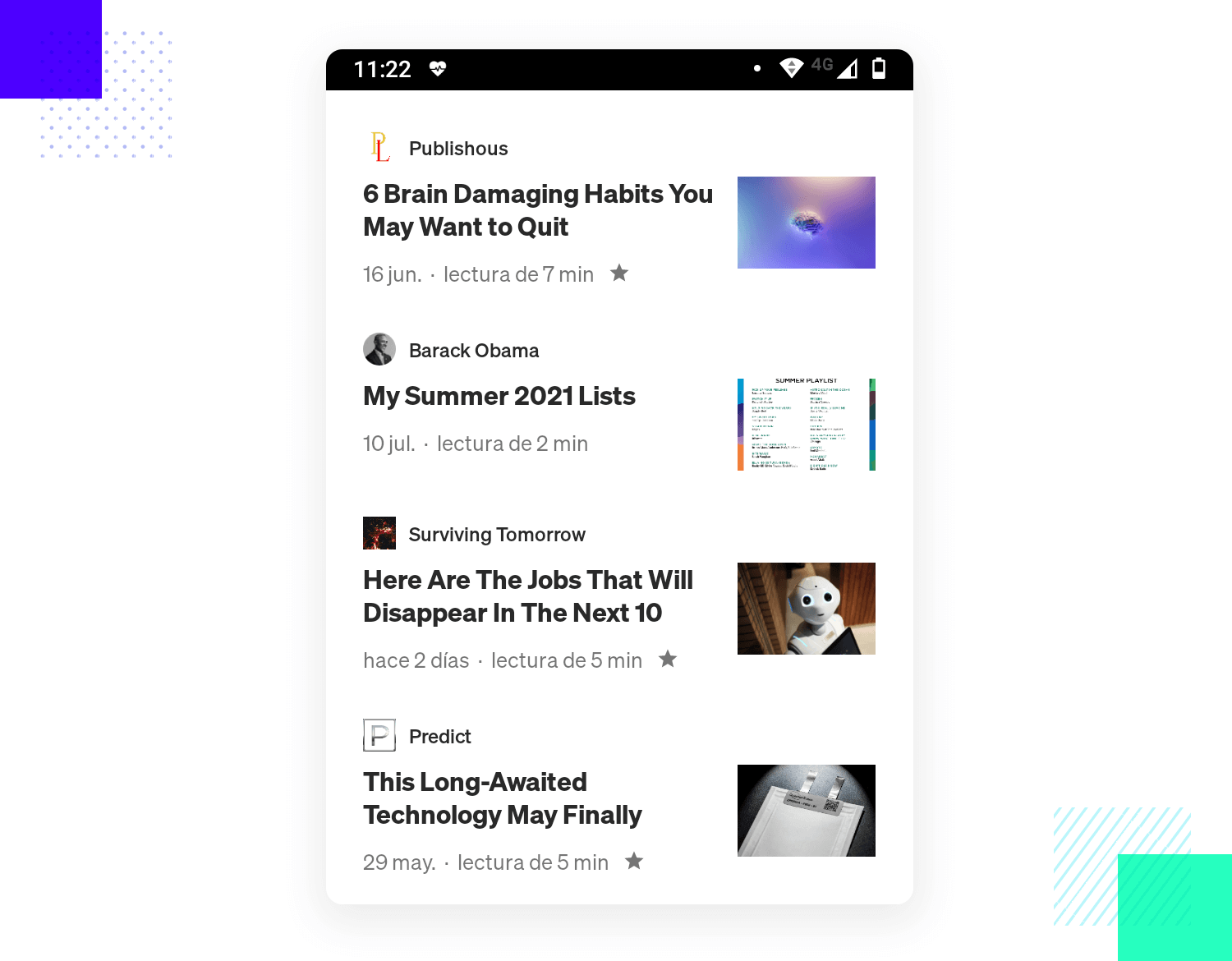
This pattern solves the problem of a reader who wants to find specific content that is of interest – which can be nearly impossible to do with navigation alone. You want to offer readers a little snippet so that they can get a sense of the content and decide if they’re interested or not.
Who wants to miss out on important developments? Notifications solve the problem of keeping users in the loop, letting them know about anything that happens inside the apps on their mobile device. Apps have their own notification designs, but they all follow similar lines of this classic UI pattern.
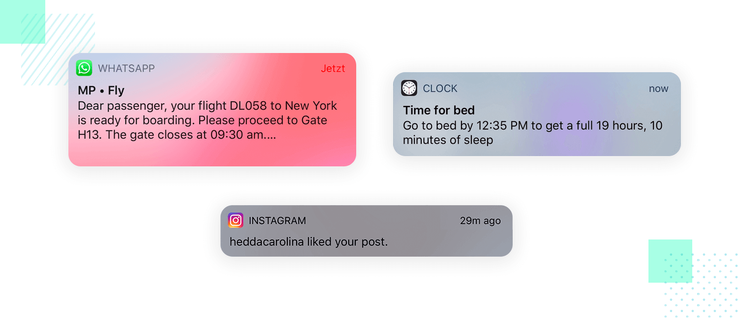
The important thing to remember when it comes to notifications is that they’re never meant to include information that is already being shown on the screen. Another scenario is some sort of technical development that doesn’t need any user involvement – like a small update or synchronizing with the network. Keep them relevant to users, especially anything that is time-sensitive.
Need for closure is a UI Pattern that is commonly used in UI design when the idea of gamification is at play. The pattern itself is a nod at our human psychology, which defends that people want closure for their tasks – it motivates them.
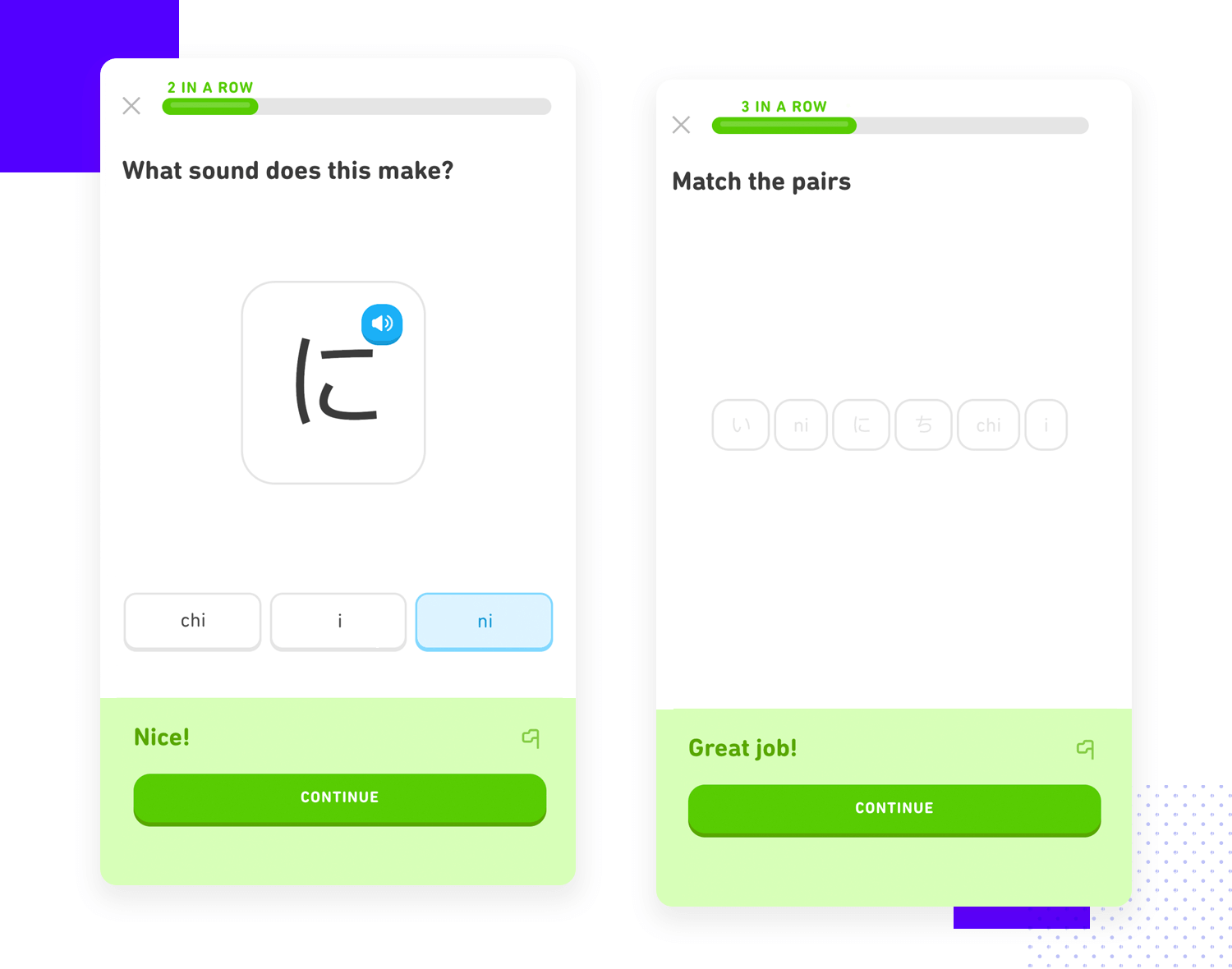
This can be used in UI design to encourage users when it comes to small actions. The recognition of the end of a task or cycle doesn’t have to be massive, it can be as simple as a quick modal window with “congratulations” on it. Ultimately, this can be a nice way to get users hyped for the user experience, especially if the entire product was made to resemble a video game in any way.
This UI pattern is all about solving the issue of miscommunication in forms. Input feedback is applicable to all kinds of forms, it’s true. With that said, it’s even more important in mobile-based forms because it requires more cognitive and physical effort for users to type their answers. This makes it even more important to help users get it right, be it with accurate labels or with input feedback.
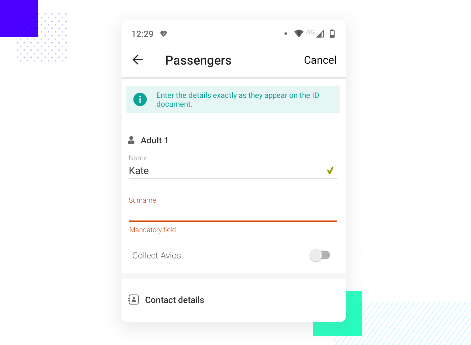
The input feedback itself is a widely used UI pattern. The feedback can be designed in a wide range of ways, from a bright green check to a green underlining of the input field. This is an opportunity to point out mistakes to users before they submit the information, giving them the chance to get it right and avoiding the feeling of frustration.
Free UI Design Tool for individuals and teams. Unlimited projects!

You can also explore new and trendy styles, such as neumorphism and skeuomorphic design.
Perhaps the single most popular UI Pattern library today, UI-patterns is a wonderful resource to have at hand. The website lists out all the most common UI patterns and makes it easy to compare several different patterns.
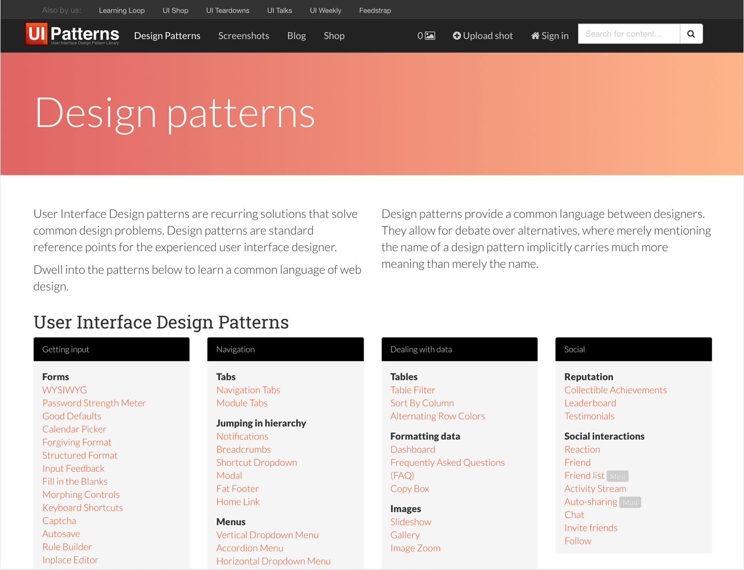
One of the best things about this website is that it makes it easy to find the right pattern, listing them all out in a comprehensive and intuitive way. Don’t expect long periods of time spent searching for the right option here! We also like the brief but very practical information listed in each pattern, which explain what the problem it solves is, along with some general guidelines.
Patternfly makes for a more complete list of patterns, listing some of the most frequent variations as well as the classic patterns. Navigation all around the patterns remains easy, due to the vertical navigation bar that makes quick comparison a piece of cake.
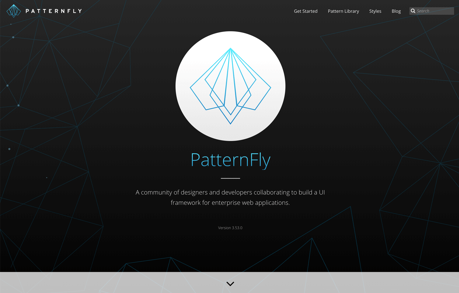
The explanations in Patternfly are a bit more detailed than UI-patterns, which makes it a better option for those that are just getting started with UI design. The website offers all the theory as well as some real examples of the patterns in action, making it a good learning resource.
We know. This isn’t the best-looking website you’ve seen. There’s something old-fashioned about the design of the website, which can perhaps distract from the wonderful content it holds. Wellie has quite a useful list of UI patterns, which lead to pages with practical examples and all the theory broken down – making for easy reading.
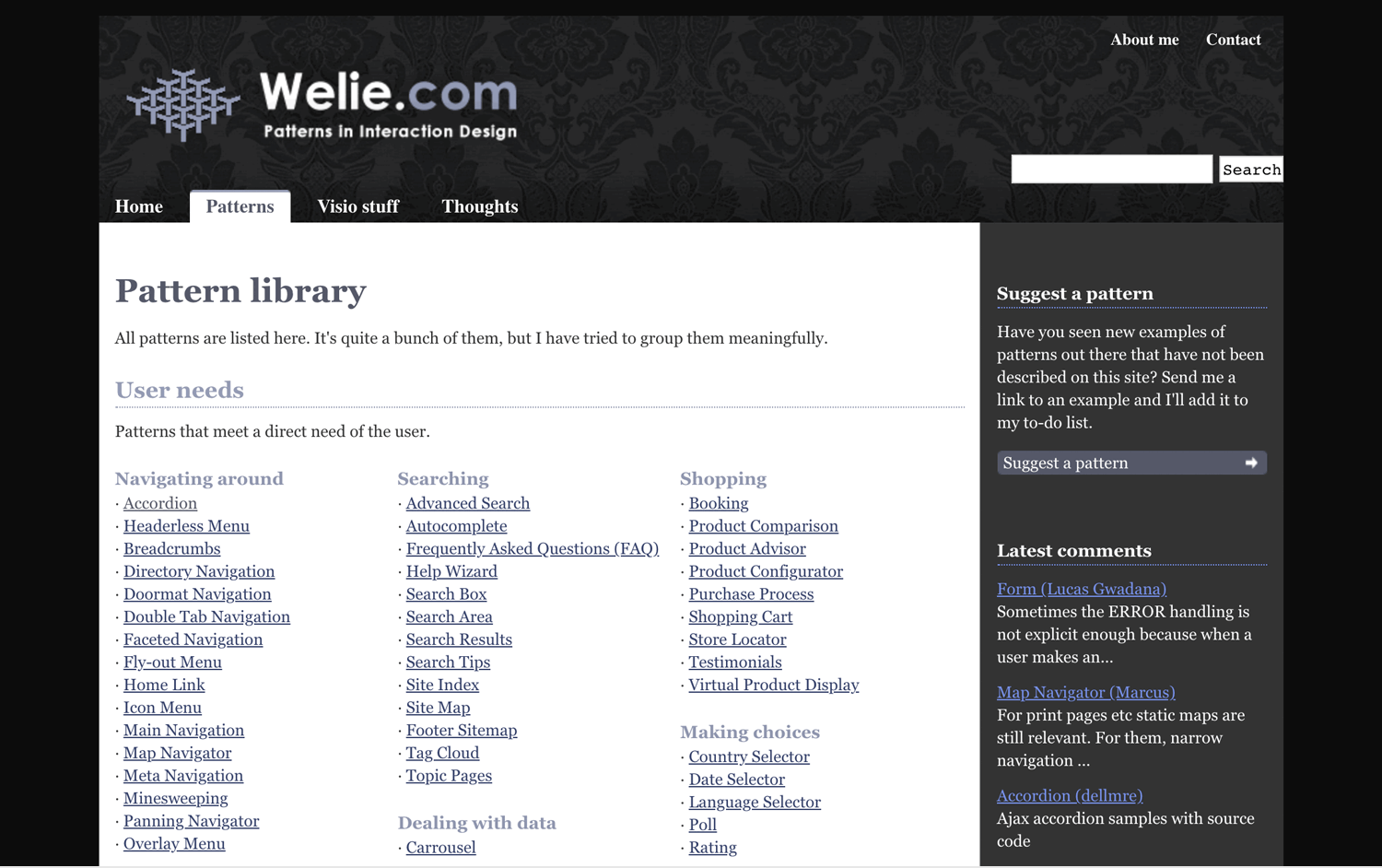
It’s a good resource to keep bookmarked, especially for those who are still trying to get a better understanding of premade UI patterns. Altogether, Wellie can be a useful resource due to its attention to detail when it comes to the content as well as its way of presenting the patterns, which makes for easy navigation.
UI patterns help designers create interfaces that are efficient and save time on coming up with a solution that already exists in the world of UI design. They’re a powerful way to focus on the creative side and let the experience of many others before you work constructively. They’re practical, free as well as tried-and-true. What’s not to love?
PROTOTYPE · COMMUNICATE · VALIDATE
ALL-IN-ONE PROTOTYPING TOOL FOR WEB AND MOBILE APPS
Related Content
 Designing an iOS app prototype? Here are 20 awesome iOS app design examples and tips to help you navigate Apple's Human Interaction Guidelines.15 min Read
 Shopping carts are a key part of any ecommerce. But what makes a shopping cart good? And what can we do to improve its conversion? Read on and find out!13 min Read
 Navigation is known to be the backbone of any app - but how can we make it intuitive and seamless? What patterns are most popular? Read on to find out!12 min Read
