Shopping carts are a key part of any ecommerce. But what makes a cart have good conversion? Read on and find out!
Ecommerce is a huge part of the internet today. As time goes by, online stores have grown in such a scale that they have earned a place in our day to day lives. With ecommerce’s growth in popularity, however, comes the growth in competition.
Start designing your ecommerce website today with Justinmind

Retailers everywhere have been pondering on the cost and benefits of investing in the UX of their online stores. What does it take for ecommerce website to offer a good UX? What makes a good shopping experience online? And most important of all: can we survive if we don’t make that investment?
Ecommerce has been a looming wave over retail – it is now time for physical stores to sink or swim. With online retailers optimizing their UI design more and more in search of good conversion and healthy sales, the time to catch up and stay relevant is now.
And what better place to start than with the classic shopping cart design? It’s a key piece of the shopping experience, and it can have a surprisingly big impact on the key metrics of the platform. It’s the typical aspect of a website that can be largely improved by minor tweaks – and the payoff can be huge.
In this post, we’ll discuss the most important shopping cart patterns, some awesome examples and how to do it with your prototyping tool.
An ecommerce has many different aspects that have to work together in order to serve the user’s needs and encourage them to buy. Among those aspects, there are some that aim to help users see and explore the available items, such as navigation. Others aim to help users grasp the characteristics of one particular item, such as the product page.
The shopping cart plays a very important role in the overall dance of online sales. The cart page is not so much as a last stop before checkout, even though users will go over the items in their cart before checking out. That is because the user experiences the shopping cart as they navigate and explore – usually as a small icon at the top right side of the screen. That’s why it’s so important to respect the general UI design principles to create a smooth experience.

The main purpose of the shopping cart is to help the user stay clear on what he or she is ordering and the details of the order. It is also to help the user make any last-minute changes that are needed – such as getting two shirts instead of just one or changing the color of the shirt.
The shopping cart is often something users won’t actively examine, but will instantly notice when a shopping cart falls short of expectations. It’s meant to be a brief overview of all the important information, with functionality being the main concern. This requires a good information architecture that allows buyers to focus on the experience.
Shopping cart design isn’t really about trying to influence the user to buy more (although that is something that can be achieved). It’s about making it easy for the user to place the order, with as little friction as possible. It’s about clearing the way of any obstacles, and getting the user to the finish line quickly.
Start designing your ecommerce website today with Justinmind

So, what makes a shopping cart design truly functional? It needs to offer important information while also giving the user power to make changes, telling them what to expect once the purchase is done.
Logically, that involves many primal questions such as what is considered important information. Is information on shipping, for example, expected to be found in the cart? If the main aim of the cart is purely functional, can we try to encourage users to buy more? Let’s find out.
An important basic distinction is that most platforms will have two designs for the shopping cart. The first is the navigational cart that users will see as they explore and shop. It is usually an icon that can be found in the navigation bar, showing the number of items it holds. Second is the cart page, dedicated only to the cart and the items in it.
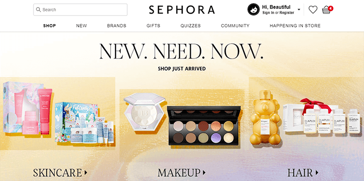
Both are important, and can be shaped to serve different ends. The navigation cart icon, for example, can be a helpful ally if you want to encourage users to shop more or to check out quickly. As users navigate the website, the icon can have brief animations or other visual cues that draw attention to it, and cause users to seek checkout faster.
The shopping cart page is crucial, because it needs to offer a lot of information to users in an organized way, so that it’s not overwhelming. With that said, this page is a great opportunity to try to get users to shop for larger quantities of the same items, or to carry out a bit of cross-selling.
Since users will be seeing this icon in pretty much all screens of the platform, you want it to be easily found. It is important that you make it easy to spot, but make it fit in with the rest of the navigation design for the platform.
There is something to be said about the location of the cart in the website: today, the classic move is to place it at the top right corner (usually, inside the navigation bar). This means that most users today, especially young ones who are used to online shopping, will expect to find the cart icon there.
As the designer behind a brand new platform, you have two ways you can use this information to your benefit.
Examples: Big names are believers in the top-right-corner-cart! These include Amazon, Ebay, Target, Asos, Flipkart, Apple, and Best Buy - among many others.
The first is to take advantage of the familiarity users have with the classic location. If users already expect to find the cart icon at the top right corner, there is more margin for your cart to be discreet and blend in more with the general navigation design. This can help the visuals of your website, creating a more coherent experience for users.
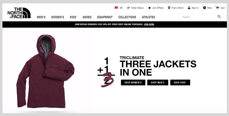
The other way designers can use this information, is to knowingly swim against the current. Being aware that most users would expect the cart to be on the top-right, designers can create something completely different. This tends to be the case with websites that aim to be memorable, pushing the boundaries of conventional design.
This road can be tricky, as most designers will tell you with a sigh. Being unique and innovative is great, but it does come with risk. After all, so much could go wrong when it comes to the user experience with ingenious design. In this case, the idea that users won’t find the cart in the expected place makes for an even greater need to find the cart, wherever it is.
There’s nothing wrong with offering users a brand new experience – but if users can’t fulfill their task of shopping for items, then their experience wasn’t good. The cart is something that should always be in sight, something users can quickly refer to. It should be instantly recognizable.
Looking to create something new? Why not check out the trendy new style called neumorphism?
This is something that many big ecommerce stores do. Telling the user how many items are in the shopping cart can work in several ways. For example, some users might feel encouraged to place more things in an empty cart – and so, by showing a zero in the cart icon we can chanel that. The only way to find out what works with your users is to test your theory!
However, the biggest reason many designers choose to include the number of items in the cart is that it helps the user be aware. It sounds rather simple, and it is – people like to refer back to their cart to check how many things they have as they continue to shop.
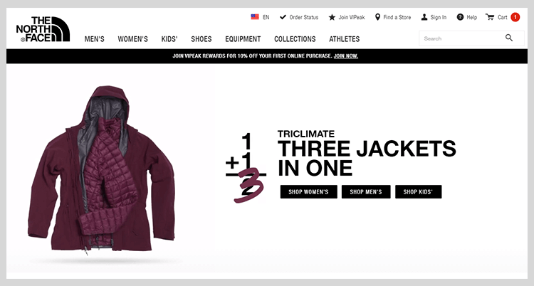
It creates a form of feedback where users can be sure that the item was added to the cart successfully. This can help the user feel more in control of the experience, which is always a good thing in UX.
By adding a number to the shopping cart icon, we can also transform it into a form of CTA. The number can use brighter colors and some animation to stand out, and try to motivate users to proceed to checkout before they abandon the search.
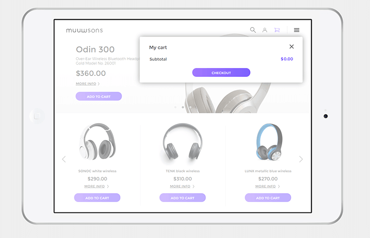
More and more websites now also offer users a mini shopping cart. This is, in practice, a larger view into the cart icon in which users can see the details of items. This is a wonderful way to give the user more control over what is in the cart – such as instantly rectifying a mistakenly added umbrella.
There is an important distinction to make between this mini cart and the full-page shopping cart design, however. Given the reduced space, you don’t want to overwhelm users by giving them too many options. This mini cart should be a small square or rectangle that takes up only a fraction of the total screen – so what should it include?
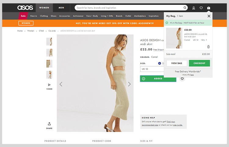
It should include the full list of items in the shopping cart, along with the option to remove the item or perhaps modify the number of each item in the order. This mini shopping cart design should give users two basic CTAs: the alternative to checkout directly or to go to the shopping cart and see everything in more detail.
But that is where it should stop. Never forget that this design is for a very small space, and that even though users want freedom and control they can be easily overloaded. You can read out post on the Paradox of Choice for UXers, but the gist is that users can take a long time to make a decision. If this time stretches for too long, users can become paralyzed and cease to enjoy themselves.
Start designing your ecommerce website today with Justinmind

For users to be fully in control, they have to know what they are dealing with. There can’t be doubts in their minds over if that last task they did was carried out successfully – that’s no way to shop.
For consumers, receiving a notification that a new item was added offers confirmation of success. It lowers the amount of times users added the same item many times over, as they weren’t sure the system understood their command. This, in turn, will make the checkout process easier and faster, as users won’t need to go over each item on their cart correcting numbers.
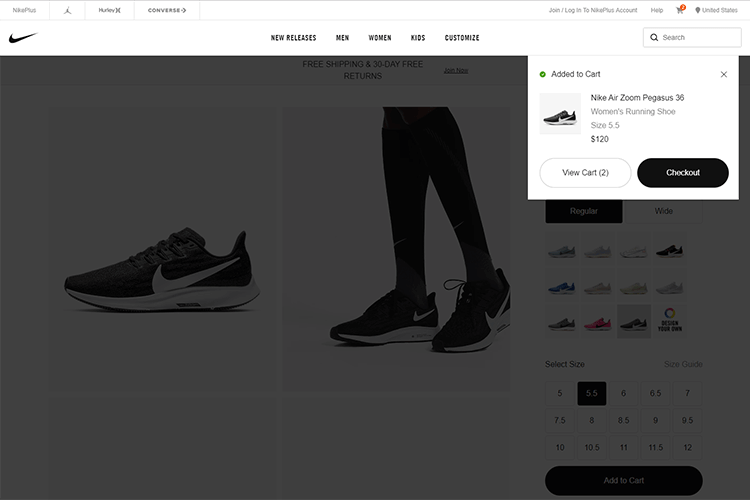
This is also about avoiding the need for users to check their cart to be sure that the item was added. It’s crucial to remember that the entire shopping experience needs to have as little friction as possible!
When it comes to what type of notification ecommerce websites use the most, we find that overlay modals are a common way to let users know about a new item in their cart. Here are some helpful links regarding overlay modals:
This way, you can ensure that the user sees the information on the new item without them navigating away from the current page. By creating this window, we also make sure the user has nothing to distract from this new piece of information.
The shopping cart page is often the last stop users make before the checkout. It is also at this point in time that users will go through the items on their cart, and make the actual decision to keep things, remove things, or abandon the entire shopping process.
This page is very important for any ecommerce platform. This page design calls for you to include all the important information while giving users freedom and control over the cart. Here are some basic aspects the shopping cart design needs to account for:
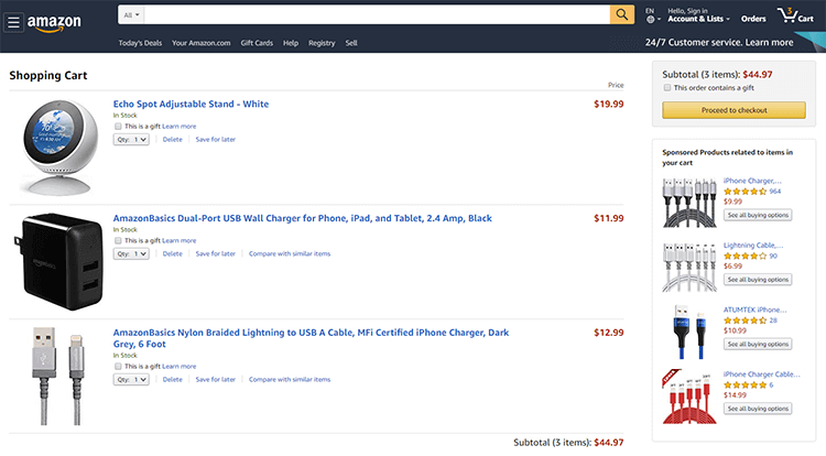
- The ability to remove items
- The possibility of modifying anything about the items. This includes changing quantities, and any other specification. A dropdown menu is a common choice for these controls.
- Basic information on each item, including a picture.
- A link to the item’s product page
- Estimated total of the purchase, including additional fees such as taxes or shipping costs
- The option to turn any item into a gift: this could be as simple as a checkbox or radio buttons
- A slot for inserting any promotional codes of coupons, if the platform works with those
- Payment options
Those are the key things all shopping cart pages have to include. The main reason why there are so many, is precisely because this is the last review iusers make of the entire order. And so, the shopping cart design has to offer all the important information the user could need – as well as giving users the control to change anything in their order.
Additional elements designers can include is an order summary box, that simplifies all of the order and shows only the bottomline: cost of items plus any additional costs or discounts. This will help users feel at ease with their purchase total, so there are no surprises when the time comes to make the payment.
How do we include all those elements into a single page without clutter becoming an issue? It is true that the shopping cart page needs to show a lot of information, but it still needs to read somewhat like a simple grocery list. It should feel easy and straightforward to the user.
The keys to create this feeling of simplicity are information architecture and visual hierarchy. You want the items to be clearly differentiated from each other. Information should be in harmony as opposed to competing for attention – so the user can immediately grasp what is happening.
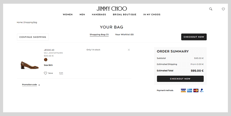
This includes the classic visual hierarchy moves, such as grouping pieces of information together so users understand they all regard the same item. Given that this is a considerably extensive matter, you can check out both our posts on visual hierarchy and information architecture for full details.
Many stores also try to clean up the visuals of the shopping cart design by hiding some elements behind icons or buttons that bring about popups. Coupon and discount slots, for example, can be tucked away so that users can click on them should they need to. With that said, it’s always crucial to make sure users can locate these buttons, as well as understand their meaning prior to the click.
On a bigger scale, the shopping cart design could be made so that each item is extendable upon hover or click. That way, users can choose to look at each item into more detail or carry on with the basic information they have been given. The possibilities are endless!
Start designing your ecommerce website today with Justinmind

Now that we are clear on the classic traits that make up a good shopping cart design, let’s dive into what changes take place when designing for mobile.
This may sound tough, but a floating CTA can make a huge difference to users. The designer needs to allow the user to review the items in their own time, but make it as easy as possible to proceed to checkout.
An important thing about the checkout button is that it needs to be more than just visible. It has to be clickable – and this touches on several aspects of button design.
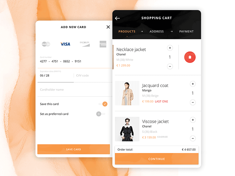
Design by Kohutpiotr.
Designers need to consider making the button large enough that users don’t need to struggle with precision in order to click. The choice of colors must ensure enough contrast against sun glare, or for shoppers that might have a visual impairment. If you’re worried about the visually impaired using your product, check out our guide to accessibility testing.
Mobile users still need all the crucial information: the reduced space doesn’t rule out the need to know if shipping is free or if it comes with a fee. If anything, designing for mobile makes it that more challenging to include all that information without suffocating both the screen and the user.
With that said, it is true that designing for the web gives you ample margin to play around with the elements included in the page. Many ecommerce platforms engage in cross-selling on websites – but refrain from doing so in mobile screens.
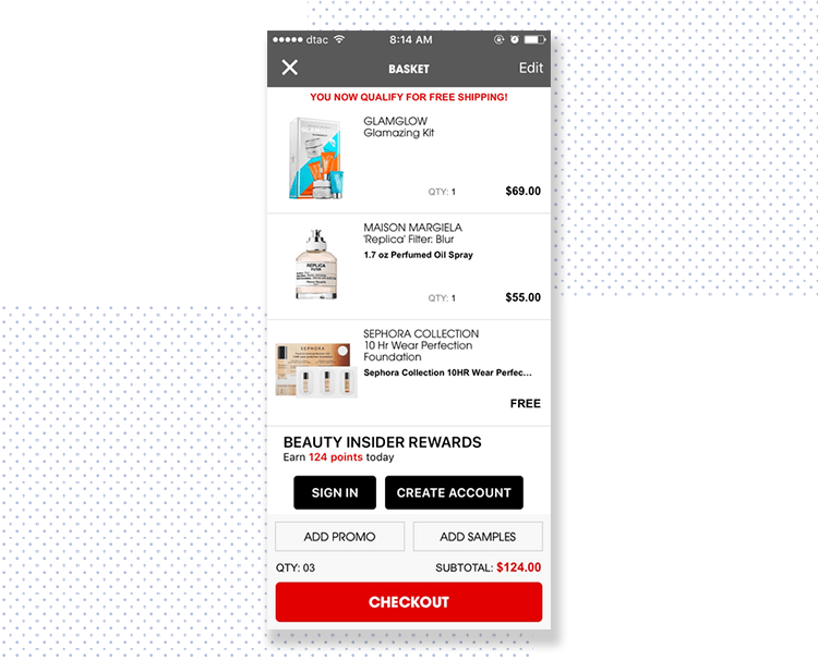
The reason behind that is that users will be easily confused by anything that looks out of place on their phone screen, adding friction to the checkout process. Users will take a closer look and understand that those items are being offered and don’t belong to the order – but that closer look takes effort. It adds to the interaction cost of the page. If anything, the entire checkout process should feel effortless.
The general aim is to remove everything that could confuse or distract. For many stores, this would mean removing any ads, promotions and cross-selling. It also means removing incentives for upselling, such as “Free shipping for orders above $50” banners.
This struggle is true for any mobile design, not just shopping cart design. The smaller screen makes everything more compressed, with elements such as text becoming a potential issue. Another issue isn’t just users reading small letters, but clicking and tapping on elements that are too small.
For example, the font size usually works to indicate that certain information belongs to an item within the shopping cart design. However, on a mobile device the margin designers have for acceptable font is much narrower. This, in turn, makes organizing the visual hierarchy of the shopping cart design more challenging.
Check out our prototype examples.
The same can be said for the controls. A shopping cart design needs to give the user control to modify the purchase – but all those controls that each item will entail need space. All of them need to be clickable, such as increasing or decreasing the quantity of an item.
Some mobile shopping cart designs get past this usability issue by having a single button for any modifications on the items. This button will lead to another screen, or an overlay modal with more options.
Start designing your ecommerce website today with Justinmind

The shopping cart can often seem like a simple part of the ecommerce platform, which makes it tempting to skip the prototyping phase of the process. That is a mistake that will lead to shopping carts with terrible usability, which can be a dooming force on any ecommerce platform.
While there are many creative reasons to ensure there is a prototyping process to the shopping cart, one must never forget the business reasons. After all, an ecommerce platform has a very clear goal: selling. Much like other more classic parts of UX design, selling is about speaking the user’s language.
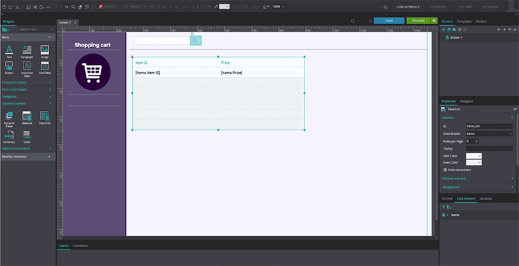
It can be surprisingly difficult to design something in the user’s perspective. The empathy needed to create just what the user needs or wants is downright superhuman – none of us mere mortals can get it right the first time. Users have a mind of their own, and the design team needs to peel back layers and layers of user behavior in order to decide which way is up.
And that is the bottom line of why ecommerce platforms just can’t do without prototyping the shopping cart design: testing. There is no testing of a mere concept. The team needs a physical prototype to place in front of users and test their reaction.
Designers will often have a clear idea of what is good and bad in design – but the user’s behavior is the only thing that separates a success from a failure.
And so, it’s time for the design team to put all their ideas to the test. Using a professional prototyping tool, the goal should be to create several initial prototypes and work your way up. As the project develops, the prototype will grow increasingly detailed – until it becomes a high-fidelity representation that is just like the real cart.
Many consider this to be the moment of truth. The moment we find out if the design is going to be a success or if it’s time to retreat back to the drawing board. Here is the issue with that idea: testing isn’t a single moment. It’s a series of moments that take place throughout the development process.
Much like the design thinking process, we here at Justinmind are firm believers in testing early and often. Your shopping cart design needs to be tested several times as you progress and build on it.
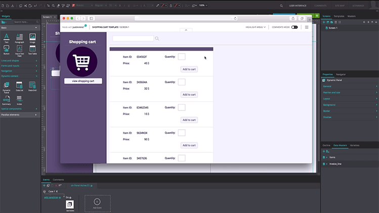
The true secret behind successful testing of your shopping cart lies in the conversion. Before the testing can begin, you have to decide where your standards are. What do you hope to achieve with this version of the design? We recommend always having a clear line, a goal you mean to reach with the design.
Example: We want a conversion of at least 50% on the shopping cart within 3 minutes of users seeing the screen. If the testing reveals we fall short of that 50%, it’s time to optimize the design.
The idea is that each time you carry out testing, you’ll come to notice small things that cause negative reactions from users. It could be a small text that makes users go back and read that bit again, or a visual animation that has users feeling a little confused. It’s important to remember that no shopping cart design is perfect – and optimization is always possible.
You want to pay close attention to how fast users can understand the shopping cart design and if there is any doubt over the details of the order. The ultimate goal here is for users to see everything they need on this one screen – and, hopefully, proceed to checkout.
Start designing your ecommerce website today with Justinmind

Victoria’s Secret‘s shopping cart design is innovative, and benefits from the unexpected. When the user clicks on the cart icon on the top-right, he or she isn’t taken to another screen – instead, the cart opens from the right side of the screen.
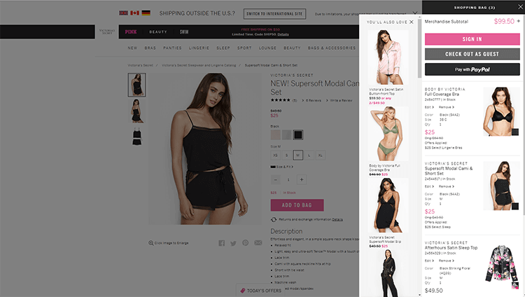
This vertical design allows space for another vertical bar in which the company cross-sells other items. We also like that the cart has an “edit” link that leads to an overlay modal where users can completely modify the item ordered – without cluttering the cart design.
The only thing we wish we had in this cart is an estimated total with both taxes and shipping costs – but no design is perfect!
Walmart is a huge name in the retail sector – and their race to catch up to ecommerce platforms has been an interesting story to follow. We can get a sense of the time they invested in their online presence by their shopping cart design.
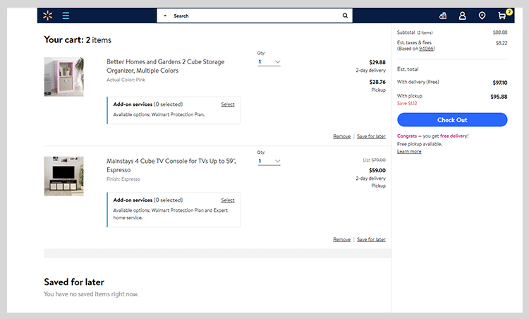
The cart itself is simple, with little distractions from the purchase. We can see the clear dividing of the screen, which makes for great information architecture.
Users can find all the information they could possibly need, with order summary box included. Walmart chose to include some cross-selling below the information, where users can see it but not be bothered by it as they read the information.
Etsy makes for an interesting example of a shopping cart design. Like many platforms that bring users items from individual sellers, Etsy makes it so users pay for items that come from the same seller at once. This means that in buying two items from different sellers, users have to checkout twice.
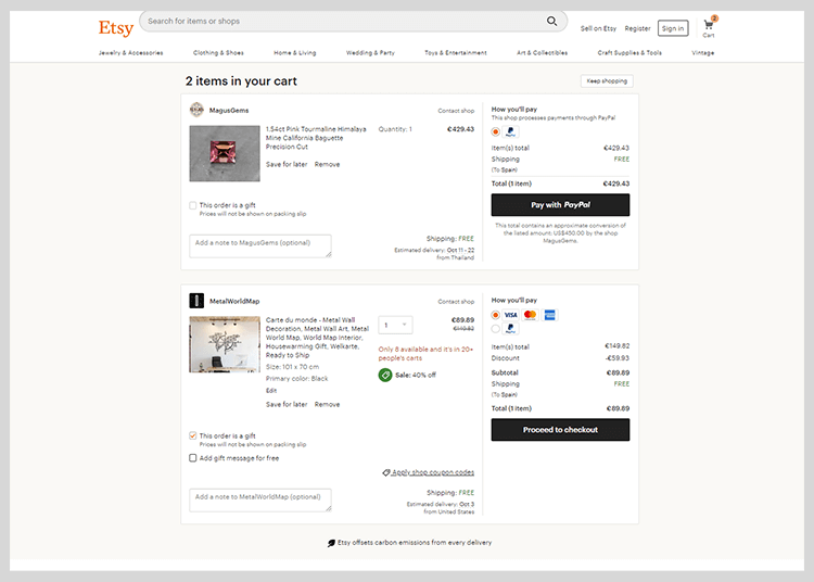
We like that their shopping cart information manages to display all the relevant information, show two separate order summary boxes and still manage to maintain a clean interface. That can’t have been easy!
Users will also appreciate that they can use coupons where sellers accept them, make items gifts and even leave a gift message for free. We also love that the CTAs are coherent but don’t compete with each other. How great!
This app has a wonderful shopping cart design by Abinash Mohanty. It makes a smart use of the space, with the visual hierarchy taking the star role in the screen. We all know that mobile screens can be a real challenge to designers – which is why this design is so great.
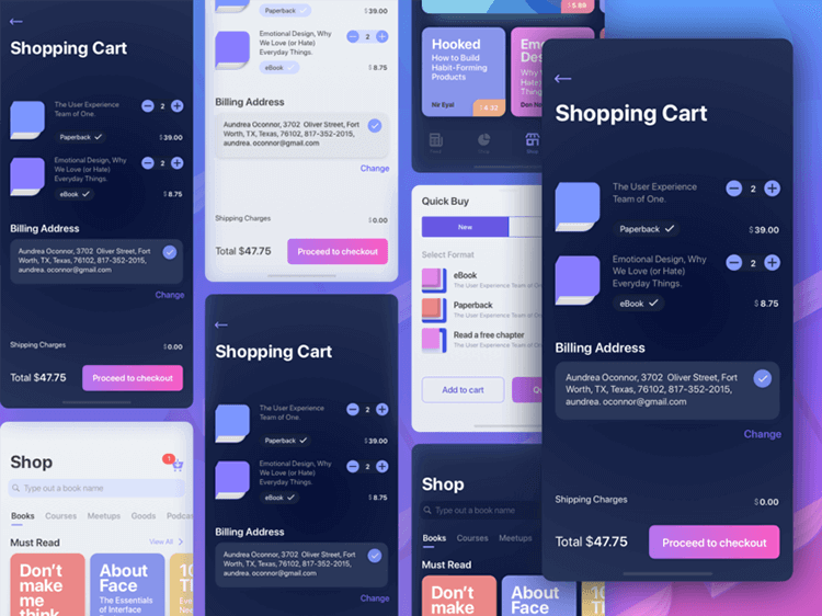
It takes all the excessive information and tucks it away, while still showing the all key information to the user – including billing address, shipping fees, the full list of items and the total. We particularly appreciate that the controls to modify the order of books are usable, as opposed to tiny icons that most of us would struggle with.
This app by Shojol Islam makes use of a clean interface, with smart information architecture to keep it all logical and useful. We like the proportion of the UI components, which allow for comfortable tapping – as well as having enough space between controls to avoid mistakes.
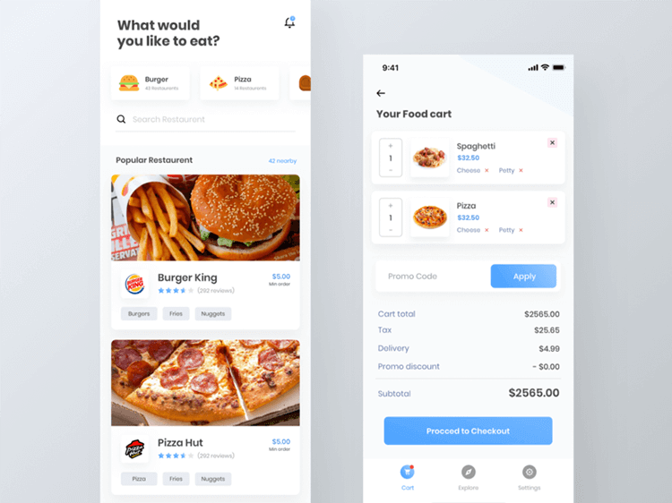
The summary box below the item list is a great advantage of this design. The user can go through the items and modify what is desired, then see the entire cost of the order broken down. The navigation orientation below it all is just the cherry on top of a wonderful usability cake.
The shopping cart is a crucial part of any ecommerce platform. It can be easy to overlook this page due to other big parts of the project, such as is usually the case with the navigation design. While the shopping cart may not be as exciting to design, it is nonetheless important for the correct functioning of the platform.
When going for a shopping cart design, the bare minimum to keep in mind is that people need control, freedom and information. This is the point where users go through their items and truly decide what they will purchase – it’s up to you to make that an easy decision!
