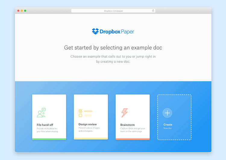
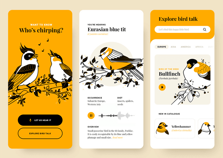
Visual hierarchy is a way to help users make sense of what they see. But how what makes a visual hierarchy good? Check out the full run-through in this post!
Visual hierarchy has a huge impact on the user’s experience. It doesn’t just affect the first impression of the product, but also how users make sense of it and enjoy its benefits. Most designers are fairly familiar with the need to organize visual stimuli, or risk tired, confused and overwhelmed users.
But what are the different aspects of visual hierarchy? When considering the visual components inside the product, what are the tools that designers have to adapt the components to establish an order of importance? How can we create a flow that gently guides users to all the most important stops within your creation?
As it turns out, there’s more to visual hierarchy design to just making things bigger or brighter – it touches on composition and relates to human psychology within UI design. Even though it may sound like a complex endeavor – fear not. We got all the highlights for you here!
Having a visual hierarchy to the components of your design serves more than one purpose. It helps the user understand how important one element is in relation to another, or where the user should start reading. It helps with understanding the product, and is crucial for good UX – users need to understand what each element is, and that includes its importance within the design.
With a good visual hierarchy to the design, you can expect users to have an easier time digesting information. Instead of having a screen with many identical components, users will have focal points and an order in which to notice and process things.
It was used by newspapers and magazines way before it was applied to digital design, and most people will know it even if they can’t define it.
As one might guess, visual hierarchy design is all about giving elements a certain hierarchy using several visual cues. The designer can use these visuals in order to create a flow to the screen, so the eye of the user can follow that flow towards the most important parts of the screen.
Visual hierarchy design, in truth, comes in two parts: the visual cues designers have at their disposal, and the different ways those cues affect the user experience. For example, the designer can use size and color as cues to convey hierarchy – meaning the design can have bright colors in certain areas to create a reading pattern as a tactic.
It is true that for your visual hierarchy to make sense, you have to start planning it and building it as you wireframe your product.
That means that the visual hierarchy will go hand in hand with other crucial aspects of the design, such as information architecture (IA). While you may not debate on colors and when wireframing, you will establish that visual cues and content are located in the right spots.
This, of course, exposes the need of the designer for a professional UI design tool. Preferably, opt for one that allows for both technical planning of navigation and IA, as well as more visual work. This way, you can already start planning the visual hierarchy at an early stage, before changes become an expensive and difficult task.
The idea is simple enough: you can use different visual traits in components to organize them visually, leading the user through the design. Let’s check out some of these key visual cues that all designers have up their sleeves in order to take the user by the hand on a path that touches all the most important areas.
All designers are familiar with the importance of a good composition. It can make or break a product on the very first impression, and plays a central role in those crucial first few moments. That is because most users don’t actually read all the content or components on a screen.
In fact, Weinreich et al (2008) found in their empirical study of the Web that most users have a habit of scanning the page for a few words. Their stay time on the screen was simply not enough for them to read the actual content but rather scan the text for key areas of interest.
The Nielsen Norman group goes even further by saying that most users will read only between 20% and 30% of the page’s content in their article How little do users read.
This is important, because it helps us understand how important visual hierarchy design is – and the role that patterns of reading play here. It is a fact that most users scan pages upon their first encounter – but how do they scan it? What factors impact this scanning?
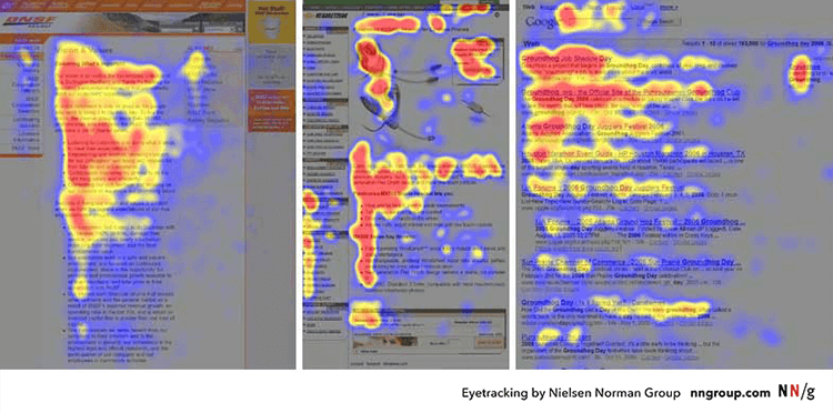
More common among screens that have a lot of written content, the F-pattern means users will follow a vertical line and only venture into the content in short horizontal lines – forming the shape of an F in heatmaps. It was first pinned down by the Nielsen Norman Group back in 2006, and it’s been a staple in web design since.
There are several reasons why users scan pages in a particular shape. Usually, the reason is that the user is looking for a quick answer to a question rather than an in-depth essay on the subject. And so, they aren’t willing to read an entire screen on the topic – users seek to minimize interaction cost needed to find what they want.
The curious thing about the F-pattern is that the Nielsen Norman Group considers it to be the brain’s default scanning pattern for text – visual hierarchy present or not. Even more curious is that the they also consider it to be a bad thing.
Using this pattern means that users only process a few words out of the entire thing, with large chunks going by unnoticed. And even worse: it can create issues with responsive design. Even if you make it so that the most important content follows the F-pattern, the words will be placed differently according to the screen size.
How can we mitigate this tendency, then? Turns out it’s not as difficult as you may think. It’s all about structuring your content so that the most important bits jump to the attention of the user – it’s about using your visual hierarchy so that it doesn’t allow users to miss important information.
This includes keeping the most important part of the content at the beginning. For written texts, that means the main points being made in the first two paragraphs. For headings and subheadings that separate sections, that means using the most descriptive words at the beginning.
“If users see only the first 2 words (in the header), they should still get the gist of the following section.”
Kara Pernice - Nielsen Norman Group
General readability guidelines also tend to help with this. Designers are welcome to group small bits of content together to make for easier scanning, as well as using bold on crucial words. Good ideas for improving the F-pattern readability of your design include breaking up large paragraphs, presenting the content in bullet points, and erasing all unnecessary content.
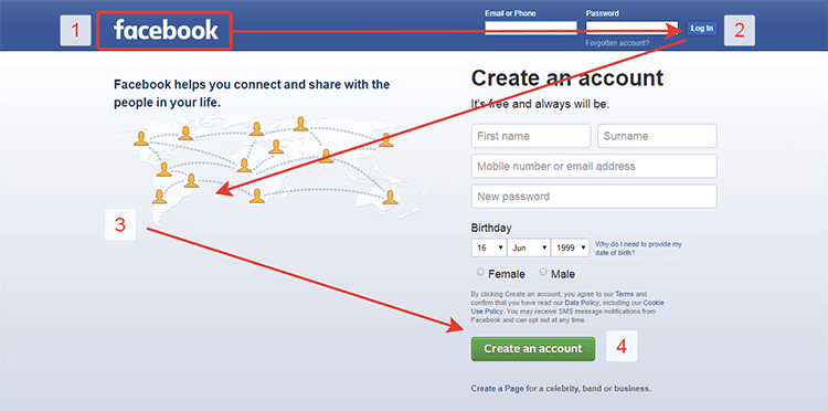
Unlike the previous pattern, the Z-shape takes place in pages with less written content and more visual components. This is usually the case with homepages, or pages with hero images. It’s a more natural pattern when there isn’t so much content for the user to digest, which makes it perfect for most landing pages.
Knowing that most users will scan in this Z-shape, designers can place the most important visuals in the corners of that Z and make sure users see them. The most classic element that tends to be placed at the end of the Z, for example, is the CTA. Nick Babich sums it up rather nicely with the following:
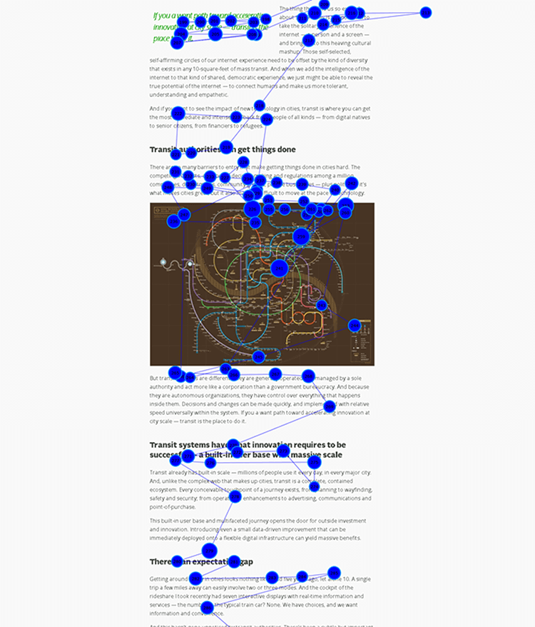
A layered-cake pattern takes place when the page has plenty of written content, but it is fundamentally different from the F-pattern.
Instead of users staying on a vertical line and only barely reading the paragraphs, users would be offered the text broken up into many sections and subsections. This means that users will mainly read the headings and subheadings, venturing into the written content as they make their way down the page.
A requirement of this reading pattern is that the content needs to be well-structured. It’s about avoiding long paragraphs that force users to scan, and instead aiming for many different sections that are well defined. The titles of the sections need to be descriptive and accurate as they will be the point of reference to users looking for that right piece of information.
It’s important to mind the distance and proximity between the sections, as well as more classic issues such as font size and color. You want to allow enough space between different sections so that the user can immediately notice the difference between two sections and a section with a subsection.
For a full overview, check out our post on how to improve UX using Gestalt principles. But for now, let’s go over some basic ideas that are considered important principles in the Gestalt theory of psychology.
In broad strokes, this theory takes root in how humans make sense of the things they see. It supports the theory that we see objects by grouping them together – effectively finding patterns that simplify the bigger picture.
The 5 principles are are also key concepts that have a big impact on the visual hierarchy of the product. These represent ways designers can present the different components of the product, so it all tells a cohesive story. The important thing to remember is that these principles are all about our brain making sense of the outside world, as opposed to how our eyes capture the visuals.

Example of the figure and ground principle at work.
Closure. The principle that if different components are given to the user in a series with missing bits, our brains will fill in the gaps on its own. Our brains have a preference for complete pictures, which leads us to seeing the whole before we notice the parts that make it up.
Continuity. Our brains will form connections between components and come to identify a pattern. Once we’ve noticed that pattern, our eyes will naturally follow that pattern.
Similarity. Different elements that are visually similar should be grouped together, as our brains will consider them to be parts of the same form.
Common fate. Group elements that move in the same direction for added connection in the eyes of the user – sliding menus, for example, create that effect.
Figure and ground. We perceive elements to be figures (in focus) or the ground (background). It plays on our perspective, and stipulates on what the eyes focus on and process first.
Proximity. Means that the proximity between different components will determine if they are perceived as being together or part of the whole.
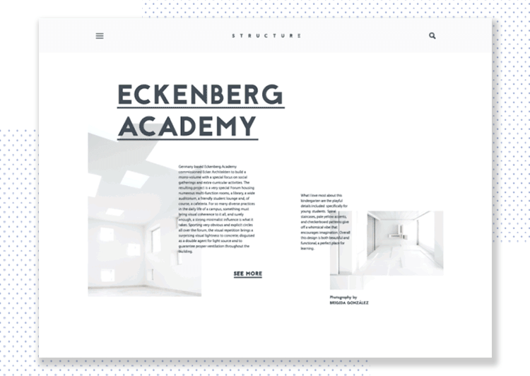
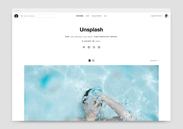
Whitespace can play an important role in your visual hierarchy design. The thing with clean designs is that because they tend to have less components than more classic styles. Everything needs to be right.
Think of Gordon Ramsey in Masterchef. Every time a contestant makes a truly simple dish such as pancakes it instantly becomes a worrisome task – even the slightest mistake will immediately jump to the feared chef’s attention. The same thing happens with minimalism in web design.
Because you won’t have too many elements or components, the visual hierarchy won’t have the issue of being upstaged by too many visuals – which is a great help. But the other side of that same coin is that the visual hierarchy of the product needs to be perfect precisely because it has very little support and nowhere to hide.
The key is to understand the function of active white space, which is left intentionally between components for the sake of structure, visual hierarchy and readability. If you want to create a good visual hierarchy in a minimalist design, you’ll need to carefully watch your typography, use of colors, as well as spacing and proportions.
For the full story on minimalist interfaces, check out our post on Minimal UI design.
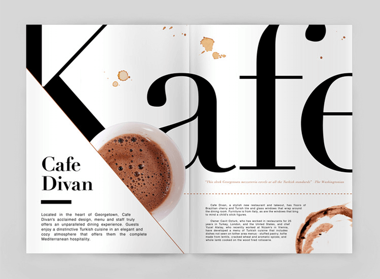
Typography plays an important part in visual hierarchy design. It’s been perfected by magazines and newspapers due to the sheer amount of written content on their pages. Order of importance is needed for people to identify the front page news title, for example.
Think of typography hierarchy as doing the same thing as headers in your digital product – it organizes the text so users can understand where to start and what is most important. An important aspect of this function is that as the designer, you get to decide where people start reading and what they notice first.
Key point: You can play with reading patterns to shape your design according to your goals. Decide if you want to follow common scanning patterns or go against them in innovative ways.
And so, let’s see some of the classic typography moves you can use to establish visual hierarchy with text.
The first and most commonly used way to convey importance is size. This is the easiest way to encourage users to start reading at a certain point, as we tend to read the bigger font first and then move on. The important thing to remember when playing with size is scale – the relationship between sizes of different components.
It is generally advised that you start with the size of the body of the text and go from there – it’s important that the body of the text have a size that allows for readability. It will be easier then, to identify the parts you want to highlight and place in focus.
It’s interesting to use different typefaces in order to add contrast. Many designers tend to select one serif and one sans serif typeface for the same page, so that there is a palpable difference between the font. Here is the trick, however: even with big differences, the font should follow the same shape.
Another way to add contrast to the typography is the weight. The weight of the typeface can immediately create contrast and establish hierarchy. Pairing thin and heavy, bold typography is a quick way to create a visual hierarchy, for example.
We do this to maintain some balance and harmony, even as we add plenty of contrast. With that said, designers that feel strongly about delivering something completely unique and are always welcome to push the boundaries of visual design!
Typography is a rather extensive topic – like many aspects of UX design, there is much to explore as to what you can achieve with typography. Check out some other helpful posts on typography:
The difference between web and mobile tends to be the same no matter what aspect of UX design we refer to. The same principles apply, but with one major difference: the large disparity between available screen space.
That lack of space for mobile screen has all sorts of impacts on how we design and plan for mobile products, but in broad strokes the story remains the same: designing for mobile is more difficult. Designers still need to live up to great expectations set by users. Usability standards must be reached and the product needs to maintain its function, as well as its appeal.
So when it comes to visual hierarchy in mobile design, what changes?
The answer is: not much. The reduced space makes each individual component even more important, as users can see the entire screen upon first glance and without much eye movement. Whereas in a full computer screen, we could guide the user’s gaze around the page; in a mobile screen, there is no guiding. There’s so little space that the user can take it all in at once.
Here’s a key change in thinking for designers for mobile hierarchy: the emphasis shouldn’t be on guiding the user so there’s flow, but rather ensuring navigation and emphasis are on point.
If you want to explore something new, check out our post on skeuomorphic design.
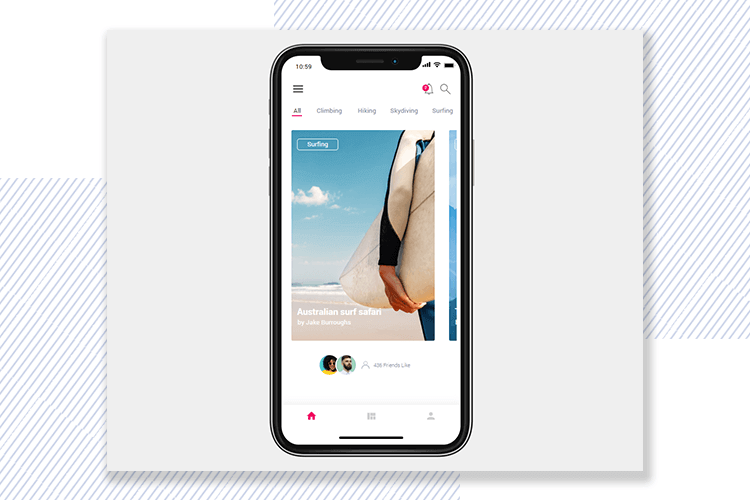
Check out more prototype examples by Justinmind!
By that, we mean that in mobile design there is usually much less content so as to not clutter the small screen. And so, the matter of guidance turns to not guiding the user to more content, bur rather guiding the user to the next screen – making navigation a top concern.
Other key areas to keep in mind are all the ramifications of the screen size when it comes to typography and written text, for example. The concepts of size and scale are crucial, because the designer needs to create contrast and establish hierarchy while still allowing for whitespace. The fonts can only be so big or so small, before users have trouble reading or the screen is dominated by a single word.
We love that Optix did their visual hierarchy with a limited use of colors – the real hero in this design is the typography. You’ll notice that Optix played with the weight and typeface in order to create order and emphasis on what matters.
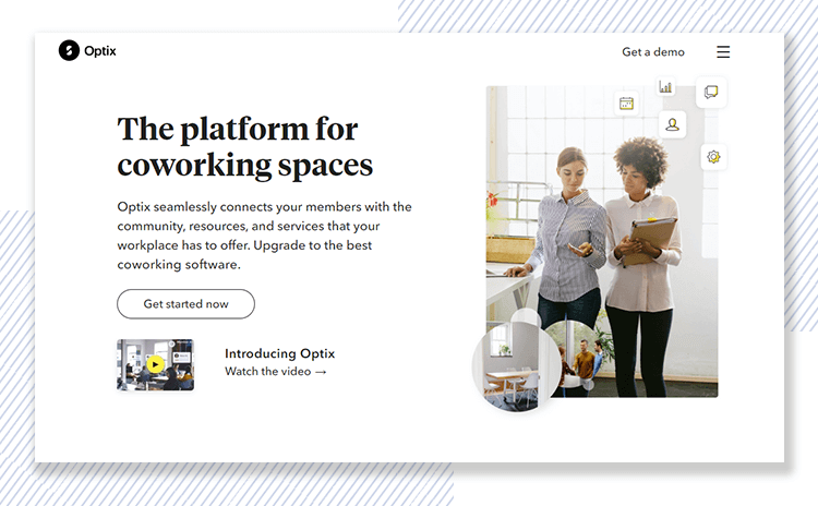
You’ll also notice that they followed the Z reading pattern, following those invisible lines with their design. On the top right, the user will notice the brand logo and move on to the CTA on the left. From there, we go diagonally to the text and second CTA. It’s both subtle and effective!
Feed has a more modern and innovative take on visual hierarchy design. Their homepage is all about the movement of the background, which gives it a dynamic and almost dreamy vibe.
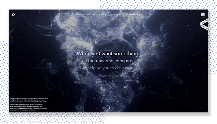
We love that Feed was minimalistic in their homepage, but invest time and care into the typography. The Paulo Coelho quote, in the center of the screen, grabs the user’s attention and seems to guide the user to continue scrolling down for more information – with both the fading of the first font and the use of a heavier second font.
Medium is a good example of a page with lots of written content that needs to be organized. While there are many different articles on display, there is a faint trace of the F-pattern, in which users can first scan the top part that includes both articles and the navigation bar. Then, users can go down vertically, seeing more potentially interesting content as they proceed.
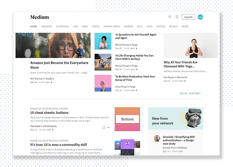
We like that while there is a lot going on with the page, there is some order and a sense of direction. It’s not overwhelming, because of the smart use of whitespace. We also love the smart use of typography to establish hierarchy in each different article, separating the title, snippet and author information from each other.
Kitchen Stories is a wonderful example of visual hierarchy done right, because it has a lot of content to offer users in a small space. Kitchen Stories is all about the clean and spacious style from the website, but it masterfully transfers that style onto its mobile app.
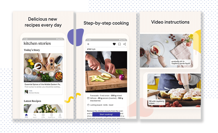
In terms of visual hierarchy, you can count on the usage of different typefaces and plenty of inspirational images of dishes that will please both hungry users and designers. The app design makes use of whitespace to establish connection and distinction from different recipes and stories, with pops of color in floating buttons that draw the eye.
Artsy is an app for all art lovers and collectors out there. We like this app because, while it has plenty of content, it’s all about the visuals. With plenty of eye-catching art to display, the app makes no effort to take the user’s attention away from the art. Instead, it sticks to black and white, with some color in the navigation.
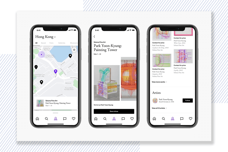
We like that Artsy displays artworks in a grid, with whitespace as the separator. The use of typography is smart, because it is subtle enough that users can tell the difference between the price of the art and the date it was made, without actually noticing the visual hierarchy planning.
Visual hierarchy is something that all users will depend on to make sense of what they see. Designers everywhere are constantly finding new ways to play with the visual elements at their disposal for products in order to convey a specific message to users. When it comes to visual design, it’s all about putting creativity to work, and keeping usability in mind.
PROTOTYPE · COMMUNICATE · VALIDATE
ALL-IN-ONE PROTOTYPING TOOL FOR WEB AND MOBILE APPS
Related Content
 Find the best free and paid SVG editors available online and desktop, including Mac, Windows and Linux.24 min Read
 Discover why space is a fundamental building block of great UI layout design, plus get pro tips on jump-starting your design process with Justinmind5 min Read
 Atomic Design is a way for design teams to create new products with a calculated and controlled approach. But why is it such a trend? Find out in this guide!7 min Read
