Checkbox vs radio button – ever wondered what the difference is? Read our complete guide and design them right every time. Get started now!
Every UI designer will be familiar with checkboxes and radio buttons. These widgets help the user progress through many online tasks and can often be found hanging out in the same site or app UI design.
Create interactive prototypes today. Enjoy unlimited projects!
But although now commonplace, checkboxes and radio buttons are still used incorrectly and interchangeably across web and mobile interfaces. Improper use of these widgets causes confusion, increases cognitive load and affects the overall user experience – as you’ll see in our post.
So make the most of checkboxes and radio buttons with this article. Learn how to recognize, understand and wireframe both of them with Justinmind’s UI design tool, and start improving the usability and desirability of your designs. If you want to, feel free to check our guide to accessibility design as well.
Both these components are very popular and can be found in a wide number of UI patterns. The trick is learning when to use the right one in the right context, such as using them in form design as opposed to UI cards.
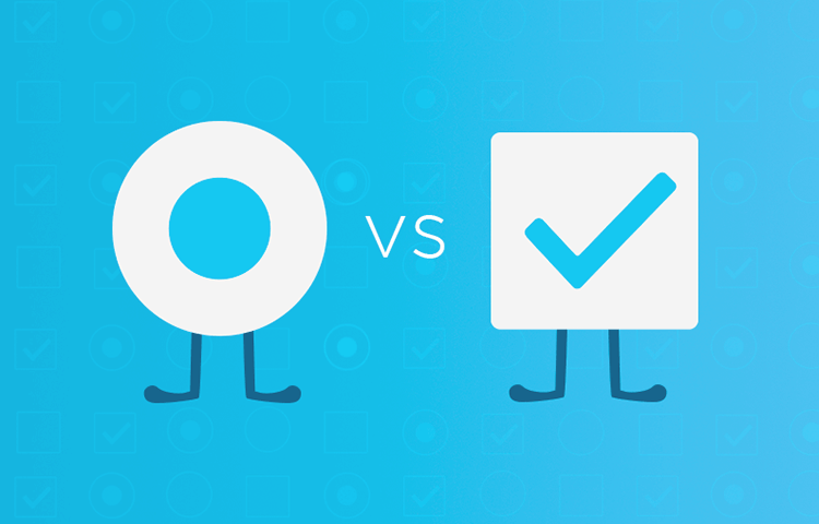
In UI design, the checkbox is presented as a small square box on the screen. It has two states: checked and unchecked. When checked, the square will be filled with a check mark.
Checkboxes are used to present the user with a range of options, from which the user may select any number of options to complete their task. Within a group of checkboxes, each operates individually, so the user can check or uncheck options independently.
These components tend to be included into the general structure of the page from early on, even at the UI sketching level.

The radio button is presented as a small circle on the screen. It also has two button states, and when selected, the circle is filled with a solid dot.
In contrast to checkbox groups, radio button groups behave as a single control and limit the user’s choice to just one option from the range provided.

As Michael Meadhra mentions, people frequently confuse checkboxes and radio buttons in UI design. Nevertheless, each has its own distinct job.
Checkboxes are used in forms and databases to indicate an answer to a question, apply a batch of settings or allow the user to make a multi-selection from a list. Alternatively, a single checkbox may be used for making single selections – such as Boolean True or False statements (e.g. “Do you wish to join our mailing list? Yes or no”).
In turn, radio buttons are used to configure a specific setting, switch between options or turn something on or off. They can typically be found in surveys where the user needs to scan a list and make a single selection from it. Both components are frequently used in data-heavy products, such as dahsboard design.
Another interesting point abnout these two UI components is that they’re always included in new trendy styles. Two classic examples are skeuomorphic design and neumorphism, in which checkboxes and radio buttons are always present.
We’ll take a look at some specific use cases next.
Create interactive prototypes today. Enjoy unlimited projects!

Checkboxes are often used to capture user preferences, as you can check as many boxes as you wish. They are used in everything from game UI to minimalist websites.
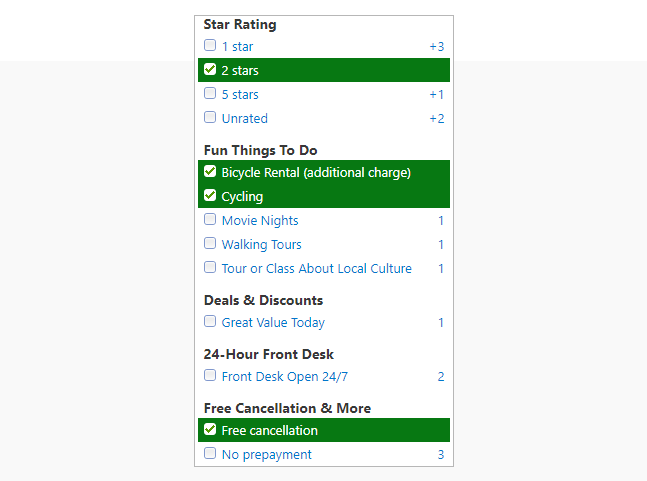
When reserving a hotel, checkboxes allow the user to select options from a wide range of hotel amenities. Booking.com uses a series of checkbox groups to help the user filter search criteria and find their ideal accommodation more efficiently. In fact, Renee Lin’s article shows that the Booking.com’s users frequently use the checkbox filters when making a booking.
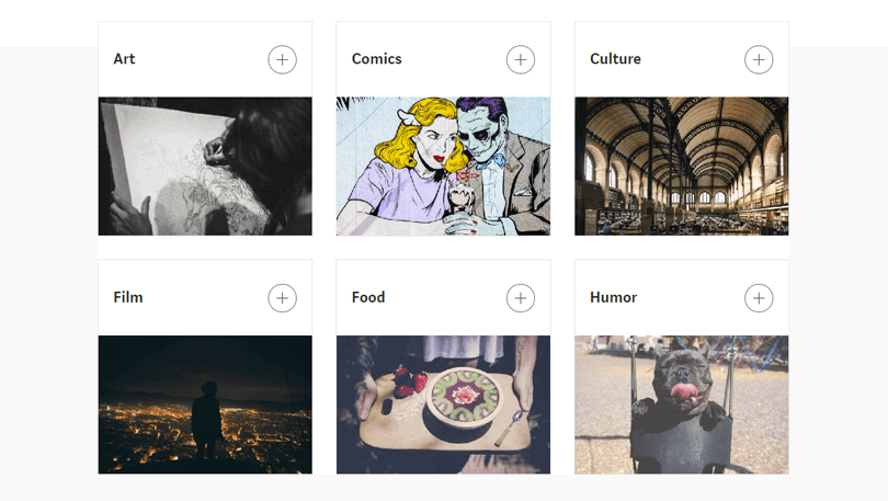
Checkboxes are often found in signup experiences when the user is creating a new online account or profile. When you create a new Medium account, you’ll be prompted to customize your interests, a task that involves checking any card(s) that matches your interests. We love this UI pattern that combines checkboxes with cards.
Checkbox design can also be seen in food delivery apps that allow the user to personalize their order. Some apps like Uber Eats, Deliveroo and even Taco Bell give the option to add extra toppings and inform the kitchen of special dietary requirements, using a list of checkboxes. Check out our post on how to use lists and grids in your UI design!
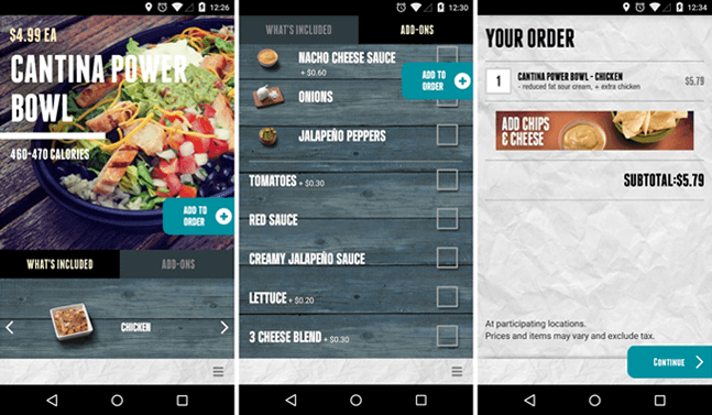
Image credit: Chris Chavez, Phandroid
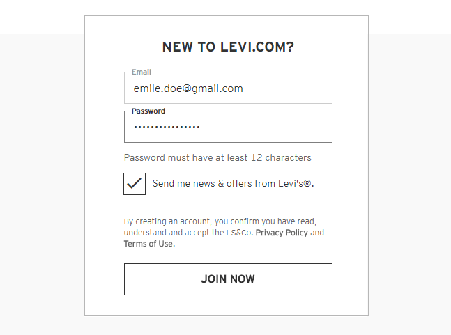
Additionally, there’s the single selection checkbox. You’ll find these at the bottom of any online form you fill in, asking you to accept or refuse an offer. For instance the “Tick to receive our newsletter” and “Tick to confirm you have read and agree with the terms and conditions” checkboxes. Check out the Levi’s example below:
Interested in form design? Take a gander at our research survey examples.
Create interactive prototypes today. Enjoy unlimited projects!

As a general rule of thumb, radio buttons should be used to allow the user to select one option from a set. This is what makes them the ideal candidate for making a selection from mutually exclusive options.
You’ll often see radio buttons in the checkout process when making an online purchase. For instance, on Amazon. When you get to the payment screen, you’ll be prompted to choose a payment option:
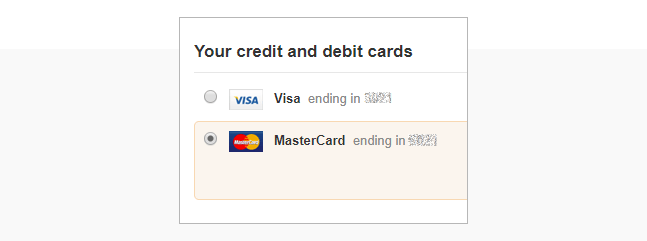
Notice that you’re only able to choose one option. Radio button heaven.
And then on to the delivery options. Amazon offers the following options: standard, expedited and priority shipping:

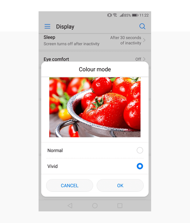
Radio buttons can take the heavy lifting out of profile or workspace customization. Laying out all available options in a logical order and having the user pick one takes a lot of the guess work out of UI personalization.
This is an example of how radio buttons are used in Android Oreo:
In food delivery apps, radio buttons do the exact opposite to checkboxes. While checkboxes help to personalize the user experience, radio buttons put constraints on the user’s options to ensure each order is carried out successfully.
If you’ve ever ordered pizza from Uber Eats, you’re required to choose a size: small, medium, large or extra large? Thick or thin crust?
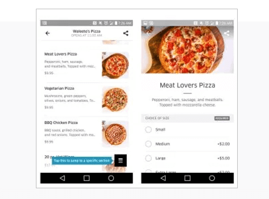
Image credit: Renespoints
Here, a single selection is absolutely necessary, and radio buttons ensure that your order is complete and coherent before you checkout and that accessibility isn’t damaged.
When not designed for the user, checkboxes pose some potential design challenges.
For starters, they imply a default answer. While this may not sound particularly disruptive, if the pre-selected option is in favor of the brand and not the user, they can be a bit pesky. Get signed up for mailing list without even realizing or have your details sent to third parties. Both having to deselect these options and later realizing you missed this step are equally frustrating.
Solution: if you want to offer a default selection, choose the safest or most convenient option.
Additionally, don’t use checkboxes if you require the user to make an active choice. As the Salesforce team points out, it’s not always clear if a user has left a checkbox intentionally or unintentionally blank in forms.
Solution: to avoid compromising your data’s integrity, opt for radio buttons or error messages when the user is required to engage with a section.
Create interactive prototypes today. Enjoy unlimited projects!

Never split up a radio button list into sub-categories. As Jakob Nielsen advises, a list of radio buttons must always appear unified so that the user knows that all options form part of the same set.
Another thing to keep in mind is that radio buttons should never be made directly actionable. Once the user makes their selection, a button should be provided to allow them to apply/confirm/save their selection.
Solution: for each radio button selection, keep list options grouped together and accompanied by a button to avoid cognitive load.
And remember, sometimes neither will do the trick. If you have more than 5 options in a set, consider using a drop-down list instead. It’s a great space-saver and much tidier.
So maybe you’d like to try designing with checkboxes and radio buttons. If you’re looking for a tool with pre-made elements to get started, you might try Justinmind’s tool.
For those of you who are already familiar with Justinmind, you’ve probably already sampled our UI kits. For anyone new to the prototyping tool, let’s run you through a quick summary:
Our tool has over 2000+ readymade UI widgets, screens and icons (including Android and iOS-friendly UI kits) to help you create wireframes and prototypes.
Our Basic widgets, those commonly found in both web and mobile designs, are pre-loaded in the Widget library palette. You’ll find the Widgets library palette as soon as you open a new prototype in the Justinmind editor. In this library, you’ll find both our Checkbox and Radio button widgets.
The Checkbox widget displays one of two states (checked/unchecked). You can easily change its default state by double clicking on it in the canvas.
The Radio button widget displays one option from a set of mutually exclusive items. Change its default state in the same way as with the Checkbox.
Use these widgets to create online forms, surveys, settings and more for you web and mobile prototypes. Get started now!
