Prototype SAP ERP products with Justinmind’s UI kit
SAP has helped companies manage resources for decades, and now with the free SAP ERP UI kit you can create your own system!
Creating a software that can help companies manage their resources. Sounds like a key element for any large or medium company, helping with things like managing inventory and purchases of supplies. It also sounds complicated.
So complicated, in fact, that it’s no wonder SAP has remained a constant across many different sectors. From car manufacturers to clothing retailers, just about any company can benefit from SAP’s brand of UX design.
With all this success and popularity, Justinmind’s prototyping tool had to create a SAP UI kit for anyone brave enough to design their own resource management tool. Let’s take a look at what the UI kit is, and what you can do with it.
SAP was founded in Germany back in 1972, by computer scientists leaving IBM. SAP SE is all about the user intention and task, getting users from different company departments to work using the system.
What started out as a financial tool has evolved to include all sorts of features and data. Slowly, SAP SE added on and expanded their tool to include crucial aspects of business management, such as production planning and material management. All of this culminates in the latest version of their resource management tool: SAP ERP 6.0.
SAP ERP is all about helping users do what they need to do efficiently, keeping track of pretty much everything. It’s the kind of system that has many different features according to what each department needs and deals with large amounts of data.
One of the greatest things about SAP, however, is probably their UX strategy. The company prides itself in their tools (and we can’t blame them), but it also gives users an opportunity to design their own SAP experiences. SAP encourages designers to deliver simplified versions of their tool, creating tailored softwares for certain companies. And that’s where our UI kit comes in.
Our SAP ERP UI kit is all about empowering designers to create the perfect resource management tool for their clients. Right off the bat, designers can grab a classic home screen from the kit, perfectly representing the SAP UI.
The page can work to get the main structure of the homepage right from the start, already offering two horizontal navigation bars at the top along with a third, vertical, navigation bar to the left. Designers can get the main layout from the page, and use it as a building block in their design, adding sections according to the client’s needs.
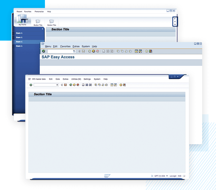
The SAP UI kit also comes with a second pre-made screen, which can be adapted to just about anything the designer likes. In this second screen, we have the main menu, sitting horizontally at the top of the page. Right below that, lies a bar filled with control actions that are represented by classic icons – the actions include things like copy-paste or delete, but can be changed to just about anything.
The third pre-made screen follows a similar structure to the previously mentioned screen, but enjoys a title typical of the summary SAP screens of “easy access”. This is the perfect screen to place all the crucial links to key features. Normally, this is the screen where users can find all the tasks of their daily work, like a massive shortcut to the most important corners of the entire system.
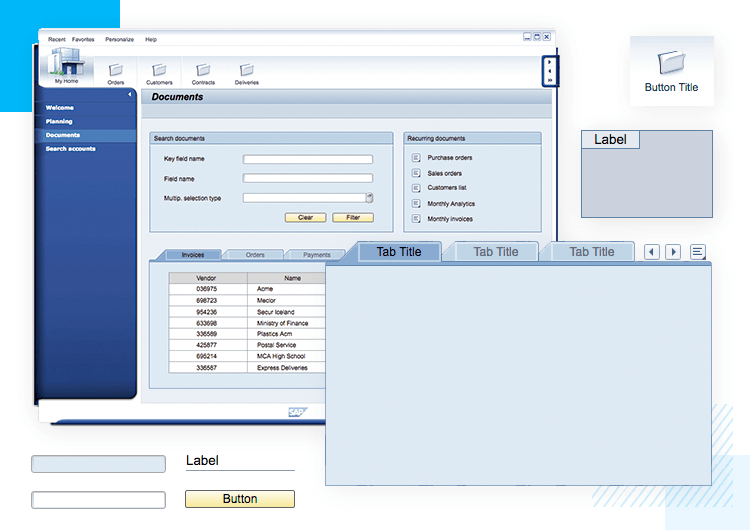
Aside from screens that come with the basic SAP UI structure, our free UI kit also comes with a series of loose components that designers can use to create just about any type of SAP system. These SAP UI components range from simple input fields to buttons, navigation bars and tabs.
When it comes to basic components, designers will be able to enjoy input fields either in white or in blue. In fact, many SAP UI components come in two choices of colors, such as the tabs and input fields. It’s also worth mentioning that these components can all be edited further inside the Justinmind tool.
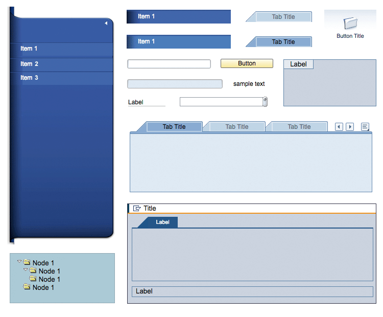
Other components come in groups. That is the case of the tab box modules, which come with several tabs and basic interaction, such as changing states according to navigation among the tabs. The SAP UI kit comes with two options for tab boxes, leaving the style decision with the designers.
Another good example of pre-built interaction is the folder tree, which comes with several levels of folders organized in a tree structure. Folders open and close according to user actions.
Other SAP UI components include buttons, individual tabs, labels and icons. Together, they cover the basic aspects of any SAP interface, and open the door to a tailor-made SAP system that many companies dream of.
Our example of the SAP UI is a documents page. As you can see, the general layout of the page follows the base that already comes with the UI kit. That is, two horizontal bars for controls and navigation at the top, plus a vertical navigation bar to the left.
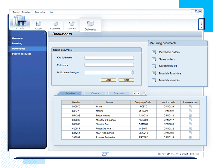
To create the general content of the page, we’ll make use of three different boxes from the SAP UI kit. The first one consists of the SAP UI component box with title. Inside this box, we’ll make use of simple text, input fields and a button. For the second box, we’ll use the same box components. Inside it, we’ll insert text and icons that act as links.
The bottom part of the screen UI will be dominated by a larger box. We’ll use the tabs box, using the tabs to navigate and manage all cash movements, such as invoices and orders. Since the tabs box already comes with basic interaction, all we have left to do is to add a data table inside the first tab – minding the data visualization.
For this SAP UI example, we’ll take one of the pre-made pages that come with the SAP UI kit. That is, the page itself has two horizontal control bars at the top of the screen, with the page title located below the bars.
On the left side of the screen, we’ll use the folder tree SAP UI component. That’s a wonderful way to present the user a lot of options when it comes to accessing certain information, while also conveying the hierarchy of the files.
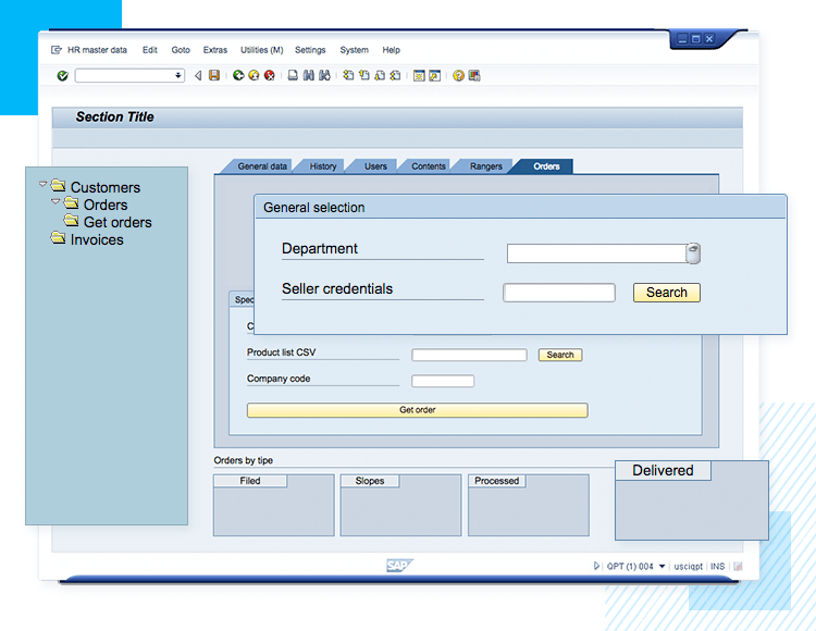
In the center of the page, we’ll have a large tabs box with tabs taking users around the most important corners of orders management. Inside the tabs box, we’ll divide the space into two parts with separate boxes: one for general search, and one for specific searches. Both boxes will have basic loose SAP UI components, such as input fields, text and action buttons.
To wrap up the page, we’ll simply add four small boxes at the bottom. Each box comes with its own label, and is the perfect spot for shortcuts and other crucial pieces of data.
Creating software for any company to manage their resources is hard work. SAP ERP has been helping companies of all sorts of industries with management, and isn’t going away any time soon.
With the free SAP UI kit, you’re free to focus entirely on the features and usability of your system. The UI components will work as building blocks, while our prototyping tool will help you implement your ideas – bringing about the next generation of resource management. Time to get prototyping!