Avoid cart abandonment and boost the grocery app experience with this simple 7-step walkthrough
A lot of our users create ecommerce apps in Justinmind’s wireframe tool. It’s no surprise. Getting them right can be difficult but they’re really useful practice for designers. Ecommerce is an interesting area in UX design. There is complex user flows to explore, different patterns to implement and tricky problems to solve. Like the cart abandonment pandemic.
But this time we’re focusing on grocery app design. In this walkthrough, you’ll learn how to design and create your own grocery shopping app in 7 easy to follow steps. All you need is the drive and, of course, a prototyping tool at hand. Let’s get into it, shall we?
Step one: Download Justinmind
Before you design and build your app, download Justinmind.
Once downloaded, open Justinmind and create a new mobile prototype. This is walkthrough is operating system agnostic, so you can choose Android or iOS.
Step two: Create your screens
It’s worth mentioning that before you get to prototyping, many designers choose to create something simpler to get the basics down. Good examples are MVPs and paper prototypes. For our app, we designed four screens. Go ahead and add 3 screens in the Screens palette. Give them descriptive names so you don’t get confused.
You can use the widgets to build out the UI or browse our free UI kits.
Now click your home screen. You’ll see a blank canvas in front of you.
Step three: Use a Master to create pinned elements for every screen
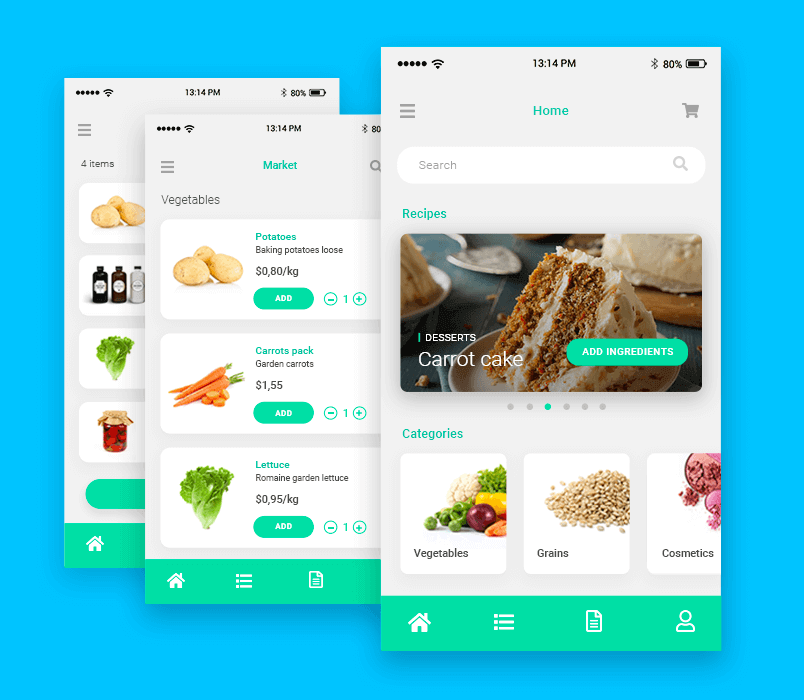
In our example above, we have recurring UI elements on all screens. At the bottom there is a navigation bar and at the top there’s the wifi, reception and battery icons.
In the Master’s palette, create a new Master. Add the recurring UI elements in a dyanmic panel placed within the Master. In the Properties tab, go to the Position field and choose “Pin to bottom”.
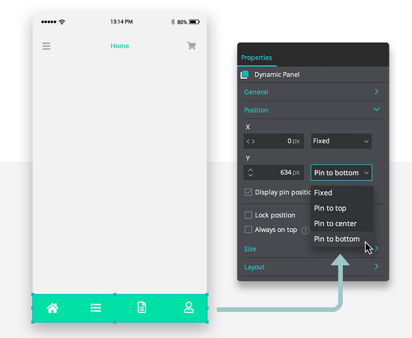
Now click back to your home screen. Drag and drop the Master from the palette onto all of your screens. By doing this, you don’t have to re-create and place widgets individually.
Step four: Create interactive content using a slideshow
In our home screen and our recipes screen, you’ll see slideshows. Users can swipe through the categories and recipes.
To create a slideshow, drag a dynamic panel onto the canvas. Add all the panels you want for each recipe. Here you’ll add each card into its own panel. Each panel must also include a hotspot to link to the screen you want.
For the cards to move in the slideshow, add an On Swipe Left and Set Active Panel event to each individual panel.
In the website wireframe tool, in the Dialog, select the subsequent panel in the Outline palette. Ensure that you select Slide left from the Transition Effect options to replicate the movement of the swipe.
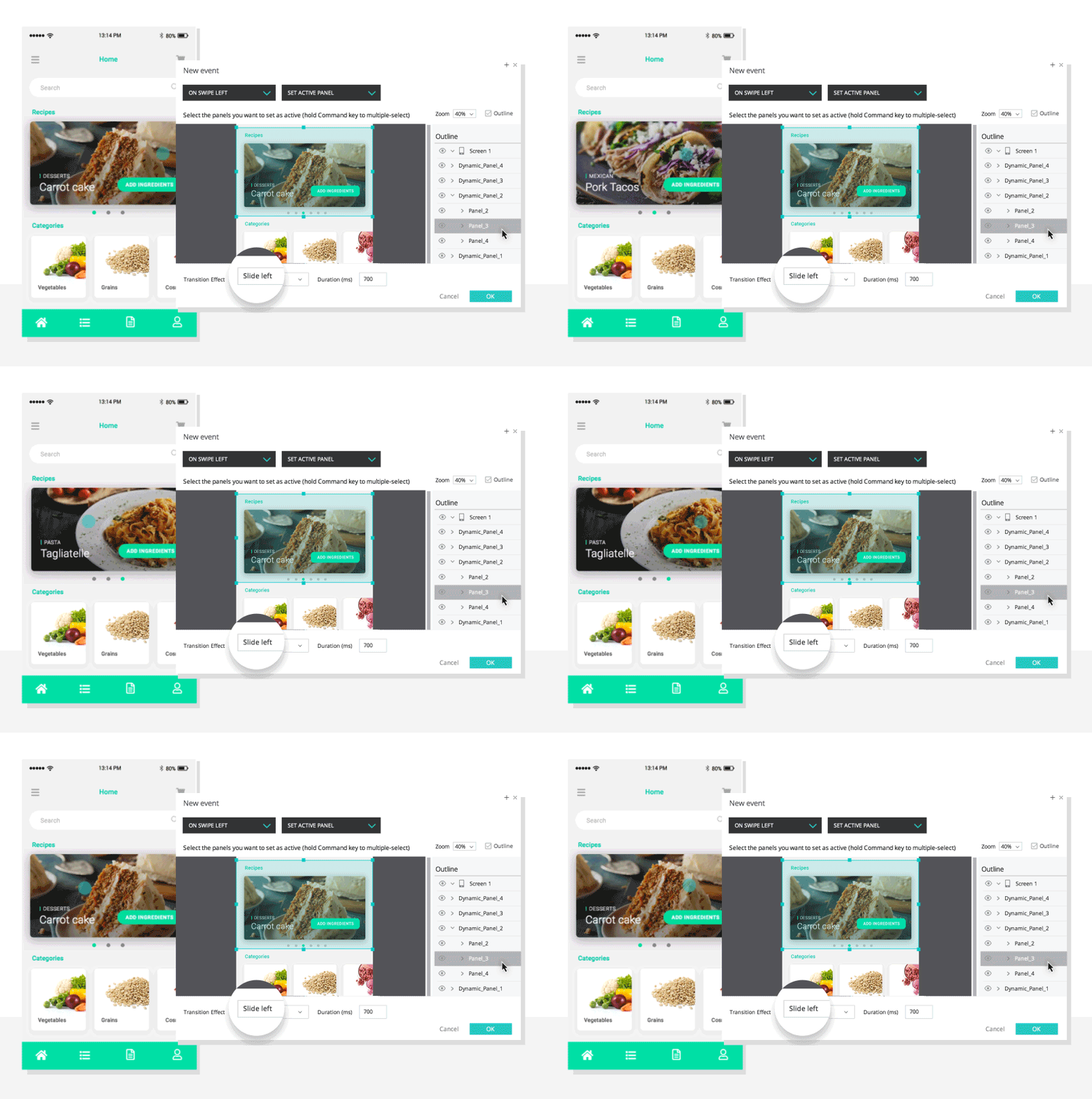
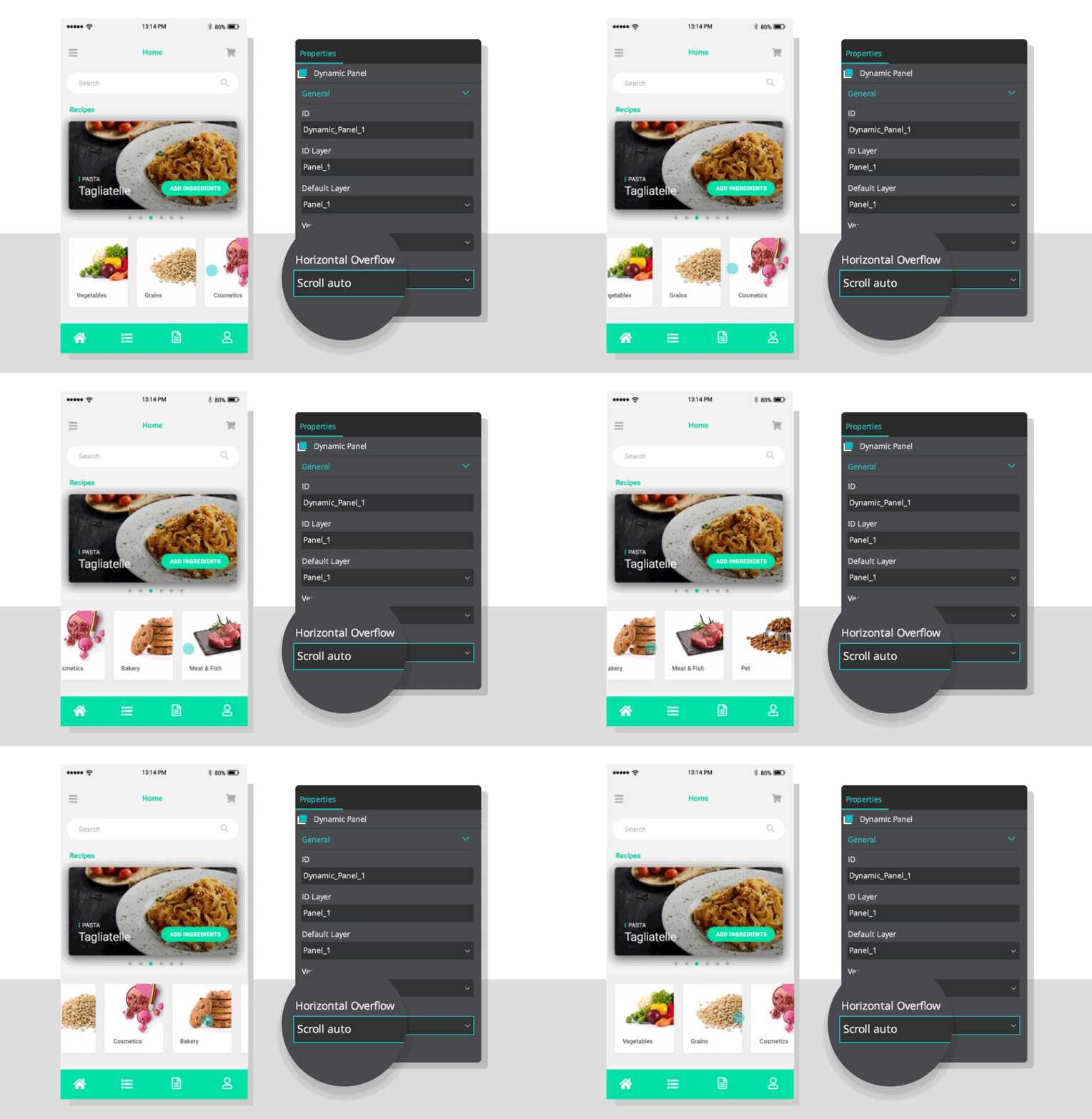
For the categories below, add one dynamic panel that is the width of the screen. Within this panel, create groups of content. Each group will need a hotspot above it to link to each category.
Select the dynamic panel. In the Properties palette, select Scroll auto for the Horizontal Overflow.
Step five: Use real data with a Data Grid and Data Masters
Take a look at screen one, you see vegetables as a category. Screen two shows you what happens when you click on that category. It shows you a list of vegetables.
You can achieve this effect using a Data Master and a Data Grid.
Think of the Data Master as an Excel document, or spreadsheet, that contains the data you want to display. The Data Grid allows you to simulate a database of any kind. Powerful stuff.
To create a Data Master, go to the Masters palette, click the ‘+’ icon. In the Dialog, you can fill out the fields and give it a name.
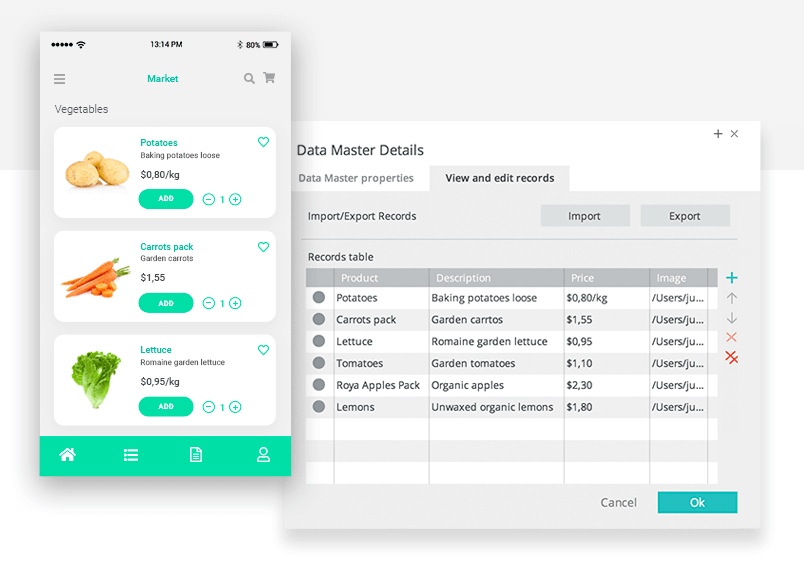
You could add your own .csv file or populate the Master right in Justinmind.
Once you’ve populated your Data Masters, slide the Data Grid onto your canvas. You can choose the columns and cells. Customize the Data Grid’s design to your own liking in the Properties tab.
Step six: Create a counter to add multiple ingredients
When you’re using a shopping app, you sometimes want more than one of the same item. As you can see on screens 2, 3 and 4 we’ve used a counter a number of times.
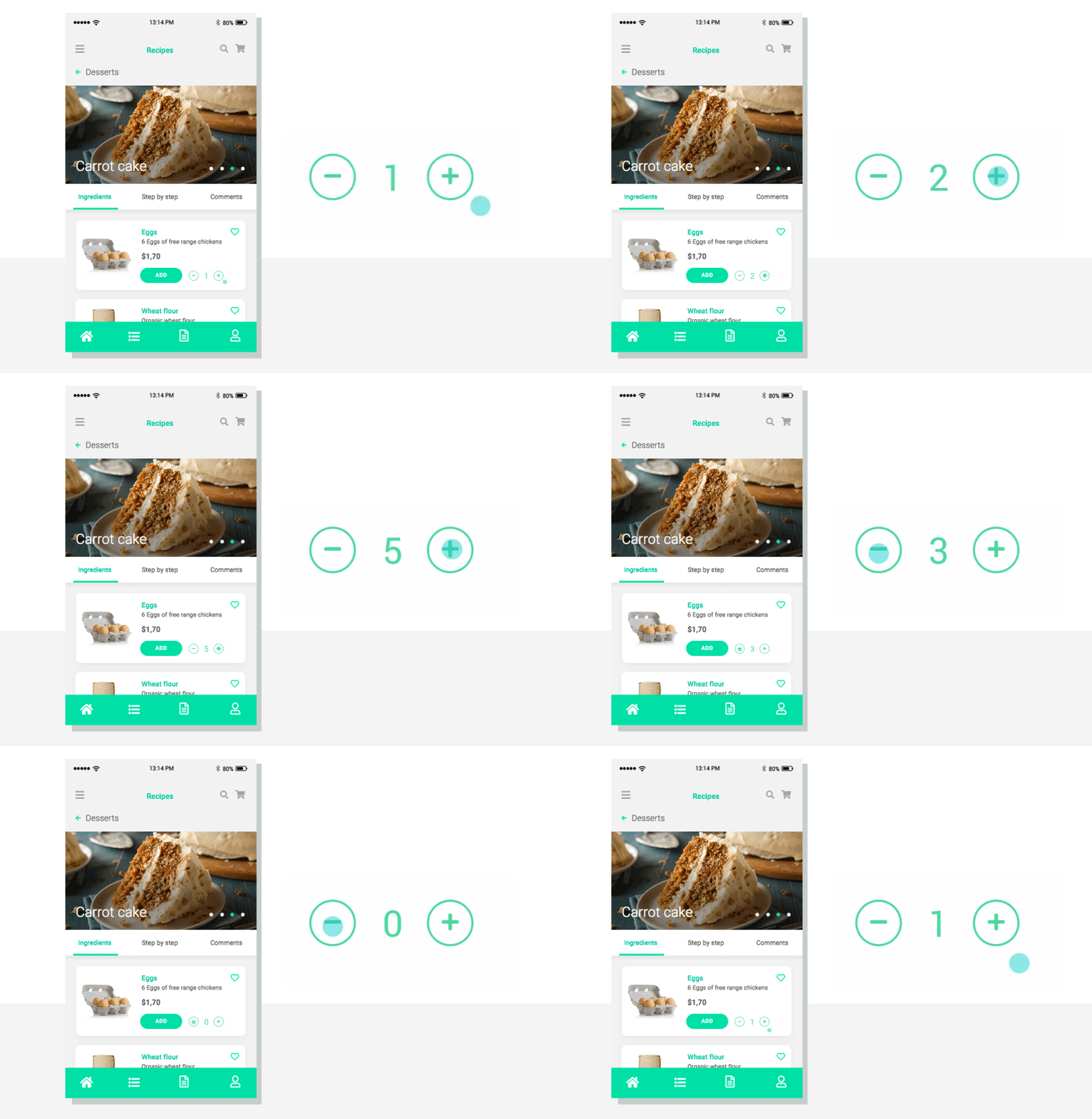
We can create this functionality in Justinmind’s app wireframe tool using Events, variables and expressions.
Make sure you have a plus icon and a minus icon and a text widget in the middle with the number 0 in the value field. Click on your plus icon. Add an Event > Set Value. In the Dialog, click the input. Set the value to calculated. Add expression. Here you drag your input, the plus function and then write the number 1 in the last expression field. Click OK. If you simulate your prototype and click your plus icon, the number should now go up.
Do the same as above on the minus button except use the minus expression. After that’s done, add a condition. The condition is important because we don’t want to buy -2 bananas. Impossible.
The condition should be input > 0. This will stop the counter from going below 0.
Step seven: Experiment with UI styles
Finished your UI but want to see how it would look with a different color scheme? What about changing a font from a serif to a sans serif?
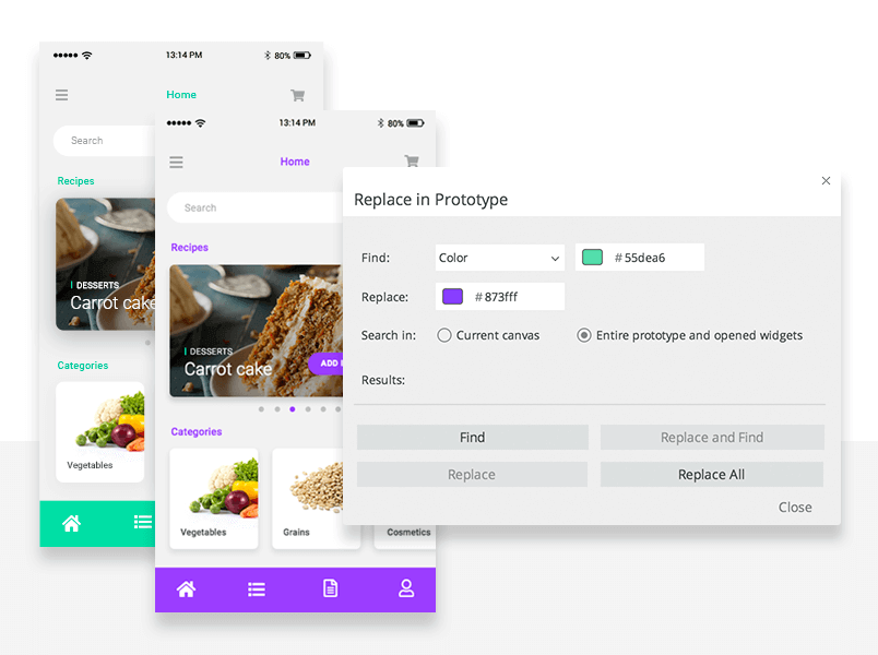
Now, don’t worry. If you want to do this, you don’t need to change every individual UI component. Oh, no. You’re in for a treat.
You can use Replace Styles to make big changes to your entire prototype. With Replace Styles, you can find all instances of a specific variable (i.e font color, font size, UI component color) and change it once, one-by-one or all in one go.
Look at that. We just shaved hours off your workflow. Check out our post on the other types of prototyping methodologies and discover different approaches.
How to design and build a grocery shopping app – the takeaway
Prototyping key functionality of your app is crucial to understanding its flow. Combine that with consistent iconography, real-life data simulation and useful tricks (oh hey Replace Styles!) and you’ve got yourself a powerful grocery shopping app that’s worthy of sharing.
Looking to create a website? Discover how to create a responsive website design in a few moments.
Related Content
 UX design portfolios are your chance to showcase your top skills and best work. Check out this post for awesome portfolio examples and websites!10 min Read
 Learn what paper prototypes are, how to make them and how they can help you design better products. Awesome examples and free templates inside!10 min Read
 In this comprehensive study, we dive deep into the world of web design tools, comparing features, pricing, ease of use, and more. Whether you're building a simple landing page or a complex e-commerce store, we've got you covered. Let's explore the best options and help you make an informed decision.30 min Read


