Free Web Wireframing UI kit: for fast, functional wireframing

Introducing Justinmind’s free Web Wireframing UI kit. Your dream wireframe tool just got even better – download the latest must-have wireframe kit now!
Plan and map out your site’s layout and user flows like never before, with Justinmind’s Web Wireframing UI kit. Wireframes are essential before moving on to the finer details, like imagery and interaction, and designing one has never been so practical.
Our Web Wireframing kit is an essential tool for anyone wanting to build a great website. With Justinmind’s readymade UI elements and drag and drop technology, you can create UI wireframes in a matter of minutes with our free wireframe tool.
So if you’re looking to improve your web design workflow and create better websites, this is the wireframe tool for you. Download the Web Wireframing kit now and read on to learn all about our newest must-have library, packed with awesome web icons, layouts and readymade templates to give your design a helping hand.
Justinmind’s Web Wireframing UI kit is made up of a collection of UI wireframe elements and layouts. All have been carefully crafted to bring you the highest quality resources for your web projects.
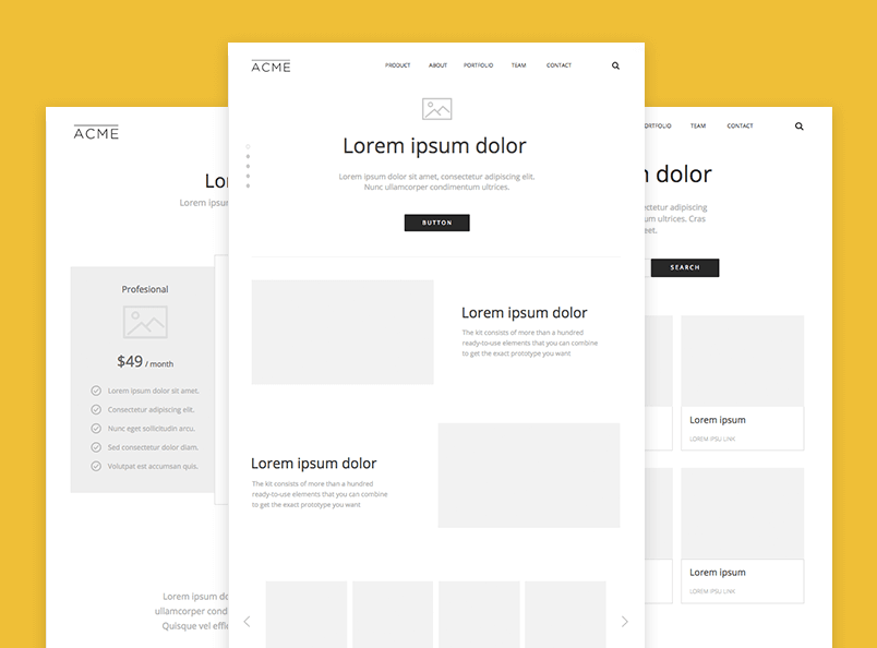
Our UI kit has been designed specifically to help you mockup your website’s screens and get all your ideas down in one place before fine-tuning them. Create static or click-through wireframes, whatever you need to test out your site’s screen and navigation design. And with our Simulation feature, you can see a 360° view of your wireframe at any stage of the project.
Let’s take a look at what’s inside the kit!
Our Web Wireframing UI kit includes 200+ wireframe elements and icons, plus layouts, templates and complete examples.
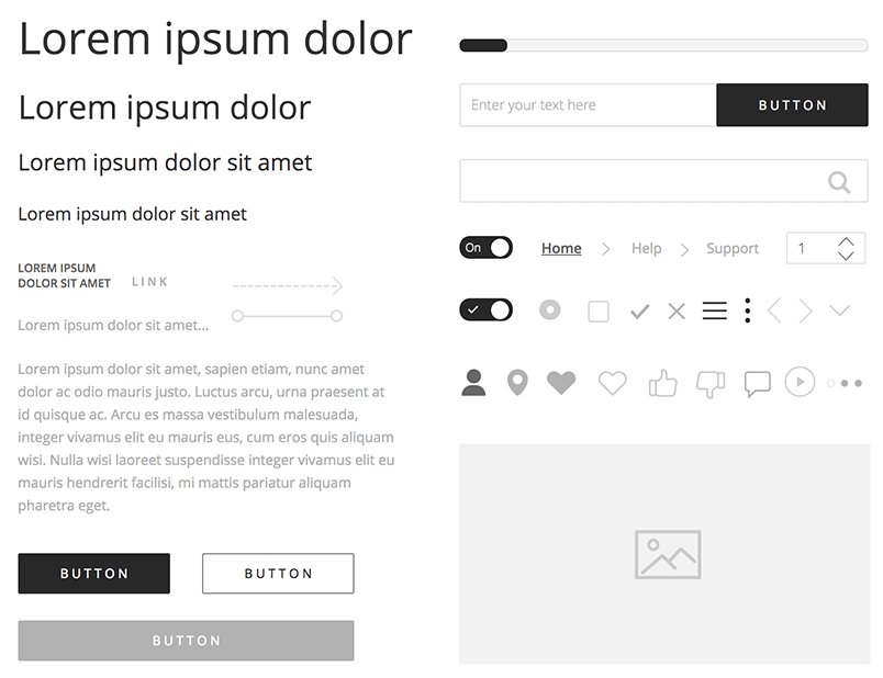
As with all our UI kits, the Web Wireframing UI kit is divided into categories so that you can find everything you need easily. Here’s a list of the kit’s categories and what they include:
- Basics: the most common widgets available in the wireframe kit. This category includes buttons, input fields, text and paragraph boxes, rectangles and image widgets
- Components: advanced labels and buttons, such as dark and light buttons, search fields, social networking buttons, pagination and slider widgets and list buttons. Use these to add more detail to your web wireframes
- Icons: special icons and symbols such as hamburger menus, social networking icons, play buttons, location pins and heart icons
- Shapes: readymade shapes, such as ellipses, simple arrows and rectangles
- Headers: web headers ranging from simple display headers to larger headers with search options
- Footers: small, medium and large web footers
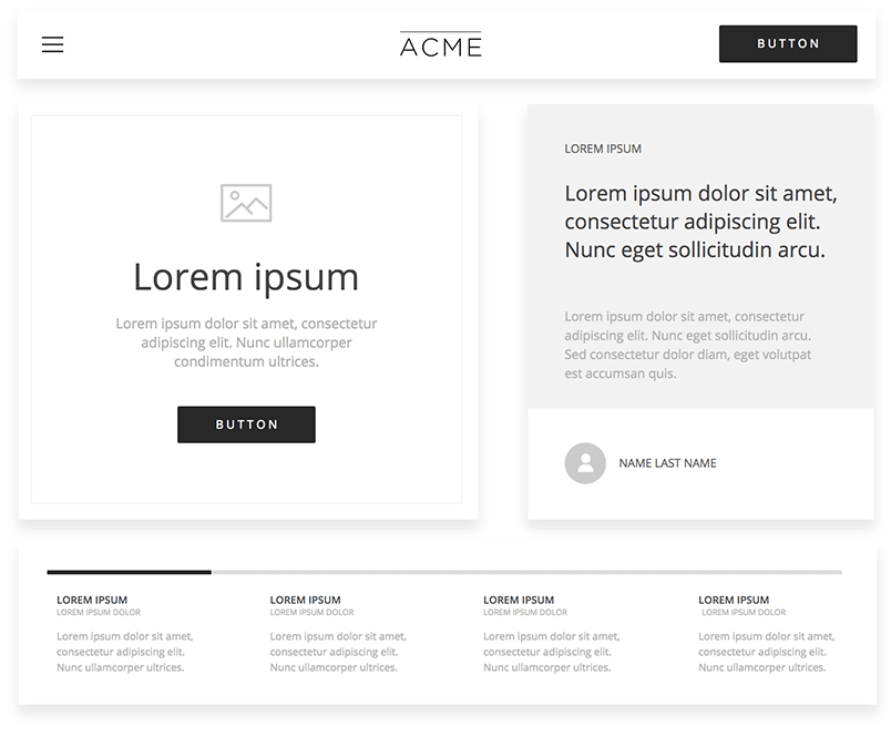
- Cards & Feature items: cards and blocks for displaying features
- Sliders & Promo items: sliders, carousels and promotional display content blocks
- Contents: a selection of content blocks
- Contact & Forms: contact cards, sign up and in forms, registration forms and payment forms
- Portfolio: grids and carousels for displaying portfolios
- Pricing tables: a range of options for displaying prices
- Teams: a range of about us and meet the team content blocks
- Testimonials: reviews and testimonials page templates
- Data lists & Grid tables: range of data displays
- Blog items: blog page templates and themes
- Screens: a selection of Homepage layouts
With this UI kit, the design possibilities are endless. Design the complete UI layout of your wireframes and define your site’s information architecture early on in the design process.
With over 200 components to choose from, you can mix and match different icons, layouts and readymade screens to convey your ideas with force and clarity. Customize them to fit your design requirements, adjusting size, fills, gradients, line styles and text formatting.
Then, be sure to carry out some user testing of your wireframe directly in Justinmind to validate basic functionality and UI patterns, and target the right users.
Follow these 4 steps to get started with Justinmind’s Web Wireframing UI kit:
1. Download the Justinmind wireframe tool
2. Open Justinmind and start a new web prototype
3. To the left of the canvas you’ll find a Widgets panel
4. Start dragging and dropping widgets from the Web category!
And away you go! Now it’s time to start getting creative with your wireframes. Remember, with our wireframe UI kit, you can wireframe any type of website you can think up!
However, if you need a little inspiration, we’ve got you covered. Read on to see how we made our own web wireframe with the Web Wireframing kit. In our example, we’ve created a file sharing website, similar to Dropbox or WeTransfer, with four screens (Homepage, Features, Pricing and Checkout).
First things first, let’s create the overall layout for our web wireframe.
In a new web prototype, go to the Screens palette in Justinmind’s editor. Notice that one screen has been created for you by default. Click the ‘+’ icon and create three additional screens. Name your screens as follows:
- Homepage
- Features
- Pricing
- Checkout
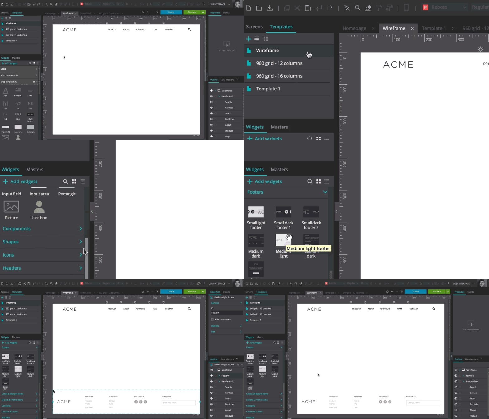
Next, let’s create a template with all the content that will appear on every screen of the site. To do so, go to the Template palette. Drag a header from the Headers category in the Web wireframe widget library and place it on the canvas inside Template 1. We’ve used “Header dark”.
Your Homepage also needs a footer. There’s a great range of footers to choose from within the Web wireframe kit. If you’re after a minimalist footer design, we recommend the “Small light/dark footer”. If you prefer something with a little more boom, maybe go for the medium or large options. We’ve used “Footer 6”. Drag your chosen footer to the canvas to add it to your template.
Your header and footer will appear in all of your wireframe’s screens.
Now it’s time to design your website’s Homepage.
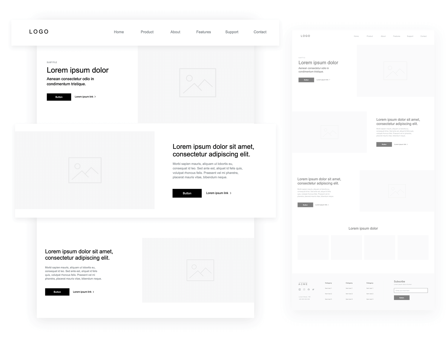
From the Screens palette, go to the Homepage. Notice that the header and footer we created for our wireframe also appear in this screen.
To reproduce our Homepage, drag a content block to the center of the canvas. This will be where the body of the Homepage goes.
To create the body of the screen, you could use individual Rectangle, Text and Image widgets. Alternatively, you can choose from the selection of readymade screens in the Web wireframe widget library. In our example, we’ve used a combination of “Promo 1” blocks.
If you’d like to preview your site’s features, consider using a slider or carousel. These allow multiple pieces of content to occupy a single region on your Homepage. If designed appropriately, they can be a great navigation resource and help you inform users. We’ve used “Portfolio 3”. We’ve also added a subscription bar (“Subscribe form 1”).
Now go to the Features page (from the Screens palette).
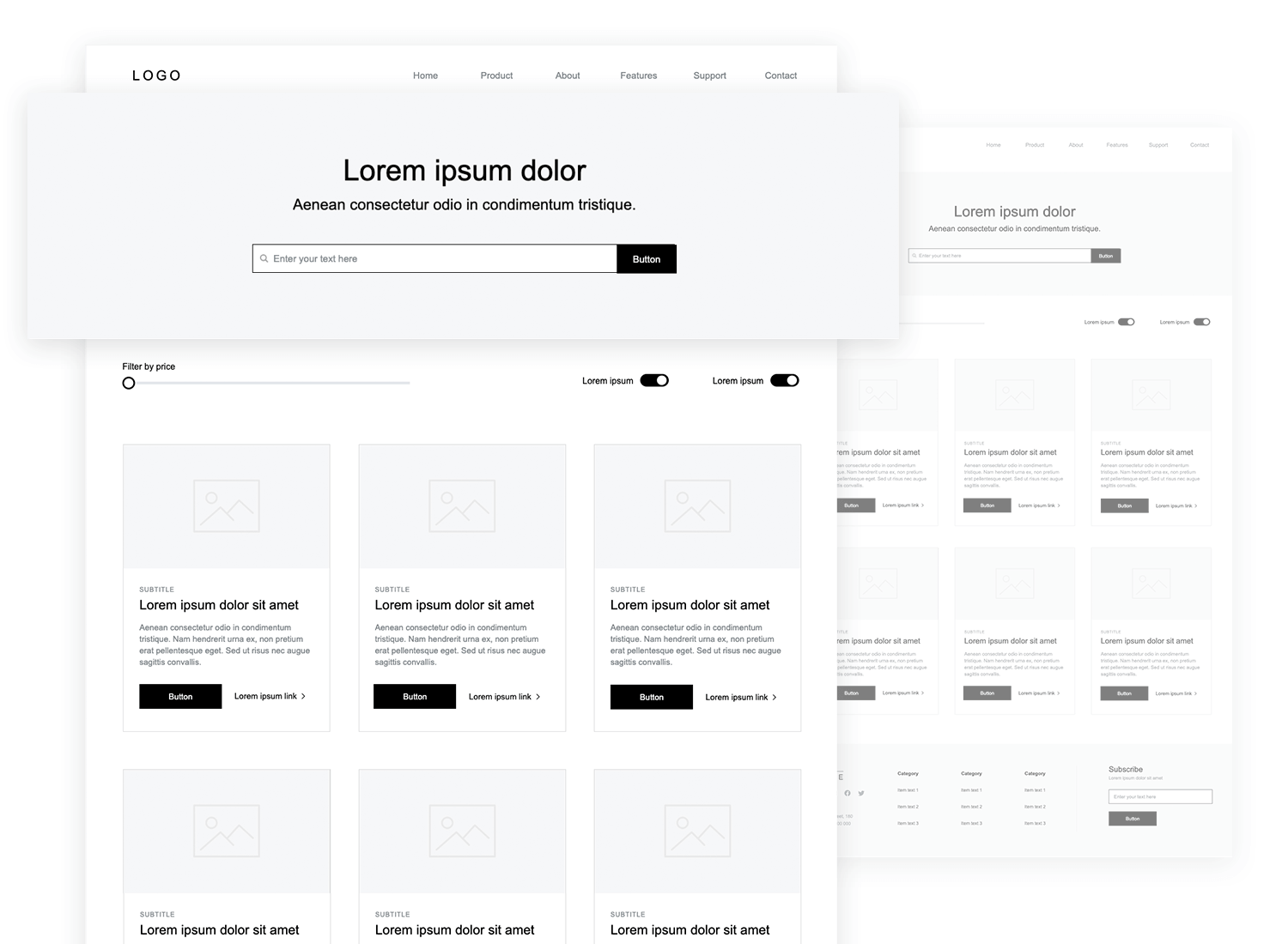
First, let’s create a search bar so that users can search for features and other useful information on our site. Drag the “Promo 5” to the canvas and place it below the header. If you’d like to add filter options so that users can refine their search, say by size, color, price or rating, you might want to add a Slider from the Components section of the library.
Then, choose a content block to display your product features. To match our example choose “Portfolio 4”, combined with “Pagination” so that more content can be added to the screen. Below that we’ve included a “Content 6” block for additional features.
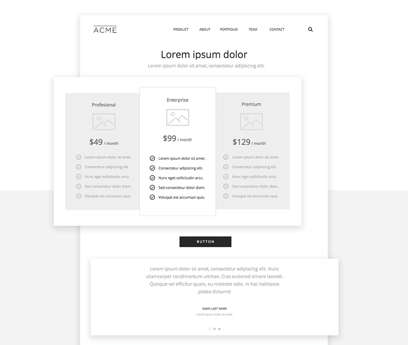
To add pricing information to your site, go to the Pricing screen (again from the Screens palette).
We’ve used the “Price table 2” screen in our example, and added a CTA button at the bottom. Having a large CTA button directly underneath your pricing options keeps things clean and reduced the need to duplicate buttons.
Below this, we’ve included a testimonial. Testimonials and customer reviews are an important part of the purchase journey and are often used in pricing pages to give potential users an insight into client satisfaction.
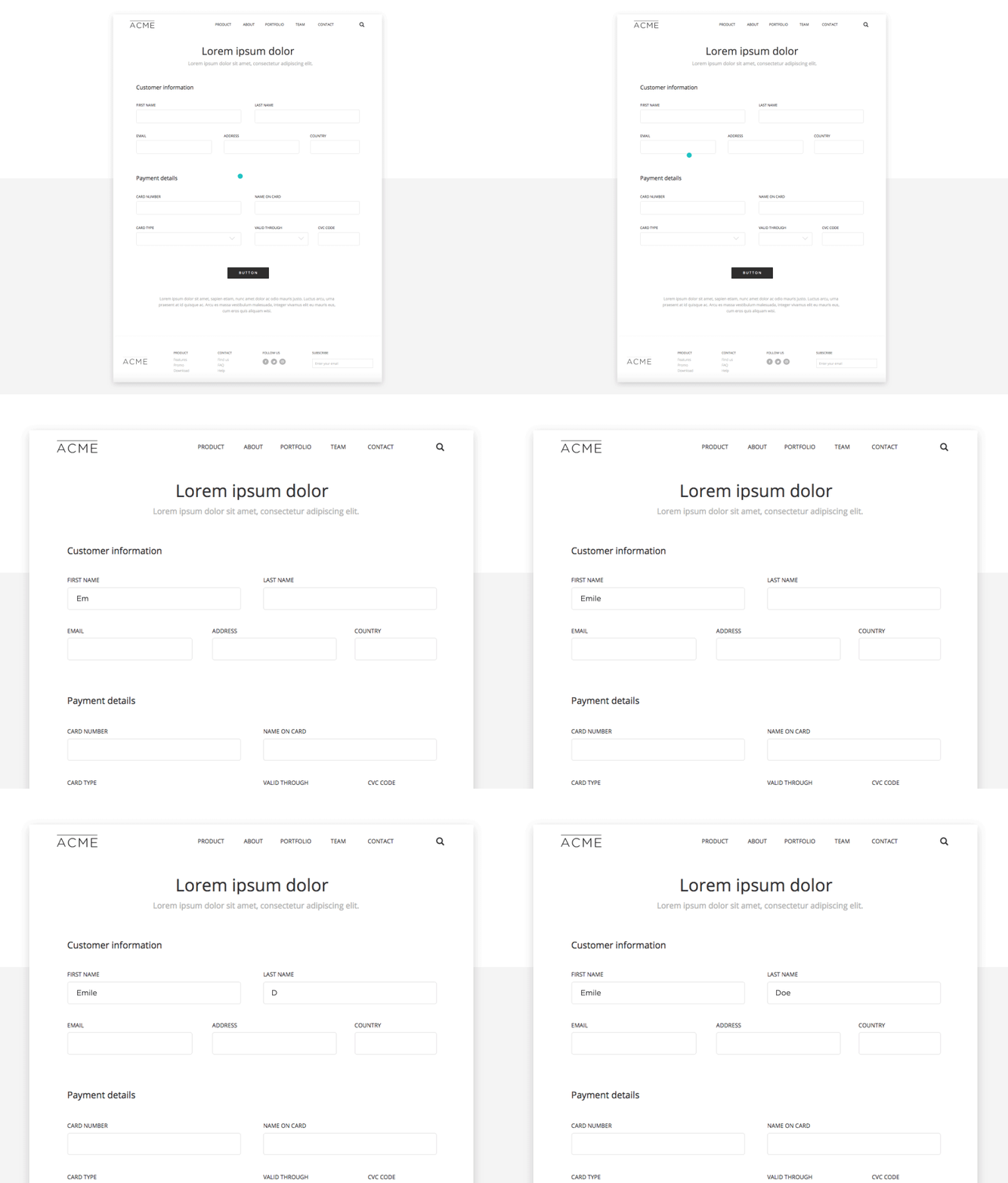
Important! Your site’s checkout experience can make or break the overall user experience and can either offer a helping hand or be a barrier to conversion. As Kissmetrics reminds us, the checkout experience should make the user journey frictionless and as easy as possible.
Lucky for you, the Web Wireframing UI kit has two pre-built payment screens to help you create a great checkout experience. We’ve used the first “Payment form 1” in our web wireframe example.
Tip: if you want to make your checkout experience interactive so that users can test it, try adding a Data Master to your wireframe’s screen. You can even import real data to make the experience as realistic as possible.
Once you’ve completed your payment screen, you’ll have built out the complete user flow for your file sharing site. Click “Simulate” in the top right-hand corner of the Justinmind editor to take a look at your finished wireframe. Hello, gorgeous!
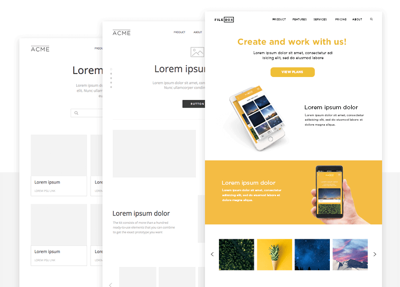
Remember, all the widgets you find in this wireframe kit are vector-based and 100% customizable – so you’re always in control of your designs. To customize a widget, simply drag it to Justinmind’s canvas and go to the Properties palette.
You can adjust its size, color, position on the canvas, text, padding, margins and border, and shadow.
If you want to modify a readymade screen or a content block made up of multiple widgets, select it on the canvas and go to the Outline palette. From here you can select individual UI elements to customize.
And don’t forget to combine widgets from different Justinmind widget libraries! You can always add additional widget libraries (e.g. Android, iOS and Bootstrap) to your prototyping workspace and make the most of all Justinmind’s UI assets.
There’s been some back and forth about the importance of designing wireframes. Although the web wireframe (stripped-back and skeletal) is less complete than its high-fidelity wireframe counterpart, it does play an essential role in the design process.
Using a wireframing kit when designing a UI wireframe will speed up your process, allowing you to focus on producing great ideas instead of worrying about the details.
With Justinmind’s Web Wireframing UI kit, you can:
- Wireframe faster
- Customize everything
- Make your design interactive!
And once everyone is on the same page, you can start building up your web wireframes and turn those basic screens into working prototypes.
Wireframing is the first step in the design process, before you move on to creating a high-fidelity wireframe. Wireframing should be used to define your product, when the biggest changes to conceptualization are being made.
- Information architecture (mandatory). This includes information related to the aesthetics of each screen’s UI elements for your site or app
- The content and copy of each screen (optional). If you choose not to include content, you can use lorem ipsum text as a placeholder. (We have some great lorem ipsum alternatives if you’re feeling adventurous)
- Links (optional). We think that it’s often useful to define the navigation flow between the main screens of your wire in order to build out the most effective ways for users to move between them – and to give you and your team a map of your site to work off on in definition meetings
- The final graphic design. It’s unnecessary to include this in the definition phase as the goal of wireframing isn’t to validate your product with user personas or communicate with the development team
- Interaction design will be necessary when you perform advanced user testing, but not at this stage in the design process
Wireframing is an essential UX design practice, helping you convey the most important aspects of your design to your team, users and stakeholders. Get your wireframing process up to scratch and there’s no website style you can’t master. Having a free wireframing tool to do the heavy lifting is just the icing on the cake.
So download our Web Wireframing UI kit and start your web project off right with the best wireframe tool