Charts UI kit: data design made easy
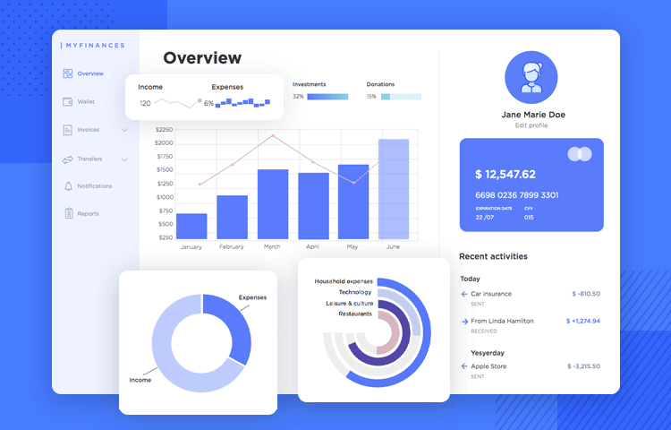
Design impactful dashboard UI designs and data visualizations with Justinmind’s free Charts UI kit! Learn how in this post
Your users are visual beings. Our charts UI kit lets you visually encode your website or app’s back-end data into a story that’s both visually appealing and more memorable than a long trough of mindless numbers. They’ll give your user something that the user can act on.
Whether it’s a fitness app, a fintech banking apps, or a personal budgeting website, great dashboard design will give your users the power to assimilate complex data at a glance and give them something they can act on.
To learn how you can design outstanding dashboard UIs using the Justinmind Charts UI kit and for tips on how to do it, you’re in excellent hands!
The Justinmind Charts UI kit is a collection of graphical elements and components that you can implement into your dashboard UI prototype quickly and easily. You can then add interaction and functionality to your charts and graphs as you design your prototype.
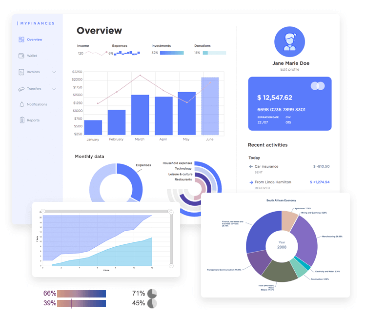
The beauty of the Charts UI kit is that you can also combine it with other UI kits that you’ll find either pre-installed in the prototyping tool or free to download from our UI kits page.
We recommend using these charts as an alternative to displaying lengthy lists, tables or numbers. Why not design a UI that puts all this data into perspective for the user so they can digest it more quickly? Read on to learn more about what’s inside our Charts UI kit to help your users assimilate your data more easily.
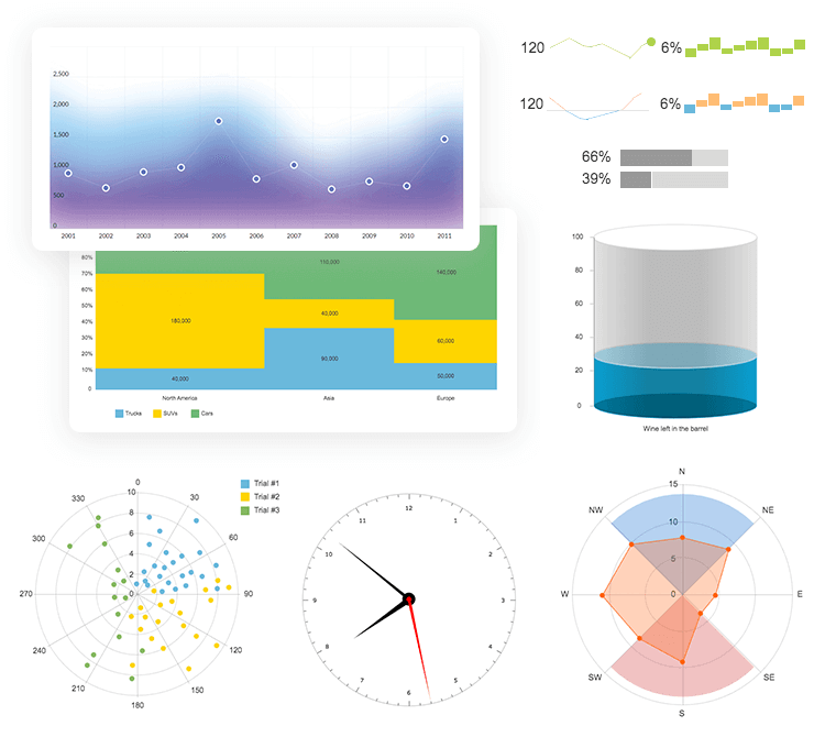
You’ve got bar charts, histograms invented by Karl Pearson, even candlestick charts that you can often see in financial market trend graphs. You’ll also find the common donut and pie charts for representing metrics like daily expenses to step counts in fitness apps.
In this category you’ll find the most versatile chart in the data world that you can work with – the column chart. This legendary chart that everyone has heard of can help us show changes over time, compare different categories, rank various items and more.
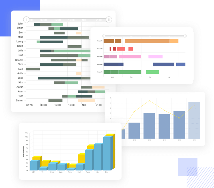
The charts you’ll find in this category are useful for displaying data to financial stocks, health stats, frequent venue times, performance statistics and much more. Design -wise you’ll find simple 2D column charts to 3D rectangular and cylindrical. You’ll also find layered columns to show alterations like GDP growth, to stacked columns to show consolidated revenue and budgets.
In this section you also have Gantt charts at your disposal. These are handy for project/product management apps as you can use them to show project schedules and even election results or vote counts.
Part two of this category includes your typical horizontal bar charts – but with astounding variety! You’ll discover everything from 2D to 3D bar charts, stacked and clustered bars, floating bars and many more!
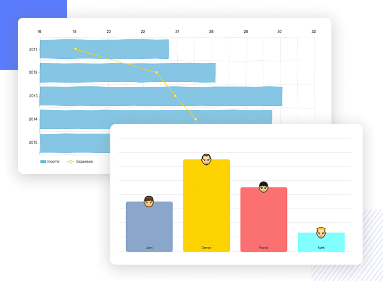
Horizontal charts are a fabulous way to show data with long labels. This is because the y-axis, instead of the x-axis, normally displays the data ranges for categories, making it great for saving vertical screen real estate.
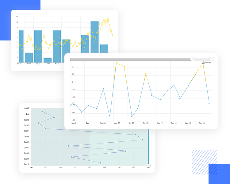
Line charts are typically used to display time-related data and in this category, you’ll find every variety you need. The category comes complete with simple line-based graphs to charts with scroll and zoom effects, colored lines for increases and decreases – even bulleted line charts mixed with columns – now that’s some fancy data visualization!
The charts in this category are useful if in your website or app you wish to show data relating to stock prices, evolving timelines and health stats. It’s also handy for showing budget increases and decreases over a period of time.
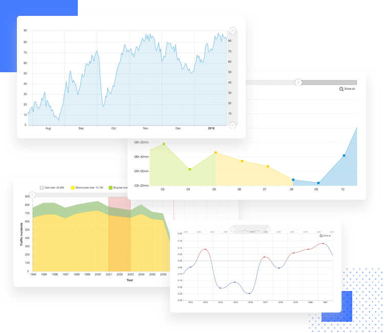
This category is a continuation of the first but with even more varieties. Here you can expect to find stepped line charts, stepped lines without risers (simply a series of horizontal lines in a chart), vertical lines, mixed-value lines and much more!
Putting together a screen showing part-to-whole or displaying data in fractions or percentages is literally a piece of pie with this category. Here you’ll find the typical pie and donut charts, both flat and in 3D. You’ll also find pie charts with broken down slices that offer even greater visual assimilation, along with a world map that has continents displaying pie charts.
But that’s not all. In case you’re after something a little less common, you’ll also be able to make use of funnel charts in this category. You’ll find a pyramid chart, flat and 3D funnel chart!
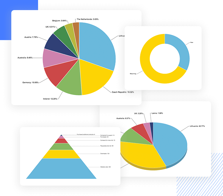
The charts you’ll find in this category have a wide range of uses, from presenting budgets and expenditure, to survey statistics.
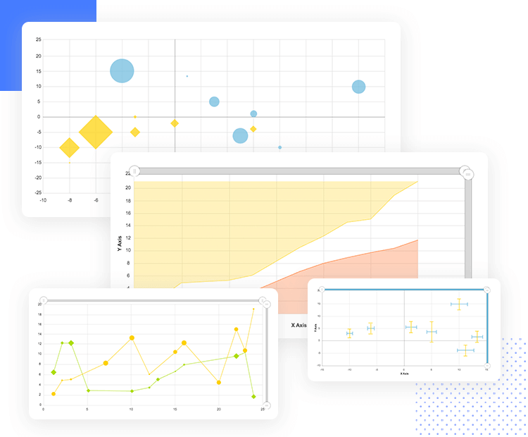
Here you’ll find zoomable bubble charts with x-y axes, error charts, scatter charts, bubble charts with date-based axes and even an x-y chart with value-based line graphs.
The charts available to you in this category, such as the bubble charts are perfect for presenting data such as income and life expectancy across different countries, but also for things like team allocations, popular visiting hours and similar projects.
In this category you can find a Mekko chart. These types of charts let you show the weighted importance of each bar category by increasing or decreasing its width. Imagine you need to compare the sale of SUVs in the United States and Asia. In the US, the bar would be wider regarding the percentage of SUV ownership, and with Asia, it would be thinner.
Additionally, you’ll find other interesting charts in this category, such as line charts with special SVG filters and background gradients, along with interactive CSS charts.
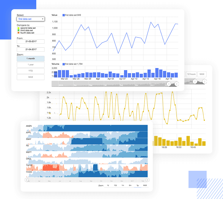
In the stock category, you can find charts that come with button components letting you select from multiple data sets, such as charts for stock indices and events, intra-day data and much more. You’ll even find an interactive chart that lets you sketch a trend line with a pencil and an eraser, for fast prototyping!
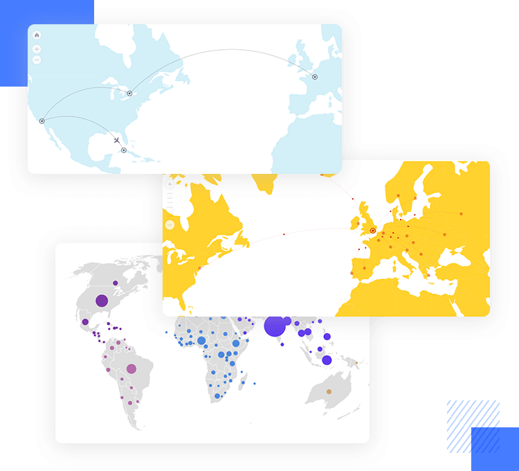
This is where you’ll find your world maps for prototyping dashboards that let the user compare data across different continents. Among the charts in this category are a map with curved lines showing travel or transport routes, a map with patterns distinguishing contents, a population bubble map and even a map with dynamic pie charts!
But did you have to prototype a weather app? No worries – the maps category has you covered for that too!
Get started designing your graphical and dashboard apps interfaces in a few simple steps. The first thing you have to do is download our prototyping tool! Then just follow the simple procedure below:
- Download the Charts UI kit from our UI kits page
- Open Justinmind on your desktop
- Navigate to widgets on the menu bar
- Select “Add/remove libraries”
- Under “Default libraries”, scroll down till you see the Charts UI kit
- Click “Add to widgets”
- Have fun designing your dashboard screens!
With the Justinmind charts UI kit you can quickly and easily prototype a dashboard website UI that demonstrates functionality, as well as usability and visibility. Below, we’ve put together a quick example to show how easy it is to get started.
In our example, we’ve designed a prototype for a personal finances dashboard. The idea behind it is that the user can quickly understand what’s going on with their finances by glancing at a few simple stats – all on one screen. To kick off our dashboard, we’re expanding on the overview screen, where our user can see their monthly financial data, such as income and expenditure, types of expenditure, along with bank statements, credit card details and overall balance.
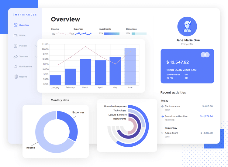
For this, we used a column and line graph taken from the Column and Line category. Along the x-axis, we’ve labeled the months, and along the y-axis, financial quantities. The line part represents income and the columns show the varying expenditure per month. If a fixed income leads to a straight line that’s fine too; it can still be helpful to the user to see if they’re bringing in more or less than they’re spending.
For a simplified demonstration of expenses vs. income, we’ve also added in a donut chart. The user can quickly glance at this to see how well they’re behaving financially, without getting bogged down in the numbers. Next, we’ve created a solid gauge, which is a type of circular bar chart, taken from the Gauges category. This is another nice, at-a-glance view chart of what the user is spending most on, without getting into specifics.
For the last part, it’s a simple case of dragging and dropping an avatar for your user’s image over to the canvas, a circular rectangle for the credit card design, arrow icons and numbers for the bank statement and already, we’ve got a personal finances dashboard UI ready to test out!
If you’re prototyping a screen with a dashboard that will display data in charts, apart from carrying out the typical user research, you must ensure your charts display accurate information, are useful to the user and can scale to various device sizes.
As you get started, you want to consider the following points:
It might seem tempting to squeeze as many fancy charts into a UI as possible. It makes sense – dashboards are supposed to display a wealth of information at a glance. However, you don’t want something that looks like the cockpit of a Boeing 747 (unless you’re designing an aviation simulator, of course!). Make sure you use only the charts you need, it will make your data more memorable and won’t overwhelm your user.
You need to decide what data is useful for the user and then the order that you present it in. Perhaps you have a lot of data you could present to them, but only a third of it will be useful on a daily basis.
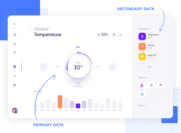
As an example, let’s say you need to design a dashboard UI that displays statistics about the weather. Perhaps most your users want to see temperature data first, followed by rainfall prediction and relative humidity.
On the other hand, they may check other stats like UV intensity and rainfall predicted rainfall quantities, but less frequently. Charts representing these data sets should be smaller, further down the UI, or perhaps eliminated completely.
Once you’ve worked out which data is more important to your users, you need to decide the best way to present it. Remember – charts turn data into a story, and you can tell stories in different ways.
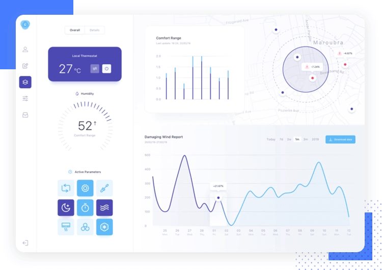
Decide what you want the data to say to the user. Perhaps you want to show how likely it is the temperature will increase or decrease. Showing a bar chart of your historical temperature data won’t be as effective at showing upwards or downwards trends as a line graph would be. The latter shows greater detail about how the temperature is trending. Plus, users are more likely to expect a line graph to depict trends.
You need not have exact data to hand to see if the visual design concept behind a dashboard works. Using the Justinmind Charts UI kit is a quick and easy way to get started designing visually engaging dashboard UIs and seeing if it will be workable to present your data in your chosen way to your users.
Why not download the Charts UI kit for free today and see what you can design!