Wireframes, prototypes & intuitive UI: Q&A with Mindtree’s Alex Hogan

Mindtree UX Consultant Alex Hogan walks us through his KPI-driven UX strategy, intuitive interfaces and how he uses wireframing to boost user experience.
This week, Justinmind was lucky enough to catch up with Alex Hogan from global IT enterprise Mindtree. In his role as Principle Consultant in Digital Business and UX Practice, Alex anchors the UX practice for North America and deals primarily with the 1B clients – those that have an annual revenue of a billion or greater.
And if his work with the likes of Pizza Hut, Calvin Klein and 7-Eleven weren’t impressive enough, he comes from a background of designing large scale instructional systems for the US Department of Defense.
When he’s not evangelizing for good UX with mega-clients, Alex is proselytizing about the ‘natural user interface’ (NUI), his vision for a better overall user experience.
We spoke to him about the NUI, how to UX overhaul a website, and where interactive prototyping fits into the perfect UX workflow.
What does an average day look like for a professional UX Architect/Evangelist like you?
In the morning I get on the phone and coordinate client activities, discuss projects and initiatives, tracking all the way back to getting historical data and analytics to understand why they’re positioning various initiatives. I determine whether particular initiatives are on track and how they could be refined, at the same time determining how they tie into KPIs.
I always look for ways to tie things back to KPIs, because if UX doesn’t impact business positively, then it’s nebulous and can’t be justified as a success; I’ve got to come up with a strategy to get clients to success and justify that strategy.
That’s why metrics are key for me. Actionable data allows you to impact the numbers in the way you want. That’s being proactive rather than reactive, and that’s the best place to be from a UX/CX standpoint. A lot of industry leaders still think of user experience as “the guys who make things pretty”, but it’s so much more than that.
It’s about crafting the best experience possible, and then letting that drive your business, or even drive the industry.
The best example I can give right now is Uber – it changed an entire industry. It hit all the pain points, and even though you were paying 10% more in some cases, all the pain was eliminated. And now we’re looking at that frictionless transaction in everything.
Understanding the users’ workflow is my first mantra, because if you understand that you’re never going to go wrong.
Can you tell us a little more about your work at Mindtree?
I do user end-to-end experience, and as a UX consultant I run the gamut from the research phase, all the way through testing and then into continued support for additional testing. We focus a lot on commerce, because that’s where clients can see the most impact.
You’d be surprised how many ecommerce or retail clients in this day and age don’t understand the measured path when they upgrade their site; inevitably what they do is put in speedbumps for their own conversions, unwittingly. They have a middle-of-road type of view, where they definitely don’t look big-picture enough.
Were they to back up and see the entire path they would see these stumbling blocks to conversions – instead they start seeing conversion drop-offs and they don’t understand why.
For example, a client may think that they’re appealing to 21-39 year olds, when actually they’ve got 50-somethings shopping on their site, who don’t feel comfortable converting online; you can eliminate that by putting a telephone number for a live contact right there at the checkout point, allowing them to finish their conversion over the phone. And they do. To the point that clients recoup double digit abandonment numbers over something that simple.
Can you give us a peek into your working process when, for example, doing a UX overhaul of a website for a client?
I try to get as much information upfront as possible. I’ll do research on the industry the client is in, their presence in the market, what their initiative is and what the industry says about that initiative, any metrics they may have, best practices surrounding their initiative, and what type of alignment they have for the initiative.
At this point I’ll have a good understanding of what they want to do and if there’s anything that I can bring to the table to either enhance, redirect, or suggest an alternative based on what I’ve uncovered so far.
Once I’ve gotten an understanding of everything I create an agenda that breaks the effort into a series of workshops that are from 60 – 90 minutes in length. Based on the project the workshops are catered to fit into the natural development flow. I’m a big one for saying that if you match the natural workflow of the user then you’ll always be right. That also goes for the project team.
The members of each workshop are the core team (Technical Architect, BA, Product Owner, etc…) and the applicable stakeholders, who are the decision makers for the topic overed in the workshop. During the workshops a projection screen is used at all times. This allows me to focus everyone’s attention and eliminate any sidebar conversations.
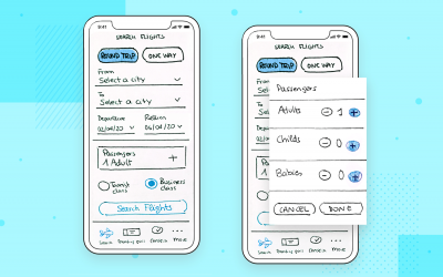
It also allows me to work in real time with the stakeholders. Wireframes, visualizations, and prototypes are all created in real time. It allows the stakeholders to see the impact of their decisions and where necessary change that decision for the success of the project. It also eliminates any alignment issues and turns stakeholders into champions throughout the organization for what we’re working on.
The workshops usually last 4 or 5 days, and upon completion the final high fidelity interactive visualization is tested with a sampling of users. Any modifications are made prior to laying down a single line of code.
Can you explain where prototyping and wireframing fit into the process?
To me, wireframes – and lot of people disagree with me here – are purely a means for collaboration, not a deliverable. They’re a way to get everybody talking and collaborating on what I’m showing on the screen in real-time. All my wireframing is done in real-time in front of clients.
That does two things. One, it allows them to see the impact of their decisions; if we’re designing interaction paths, they see what’s happening live in front of them. The second thing that realtime wireframing does is keep stakeholders focused on the task in hand.
At the end of the session everyone’s in alignment – no longer do we have primary leadership from the board, but rather everyone is individually championing the solution throughout the organization.
So after a week they’ve got a high fidelity prototype. And then we take it and do user testing against a sampling of their users. Anything we see as a trend we address as an entire team. We redo the prototype and retest again on a small sample round that reworked feature, and only then do we go to code.
The difference is that traditionally the UX process can take anywhere from 6-16 weeks in waterfall engagement, but wireframing in realtime this way takes two weeks – one week with stakeholders, the second week testing and modifications, then delivery.
You’ve championed the NUI, or Natural User Interface. Can you explain the concept and why it’s important?
NUI is something that I’m passionate about and so should everyone else be. It’s the logical evolution of what we create. Soon we’ll look at devices and apps that used a GUI in the same light as green screen monitors and command line applications. Gestures and voice commands are approaching rapidly and if you’re not looking at NUI now, you’ll be trying to play catch up before you know it.
Natural intuitive interfaces match the user’s natural workflow and are predictive when necessary, personalized at all times, and automate tasks that some still design for manual interactions – this is what tomorrow brings. Not next month or next year, but tomorrow.
Is it realistic to talk about creating truly intuitive interfaces? How can you plan for cultural, cognitive or emotional factors from user to user?
Yes, it’s realistic. I think it’s a natural evolutionary step. When the internet first came out we used Chicago style guide to design sites, and that was meant for print. We found that wasn’t going to work, we were dealing with a different environment. Computers went from command line to the graphical user interface (GUI).
But GUIs still have a learning curve, and on newer devices they are intrusive and clumsy. Natural user interfaces aren’t. Everyone has seen two year olds interacting with, and understanding, a natural interface. Granted, not every app uses a fully fledged NUI, but all mobile apps use some kind of gesture, and that’s the NUI – using gestures as opposed to buttons, and understanding that you can use different gestures to do different things.
No longer do we look at how we can interject GUIs, we’ve got to interject a lexicon, a voice lexicon, swiping and gestures. That’s more of the natural world than a GUI can ever begin to be.
What challenges does the UX industry face right now?
The biggest challenge the UX industry faces right now is the impression that a lot of companies and individuals have of UX. To some we’re still the people that “make things pretty” or “create the wireframes”. There’s so much more involved.
A good UX individual is someone that’s an expert at becoming an expert. We need to understand the business, understand what their goals are, and understand how to create opportunities so the business can attain those goals.
If a business comes to you and states that they’d like to increase their digital business by 10% over the next physical year, then you’d better be able to derive a tested UX strategy that will get them there.
Related Content
 UX design portfolios are your chance to showcase your top skills and best work. Check out this post for awesome portfolio examples and websites!10 min Read
 Learn what paper prototypes are, how to make them and how they can help you design better products. Awesome examples and free templates inside!10 min Read
 In this comprehensive study, we dive deep into the world of web design tools, comparing features, pricing, ease of use, and more. Whether you're building a simple landing page or a complex e-commerce store, we've got you covered. Let's explore the best options and help you make an informed decision.30 min Read


