With 20 thousand employees, 3 million active drivers and around 76 million active passengers, how can a company like Uber carry out effective UX research?
No matter where you live, you’re likely to have heard of Uber. Along with other big names such as Airbnb, Uber has been taking the sharing economy to new levels. Since being created in 2009, it has evolved to operate in over 70 countries across 6 continents.
How does all this territory affect the way Uber gathers and analyses data? How can it keep up with all these different people and their expectations?
Precisely because it has grown to such a large platform, Uber’s UX design team faces challenges that would seem daunting to most companies – but Uber makes it work. We were super excited to hear UX Director at Uber, Molly Steves, break it all down for us.
Uber UX Research: Learning Locally, Acting Globally
Live from SF with UX DIrector at Uber
Posted by Justinmind Prototyping Tool on Wednesday, 20 February 2019
Uber and its design team have an incredibly complex task on their hands. This complexity goes beyond the sheer scale of the platform, going on to touch cultural differences regarding transportation. Cultural matters, unfortunately, can be much more difficult to respond to when compared to strictly logistical problems.
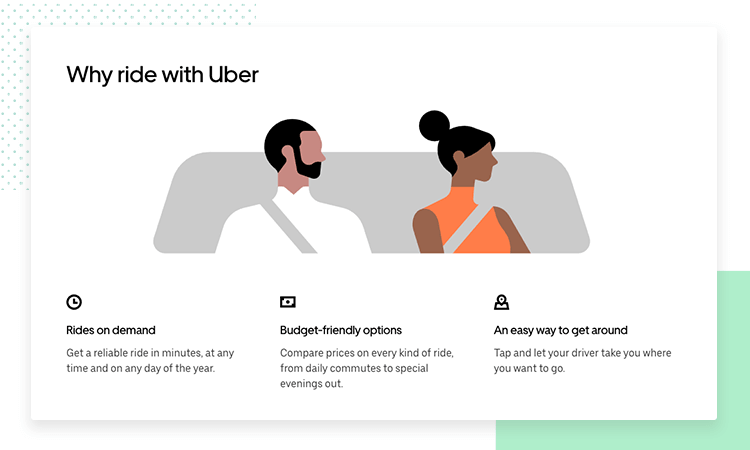
For a company such as Uber, their UX research had to be more comprehensive not just because of large cultural differences between markets – but due to the very nature of their service. As it turns out, pairing passengers with drivers in an effective way is challenging to say the very least.
The problem is that there are many, many types of people who use Uber to move around – and many types of people who decide to become drivers.
Consider all the different types of people who count on Uber for transport. You can expect full-time working professionals, travelers from abroad, people with many different types of disabilities and overall users who just can’t drive their own vehicle.
Side note: In case you would like to learn more about Uber’s business model, go ahead and check out this episode of Freakonomics: Why Uber is an Economist’s Dream.
When it comes to drivers, Molly tells us that drivers include people from different backgrounds looking for an additional source of income. This is, perhaps, even more true of people who live in places where having a car is a big expense – where they look for ways to turn an expense into a source of profit.
And so, Uber deals with quite a few different factors that affect its users and its platform. Aditionally, we have the fact that Uber has power to affect the communities it operates in.
Now that we’ve gone through some of the basic elements that make UX research at Uber so complex, let’s see some of the biggest challenges their UX research team needs to consider.
The fact that Uber’s design teams needs to find a way to deal with all this data, while still maintaining its flexibility, contributes to a UX research team that sets out to offer a consistent experience to all users – while responding to local preferences. These are some of the biggest factors in the research at Uber.
Uber has millions of active users spread all around the globe. All these users generate an enormous amount of data – but does this data tell the whole story? One of the biggest challenges Uber design faces is that data can be comprehensive, but rarely pins the entire experience.
That’s where Uber’s data scientists come in. Uber employs wide teams of people who don’t just go through this data looking for specific signs of Uber’s performance. These scientists do everything they can to create a complete storyline of the experience – which makes it much easier for Uber to pinpoint how users felt at any point in time during the service.
Today, society changes at a fast pace. How can Uber identify those changes to people’s behavior or tastes, and respond accordingly? People pick things up and abandon them at a quicker pace than 50 years ago, and this trend isn’t likely to change in the next 50 years.
Uber deploys a large amount of effort in trying to see those changes coming, so the platform can adapt. Not all of these changes are going to dramatically impact Uber or UX design at Uber – but some of them just might, and those are too important to overlook.

For example, the fact that young people in urban areas are buying less cars as reported by BBC News. This is a good sign for Uber, a platform that offers people an alternative to owning a car while still managing to move around as needed.
This new trends begs the question: how will this affect infrastructure in the long term? Should Uber expect less parking lots and more pick up/drop off locations in urban areas? Should this even register for Uber as a factor in the future decision-making?
Uber’s data poses some big questions about the long-term direction of UX research and design at the company – which can be challenging to define and respond to. Data-driven design isn’t always easy, but it’s a solid bridge to a good user experience.
As we mentioned before, cultural differences are difficult to grasp. Just like other large businesses that had to famously change their approach to certain markets, so too does Uber have to adapt to local people’s expectations.
Molly gives a great example of how Uber identified an area which they needed to modify in order to truly thrive in a foreign market – and it’s also about India! The subcontinent is a massive market that draws companies from all over, but it is also very unique in its culture – representing a major challenge to all foreign companies.
In Uber’s case, that change in culture and society impacted the number of people who could use the service. The platform, after all, only accepted payments in credit cards – which aren’t as widely used in India as in the US.
In order to adapt, Uber started accepting cash payments and found that this same concept could be applied to other markets that shared this particular trait with India.
These are the folks in the front lines! Located in offices in their most important cities, the city operations team is in charge of things running smoothly in their area.
“They [city operations] are really the heart and soul of every city.”
Molly Stevens - UX Director at Uber
They are the ones who deal with most issues drivers might have, and ensure the quality and functioning of the platform in their city. Perhaps just as important, is their function of gathering data from the market and reporting it back to larger offices so that everyone is up to date on trends and tendencies in different markets.
Due to this additional job of gathering knowledge and data, the city operations teams everywhere are crucial to Uber’s UX research.
Right. Now, we’ve seen some of the key pieces of Uber and how it operates- as well as some of the factors Uber’s UX research team needs to keep in mind at all times. Now, knowing that Uber relies heavily on data for its UX decision-making, we realize that research at such a big platform is very complex.
But perhaps what’s even more difficult is finding a way to implement all of this on a global scale. How does Uber deal with data it gathers in India? Where are the people who make decisions based? And if they aren’t in India, how can Uber ensure everyone is on the same page?
Communicating data and knowledge between employees and offices is a large part of how Uber scales their research.
With city operations spread around the world, Uber has no choice but to find ways to ensure good communication across offices or risk inefficiencies that can doom the whole platform.
A very telling aspect of how effective communication and collaboration is at Uber is the fact that their engineers are based in the US. These same engineers must create a service that tailors the user experience to regional cultures in India.
It’s fairly common that growing companies need to grow their teams – but Molly doesn’t mean just hiring more data scientists. Uber decided that in order to truly get the bigger picture, they needed people who could bring in context to the data.
But what kind of context? Well, all the context Uber can handle. The platform has a diverse team that includes professionals of backgrounds that aren’t exclusively from data science. Uber has welcomed employees with a strong background in psychology and anthropology, for example.
Getting feedback about the product is vital for UX research. And Molly is proud to explain she took part in improving the way Uber got its feedback. Uber used to rely on a Net Promoter Score as a way to measure its performance – but that system left much to be desired.
If you're wondering: The Net Promoter Score is a measurement of user’s willingness to recommend the service/product to their friends, on a scale of -100 to 100.
As an alternative, Uber started to create its own surveys and even created their own platform which deals only in getting feedback. You can read more about the platform in this post on how uRate improved their engineering workflow.
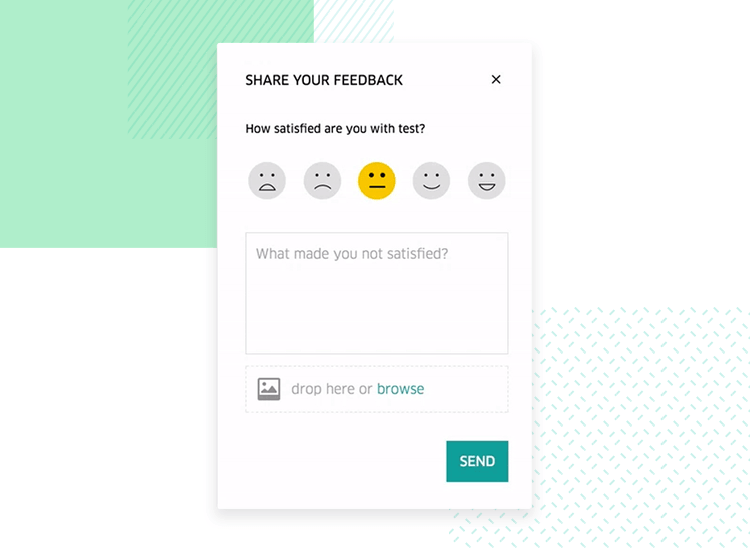
As for Molly and the central role she played in improving the feedback Uber got from it’s users, it all boils down to having more freedom and control over the survey.
By having an in-app survey, Uber manages to get users at the right time – with the timing itself working to add context to the survey. The emoji scale of satisfaction helps users pin their feelings without demanding too much action – which works perfectly for a platform like Uber.
Employees in their city operations team don’t necessarily have a background in data management or data science. They come from all sorts of fields of expertise but they all play an important part in the data that Uber depends on for its UX design – they are the eyes of Uber in the playing field.
And so, Uber ensures that all members of the City Operations team receive training in data science, regardless of what their official job title is. This training initiative has a hugely beneficial impact on the city operations team, helping them in their daily tasks.
As an added benefit, this training in data science helps the company as a whole achieve a realistic and accurate perspective of the markets. The secret factor that helps to create this perspective? Knowing the data you use in your decision-making is accurate.
International research can take time and a lot of effort in order to go through the whole research process – and Uber needs to stay on its feet to adapt when needed. Waiting for months for a certain study to be concluded isn’t always an option.
In response to this, Uber’s research team carries out bi-weekly studies on key markets, so there’s a consistent inflow of data and conclusions they can apply to the platform. This means their response time is much shorter, as they can identify changes in the market before the changes push Uber into a tough corner.
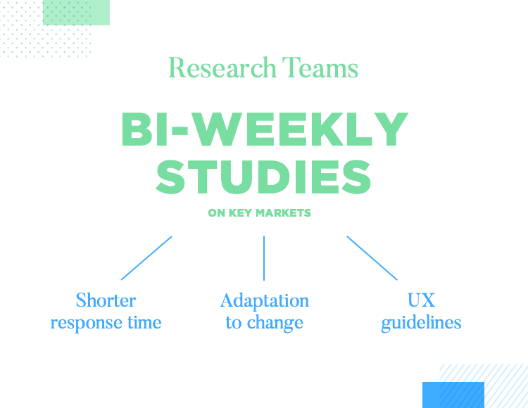
These weekly studies are turned into UX guidelines for Uber’s design team, so its members can start their design process without having to wait for the larger, more comprehensive study that will come afterwards.
The general result is a much faster workflow that delivers two things that Molly, Uber and us here at Justinmind, are in constant search of: flexibility and data-driven design. And fortunately, us three aren’t the only winners, as millions of happy users can attest to.
Molly Stevens left us all wiser with her illuminating talk on Uber and how it manages to stay on top of its UX game. It all goes to show just how powerful carefully collected data can be – and how challenging it is to implement any strategy on a global scale.
