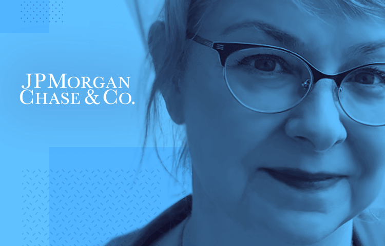
Mobile interface design, prototyping and a smidgen of punk rock. All in a day’s work for Melora Zaner, Head of Mobile Design & UX at JPMorgan Chase NYC
The digital revolution is turning banking on its head. JPMorgan Chase is at the vanguard of this change: from introducing Chase Pay – its own mobile wallet – to being the first bank to integrate Touch ID for Apple device users, the New York based bank has pushed the envelope of digital banking experiences.
Melora Zaner is the woman in charge of building the next gen of mobile banking experiences in her role as JPMorgan Chase’s Head of Mobile Design and UX. Melora is no stranger to building out multi-location mobile design teams: before coming to JPMorgan Chase she was Senior Director of Yahoo Design and Mobile Development for Asia, following a 12 year stint at Microsoft managing design studios from Seattle to Shenzhen.
When she’s not designing our mobile future, Melora keeps on top of her 20+ invention patents in social media and cloud computing services, and improves girls’ access to tech careers through DigiGirlz, which she helped found.
Inbetween all this Melora was kind enough to email with Justinmind about how building mobile design teams, prototyping digital banking products and learning from her punk past.
We hear you’re involved in the building of design studios in NYC and San Francisco. Can you tell us more about this and what JPMorgan Chase’s design/UX departments will look like in the near future?
Here at JPMorgan Chase we have a centralized design organization which partners deeply with our lines of business and product development organizations. This means we have a collaborative and supportive design community reporting up to a single leader, yet have teams that are dedicated to the company’s key initiatives and priorities.
For the past several years we have been building up our talent base on both coasts as a way to nurture and stabilize our design culture. Now we are ready to move into the next phase where we will be even more immersed in our focus areas with a co-location approach, leveraging agile and lean UX best practices.
How is your mobile team organized, and what design methodology do you follow?
Our mobile team is organized based on how customers think about engaging with their bank while on the go. For example, we have key experiences for managing, spending, transferring and investing money. We use design thinking processes and iterative user research for defining current experiences and for identifying future opportunities – all grounded in the customer voice. We do this in such a way that every scenario, concept and detailed user flow has been vetted with our triad of design, business and technical partners, and has been seen by a customer several times in the process.
Find out about Design Thinking at IBM, in our interview with Distinguished Designer Doug Powell
Can you tell us where prototyping fits into the design and development process at JPMorgan Chase? What do you look for in a prototyping tool?
Our mobile team has decided to design more using prototyping tools from early concept to detailed interaction flows. Evaluating designs with stagnant screens is no longer efficient for us. We have found it improves our interaction designs and information architecture when we can evaluate our scenarios as live, moving experiences. This is especially true when we are trying to simplify potentially complex user tasks or when trying to innovate new ways of interacting with the bank in a mobile context.
We also find it improves our communication with developers and stakeholders, and increases the quality of user feedback in our research labs. We have designers from diverse backgrounds such as comic book and graffiti artists, former teachers and developers, etc., so we look for tools that have small learning curves, have enough capability to “feel” like an actual app on the phone for user feedback, and can be shared with developers.
What are the biggest challenges for users when mobile banking, and how are you guys trying to solve them?
Our design principles are simple, human, personal and cohesive for all our digital experiences. We ensure that our customers can smoothly transition from online desktop experiences to mobile ones with geo-location photography and familiar interactions and navigation.
Our mobile team has decided to design more using prototyping tools from early concept to detailed interaction flows. Evaluating designs with stagnant screens is no longer efficient for us.
We also want to honor the most common tasks mobile customers want to do by making them easy to understand at a glance and simple to accomplish within three taps or less.
You’ve built design teams in both the US and Asia. What are your top tips for building and nourishing an efficient digital product team?
I believe in diverse and inclusive team building, which reflects the diversity of our customers. I look to hire designers from a variety of ages, gender, culture, backgrounds and interests. Each person has a special skill or super power that they bring to a team and we look to match them with the right project where their super power can be mastered.
What may be a weakness for one person is a strength for another – so in this way, we hire to ensure a team is well rounded with enough strengths that it can truly be a super hero team. As corny as this may sound, it gives each person a chance to shine and grow based on what they do best, and serve as a learning opportunity for others looking to stretch themselves.
We also have a one for all and all for one culture. If one is struggling, we all are; if one is succeeding, we are all succeeding. We work hard, learn together and have fun. I am committed that when each person goes home at night, they can say it was a day well spent. This is universal and works across world.
You started out as a punk lead singer – did you ever think you’d be working in high finance?? Also, how has this background informed your user experience philosophy?
Yes, I have friends who are very surprised that I am working in high finance! But it makes total sense to me. I am drawn to writing and performing music because it’s a way to create an experience with a group of people where history and memories can be made and shared. Singers and bands come and go, but the songs are lasting because of the memories triggered by them.
I feel the same way about technology – it too comes and goes – rapidly! But the experiences we share while using it are lasting. So I apply my love of music to my love of designing digital experiences with full commitment to create opportunities where emotions and relationships can be respected and deepened no matter which version of a device or OS one is using. We can create meaning that is useful and lasting.
Related Content
 UX design portfolios are your chance to showcase your top skills and best work. Check out this post for awesome portfolio examples and websites!10 min Read
 Learn what paper prototypes are, how to make them and how they can help you design better products. Awesome examples and free templates inside!10 min Read
 In this comprehensive study, we dive deep into the world of web design tools, comparing features, pricing, ease of use, and more. Whether you're building a simple landing page or a complex e-commerce store, we've got you covered. Let's explore the best options and help you make an informed decision.30 min Read


