Food tech, prototyping and philanthropic UX. Just Eat’s Principal UX Designer tells us how user experience can change the world for the better.
This week Justinmind had the chance to find out what motivates Sandra Gonzalez, Principal UX Designer at Just Eat. Whether she’s working on food tech in her day job, dedicating her spare time to UX philanthropy with UX for Change (a community she founded to “share the goodness of UX to change the world”) or advocating for the teaching of UX in schools, Sandra is passionate about user experience and the digital future.
We caught up with her to chat about her work at Just Eat, how her team uses prototyping, and what we can expect from November’s Mobile UX London, which Sandra will be hosting.
Can you tell us a bit about your role as Principal UX Designer at Just Eat.
Just Eat is one of the most exciting places I’ve ever worked! As Principal UX Designer I am responsible for the UX vision, as well as ensuring a cohesive experience across all digital consumer touch points.
I joined the company at the beginning of 2016 and I’ve not only had the opportunity to work with the extremely talented UX designers across all departments, but also build our Digital Brand Studio from scratch – this team was responsible for delivering our latest product redesign.
What excites me most about working for Just Eat is knowing that the designs created by our team touch millions of lives on a daily basis in 12 countries around the world. To be quite honest, it’s a very humbling feeling.
How did you get into UX Design?
After getting a triple degree in Computer Engineering, Mathematics and Education, I knew I was at my best working on multidisciplinary challenges. That is why UX design was such a natural career progression for me after working as a online-producer, front-end developer, high school teacher and product manager.
In 2008 I found myself in a UX Program Manager role at Microsoft creating prototypes to validate ideas and experiencing the thrill of observing usability research on some of the suggestions I had made for improving their search engine experience. I knew then that I had found my passion.
You’re working in food tech – an extremely competitive, fast changing sector. How do you stay ahead in terms of UX?
There are two factors that I believe help Just Eat stay ahead in our sector. First, the ability to develop strong partnerships with industry leaders such as Apple, Amazon and Google. To give you an example, we were launch partners for the Amazon Echo in the UK.
These opportunities put us in a situation where we have to push ourselves beyond the traditional UX process because we are creating experiences for devices that are not even available yet to our customers. For these challenges we use Lean methodologies to make sure we are continuously learning and testing our design assumptions.
What’s more, we are also solving one of the most basic needs any human experience — hunger. Therefore we need to always honour our human basic needs, regardless of the technology used, to get our user closer to food; that is where a deep understanding of cognitive science can give us the edge in the food tech sector.
If you need to update a feature, what’s the design process you and your team go through?
Before thinking of features, we focus on the problems we are trying to solve. Stacking features on top of each other, in many instances, is a recipe for disaster. At Just Eat we identify the need to improve an experience through qualitative as well as quantitative research.
On some occasions tweaking a feature may be enough to solve the problem; on others we may need to reconsider the end-to-end experience. In general our process is divided into four phases: design strategy, ideation, user research and UI design.
During this process we work closely with product managers, researchers and engineers in order to collaborate and agree on the best approach to solve each design challenge taking into account user needs, business requirements and technical constraints.
What role does prototyping play in getting mobile and web users hooked on the app?
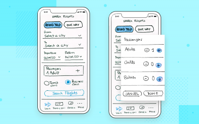
Prototyping plays an extremely important role in our design process – from low-fidelity prototyping to start conversations with our users or stakeholders to gather feedback at an inception stage, to using smooth high-fidelity micro-interactions while finalising the UI and everything in between.
Prototyping plays an extremely important role in our design process – from low-fidelity prototyping to start conversations with our users or stakeholders to gather feedback at an inception stage, to using smooth high-fidelity micro-interactions while finalising the UI and everything in between
When it comes to getting our users hooked, we constantly research new interactions and experiences with our customers by creating prototypes and inviting them to give us feedback on their experiences in research sessions. We sometimes even pay them a home visit, just to make sure we can observe them in their natural environment where they’re more comfortable and relaxed.
What is exciting you about the industry at the moment?
One of the most exciting breakthroughs in the tech industry is the shift from continuous delivery to continuous learning. For a long time there was this expectation that, as a designer, you had the answer or solution to every design challenge. This created what Jeff Gothelf in his book Lean UX calls Design Heroes.
Now the industry is more focused on taking a more humble approach and allowing teams to learn in a continuous fashion. As designers, we are now in a position where we can set up a hypothesis which can be validated through experiments in order to learn from our actual users, provided that we can sympathise with them (as much as our personal experiences allow us to).
However, that may not be enough in many occasions, so setting up experiments in order to learn more about our users is absolutely crucial. In a way, this has turned digital product design into more of a science than an art.
Read our Q&A with the great Jeff Gothelf!
What key trends do you see emerging in UX? What changes will we see in UX in the next 5 or 10 years?
We are getting better at breaking down the barriers between machines and humans. The fact that I can have a silly conversation with some of the devices in my home is just mind-blowing. To give you an example, my five-year-old son asked Alexa (on Amazon’s Echo device) if she wanted to be his girlfriend and instead of getting an error message, Echo handled the situation very gracefully.
Up until now, creating an experience that was clear for the user to navigate in order to complete a task was considered good UX. In the next 5 to 10 years, creating an experience where the user may forget that they are interacting with a device at all is what will be expected.
We are at a point where we are blurring the lines between very rigid interactions and more human experiences with our devices. The main change I think we will see in the discipline of UX is a deeper understanding of who we really are as humans. Up until now, creating an experience that was clear for the user to navigate in order to complete a task was considered good UX.
In the next 5 to 10 years, creating an experience where the user may forget that they are interacting with a device at all is what will be expected.
Where do you look for inspiration?
I find inspiration listening to stories about how people solve incredible challenges. I try to not only listen to design talks but any talk about solving a challenge. I find TED one of the most inspiring places in the internet and that is where I usually go for inspiration.
What other brands do you think are doing great UX work?
I have been quite impressed with Google’s wearables. Given my line of work, I am on the iOS platform for two weeks and I then switch to the Android platform for another two weeks and so on and so forth. This way I get to experience the two main platforms that my team designs for and it enables me to have a user-focused opinion when designing for either.
Having used the Apple Watch alongside Android Wear, I have been quite impressed with how Android handles the user experience contextually. To give you an example, my Android wearable knows how to stack my apps in order of importance, reflecting what matters to me at any given moment, without me ever having to program or manually prioritize it.
If I am listening to Spotify, regardless of what I was doing prior to that or if I have an incoming email, my music controls are always at the top of the stack. However, if my Uber is arriving then information on the car and driver takes over the experience as I look into my watch, without the need to even touch the watch.
I know this is going to sound funny but the first time I used an Apple Watch I literally ran into a pole because I needed to look up the Uber’s information late at night, and the Apple Watch will not easily surface this information; as I’m trying to dig it out of the watch and continue walking, I went head-first into a lamppost.
It got even more awkward when I got into the Uber and the driver couldn’t stop laughing. We ended up talking about UX all the way home.
This year you are hosting the Mobile UX Conference – what can attendees expect from the event?
The Mobile UX Conference will be a great event when we all come together as a UX community to learn from world-class UX leaders. Attendees can expect an inspirational day, full of new methods and techniques as well as amazing stories behind how these came about.
What talks are you most looking forward to hearing?
I’m especially excited to hear Hara Mihailidou talk about her work at JustGiving because something I am extremely passionate about is UX in non-profit organisations, which is why I founded UX for Change.
Can you tell us more about UX for Change, a UX community founded to “share the goodness of UX to change the world”?
Yes! I founded UX for Change with the intention of connecting humanitarian projects and the public sector to UX designers who wanted to share their knowledge and skills on a pro-bono basis.
We work closely with great initiatives such as teaching UX design in primary and secondary schools, and helping design technology within a humanitarian context, like as refugee technology with a focus on women’s health.
How can UX be used to change the world for the better?
The field of UX combined with a user-centric design approach that focuses on understanding our needs, our fears, our desires and behaviours can design products that make our lives better. The discipline of UX enables us to create user-centric solutions to daily human challenges. Therefore by its very nature UX has already changed the world for the better.
If UX Designers ever wonder what they can do with this amazing opportunity to change the world, I recommend they look into teaching our craft. I have been very outspoken about how UX design should be taught in primary schools, given that children now have the tools to design their very own experience with games such Minecraft or Inventioneers.
I believe teaching UX is a way to change the world for the better. This is one of the reasons I have been so actively involved in the Apps for Good programme because it allows me to inspire children all over the world to create technology that makes a difference within their communities.
Related Content
 UX design portfolios are your chance to showcase your top skills and best work. Check out this post for awesome portfolio examples and websites!10 min Read
 Learn what paper prototypes are, how to make them and how they can help you design better products. Awesome examples and free templates inside!10 min Read
 In this comprehensive study, we dive deep into the world of web design tools, comparing features, pricing, ease of use, and more. Whether you're building a simple landing page or a complex e-commerce store, we've got you covered. Let's explore the best options and help you make an informed decision.30 min Read


