“Prototyping has become a natural part of every design flow”: Q&A with Developer Nick Babich

Software developer Nick Babich talks UX trends, interactive prototyping processes and the importance of empathy in design
Justinmind caught up with software developer and UX writer Nick Babich who has an unyielding passion for design. Nick offered insights into his hi-fi prototyping process, emerging trends within the UX community and why empathy shouldn’t be overlooked when it comes designing a good product.
Hi Nick! Could you start by giving us a little background on who you are and what attracted you to UX/UI design?
I’ll start from the very beginning. I was born in a small region near Japan called Sakhalin and since early childhood I’ve had a lot of inspiration around me. Both nature and people were sources of inspiration and ideas.
I have a solid technical background and mastered my skills in mobile & web development. I have a Master’s degree in Computer Science but I was always interested in design. I don’t separate design and development. I think both designers and developers should work together in order to create a good product.
I believe that designers should have some developers’ skills (to understand what’s possible and what’s impossible; and to be able to understand task complexity), and developers should have designers’ skills (to develop business logic that best suits the user interface). We should be both technology- and design-driven.
You recently wrote about empathy as the bedrock of design. Yet it’s something often overlooked. Why do you think this happens?
I believe that empathy is a cornerstone of good design — being empathetic towards your users is essential for creating a good product. Design is about people. The ability to step outside of yourself and see the world as other people do is core to designing a good product.
But to be completely honest with you, I think that the software development business is lacking empathy more than any other industry. This happens due to the detachment between designers and users, and a lack of appreciation of how users think and work.
This leads to confirmation bias and an assumption that users will approach and solve problems in the same way as the designers and developers of a product. Just look around and you’ll see a lot of horrible products with really bad user experience that were created based on this assumption.
A lot of examples can be found in enterprise software where detachment is more significant. But the situation is changing and now we are seeing more products with a stronger focus on user needs compared to what we saw just a decade ago. BYOD (Bring Your Own Device) is a phenomenon that has changed enterprise software – today users expect their enterprise software to be designed as beautiful as the other products they use.
If you don’t think in this way for your product, you are putting yourself at a disadvantage. I do think that the UX industry is maturing a lot, and therefore, companies are starting to understand and value the importance of good design.
What’s one piece of advice you’d give to help foster empathy more naturally?
Step into a user’s shoes (sometimes literally, not figuratively). One good example is Patricia Moore. In 1979, aged 26, she was asked to design a potato peeler for elderly people. She really wanted to design a good product for the target audience and she found a perfect way to understand what was required.
Patricia spent three years visiting more than 100 different US cities dressed as an 80 year old woman. This helped her understand who her users were, what problems they faced and how the product she designed can make their life better. This approach lead to great products.
Patricia made herself an elderly woman.
In most cases you don’t need to follow Patricia’s method, but you should understand that it’s important to be on the same page with your users. In the context of UX design, this usually means taking the time to carry out user research (watching your customers, talking to them, etc.), and drive value from the research (analyzing and summing up into points for your decision-making processes).
One technique that I recommend is storyboarding. This method came from the movie industry and it’s very much thinking about your product if it were a movie in terms of how people would use it. You have to imagine a stage and who the actors are, for example.
This will help you understand how people would flow through the interactions, giving you a clear sense of how to create a stronger narrative (user flow) and how your features come together to form the whole product (core user experience).
As a fan of fresh and clean user interfaces, what are some of your favorite UX/UI interfaces which spring to mind?
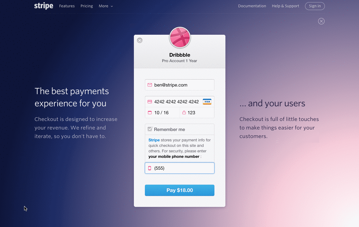
Stripe‘s interaction experience
- Clean UI: I’m a big fan of minimalistic user interface and one interface that I like the most is the homepage of Google Search. While it’s pretty old, I still find it attractive because it combines both a minimalistic look and good functionality. What most important about this UI is that is aligned for users with completely different experience and computer skills.
- Interaction experience: the user interface of app Stripe is a perfect example of good interaction model. The UI has a lot of great animation and unlike many other apps where animated effects look foreign or odd, Stripe’s animation flows very naturally.
- UX: Dropbox has great overall user experience. Some people might even say that Dropbox is really boring because it simply works. Speaking about the app, Dropbox combines minimalistic UI with solid functionality and familiar interaction model across all supported device types.
Do you foresee any trends that will shake up design in the coming months?
I think that conversational interfaces will be our next big thing (maybe not in the upcoming months, most probably in the upcoming years). The recent progress in natural language processing and a competitive market (all big players such as Google, Apple and Microsoft are creating solutions) will result in more advanced interaction systems.
It’s great to interact with a product in the same way as we interact with each other – through a dialog. One popular business case for this type of experience is the personal assistant. We could be seeing a shift in providing direct and personalized support for users using personal assistants.
Another trend that I want to mention is augmented reality. I strongly believe that AR has more potential for business than VR. It’s not just for gamers. AR will go beyond an entertaining experience and will be used in business, medicine and education. Both technology and people are ready for this leap into the future.
Staying with trends for a moment, in the last year were there any trends that surprised you?
I was pleasantly surprised by the prototyping boom and the rise of tools for easy prototyping. A lot of new tools were released during the last few years that make the process of prototyping and designing user interfaces really joyful. It’s easier than ever to bring ideas to life and prototyping has become a natural part of every design flow.
We have seen your beautiful prototypes on Behance, could you explain to us a little about your process, what you use and how you reach the final prototype?
Thanks! They are UI prototypes that I created for my articles to demonstrate some important points, so they don’t reflect my UX design process.
Speaking of my process, I try to use design thinking strategy for my projects and the most interesting and challenging part of the UX process for me is ideation.
Before I try to prototype something, I spend a lot of time thinking about a solution for the problem, making a lot of sketches and discussing possible solutions with my colleagues. I would like to mention an important point related to ideation – keep an idea log.
It’s important that you do it on a regular basis. Each time you have an idea – write it down and keep it. Don’t throw the log in garbage after the project’s released. Most likely your ideas will help you in the future when you’ll need to improve it based on feedback from the market.
Are there any design problems you’re tackling in your current projects?
Yes, the problem of effective communication between designers and developers in newly established teams. In my current project I have a distributed team and all team members are located in different time zones. This requires paying a lot of attention on task synchronization, clear estimations for all planned activities and proper deliverables from each team player.
You take inspiration from film and books to inform your design, do you find that these aspects of culture help to create better design overall?
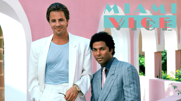
Nick’s software design is inspired by the heroes of his youth
Absolutely! I believe a huge part of our inspiration comes from our environment. That’s why it so important for designers to travel a lot, to watch really good films, compare and analyze. Another important moment is when you were born.
Being a child of the 80s, my inspiration lies in the culture of that time and is reflected in my work. For example, why not use vibrant colors from Tron in your design? Or try typefaces from Miami Vice for your website’s homepage!
Related Content
 UX design portfolios are your chance to showcase your top skills and best work. Check out this post for awesome portfolio examples and websites!10 min Read
 Learn what paper prototypes are, how to make them and how they can help you design better products. Awesome examples and free templates inside!10 min Read
 In this comprehensive study, we dive deep into the world of web design tools, comparing features, pricing, ease of use, and more. Whether you're building a simple landing page or a complex e-commerce store, we've got you covered. Let's explore the best options and help you make an informed decision.30 min Read

