Web design has its basic rules and principles, which tend to be valid to any product out there! Today, let's go back to the basic rules design.
What makes web design great? How do designers make their work be easy to use, even for those who have never experienced the product before? Despite how extensive and diverse the world of web design can be, some things hold true for designers everywhere. These are universal rules which experienced designers will apply to their work without even noticing it.
That’s why we put together this list of crucial web design principles to learn if you’re just getting started. Along with a set of professional UI design tools, these are the rules that dictate how good designs are made. From understanding why some layouts work to creating mobile-friendly products – this list has them all. Check it out.
Web design can be a hugely creative sector. There’s lots of margin to take the design in unexpected paths, following some innovative desire to push the boundaries. With that said, web design can also be highly goal-oriented, which means that this creativity isn’t just blindly put on the web for people to experience for whatever end.
There is always a goal in mind that makes design teams tweak every last detail, crafting a tailored design that seeks to achieve that goal. A classic example is ecommerce websites. There’s a huge margin for brands and designers to create a vibe, a visual identity that captures the soul of the store. However, the ultimate goal is always the same: to sell.
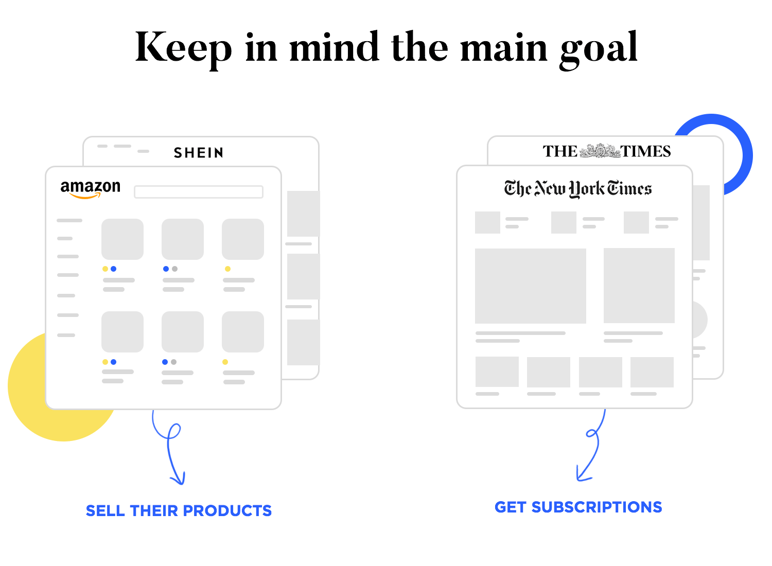
This goal will determine how designers approach some key decisions in the web design process. A lot of focus is placed on helping users explore the store and easily find specific items. A lot of effort is invested in a product page that showcases the products in the best possible light. The checkout process is simplified and carefully calculated so that shoppers barely have to think in order to buy things.
When it comes to web design, a general principle is that decisions are never made just because. There’s a central goal that all the details must work towards. There’s always a direction, which works to guide the design team in creating an effective design. Everything will depend on what we hope to achieve with this website – what the desired outcome is.
Who doesn’t love websites with incredibly intricate and powerful visuals? Designers often try to create something that shows their visual prowess, using their skilled eye to bring art to the online masses. And many times, those visuals add to the experience, making it unique and memorable.
But a key web design principle is that balance and harmony are a necessity. It’s important to know when less visuals can make the entire design better, allowing users to focus on the right things. Sometimes, by adding more elements we dilute the true power of the design or simply make it more difficult for users to recognise what they see.
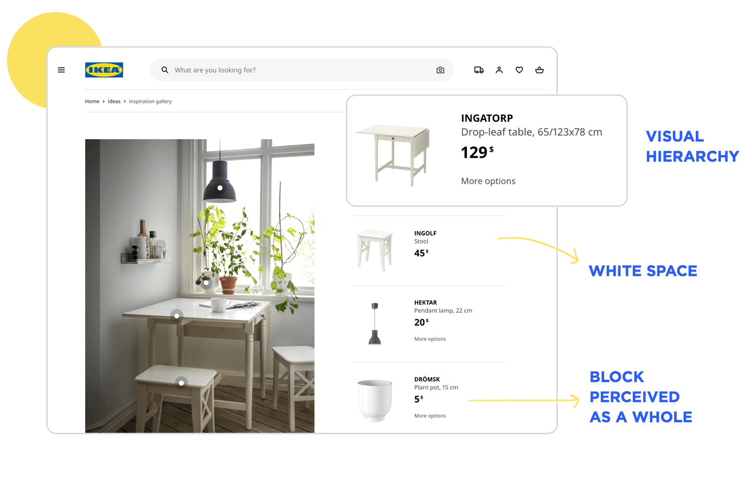
A few important concepts come into play here. Among them we find things like visual hierarchy and whitespace, both of which are critical to the success of any design. Together, they allow designers to communicate with users without needing a single word.
A good structure will allow users to know what they’re looking at immediately. The hierarchy makes it clear what elements are connected and which aren’t, as well as highlighting the most important areas. The whitespace gives visual relief and helps to direct the eye of the user through the design. Truly good web design doesn’t need extra seconds of users looking for the right button to click – people simply know upon first look.
These web design principles of design can sound a bit technical at first, but they grow to be a second instinct to experienced designers. These are closely related to the previously mentioned concepts of visual hierarchy and whitespace, but focus on a different aspect of web design.
In broad strokes, web designers all have to get familiar with certain design rules and laws that dictate how proportions, shapes and proximity affect a design. These are tried-and-true rules that make the most of what we all know about how users perceive and process what they see.
One of the most important laws is the Gestalt theory. It basically defines six different cognitive rules as to how humans perceive visual things – especially when it comes to groups of elements. In the world of web design, this means that simply throwing a bunch of buttons and arrows together will never have a good result. There’s a right way to arrange these elements so that you help users understand the design as a whole.
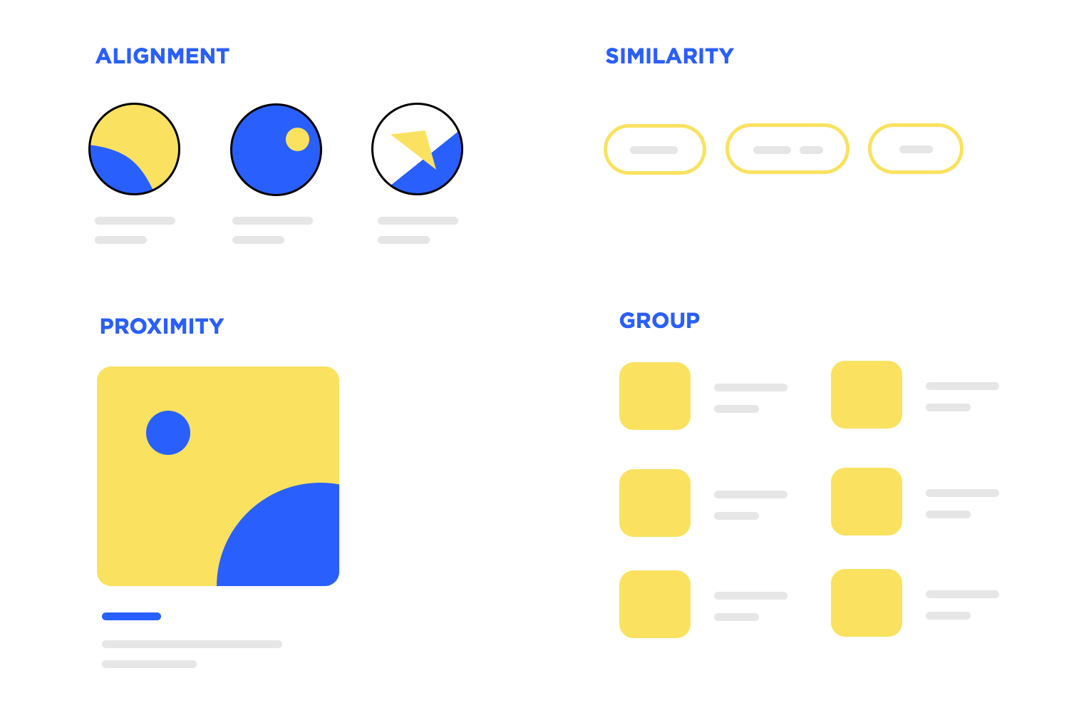
We won’t get into the details of the six rules, but it’s important to understand what these rules can do for web design. They’re about understanding the human eye and creating visual elements that play on our visual abilities as people. A silly example is the rule of closure: people’s brains will fill in blanks and work to create a complete image even if they’re looking at something that is incomplete. The legendary IBM logo plays on this fact.
Another important set of web design principles include Hick’s law. This is a fairly simple concept to remember: the more options users are shown, the longer it takes them to make a decision. This is because our brains have to consider and analyse all these options to choose the best one – which becomes a problem when there are simply too many choices.
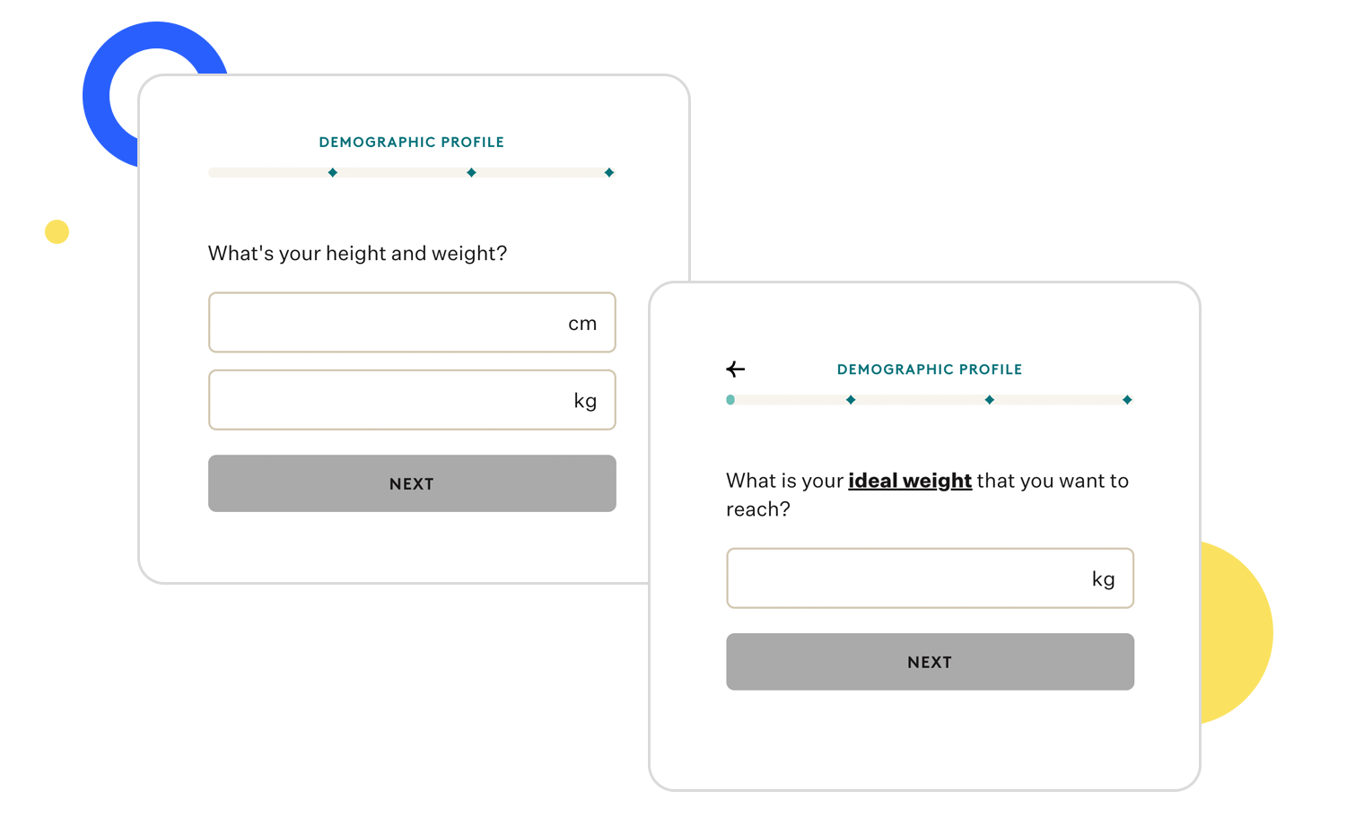
There’s a reason why restaurants try to keep down the number of dishes in their menu. If you had to choose from a menu that stretched for 6 entire pages, you may become overwhelmed. After a while, you’d get tired and feel the joy draining out of the experience. After all, you didn’t come to the restaurant to be stressed out – you came to enjoy a nice meal. The exact same can be said regarding web design. There’s a limit to how much mental effort you can ask from users before their joy evaporates.
Ultimately, these types of web design principles will all play a part in the design. This is especially true in the beginning, when we have to define the UI layout. Allocating space in a way that is both pleasing and effective takes practice, but it does grow to be an instinct for web designers. It’s all about prioritizing what’s important, making the most of the space and allowing for empty areas in the right places.
Just like die-hard marketers, web designers also need to know exactly who their market is. This is a crucial web design principle, without which no good design could ever take place. Precisely because web design needs to be premeditated and deliberate, you want to know who the users are, what they want, what issues they deal with and how they think.
The clearer the image you have of the final user, the more likely you are to create a design that succeeds. In the web design game, the details are likely to depend on the final user and not the designer.
This can be a bit confusing to new designers, because it goes further than the design team itself. In big teams, there’s a whole group of people whose job is to do research on the user and create a specific database of who they are and what they want. This information is crucial, because it will set the tone and approach of the entire project. Creating a website meant for teenage girls is completely different than designing a governmental page that is used by the elderly.
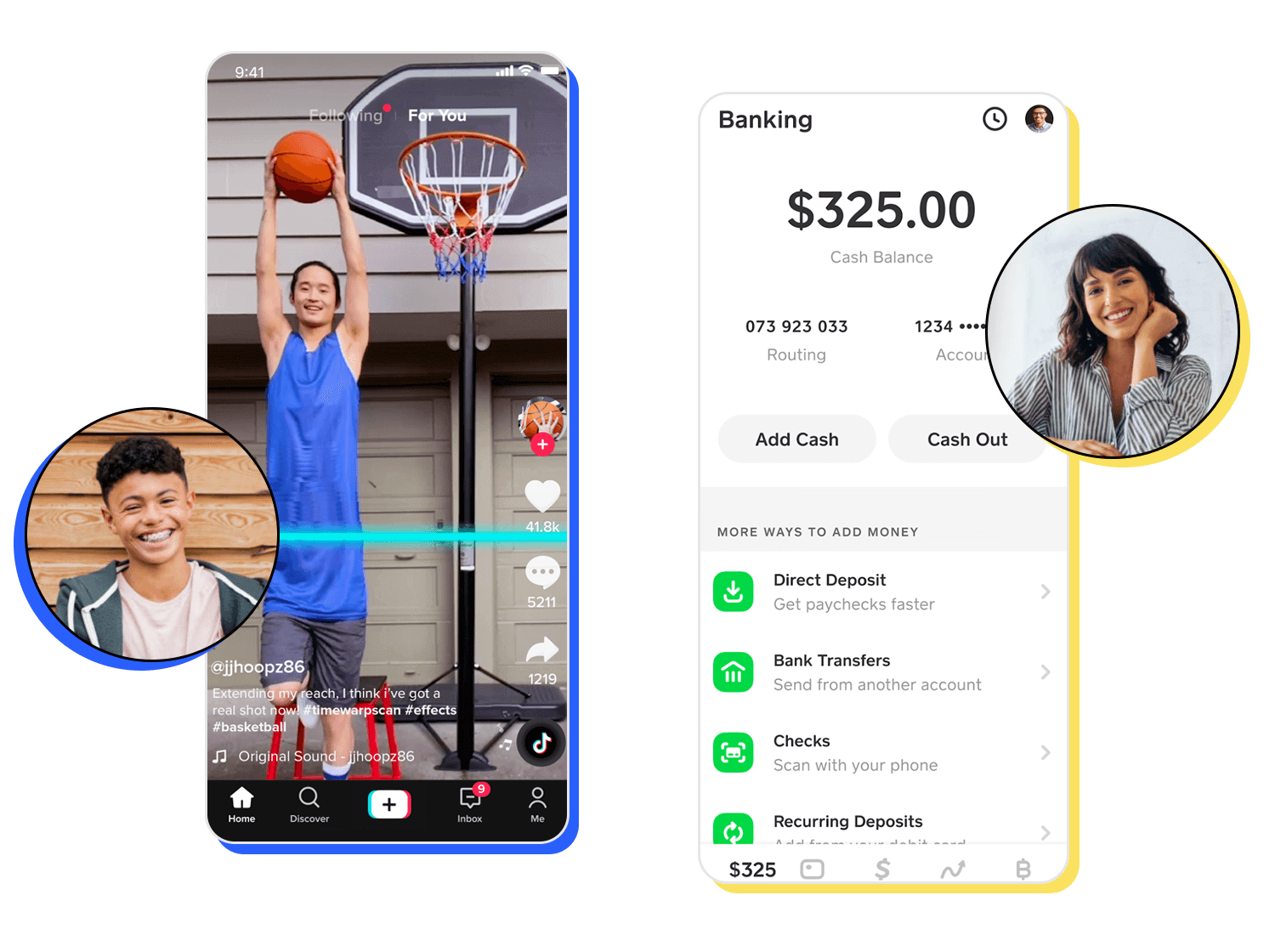
This is a branch of activity that is commonly referred to as UX research. It’s basically a huge effort in understanding the user, their feelings, their lives and their way of thinking. It will often result in more tangible materials like user personas, user stories or mental models. Regardless of who creates these materials, they sustain a critical role in the design process from start to finish. These are what designers turn to for clarity, for direction.
There’s a mindset change that takes place with experienced designers. As time passes, the truly skilled learn to find that sweet spot between their creative work and what the user wants or needs. Ultimately, the user’s point-of-view is always right, always the priority. After all, they’re the ones that will use the design. It requires a little effort at first to put our own opinions aside and listen to what the final users have to say, but it’s a skill that is developed over time.
Ah, typography. Love it or hate it, there’s no question that the use of a powerful typeface can completely change the feel of a design. From choosing a font with undeniable readability even in very small size to opting for something dramatic for a high-impact title – the typography matters.
There are so many wonderful examples out there of websites that created an entire vibe with their choice of typeface. They can help the branding, aid in creating a visual identity or simply fit in and support the other visual elements. There’s a whole world out there of unique fonts that are hand-drawn by artists as well as Google Fonts that are free and easy to use in any project.
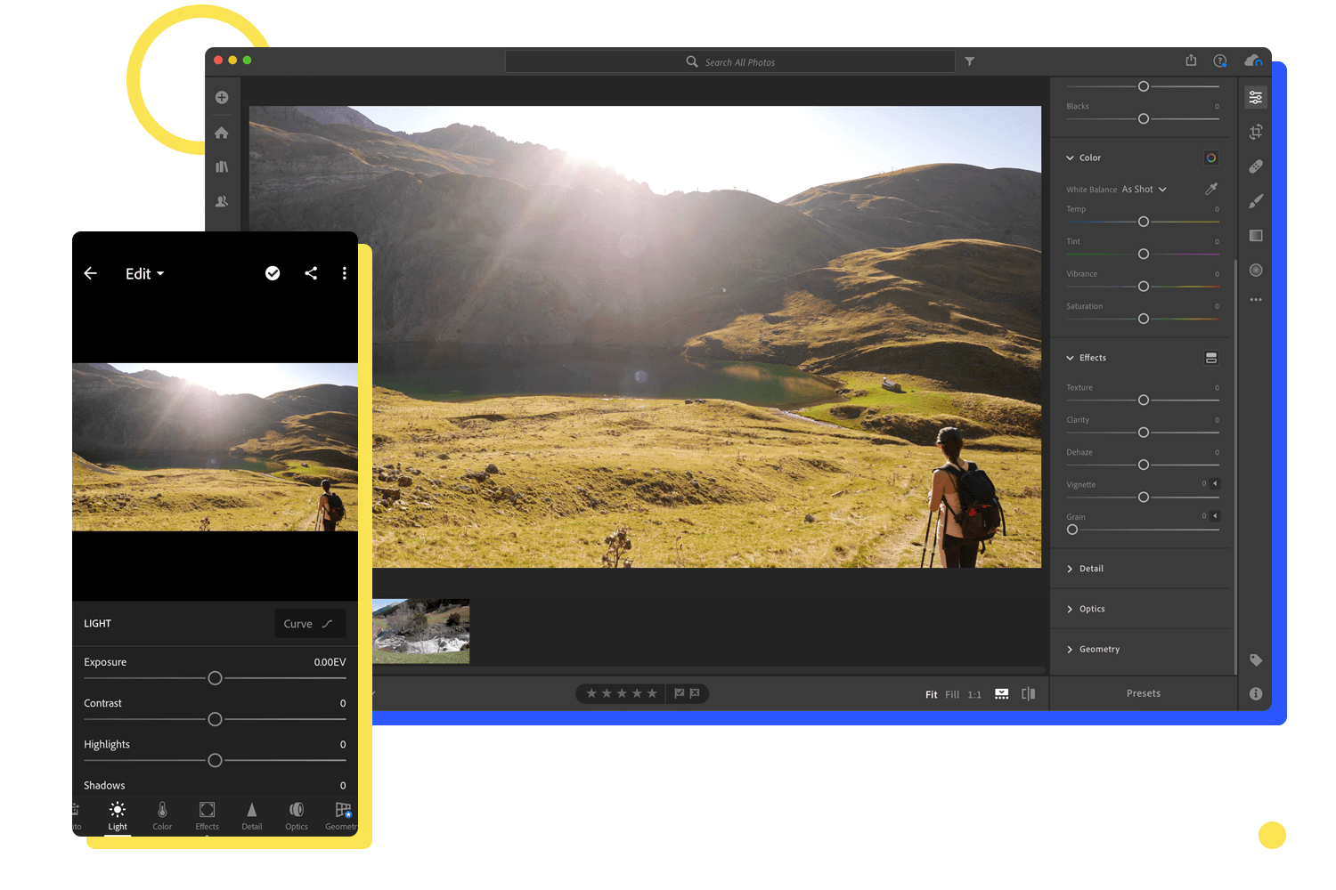
Regardless of what the goal of the web design is or what visual effect you choose, there’s always a few factors to consider when choosing the font. Things like how many weights the font comes with, how well it scales or what the contrast ratio is.
Depending on what devices the design is for, the best choice of font may change. For example, mobile design is the right place to favour readability over style. The smaller the screen, the more important it is to help users manage to read the crucial bits and to avoid having them squinting at the device.
Mobile-based design has grown to be a key part of web design. The mobile-friendly design principle is no longer a bonus, but a necessity as the use of mobile devices continues to grow. As there’s no running away from creating a design that works well on a much smaller screen, most designers today learn how to create a mobile experience from very early on.
The real trick with mobile design is maintaining the same brand identity and keeping the soul of the design intact, even in much less space. Making elements smaller and rearranging them can only take you so far – true mobile-friendly design approaches the entire screen differently.
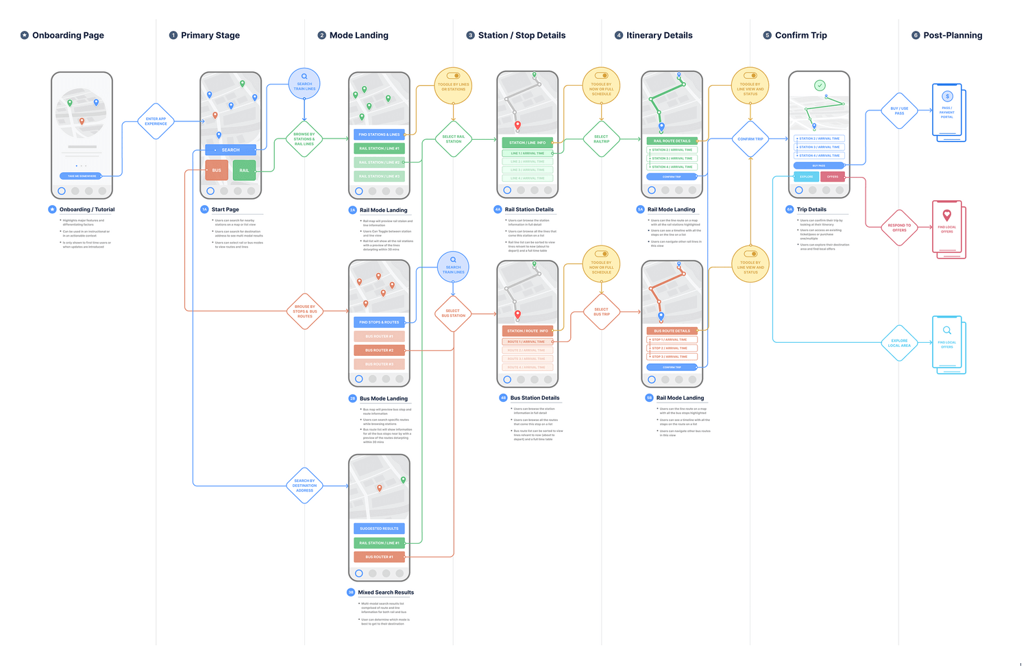
Starting with the layout, designers will allocate space and prioritize that which is absolutely necessary. Everything else is stored away, but most elements will remain easy to find. A classic example is the hamburger menu. Say what you will about the usability issues that it brings, these icons are super handy in mobile design. It stays in sight for users in case they want to navigate around the product, but takes up very little space.
A way in which many design teams approach the mobile-friendly web design principle is with mobile first. This basically means that the mobile-based design is the very first thing that is put together and created. All the primary features and key components are included in the mobile design, which is then escalated and grows into a web-based version of the product.
Other teams simply focus on responsive design. This is a very important web design principle: everything must be responsive today. Even if you start with a mobile first approach, you still need to make sure that users can go from device to device and still get the same experience.
All web design teams know this to be true. Together, the navigation design and the information architecture (IA) form the backbone of the product. They make it possible for people to understand the product, move around the features and find a specific piece of information they need. These two web design principles basically create the base on which the rest of the product rests.
Firstly, the IA is planned. This is when designers look at everything that the product has to include, from visual elements, information and anything that goes into supporting the primary features. This creates a long list that is categorized and organized to create a hierarchy of information. The hierarchy helps to create a logical structure in the product, so that users can find information, no matter how small or brief.
Think about it. Users need to have the ability to find the smallest bits of information in a website even if they’ve never experienced it before. How do designers make that possible? The answer lies in organizing the content in a logical and intuitive way.
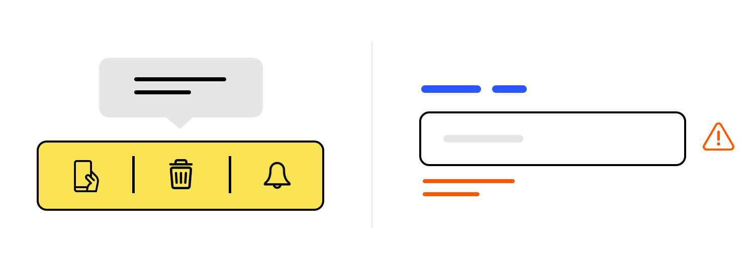
The navigation plays a similar role. Creating a highway system for users to move around is more than just shoving a bunch of links in a hamburger menu. The navigation needs to reflect the information architecture, so that users can easily find the primary information and features without breaking a sweat. Some designers say that users shouldn’t even have to think in order to navigate.
These two pillars of web design can make or break any product out there. If users can’t understand where things are, they can’t benefit from the product. If they can’t reach an important feature, the entire experience is compromised. Designers will invest a lot of time into creating, testing and validating these two areas of the product, precisely because it’s so crucial.
Cognitive effort is just another term for the mental effort that users need in order to use the design. As we mentioned before, if anything requires too much effort it’s very likely that users will become overwhelmed, frustrated and tired. It corrupts all the hard work that designers invested into creating that experience. A web design principle worth remembering is that truly great web design is intuitive and effortless.
So, how do we keep the cognitive effort down to a minimum? Some of the tactics are surprisingly simple, like allowing whitespace and making sure the design isn’t too busy. Investing time into an intuitive navigation system is another good way to make the experience easy for users.
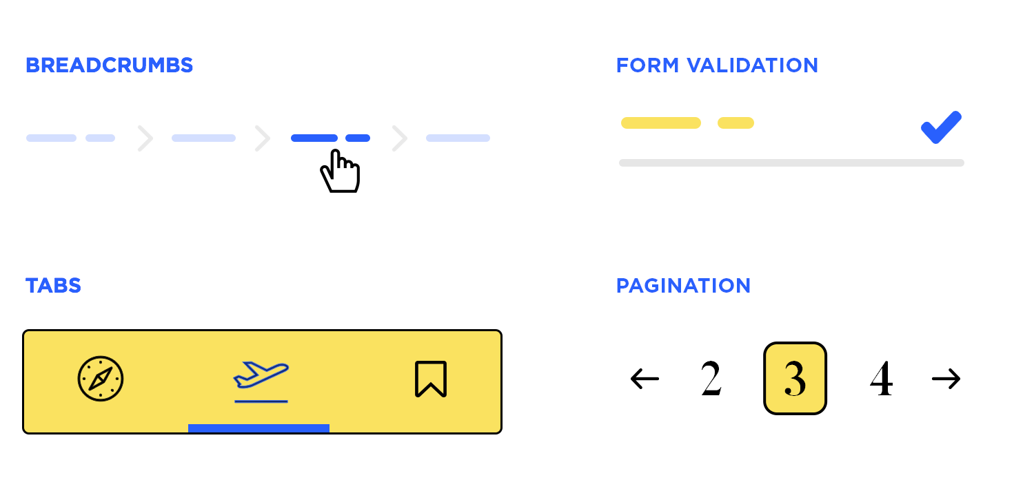
Even though lowering the cognitive effort can seem like a daunting task at first, most designers will instinctively know an energy-demanding design when they see one. More often than not, it’s all about the details. A label that actually helps. Copy that is easy to read, both because of the language and the choice of font. A form that leaves no room for interpretation. An error message that tells the user how to fix the problem.
After designers have gone as far as they can when it comes to smoothing out the effort required to use the design… they keep going. The secret is to carry out multiple rounds of user testing in order to spot areas that can be improved further. It’s all about keeping a close eye on the behaviour of users and getting a sense of which elements and areas gave them pause.
Design patterns are basically tried-and-true answers to common problems that all products run into eventually. We went into great detail in our post UI patterns as to which patterns are most used by design teams and which problems they solve.
The web design principle here isn’t necessarily which patterns to use. It’s more about accepting the patterns and seeing their value. There’s a reason so many design teams rely on them to deliver great designs – they work. They are sure ways to create a design that gets the job done while also leaving a good margin to get creative.

We know that many web designers look to leave their mark and create something unique. But truly versatile web designers recognize the role that patterns play in the design game. They help extensive designs stay consistent, help users get the most of the product and help designers to create faster and better.
It’s a well-known web design principle that usability testing is a crucial part of any design process. It’s a powerful aspect of design itself, working to show us the gap between what the design team thinks that users want and the reality. This is the secret to any good product out there. It can mean the difference between a project that runs well and one with delays, terrifying costs and bad performance.
Let’s go back to the beginning and go over the 3 main types of user testing. First, the exploratory testing. This refers to a testing round that takes place in the beginning of the project, as soon as there’s a minimum viable product to test. It seeks to know more about the user’s behaviour and validate the main pillars of the design (IA and navigation).
Second, there’s the assessment testing, usually done midway through the project. They measure the usability and work to guide the team towards areas for improvement.
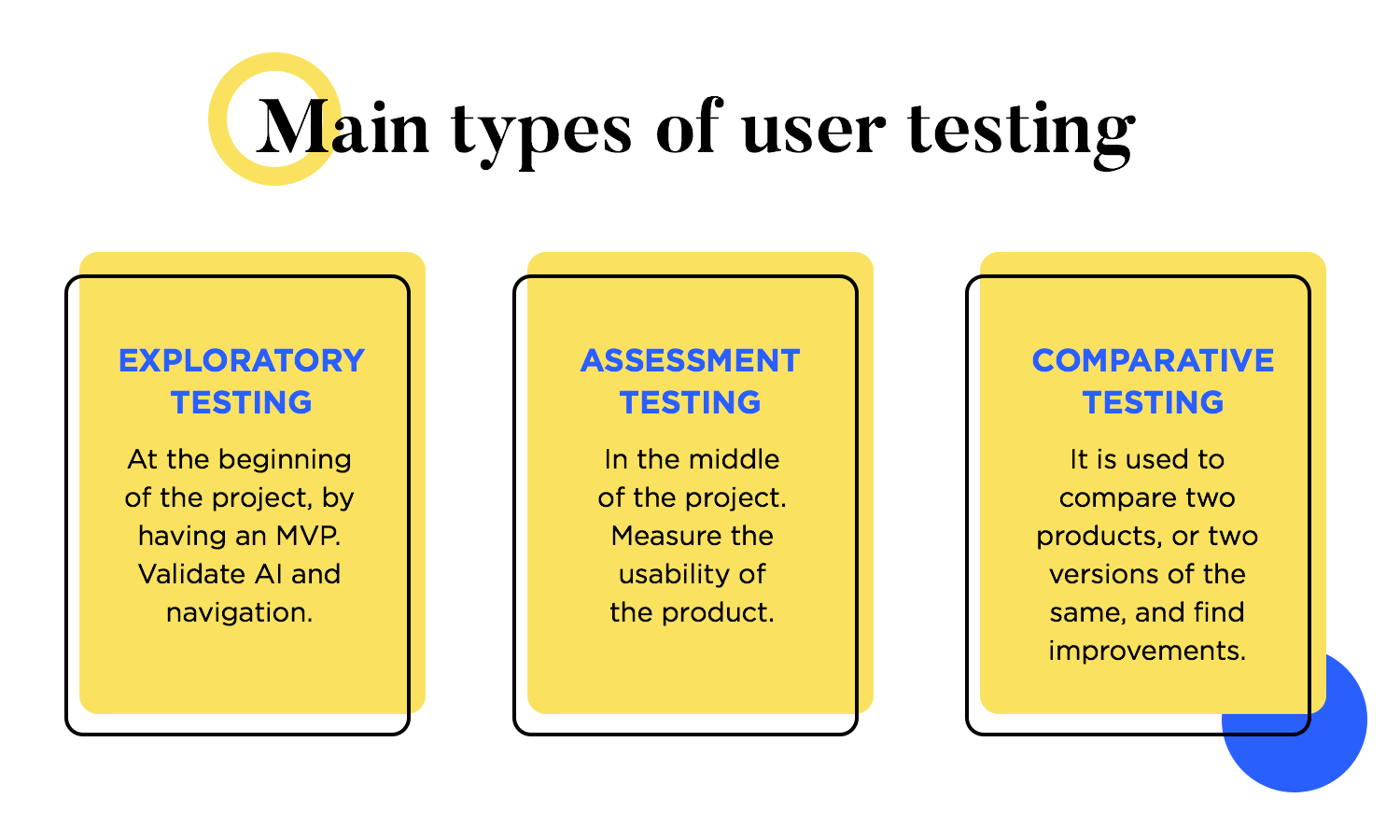
Lastly, we have comparative testing. As the name suggests, this is when design teams simply test two products against each other. Usually, one product is the team’s design and the other is a competitor. This can show us which design flaws the competition has, what impact they represent and help us avoid the same mistakes.
As to how designers carry out testing, there’s a huge number of possible approaches and methods out there. Today, with top-quality remote testing software like Userzoom, there’s few limits as to what we can actually test. This is a topic that deserves it’s own guide, which is why we strongly recommend you read our full guide to user testing. It goes over the most popular methods, how they work and why designers use them.
The world of web design keeps evolving, changing. The standards that users have, the technology available to designers, the businesses that rely on design teams to sell and make money… everything moves fast in this sector. However, some things remain true when it comes to these key web design principles. Some of these ideas have been around since the 1970’s, when the internet was taking its first few steps.
It goes to show that web designers can rely on a solid center of their knowledge, trusting their instincts and referring back to the user research materials for guidance. These principles will, over time, become just another way in which designers fine-tune their work and will come naturally to most.
PROTOTYPE · COMMUNICATE · VALIDATE
ALL-IN-ONE PROTOTYPING TOOL FOR WEB AND MOBILE APPS
Related Content
 Crafting landing pages that convert doesn't have to be tough. Here’s our snapshot of 30 landing page examples with awesome UX that nailed it!12 min Read
 How important are lists in UI design? How much do they affect usability and what’s the best way to design them? In this guide, we'll explore the elements that make up a great list UI design and look at some inspiring examples!15 min Read
 UI design examples that bring some serious inspiration. From parallex scrolling to delicate animations - this list has it all to get you inspired!8 min Read
