Interaction designer, Ron Kim, joined us to reveal how he and his team use UX design and prototyping to help NASA launch rockets into space.
We welcomed Ron, interaction designer from NASA, to the Galvanize center in San Francisco to share with us his insights into UX design and the important role it plays in modern space travel. He also provided some interesting insights into where the industry could be headed in the future.
NASA has 10 centers around the country, including the Jet Propulsion Laboratory, but the ones Ron and his team primarily work with are the Johnson Space Center, which is where Mission Control is located, The Marshall Space Flight Center which assembles the next generation of space rockets, and the Kennedy Space Center that launches rockets.
“...we’re designing for people - they just happen to be engineers.”
Ron is stationed at the Ames Research Center in South Bay, Moffett field alongside a team of 12 designers, 12 developers and six quality assurance engineers. Although they originally started off as a design consultancy agency, the company has now become embedded in NASA.
NASA are logical thinkers, meaning it can be hard to convince them of the importance of UX. Being part of NASA, according to Ron, means that it has been easier to build trust and legitimacy in using design thinking to build their tools.
After all, building software isn’t just about meeting a certain set of requirements – Ron and his team have to consider the human element, as he put it “we’re designing for people – they just happen to be engineers.”
Live from San Francisco with UX designer from NASA
Posted by Justinmind Prototyping Tool on Wednesday, March 21, 2018
In what was a very enlightening talk about UX for space exploration, Ron kicked off with an example of a striking picture of American astronaut Peggy Whitson floating about in the international space station (ISS), tapping away at an iPad.
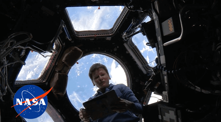
Image source: nasa.gov
This set the tone for the rest of his presentation because, as he stresses, software design has become increasingly important for NASA operations, both on the ground and in space.
Like many organizations, NASA typically develops its own back end software. In recent years, however, they’ve come to learn that user experience is an important aspect of enterprise software they can’t ignore.
After all, the easier it is for ground control engineers and astronauts to use NASA’s back end software efficiently, the quicker, cheaper and more efficient their missions will be. That’s why Ron and his team follow the practice of designing with a “walk-up-and-use” approach.
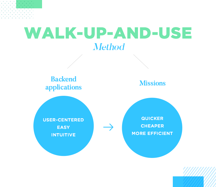
The idea of the “walk-up-and-use” approach is to make back end applications developed for NASA employees easy and intuitive. This is especially true with astronauts, as Ron emphasizes, who have to use multiple different apps throughout their day, which is usually very complete with maintenance, spacewalks for reparations and scientific experiments, requested of them from NASA and various education institutions and private corporations.
The Playbook app and Mars Rover Scheduling Tool, are two great examples of backend software Ron and his design teams have had to work on for NASA.
Ron starts off with an example of a web app called the Playbook that one section of his team worked on which lets astronauts schedule their day. Prior to this, astronauts had their days scheduled for them by Mission Control on the ground – and right down to the five-minute increment! This, according to Ron, was because it’s a costly business rocketing astronauts up into space.
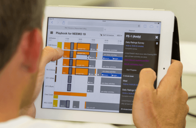
Image source: nasa.gov
However, as deep space travel becomes a closer reality each year, our technology (and astronauts) has to adapt. Playbook is an application that helps them schedule their day easily and autonomously.
Ron then gives an example of the first tool he and his team started working on, which was a Mars Rover scheduling tool. This tool is used for planning, scheduling and controlling the Rover’s activities each day by the ground-based engineers in NASA’s M-Slice laboratory (Mars Science Laboratory).
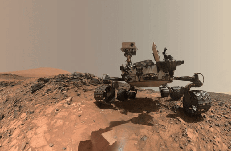
Image source: nasa.gov
When this talk went down, Ron and his team were also in the process of developing other web-apps for the ground-based team. They were mostly a set of data entry tools used to manage safety documentation, and for verifying checklists before they launch something into space!
The two main programs that Ron and his team work on are the ISS and Exploration Systems Development.
Work started on the ISS in the late 90s and it took 13 years in total to construct. The ISS acts as a giant laboratory orbiting the earth where astronauts conduct the scientific experiments referred to above. The main types of experiments are based on measuring the effects of microgravity.
In this program, it’s not just the ISS that Ron and his team have to support – they also have to design apps and software for all the engineers in the ground support facility who have to deal with filing paperwork, and follow endless procedures to ensure they can successfully propel astronauts and supplies into space at 1,000 mph.
The Exploration Systems Development program comprises two vehicles. One is a giant rocket called the Space Launch System, which is a Next Gen deep space rocket that in a few years’ time, will send several payloads and astronauts to the Moon – and after that – to Mars!
But that’s not the only vehicle on this program. They also apply their design process when developing software for the Orion vehicle, which carries the crew that sits on top of the Space Launch System. Ron breaks down the type of support he and his design team supply to these two programs as Mission Assurance and Mission Planning.
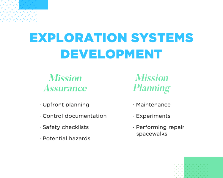
You can think of Mission Assurance as preventing all the things that could go wrong. It includes upfront planning, control documentation, safety checklists along with any documents mitigating potential hazards. Those mitigation documents then go into the systems that the engineers and Mission Control need to access.
Mission Planning is the other aspect of support provided to the two above programs. By Mission Support, Ron means the organization of any mission that takes place in space, the current one being the ISS. Their design process covers software that manages any tasks that happen on a day-to-day basis, including maintenance, experiments and performing repair spacewalks.
To make sure they can provide mission assurance and planning to support the two programs mentioned above, Ron and his team use a design process that includes the following stages: discovery, contextual inquiry, ideation and testing.
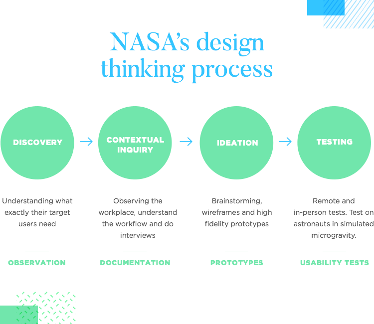
One of the most exciting phases is the discovery stage. During this first step of the design process, the team tries to understand what exactly it is their target users need. And this is no easy task- as Ron attests to. What the engineers and astronauts at NASA do is so different from his and his teams’ own work, that they have to spend slightly longer in the research phase than designers in other industries might have to.
To illustrate this, Ron then gives an example of one of NASA’s projects at Ames which involved blasting a 30 foot flamethrower at different materials to test their durability on re-entry to the atmosphere. For projects like these, Ron and his team have to spend time with the engineers to learn about all of the processes involved – observation is key here.
As the name might suggest, the contextual inquiry stage consists of observing the engineers and astronauts in their place of work, a type of shadowing or expert-novice setup.
As Ron and his team observe, they take notes of any important information or processes in addition to attempting to understand their workflows and processes. They then gather artifacts as well as document other tools of reference pertaining to their workflow.
“...over time we’ve been able to get a sense of who our users are.”
Ron testifies to the use of flow diagrams for understanding the different roles and responsibilities involved in a project, in addition to the various forms of communication and coordination used by different teams. They also use sequence diagrams to help them understand the order of operations of a particular team for whom their team is developing for.
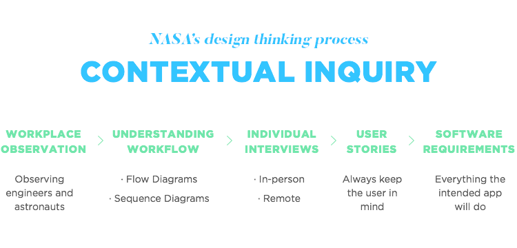
After a while, as they get an understanding of a particular project, the processes involved, and the steps their target users have to go through, they go back for lighter observation sessions – usually one-to-one interviews involving a structured protocol.
These interviews, Ron told us, help him and his team to get a better picture of the people they’re helping: “…over time we’ve been able to get a sense of who our users are.” He also highlighted that their approach is largely influenced by the difference between the two main types of user they design for: astronauts and ground-based engineers.
Ground-based engineers are a highly specialized bunch and tend to be what Ron defines as “expert users”, meaning that their knowledge and skills are highly focused on one area.
For this type of user, his team needs to strike the perfect balance between usability, along with the “power features” the users consider will help improve their workflow.
Astronauts, on the other hand, tend to be highly skilled generalists who perform a wide range of activities on a daily basis. Their average day on the ISS involves conducting scientific research experiments, maintenance and spacewalks.
Ron and the design team have to account for the fact that an astronaut’s work has huge time constraints due to the high costs of sending them into space.
After synthesizing all the information gathered from their user research, the design team writes their software requirements – everything the intended app or software will do. Although this is usually the realm of the product manager, in Ron’s team, every task is spread out among the team members and so too is this document.
However, according to Ron, in light of all the technical requirements and specifications, it’s often easy to lose sight of why the software is being created – for the user. As a way of always keeping the user in mind, they use user stories.
Usually they use the statement “as type of user, I want some goal so that this happens” to help create the stories. By identifying the users and carrying out the research, they can create these statements before writing the software requirements.
Among the benefits this method boasts, according to Ron, is that it sparks discussion and positive debate, helping the entire team to think more openly. The quality of the sketches don’t matter – what matters is the creativity.
After their brainstorming / sketching session, they dive into prototyping. To start with, the team works on simple sketchy wireframes to provide a generalized description and direction for the project. Sometimes they even use paper prototyping for when they need to get feedback quickly and early. Once they refine their idea, they create a high fidelity prototype.
Later, as their ideas become further refined into high fidelity prototypes, they perform in-person and remote usability tests.
When testing, Ron and his team typically use think-aloud protocols in which they observe as the user performs his / her list of tasks, while having them verbalize everything that’s going through their mind. This verbalization provides them with even more insight into what needs improving. They then reiterate and repeat the process before beginning development.
Ron then presented us with an interesting dilemma: user testing on the ground is a piece of cake – but what about testing on users who are in outer space?
Instead of testing with astronauts who are already in the ISS, Ron and the team test their new applications and software with astronauts stationed in Aquarius, an underwater laboratory facility off the coast of Florida where astronauts prepare to live in space.
Aquarius gives these astronauts the opportunity to train their bodies to adapt to microgravity by being submerged in water. It’s when they’re submerged that Ron and his team have them test the apps they’d use in space. But why test in this environment? Because being submerged in water provides conditions similar to microgravity and that’s what this exercise is all about – simulating the environment where the astronaut would use the app.
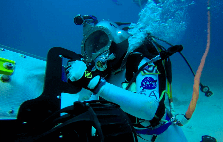
Image source: nasa.gov
Ron provides an interesting example of this type of testing in Mission Control. The users being tested were astronauts who were participating in NEEMO. The flight team and principal investigators sat at the front of the room while Ron and the rest of the design team sat at the back, observing the astronaut’s interactions with the tool.
There were two screens: one showing the astronauts using the tool and the other providing a view of the user.
Can you give us an idea of an average day for a UXer at NASA? What are you working on right now?
We usually work out of our offices in the heart of Silicon Valley, just off the San Francisco Bay in between Mountain View and Sunnyvale. We have a relatively small UX design team, so we find ourselves supporting a variety of roles.
Depending on the day, my time may be spent sketching ideas, conducting user research with my clients, designing UI screen mockups and prototypes, or managing a project schedule.
I’m currently working on a team to design a new web app aimed to consolidate and dramatically simplify the process of sending scientific experiments to the International Space Station. There’s a significant amount of data that scientists and researchers need to provide when planning to send an experiment to space, and they often find themselves entering the same data multiple times across many disparate systems in the process.
By developing this tool, we’re looking to streamline that process so that experiments can get to space more quickly, which allows NASA to make more efficient use of the Space Station.
I’m also wrapping up work on designing an iOS app, the NASA Task Load Index, intended to measure subjective workload in various environments such as space flight, aircraft cockpits, military units, supervisory and process control, and simulations and laboratory tests.
What are some of the UX challenges you face when designing software for NASA? Is it different from designing software for any large enterprise? If so, how?
Our clients often work in very specialized areas, so acquiring the necessary domain knowledge to understand our users, their workflows and processes, and the various use cases can be quite a challenge. Spending time to talk to our users in person to gain context and understand specific problems has been something we feel is always time well spent.
Also, some of our data integration projects that share data with different systems require us to work across different NASA organizations and contractors, often with clashing cultures and differing opinions. This requires a thoughtful approach to foster cooperation and ensure that everyone’s needs are being met and the right problems are being solved.
When you think of NASA, you think of the cutting edge of science and tech – does that mean that, as a UXer, you’ve got to be coming up with new protocols for usability testing all the time?
Most of our projects are web applications, so we’ve mostly been making refinements to our usability testing protocol for this kind of product. As we design for new systems or updates to existing ones, we adjust these protocols to ensure new workflows are covered and that our tools meet the needs of the various stakeholders who will use our product.
We’ve begun to explore emerging technologies such as Internet of Things (IoT) and developed initial protocols to perform usability testing, but IoT, augmented reality, and other types of next-generation physical computing technologies are still relatively new areas that need to develop a bit more before they can be widely adopted.
At the end of his presentation, Ron surmised some of the possible directions app development could be headed in the future. He mentioned “the internet of things” (IoT) and Augmented Reality (AR), implying they could potentially play an even bigger role in app and software development as time goes on.
“As designers we often want to create these pixel-perfect, sleek interfaces, that’s like driving a Ferrari...[though our users]...don’t necessarily want a sleek ferrari; they want a Toyota Camry.”
They currently have partnerships with several universities, including Carnegie Mellon. They’ve already developed tools using AR and the IoT. One of their latest experiments includes testing how an astronaut can find tools on the ISS using sensors combined with a headset.
IoT and AR continues to be an emerging space (no pun included!), though there’s a lot of work still to be done and a lot to be refined before NASA can formally adopt these technologies. The most important consideration is, as always, how these technologies can make life easier for the user.
In the Q/A session, one of the audience members posed the question:
“Are your users ever frustrated by the fact that your infrastructure may have limitations on the type of UI that you develop…[that]…it might not be as sexy as your standard iPhone / Android device…?
To which he answered:
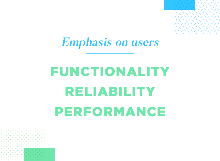
“As designers we often want to create these pixel-perfect, sleek interfaces, that’s like driving a Ferrari…[our users]…don’t necessarily want a sleek ferrari; they want a Toyota Camry.” As scientifically minded individuals, NASA’s users value functional operations, performance and reliability.
Whether you design software that is elegant or merely functional, Ron’s case demonstrates that UX design is about understanding who your users are and where they’re coming from.
PROTOTYPE · COMMUNICATE · VALIDATE
FOR PROTOTYPES OUT OF THIS WORLD
Related Content
 UX design portfolios are your chance to showcase your top skills and best work. Check out this post for awesome portfolio examples and websites!10 min Read
 Learn what paper prototypes are, how to make them and how they can help you design better products. Awesome examples and free templates inside!10 min Read
 In this comprehensive study, we dive deep into the world of web design tools, comparing features, pricing, ease of use, and more. Whether you're building a simple landing page or a complex e-commerce store, we've got you covered. Let's explore the best options and help you make an informed decision.30 min Read
