SurveyMonkey’s product designer, Jonathan Remulla, opens up about his journey with machine learning and how it boosts UX
Will machine learning (ML) be the new revolutionary technique to improve UX? Jonathan Remulla from SurveyMonkey joined us at Galvanize in San Francisco to tell us how they leveraged the beast that is ML to design awesome new features. Features that instill confidence within their users and keep new users coming back for more!
Discover how one of the most prolific survey tools managed to design an assistant, recommendations as well as predictive questions and answers that streamlined the whole user experience!
Live from San Francisco with UX designer from NASA
Posted by Justinmind Prototyping Tool on Wednesday, March 21, 2018
Everyone’s heard of Survey Monkey. Originating from the Bay Area in 1999, for many it’s the go-to tool for generating a professional survey and getting feedback fast. Jonathan is Product Designer at Survey Monkey, and at the time of the ML project, had the best part of two decade’s design experience under his belt.

With plenty of experience in design but having never dabbled in data science, it’s not surprising that Jonathan balked slightly when he first saw ML on the product roadmap. It wasn’t something he’d ever imagined doing at SurveyMonkey. But he quickly realized it made sense when you consider all the data the company generates.
With over 60 million users and 20+ million survey responses, the folks at SurveyMonkey thought, “why throw the baby out with the bathwater?” Surely there was something they could do with all that data! And that’s why ML entered the roadmap.

But what is ML exactly? In a nutshell, ML applies AI in a way that helps a system automatically learn and evolve by identifying data patterns. To make this happen, it turns out you need two ingredients: a ton of data and a group of people who are very good at math. Both of which SurveyMonkey happened to have, just before they began the project in 2017.
They rounded up a bunch of data scientists who had been working in other departments and brought them into Product Development for the first time. The scientists then determined ways to harness SurveyMonkey’s existing data and collect more for data models, which are basically a way to make automated predictions.
SurveyMonkey would then use these data models to design new features that would streamline the survey creation process for the user by automating the process and providing recommendations.
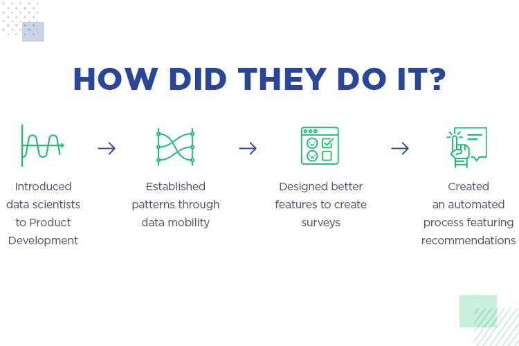
By 2018, Jonathan and his team of designers and data scientists began work on real features based off of their data models. Features that would, for the first time, leverage ML. They started with question and answer predictions, and by the end of the year had moved on to their Genius Assistant and Build It For Me features.
However, before Jonathan and his army of designers and data scientists went in with guns blazing, there was one hurdle to overcome: to find out what the user actually wanted. As Jonathan points out, ML can help you build awesome features, but it’s a futile exercise unless you’re solving a problem that actually exists.
For Jonathan and his design team to get the most out of the resources SurveyMonkey had, they decided first to empathize with the user. To develop features that would really boost the UX of the product, they decided to focus on the user’s emotions.
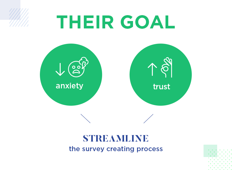
As Jonathan explains in his talk, he and his team found that an alarming number of surveys were never actually sent after they’d been drafted. Why was that happening? A one-word answer stood out in stark relief: anxiety. They asked themselves “how might we improve confidence and reduce anxiety?”
This question led the team to work on streamlining the process for their customers, and especially for their new users. They wanted to make the survey creation process less daunting for first-time users, to help them across the finish line and actually get their survey sent.
To kick off his presentation about how SurveyMonkey managed to boost UX with ML, Jonathan offers up a case study that paints an exciting but stressful scene. One which starts off with panic and trepidation as the underlying themes.
The study revolves around a user called Janice who begins a new job at a startup called SoSuite, a company selling social media tracking tools. Her new job title was Customer Success Manager. She was to be in charge of the satisfaction of over 5,000 customers. In this kind of scenario, it really comes as no shock that one of the first tasks her boss assigned to her was a customer survey.
There was a problem, however: she’d never actually created or sent out a survey in her life! Arrrgh! As a barrage of emotions raged through Janice, she thought about just how much was riding on this simple request. She needed to make the right first impression at her new job and so it had to go smoothly.

Jonathan was wise in choosing this example as the kind of problem they wanted to solve with ML. As the story unfolded, he placed a special emphasis on Janice’s emotions, as this was an important motivator for the research behind SurveyMonkey’s ML upgrade. One of the main downfalls they wanted to avoid was making the user feel stupid or incompetent.
So, in this example, Janice gets stuck into creating her new survey and uses SurveyMonkey to get the job done. Jonathan then goes on to use Janice as a model to describe the kind of thought process the typical user might have for the first time when using SurveyMonkey.
She sees that she can start a new survey from scratch or create one from an existing template. The latter option looks great for saving time, but there are literally hundreds on offer. She goes on to discover the Build It For Me option and decides to run with it.
The next thing Janice sees is “who do you want to survey?” She has a choice between target market, attendees, co workers and existing customers. In this case, she chooses the existing customers. For the survey type, she selects “customer satisfaction”.
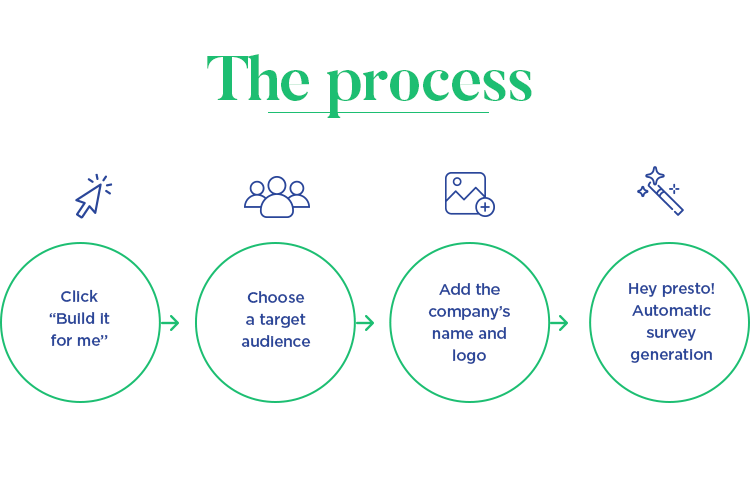
The rest of the process is surprisingly simple. All she has to do is add the name of her company (SoSuite), upload the logo and then let SurveyMonkey automatically generate the survey based on her inputs. SurveyMonkey will now give her some recommendations to finish the survey, such as replacing certain answer choices with a list of SoSuite’s products and services. This could be replicated for all questions, saving a lot of typing time.
Certain multiple choice questions, such as customer age ranges are already available, saving her from typing all of them. A “perfect” message (survey score) pops up on the left and an estimated completion rate of 62% within 2 minutes is given. SurveyMonkey was even able to recommend that she add her boss’s email list as a .CSV file to send. Clever or what?
Overall, Janice was able to save a lot of time and her confidence grew by the second – she got it all done in 7 minutes, without knowing the first thing about surveys! Jonathan chose Janice’s case to illustrate the success of their ML endeavor.
Using ML, SurveyMonkey were able to design and develop new features that help recommend you, the user, the appropriate survey type and send method based on your case. It helped to narrow down options for the user, meaning they get the task done faster and the regular feedback fills them with the confidence that they are getting the job done properly.
The whole point of SurveyMonkey applying ML when developing its Genius Assistant new features, as Jonathan stresses during this talk, was to instill confidence within the user. And you can only do that when you and your team design with a user-centric approach. To do that, it’s best to work with facts.
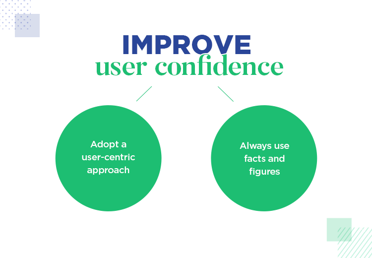
Let’s take a look at some of the features SurveyMonkey were able to develop with an iterative, data-backed approach with ML and UX at the forefront.
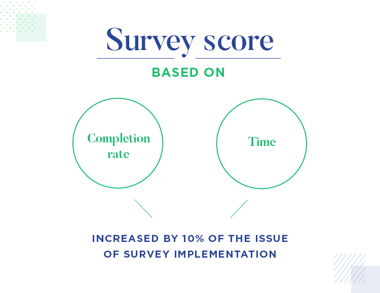
As an example, Jonathan starts by mentioning the survey score. To do this, they worked with the two things they already knew: the completion rate and time.
Jonathan and his team were able to discover the completion rate because they had been tracking surveys sent and completed. They were also able to get the completion time as they knew the moment a user opened a survey to the time they completed it. And that was it – the first SurveyMonkey feature to utilize ML.
Jonathan and his team of designers and data scientists were excited, to say the least, by this latest innovation.
“The Data scientists were super psyched, everyone was really stoked that we built our first ML feature”
After that, they saw a 10% increase in the rate of survey deployment. When we take into account the amount of registered users SurveyMonkey has, that’s quite a significant increase, as Jonathan gleefully attests. This meant that users were starting to feel more confident about sending their surveys – an issue they’d been previously looking to address.
The next game changer that the team worked on was the data model to predict question types. As Jonathan asserts, the problem isn’t normally that the user doesn’t know what they want to ask, but rather, they don’t know how to ask it.
As SurveyMonkey provides over 20 different question types, choosing the right type each time can be quite intimidating, or purely time consuming to say the least. What’s more is you want to make sure that your survey is expertly written. Jonathan and the team saw this as an opportunity to give their users the comfort of having expert survey-maker advice and predict the right type of questions to elicit the answers they need.
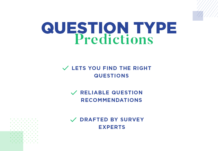
Using the models the data scientists provided, they were able to make these predictions very quickly and accurately. In terms of accuracy, SurveyMonkey was able to predict three out of every five questions accurately, leading to a huge reduction in workload for the user.
“You know what, can we just pause it a little?”
When it came to speed of prediction, things were actually happening too fast! Normally this is never a problem with technology in general, which goes to show the power of ML. The prediction results came in so fast that they went from having zero suggestions to whole trestles of information.
As a result of the rapidness of these ML predictions, Jonathan decided that it was best to slow things down a bit so as not to overwhelm new users, as everything was happening in a millisecond. As he recalls in his talk, he asked the question “you know what, can we just pause it a little?”
The effect of the spinner had the positive benefit of giving the user a quick moment to digest what was happening on the screen. It also served as a way to hint at how powerful the tool actually is – something that helps give them confidence that they can trust the predictions.
The logical follow-on from question type prediction was answer prediction. The only problem here, however, was that there was no previous data to go on. Neither data scientists nor product designers had tracked the kind of answers options users had been providing in their surveys.
This limited the options available to Jonathan and his team. However, they realized they could cut down on the time it takes the user to type in the answer options. To indicate how much of a problem this can be to users, Jonathan gives the following example:
Imagine a “strongly agree” to “strongly disagree” answer. This can lead up to eight different answers alone. Multiply that by five or six questions and you suddenly find your typing skills growing at a fierce rate! That’s not very user friendly, however.
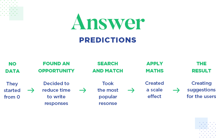
So instead, Jonathan and his team took some of the most popular answer ranges that customers had been using to date. In doing this, they created what he called a “scale effect” whereby you purposefully create a feature to generate the data that you don’t have.
Rather than providing the user with explicit recommendations, the answers are merely suggestive. Otherwise, they ran the risk of users having to change many different questions. And we completely agree. This type of unnecessary work can bump up the interaction cost – which isn’t desirable for any product.
After about two and a half months, SurveyMonkey then had enough answers to build up a large repository that the data scientists could start having fun with.
Just like with the answer prediction feature, Jonathan and his team also didn’t have any previous data to go on for the “Build it for me” feature. This meant they had to set up the conditions for another scale effect. There was never a precedence for the Build It For Me feature: you either chose to create a survey from scratch or you chose from one of the templates available.
With the Build It For Me feature, you simply pick a target audience and a survey goal (which in Janice’s case was getting feedback). Then you’d go on to choose the right template because that would then narrow down the options from 300 to 4.
Because they had no previous data to work with, the data scientists weren’t involved for this feature. Instead, Jonathan and his team brought in a content strategist and a survey researcher to make sure that the assumed user paths Jonathan and his team created were in fact correct and made sense.
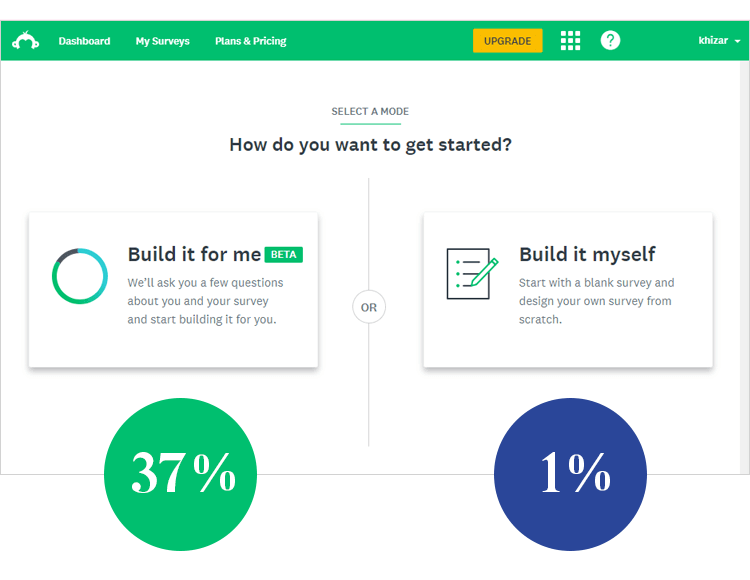
They tested this feature for about 8 weeks and released it only to a very (relatively) “small” cohort of 10,000 test users, and they found that 37% of customers were selecting the Build It For Me options and about 1% the Build It Myself alternative.
One of the expectations Jonathan and his team had for the new UI was for the user to feel like they were entering an experience. This meant using a new color scheme and creating a simple, uncluttered UI where decisions would feel very intentional.
The best thing of all about this new UI that Jonathan recalls in his talk is the fact that it also feels intentional for them. They can start learning and gathering data as soon as a user lands on the page! In this way, SurveyMonkey can keep improving and evolving to suit its users.
So what can we learn from Jonathan and his team’s experience with ML? Towards the end of his talk, Jonathan gives us some pointers for utilizing ML if you do decide it has a place on your roadmap.
Firstly, you should start with what you know. In Jonathan’s case, he and his team knew exactly how long it took to complete a survey, along with the completion rate, so that was their starting point.
Next, and quite logically: always start with a vision. Make sure you have a concrete idea of the problem you’re solving for your users, otherwise you risk wasting time and money. Remember – if it ain’t broke, don’t fix it!

Thirdly, ML is incremental and requires a cross-functional team effort. It requires scaling and iteration to perfect. It also requires a tight-knit team of experts: PMs, designers, data scientists, content strategists – everyone should have their pitch.
Lastly, unless it’s necessary, ML should remain mostly invisible and work behind the scenes, at least when it comes to productivity software, like SurveyMonkey. Users want to know they can get things done fast and with confidence!
PROTOTYPE · COMMUNICATE · VALIDATE
ALL-IN-ONE PROTOTYPING TOOL FOR WEB AND MOBILE APPS
Related Content
 UX design portfolios are your chance to showcase your top skills and best work. Check out this post for awesome portfolio examples and websites!10 min Read
 Learn what paper prototypes are, how to make them and how they can help you design better products. Awesome examples and free templates inside!10 min Read
 In this comprehensive study, we dive deep into the world of web design tools, comparing features, pricing, ease of use, and more. Whether you're building a simple landing page or a complex e-commerce store, we've got you covered. Let's explore the best options and help you make an informed decision.30 min Read

