VR, MR and AR look set to play a big role in the UX design industry of the future - read on for tips on how you can embrace this new field as a designer
The winds of change are blowing in the tech and design worlds. The future of app, web and software design promises all manner of challenges and possibilities for those who are willing to step up to the plate. Virtual Reality (VR) isn’t just a gimmick – it’s set to make a comeback, and even stronger than before.
We saw headsets like Google Cardboard and Oculus Rift entering the market and causing a furore, then dying down again. Their VR design had a very primitive, experimental feel, and perhaps that’s why it hasn’t taken off yet. However, that’s not to say they weren’t instrumental to the growing field of VR design, a field that could completely revolutionize the way we live and sooner than we think.
The same also holds true for augmented reality (AR). Yes, you could say that AR design has played a part in modern life with apps like Pokémon Go and Instagram, but up until now, apart from handy backup cameras with AR guidelines in cars (first introduced with Nissan’s Infiniti Q45 in 2001), it hasn’t seemed like anything more than a curiosity, a nice-to-have.
Fast forward to today and the area is really heating up. In 2018, Google brought out their AR Core platform for developing more advanced AR products and in 2019, Microsoft introduced their HoloLens 2 at the Mobile World Congress, breathing new life into the term “mixed reality” (in between VR and AR).
Image credit: SAVATAGE for Intentional Futures
These winds of change raise new questions for designers. Will it pay off to dabble in the worlds of AR, mixed reality (MR) and VR design? We say it certainly doesn’t hurt to gain experience designing for these technologies and it could enhance your skills as a designer all round. The question is, how to go about it?
If you’re interested in AR, MR or VR design, or just looking for a refresher course, this post should point you in the right direction. Read on for 18 important design principles regarding these relatively untapped fields.
VR is pretty much as the name implies – a virtual world that the user can enter and experience as their own reality. In the last few years there’s been a lot of experimentation in VR design. However, even though it dates back to the 60s, VR design only recently started to come to the forefront.
Devices such as Google Cardboard, Facebook’s Oculus Rift and Samsung’s Gear VR have been the first steps toward a technology that’s getting bigger each year. Devices like these allow the user to have immersive, 3D experiences by simply downloading a VR optimized app and connecting their cell phone.
For the first time, users could have all round 3D experiences in Google Earth or play 3D video games. Interaction was also possible with head motion, or remote controls.
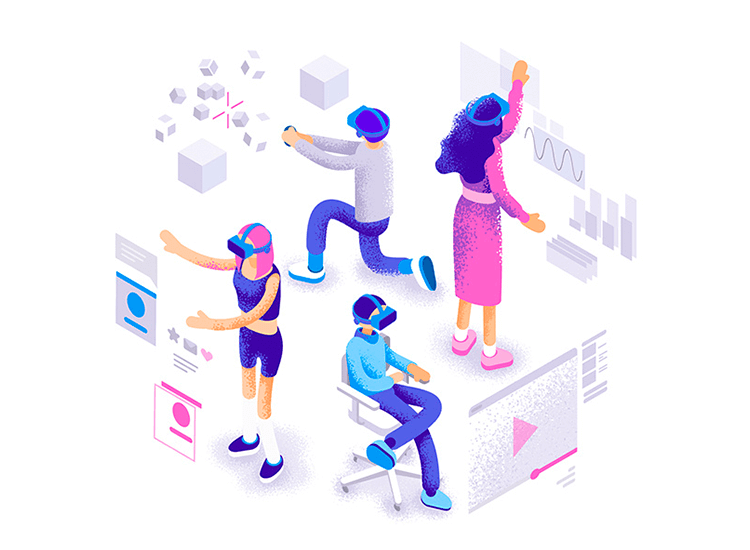
Image credit: Dmitrii Kharchenko
VR design comes in all shapes and sizes. An app’s VR design can have practically no interface and be purely based on a virtual world. Or, it can have little-to-no virtual world and mostly consist of 3D interfaces. As a starting point, most UI designers might naturally gravitate towards the latter in a prototyping tool, as they would need lots of experience in 3D modelling to create complex virtual worlds.
But it’s not just VR design aesthetics that opens up many exciting possibilities for designers, as VR is changing UX. Why? Because this time you’re fully immersing the user, creating a virtual environment that works on most of their senses, such as sight, sound and touch (via remote controls). We could then consider VR design to be the ultimate empathy test.
VR – the terms’s simple right? Self-explanatory. But what about AR? This is where many people get confused: the distinction between AR and VR design. But it’s actually pretty simple. In fact, many popular apps we use today are a great example of AR design in action.
Instagram and Snapchat are examples of apps that use augmented reality. When it comes to editing images and selfies, superimposing digital costumes, applying make-up, changing the face, modifying voice – these are all examples of AR design in action.
A further example of AR design in daily use might be the back up camera in your car. This rear view camera uses that uses virtual distance and directional lines superimposed over a video feed to guide you as you move your vehicle. The GPS you use while driving is another a great example – the voice that tells you which ramp to take on the freeway is the digital world interacting with the real world.
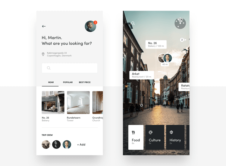
Image credit: PLATFORM
However, the first time we started seeing the true potential of AR to influence the real world was with the Pokémon Go app. In 2016, when this app exploded onto the scene, up to 45 million users downloaded the app to search for virtual Pokémon in the real world.
It seems like child’s play – until you introduce real-world rewards that result in user delight. That’s what we try to achieve in so many of our app and web designs. In the case of the Pokémon Go app, the main motivator is the social aspect.
However, it’s not just social rewards that can contribute to user delight. The IKEA Place app lets people see how furniture would look in their home and gets them excited about their next purchase. It also helps them save time and money. Simply put, and as the name suggests, AR augments or somehow enhances your current reality.
MR is where things start to get a little complicated. A term that’s been around for many years, it might not be clear how MR design differs from AR or VR design. In fact, many people tend to use these three terms interchangeably. However, there are a few fundamental differences that may seem subtle at first, but that do separate MR design from AR and VR design.
First of all, like VR design, MR generally requires the use of a headset. However, MR headsets tend to be lighter and fit more naturally, like tight fitting glasses. Microsoft HoloLens is a great example. When it comes to the visual experience, you can think of MR design as being a combination of AR and VR design.
Nonetheless, MR is neither a completely virtual world, nor does it simply consist of virtual elements superimposed over the real world. It goes a step further by letting the virtual and the real actually interact. It merges fully trackable, digital objects or sprites in the user’s physical world.
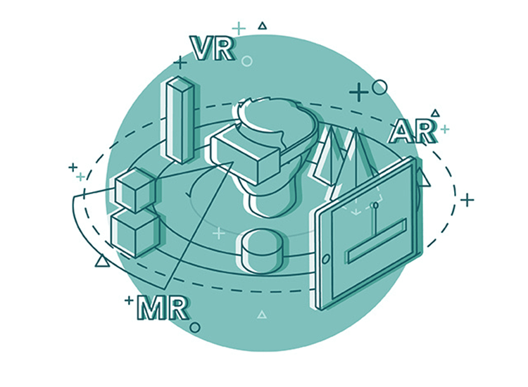
Image credit: Fabien Michaud
The best way to understand MR design is perhaps through example. Imagine a virtual frog leaping off a table and jumping underneath it. The frog would disappear from your field of vision until you look below the table. That’s MR design. It’s true interaction between the material and the immaterial.
MR design is of course still in a relatively primitive stage, but it offers up a lot of exciting possibilities for designers who are willing to learn and explore uncharted territory. Who knows, you could pioneer or even set a benchmark for the next technological breakthrough of our era!
Learning what separates AR, MR and VR design from traditional UI design helps us establish a common set of design principles for the three fields: space, motion and scope.
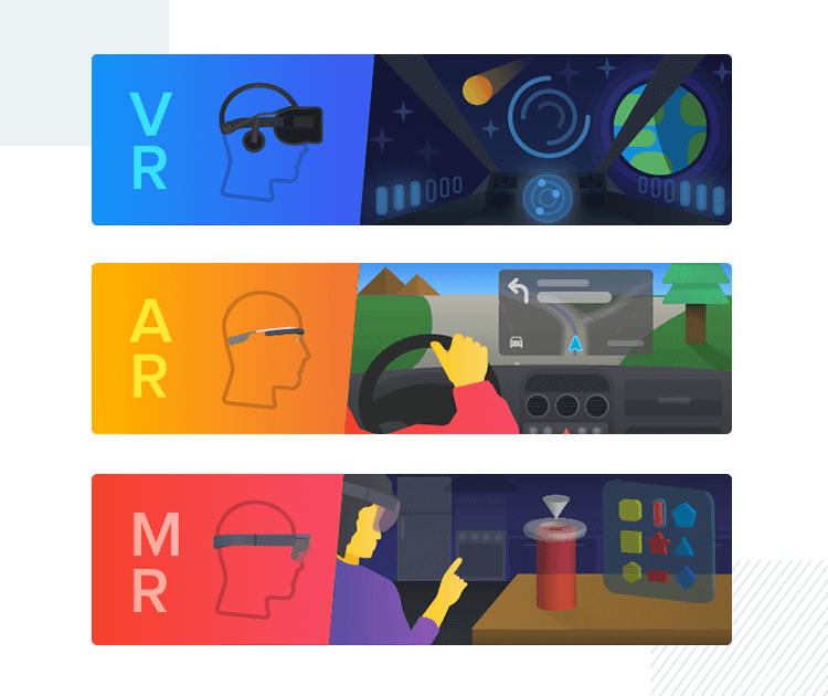
Image credit: Guilherme Schmitt for Intrepid Pursuits
The first and most foremost principle is space itself. Most types of AR, MR and VR design products will require some sort of 3D visual design.
When prototyping with any of these three, you’ll need to consider the distance between the user and the interface or object that you’re designing. Is the typeface clear and is it legible at different angles? Are all the buttons visible? Is the UI or object at a comfortable distance from the user?
Next on the list is motion. When working on an AR, MR or VR design, your users will have more opportunity to use movement to manipulate content, and on a wider scale. For example, instead of tapping or swiping using fingers and thumbs, your users may use their whole arm, or in some cases, their head or facial expressions.
You must also take button size and behavior into account when considering how people might interact with the controls AR, MR and VR designs.
Lastly, and most importantly, we need to consider what actual use people will get from our AR, MR or VR design. There needs to be some kind of reward or user delight in mind, otherwise, there’s not much point. Designing and developing in these fields can be a costly pursuit and you don’t want your product or feature to be a flop.

Image credit: Pawel Olek for Buddy
Whether it’s a VR sightseeing experience, an AR home decoration app or an MR game, you’ll need to make sure that it fills a hole in people’s lives. This can be done by carrying out adequate user research beforehand.
If you follow and implement the same procedures that you do when designing 2D interfaces, then VR design should be a walk in the park (a 3D one!). After you carry out your usability testing and map out your user flows, designing a 3D interface follows the same logic as designing a 2 dimensional one, but with a few extra steps added in.
Writing for UX Planet about UX for VR, Sourabh Purwar gives a straightforward explanation of how you could go about designing a 3D interface for VR.
Imagine having a 3D VR image ready for projection. It’s basically a 360 degree image to be projected onto a sphere, that measures 180 vertical degrees. Convert these degrees into pixels and you get an image that’s 3600 × 1800 pixels when flattened out.

Image credit: René Pi
This would be the image you’d be working with. The only problem is the actual interface itself, rather than the image. The acceptable viewing range is within the range of 1200 pixels × 600 so you would have to create a second canvas that overlays this cut version of the larger image.
Then you have the graphics in VR design to consider. The human eye can see above “8K”, that is 8000 pixels. There’s currently no VR device available that can provide this degree of resolution. The most powerful VR display, the Oculus Rift, can see in a pixel range of up to 1440.
As a result of these restrictions in resolutions, those working on VR design need to pay special attention to the finer details of the elements in their virtual world. One such example is typeface and many designers stress the need to consider print design when it comes to designing fonts that are legible.
Yes, when it comes to VR design, traditional print design comes in useful. Why? Because print design uses typeface that’s designed for the real world – the 3D world.
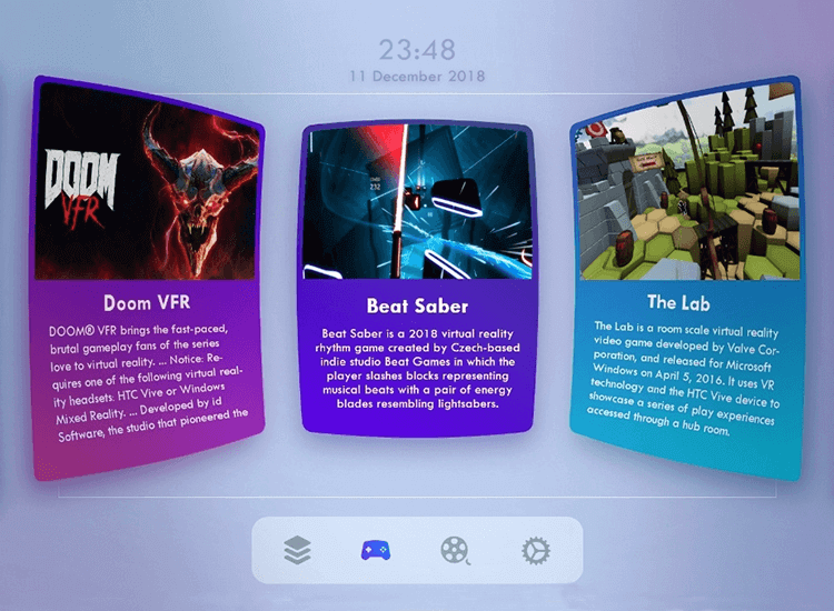
Image credit: Payam Daliri
As a result, print design typeface is especially designed to be legible at the furthest possible distance and from a multitude of angles. Looking at various examples of VR designs and their 3D interfaces, you’ll notice something that’s definitely reminiscent of this early form of print design.
When it comes to UI controls in VR design like buttons, make sure they’re placed within the user’s immediate field of view. It’s best not to have our users looking up and down and here and yonder in search of the controls. The learning curve should be kept to a minimum, as they will already be in a rather unfamiliar environment.
Consider implementing the same types of buttons and controls in your VR design as those used in 2D interface design where possible. This reasoning behind this is that people form mental models – conceptual ideas based on what they already know. In short, they prefer using technology that feels familiar.
Image credit: DarkCube Studio
A further point to make is that if you’re planning for the UI controls in your VR design to be used in conjunction with head motion, then make sure they’re to the side of the screen they’re controlling. That’s because the user’s natural tendency is to look back to the content at the center of the screen after selecting a button. This will help prevent frustration from accidentally resting their gaze too long on a specific control and accidentally selecting it.
Lastly, if you’re going to use automatic buttons in your VR design (often used for head motion control) that auto select if a user does nothing after a few seconds, use a timer or countdown. This will inform the user that a change is about to be made so that they know what’s going on once the screen changes.
There’s so much in the way of visuals when it comes to VR design that we tend to lose sight of the other important factors that govern this technology. VR is a field that throws up new considerations into the mix. Those are, specifically: the user’s location in physical space and their degree of comfort, along with, and most importantly of all, their safety.
Think of a VR app that allows the user to navigate a 3D environment. The first consideration we need to make is if the user could collide with physical objects in the room or trip over. This is an absolute nightmare that would have any UX designer worth their salt waking up in a cold sweat. Not only would it be a bad user experience, the design would actually have caused injury to the user.
Provide very clear advice to the user that establishes how much space they need, either as the app starts, or during the onboarding process. You may even consider including dividing fences or lines that sense physical objects in the room and throw up a barrier that alerts the user.
VR technology can cause nausea, which results from disparities between perceived movement within the virtual world relative to the user’s degree of movement in the physical world.
This is due to a mismatch between the movement detected by the brain and what the eyes see. The lack of visual input to put that movement into context results in nausea, similar to back seat car sickness. The very same can happen in VR worlds and it’s the designer’s job to avoid it.
You can avoid making your users nauseous if you limit the amount of rotation needed in your VR design and ensuring that everything in the virtual world moves at a speed relative to the user’s actual movement. Use lighting and audio as further prompts to direct the user through your VR space.
You must also make sure that the user’s environment is just the right fit. Creating an environment that’s too small or cramped could cause your users to get claustrophobic, whereas if it’s too amplified, the user could get lost.
Make use of 3D audio in your VR design. This type of technology is still in its early stages but can transform how we perceive things in the virtual world. 3D sound means sound that’s relative to our spatial positioning regarding its source.
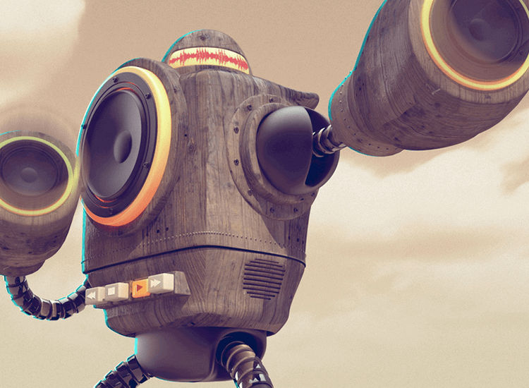
Image credit: Flavio Montiel
Think of fireworks screaming off into the distance before exploding with a reverberating sound, or an airplane passing overhead. Imagine the low rumble of the underground. This kind of auditory feedback can be great for establishing context in your VR design and can really make your 3D experiences come to life.
Before designing an AR app or feature, there are a few things you’ll want to consider. An AR design will not be as intensive as a VR design, mainly because the 3D world will be provided by the user’s device camera.
However, as it is the physical world that’ll be the canvas, there are a number of important considerations and allowances you need to make in your AR design.
You’ll first need to understand the user’s environment and design accordingly. For example, is the AR feature meant to be used in selfie mode? Will it be to try out new interior designs and see how certain furniture pieces look in your home or office?
It’s important that the user understands the scope of your app before they use it so they know how much space they’ll need to operate it. It may seem like common sense, but making this scope clear ensures the user has the best first impression possible. You don’t want their first feeling to be one of frustration because their space is too large or small.
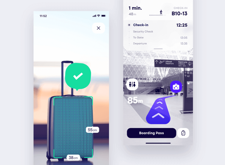
Image credit: Adrian Reznicek for PLATFORM
You should also establish your intended AR environment to get your scaling right. You want to ensure your designs are the right height and width for the spaces they’ll occupy. Establishing your intended environment also forces you to take varying lighting conditions into account.
Unlike VR design, in the AR world you’ll want visual objects to respond to light with appropriate shadowing and reflection. Or, if lighting conditions aren’t optimal, you may consider adding a prompt to instruct the user on how they can adjust the lighting in the room to improve the experience.
You might want to make the same considerations with sound. An example might be in a GPS app where the voice mode may not be a viable option if the car radio is blaring at full volume, so the app will communicate to the user to connect the app to the stereo via bluetooth.
Lastly, in similar fashion to VR design, you need to be aware of the user’s motion when designing an AR app. It’s very important that you alert the user to the potential hazards of their surrounding environment. Afterall, if they’re going to be focusing on a 2D screen, they may not be all that aware of their surroundings.
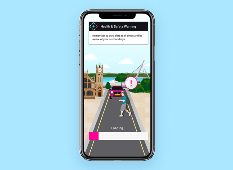
Image credit: Hayley Gregg
Having prompts or providing the user with an adequate warning message beforehand can help prevent the user having a serious accident, such as wandering onto a busy road in search of a Magikarp!
Take into account the tools that will be used to develop your AR design. While designing an app or software UI for 2D use, you pretty much know what’s going to be feasible.
However, when it comes to AR, MR or VR design, you may not be sure that what you create will be possible when it comes to development. That’s why it pays to know the tool that’ll be used to develop your app or software design.
An example of a platform used to develop AR apps for iOS and Android is Google’s AR Core. AR Core has many features, such as Surface Plane Detection and Light Estimation. These features mean your designs could make use of the ability to identify various surfaces and react to light by shadowing and reflecting.
Taking some time to get to know the development platform is a must for designing successful AR features.
As MR can be seen to be a combination of both AR and VR design, it has many principles in common with the latter two. You could think of it as a sort of design triangle.
However, if you’re taking the plunge and designing for mixed reality software, there are certain principles setting MR apart that you should always bear in mind.
Firstly, you need to respect the user’s personal space. Also true in both AR and VR design, making objects appear in severely close proximity to the user will make them feel uncomfortable and less in control of their mixed reality.
Image credit: Rachel Frankel
What you can do to mitigate this is to ensure that any sprite or object that materializes in your MR app doesn’t appear any closer than two meters away, which is what Microsoft considers the optimum distance.
Avoid using any 2D assets in your mixed reality design. Unlike AR and VR design MR has to blend in seamlessly with the real world. 2D objects cannot react to light and reflect it, nor can they create shadows. Even when designing things like menus for your interface, try to always make them 3D.
Be realistic with your MR UI designs. We know that reeks of irony but it’s true in a practical sense. How many Hollywood movies have you seen where the characters are able to manipulate holographic elements?
You’ll probably imagine Tony Stark swivelling around in his chair, swiping through the air at a dizzying medley of graphs, stats, buttons and interface options. It looks cool but we want to avoid that in real life. It’s more than likely your users won’t be using your design to save the world. At least not yet!
It’s important in MR that your design never overwhelms the user. The real world isn’t normally overwhelming, so why should your MR app be any different? Especially since you want it to blend in seamlessly with the physical world.
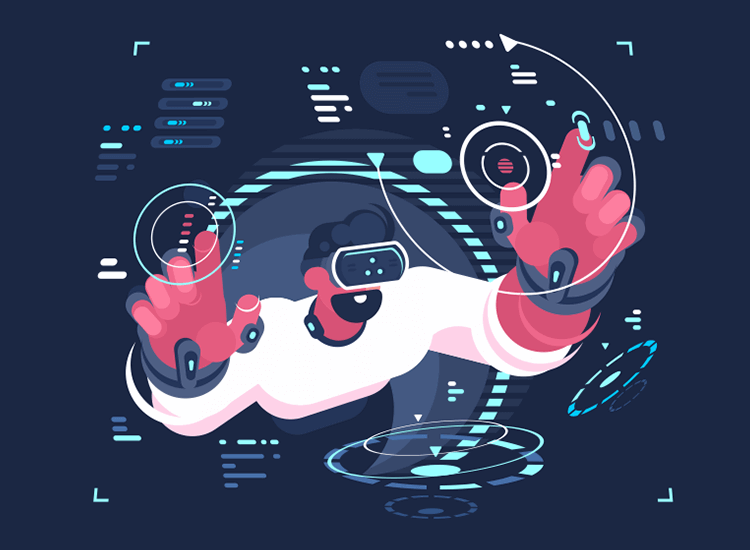
Image credit: Anton Fritsler for Kit8
Furthermore, you want UI elements to be clear and concise, not cluttered and confusing. Only include UI elements and visuals that are absolutely necessary. Getting things done as easily and as fast as possible is what great UX is all about.
Someone please think of the tools! Lastly, just like with AR and VR design, you’ll want to work with the relevant development tools in mind. Make sure you use optimized geometry and shaders in your MR design. Using these effects is absolutely necessary for Microsoft’s Holotoolkit and will make your MR designs even more realistic.
The fact that we’ve stepped up from simple phones, that could just send calls and SMS messages, to pocket sized computers shows how fast technology is developing. And AR, MR and VR design looks set to grow exponentially in the future.
With this growth comes new opportunities for designers and developers. It also opens up many interesting areas of research in the field of UX, such as the effects on user physiology, behavior and psychology.
Getting into AR, MR and VR design might seem challenging at first, but looks like it could really pay off in the future. For many designers, taking this leap into the unknown offers up a world of design possibilities and exciting challenges. There’s no doubt that working in the areas of AR, MR and VR design will help boost any designer’s career and is sure to be embraced.
PROTOTYPE · COMMUNICATE · VALIDATE
ALL-IN-ONE PROTOTYPING TOOL FOR WEB AND MOBILE APPS
Related Content
 Crafting landing pages that convert doesn't have to be tough. Here’s our snapshot of 30 landing page examples with awesome UX that nailed it!12 min Read
 How important are lists in UI design? How much do they affect usability and what’s the best way to design them? In this guide, we'll explore the elements that make up a great list UI design and look at some inspiring examples!15 min Read
 UI design examples that bring some serious inspiration. From parallex scrolling to delicate animations - this list has it all to get you inspired!8 min Read


