Tree testing helps to validate crucial things like the architecture of your product. But what do we need for the test? How do we prepare? Read on to find out!
Tree testing is a method that helps designers have a better understanding of information architecture and the hierarchy of categories in any given product. Along with card sorting, tree testing has the power to eliminate confusing categories or labels – both of which can have a seriously negative effect on the user experience.
But what does a tree test look like? Why is it beneficial for design teams? What kind of tasks can you give users in this test? What’s the difference between tree testing and card sorting?
Read on to find out more about this very popular user testing method, how you can carry it out and why it’s gained so much popularity over the years.
In tree testing, you present the user with a very basic visual representation of the structure of your product. This can represent the larger and more important categories of your website, or perhaps the biggest categories of products your platform will offer.
It’s meant to be simple and straightforward, free of any visual distractions so that the user can fully focus on the logic of the design. The test itself looks like a mental map, showing the hierarchy of the categories you want to test. The task given to users can change, but generally involve giving a specific item or information and letting the user choose its location within the tree.
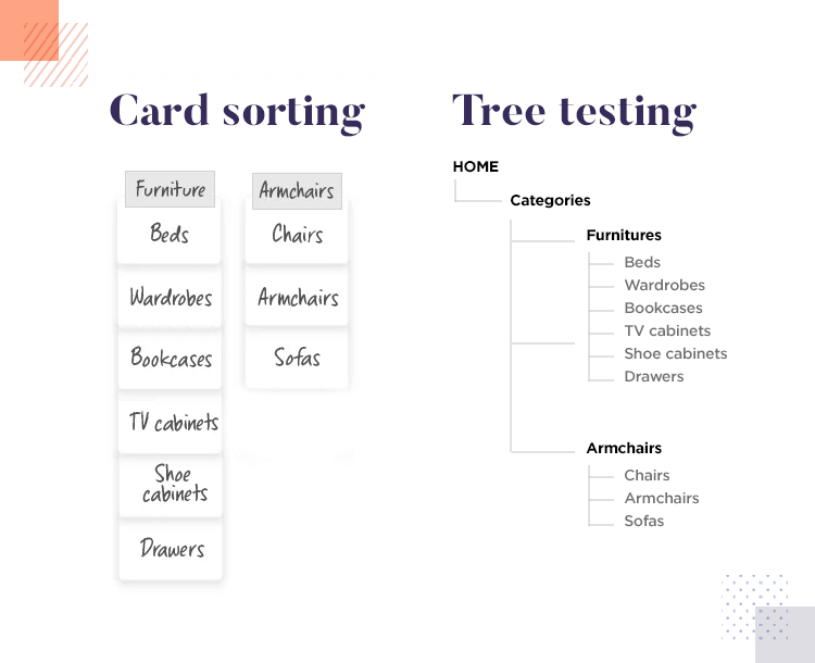
The theory of this method can often confuse people, mainly because it shares a lot of aspects with card sorting. In truth, tree testing and card sorting can be considered two different sides of the same coin. In this case, tree testing offers users a predefined structure, instead of asking them to create their own categorization.
The best way to go about it, is to use card sorting as a first step to give you an idea of how your users categorize things. From there, you can create your own structure, respecting your users’ way of thinking. In this sense, tree testing can also be considered a good follow-up on card sorting.
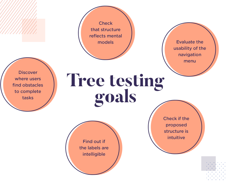
There are some aspects of this user testing method that separate it from all others. Card sorting can be a very helpful way to understand how your users think, but it may not give you the specific categorization you should use. Consider the following example, given by Kathryn Whitenton with the Norman Nielsen Group.
“For example, participants in a card sort often create a generic category to hold a few items which don’t seem to fit anywhere else; this is understandable, but if you were to actually include an “other stuff” category in your menu, the same users would avoid it like the plague.”
That’s quite right. Users tend to avoid vague labels because it implies that going through that content will mean quite a lot of work. Users don’t want to wonder where things are, they don’t like having to go through long lists of things when looking for the one they need. Labels and logical categorization are key in making your product easy to use – and both tree testing and card sorting help on that front.
The requirements for the test are quite simple, as is to be expected from such a straightforward method. You will need three things: real users, the hierarchy structure (the tree) and the tasks you mean to ask of users. Simple, right?
The most complicated aspect of tree testing will depend on how far along you are in the project. You’ll need to create a structure if you hope to test it – which in of itself can be a bit of a challenge to design teams.
In general, you want to make sure your tree includes all the levels of categories in your product. Even if you’re already comfortable with a part of your design, make sure those categories are in your tree as well. Even if users already understand some categories – you want to check that users understand the relationship between them all.
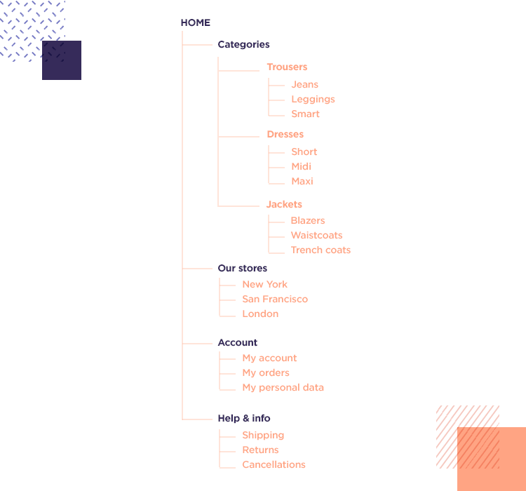
Having all the subcategories, down to the last level, is important. This is due to one major aspect of how people categorize concepts in their brains: comparisons with other concepts. This means that when trying to categorize a piece of information in your tree, users will look at categories and compare them to see which one is the most suitable.
This small detail is very relevant, because the more precise you are with your subcategories, the more realistic the behaviour of users will be.
Right. Once you have your tree, comes the time to decide what tasks you’ll include in your test. This will be closely linked to the evidence you gathered when you first defined your product’s requirements. If you have more data about your product, use that as a map to your tasks.
What are the most important pieces of information in your product? Tree testing can be a good way to check that important areas in your information architecture are easy to find, and shed some light on how you can make it even easier to be found. The same can be said about important products and items, validating the overall navigation and categorization.
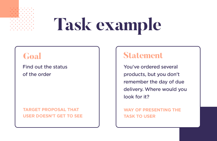
For each task: Give users not just the task, but also the context around the task. The best tasks are written offering users a simple situation, giving them the context but not conditioning them (you don’t want to affect the user’s decisions!).
Depending on what you want to test and which aspect of your tree you’ll be validating, the relevant metrics for you may change. With tree testing, it tends to be all about if users manage to complete the task – but the time it takes them to is just as telling.
Here, a key point in any form of user testing comes into play: each design team will draw a line in the sand that suits their project. There isn’t a one-size-fits-all answer to the question of “how much time is too much time for this particular task?”. It’s up to your team to create specific standards for the metrics that best represent the insight you’re looking for.
The dimensions of your tree test will depend on your project and resources. Tree testing is usually done remotely in unmoderated tests. Logically, you can go for a more qualitative form of tree testing and make it on-site, moderated by your team. Making it a face-to-face test will allow you to actually hear what the user was thinking, as you can ask them questions, but it will drive up the cost of user testing.
There are some practical aspects to keep in mind about your tree test.
The number of users. Most tree testing tools out there will have a large bank of users where you can easily form a representative group for your test. These same tools will also allow you to bring in your own users for the test, which gives designers an ample margin to carry out testing that suits their own needs.
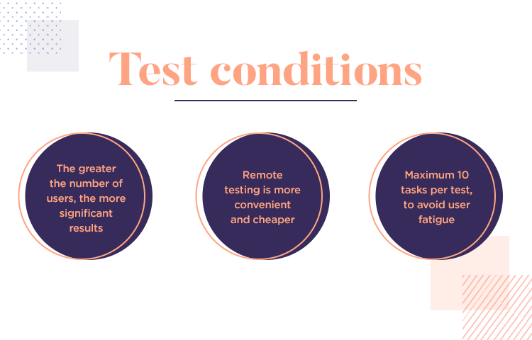
The number of tasks. Users need to act in a realistic way in your tests. In real life, most people will get bored and tired after interacting with a product for too long – the same thing happens in your tree tests. It’s generally recommended you limit each test to less than 10 tasks per user. After that, fatigue may affect user behavior and muddy the waters of your data.
After all that work, comes the time to look at all the test results and draw conclusions from them. This can often be a challenge, as interpreting data doesn’t come naturally to some of us. Regardless, it’s important that we allow the data to guide our decisions.
At this stage, you want to remember the standards you and your team set before the testing began. Keep those at hand and compare them to the test results. It’s not unlikely that many aspects that were tested fail to meet your standards – that means it’s time for iteration of the design.
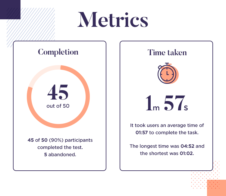
In this stage, having a true tree testing tool can make a big difference. You’ll get all the test results organized and presented to you in a visual way – which makes interpreting the data that much faster and easier. From there, it’s about tweaking and improving the design until you can start putting the design down into a tangible wireframe. Always remember to use a professional wireframing tool for your wireframes.
Tree testing is a standard classic in most user testing tool boxes out there, and it’s easy to see why. When used wisely, this simple test can help us understand some key things that allow for user-centric design. Covering two major aspects of any product, navigation and information architecture, tree testing can be a way of covering your bases and validating the core of your design.
Remember that the details matter in tree testing. Not the visual details, not the interactivity of your product, but the really important details of your navigation, categorization and labelling. From the test, it’s all about iterating on the design until you reach a certain level of quality – that means fluid testing and lots of learning experiences!
