Bad UI design can kill UX, but not always. Here are some examples of when bad UI design works and when it doesn’t
The calculator isn’t the most beautiful thing in the world but when you press your fingers into its buttons, it can do some wondrous things. Or take Crocs – the butt of many jokes – but the first choice of shoes for people working in the medical profession. That’s the thing when it comes to the bad UI design vs. usability debate: products don’t have to be beautiful to offer a great user experience.
Nevertheless, it’s important to recognize when a website is intentionally tacky, kitsch or basic and when it’s just plain bad UI design. What really matters is how user-friendly your website UI design is. To provide the best UX for your users, it’s important to always test them first with a wireframe tool like Justinmind.
In this post, we’ll look at some examples of popular websites with bad UI design, along with others that aren’t popular and serve no purpose at all. Warning: no punches have been held!
Amazon’s been in the online retail game since the early 90’s. What was a humble online bookstore is now one of the world’s tech giants. But it’s UI design leaves a little to be desired. In fact, some designers might even consider it to be bad UI design.
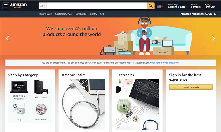
Amazon uses a carousel, which has been known to divide opinions within the design community. Users can often scroll right by a carousel, even if it has the best offers in town. But, if Amazon is one thing, it’s consistent and the homepage usually has between three to four carousels on the go. Thankfully, when you’re making your own designs, there are alternatives to experiment with.
A small UI change could cost Amazon millions and there’s a chance expensive tweaks might not improve profit or usability. Sometimes when it comes to bad UI, if it ain’t broke – don’t fix it.
The self-styled front page of Reddit doesn’t look that special on the surface. But as the old cliché goes: “never judge a book by its cover”. While the aesthetics, from a creative point of view could be considered bad UI design, there are many things it does get right.
There is ample space dedicated to the content. Reddit is driven by user generated content. That is the website’s modus operandi, so it’s fitting that most of the website is dedicated to just that.
It’s also a minimal kind of UI design, which works largely in Reddit’s favor; with so much content it would be nigh on impossible to create a system that could accommodate so many users. It might look a little rough around the edges, but simplicity is what plays a big role in why Reddit is so successful.
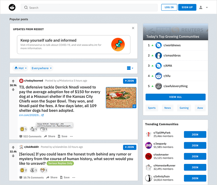
Reddit doesn’t have to be about bad UI design though. Subreddits benefit from customizable CSS, giving you the freedom to spruce up the UI if you want.
Visit most news websites and you’ll be bombarded with a cacophony of big imagery and bold headlines, large and small. Drudge Report is no different in that sense. You get bold headlines and you get imagery, but you also get a web experience that takes minimalism to a whole new level.
It’s been around since 1996 and still contains the out-of-date HTML to prove it. But Drudge Report tells us what UI design it isn’t – it isn’t flashy buttons and or hero images or even – gasp – responsive design! And despite the seemingly lazy or bad UI design, it still remains hugely popular.
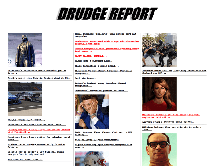
What makes Drudge Report’s UI design so special is the freedom to choose what to read. All the text, links and headlines are formatted in the same manner so no one story is given preference over another. This means the user is free to scan the website on their own time and make the decision to read what interests them most.
Jason Fried wrote that the chaotic presentation of the information almost mirrors the business of a newsroom and this in part explains the excitement of what Drudge Report offers, despite the bad UI design.
Typing Craigslist into your browser will take you to a page so stark and barren you might believe you’ve been transported to the early 90s. Or regressed to a dimension of bad UI design, with zero engaging graphic design and without real information architecture.
But it is this stripped-back, bare-bones quality of Craigslist that gives the advertising giant its popularity. Through embracing unconventionality and what some would deem bad UI design, Craigslist has maintained global reach among people who wish to flog their wares. Why, though?
The site has been around since 1995 and sticks to its users’ mental models of how the site works. 25 years on and we still have the same Craigslist! It could also be attributed to the cognitive load (or lack thereof), according to UXmatters. That’s right – the site is so sparse that this engenders a level of trust and freedom among users.
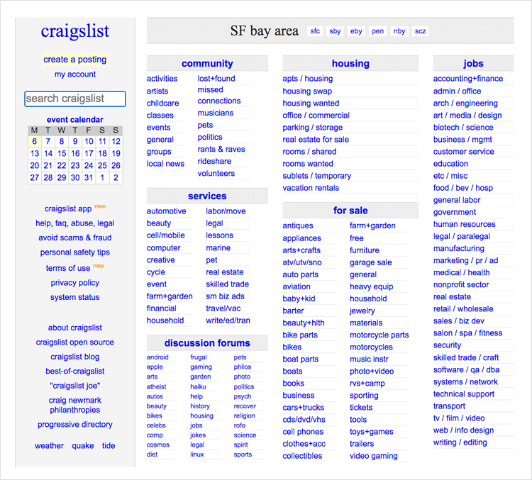
These are important facts when making transactions online and Craiglist’s minimalist approach means its users are the ones who make the decisions, in their own time, with no extraneous distractions. And they always know what to expect from the UI design.
Netflix started off as a mail order video service and has become the most popular streaming service in the world. Why? Mainly because of its excellent use of big data to help users discover new streaming content, leading to brilliant UX.
However, they do commit a few bad UI design faux pas in their app. One of the pet peeves of many users who enter websites and apps is that audiovisuals autoplay and without warning.
One such example of this is the way Netflix plays trailers when the user reads the synopsis for more than a few seconds or hovers the cursor over the image to the left of the screen UI. The user who wants to read the synopsis probably doesn’t wish to have a distracting trailer suddenly start playing on the same screen. And especially not if they’re planning on watching at 7am or midnight and aren’t not sure of the current volume settings on their TV!
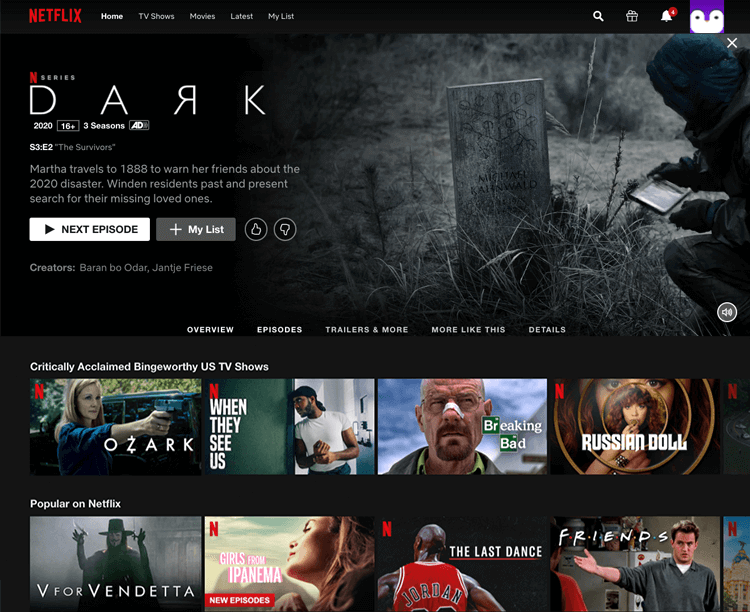
Netflix could easily solve this bad UI design defect by simply allowing the user to play the trailer at will. Another idea would be to follow Facebook or Instagram’s lead in automatically muting videos.
CNN also has the bad UI design trope of autoplaying. The popular US news channel has a clean and simple UI design that mimics a newspaper and lets the user focus on the important stories of the day. But that experience is downgraded with the autoplay feature of ads and videos on news stories.
This immediate autoplaying without warning can be disorienting and, frankly, bad UI design. Imagine going to read a story about international conflict only to then start hearing an audio about toothpaste and having to scroll back up above the fold to find the video to stop or mute it?
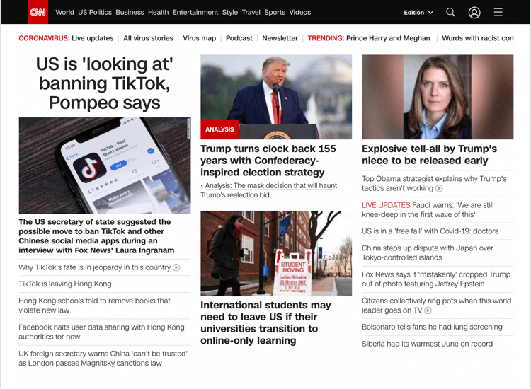
Apart from this, visually impaired people who use screen readers to consume web content may have difficulties reading out content aloud if an autoplay video or audio starts without their prompting.
Despite this bad UI design element, however, it still remains a highly renowned and popular news channel website which makes us think they should try and fix this error to lead by example.
Could it be possible that luxury clothing label Louis Vuitton’s website has bad UI design? Yes. LV have gone for an appealing minimalist design on their site to let their product range shine. However, it’s also minimalist in terms of copy – which is not always a good thing, especially when it comes to buttons and call to actions.
One of the first things you’ll notice as soon as you land on their homepage is an image-less square with thin borders and nothing but the heading “the perfect summer pouch”. This is followed by the short description ”2 zipped pockets and a removable strap” in the UI.
The user might be able to surmise here that they’re referring to new bags that are in their summer collection, but we’re not quite sure of the angle they were going for by deciding not to include an image. If it was to make the user imagine what the bags would be like, the description falls a little short. But what falls further short is the button below with nothing but “HERE” written on it.
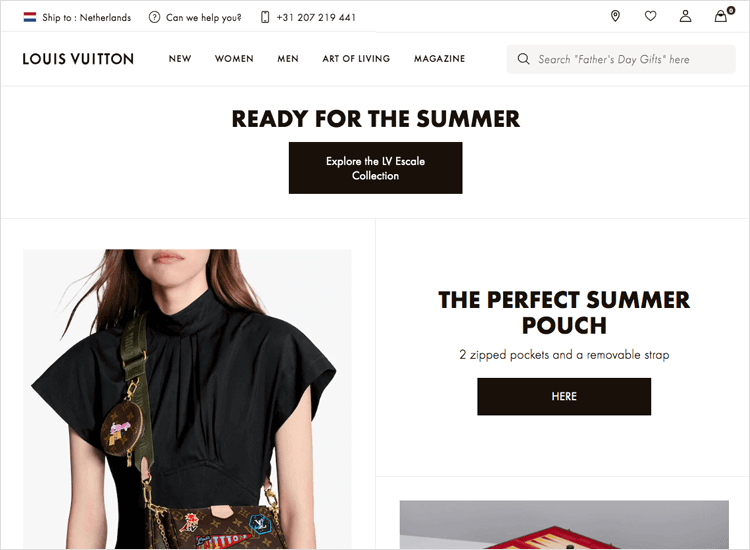
The click-to-find-out approach never works with users and could be considered bad UI design. In this case, it’s unclear what “Here” means. Will it take the user to an order form, as in “get it here”? Will it take them to a guide on how to choose the perfect summer pouch? Or will it take them to their collection of summer pouches where they can subsequently select and purchase one? To save you a click, it’s the latter!
If you’re an art school and trying to do something a bit different in terms of UI design, we get that. Yale School of Art has made quite the statement of minimalism, stripping everything down to its bare basics.
Sometimes this works, sometimes it doesn’t. The fact that all the content appears to be stuck to the left of the UI against a black screen, means the user needs to consciously look to the left to read the content, which is quite a lot, as the user keeps scrolling down. There also isn’t a clear sense of visual hierarchy on the homepage navigation menu options. That’s just plain bad UI design.
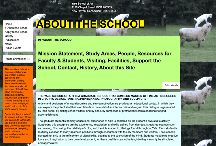
When you select different options in the navigation menu, a different image, divided into an indefinite amount of squares repeats itself across the screen. While indeed arty, this is visual overload that can quickly lead to user fatigue with UI design that is just too much.
While Bolden manages to create a clean and striking UI design, they are a stark example of going too minimalist. Thought-provoking imagery that makes people ponder their meaning can be great at catching attention, but this shouldn’t be what your whole website does. If it is, it’s bad UI design.
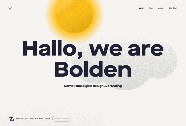
The user is given just four menu options to find out what exactly it is that Bolden does: Work, How, About and Contact. Neither of these pages really expands fully on the actual services they provide and seem more about offering poetic prose than informing the user and identifying with their emotions.
What’s more, the menu option of “How”, while probably meant to get the user’s attention, can be a bit disorienting and frustrating when you’re just trying to find simple information. Not great UI design.
The 007 museum in Sweden is the only one of its kind. So is the website. The entire UI layout of the website consists of over-sized images and font, all of it placed in a disjointed way that doesn’t help guide the eye, with some images being centered, some fixed to the left.
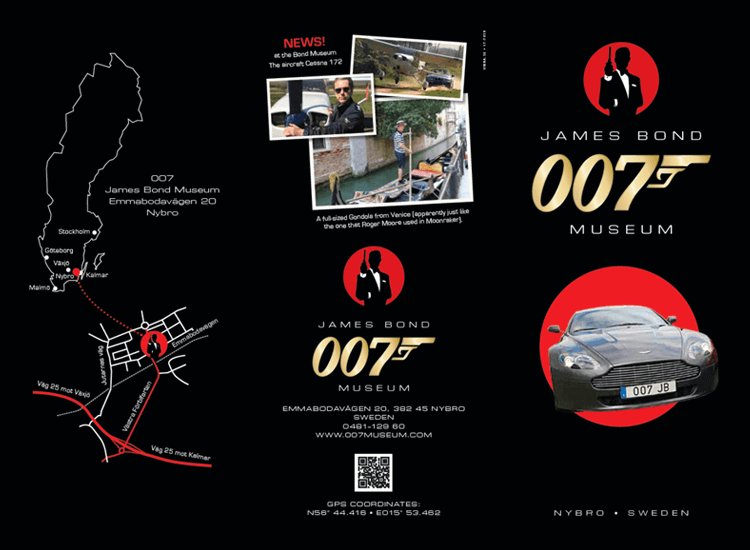
It looks like one of the first websites ever created and lacks any kind of hierarchy in its information architecture. However, it does provide the user with a bit of a chuckle as they scroll down through the pages. If you’re looking for an example of the epitome of bad UI design, this is the site to come to.
Diller Scofidio + Renfo is a design school website that overwhelms the user with a bad UI design consisting of a dazzling array of images and poor navigation. If you weren’t aware of the company name, (it’s not that the domain name gives a hint), before landing on the homepage, you’ll have a hard time reading it vertically on the side of the page with an already obscure font.
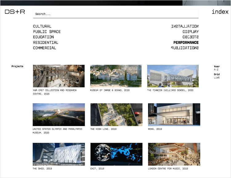
To get to something that resembles a menu, you have to navigate away from the homepage by clicking “index”. Even there, there’s no sign of an “about” section. There’s a list to the left of the screen that shows the options “cultural”, “public space”, “education”, “residence” and “commercial”. It’s not clear if these were projects the company has worked on or just nice pictures to admire.
To the right of the screen is another menu (this left-right positioning doesn’t seem to be implemented with any hierarchy in mind) with the words in mirror writing. Unless the user is fluent in mirror writing, they’re forced to hover the mouse above the words to read them.
Once again, “hover to reveal” is like the “click to find out” methodology and generally just frustrates users rather than impressing them. In some situations it might work well, but when it comes to menu options, for us it’s just bad UI design.
We’d recommend a card sort, then a UI design overhaul!
Vintage cars are like a moving history lesson and deserve to be done justice with a decent website UI design that doesn’t have to be vintage.
MDGB Parts and Services has a homepage that greets the user with an unholy 90s medley of moving text, red font that isn’t for error messages and unclickable links (are they links or just underlined for the heck of it?). With a bad UI design like this, it’s very hard to know what’s clickable and what’s not.

The main menu on the left side of the screen is a series of duplicated images (with the options written in red text). The only semblance of hierarchical navigation in this bad UI design is that some of the menu options are indented to the right. The copy also keeps it old-school throughout the site with links like “click here” and “email here”.
As soon as we were able to start the ignition and accelerate towards web civilization, we breathed a sigh of relief!
The website of an advanced technology college probably wants to show their tech savviness through their website, right? Agreed. The best way to do this is to show how user-friendly they can make their website UI design, rather than creating something that’s going to give the user a headache. Unfortunately, that’s not the approach the University of Advancing Technology has taken.
Is the UI design above the fold on their homepage unique? Yes. Is it clever? Yes. Is it innovative? Yes. Is it user friendly? No!
The degree programs (square images) spin around a larger hero image in a merry-go-round fashion, making it hard to click on each title. It actually distracts the user from the main menu. And, while innovative, it’s not that these graphics make the page UI design look modern either – there seems to be a real naughties feel to the design. It also doesn’t do wonders for the page speed.
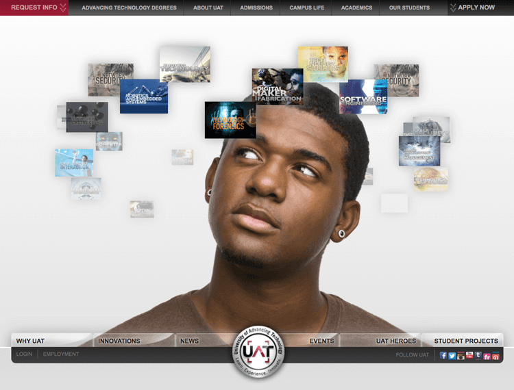
If you wish to read anything else on the screen, there’s a part of you that’s just itching to find a pause or stop button for the merry-go-round. It also doesn’t help that lists of cards just fly up from the bottom after a few seconds of inactivity. Any kind of interaction should always come as feedback and follow a user gesture – that would keep it in line with Jakob Nielsen’s Visibility of System Status usability heuristic.
When users land on the homepage of a website UI design, the general rule of thumb is that they will immediately know what the company is and the kinds of services that it offers. Lazeroffice.com, while having a pleasant UI design, doesn’t facilitate this process as it’s not entirely clear from the offset what they actually do.
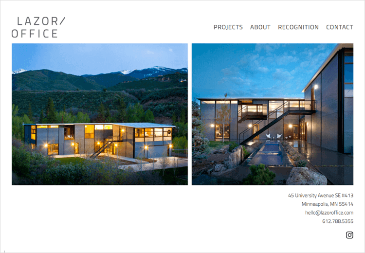
The only thing we can espouse from their name and the pictorial presentation on the homepage is that they might construct buildings. When you take a trip to the About section of the page UI design, you’re greeted with a very long-winded explanation that takes a while to get to the point, on top of having a difficult-to-read, light grey font against a white background. If you’re not prone to migraines or cluster headaches though, you should be alright.
iFLy50 is a website for iFly KLM Magazine to promote their destinations. And they manage to do that in the most delightful and extravagant way with their UI design.
It’s just a shame that the UX is somewhat dampened by the fact that they insist on auto-playing the ambient audio as soon as the user lands on the site. What’s more is that each time they navigate away from the homepage and then return, the settings aren’t saved so the audio starts to play again.
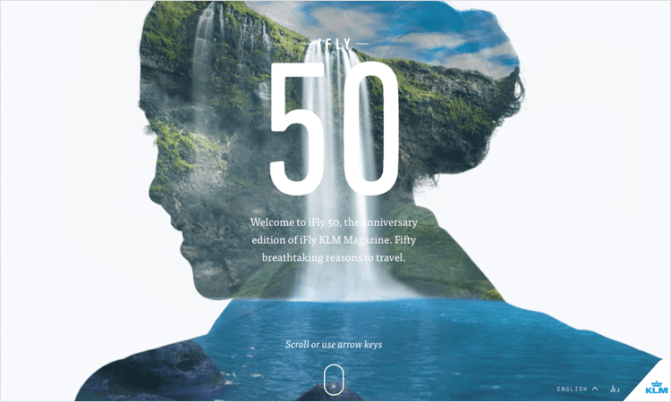
To add to the frustration, a modal window pops up at some point during scrolling for a competition to choose your top five destinations. It has no close button and only one button, giving the user no option but to click it and enter the competition. This violates Jakob Nielsen’s user control and freedom heuristic.
UI designers must keep in mind that beauty is in the eye of the beholder and bad UI design can still be good UX. And while some of the websites above may be stripped back and minimal, it doesn’t necessarily mean they have bad UI designs. The majority of them have simply maintained their original UIs – which at the time were precisely what the internet was ready for.
However, extremely minimalist, maximalist, old fashioned or just plain bad UI design doesn’t necessarily equal good UX either – quite the opposite. The best rule of thumb to follow is to keep things original, keep them functional, and always create UI designs with the user in mind.
PROTOTYPE · COMMUNICATE · VALIDATE
ALL-IN-ONE PROTOTYPING TOOL FOR WEB AND MOBILE APPS
Related Content
 Crafting landing pages that convert doesn't have to be tough. Here’s our snapshot of 30 landing page examples with awesome UX that nailed it!12 min Read
 How important are lists in UI design? How much do they affect usability and what’s the best way to design them? In this guide, we'll explore the elements that make up a great list UI design and look at some inspiring examples!15 min Read
 UI design examples that bring some serious inspiration. From parallex scrolling to delicate animations - this list has it all to get you inspired!8 min Read


