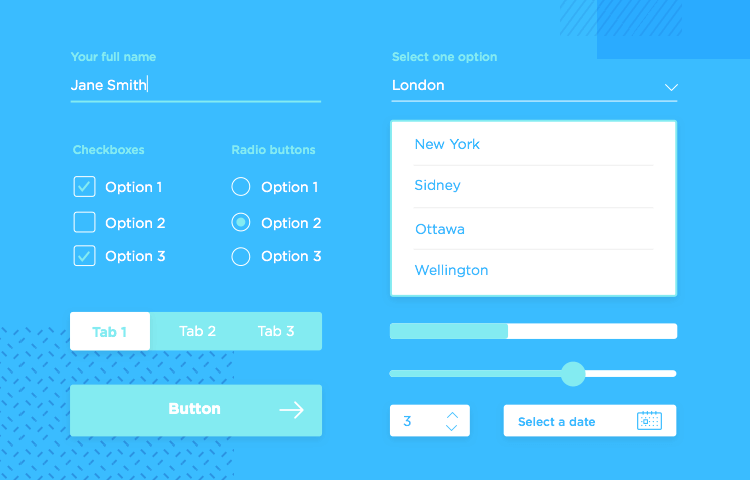
Having the right form UI components in your toolbox can take your form design to the next level. Here are the kits that will help you get there!
All UX designers know that having the right UI kits at your disposal can make all the difference in any project. When it comes to form design, the right form UI components can result in either an efficient form, or something that has users ready to switch to a less confusing alternative.
It’s not so much about the copying and pasting of visual elements – but rather of improving your workflow as a whole. It’s about ensuring that throughout all of the digital product, your forms get the job done while also being consistent. We all stand to gain from creating a coherent experience for users – just as we all aim to have happy users.
Like we mentioned before, it’s always a good idea to have a consistent design. Generally speaking, you want your design to be consistent because that is a major factor in how users learn to use your product and how easily they can use it afterwards. With forms, that is even more true.
Forms, be they mobile or web, can be confusing. Users can skip questions, give the wrong information or just abandon the product altogether. After all, when talking to people it’s common to have to add context around a question so people can fully understand it – and smart designers apply that same concept to their form.
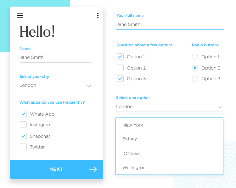
Your form can offer context in all sorts of ways – using labels, placeholder text or even popup messages with further information. But what many designers overlook is the fact that the very UI components that make up the form offer context – and can mislead users, when poorly planned.
As users navigate your product and find the forms as they explore, they will remember the form UI components as they fill out the fields – and eventually, they will come to recognize the components and be able to predict what they mean or what they do.
Tip: The more consistent the design and components used, the quicker users will gradually come to speak the forms’ language, per say.
On a separate note, form UI components can serve a wide variety of uses in any given form. For that reason they must be well-planned, so they don’t:
- Confuse users. Using the same array of form UI components for a question that accepts more than one answer and a question with one answer only is a common pitfall, for example.
- Corrupt your data integrity. If you use pre-checked boxes, how do you know the user even read it or agreed with it? Did the user really give you consent? You don’t want to have to second guess your data!
These are some of the form UI components that will save you time while also improving the general performance of your forms. You’ll find something for every form, from Android app forms to your good old sketch of a future form. Let’s check them out.
Let’s start with the form UI components for the projects that will be developed into working wireframes and prototypes of the form – any form. Many UX designers enjoy getting their ideas down with a sketch of the structure and feel of the form before they start developing on it – after all, building on anything is much easier with a blueprint.
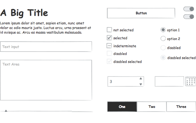
The Sketching UI kit has all the building blocks of a form, including checkboxes, toggle buttons, slider and good old plain buttons. As one might expect, the form UI components in question are very simple – this is so that the designer can focus exclusively on the flow and logic of the form.
Download the prototyping tool now!
If the Sketching library is meant to be the very first step in the creation of your form, the wireframing components are meant to be the second. The components are still simple in nature and stick to the black and white classic look – so that the visual aspect of the design won’t distract you from continuing to work on the structure, logic and navigation of your form.
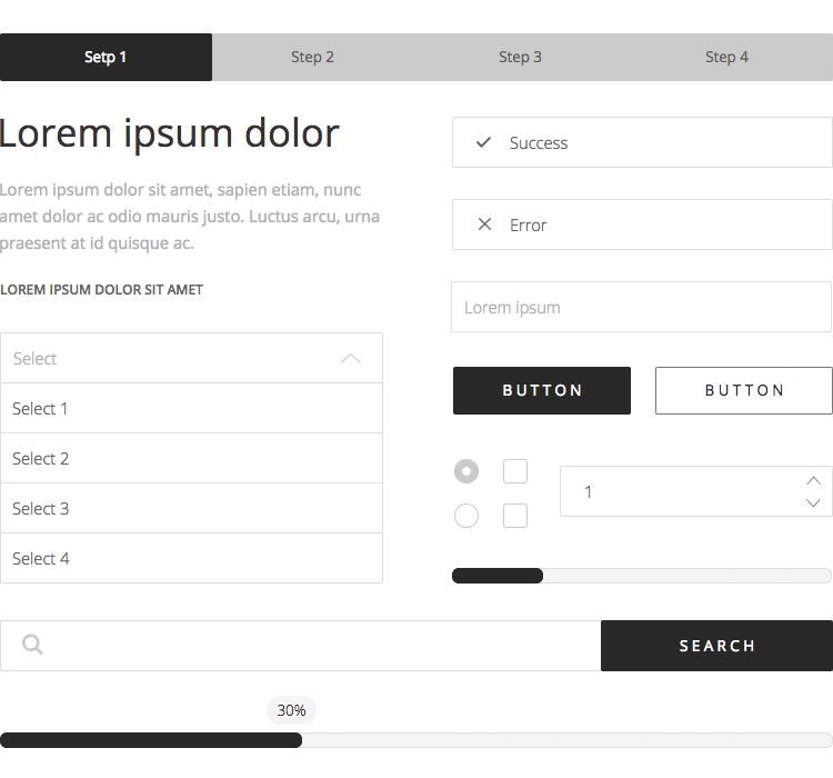
The list of components available to designers in this library is more extensive, as it covers most of the classic UI elements we are used to seeing on a daily basis. You’ll find the usual suspects for forms, such as toggle and radio buttons, along with other elements such as breadcrumbs, percentage bars, and social media buttons.
Download the prototyping tool now!
A cool feature of this form UI components library is that it comes with its own set of form examples so you can see the form UI components in action, while also getting your inspiration going. Even cooler yet – those same examples double as templates that you can drag and drop within our prototyping tool. It doesn’t get much more practical than that!
Bootstrap is such a widely celebrated UI kit. Due to its peculiar CSS characteristics, Bootstrap is filled with the type of form UI component that makes life easier for everybody involved.
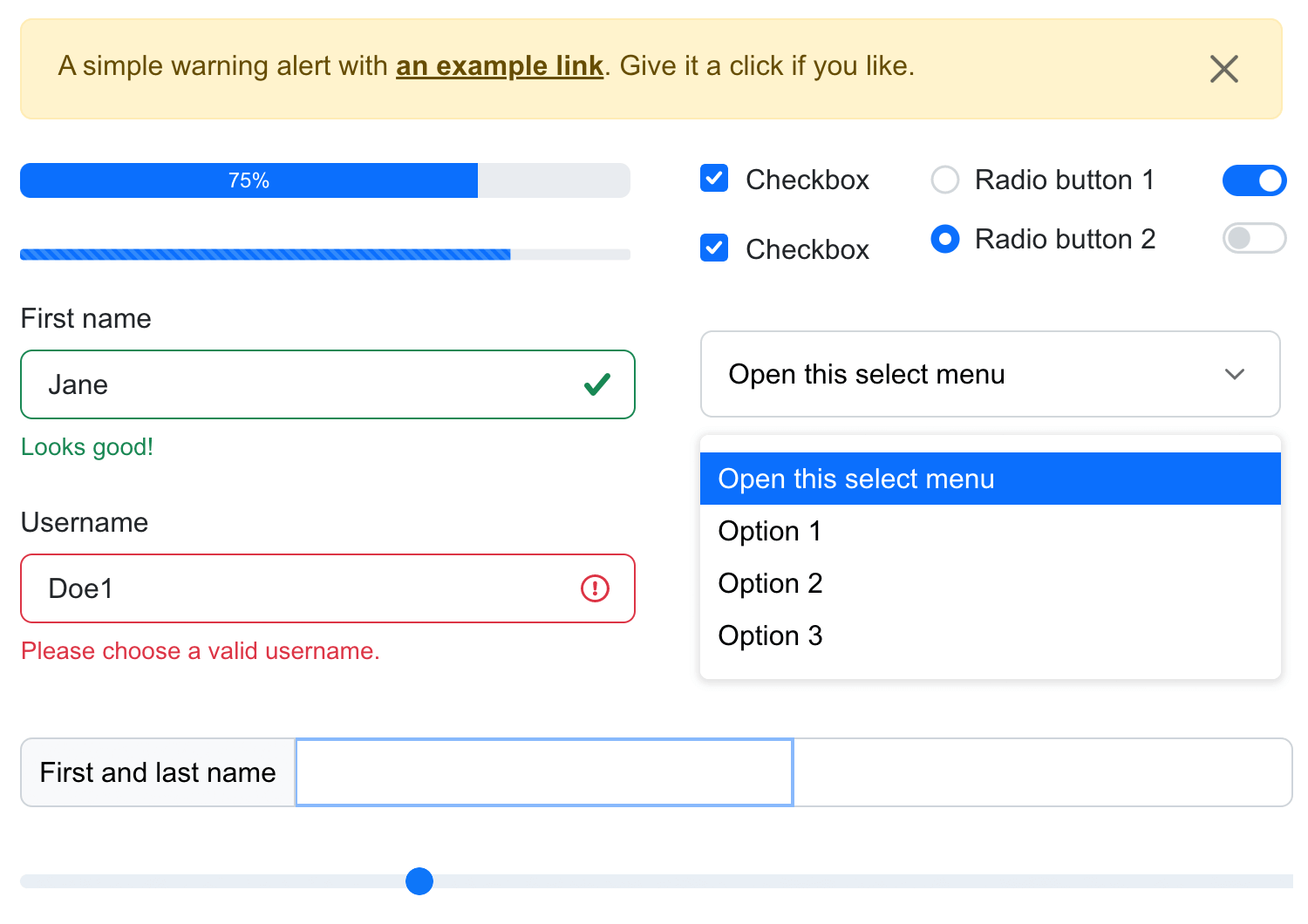
As a designer, all the micro interactions and responsiveness are already built into the components – speeding up the design process. On the other hand, developers will find their path defined for them once the designer handoff takes place – and who doesn’t like saving time and effort? Wireframing UIs will be as speedy as it gets.
All in all, this UI kit will make the whole product development process easier on the entire team.
As for the individual form UI components, you have all the basic building blocks of a web or mobile form. Think text fields, action control buttons, and progress bars. All text entry fields already come with inline validation, so you can focus on the bigger picture as opposed to the small stuff.
The Kendo UI components make use of HTML5, CSS3 and jQuery – making it a top candidate that works perfectly in Chrome, Safari and Firefox. Talk about versatile! Aside from the technical benefits of using Kendo form UI components in your next project, comes the practicality of using a complete library – with over 70 UI components to choose from!
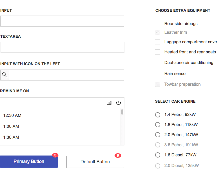
The specific section of the form UI components comes with your usual text entry fields and custom entry fields, such as calendar and time input fields. You can expect the classics, such as dropdown menus, checkboxes and radio buttons – but also a few modern components, such as error panels.
Keep an eye out for the examples that come with the library – they work as a great starting block for your forms, especially for login forms that are more brief and simple.
This is a paid form UI component kit for Apple’s mobile operating system – but we feel like it’s worth every penny. The iOS Design Kit promises to enable you to create any type of app possible without having to search for additional elements or components. All components come in files for Sketch, and have two versions: iPhone XS and iPhone 8.
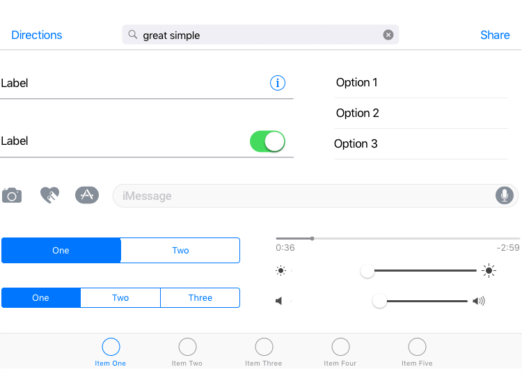
Part of the benefit of using a paid UI kit is that it will often come with more amenities than its free counterparts – in this particular case, that comes in the shape of a well organized kit, with layer styles and several screen templates for you to choose from.
All templates respect the Human Interaction Guidelines set by Apple. The iOS design kit has a price tag of 99$.
This form UI component library comes with plenty of template screens for Android – about 61 of them, in fact. Brought to you in one resolution (360 x 640px), the kit also gives you the individual components which can be resized to suit your needs. All template screens are made in accordance to the Android 7.0 (Nougat) guidelines.
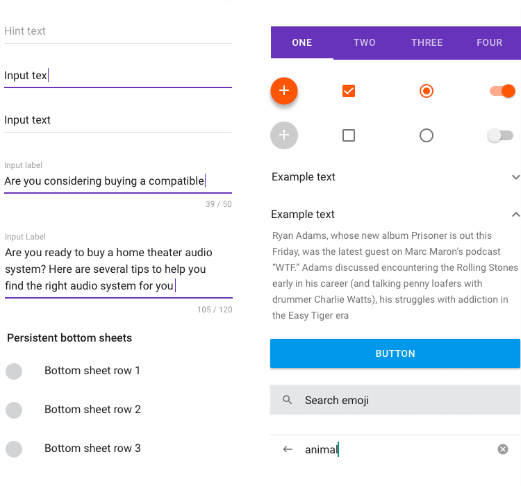
All the components come in Sketch files, in organized layer styles. The kit comes with all sorts of elements and icons – you can checkout the icons in the 5 different themes they come in on their UI Component Viewer.
The original Android kit can be downloaded for free. You can also go for the paid version which includes many more components and screens among other extras.
This simple and free form UI component kit is perfect if you want to put together a few forms in a quick manner. The library comes with different types of input fields, including a text field, number input, and a dropdown menu along with several sliders.
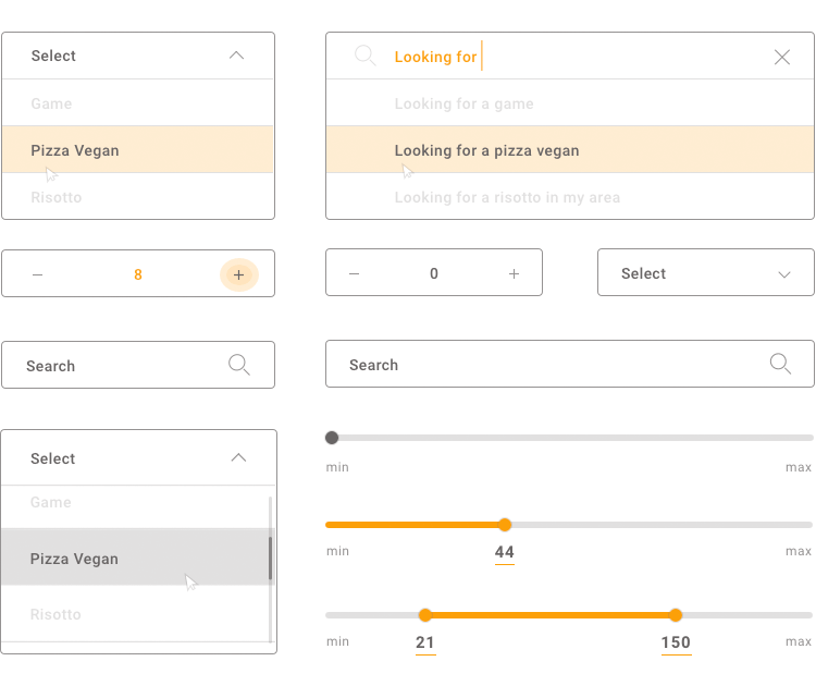
The visual aspect of the form components is warm and comes in 3 different color schemes. All components come with Roboto font. We like that this form UI component library is simple in nature and offers a great way to add personality to your form.
You can find and download the UI Component here.
This form UI component library is all you could need to create forms for both web and mobile devices. In the Forms and Surveys UI kit, you can expect to find everything from text field entries and the classic form components like radio buttons, sliders, counters, ranking drag, date selection, dropdowns and scales.
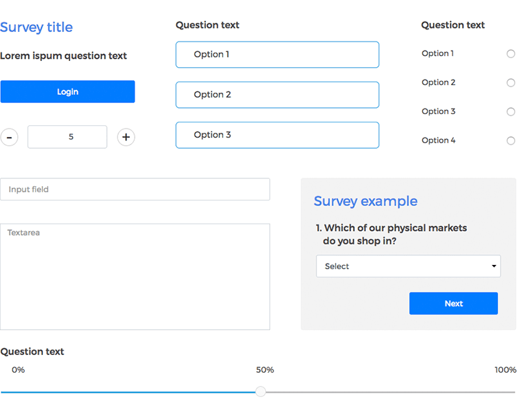
You can insert these form UI components right in your prototype and enjoy the fact that they already come with basic interactions. Even better than handy and practical UI form components that have basic interaction already: form templates you can drag and drop right in your prototype.
The form UI component library comes with both components and ready-to-use templates for both web and app forms. Templates include customer satisfaction surveys, login and signup forms, and contact forms.
Both of these UI kits are a must in any designer’s toolbox. After all, mobile products and design is such a big part of life for us all that not having the right mobile form UI components is just not an option. You gotta be prepared, right?
It’s no secret that iOS and Android are the two single most important mobile operating systems out there, and they have such a vast space between them in the UX spectrum. As a consequence, they each have their own UI kit on Justinmind.
This UI kit includes all the form UI components you may need to design a mobile form. This includes the basic text field entries, and more visual components such as sliders, spinners, scrollbars and progress bars. The Android UI kit comes with a large amount of buttons for your project: from toggle, radio, add and edit buttons.
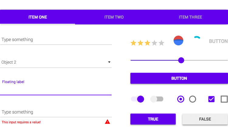
You have the option of using text entry fields that already have inline validation incorporated into them, or simply going for a plain field entry (in the case of optional fields, for example). The form UI component library also comes with different styles of keyboard for a more realistic idea of the finished product.
Download the prototyping tool now - it's free!
This UI kit is just as complete as its Android counterpart. The form-specific iOS UI components include all the classics and more. Text entry fields, for example, come in their plain form, with just labels, or with both labels and icons.
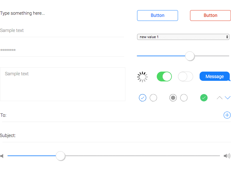
More visual components include sliders, spinners, and just about every button possible for iOS products – most of which may be applied to your form with the same ease as if they were used on any other aspect of your design.
Download the prototyping tool now - it's free!
The reasons why you should dedicate some time to selecting the right form UI component kit for your forms are the same to have a UI kit for any design. It’s about losing the things that take up too much time for little outcome, while having something that improves the product as a whole.
The two most important things when it comes to your form UI components and final design are practicality and consistency. Practicality improves your workflow, while consistency improves the user experience – which makes having the right UI kit a big plus for any project.
