Tackle the website redesign process with confidence by following these 7 steps for a successful user experience
To many unsuspecting users, a website redesign looks just like a face lift. Nothing more, nothing less. And for our users, that is how it should be. But for the UX designer, the website redesign process means something much more and involves a lot of creative thinking, iterating, meticulous planning and endless coffee.
Much of UX design is stuff that’s done behind the scenes which people take for granted. Your user will just see the finished product and will never come across the mountain of work it took to get there. Nobody is thinking about how long your team labored over the position of the call-to-action button (thankfully…).
As with anything in UX design, you need to have a process in place to get the results you want. Without a proper plan things are bound to go wrong. Following a well-thought out plan is what enables us to deliver consistently good user experiences.
In this post, we’ll go over the steps you need to take when tackling the website redesign process. Then, you’ll be able to start designing websites in Justinmind’s wireframe tool from the bottom up in no time.
Know the brand’s attributes
42% of people don’t trust brands. This alarming figure is the result of broken promises and brands not meeting expectations.
If you’re about to undertake a website redesign for a client, you want to understand the brand attributes of that client. Knowing this information will enable you to design the most appropriate solutions for not only the client but its audience.
Brand attributes are the descriptive attributes that a client has. These can arise naturally from a customer base but companies will normally take the time to identify the characteristics themselves and develop them.
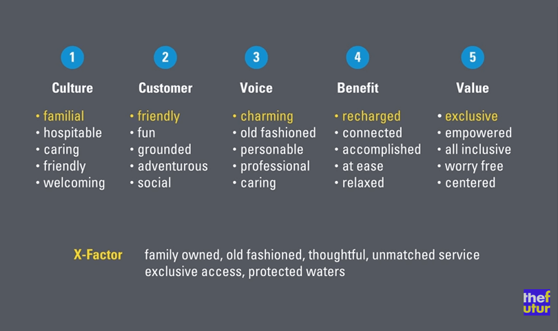
Image credit: The Futur
Cultivating brand attributes is important because its these attributes which make you memorable and attractive to users. Think of it as the personality of the client.
The cosmetics company, Lush, for example, has worked hard in order to create an ethical image and this is as a result of their fleshed out company values. It’s evident they have put a lot of money into their brand identity. So much so that some have commented that they have a cult like following.
You can identify your brand attributes through various methods:
- Brainstorm with stakeholders
- Surveys
- SWOT analysis
Don’t be afraid to use helpful analogies, like the car analogy, as these can be beneficial when you need to get really specific.
UX strategist Jose Caballer says that out of your brand attributes session, you should have a statement which explains clearly:
- Who we are
- What we do
- How we do it
- How you’re going to feel when we do it
- What it’s going to give you
Katheryn Wheeler over at HubSpot wrote a very comprehensive beginner’s guide to developing a remarkable brand identity which is definitely worth reading.
Create your user personas
Did you know a targeted persona can make a website 2-5 times more effective and easier for your audience?
It pays to know who you are serving. Before you’re able to write a word of content or start the graphic design, you have to intimately understand who your audience is.
One way of understanding your audience is through building unique and specific user personas.
By creating your ideal customers through personas, you’ll be able to design the right solutions for them.
The user persona can help you generate empathy which is so important when going through the website redesign process. It is what will ensure the user is always at front of mind and it’s always their problems you’re solving.
There are 4 perspectives that your personas can take, according to Interaction Design Foundation:
- Goal-directed personas
- Role-based personas
- Engaging personas
- Fictional personas
Whichever perspective you take, it’s important that your personas are detailed, based on data and are accepted by the client.
Align website goals with marketing goals
There are myriad reasons as to why a client will want to redesign their website. Whether it’s to dust off the old appearance to make way for something fresh or because they haven’t been seeing the results they had hoped for, a website redesign needs to have goals.
Let’s say your client insists on having a fancy landing page because all of their competitors have one. Does this landing page help or hinder the business goals?
Your client should already have their business goals outlined. As well as their revenue goals, lead goals and so on. If they don’t, ask them. Peter Vanden Bos wrote an article on how to set business goals.
These goals are important when it comes to creating the website. The marketing goals need to be aligned with the website goals.
If a website is built and a client sees no uptick in sales, this doesn’t automatically mean that the website design is bad but that the marketing goals and business objectives could have been forgotten.
If your client says they need to generate 100 new leads a month, you need to be able to join that goal with the design.
Your client might want an increase of 15% in sales with 10% being organic traffic. In that instance you might want to do SEO on the full website and establish a blog to address each customer segment, as an example.
When it comes to setting goals, they have to be SMART: specific, measurable, attainable, relevant and time-related. Vagueness is not an option here.
Carry out a UX audit
A new website redesign doesn’t always need to be born out of the ashes of the former. You can still make good use of the content and information available on the client’s current website to help inform some of your UX decisions and designs going forward.
A UX audit will allow you to understand what is working and what isn’t working on your client’s current setup.
An audit helps you to see your client’s current website taxonomy, giving you a bigger picture how your client’s current website is structured so that you can make your own changes and amendments.
An audit can further help you discover:
- Conversion metrics
- Traffic and engagement
- Sales data
- Usability problems
- Is the website UX friendly?
Audits can be done either internally or externally, should the budget permit. Any good UX audit should be properly planned, have specific goals and a time frame.
After your audit is complete, you may need to consider which features you wish to remove or prioritize. Richard Banfield has an excellent post on how to prioritize product features.
Generate user stories
When you’ve made your user personas, you can use these to create the user story / customer journey. User stories are a useful Agile tool in UX strategy and can really bring to life the experience that your user will have.
A user story is the narrative of how the user is going to experience a website. When you know your user through a persona and create a narrative in the form of a user story, you can design features which anticipate your user’s needs, improve their experience and accomplish their goals.
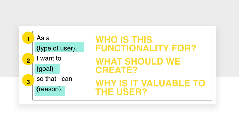
User stories don’t have to be long. In fact, they typically follow a simple template, according to Mike Cohn:
As a < type of user >, I want < some goal > so that < some reason >.
A few post-it decks and an empty wall is all you need to generate your own user stories.
Build your site-map
Just as an engineer needs plans to build a bridge, a UX designer needs a site-map to successfully build a website.
This stage is crucial because the site map will define how you go about creating your designs. By now you should have the information you need from key stakeholders and other research to map the content of the website.
James Deer writes that a good tip is to cross reference your site-map with your goals as this can help you to validate the existence of site content and focus on using content to solve problems and answer questions.
There are plenty of site-map generating tools out there which can help you create visual site-maps. Post-it notes, despite their utility, might get lost. They’re good when you’re starting to establish the site-map with other team members but pretty soon you’ll need to put the site-map somewhere safer.
Wireframe and prototype your website redesign
It isn’t until you’ve done the last 6 steps can you finally start designing. But, everything you’ve done up to this point is necessary to know what to wireframe and prototype.
Of course, any website redesign is a hefty undertaking. Just take a look at how we redesigned Justinmind’s website. It takes a lot of blood, sweat and tears. Although, any process that gets broken down into smaller chunks is easier to tackle.
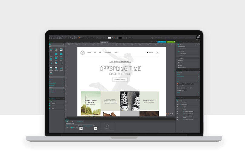
First, you want to use all that knowledge and information you’ve gathered to create some initial sketches.
From there, you can start to develop some more robust wireframes of your designs. At this stage, you just want to understand functionality so starting with a wireframe is the answer to crucial layout, structure and organizational questions. Wireframes are also a good place to get stakeholder approval.
Once you’ve got the basic structure of the website down, you can graduate to more high-fidelity interactive wireframes, replete with rich interactions.
Conclusion
With these 7 steps, your next website redesign doesn’t need to invite headaches and stress. By breaking down the process into more manageable chunks, what was once a daunting undertaking suddenly becomes a challenge you can’t wait to start.
Related Content
 Crafting landing pages that convert doesn't have to be tough. Here’s our snapshot of 30 landing page examples with awesome UX that nailed it!12 min Read
 How important are lists in UI design? How much do they affect usability and what’s the best way to design them? In this guide, we'll explore the elements that make up a great list UI design and look at some inspiring examples!15 min Read
 UI design examples that bring some serious inspiration. From parallex scrolling to delicate animations - this list has it all to get you inspired!8 min Read


