With clear, simple UIs and fast loading web pages, flat web design is going nowhere fast. Here are some important principles and great examples of this style.
Simple 2D, minimalist interfaces, bold and contrasting color schemes, along with a deliberate lack of interaction all point towards the signature characteristics of flat design.
Exploding onto the web design scene around the mid 2000s, flat website design was to revolutionize everything from web and mobile UIs, to PC operating systems and software. But why the need for this visually appealing, yet simplistic design? Why not have things detailed and 3D?
In this post, we’ll examine how flat website design came about and how that style has evolved to flat design 2.0. We’ll also explore some of the principles governing this style for when you dig out your prototyping tool, as well as some great examples to inspire your next designs.
First of all, let’s look at when and how flat website design first came about. Flat UI design can trace its origins to Swiss Style in the 1950s, an early form of graphic design. Swiss Style was characterized by clear and legible Sans-Serif typography, and images and text combine in a way to product aesthetic and functional harmony.
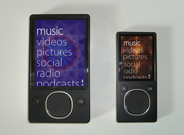
Fast forward to the 2000s and we start seeing a digital rebirth of Swiss Style: flat design. First known as Metro Design, brought out by Microsoft, flat design started being rolled out on the Zune MP3 player.
Zune had quite a modern-looking flat UI design for its time, with large, lowercase Sans-Serif fonts. That said, the device didn’t have much success, mainly because it had to compete with the iPod. Then Microsoft went along and rolled out its Windows 7 and 8 platforms, which echoed the flat designs used in the Zune.
While all this was going on, the folks at Apple were engaging in a practice known as skeuomorphic design – a design methodology that renders all elements as 3D, and as realistic as possible. The icons and backgrounds were designed to reflect real-life objects and environments, such as a trash can to store deleted files.
Looking to discover a trendy new design style? Check out our post on neumophism.
Skeuomorphic design wasn’t a trend, however. It was a necessity at the time to get people familiar with technology. By rendering UIs as representative of the user’s real world, the user’s learning curve would be greatly reduced and they would soon form mental models more quickly about how UIs worked.
So why exactly did flat UI design come about and why did it have to replace the rich website UIs of the 2000s? The short answer is practicality. The long answer is a combination of different factors relating to UX design.
Even though skeuomorphism and rich design might have seemed flattering in its era, the honest truth was that referencing the real world so literally was giving lots of extra work to designers. In addition to this, teams were spending so much time focused on graphic design that the user experience was often an afterthought.
Website UIs were often unclear at best and, at worst – simply unusable by the majority of web users. Rich design and skeuomorphism led to cluttered screens without clear spatial relations between objects and without clear directions.
Webpage performance also suffered – pages took longer to load graphics. It was clear at this stage that the design world needed to come up with a solution to this problem. That was reason enough to ditch this design technique and start to think of something that would work better, both in terms of usability and website performance.
“...we understood that people had already become comfortable with touching glass, they didn’t need physical buttons, they understood the benefits…”
Jony Ive - Head of Design at Apple
An added weight to that argument was that users were already familiar with the basics of how computers, websites and mobile phones worked. This drove the conclusion that rich design and skeuomorphism were headed to the trash can.
Enter flat website design to the rescue! Drawing on the Swiss Style we mentioned earlier, flat website design turned skeuomorphic and rich design in on their heads. Web UIs started to see flat icons, crisp outlines, flat buttons and minimalist UI design.
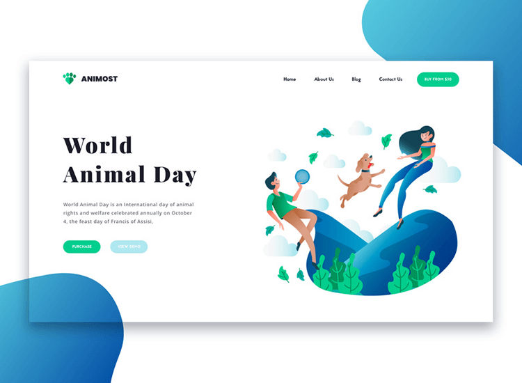
Image by HireFullStackDeveloperIndia
Vector art started to reign supreme over bitmap and the flat UI controls had absolutely no shadowing or color gradient variations.
“...there was an incredible liberty in not having to reference the physical world so literally. We were trying to create an environment that was less specific. It got design out of the way.”
Jony Ive - Head of Design at Apple
The idea was a total departure from any kind of 3D, resulting in a much more simple and clearer UI design. For designers, it meant they had more time to focus on the actual user experience. For websites, it meant faster page loading times and less chance of being penalized by Google.
Certainly, after the web 2.0 of the 2000s, flat website design was a breath of fresh air.
But flat website design wasn’t all sunshine and roses either. Flat website design brought with it its own set of problems too. For one – a lack of visual cues often left users feeling confused about how to interact with a webpage’s elements and controls.
Icons or images that were buttons didn’t seem clickable. There was no 3D shadowing and the designs weren’t isometric. For this reason, elements like buttons tended to blend in with the unclickable for the user.
To further complicate issues, flat website design also meant the spatial relationship between certain elements on the same page wasn’t clear. This was compounded by the lack of animation, which also serves as a cue to the relationship between certain elements on a webpage.
Enter a new hero – flat design 2.0, sometimes known as “nearly flat design” or “deep flat design”. Flat design 2.0 retains the same simplicity of flat website design, using simplified icons and UI design, but with an added layer dimensionality, which makes it, in a way, similar to Google’s Material design.
Flat design 2.0 UIs often have an isometric effect which you could even compare to the 2.5D design of many retro video games like SimCity 2000, Doom and Duke Nukem 3D. This has also led to flat design 2.0 images and elements being dubbed “pseudo 3D”.
Gone are the rigid rules of flat website design. Flat design 2.0 allows for the use of shadowing, light positioning, z-scale layering and animation to inject a little depth. And in addition to not being limited solely to monochromatic fonts (like in flat design), flat design 2.0 allows designers to freely use color gradients to add extra depth to UI elements and graphics.
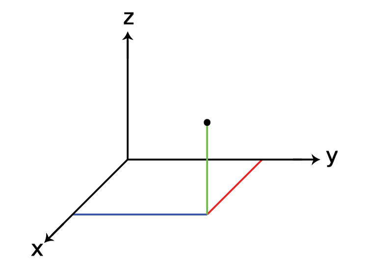
This subtle but enhanced layer of depth in flat design 2.0 means that designers can keep things simple and reduce cognitive load on the user, while simultaneously improving the UX by offering visual cues. With flat design 2.0, buttons now look clickable and spatial relationship between elements on screen has been re-established.
We could say that flat design 2.0 brings an added sense of functionality and usability to the table and it looks set to stay for a while. It’s also not just a passing trend, but a step towards improving usability in the field of UX.
The good news is, achieving a great flat website design is a piece of cake in comparison the skeuomorphic designs of the early 2000s. And the really awesome part is that you’ll also have more time to focus on the user experience.
First of all, let’s cover the basics. To achieve a great flat design 2.0 effect, you’ve got to first lay the foundation for a great flat website design. Here are some tips that’ll render your web design as flat as a British pancake.
Use icons with a basic 2D design that show simple illustrations. Over complicated symbolism has no place in flat website design. Just a simple, basic representation of an icon’s function will do. It’s also important to give your icons a clean design. Doing this will help your users readily understand their purpose.
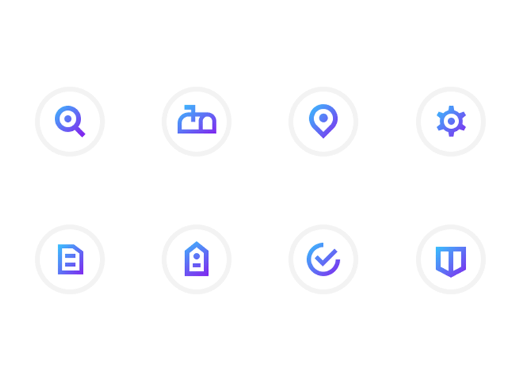
Image by Ted Kulakevich
In terms of color, you’ll want to use bold, monochrome palettes. However, when it comes to CTA button design, using bold and contrasting color combinations can make buttons and elements stand out.
You may want to rethink that content-heavy homepage, because, like the old adage: a picture is worth a thousand words. This couldn’t be truer than with flat website design. Not only can images be a great substitute for text, but they can also help you capitalize on valuable screen real estate.
Using simple vector images or just one bright color for the whole background means you not only reduce clutter, but have more time for those all-important UI elements. By substituting images for words, you can draw more attention to important elements such as CTA buttons.
Text and font must be readable. In flat website design, it’s vital that you don’t use too many different fonts – if you do, your design can become disjointed and lose its minimalist look. Try using different sizes and weights instead of changing the font and use Sans-Serif typography for optimum readability.
It’s also about transparency, though not in a figurative sense when it comes to font and buttons! When designing your font, you should make sure the colors are bold and provide a sharp contrast to the background. Straining the eyes to read text doesn’t make for a user-friendly experience, especially when confronted with outdoor sun glare.
Visually prioritize the most important content and CTAs by using contrasting colors and element sizes. Create an illusion of 3D hierarchy when hovering between elements by enlarging one as the cursor hovers over, or by adding an interaction that temporarily changes the button’s color.
When it comes to creating a flat design 2.0 for your website, we’re really just talking about an extension of flat website design itself, with some 3D styling and animation thrown into the mix.
Here are some quick pointers to get you on the way to creating a website with flat design 2.0.
First and foremost: it’s time to reconnect with web design’s estranged friends – shadowing and light positioning. Use these effects sparingly to create an added layer of depth to your flat website design elements, such as CTA buttons and graphic designs in images. The rules of flat design 2.0 even allow you to use various color gradients in each element to further increase the 3D effect.
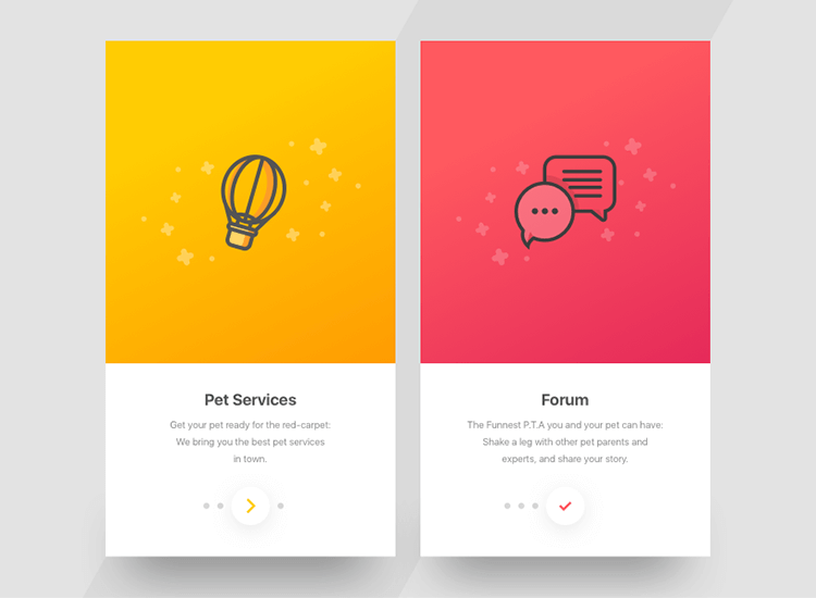
Image by Ranjith Alingal
Next, to give your flat website design a clearer sense of hierarchy, use a z-axis to create the impression of layering. The easiest way to picture this is to imagine the effects of parallax scrolling. Using z-scale layering immediately creates an illusion of a 3D environment.
Animations help guide the user to take action. Making elements look like they’re responding to the world of physics can actually make a big difference in terms of usability. Why? Because you’re providing more context.
Animation can help users understand the spatial relationship between elements on a screen. For example, do they have to flick through a list of cards, icons or elements? Animation can also help render a 3D atmosphere more intuitive to the user.
Don’t overdo it though – animations should be kept to a minimum, especially when they’re not being used to fulfil a specific function. Animation should never get in the way of, or comprise a design.
SVG elements are the way to go when it comes to flat website design, and the same is true for flat design 2.0. Steer clear of bitmap images, as they don’t scale well. Vector images can scale to suit the screen resolution of any device, thus increasing a website’s responsiveness – one of the main goals of flat website design.
Now let’s take a look at some stunning examples of great flat website design. In our list we’ve included a variety of websites that are good examples of both flat website design and flat design 2.0. Time to get inspired!
Hats off to 450 GSM for maintaining the classic simplicity of flat website design, while at the same time, incorporating flat design 2.0 methodologies. These guys manage to keep things simple and intuitive with their design.
High contrasts, toned down pastel colors in the background and flat buttons with rounded edges keep things unequivocally…flat! Except for the red origami bird on the right – an extra dimension is added in using shading and a shadow effect.
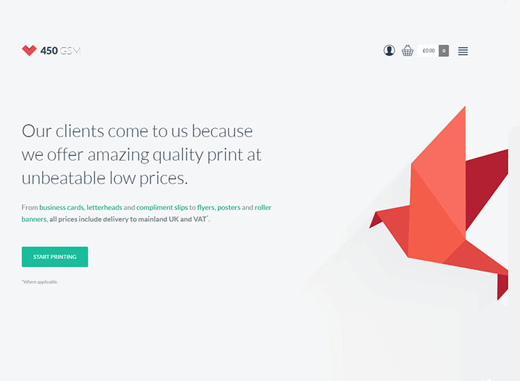
The green CTA button to “start printing’ changes gradient to a lighter shade of pastel green as you hover the cursor over it. This minimalistic animation helps show that it’s clickable.
Caps viens-là is a straightforward, fun online game that is a great example of the evolution of flat website design with its 2.5D graphics. The designers created a sense of depth with 3D styling and shadowing, but the items that you interact with are unmistakably 2D.
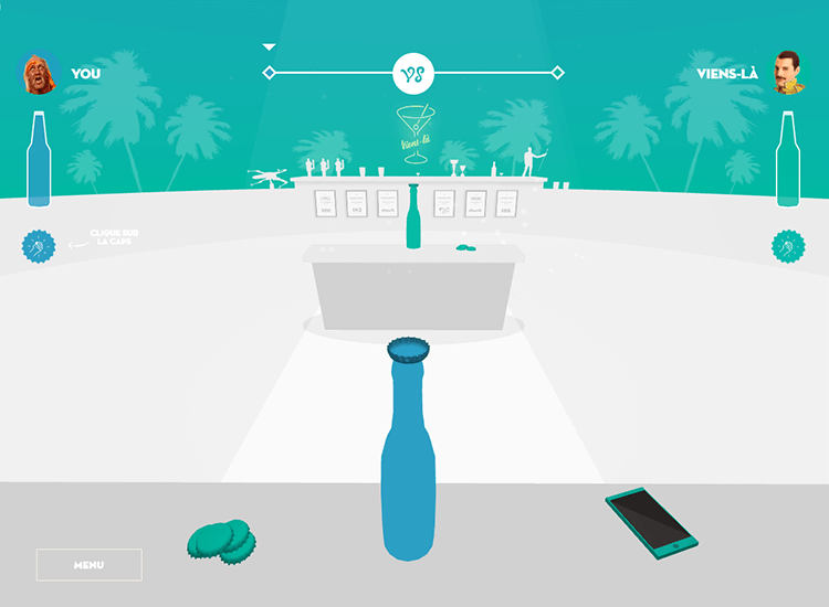
Add graphics and animation and you’ve got the mixed bag of 2dimensionality and 3dimensional modernity that is flat website design 2.0.
Picture a chartered accountancy website. You’re probably not thinking of something fun, refreshing and creative. But QAccounting questions this image of somber, conservative designs for financial websites by throwing out a fun flat website design.
You’re drawn in by the circling, pulsating vector graphics that create an almost gamelike appeal to the homepage. Various bold gradients of blue are used throughout the design, injected with bold red and purple.

Deliberately crude underlines provide a faux shadow to the buttons; hover the cursor over them and they turn from red to blue, indicating clickability. To add to the interaction, a blob of energy darts about the screen, following your cursor as it moves, creating animation on the page and helping direct the eyes.
Turner’s Dairy is a great example of traditional flat website design. It seamlessly blends real life images of their products with garish colors. The site uses no shadowing or 3D effects. The only animation is the movement of each panel and button that you run the cursor over, to demonstrate clickability
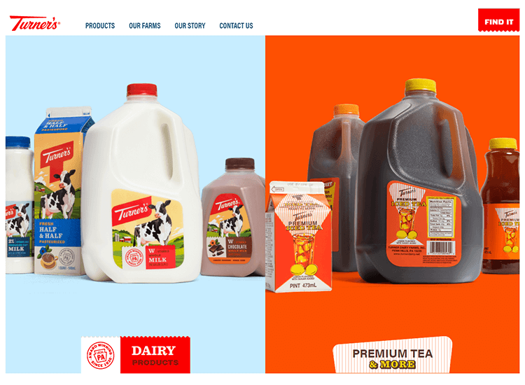
The design is loud, fun and shows that you don’t need to make a design 3D if you want it to jump off the page.
The CSS conf EU moves across europe giving conferences about coding and hosting various speakers who are experts in the field. Their flat website design is an excellent example of how to use color to your advantage to create a simple, yet appealing design that guides the eye throughout the page.
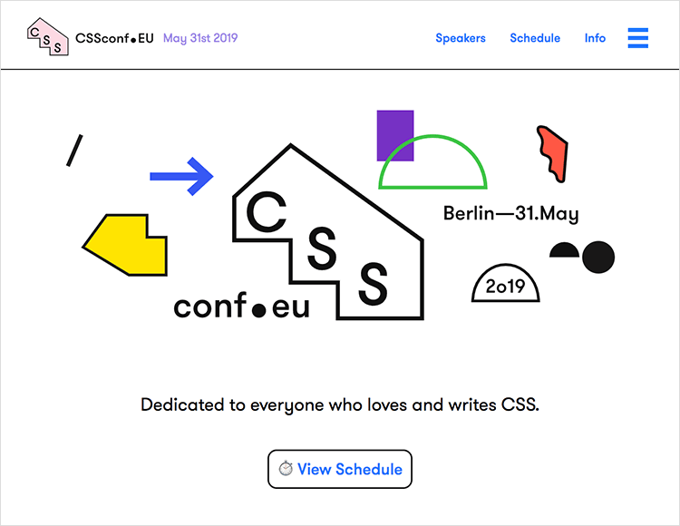
There’s nothing that really qualifies this page as flat design 2.0, but it’s not needed – this design is deliberately flat. Elements look clickable simply by turning a brighter shade when you hover your cursor above them.
Olapaloma, a publication agency from Barcelona, does a really good job on creating jaw-droppingly simple visuals. They’ve leveraged the principles of flat design 2.0, while staying loyal to the original flat website design concepts.
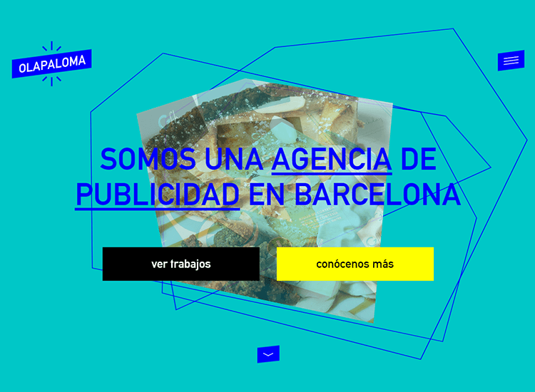
Throughout the site we can see a clear, loud blue and yellow color scheme. Moving angled lines in the background bestow a 3D illusion. Scroll arrows and jumping CTA buttons all give the appearance of clickability, while moving the mouse to different parts of the screen changes the color of the background.
Google’s Christmas website, Santa Tracker, is an excellent example of flat design 2.0. All images use subtle 3D styling to give them a pseudo 3D appearance. At the same time, layered elements and shadows falling onto the background creates a living ambience.
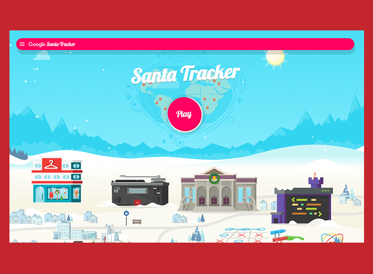
There’s constant movement on the webpage: snowflakes fall while vehicles and other sprites move in the background. Hovering the cursor over any of the buildings throws up baubles of information that take you to various Christmas games.
Wthr.live is a fun weather forecast created to inspire designers. It’s a brilliant example of how flat website design can initiate excitement and engage a user.
Firstly, the site earns its deep flat badge with moving Sans-Serif font in the center, of a bold, single-colored background. It’s minimalistic in that it provides just the right amount of information without going overboard.
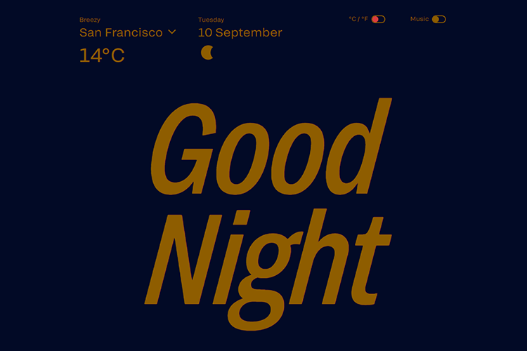
The information it provides happens to be what the user cares about at that moment, such as the temperature now and later, along with details like humidity and wind speed.
Dots, a mobile gaming company from New York have done great things for their promotional website, and all while staying completely flat.
Their mobile game can be considered representative of flat design 2.0, but their website keeps things ultimately flat. With no animation, and an absolute minimum amount of interaction when hovering over clickables, this is a lesson in how flat website design doesn’t have to have a flat personality.
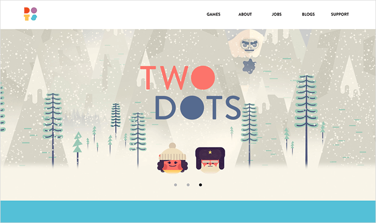
The appealing contrast of stylish pastel colors and striking cartoon images creates a fun-loving design that’s like candy for the eyes.
Landing on Lânder’s site, you’re immediately treated to a show of animation as a flurry of typical desk clutter flies towards the center of the screen. Each object has a blockish, cartoon-like feel but with an added layer of detail. The scrunched up pieces of paper allow the site to flex its flat design 2.0 muscles, along with the paper doodles and glare on the photos.
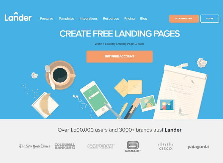
CTAs don’t have shading or gradient variations, but do look clickable, with contrasting orange and bold white font that also darken as you hover the cursor over them.
Love it or hate it, flat website design looks set to stay. And with good reason: it not only offers a clean and clearer UI that creates less visual noise for the user, but flat website designs are also more responsive by default.
Nowadays, with the sheer volume of content available on the internet, holding the user’s attention is more important than ever. Using a flat website design helps your webpages to load faster and helps avoid penalization by Google.
However, going forward, it’s clear that flat website design is evolving, with the apparition of flat website design 2.0. By going the extra mile and integrating flat design 2.0 principles, you can ensure your website is as intuitive as possible, with the latest design styles, while still being responsive.
PROTOTYPE · COMMUNICATE · VALIDATE
ALL-IN-ONE PROTOTYPING TOOL FOR WEB AND MOBILE APPS
Related Content
 Crafting landing pages that convert doesn't have to be tough. Here’s our snapshot of 30 landing page examples with awesome UX that nailed it!12 min Read
 How important are lists in UI design? How much do they affect usability and what’s the best way to design them? In this guide, we'll explore the elements that make up a great list UI design and look at some inspiring examples!15 min Read
 UI design examples that bring some serious inspiration. From parallex scrolling to delicate animations - this list has it all to get you inspired!8 min Read
