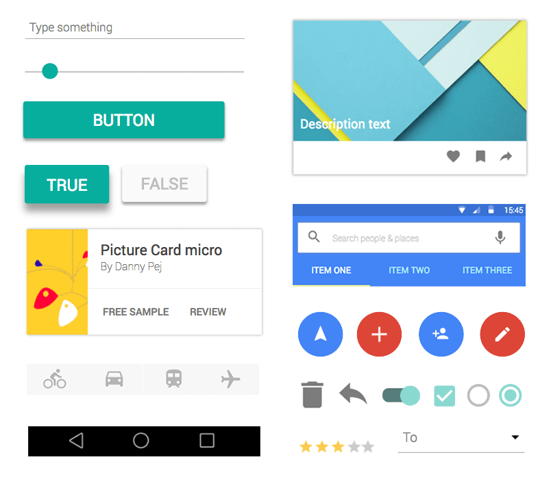
Justinmind’s material design kit allows you to create intuitive push notifications for your Android mobile app wireframes
If there ever was a love/hate relationship with an app feature, push notifications would be it. They may be necessary for apps to operate, but that doesn’t’ take away from the fact that they’re intrusive and distracting.
Download Justinmind and wireframe push notifications your users will love!
On one hand, there’s the unyielding need to know when someone’s liked our Instagram post or when our Deliveroo rider is on their way. On the other hand, being woken up in the middle of the night by a ton of alerts and reminders to clear device space is infuriating.
It’s safe to say that this relationship is due for an upgrade. Luckily, we’ve got a few tricks up our sleeve to make your push notification game stronger than ever. What’s the first step you ask? Wireframing your notifications with an interactive app wireframing tool like Justinmind.
Defining the user flow of your mobile app notification
The first step in creating a mobile app notification is to define the experience around that notification. You need to know what users will be able to see and do with it so that you can design the interaction.
It’s important to understand the context and how a user would reach the notification, as well the list of screens involved. Do this by sketching out the user flow up to and beyond the notification in a screen map. Get more information on defining the experience of an Android notification. Once you’ve done this, you can start to visualize the user flow in a wireframe or prototype.
How to prototype smart notifications for your mobile app
Getting started with your Android app wireframe
In our example, we’re going to create a set of notifications that inform the user of a new email in their inbox, from their mobile’s lock screen. We’re going to create two notification dialogs: the first is what the user will see upon first engaging with their lock screen. The second is the expanded version upon tapping the screen for more information.
The first thing you’ll need to do after downloading and opening Justinmind is to create a mobile app wireframe. Justinmind supports both Android and iOS, but we’re going to use an Android wireframe template in our example. You can also add more elaborate details and work your way up to a high-fidelity prototype.
With Justinmind’s Android Lollipop and Nougat UI libraries, you can build mobile UI wireframes that follow Google’s material design principles. All mobile app libraries available in Justinmind have a complete set of industry-standard UI elements and icons so that you can create authentic mobile wireframes that maintain brand consistency.
We’ve even got ready-made screens to save you time. The Android widget libraries have a wide selection of pre-built screens, including Lock, Slide Menu, Maps, Contacts, Calling, Notes, and Email screens.
For our example, we’ll need a Lock screen. Drag the Lock screen from the Screen Examples section of the library to the canvas.
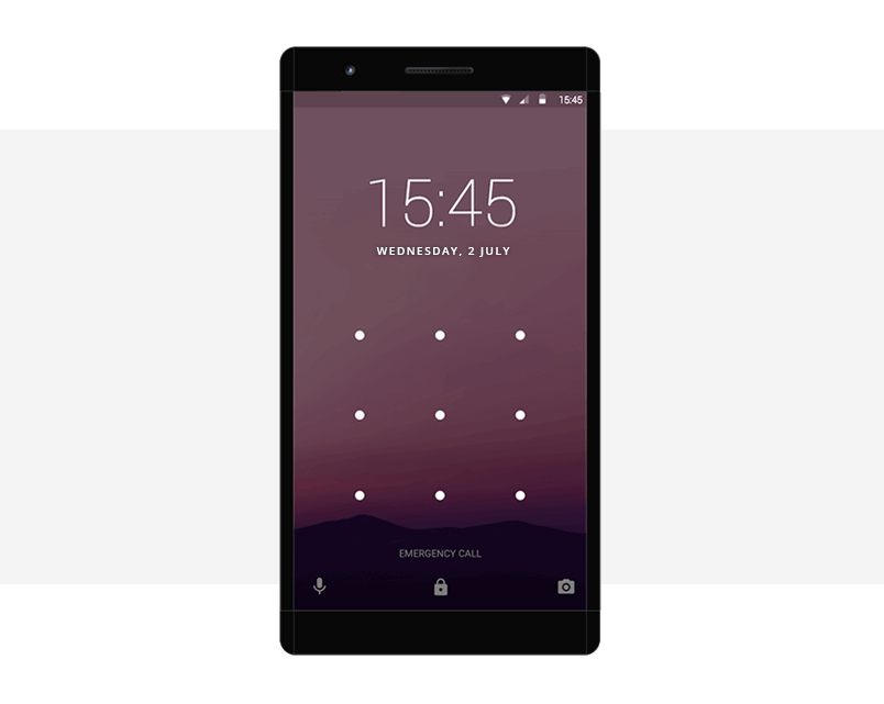
Creating a notification dialog with Justinmind
Justinmind has a range of default Android notification dialogs available, so creating one from scratch isn’t necessary. However, creating a manual notification will give you the freedom to customize it as preferred.
First dialog
To create the first notification dialog, drag a rectangle widget to the canvas. Change the background color to match Android’s notification dialog background (hex code #FAFAFA) and resize it to fit our example.
Next, add three-paragraph widgets on top of the rectangle and align them vertically. The top widget will hold the name of the contact, the middle the subject line and the bottom the user’s email address, corresponding to their Google account. Customize to match our example. Tip: the font used in the default Android notification dialog is Roboto.
Add an image widget and place it in the top left-hand corner of the rectangle. Customize it so that it displays the first initial of the contact who has sent the email.
Then, add a Hotspot widget to the canvas, place it on top of all the UI elements and resize it to match the rectangle. We’ll use this to add interaction later on.
Finally, group all of your UI elements together inside a dynamic panel. Tip: in the Outline tab, make sure that your Hotspot widget is stacked on top of all the other UI elements, then the paragraphs and image widgets are followed by the rectangle to ensure the correct hierarchy.
Expanded dialog
To create the expanded dialog, drag another rectangle widget to the canvas. Change the rectangle style to match our example. Copy the three paragraphs from your first notification dialog and paste them on top of your rectangle. Note that this time, the final paragraph should hold the first line of the email’s body text, not the user’s email address.
Then, drag ‘Archive’ and ‘Reply’ Android icons on top of the rectangle and place them below the paragraphs. Below, add a fourth paragraph widget to hold the user’s email address. Add line widgets above and below the archive and reply icons.
Copy the contact image from the first dialog to the top left-hand corner of the rectangle. Finally, add a contact avatar on the right-hand side using an image widget (see our example below). Group all of these UI elements together inside a second panel of your dynamic panel. To create a new panel, just click the ‘+’ at the top of the dynamic panel.
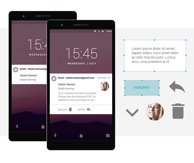
You’re done with the visual part, time to make it interactive!
If you want to really elevate the design of your Android app, check out this tutorial and learn to prototype a chatbot.
Making your notifications interactive
In order for the user to get from the first notification dialog to the second, you’ll need to use Justinmind’s Events system. You’ll be creating a ‘Set Active Panel’ event because you’re using dynamic content.
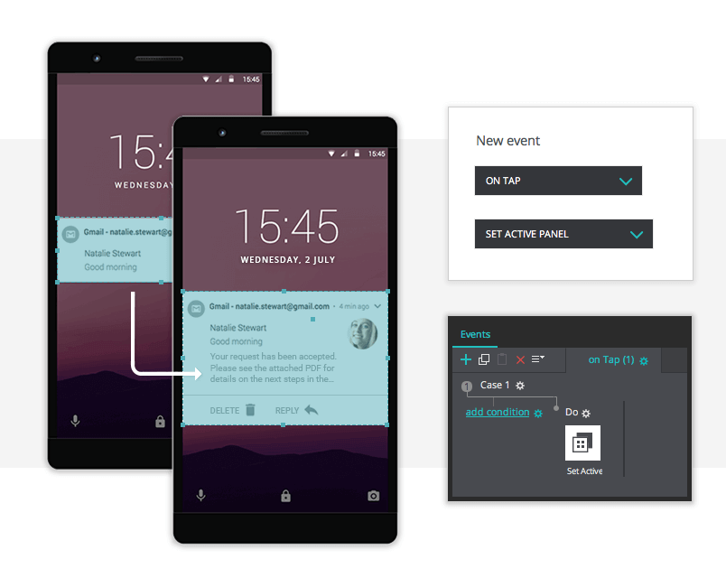
So, from the Outline tab, select the Hotspot widget from the first panel of your dynamic panel and head to the Events tab. Add an ‘On Tap’ + ‘Set Active Panel’ event, selecting Panel 2 from the Outline tab. If you like, add a pop transition effect below.
And that’s it! Click ‘Simulate’ to see your mobile app wireframe in action!
Best practices for prototyping mobile app notifications
According to app data expert, Ashley Friedlein, mobile app push notifications drive user retention rates by over 100% when designed well. The problem is that they’re not being designed to engage users – rather just roll out app reminders at the cost of the user’s patience. The challenge is to provide notifications that are relevant, useful and desired. Here are some best practices to make your mobile app notification game stronger:
- Use color wisely to communicate to the user the importance of the message
- Make sure your notification copy is clear and context-sensitive
- Group multiple notifications or summarize them in a way that makes sense for the app/interaction
- Go responsive if notification can be viewed on multiple devices
- Use animation with purpose – make your notification experience action-rich, not action-packed. Additionally, make sure that any animation you add is in line with the motion guidelines of your mobile operation system
- Good notifications are well-timed so think about the most important triggers – and remember, instantaneous isn’t always best
“Notifications at the wrong time are worse than useless. Irrelevant pings not only get ignored, but the noise they create dilutes focus, causes frustration and a false sense of urgency.” — Alex Potrivaev
Remember, the goal is to up the interaction rate, so try sending fewer, more meaningful notifications. Good notifications are absolutely necessary. They inspire intrigue and promote engagement.
Designing Android app notifications the smart way: the takeaway
It’s hard to imagine going anywhere without your mobile device these days. And whether we love them or not, notifications serve a purpose in mobile apps.
Designing them well can either make or break the user experience of your mobile app. Building a wireframe is the best way to test out our solution early on in the design process and ensure that we are creating helpful notifications for users.
Related Content
 UX design portfolios are your chance to showcase your top skills and best work. Check out this post for awesome portfolio examples and websites!10 min Read
 Learn what paper prototypes are, how to make them and how they can help you design better products. Awesome examples and free templates inside!10 min Read
 In this comprehensive study, we dive deep into the world of web design tools, comparing features, pricing, ease of use, and more. Whether you're building a simple landing page or a complex e-commerce store, we've got you covered. Let's explore the best options and help you make an informed decision.30 min Read

