4 error message examples to help users navigate your UI – plus a FREE mobile error message downloadable by Justinmind
Error messages give users feedback when something has gone wrong in their web and mobile interfaces. Small as they are, these messages, instructions, reminders and warnings are essential to a brand’s user experience, conversion rate and reputation.
When designing an input form in a user interface, error messages are often badly designed or left out altogether. Bad error message examples include messages appearing at the wrong time or with misleading and/or erroneous information.
According to UXMas, error message design should be human, helpful, humble and humorous, if possible! Here are four best practices for designing error messages in your prototypes, with Justinmind’s prototyping tool.
Error message examples and best practices for prototyping them
Error messages are used in input forms, such as login or sign up forms, to inform the user of how and why there is a roadblock in their task flow. The user is reliant on the error message to move past these roadblocks, which is why it’s important to make each occurrence as seamless and meaningful as possible. For more information, check out post on testing and validating forms.
Poor error message design stems from poor planning in the UX design process. Designing error messages early on with a paper prototype will help ensure that the user receives as much help as possible when trying to complete a task. As the prototype evolves, so will your messages.
Want to design your own error messages? We’ve create a mobile example that you can download and customize to create your own app error messages. First of all, you’ll need to download Justinmind’s wireframe tool!
Download Justinmind’s mobile error message here and try it out here!

1— Error message examples: consider placement and timing
Effective error messages appear immediately after an error is committed and are strategically placed on-screen, at the optimal moment, so the user can’t miss them.
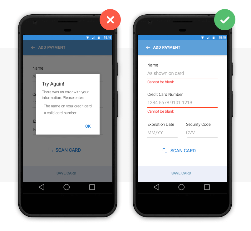
Image credit: Nick Babich
Above we have two error message examples. The left payment form uses a pop up to inform the user that they are required to fill in their details in order to make a payment. The user has to click out of the pop up to make these adjustments, which adds an additional step to their user journey. There is also the risk that the user will forget the pop up’s instruction and will be forced to return to the pop up. This can be time-consuming and frustrating – bad error message UX.
The right form uses inline validation. Clearly visible instructions immediately appear under each input field if the user leaves them blank. The user receives instant feedback and the required adjustments are clearly marked.
How to prototype this error message
Creating an inline validation error message in your web or mobile prototypes is easy with Justinmind. Use input text field widgets and a button to create the input form. Then, add text fields below each input field and write your error message in each.
To make your error messages interactive, combine ‘On Click’ (for web) or ‘On Tap’ (for mobile) with ‘Show’ actions with conditions. Learn how to simulate error messages in our website wireframe tool.
2— Error message examples: make them actionable
No matter how well-designed or strategically positioned, your error message is no good if it doesn’t offer the user a way out.
The user not only needs to know that there is a problem, but also how to rectify it. Actionable error messages are ones that tell the user what to do next in order to complete a task.
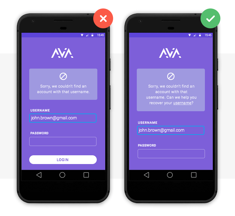
This is one of the best error message examples we’ve seen. The system not only informs the user that their email address is already in use, it also tells them how to log in by recovering their username.
How to prototype this error message
To prototype this error message, you’ll need two screens: a sign up and a recover username screen. Create them with input field and button widgets as above.
In the sign up screen, add a paragraph widget. Write the error message text and underline the text that will hold the login link. Mark it as hidden in the Properties palette.
Then, highlight text to be linked and add an ‘On Click’ (for web) or ‘On Tap’ (for mobile) and ‘Link’ event, selecting the recover username screen. You’ll need to add a condition that will make the error message appear only if the email address is already registered.
*Note that if you wish to add two links, you’ll need to use hotspot navigation widgets.
3— Error message visual examples: make them noticeable
Error messages are a waste of time if the user doesn’t notice them. As Jakob Nielsen puts it, “the very worst error messages are those that don’t exist”. Large fonts and garish pop ups quickly become irritating. So how do you make sure your messages get through? With the right use of color.
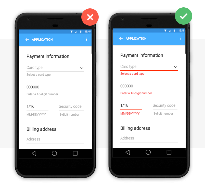
Image credit: Nick Babich
Color is one of the best tools for user validation. Error messages are typically displayed as red text/warning icon against a white background for contrast.
Note that color should not be the only indicator of an error. In order for your web or mobile design to be accessible, Jakob Nielsen advises to include redundant cues that color-blind users can see.
With smart technology (Augmented Reality, Artificial Intelligence and Voice user interface design) on the up, human-user interaction needs to be as natural as possible. Learn more about making your prototype accessible with our accessibility design post.
How to prototype this error message
You can change the font color, size and family of the error message in Justinmind’s Properties palette. If you wish to use a warning icon, you can change its color upon a user’s interaction by using SVG vectors.
4— Error message text examples: be specific
So you’ve mastered the error message aesthetics, you’re so close! Don’t let your design down with convoluted explanations or obscure codes and abbreviations.
Here’s some advice on how to make sure your error message is readable and has a human tone:
- Be empathetic, not technical e.g. never show raw error data such as ‘an error of type 2 has occurred’
- Be informative and precise by indicating that something has gone wrong and what it is exactly
- Be consistent by using the same tone and precision in each message
- Always give advice on how to fix the problem
As Jonathan Colman explains, a good error message is simple and clearly worded, a bad message won’t provide details about what happened, where it happened, or what to do next, and an ugly error message will completely conceal the problem.
Below are some error message text examples:
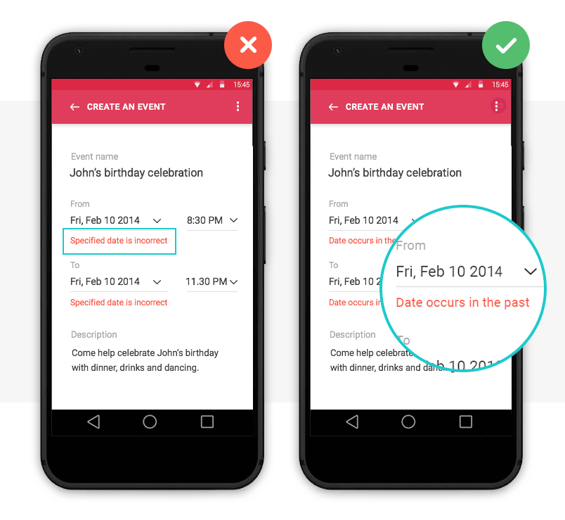
Image credit: Nick Babich
How to prototype this error message
If you’re unsure what kind of error message text to opt for, it’s time to user test your design. With user testing, you’ll see how users react to your design in real-time and get instant feedback to make an informed decision.
With Justinmind, you can quickly and easily link prototypes with user testing tools, such as UserTesting and UserZoom.
Why use error messages in your UI design?
When users interact with a site or app, errors are inevitable – after all, to err is human. But that’s what error messages are for.
Error messages help overcome roadblocks in the user journey and reduce the time it takes to get from Point A to B. They also help to alleviate frustration when errors occur, improving the user experience.
According to Nielsen’s First Law of Computer Documentation, users don’t always pay attention to system messages or warnings. But when users want to recover from an error, they are particularly attentive. So if UI/UX designers up their error message game, users will appreciate it.
Start by prototyping your error messages with Justinmind and become a pro in no time.
Related Content
 UX design portfolios are your chance to showcase your top skills and best work. Check out this post for awesome portfolio examples and websites!10 min Read
 Learn what paper prototypes are, how to make them and how they can help you design better products. Awesome examples and free templates inside!10 min Read
 In this comprehensive study, we dive deep into the world of web design tools, comparing features, pricing, ease of use, and more. Whether you're building a simple landing page or a complex e-commerce store, we've got you covered. Let's explore the best options and help you make an informed decision.30 min Read

