Designing for iPhone X – what every app iOS designer needs to know, plus some extra-handy UX and prototyping tips we’ve thrown in for free!
With an all-screen design, flawless Super-Retina display and breath-taking wide color, Apple really have outdone themselves. The iPhone X has been out for a few months now, which means that you’ve had time to read reviews and discover for yourselves just how amazing it is.
And we’d agree. In fact, we can’t stop talking about it. Just last month we announced the newest addition to Justinmind’s UI widget libraries: our iOS 11 UI kit. We also created a brand-new prototyping template for iPhone X. With Justinmind’s prototyping tool, you can design intuitive, lifelike apps for iPhone X in no time.
In this post, we’ll show you how. We’ve rounded up all of the iPhone X’s best UI features and combined them with some helpful design tips to get you started. So if you’re designing apps for iPhone X, this is a must-read.
Let’s dive in!
Designing for iPhone X: a larger display
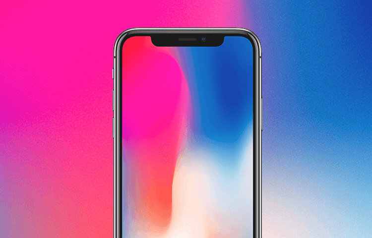
Embrace the tallness of the iPhone X, all 5.6” (143.6 mm) of it. The display itself is 332 pt (7mm) taller than the iPhone 8 – that’s the equivalent of 7 navigation bars as Design Code puts it. And with virtually no bezel, the iPhone X is all-screen.
So what does this mean for iOS app designers? Here are a few things to keep in mind:
Utilize the entire display
The iPhone X new Super Retina Display boasts a 5.8” screen, so make sure you use all the real estate available. Use full screen images and layouts that extend to the edges of the display and remain visible upon scrolling. The idea is to fill the user’s hand, and create a content-rich, full-screen experience.
If you’re after some inspiration, check out our compilation of inspiring iPhone X app designs.
Respect the curve
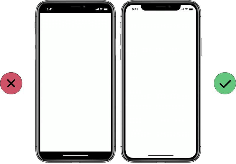
The iPhone display has rounded edges, creating a beautiful curved design and an immersive experience for users. When designing apps for the iPhone X, make sure your backgrounds and full-screen images follow the curves of the iPhone’s display.
As mentioned, we recently released a new mobile prototyping template for iPhone X. The template comes with a device shell, mimicking the iPhone edge-to-edge rounded display and notch (the sensor housing).
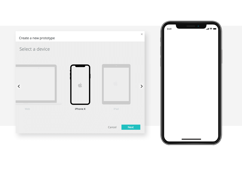
Use Justinmind’s iPhone X template to fit your content perfectly within the curved edges. Use our alignment feature to center important content (such as data tables and image collections) to ensure that content isn’t clipped by the device’s edges or the notch.
As for screen content, take a look at Apple’s safe area layout guides for icons and image placement.
Be mindful of recycling old designs
Note the difference in aspect ratio in relation to older versions. The iPhone X is either taller or wider (depending on whether you’re holding it portrait or landscape) than the iPhone 8, adding roughly 20% additional vertical space for content.
Designers, this means that screen backgrounds and layouts created for iPhone 8+ and older will need to be reworked for iPhone X to avoid hidden or cropped sections. Likewise, ensure that iPhone X designs can be adapted for iPhone 8+ and older by keeping visual content and layouts in view on both the 4.7” display as well as the 5.8”.
With Justinmind, you can make your artwork responsive, so that it fits both on different iPhone displays. Scale images and UI elements so that they adapt to the size of your prototype’s display.
Don’t hide the status bar
Trust us on this one.
The status bar is taller on the iPhone X than on previous versions – more than doubling in size (20pt to 44 pt). It also includes a notch in its center.
As recommended by Apple, the status bar (including the area around the notch) should be visible at all times. Hiding the status bar will make your app feel smaller as well as inconsistent with Apple’s design guidelines:
Note that, in landscape view, the status bar should be hidden to maximize on real estate in full-screen mode when viewing photos or videos.
But that’s nothing a little Justinmind prototyping can’t help 😉 In fact, we’ve created some readymade screens to make life even easier. Download Justinmind and have a go!
Designing for iPhone X: new and improved screen resolution
When creating UI assets for the iPhone X, pay close attention to the new resolution. iPhone X has a high-resolution Super Retina display and a scale factor of 3.o. And at 458 (pixels per inch) ppi, icons, UI elements and screens will need to be built out for the new pixel density. Additionally, high-res images are a must.
Keep your pixels under control with Justinmind. The rulers, guides and grid displayed on and around the canvas will help you keep your lines sharp and content crisp. Use the snap to geometry feature to minimize half pixels and blurry details when scaling down.
Designing for iPhone X: richer, dynamic color
Color is also bigger and better on the iPhone X. Users can expect more accurate and saturated color, with true blacks, high brightness, resolution and dynamic range, and a 1,000,000 to 1 contrast ratio.
This is the first Apple device to support a P3 color space with OLED technology, producing a richer, more vibrant display than with sRGB.
To enhance the visual experience for your iPhone X app, use a wider selection of color against a white or black background. Photos and videos will appear more lifelike and create more of an impact.
Experiment with different color palettes for your iPhone app designs with SVG vectors in Justinmind.. With SVG vectors, you can easily change the color (as well as the size) of your app’s images.
Designing for iPhone X: mobile gesture heaven
Without a Home button, the iPhone X relies completely on gestures. Screen-edge gestures have replaced many system-level actions that were previously triggered by the physical Home button. These include navigating to the Home screen, app switcher, and Notification and Control centers by swiping from an edge of the screen.
When building out your iPhone X screens, keep the home indicator visible whenever possible and avoid interfering with screen-edge gestures that users rely on. Remember that familiar gestures make navigation more intuitive. If you absolutely must create custom gestures, Apple recommends using a first swipe to apply the app-specific gesture and a second swipe for the system gesture.
Adding app gestures to your iPhone X prototypes is really easy with Justinmind. In the canvas, click on an icon or UI element and go to the Events palette. From here, choose from a wide range of gestures (user triggers and system actions) to create interaction in your prototype. For instance, reproduce the screen-edge gestures with “On Swipe Up/Down/Left/Right” triggers.
For anyone new to iPhone X design, you can design and simulate scenarios in Justinmind that will help you map possible user flows for your app gestures.
Designing for iPhone X: death to the hamburger!
With the launch of the iPhone X, iOS navigation has been given a makeover. The hamburger menu has been replaced by a taller navigation bar.
Designed to display app menu items, Apple’s hamburger menu has seen its share of criticism over the years. Apple UX Evangelist Mike Stern calls it out as bad UX and other sources suggest it impedes discoverability and efficiency, and decreases user engagement.
With the release of the newest iPhone, Apple finally responded to the feedback. With a much larger display, the iPhone X easily accommodates a tall native navigation bar, sitting comfortably below the new status bar. And upon scrolling, page titles merge with the navigation bar for seamless, intuitive navigation.
As Apple’s Human Interface guidelines suggest, you can “improve clarity and context when browsing and searching, apps can implement navigation bars that include large, bold titles”.
Design your navigation bar with Justinmind’s iOS 11 UI elements.
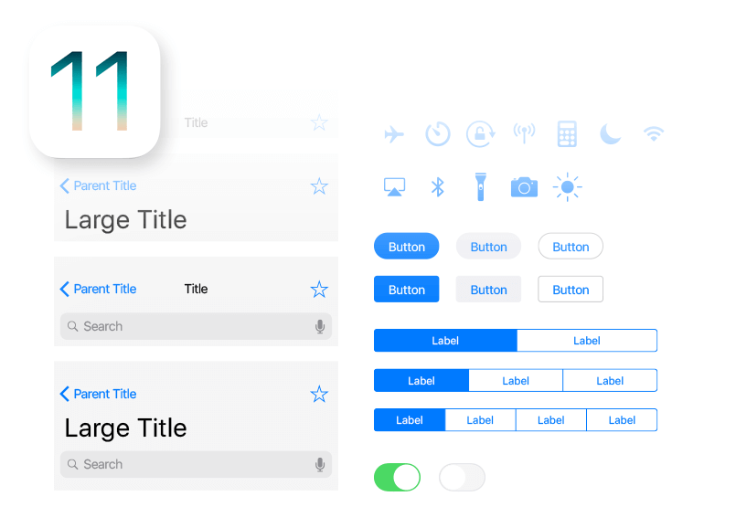
Download Justinmind now and start creating apps for iPhone X in no time! Start creating your own high-fidelity prototype today. 
Related Content
 UX design portfolios are your chance to showcase your top skills and best work. Check out this post for awesome portfolio examples and websites!10 min Read
 Learn what paper prototypes are, how to make them and how they can help you design better products. Awesome examples and free templates inside!10 min Read
 In this comprehensive study, we dive deep into the world of web design tools, comparing features, pricing, ease of use, and more. Whether you're building a simple landing page or a complex e-commerce store, we've got you covered. Let's explore the best options and help you make an informed decision.30 min Read
