Lean UX is all about changing the focus and gaining perspective in the design - but why is it so popular? What does it mean in practice? Read on to find out!
Lean UX unites product development, design and business in a methodology that promotes continued development, constant iteration and validation. By building, measuring and learning, designers are able to get closer to great user experiences sooner rather than later.
Design wireframes and hi-fi prototypes with Justinmind for Free. Unlimited projects!

Lean UX techniques can be applied to enhance a traditional UX process and give it a boost in both performance and efficiency. And so, let’s take a closer look at a much discussed but misunderstood methodology: Lean UX.
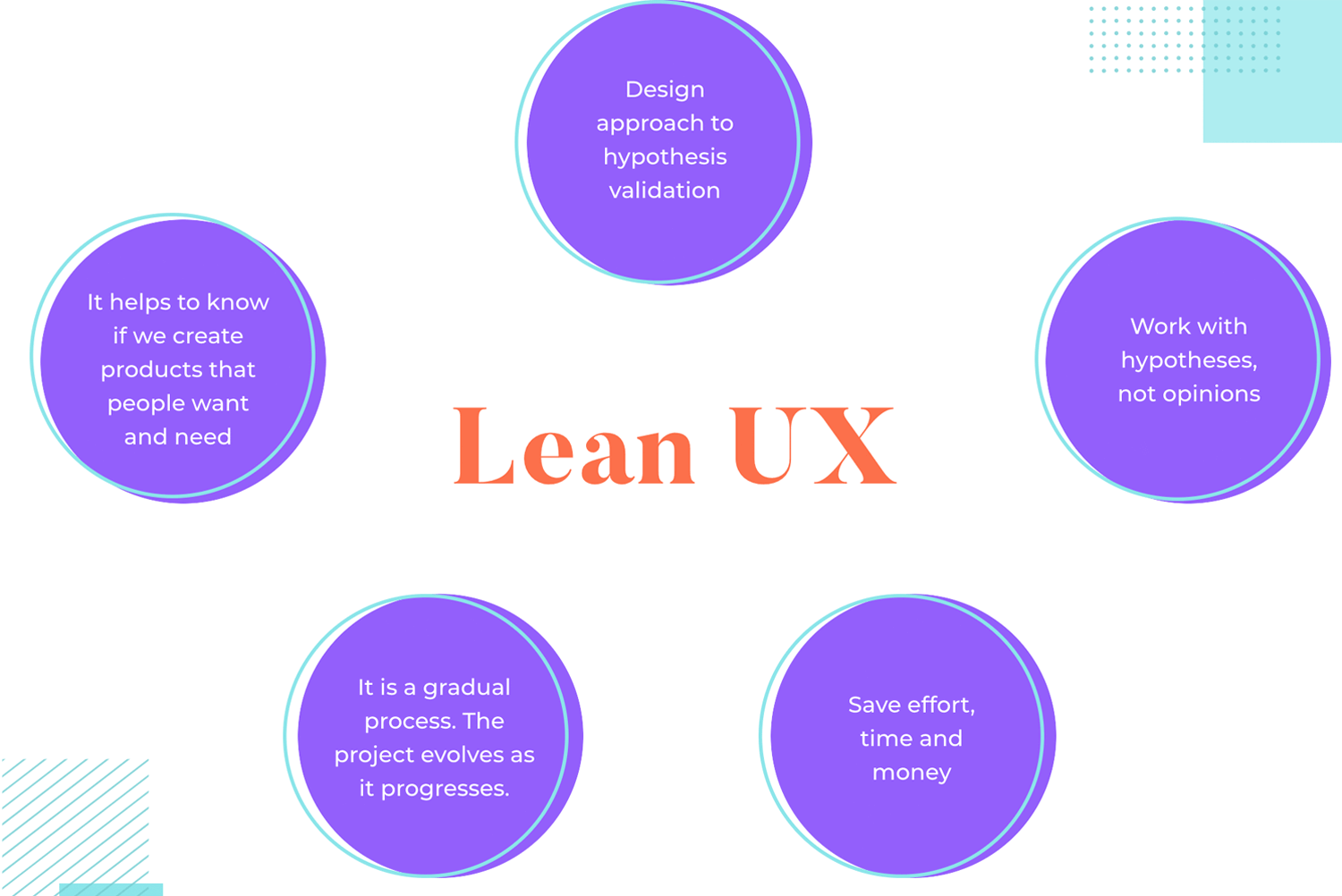
Lean UX is an approach to designing and crafting user experiences. At its heart, Lean UX is about letting the validation of hypotheses guide the work of the design team. This implies that designers never make decisions based on their gut or their preferences – there are only hypotheses here.
A hypothesis might read like this: “I believe that people like persona A have a need for (or a problem doing) XYZ”. This may sound a bit silly at first, but it’s important to frame our theories in the right way so that we encourage a truly lean approach to design. Simply stating what you think isn’t enough. You need something concrete that can be tested and validated, proving the theory right.
So why is validating your hypotheses important in Lean?
Think about this: you’re in a meeting with your other colleagues and you’ve all decided that the one idea that is a definite winner. You and everybody else on your team go to work on this Big Winning Idea. You spend a ton of money, invest a lot of hours, the code goes from rough to ready and eventually, you have a product to release.
What do you do?
You release it. You put your Big Winning Idea out into the world and slowly await the tech write-ups, five-star reviews and the revenue flowing in. But soon, you realize that the Big Winning Idea isn’t so big and it’s definitely not winning.
Hypotheses and validation help us know if we’re making products people want and need. The framework of lean UX is about gradual progress, as opposed to putting all your eggs in one basket. There’s no jumping head-first. It’s all about dipping your toes in the water and making sure you don’t get temperature shock. That’s what makes the method Lean. It provides space to pivot and change as the project unfolds.
You might think that not speaking to your users (or potential users) is a disastrous thing but many companies still fall into the trap of making products people don’t need. The first few stages of the project where the team validates the core features is meant to keep that from happening. Laura Klein writes in her book Lean UX for Startups:
“Instead of thinking of a product as a series of features to be built, Lean UX looks at a product as a set of hypotheses to be validated. In other words, we don’t assume that we know what the user wants.”
Design wireframes and hi-fi prototypes with Justinmind for Free. Unlimited projects!

Designers have many methodologies to choose from when creating products. It’s true that there’s more ways to approach the creative process of any UX product, from design thinking to Agile. With that said, let’s take a moment to understand why so many design teams out there choose Lean over and over again.
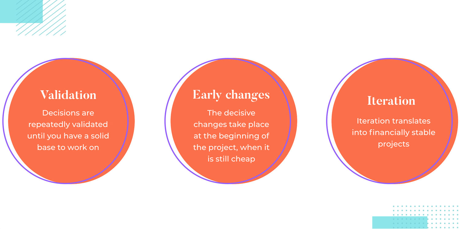
You save money by adopting a Lean methodology. Instead of wasting 3 months precious time into a project that is headed nowhere, the lean method keeps teams focused on what matters. Decisions are validated over and over again, creating a solid base on which a product can be built. It’s true that this in of itself brings many benefits – but it also creates a financially stable project.
Laura Klein, the author of Build Better Products, mentions the company Webvan in her book. They spent $400 million on an automated warehouse system only to discover that people weren’t ready to do their grocery shopping online yet. Think of all the time and money wasted.
There are many projects out there that fail because drastic changes were needed in the last moments, adding a huge strain on the finance of the product. In the world of UX, everybody knows that late changes can break a product design project. It’s all about spending money on decisions that were validated, so change happens quickly and early – while it’s still cheap.
In addition to trimming your budget, Lean UX is also a huge time saver. The lean method is collaborative in nature and doesn’t focus on heavy documentation. This means no more lengthy documents or endless back and forths with developers. Despite the fact that the lean method isn’t exactly linear, it keeps the design team from wasting time.
“Functional software is more important than comprehensive documentation”
Jeff Gothelf - Lean UX
Lean UX focuses on quick and rapid solutions instead of months and months of development on a fully designed feature. There’s no investing great deals of time into a huge feature and testing it once it’s completely finished.
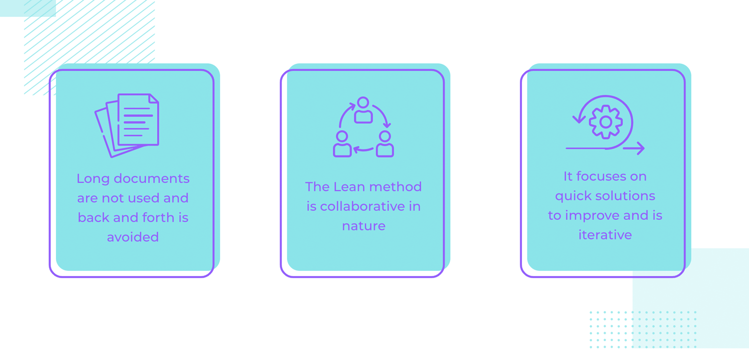
Lean is also iterative. Research and design move quickly and don’t require months to be delivered to engineering. Product owners, designers and developers are all involved in the Lean UX process. Everyone has ownership of what they produce, making everything go much quicker than a traditional design development process.
Ultimately, everyone works together and progress is made a little at a time. Think of it like a project that moves in small but sure baby steps.
There is a lot of overlap with User-Centered Design (UCD) and Lean UX. UCD is iterative like Lean and are both processes which focus on the user and their needs at each phase of the design process.
That is because both methods give a lot of importance to letting validation show us the way. Both approaches encourage designers to distance themselves from the product, with testing acting as a guiding light.
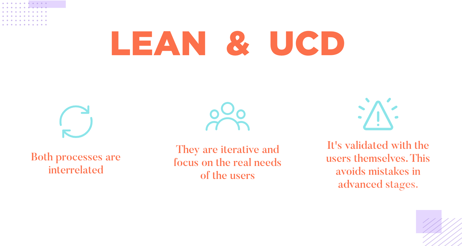
Much like UCD, the lean way is about creating something that truly fits users like a glove. It’s not just about delivering a sound business project but also creating something that shapes itself to the lives of real people. By validating everything with users, lean design teams can see their hypotheses in action, lowering the chances of poor design making it to the final stages of the project.
You can have assumptions in Lean UX but those assumptions will be put to the test. Instead of making guesses about potential new features or designs, Lean UX relies on data to inform any decisions. This helps prevent making that lowers the quality of the product.
“Here is the worst possible way for you to try to figure out if your idea solves somebody’s problem: ask them. The vast majority of entrepreneurs seem to think that explaining their concept in detail to a few people and then asking whether it’s a good idea constitutes validation. It does not.” – Laura Klein, UX for Lean Startups
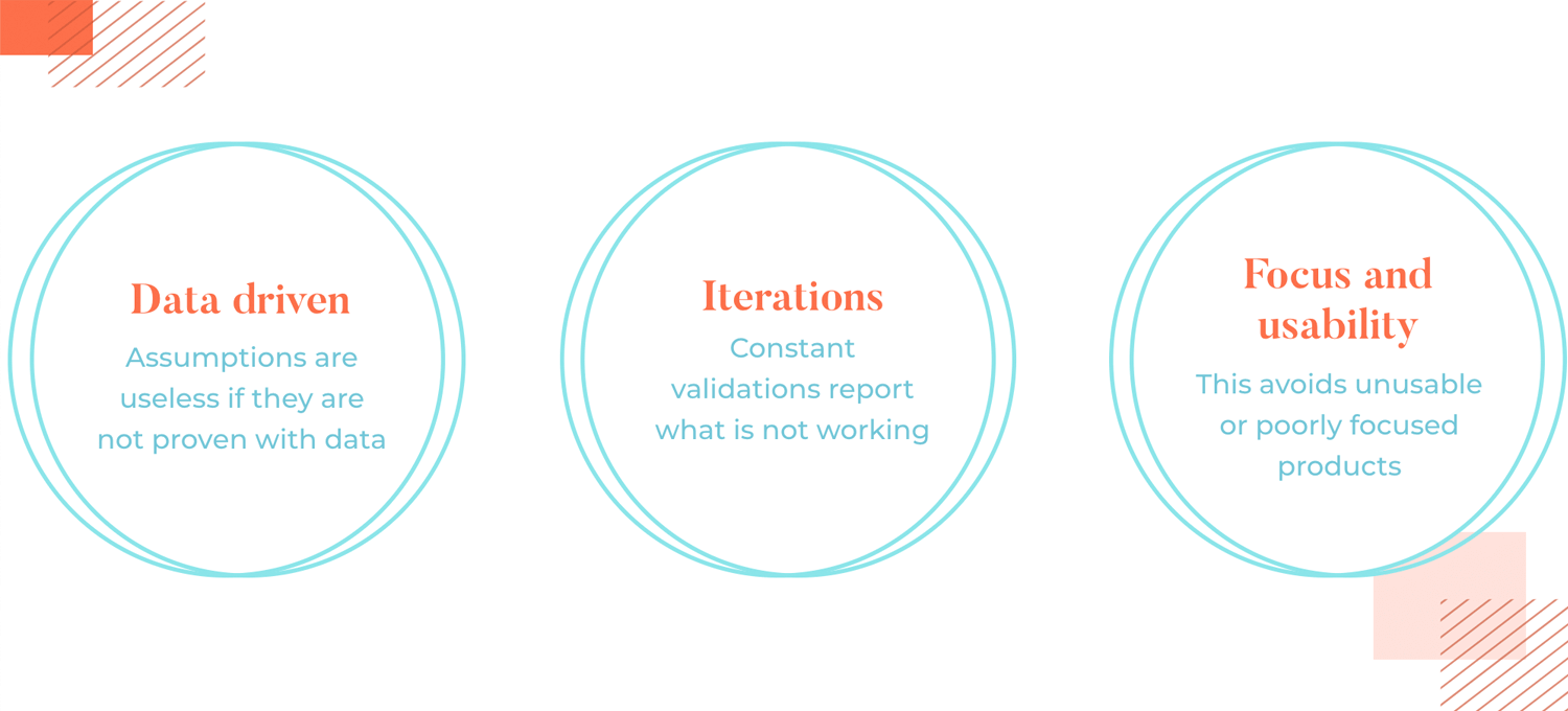
Perhaps even more importantly, constant testing and validating shine a light on aspects of the product that don’t perform well. Even if something was designed in a way that doesn’t work for users, testing will reveal what went wrong and when.
We here at Justinmind were lucky enough to have an interview with one of the men behind the method. In the book, Lean UX: Applying Lean Principles to Improve User Experience, he and Josh Seiden combine lean ideas with design and strategy. It all works to build processes that are more collaborative, iterative and open. Fast forward a few years, and the entire industry of UX loves the lean approach.
It’s a wonderful way to hear from him exactly how he sees Lean UX, what its impact is and how others can benefit from it. Read the entire thing and discover how Lean UX makes better products.
Design wireframes and hi-fi prototypes with Justinmind for Free. Unlimited projects!

Lean UX is driven by 3 main concepts: think, make and check. While it may be easier to see these as 3 steps that take place in a straight line, nothing could be further from the truth. Lean UX is a cycle that keeps going around, with the product improving and advancing every time the cycle is completed and started again.
Think refers to creating assumptions about any given problem and what you think you know about that particular area. These assumptions are important because eventually, they provide new knowledge which will be turned into hypotheses that can be tested. Other aspects of the think stage involve:
- Research
- Ideation
- Mental models
- Sketches
- Storyboards
Make involves designing a Minimum Viable Product (MVP). An MVP is the bare minimum you need to engage your audience and start an iteration-feedback loop. An MVP might be a landing page to a product that doesn’t exist yet to gauge customer interest. It might be a low-fidelity wireframe of the main features and bare bones.
This stage is highly iterative (that is to say, you make the minimum and continue to build upon it). Here are other ways you can create your own MVP:
- Prototypes
- Wireframes
- Value propositions
- Landing pages
- Hypotheses
“Lean UX is where prototyping shines. As with the initial sketches, focusing the prototype on critical components of the experience is essential.”
Jeff Gothelf - Smashing Magazine
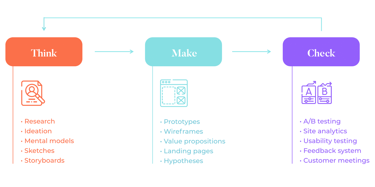
Check is the last stage in the Lean UX loop. This is where you test your MVP with your audience and validate or invalidate it, taking your newfound knowledge back to the think stage to start over again.
It’s important to consider that you won’t be testing a finished MVP or an entire interactive prototype. Testing starts out humbly, using the part of the product that was created in the previous step. Be it a navigation system or the information architecture, testing happens frequently and tends to focus on every little thing that was decided on previously.
This is a part of why you always need to have a professional prototyping tool at hand. Here you can expect to carry out:
- A/B testing
- Site analytics
- Usability testing
- Feedback system
- Customer meetings
Design wireframes and hi-fi prototypes with Justinmind for Free. Unlimited projects!

We touched on assumptions earlier but as assumptions play a fundamental role in Lean UX, they deserve to be understood a little better.
The reason that assumptions play a big role in Lean UX is the shift from the traditional requirements/deliverables method. Instead of relying on requirements, the focus is turned towards creating a problem statement.
A problem statement can take this form:
We have observed that [product/service/organization] isn’t meeting [these goals/needs], which is causing [this adverse effect]. How might we improve so that our product/service/team/organization is more successful based on [these measurable criteria]?
This helps you to know when you’ve solved the problem. It’s likely you might have multiple problem statements. It is the team’s job to decide which problem statements are most pertinent to business, prioritizing user goals and pursuing the best route.
From your problem statement, you can start to make assumptions. When creating assumptions, it’s best to have your problem statement in front of you. Now, you need to think about user needs and solutions.
Use statements like these to help guide you as you create assumptions:
- My customer needs to…
- I believe I will acquire the majority of my users through…
- The biggest risk is…
- What features are important?
- What problem does the product solve?
After you write a problem statement, identify and select your main assumptions, the next stage is developing hypotheses. To test an assumption, you simply transform it into a hypothesis. This is useful for identifying any gaps in your thinking.
A hypothesis statement template looks like this:
We believe this [business outcome] will be achieved if [these users] successfully [attain this user outcome] with this [feature].
And this is what it might look like when you’ve created your hypothesis:
We believe that conversions will increase by 25% (business outcome) if new customers (your target audience) successfully identify a larger call to action button (feature).
Once you’ve created a hypothesis statement, it’s time to put it to the test. As you can see from the hypothesis statement, you start with what you expect to happen – in this case, an increase in conversion. From there, you move onto who will help you achieve this (new customers) and how (big, shiny call to action button).
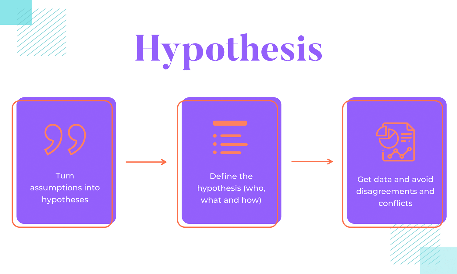
The beauty of creating a hypothesis is that if you ever hear someone say the dreaded “I don’t think this idea will work”, the testing data will show everyone the truth. By putting all hypotheses to the literal test, all disagreements and conflict is avoided. Personal opinions take the back seat, while test results do the driving.
An MVP is what prevents you from going out and designing a fully fledged social network that nobody asked for. Instead, you design the bare minimum and expand on that, little by little.
By building an MVP, you’re creating a small product that functions. You don’t need flashing lights just yet. Your MVP can be so stripped back that a landing page alone can be sufficient. You just need to have something to satisfy early customers and gain interest. Something that captures the central essence of the entire product – something concrete and tangible.
“As you consider building your own MVP let this simple rule suffice: remove any feature, process, or effort that does not contribute directly to the learning you seek.”
Eric Ries - The Lean Startup
Part of the beauty of MVPs is that they can take many forms. Depending on the nature of the product, a simple wireframe might do the trick. You want something that symbolizes the soul of the product, so you can validate that core and make sure the product can thrive. It’s about creating a solid base that all else can rest on.
Testing is the backbone of Lean UX. Testing is what gives you answers. It will help you understand why your users interact with your product in the way that they do. It’ll guide your design decisions and offer clarity. Testing doesn’t necessarily have to involve a lot of people either.
Part of the beauty in user testing is that methods and tools are diverse. Depending on what exactly is being tested, the right approach might change. Whatever needs to be validated, though, can be done in a way that suits the time and budget of the project.
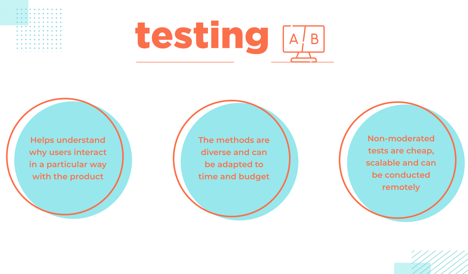
Unmoderated testing tends to be lean because it is cheap to carry out, quick to find recruits and can be easily scaled. You can use a variety of artefacts from low-fidelity prototypes, clickable wireframes and just about everything else. You want a wireframe tool that allows for you to build on the MVP, so you can work your way up to a realistic prototype as the project progresses.
Unmoderated testing just means that a user can complete a testing session without needing a UX researcher in the room. This can be done on a service like Userzoom and users can do it from the comfort of their own home.
Design wireframes and hi-fi prototypes with Justinmind for Free. Unlimited projects!

So, all it takes is thinking about problems from a design perspective and a little Lean Startup magic? Why aren’t all companies using this approach? Taking the lean approach isn’t always easy for big companies. Let’s go over why that is.
1) Fear. Fear of failure, specifically. Lean UX embraces failure as a way to learn and improve. One of the main principles of Lean UX is the permission to fail, as well as the idea that failing early and quickly is best.
When we know that there are no repercussions from failure, we’re more prone to take risks and these risks could lead to innovation or even disruption.
Business Administration professor Edward D. Hess agrees. He says that failure is a necessary part of the innovation process because “from failure comes learning, iteration, adaptation, and the building of new conceptual and physical models through an iterative learning process. Almost all innovations are the result of prior learning from failures.”
2) The reason that many large companies shun innovation is that they’re comfortable. Too entrenched in old business models. Large companies tend to have been in business for a while, which could make it difficult to implement such a drastic change in the way things are done.
This is both because there is already a certain way to do things which people are used to, as well as because it can be difficult to change the workflow of several large teams. Be it as it may, it’s no secret that getting large amounts of people to change their ways can be challenging. This is even more true when you’re trying to change the very way they think about design.
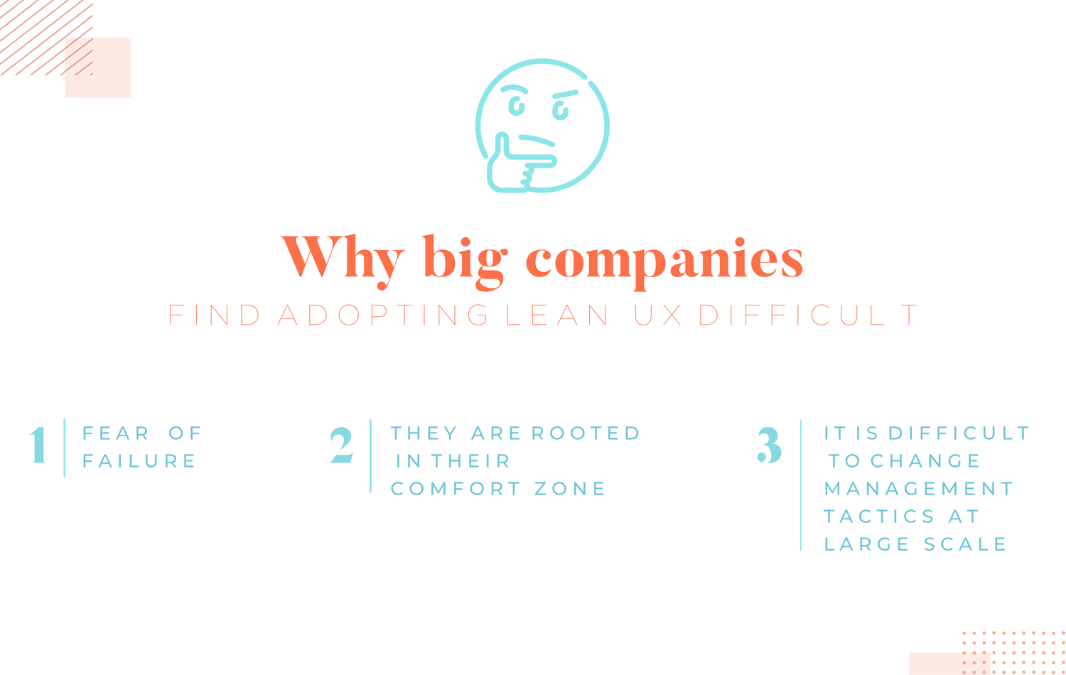
3) Old school management tactics can prevent companies from adopting the Lean UX principles. When thinking of a big company, try to see it as a huge institution. It has its own set of rules, which have been in place for a long time.
Of course, there are ambitious managers who want to push their organizations and try to innovate. However, it’s common to see that traditional management practices push them underground, forcing them to hide that side of who they are in order to maintain the current way things are approached.
Consider a manager who does embrace the lean method. It’s easy to imagine that many middle managers won’t appreciate the change in workflow, putting them in an unfamiliar situation. When trying to implement Lean UX, it can be tough to make an institution adopt a new path.
These roadblocks can stifle innovation at companies and make managers feel as though they’re simply functionaries instead of genuine innovators. Not all is lost, however. There’s many creative ways in which companies can hop on the Lean train.
Gather some like-minded colleagues and try and tackle some problems together. Keep the team small (but still, if possible, cross-functional). The problem doesn’t have to be large either, just complex enough to maintain motivation and to help everyone understand what can be achieved in a short amount of time.
“You want these folks to get to know each other, to build trust, a shared language and rapport, and through that simple spending of time together they start to look at different ways of working and respect each other’s opinions more. They start to think of themselves as a unit that wins or loses together” Jeff Gothelf explains.

Then show the results to your managers. It’s important to highlight how you solved the problem quickly and prove the power of silo-busting. These small victories over time can result in a bigger, dramatic shift in thinking and greater acceptance of Lean principles in the enterprise.
Breaking out of the silo mentality won’t happen overnight. It’s a good thing to make sure the communication channels between you and your manager are always open. That means explaining what you’re doing, why you’re doing it, the challenges you’re experiencing and how much it all costs. It helps here to drive home the benefit to the company to really bolster your arguments.
Communication conventions may have to adapt to this new way of thinking. Thankfully, tools like Slack make this transition easier. The entire team will need the right equipment to maintain good communication as you introduce Lean into the enterprise.
Open communication should spill over to your customers too. Not just between you and the rest of your team.
Jeff explains that “the best thing you can do is to start engaging with customers as regularly and consistently as possible, and bring as many people as you can to the conversation.” Jeff believes that by opening the communication with our customers as soon as possible, we’ll mitigate any resistance to Lean UX in the enterprise.
In brief, to overcome the hurdles at your organization here’s what you can do to introduce Lean UX principles:
- Find like-minded colleagues to escape silo prison
- Speak to your customer early and often
- Go stealthy to drive innovation
- Ask for forgiveness instead of permission
- Nurture clear channels of communication with your managers
- Highlight the benefits to the organization
Design wireframes and hi-fi prototypes with Justinmind for Free. Unlimited projects!

Meetups are valuable for a variety of reasons. They give you direct access to people who are already interested in your product. You know that, because they’ll have signed up to attend. It’ll be confirmed when they actually arrive and you see them in person.
Already you can begin to get some early validation for your ideas. But aside from being a useful tool to get validation, you can create a community of early adopters who can evangelize on your behalf.
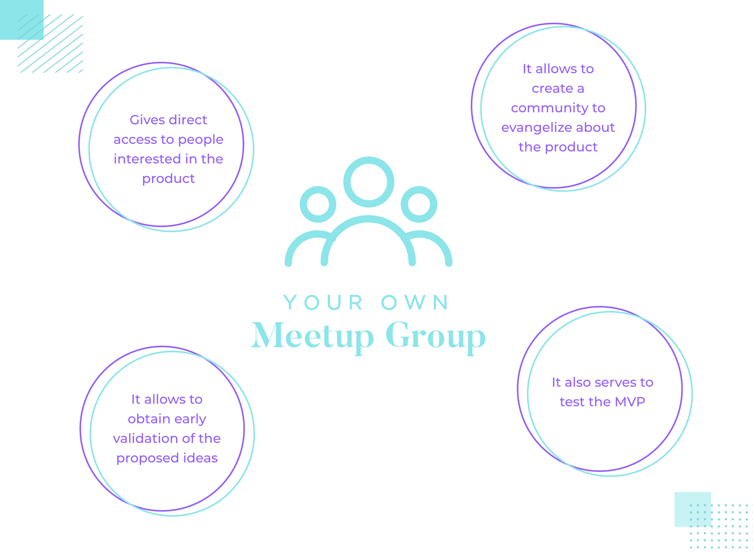
If you have a dedicated Meetup with a group of loyal people, you can use them to spread the word for your product. Plus, you can talk directly with them about what you’re thinking. It’s a great way to Get Out of the Building.
Another use is testing out your MVP. Creating an MVP is vital if you want to understand where your product fits in the market and, crucially, if people want it. You might discover through your Meetup group that what you’re working on actually isn’t what people want. This gives you the chance to:
Tweak your idea into something that your customers actually want. Pivoting might sound scary, especially if you’re wedded to a particular idea. But if you’re not getting validation, the lean way gives you plenty of margin to change direction. There’s nothing wrong with cutting your losses and moving on to other hypotheses.
Advocating for the user is the mantra of many UX designers. Thankfully, Lean advocates for them too. User personas are an opportunity to create empathy. Empathy makes better products because you’re putting yourself in the shoes of your user. That means understanding their pain points and what makes them tick.
Personas are excellent for their utility; they are a tool which can mitigate the need for expensive research studies and the best ones only need one page. Better to spend a few hours crafting decent personas than spend thousands of dollars you don’t have interviewing people.
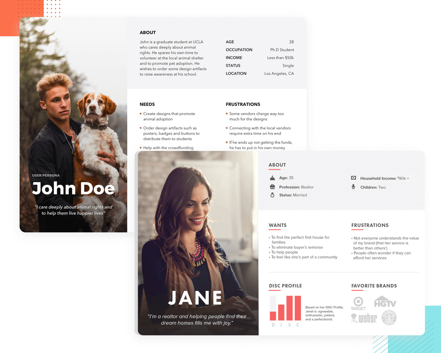
You could take a few people from your Meetup and transform them into personas. When you have more information as a result of ongoing research, you can adapt your personas by seeing which guesses were right and which were wrong, then adapt accordingly.
It’s true that each design team will create user personas in their own way. Some of them are in-depth and look into motivations, problems and goals. Others focus on the simple things, like the face and profession of the user. Either way, it’s important to have user personas at the disposal of your team so they can refer back to it when need be. You can find some very practical user persona templates to speed things up.
Heuristics are rules of thumb. They’re not set in stone but can be used as a set of useful guidelines when navigating uncharted territory. If you’re making a product for the first time, heuristics can give you pointers on what to do and what not to do.
Standards, like the 10 Usability Heuristics for User Interface Design, help anchor us to reality. The principles have been tried and tested countless times so we can guarantee that they’re a safer bet than that unfounded hypothesis you just whipped out of thin air.
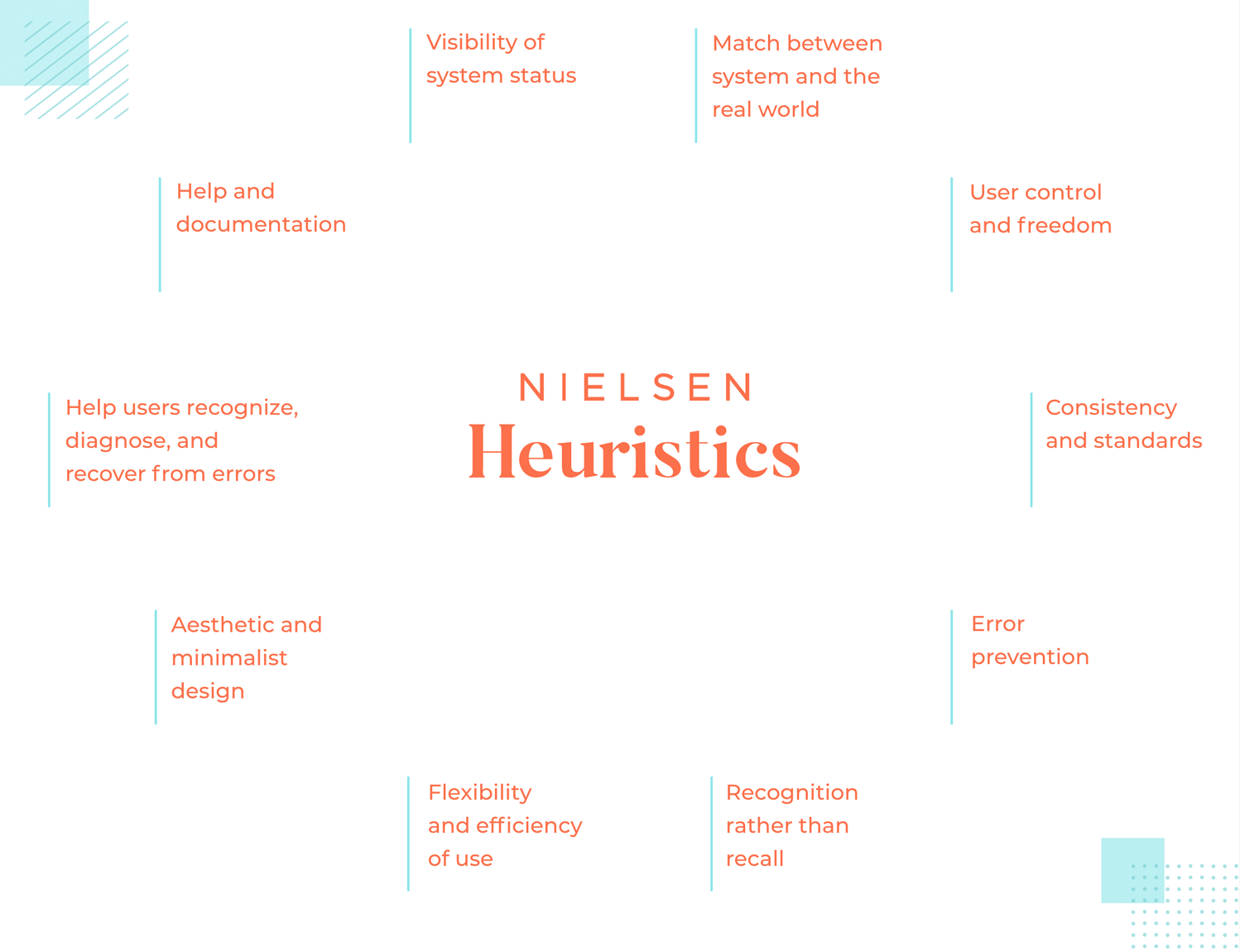
Don’t tie yourself too tightly to these heuristics. Even though those particular heuristics by Jakob Nielsen have been going strong since the mid-nineties, it’s worth remembering that they’re still broad guidelines and not specific usability guidelines. Rather, they set a certain bar when it comes to usability and it’s up to the team to live up to them or not.
You will need to find out the specifics of any given problem through user research on your own. But at least by using heuristics, you’re on good footing. They’re a starting point. Using them will save you time and money because you don’t have to investigate whether or not error prevention is a good thing.
Designing an MVP is easier said than done. But they’re valuable for speeding up learning, decreasing waste and encouraging iterations. All too often, though, when we’re in a Lean cycle, we’re prone to losing focus or forgetting the bigger picture.
You have many options available to make your own MVP, from Justinmind to Unbounce. Where the MVP Canvas Template enters into the process is at the very beginning. It can be used to give your MVP creation focus and clarity.
The MVP Canvas is a tool to help you clarify your product strategy and key assumptions. Amy Jo Kim, the startup coach, created the MVP Canvas. She found that the one-page canvas helped to articulate the strategy across the whole team.
The canvas has 7 sections:
- Early customers
- Unmet needs
- Value proposition
- Your solution
- Unfair advantage
- Early Metrics
- Key assumptions
Here you write down your initial thoughts. You can use the canvas as your assumptions get tested and evolve. It’s a great tool to stay strategically aligned with your team.
Yes, building and creating a successful product is hard work. Very hard work. Who has time for other people when you’re trying to change the world one user experience at a time?
Why not let people know how hard it is? Using social media platforms like Twitter gives you access to an audience who you can share your thoughts, anxieties, fears and desires with. You can build meaningful relationships with other like-minded people as well as form potential business connections.
Then there’s blogging. You can use blogging not only for your SEO efforts but to explain your process behind why you took certain actions or what test worked or didn’t work.
This type of content humanizes you and people will be able to empathize with that. When they can empathize with you and your struggles, they’ll be able to relate and, maybe one day, turn into customers of your product.
Start putting your product updates on a website like Product Hunt to get more visibility. It shows the community what exactly you’re up to and they can follow you to stay in the know.
Getting out of the building is important when practicing Lean. Speaking to real people in the real world is valuable. But so is creating that sort of community online by finding out where your customers hang out and talking to them. Slack groups, Twitter chats and online communities are all ripe for these sort of connections.
Design wireframes and hi-fi prototypes with Justinmind for Free. Unlimited projects!

What is there to say about the book that started it all? Brought to us by Jeff Gothelf and Josh Seiden, this is the book that allowed for Lean UX to grow in popularity and use. Lean UX: Designing Great Products with Agile Teams has been read by countless people by now, earning a place amongst the top UX design books in general.
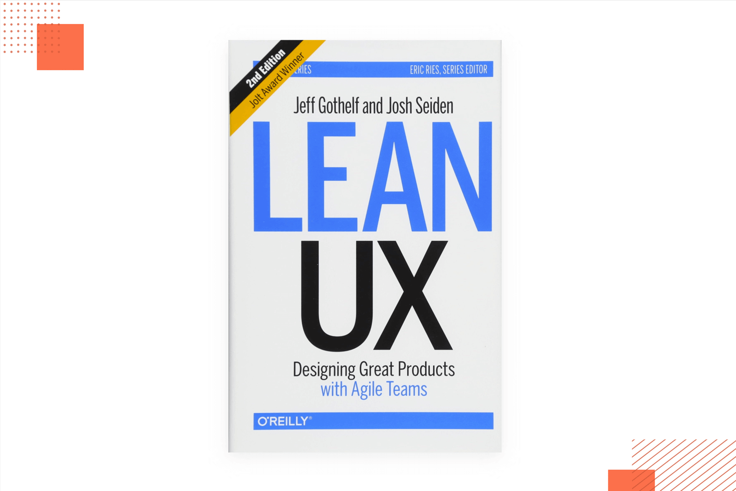
It covers everything, from the theory of how lean works to more concrete details on what makes a minimum viable product. It’s a classic for any UX designer to have at hand!
UX for lean startups is brought to us by legendary Laura Klein, whose design books are beloved all around the globe. We love this book here at Justinmind. It’s essence is all about working to find the right way to test design decisions, as well as to using data to draw conclusions.
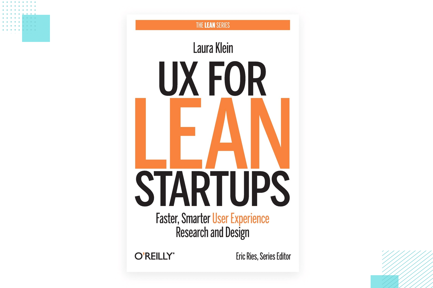
The book aims to cover not just the theory of user testing, but aspects that are much more detailed and concrete. Both newbies and veteran designers will, without a doubt, learn a thing or two from this book. It’s just about learning how to user test things. It’s about learning to test better.
Lean Analytics: Use Data to Build a Better Startup Faster is another wonderfully practical book for anyone interested in UX design. This book by Alistair Croll and Benjamin Yoskovitz covers everything related to analytics in UX design.
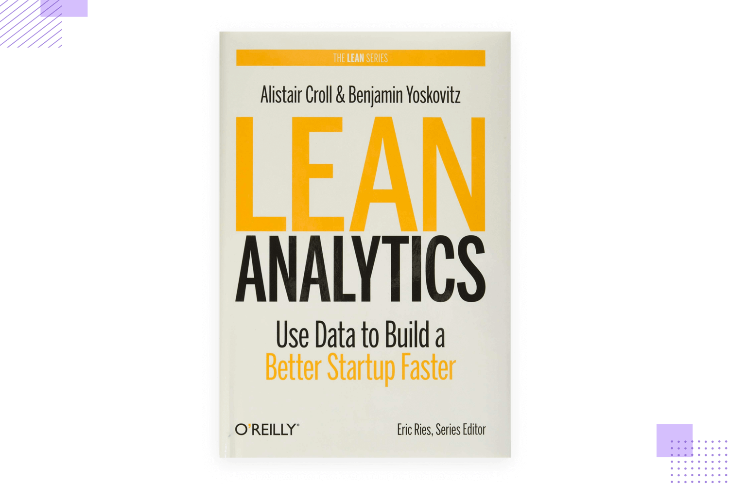
We love that this book goes beyond the classic question of “how do I test a design idea?” and ventures much further. The book threads carefully between the world of UX and the world of business, working to show how analytics can align the two and create a truly powerful product. It’s great stuff, especially for business analysts venturing into design or vice-versa.
This is a wonderful way to get more familiar with a key aspect of Lean UX design. With the lean approach, deliverables all take a back seat so that the time and effort of the designers is prioritized in the product. However, for those of us coming from a more classic way of designing, it can be hard to let go of deliverables.

That’s why Getting out of the deliverables business works so well. The talk, given by none other than Jeff Gothelf himself, focuses on trimming the extra fat from these documents and focusing on actually creating things. Wonderful!
Learn Lean UX is basically an overview of the entire lean process and lean principles. Also given by Jeff with Mural, this presentation covers everything in the lean approach. We get it – sometimes, you’d rather hear than read it. That’s why we included this 1 hour long presentation that could work to introduce people to the lean way of doing things.

Lean UX is a paradigm shift. It focuses on creating efficiency and removing any waste unlike other common design methodologies. By reducing the reliance on deliverables and focusing on small wins over time, products can get to market faster with the knowledge that your customer really wants what you have to sell them.
Any design-driven product team can benefit from the Lean method to boost their workflow. Even in large companies, there’s power to be found in the Lean way of doing things!
PROTOTYPE · COMMUNICATE · VALIDATE
ALL-IN-ONE PROTOTYPING TOOL FOR WEB AND MOBILE APPS
Related Content
 UX design portfolios are your chance to showcase your top skills and best work. Check out this post for awesome portfolio examples and websites!10 min Read
 Learn what paper prototypes are, how to make them and how they can help you design better products. Awesome examples and free templates inside!10 min Read
 In this comprehensive study, we dive deep into the world of web design tools, comparing features, pricing, ease of use, and more. Whether you're building a simple landing page or a complex e-commerce store, we've got you covered. Let's explore the best options and help you make an informed decision.30 min Read

