Think you don’t have time to make a screen mockup? Think again, because we’ve come up with a few ways to make mockups faster with less hassle
We’ve heard it (we may even have said it ourselves) before. “I don’t have time to add yet another design stage to my design process. Wireframe, prototype, wrap it up!”
When you’re designing app or web interfaces it’s tempting to try to skip the website mockup phase and just get stuff MVPed already. But mockups aren’t just the ugly sister to prototyping’s Cinderella; screen mockups are actually an integral part of awesome digital product design. That’s true even in projects that follow Lean principles or rapid prototyping.
Let’s take a look at what a screen mockup should comprise, and how best to design mockups that complement your design process.
It’s easy to get confused about the difference between wireframes, prototypes and mockups. To get a handle on these differences quickly, it’s best to think about how each fits into the design process.
Between idea and development, there are usually three or four design stages. At a glance the stages break down something like this:
- UI sketching allows designers to work through all their bad ideas and single out the ideas with potential
- Wireframes are where the information hierarchy, content grouping and core functionality are worked out
- Mockups contain the visual details
- Prototypes bring together visuals and interactivity in a real-free version of the final product
These stages allow UI designers to test and iterate on their ideas quickly and cheaply, and to get sign off from stakeholders. And this isn’t solely applicable to brand new products. These four stages can be applied to interface updates or new versions too.
Let’s focus on the mockup stage. As screen mockups are made right after basic wireframing and before interaction is added, they’re often referred to as mid-fidelity. Screen mockups can be identified by their visual sophistication but total lack of interactivity. If you’re presented with an amazing looking set of screens that are 100% static, you’re looking at a screen mockup.
Decisions about fonts, color schemes, brand assets, content layout and navigation pattern styles will be worked out in a screen mockup. Basically, the mockup takes the bare-bones wireframe and dresses it up in some fancy looking clothes.
So why bother with just making the app or web look pretty at this stage? Because mockups are one of the most effective ways of communicating visual requirements clearly. That’s especially true for stakeholders, who would probably freak out if you presented them with an early stage mockup. And while screen mockups aren’t interactive, an experienced app or web investor will be able to glean some functionality just by examining a visually faithful one.
“While the mockup furthers the wireframe’s purpose of documentation and organizing the team’s vision, it has an extra advantage that the wireframe does not: with its superior visuals, the mockup is more useful to stakeholders and investors.” Marcello Graciolli
Basically, mockups are the glue that binds the wireframing and prototyping stages together.
There are probably a few UI designers out there thinking “Another design stage? I don’t have time for that!” Initially the idea of adding yet another pre-development task to the to-do list can seem like crazy talk.
Luckily, there are a few ways to make the mockup-making process faster without losing efficiency. The methodology you choose will obviously depend on you as a UI designer and on the project you’re working on. Take your pick from the following screen mockup approaches
Code-savvy UI designers could get their hands dirty building coded mockups as well. The good part about a coded mockup is that, obviously, you’re saving time at the development end by coding early on. The bad part is that unless you’re super proficient your code may well be unusable and, worse, your coding limitations could end up limiting your product.
Many designers would turn to their favorite design tool to make a UI mockup. Tools such as Photoshop and Sketch are all about creating pixel perfect static images after all.
The downer about building mockups in a design tool is that when it comes to turning them into prototypes you’ve got to build the design assets again from scratch, right? Happily, a mockup tool like Justinmind are fully integrated with Photoshop, Illustrator and Sketch. Build the mockup in your favorite design tool, import assets and keep working on them while you prototype. If you’re working with Justinmind all SVG files and artboards are fully editable.
If you’re keen to cut out the hassle of tool hopping completely, you can also create mockups in a full spectrum product design tool. Try to pick a tool that has a good selection of pre-made UI elements that you can drag and drop into the mockup for instant fidelity. You also want something that gives you freedom with typography and fonts (Justinmind is integrated with Google fonts), and one that comes equipped with a ton of device-specific icons, buttons and navigation patterns.

“The mockup can either sell your design or plummet you into a cyclical tunnel of churn. That’s why, like it or not, interface designers often live and die by the mockup.” Luke Wroblewski
UI designers new to mockups might make these all too common blunders.
- Expecting a screen mockup to communicate functionality: Remember, screen mockups look great, but they’re just a series of isolated images at the end of the day. They can’t capture the complexity of a website or app’s experience. Present a mockup to inexperienced stakeholders at your peril. Google’s Luke Wroblewski gives some tips on how to avoid this.
- Feature bloat: It’s super easy to keep adding whistles and bells to a static mockup. A button here, a button there and before you know it you’ve got feature bloat.
- Failing to solve the problem: Mockups can be pretty while failing to fulfil the true purpose of any design – to solve a problem. Don’t fall into the trap of viewing the mockup as isolated from the problem context.
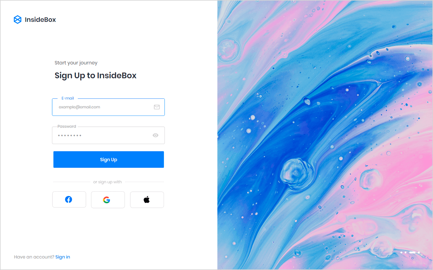
Number one on screen mockup example list is this minimalist website sign up page that we love for its color scheme and organized layout. Plenty of white space allows for a more breathable read through the content presented. The interface is clean and straightforward, emphasizing user experience and simplicity.
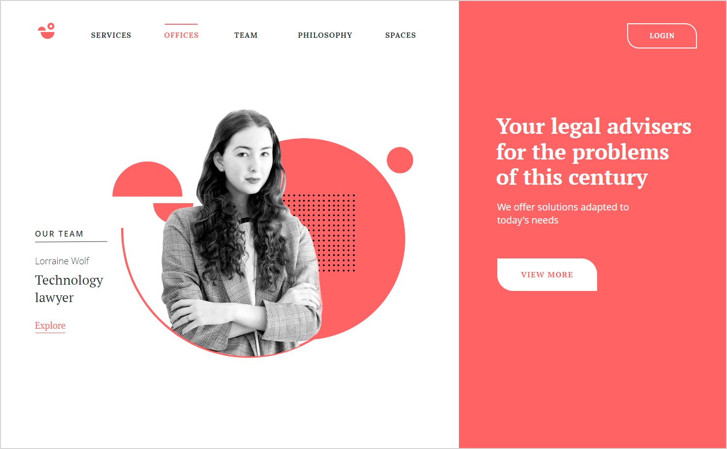
This legal services homepage pops with its lively colors and welcoming features. The font style is modern and sleek, and the bold, eye-catching buttons invite users to take action without distraction. This screen mockup is a prime example of how playing with color can be both stylish and user-friendly, combining elegance with functionality.
We love this smart home dashboard example of a screen mockup because it nails the balance between aesthetics and functionality. The dark theme with light blue accents not only looks modern and sophisticated but also reduces eye strain, which is crucial for prolonged use.
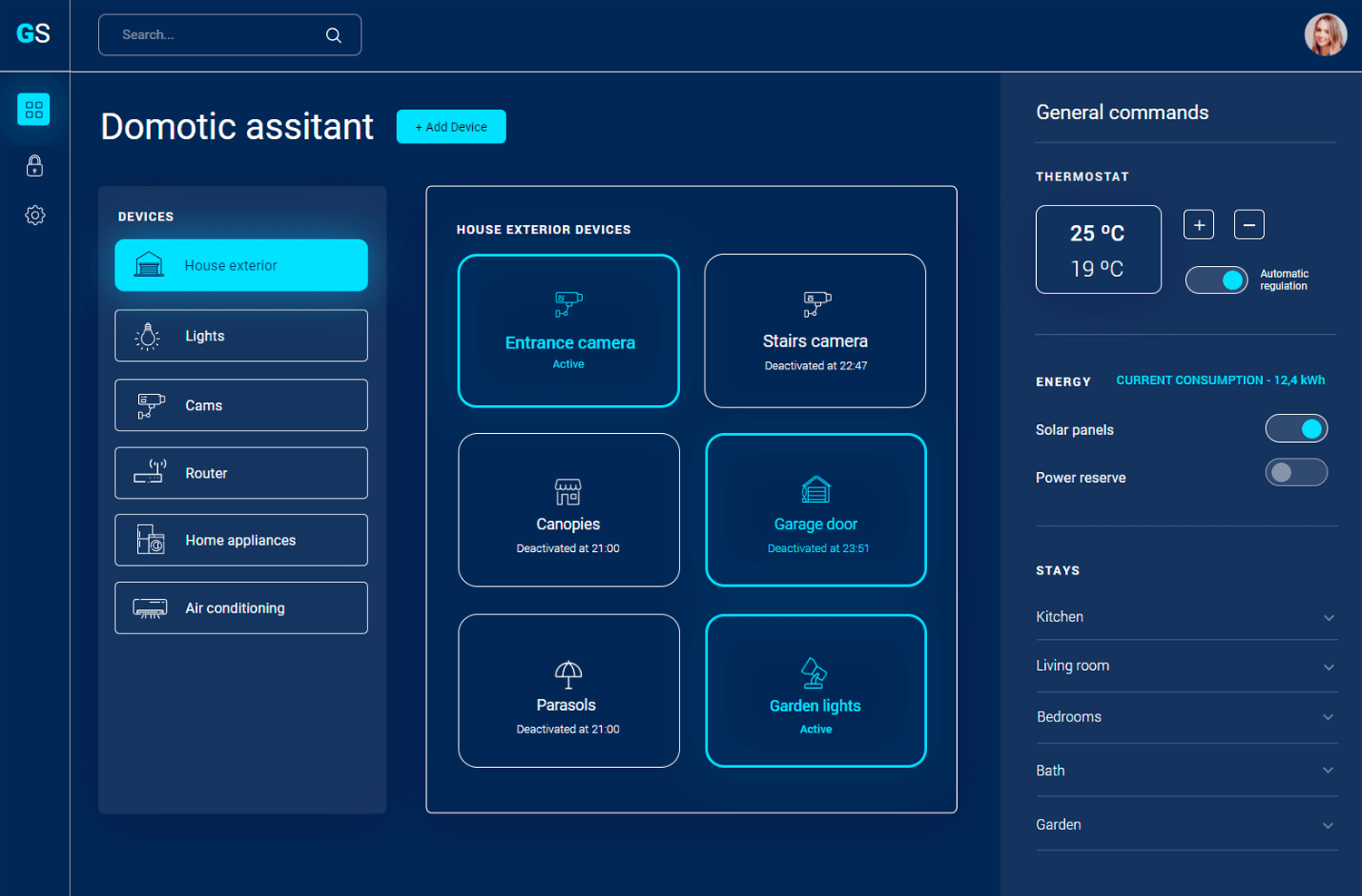
The clean design with well-defined sections makes it incredibly intuitive, allowing users to find what they need without any hassle. The use of icons alongside text is a smart choice, enhancing visual comprehension and making the interface more accessible.
This web form sign up screen ui mockup perfectly balances simplicity and visual appeal. The minimalist design focuses on the main task—signing up—without overwhelming the user with too many elements.
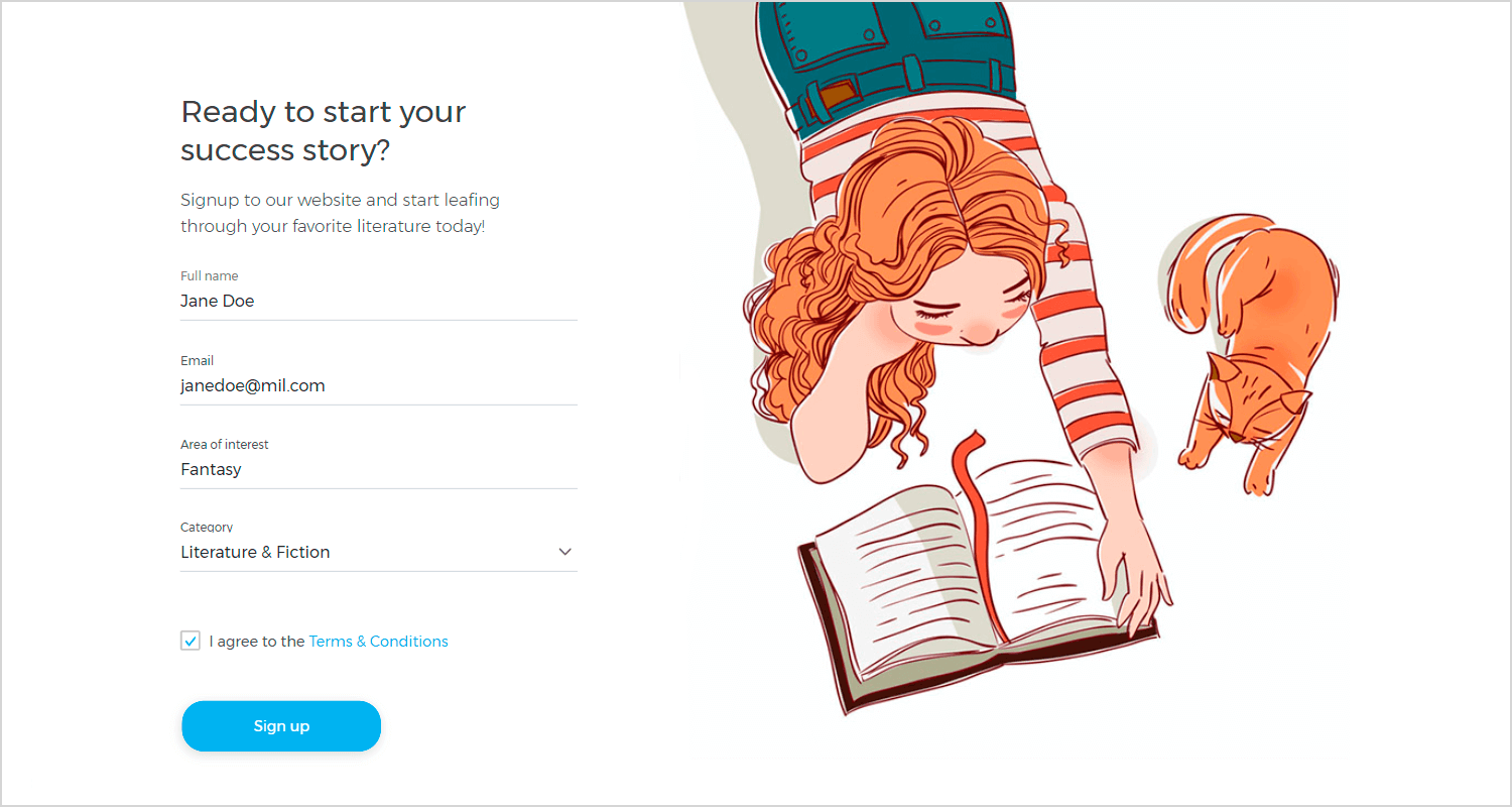
A light color palette creates a calm and inviting atmosphere, further enhanced by the delightful illustration of the girl reading with her cat. This personal touch adds warmth to the interface, making it more approachable.
The simple screen mockup design layout in this event planning homepage keeps the focus on the main task (presumably signing up for event planning services), while the illustration on the side adds a touch of dynamism and vibrancy.
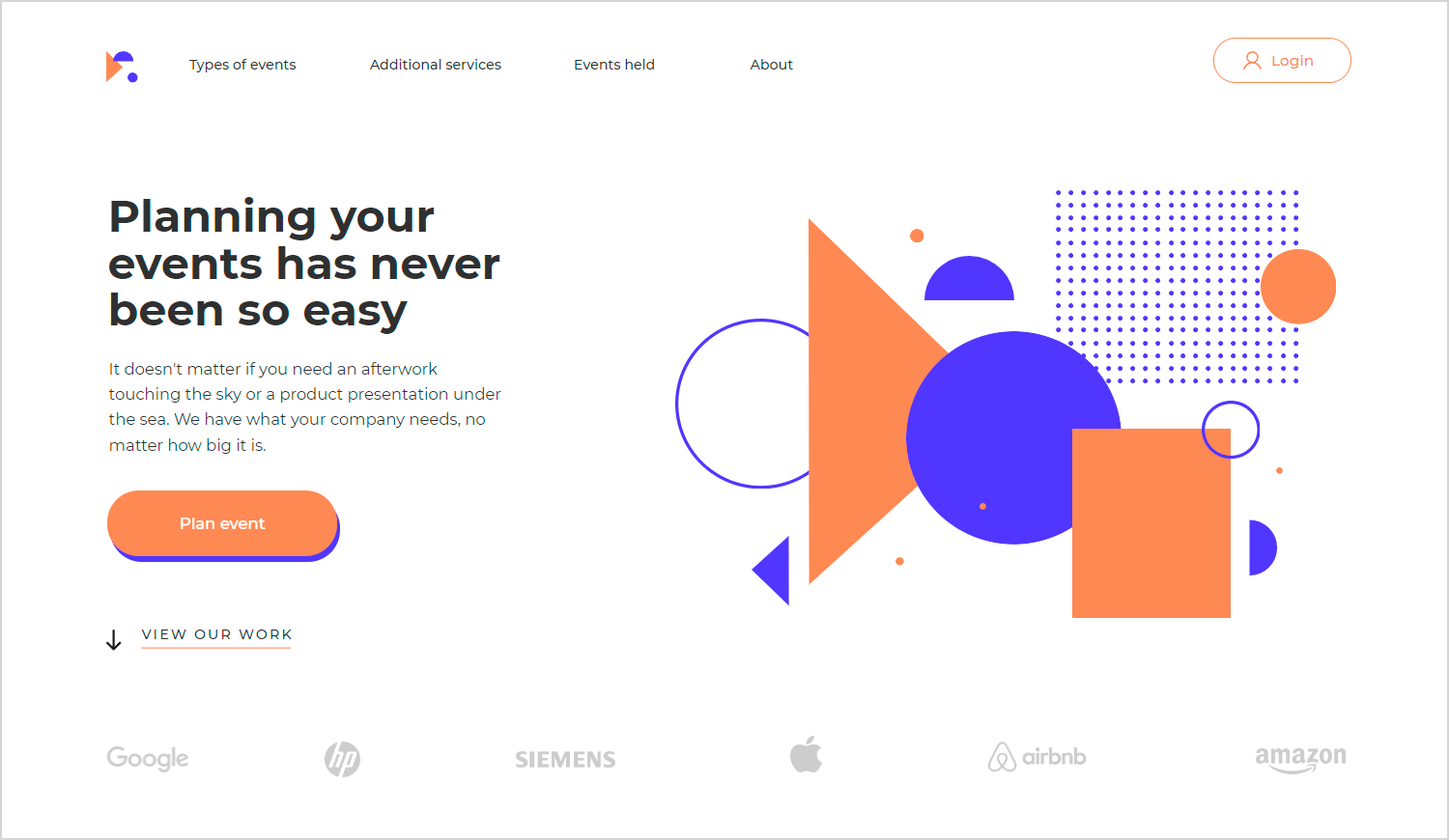
The use of contrasting colors like orange and blue in the illustration creates a sense of energy and excitement, potentially reflecting the fun and celebratory nature of event planning. The dynamic shapes further enhance this feeling of movement and engagement.
This website design for a plant store homepage excels at creating a calming and inviting atmosphere for potential customers. The color palette is key here, with a focus on calming greens and dark grays.
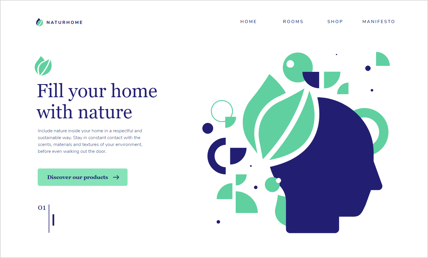
These colors instantly evoke a sense of nature, perfectly aligning with the store’s focus on houseplants. The layout is minimalist and avoids clutter, ensuring the hero section takes center stage.
Once you start to think of static screen mockups as the connective tissue between wireframes and prototypes, their importance becomes clear. By using screen mockups to iron out visual niggles, UI designers free themselves up in other design stages to focus on functionality, hierarchy and UX.
Used right, screen mockups can also play a role in getting stakeholders on board with your idea, as long as you don’t rely on them to communicate interactivity or user flow.
Choose whichever mockup methodology works for you – design tool, integrated mockup/prototyping tool or code – and get started!
