Considering a graphical background that your users won’t forget? Check out these trends that have UI designers hyped in 2018.
When it comes to designing an app, it’s clear that the background of the screen is of vital importance. Of course, users’ tastes and preferences have changed over the past decade, bringing us to a tipping point of exciting trends in 2018.
Back in the day, pretty much all backgrounds were of a solid, light colour as to not distract the user and let the content of the app shine. Today, we have learned that a graphical background can complement the content without taking any attention from it. It’s a fine line to walk – but we’re here to help you find the perfect balance in your app design.
UI designers everywhere now understand that adding certain elements in their app prototyping tool can help guide the eye of the user, set the tone of the product and help in improving the readability of the content. This opened the door to the use of pictures, illustrations, colour blocks and all sorts of effects.
Using colour to split screens: divide and conquer
Splitting the screen is a trick that has been around for some time. But while splitting the screen is a common feature on desktop computers, applying that to mobile has been challenging. With such limited space, how do we split the screen without overloading the user’s eyes?
Fortunately, UI designers have found the answer. By using contrasting colours to separate the content and illustrate actions taken by the user, we have a graphical background that is both visually attractive and functional.
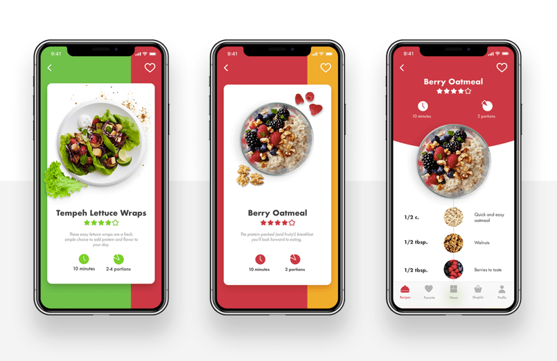
Credit: Tubik.
In this example, we can see that not only does the designer use the red colour to split the screen in this prototype, but also includes a white box to fit the content in – making the most of the contrast between the colorful graphical background and the white content box. Functional, fun and beautiful!
Overlapping graphic elements: set the stage
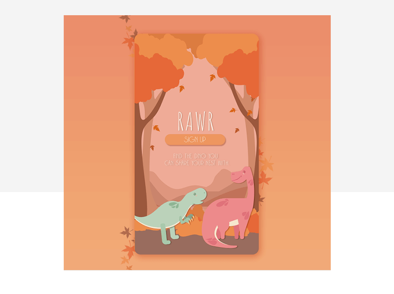
Using different elements in your prototype that overlap in the background can sound strange to some. If not done correctly, you can end up with a screen that has too many elements. Visually polluted and confusing – things you don’t want your product to be. But this type of graphical background can have huge payoffs.
Designers have been boarding this UI design boat because you can use the overlapping elements to create a sense of space. Even though smartphones have been getting bigger and bigger, screen real estate is still limited and quite precious. If you want, you can create a feeling of depth in the screen so the user has the optical illusion of more space. Smart!
Credit: Kai Rennenberg.
Another positive is that this gives you the opportunity to create a truly eye-catching design – at Justinmind, we love adding shadows to certain elements in the graphical background to create an elegant look and authentic feel.
For 4,000 plus free elements to use in your graphical background designs, check out our UI kits page.
The trick is that you want elements that agree between themselves, so even though you have several different things happening on the screen there is still harmony.
Using a whole picture as graphical background
Yes, using a single picture for the whole graphical background has been a source of debate among the UI/UX design community. Some love it while others say it’s unforgivable.
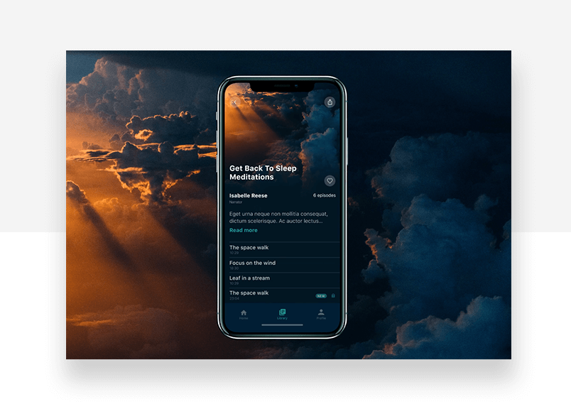
Regardless of how you feel about having a picture as your background, there is no denying that it has become a trend in 2018. And indeed, if you can be smart about how you set up the different features of your app around the graphical background picture the results are likely to be incredible.
Credit: Tubik and Sergey Valiukh.
After all, a picture is worth a thousand words, right? Pictures can still communicate a message to the user in a clear way – be that message regarding the brand identity or the functionality of the app.
Here are your biggest allies in adapting the rest of your content to the image in your graphical background: opacity and content boxes.
Credit: Air France.
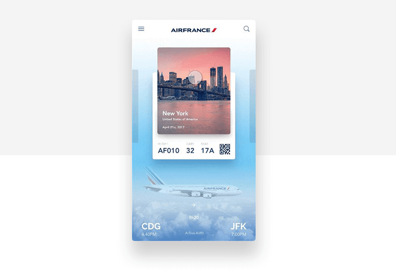
Some designers have been skillful when placing the content in boxes so there is good contrast and readability, as you can see by this great graphical background arrangement by Air France. Aside from the fact that the content can be seen perfectly, the background picture itself is opaque. This makes the entire screen smooth, and ensures that there is nothing to distract the user from the boarding information.
Colour gradients: give your user the feels
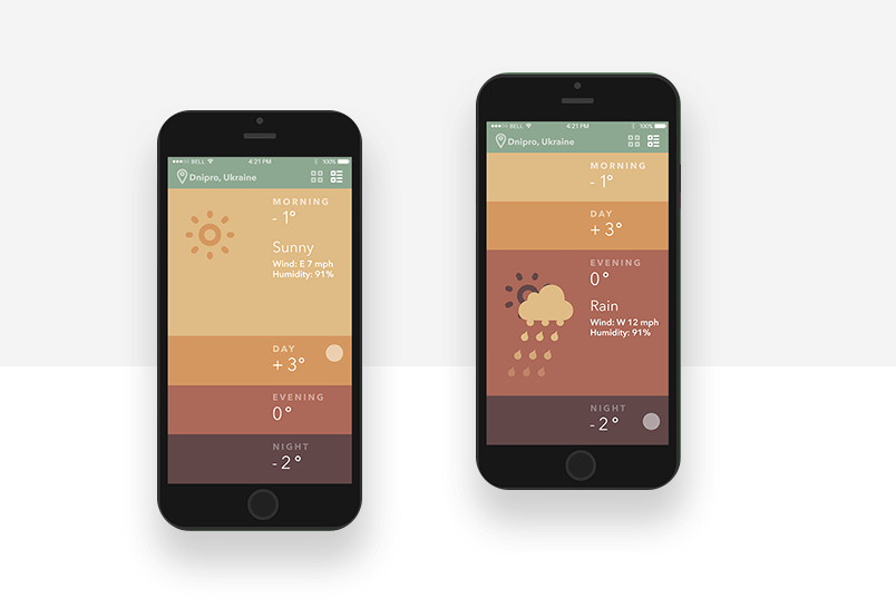
Designers are no strangers to the power of colours. By using the right set of colours in your graphical background, you can reflect the brand identity and personality, ensure good readability and play with the user’s emotional perception.
You can separate content by type or concept using your colour gradient as a map. If your background is blue, a simple darker variation can help organize the screen and make its navigation easier.
The true driving force behind the trend of colour gradient in graphical backgrounds is its ability to influence human emotions. Most UI designers around the world are already aware that human psychological factors play a big part in mobile design, and that our emotions are a key element in the success of any app.
Credit: Tubik and Sergey Valiukh.
You can play around with the contrast and brightness of the colours and come to a background that lovingly nudges the user in the path of… happiness? Comfort? Stability? Trustworthiness? Your graphical background can act as a reinforcer of the very thing that makes your app great, as opposed to being just a white canvas for your content.
A small note here:Increasing opacity levels in the background image can be a handy way to ensure good contrast between the image and your CTA. And we all know that the spotlight needs to be on the CTA at all times!
Custom illustrations: make your graphical background tell a story
Having your own illustrations can add so much personality to your product. We are all used to seeing the classic icons across different apps – and we all can appreciate something unique when we see it.
Creating characters that can represent the company, the product or the user requires a certain process of research. After all, how do we go about the humanization of our app? If our app were a cartoon character, would it be a robot? Another human? Maybe some other animal that can better represent our brand identity?
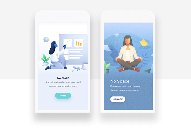
Credit: Nimasha Sperera.
The main reason why many designers choose to create custom illustrations for their graphical background lies in the fact that they can make the introduction to the app easier for the user. If your app involves some sort of walk-through or extensive sign in process, having characters in the background can help users understand the process as it goes from simple instructions to storytelling.
Geometric shapes and forms: a language we all speak
Geometric shapes are pretty basic elements – but simple things can be quite powerful in UI design.
Using simple geometric shapes, you won’t have any fancy tricks or illusions to hide behind. You’ll be faced with the need to examine with single element on that screen, and study how that content affects the graphical background, and vice-versa.
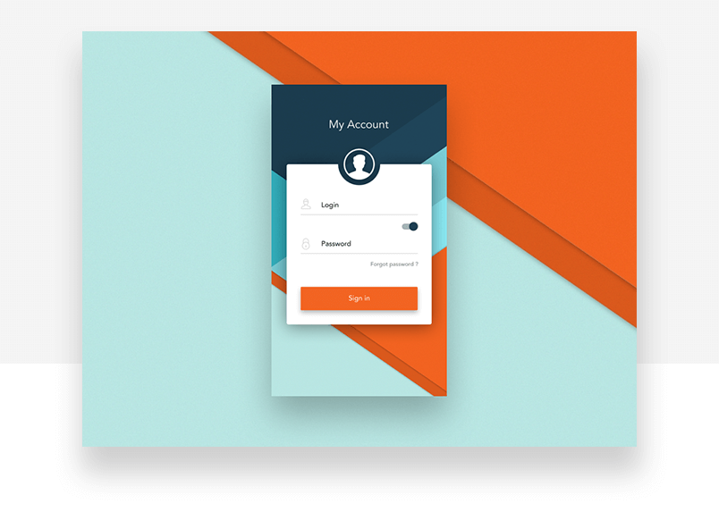
Credit: Michal Palruski.
That means that the different elements of your screen need to be carefully thought out. Your proximity, spacing or alignment need to be perfect in order to create harmony. It is quite demanding, but it does gives the designer an opportunity to show off their work in a way that leaves no room for doubt regarding talent.
It’s not easy, but designers have been using geometric shapes and images for centuries. In truth, we will probably use geometric elements for the next century too. Separately, a design that relies on graphical background of simple shapes with a clean look can do wonders in transmitting elegance and simplicity, from the brand to the user.
Just like all other aspects of your app, your background deserves attention and planning – but you can take that time and dedication and turn it into a lovely background that says something about you, that makes your user feel things, see your content differently.
This is the main reason why graphical backgrounds have become such a hit among UI designers – instead of something that aims to not cause trouble, aim for a background that will add value to your app. With the right research and the right UI designer, you’ll end up with a product that is unique in its own personality and feel. And who doesn’t love that?
Related Content
 Crafting landing pages that convert doesn't have to be tough. Here’s our snapshot of 30 landing page examples with awesome UX that nailed it!12 min Read
 How important are lists in UI design? How much do they affect usability and what’s the best way to design them? In this guide, we'll explore the elements that make up a great list UI design and look at some inspiring examples!15 min Read
 UI design examples that bring some serious inspiration. From parallex scrolling to delicate animations - this list has it all to get you inspired!8 min Read
