What is responsive design and why is it so important? What does it look like? Read on to get close and personal with a star in the UX game.
Responsive design is a huge thing in the UX design game nowadays. Everyone in the business knows that having a truly responsive design means good usability. It’s non-negotiable.
But what does “responsive” even mean? What separates responsive designs from the non-responsive ones out there? Why is it so important now? Let’s take a moment to dive deep into a familiar name that can often be misunderstood. Have your favorite prototyping tool at hand, just in case you’re struck with sudden inspiration!
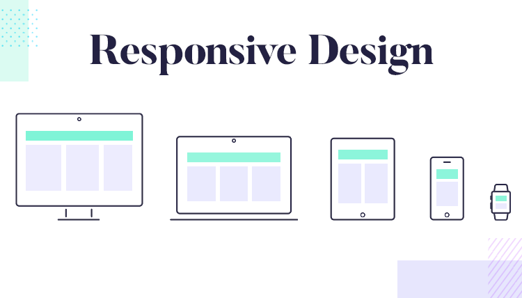
The idea of responsive design is that the product can adapt itself to any reading device the user may use. It’s more or less like transforming the content into water, mimicking the liquid’s ability to fill any type of glass. This shows that the old way of creating websites, using fixed positions, is all but dead and buried.
The rise of responsive design has to do, in many ways, with the rise of mobile devices. Suddenly, users could go from a laptop wide screen to a smartphone. Fast forward a few years, and users expect to be able to access any website with a huge range of mobile devices. Designers officially can’t ignore the importance of mobile devices, not when there are over 3 billion of them in use out there.
Connected to the rise of smartphones, is the rise of Google. Chances are, even if you lived under a rock you’d still use Google to find content on a regular basis. For any given website, Google is how users will discover the product – especially if you need a lot of them to find it. This brings us to the second factor that makes responsive crucial: Google’s mobile-first indexing.
It can be difficult to understand the part that SEO plays in UX design, especially when getting to the nitty-gritty of content optimization. In broad strokes, Google’s move to put mobile design first is a way of telling any new website that the mobile version will be the prime influence in the products ranking. In short: no responsive mobile website, no front-page ranking for any searches. You can find more details in our guide to mobile-first design.
Here’s a very brief explanation of Google’s advice when it comes to improving your responsive design:
- Maintain the same content for web and mobile. This also means maintaining the titles, headings and general structure of the content.
- Use the same meta data for both web and mobile.
- Have quality visual content. We’re talking about large images in the right format, making sure everything has the same title, filename and alt text.
The thing is, if you dedicate time and care into your responsive design, you’ll likely meet all these criteria. Many of these factors also contribute a better user experience, helping the brand offer a consistent experience to users.
Right. Now we know what makes responsive design so important, let’s go over some characteristics that define responsive products.
CSS breakpoints are a classic trait of responsive websites. Their job is to “break” the design into a smaller version of the website, according to the size of the screen. The breakpoints usually have a minimum and maximum width that dictate which version of the design can be seen by users.
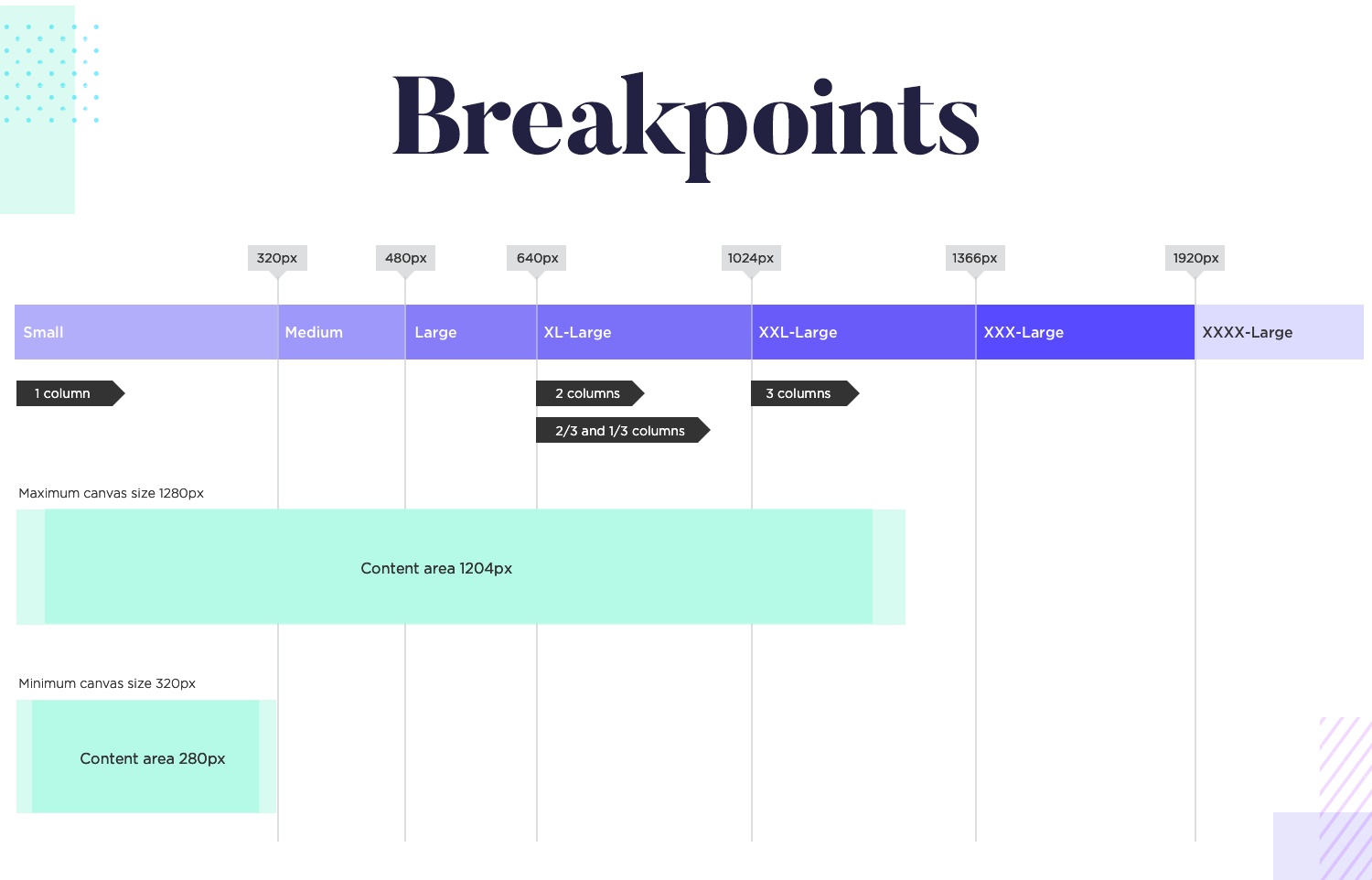
But how many breakpoints does a website need in order to be truly responsive? A website design will still look strange if the device doesn’t suit the minimum or maximum width, which defeats the whole purpose of creating a responsive design.
Our friend Nick Babich, editor of UX Planet, speaks of at least 3 major breakpoints in order to cover the devices most users love – from desktops, smartphones to tablets. Many designers also include “minor” breakpoints, where the content adjusts itself to maintain the visual balance of the design but doesn’t change drastically. This includes things like changing the font size but not the general structure.
Images are really important in any website, be this a high-resolution photograph or a custom illustration. Some designers out there believe in cropping images so that users only see a part of it in smaller screens, so the visual impact stays intact. For us though, the best approach is to use vector images.
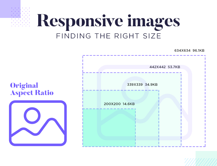
A useful tool: Check out this image breakpoints generator. It’s very handy for seeing CSS breakpoints in action, as well as finding the right size for responsive images.
This is about having the ability to change the size of the image without worrying about loss of image quality. This also applies to the typography in the page. Instead of using images that have text, it’s smart to stick to real text, so that the page can change the size according to the screen, without losing the quality of the font.
For many design teams, it’s best to start the design by focusing on the smallest screen first. This is mainly because by putting the mobile design first, teams can have a sound understanding of where the content needs to go.
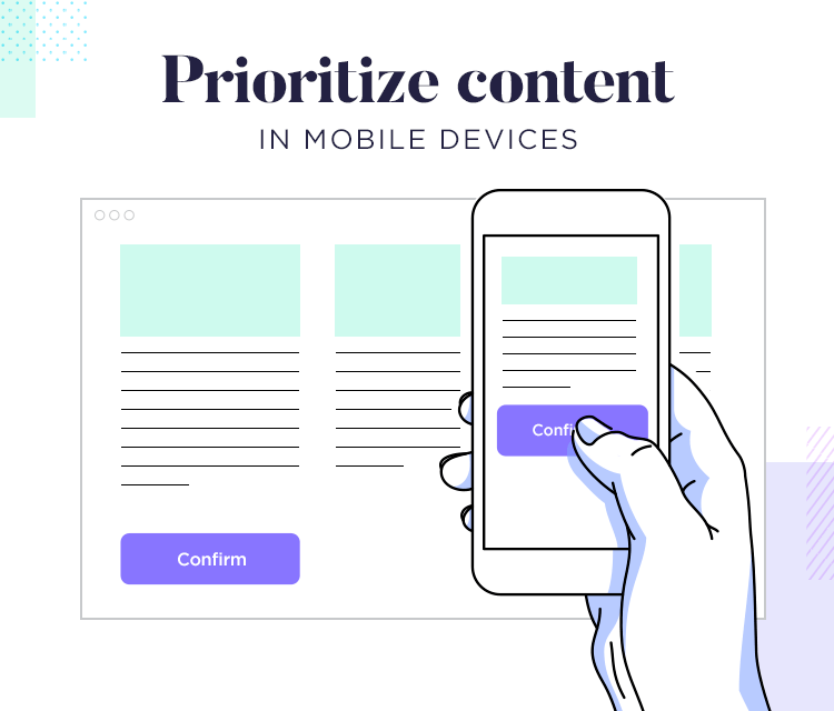
When it comes to responsive design, it’s all about focusing on the content as opposed to the general design. And so, by creating the mobile version first we can narrow down on the crucial content that we need to show from the get-go – the parts the user absolutely needs. From there, we can either add more details and more content as we move on to larger screens, or find better ways to present that key content.
Most responsive designs out there have the traits we’ve mentioned before. It’s true that to prototype a responsive website can sound rather easy in theory, but there are a lot of factors to consider. Let’s go over some general advice for creating websites that users can love, no matter the device.
By the way: You can find real-life websites that got their responsive design right with our list of responsive website examples.
This ties in with the reason why so many designers prefer to start with the smallest screen resolution possible. It’s not just about knowing what parts of your content are absolutely vital, but also about knowing the best way to present them.
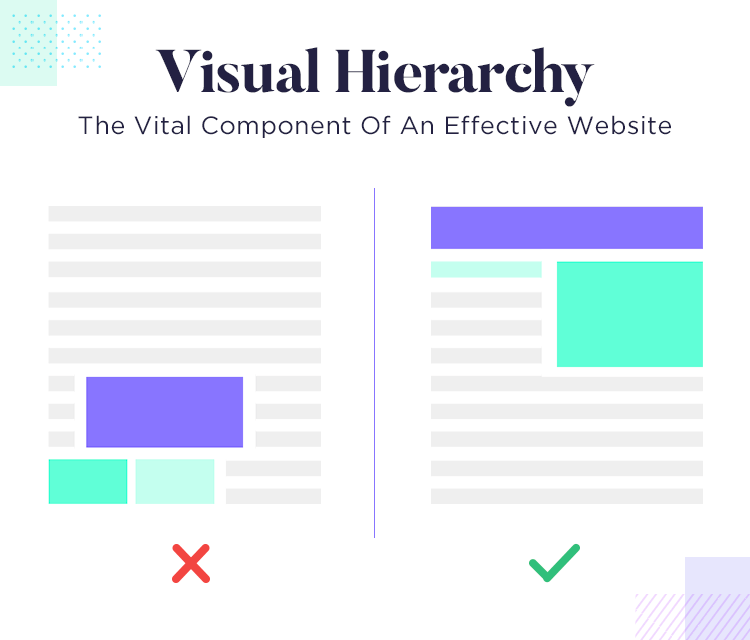
The visual hierarchy of the website may have to adapt as we pass the breakpoints, but its soul should stay the same. It needs to adapt, in the sense that as the size of the screen changes, so do the components in order to maintain the usability of the product. This also helps with Google’s crawler, sending out the message that your product maintains a consistent experience in both mobile and web.
Buttons can be rather straightforward when it comes to web-based products. After all, the cursor is an accurate tool that pretty much anyone can use – but we can’t say the same for our fingers. The size of the finger in question may change from user to user, and designers need to account for the little available space on a mobile screen.
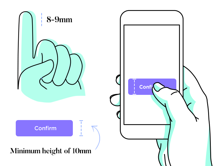
To add to that potential issue, we also have the fact that buttons need to be descriptive and offer as much context as possible. This means using a carefully chosen microcopy and the right color for your primary buttons, especially when it comes to mobile designs. You can find the full-story on designing buttons that work for everything in our post: button design.
If you rely on a navigation bar for the main way of finding information, you’ll need to carefully prioritize your bar in the mobile design. Aspects of the product like navigation design are absolutely crucial, and need to be planned carefully in responsive websites. As the screen of the device gets smaller, you’ll have less and less room for that navigation bar.
It’s important to ask questions like: when do we hide the navigation options? Do we hide them all? Which ones do we hide first?
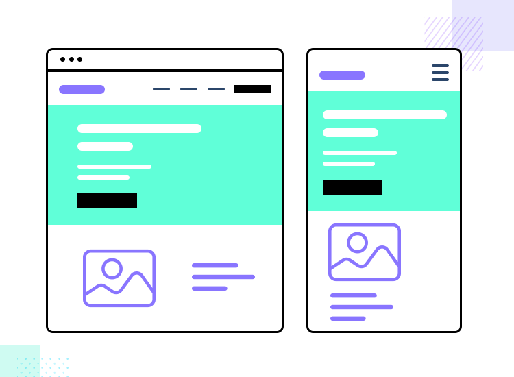
More often than not, products will eventually need to hide everything behind a button, like the hamburger menus we are all so used to seeing on mobile websites. It’s true that a hamburger menu isn’t the only option, but there’s no denying that the entire navigation menu will need to be hidden in smartphones.
This is all about trying to identify the most important pages in the entire product, and making sure that users can find them no matter the device they are using. This prioritization is always best when done early in the design process, so if we start with the mobile design we’ll already have the important bits that need to be included.
Users have very high standards nowadays. So does Google. And in truth, static websites simply won’t do anymore. Responsive design is the future, with new techniques and great examples popping up every year. Designers everywhere are looking at their products in a new light, focusing on the content and its arrangement like Tetris aficionados. And they are absolutely right.
Hopefully, with this introduction you’ll have a better idea of the factors that come into play in responsive design, as well as how these factors relate to each other. At the end of the day, we all want to offer a truly great and consistent user experience and that’s what responsive design brings to the table!
PROTOTYPE · COMMUNICATE · VALIDATE
ALL-IN-ONE PROTOTYPING TOOL FOR WEB AND MOBILE APPS
Related Content
 Crafting landing pages that convert doesn't have to be tough. Here’s our snapshot of 30 landing page examples with awesome UX that nailed it!12 min Read
 How important are lists in UI design? How much do they affect usability and what’s the best way to design them? In this guide, we'll explore the elements that make up a great list UI design and look at some inspiring examples!15 min Read
 UI design examples that bring some serious inspiration. From parallex scrolling to delicate animations - this list has it all to get you inspired!8 min Read


