Microcopy may be mini, but it can have a macro impact on user experience. Check out these 10 examples and start writing great UX microcopy.
When was the last time you filled in a form online, subscribed to a newsletter, or even just clicked a button? It’s a safe bet that you did at least one of these today and, if you did, you interacted with microcopy. The thing is, you might not even have noticed it.
Good microcopy – those snippets of text that guide you through an interface – is often (but not always) unobtrusive and instructive. A phrase or even just a single word that changes your interaction with and your attitude to the interface, making both more positive. Think about it – you land on a 404 error message. Which one gives you a better user experience?
Exactly. And that’s good microcopy.
Despite its diminutive size, writing awesome microcopy can be a potent tactic for engaging your users: not only does it nudge them along user flows, but it also allows for better user interaction. Sure, marketing copy is vital for initiating dialogue with your users or potential users, but keeping them onboard with your product during months and years is equally important.
As designers, we tend to think about UI, flows, fonts, animations and interactions, but sometimes there’s nothing better than actually speaking to your user one to one. Or at least making them feel like you are.
So what exactly is good microcopy?
Defining what makes microcopy successful is a bit like nailing Jell-O to the wall, but there are certain commonalities in the 10 examples we’ve picked out below. They’re short, snappy, user-oriented, and they serve two main functions: to guide users through an interface at moments of potential uncertainty, and to explain certain outcomes.
As Kathryn Whitenton writes in her informative piece for the Nielson Norman Group, microcopy can minimize extraneous cognitive load, the amount of brain power a user needs to understand and interact with your interface. Originally a term from psychology, cognitive load is useful to enable UX designers to understand the limitations of our processing abilities and to design accordingly.
That said, good user interface design is always going to be key to creating a stellar user experience, but when it comes to instructional text buttons, dropdown menus, field labels or error messages like Bluegg’s above, all of these consitute potential microcopy moments.
Side note: discover a list of prototyping methodologies and find more ways to get your ideas down in tangible form!
Inspirational microcopy examples for UX
Increase conversions
If you’re running any sort of eCommerce site, your main aim is to generate leads and conversions. It may seem incredible but a few well chosen words can make or break that process. ConversionXL has a great example of this: when Yoast was updating their checkout flow, they added six simple words next to the Total button – “there will be no additional costs”. As Yoast’s behaviourial scientist explains, hidden costs, or the fear of them, is the number 1 reason why people abandon shopping carts. Using microcopy to make it clear this won’t happen played a part in increasing Yoast’s conversion by 11.3%.
Raise user confidence
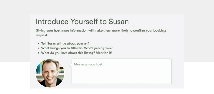
Airbnb provides us with another great example of how crucial microcopy can be to successful UX design. Founder Joe Gebbia explains in this revealing talk on building trust through design, Airbnb use microcopy to help users have successful, enjoyable interactions and conversations on the site. By guiding users through the process of contacting hosts, Airbnb uses microcopy to facilitate trusting relationships from the word go. As Gebbia has it, “Now, we know design won’t solve all the world’s problems. But if it can help out with [the stranger danger bias], if it can make a dent in this, it makes me wonder, what else can we design for next?”
Alleviate users’ worries
As Nick Babich points out in his great article on the subject, microcopy can be fundamental in reassuring your users at the point of subscribing or sharing details. Maybe you don’t want to provide your birthday when signing up for Facebook; or maybe you want to know why he heck a site needs your phone number when all your doing is ordering a cookbook.
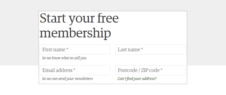
Explaining to the user why you need their information, or outlining how you use (and protect) their data, is crucial to successful onboarding. Check out how The Guardian newspaper deals with potential concerns.
Build your brand
We love Bill Beard’s sage advice in Smashing Magazine: “Treat every moment like a branding moment. Even when it’s not”. What this means in practice is knowing when to use your brand ‘voice’ in microcopy and when it leave it at the door. Hubspot’s chief microcopy mastermind Beth Dunn explains that the line between funny and plain annoying can be difficult to tread, but we think Hubspot gets it just right with their playful tone.
Of course, you don’t always want to be amused by an interface. Sometimes you just want a little bit of guidance and a button that tells you exactly where to go next. That’s good microcopy too.
Minimize doubts
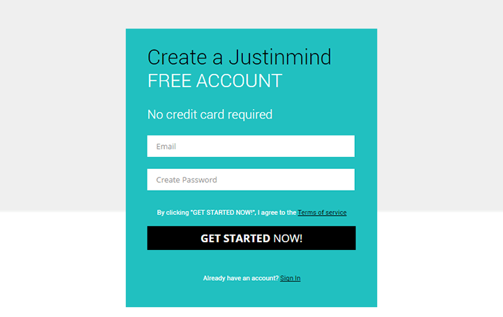
Your microcopy can also minimize any doubts a user has about website or app processes, i.e. registration or subscription. For instance, Justinmind does this when it says “no need for credit card details”. With the help of User testing you can find out what kind of questions users are asking and anticipate them! Forms are a good example of a type of design that really benefits from thoughtful microscopy. Check out how you can design and validate form prototypes with our post.
Let your users know what to do
Or take another example from Airbnb, this time their Landing Page, which provides suggestions in the search box of their most popular ways to find accomodation So as soon as users land on the site they’re being nudged to go deeper into the site. Sure, Airbnb could have written a long explanation on the side of the search box, or they could have left it blank and boring, but they use microcopy to guide you along the way.
By-the-way, you can explore the differences between low and high-fidelity prototypes and see at which point you can incorporate your error messages into the product design.
Explain errors
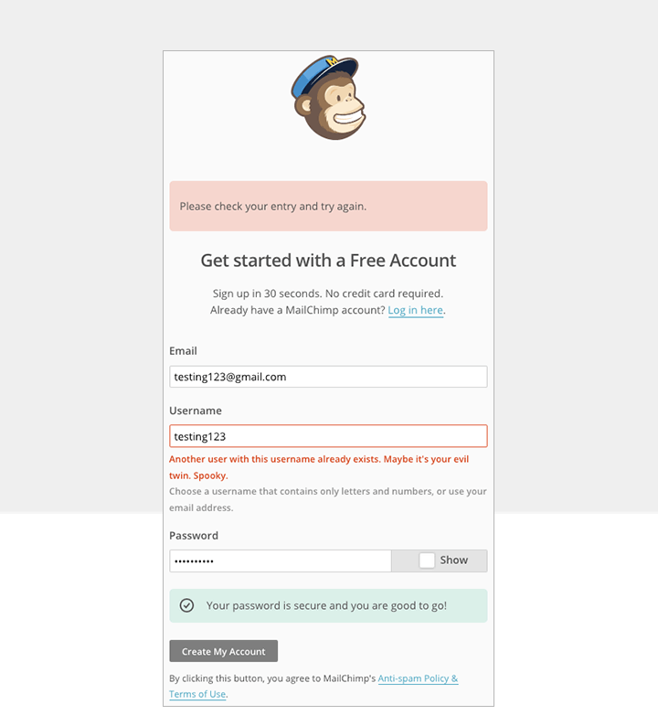
There’s nothing more annoying than receiving an error message and not being able to figure out where the error is. Use microcopy to avoid this, as Mailchimp does here to great effect:
Set expectations
Sydney-based designer and self-confessed microcopy fan Richard Sison boils the essence of microcopy down to a few choice one-liners: “good microcopy sets expectations”, “good microcopy is a promise”, “guide microcopy guides and educates”. His blog Good Microcopy is the go-to resource for, you guessed it, examples of good microcopy.
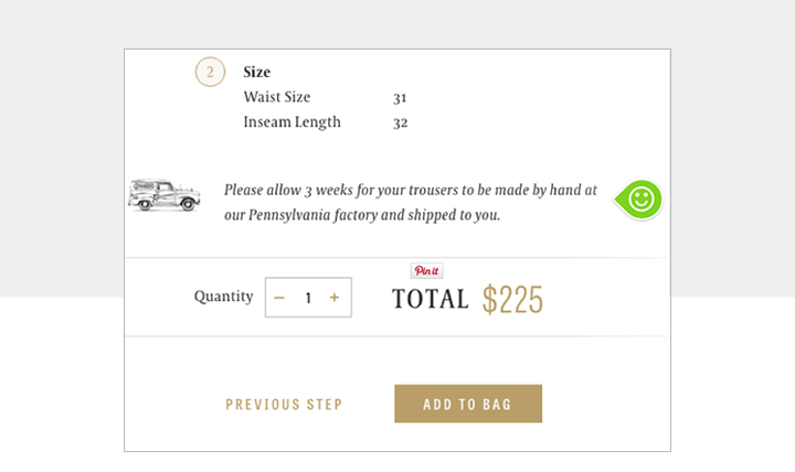
We love this example highlighted by Richard, in which clothing site Gitman explains why their packages might take a little longer to arrive than from other companies. This one little phrase avoids a crowd of angry customers demanding to know where their pants are a week down the line.
Make people smile
And finally use your microcopy to spread good vibes. After all, a study recently showed that YouTube users stuck around with advrts that made them feels happy. Microcopy can do the same – bring a smile to your users faces and their perception of your interfaces functionality will stay high. PhotoJojo accomplishes this with GIFs of puppies falling over on their 404 pages. Because who doesn’t love hilarious dog fails?
Justinmind’s prototyping tool lets you develop and test high fidelity prototypes, so you can work on getting your microcopy word perfect before your interface goes live. Download it below for free.
Related Content
 UX design portfolios are your chance to showcase your top skills and best work. Check out this post for awesome portfolio examples and websites!10 min Read
 Learn what paper prototypes are, how to make them and how they can help you design better products. Awesome examples and free templates inside!10 min Read
 In this comprehensive study, we dive deep into the world of web design tools, comparing features, pricing, ease of use, and more. Whether you're building a simple landing page or a complex e-commerce store, we've got you covered. Let's explore the best options and help you make an informed decision.30 min Read
