Carousel websites were once all over the web; lately other UI patterns have stolen their thunder. We look at why carousels are falling out of favor, and some UX-friendly web and mobile alternatives.
Once upon a time, and not so very long ago, carousel websites were owning it. They popped up on homepages everywhere, from Sony to Macy’s – in fact, 52% of US based e-commerce sites featured a rotating carousel on their homepage up until 2015, according to the Baymard Institute. But increasing numbers of usability and UX experts have questioned the wisdom of using homepage carousels, or sliders, thanks to concerns about conversions, visibility, usability and just plain old design principles.
Let’s deep-dive into the pros and cons of carousel websites, plus take a look at the best alternatives out there.
What exactly is a carousel website?
You might know them as image sliders, carousels or rotating offers, but all these terms refer to the same thing – large content teasers that rotate across the top part of a website’s homepage. The majority of carousels rotate automatically, ostensibly to expose the maximum amount of content possible to users. Simple, right? Effective? Maybe not so much.
Wait, so what are the good sides of rotating carousels?
Basically, rotating carousels are good in theory. The central premise behind them is that they make space where there was no space before: instead of being limited to showcasing only one hero image or offer on a homepage, a business or content producer could showcase five for the same pixel real estate. The attraction, particularly for hassled web designers and sales departments, is obvious. What’s more, says Kara Pernice of the NN Group, rotating carousels “can help diffuse any infighting about whose content is most deserving“, appeasing stakeholders with conflicting priorities.
And the bad part of carousel websites?
The bad news is that rotating carousels don’t seem to achieve their stated aims, neither in terms of visibility, clickability nor usability.
- Only 1% of site visitors click on a hompage carousel. And only 20% of that 1% click on anything other than the first image. That’s an incredibly low conversion rate for something that may well take up over half of the homescreen.
- Carousel websites kick off ‘banner blindness’. Web users are now savvy enough to mentally screen out advertizing banners automatically, and as eye-tracking research by Jakob Nielsen shows, that’s exactly what they subconsciously do with rotating carousels. Moving images at the top of the screen look like ads, and no one likes ads.
- Carousels reduce loading speeds thanks to their dependence on jQuery, in which the script loads all images simultaneously. This is no problem for smaller images, but full-screen slider images will load slowly, meaning that visitors miss the images or, worse, simply abandon the site.
- Most viewers never progress past the first image (84% according to the University of Notre Dame). If a carousel is being used to give a 360 degree vision of a brand, it isn’t going to work and users will come away with a lopsided view of services and products.
- Carousels pretty much bellyflop on mobile devices. They affect loading times, mess with responsive page design, can become hard to read on a smaller scale, and quickly disappear from view as users scroll down faster on mobile devices than desktops. And with desktop device sales levelling off but mobile device sales still soaring in the US, designers who ignore the problems associated with rotating carousels do so at their peril.
- SEO suffers. The text in images isn’t ranked by Google’s crawlers, and the plethora of H1 tags found in a carousel will hurt rankings.
The Nielsen Norman Group provides an elucidatory example of the dangers of homepage carousels: they ran a usability study to find out whether a user could find an offer located on a rotating carousel on Siemens homepage, at the top of the page and in 98 point font. The result? The user failed to find the offer, even after extensive scrutiny. You can read more about the test and its obvious conclusions in the original blog post, but it’s clear that oftentimes rotating carousels are not doing their job.
Alternatives to carousel websites
Given that carousels are not providing the user experience they should, it’s time to find some viable, usable alternatives that support both business and user goals. There are several practical alternatives you can easily prototype with a prototyping tool such as Justinmind and tested before roll-out.
Hero layouts
Hero layouts – huge, good-looking header images – are a solid carousel alternative for designers still looking to create a dramatically visual homepage without the usability issues. They’re static, which means users are less likely to suffer from ‘banner blindness’ upon landing on the page and, for users with accessibility or literacy images, a non-moving image is much easier to read, engage with and click. The lack of movement also means that jQuery script is avoided, making loading times faster and smoother. It’s also easier to create brand and e-commerce consistency across all devices with a static hero image, as you have control over what the user sees and when they see it; this is espcially true for mobile users, who may miss out on carousels altogether. On top of all that, you’re SEO is going to thank you when Google stops castigating you for keyword spamming with all those carousel related H1s.
Find plenty of alternatives to carousels on our UI kits page, with over 4,000 elements and components to choose from for your UI designs.
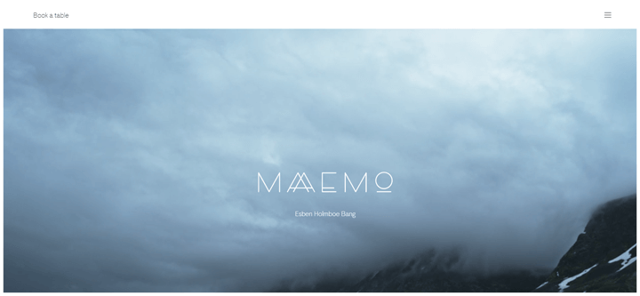
Also, hero layouts just look really good, as this example from Norwegian restaurant Maaemo shows.

If you’re mocking up homepages in a prototyping tool, make use of parallax scroll elements to create hero layouts, view them on any device and test them with target users before getting into code.
Targeted homepage
Targeted homepages are like manna from heaven for anyone who wants to vary messaging according to site audience. Using third party coding and cookies, you can change the content of your homepage based on factors such as user location, age, social demographic, past behavior and search history; tailoring homepage content for distinct interest groups gives you all the ‘extra space’ sought by rotating carousels, but based on data and machine learning.
Big online players already use this content personalization to deliver better user experiences, and better profits. Amazon targets it’s homepage content on multiple factors, from customer history to session behavior; everytime you visit Amazon, it’s homepage gets a little more personalized and sells that bit more effectively. Or there are simpler versions, such as Deloitte, which sends users to country-specific sites based on their location.
However targeted homepages are implemented, they provide a more personalized user experience than homepage carousels, and have a positive impact on conversions. ConversionXL explains the impact in more detail.
Video
Video is becoming increasingly popular on homepages as designers look for ways to engage and intrigue while maintaining usability. While they’re dynamic, like carousels, videos don’t seem to invoke banner blindness; in fact they seem to render much higher conversion rates than many other elements. Kissmetrics claimthat site visitors are 144% more likely to purchase after seeing a product video, as compared to those who saw no video. Cnversion rates like those bear little comparison to the 1% that clicked on carousel images. And video used on a homepage can be recycled across social media such as Facebook, where users spend 3x more time watching video that interacting with other content.

Related Content
 UX design portfolios are your chance to showcase your top skills and best work. Check out this post for awesome portfolio examples and websites!10 min Read
 Learn what paper prototypes are, how to make them and how they can help you design better products. Awesome examples and free templates inside!10 min Read
 In this comprehensive study, we dive deep into the world of web design tools, comparing features, pricing, ease of use, and more. Whether you're building a simple landing page or a complex e-commerce store, we've got you covered. Let's explore the best options and help you make an informed decision.30 min Read


