Progress bars set expectations, give an impression of activity and can calm users. Here are 10 that do it right
Good design has the power to turn the mundane into the marvelous. UX designers are no different when it comes to infusing a small amount of pleasure into a seemingly straightforward experience.
Start designing new products today. Enjoy unlimited projects.
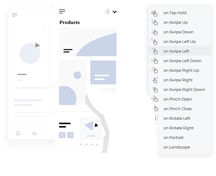
The humble progress bar hasn’t escaped this treatment. Progress bars are not the most exciting thing in the world but they are powerful, even in a wireframe. They’re what you see when a screen is loading if you’re downloading something, watching a video or listening to a song. A progress bar shows you have much progress you’ve made and how much left you’ve got to make.
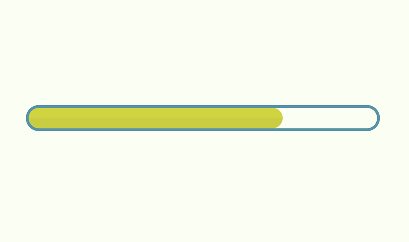
Progress bars are a great way to calm your users. What they do is set expectations and give an impression of activity. They’re a way of communicating with the user and being transparent. A progress bar tells them: hey, we’re doing what you asked but it’ll take this long.
This sort of appropriate feedback lets the user know if the interaction was successful or not. When the progress bar is complete, a user will feel a rush of endorphins, too.
Here are 10 progress bars that we wouldn’t mind seeing when we’ve got a little waiting on our hands. Also, if you want to check out how to incorporate progress bars into your project from the very start, check out our post on UI wireframes.
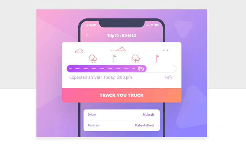
This progress bar by Krishanpal Singh makes use of calm gradients and quirky illustrations. What’s great about this little progress bar is the “expected arrival” copy, reassuring users and setting expectations. Although, the “78%” seems superfluous. How can a person put that into context? What does 78% of the way there mean? A better alternative might be how many miles are left on the journey.
This progress bar by Kevin Jones is for saving your work, presumably to the cloud. This could work well as a menu bar icon for a cloud service. It’s an inoffensive and cute design and illustrates the point perfectly.

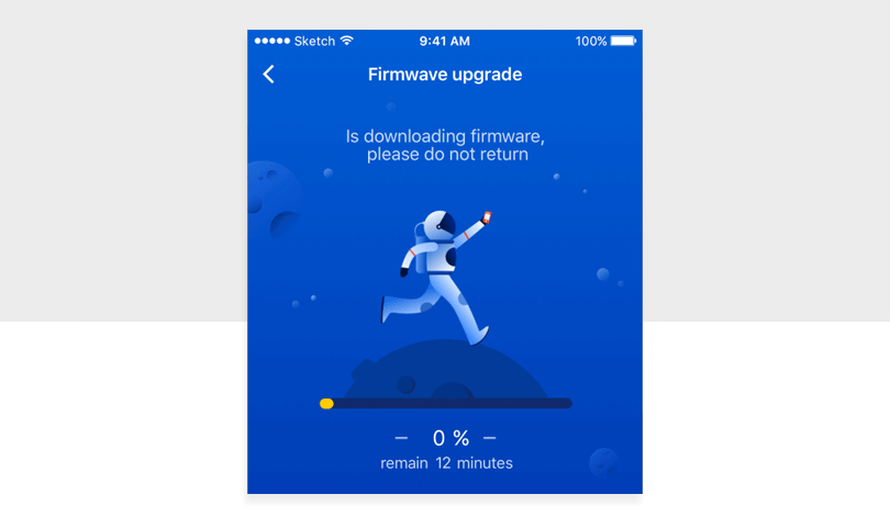
Illustrations are a great way to create engagement and add visual interest to a user interface. A progress bar is a great place to add a relevant animation, especially as it beats a standard progress bar. This one, by Supi, is animated and the astronaut runs across the moon as it spins on an axis. The color palette is uniform and doesn’t hurt the eye. We’d be happy to see this one.
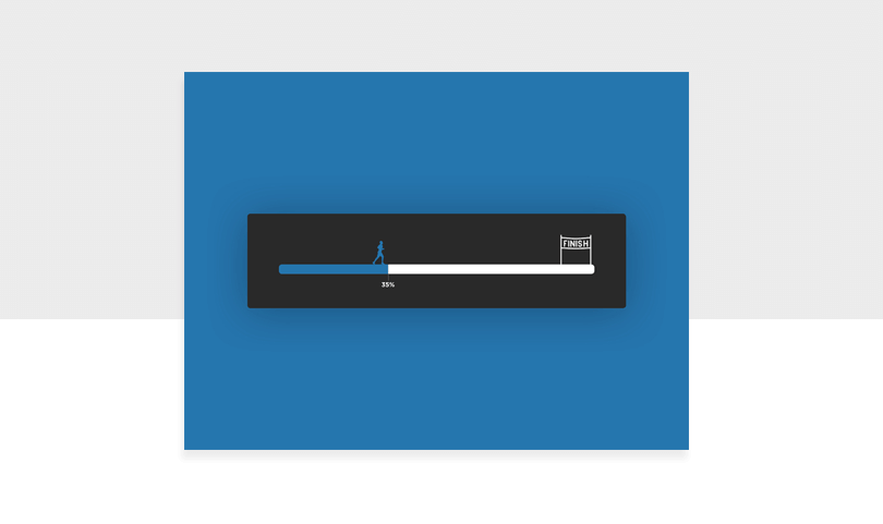
Sometimes a progress bar feels like a marathon and Jared Gase managed to capture that idea perfectly. It’s simple and the metaphor packs a punch.
Start designing new products today. Enjoy unlimited projects.

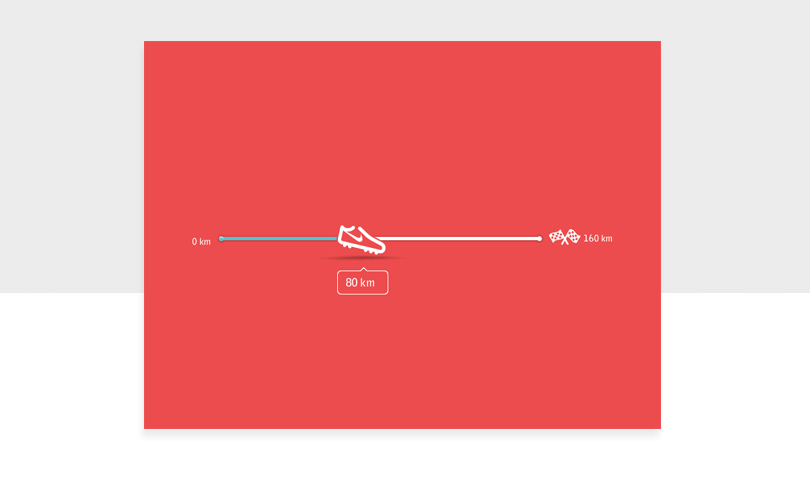
Similar to the last one, this progress bar by Think Studio works for the runners among us. The shoe represents the distance travelled and the finish line… it’s so close! This design would work really well in a fitness or exercising app.
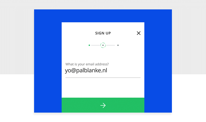
Ah, another progress bar that sets expectations. Good! Pal Blanke‘s 3 step page progress steps firmly let you know where exactly you are and how much you’ve got to go before you complete the form.
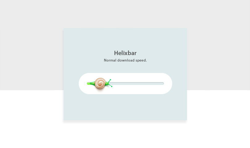
This progress bar by Andrey Davlikanov is fun, colorful and different. But, let’s be realistic. Nobody wants a progress bar to move at a snail’s pace, do they? Nice design, shame about the metaphor.
Start designing new products today. Enjoy unlimited projects.

Amazon’s tracking bar is very useful for online shoppers eager to know when their delivery will arrive. This progress bar usefully tells you if there was a delivery attempt in case you were out. It also lets you know when to expect your delivery.
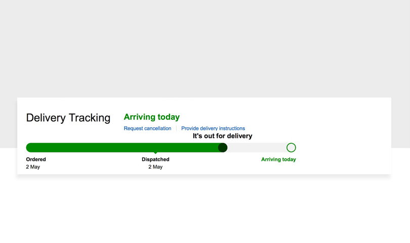
A timeline like this in ecommerce is great because users want to know when their packages we dispatched and when they’re arriving.
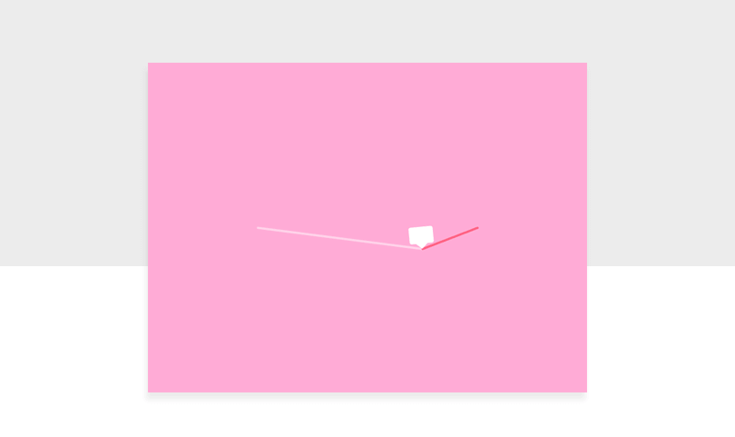
We love this progress bar by C.H.C. The little chat box slopes down the progress bar as it loads, creating an engaging and dynamic animation. It’s delightful.
Ooooh, Stranger Things! This Easter Egg, found on Spotify, is awesome. It transforms the UI into The Upside Down and a light beam moves slowly over the screen as your song plays. Watch out for the Demogorgon!
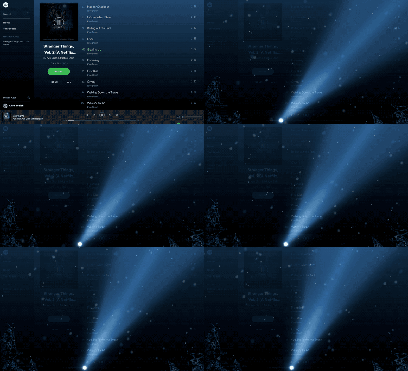
The only drawback to this progress bar is that it isn’t available anymore. But don’t let that stop you from taking some sweet inspiration from the design.
A progress bar is an opportunity to make the waiting time a little more interesting than usual for your users.
What a progress bar can do is make impatient users happier, boost engagement and set expectations. If a progress bar looks like it’ll be a while, this can act as a cue for someone to get up and make themselves a hot drink during the wait. Use these 10 progress bars as inspiration for your own designs.
PROTOTYPE · COMMUNICATE · VALIDATE
ALL-IN-ONE PROTOTYPING TOOL FOR WEB AND MOBILE APPS
Related Content
 We created a list of the top UI design principles that capture some of the most interesting faces of digital design. Check them out!10 min Read
 Crafting landing pages that convert doesn't have to be tough. Here’s our snapshot of 30 landing page examples with awesome UX that nailed it!12 min Read
 How important are lists in UI design? How much do they affect usability and what’s the best way to design them? In this guide, we'll explore the elements that make up a great list UI design and look at some inspiring examples!15 min Read
