Find out what the world’s biggest online seller can teach us about e-commerce UX
When it comes to e-commerce UX, Amazon looks like it’s killing it. Jeff Bezos’ baby is set to bring in $258.22 billion in US retail sales alone in 2018, or just over 49% of the country’s entire online spend for the year.
And that’s not a one-time thing – the retailer has been taking home around 50% of online retail sales in the US for the last few years. If anyone knows how to create user-friendly ecommerce experiences, it must be Amazon. Right?
So it’s weird that Amazon’s website is what’s technically known in UI design as “a hot mess”. Impersonal, unashamedly algorithm-powered, and over-crowded, Amazon can leave users feeling unloved. The interface can be so janky that Fast Co. asked a crew of designers to fix the fact that Amazon is “woefully lacking” in user-centred design.
While Justinmind’s UX team is no fan of dark patterns or ugly websites either (well ok, sometimes we are) we still think there are some valuable ecommerce UX lessons to be learned from Amazon. Check them out below.
PS – did you know you can prototype your own e-commerce app right now with Justinmind?
User reviews boost e-commerce UX
Amazon shoppers leave a heck of a lot of reviews. Don’t believe us? Check out Jared Spool’s comparison between Amazon and Target reviews for the release of Harry Potter and the Deathly Hallows. Both retailers sold a similar number of copies online. Amazon got over 1800 reviews. Target got 3. Burn.
Looks like the system has great usability for review-leaving users. Amazon positively rewards frequent reviewers with one of their “Top Reviewer” badge. The better your reviewer ranking the more likely you are to have businesses send you free stuff to review.
Why does Amazon encourage users to leave reviews like this? Because reviews contribute to a positive e-commerce experience. 95% of consumers rely on online reviews to help them make product decisions, according to the Baymard Institute. Reviews are an essential part of online purchasing and reduce consumer anxiety at the checkout.
But be wary of just wholesale lifting Amazon’s review system UX design. After all, Target uses the same system and we already know how that worked out for them. Instead, follow the tried and tested user experience approach of ideation, prototype and iteration to see what kind of review system works for your ecommerce site.
Here are some basic best practices for designing a winning review system UX:
- Always include a Rankings Distribution Summary in the UI design
- Set up notifications to ask users to leave reviews
- Make review filtering intuitive and give users feedback when they filter
- Make sure you have a reliable prototyping tool
Easy-to-find products are easy-to-sell products
Amazon currently sells over 480 million products on its US site alone. That’s an information hierarchy puzzle right there. Amazon has always solved the problem of information overload with nested category navigation.
The great part of their nested category navigation is the rapid reaction of the dropdown menu.
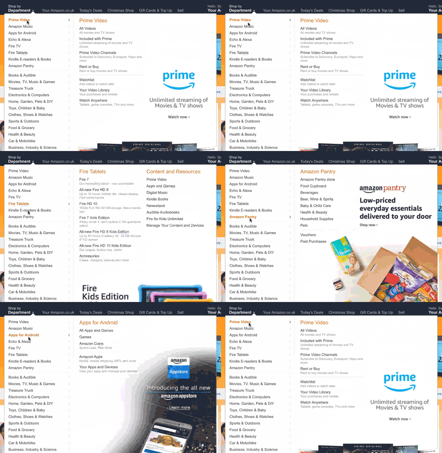
The Amazon UI gives users an instant overview of each subcategory with zero delay. It’s a flawless fly-out interaction that helps users get a glimpse into the vast number of product categories Amazon has. Ben Kamens explain the code science behind this super-reactive dropdown navigation.
Design your own dropdown menu with Justinmind
Scan-to-search options are user intuitive… if ya can find ‘em!
So yeah, the nested navigation is great for users and helps Amazon put some order in their virtual storefront. But in a site with a large amount of content – literally millions of pages in Amazon’s case – there should be multiple ways of navigating and searching information. Done right, multi-access navigation increases accessibility and findability. Done wrong, it has the opposite effect on e-commerce UX.
Luckily for Amazon, they got multi-access navigation right when they added the scan-to-search feature in 2014. Back then, Amazon app users could scan objects such as CDs, artwork and logos with their phone camera and find related products in the Amazon store.
Since those early days the scan-to-search feature Amazon has incorporated AR into the functionality. Now you can scan every day objects and be taken to their equivalents in the store. You can also project objects from the store onto your surroundings. Not sure that lamp is going to look good in your hall? Amazon AR has got you covered.
There’s just one problem with this great little feature. Discoverability. Designer Agnes Kim – a self-confessed Amazon addict – was surprised to discover this feature after years using the app. She guerrilla tested other users and found that none of them used the scan or voice search features.
Hhhmm, interesting. Amazon currently signals its scan to search feature by a camera icon in the app search bar.
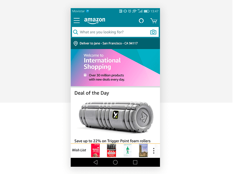
The feature could be given more prominence on the app homepage as a search option, perhaps replacing the Deal of the Day.
One-click ordering for frictionless experiences
Amazon’s one-click ordering system was, according to the Wharton University of Pennsylvania, “a game-changer” in the world of e-commerce UX. The idea that users could enter their payment and postage information once and then keep on buying thereafter with a single click revolutionized online shopping.
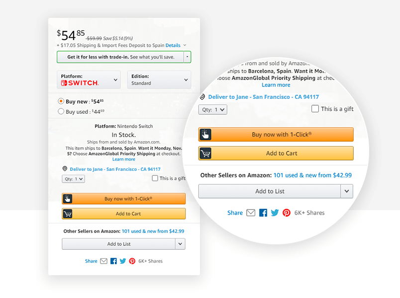
Why? Because users hate clicks. OK, they don’t hate them. In fact, usability heavyweight Jacon Jakob Nielsen found that users were actually 600% more likely to find products on an ecommerce site after the design was changed so that products were four clicks from the homepage instead of three.
That said, Amazon’s one-click purchase reduces both friction and cognitive load. Shoppers don’t need to fill in potentially tricky form fields, and don’t have time to get cold feet about their purchase decision.
Of course it’s not all paradise over at Amazon UX HQ. There are some Amazon UX practices that you might want to leave well alone…
Welcome to e-commerce UX’s Roach Motel… you’ll never leave
Ever tried to delete your Amazon prime account? If you have, then you might have experienced what’s known as the “roach motel” tactic. This dark UX pattern took users through multiple screens involving confusing dropdown options as they attempt to close their Prime account.
And the sucker punch? If you did reach the end of the wild goose chase you find out that there was no way to delete the account yourself – a customer-service bot had to do it for you.
Amazon have improved that aspect of their e-commerce UX to some extent, although the UX copy isn’t as user friendly as it could be.
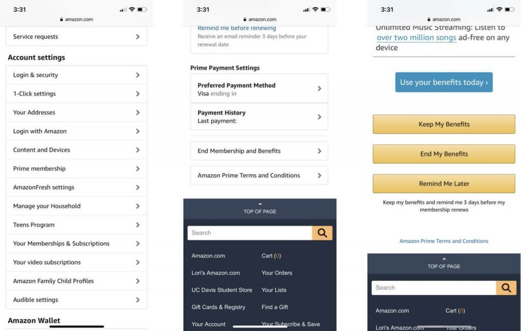
Image thanks to iMore
End my benefits? Say what now? Does that mean “cancel my account” in Amazon-speak?
Alexa is listening to you. Mua haha
Back in July 2017, Engadget wasn’t the only publication asking if Alexa was “going to murder you in your sleep”. A lot of people were more than a little freaked out by the Amazon smart speaker’s tendency to burst into creepy laughter at random times.
Amazon confirmed the problem was that Alexa was hearing the command “Alexa, laugh”, mistakenly. They fixed the issue pretty fast. But it was still creepy.
E-commerce UX rule number 1. Don’t be creepy.
E-commerce UX rules we can learn from Amazon – the takeaway
We’re not saying Amazon’s user experience is perfect. But there are valuable e-commerce UX lessons to be learned from the online giant, both from its mistakes and its triumphs. By testing the Amazon template to see if it works for your particular site or app, and by reducing barriers to both product search and checkout, you’ll end up with a better online purchase experience.
Related Content
 UX design portfolios are your chance to showcase your top skills and best work. Check out this post for awesome portfolio examples and websites!10 min Read
 Learn what paper prototypes are, how to make them and how they can help you design better products. Awesome examples and free templates inside!10 min Read
 In this comprehensive study, we dive deep into the world of web design tools, comparing features, pricing, ease of use, and more. Whether you're building a simple landing page or a complex e-commerce store, we've got you covered. Let's explore the best options and help you make an informed decision.30 min Read


