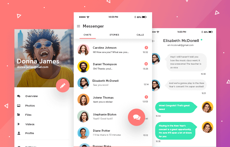
Messenger apps are an exciting UX opportunity. They should be easy to use and quick to understand. Here’s how to design yours in Justinmind
In a world of constant communication (we swear this isn’t the intro to a movie trailer), messenger apps reign supreme. HubSpot discovered that over 5 billion people are active users of messenger apps…
Whether we’ve got your noses stuck in Slack discussing our next big marketing campaign or we’re arranging happy hour with friends over Messenger, we rely on messenger apps to stay connected, plan our lives and build relationships.
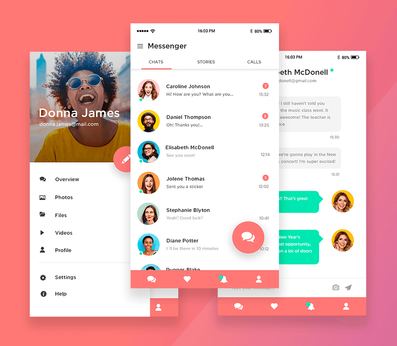
In this post, we’re going to show you how you can design and prototype your own messenger app UI right inside Justinmind’s app prototyping tool. Are you ready? If you’re looking for something a bit different, check out this post on prototyping methodologies and find alternative ways to transform your ideas into designs.
Step one: Download Justinmind
To get started on our messenger app adventure, get your hands on Justinmind.
Once you’ve downloaded and launched the app, go ahead and create a new mobile prototype.
You can choose iOS or Android or create your own dimensions. It’s also worth mentioning and you can brush up on the differences between a high and low-fidelity prototype before following this tutorial.
Step two: Create your templated content
Efficient design is all about time-saving. Who wants to spend hours creating work over and over when you can use the magic of Templates? You’d rather be saving time, right?
A Template is a quick way to reuse content that appears throughout your screens in Justinmind. Any Template you define will automatically appear on every page you create. Templates are great for elements that appear throughout a website or app, like menu navigation.
What do we need to put in our Template?
- Bottom navigation
- Slide menu
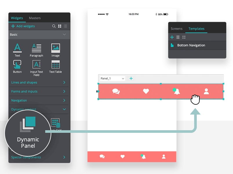
To get started on our Template click the ‘+’ button in the Templates palette and give it a name. In the Template, we’ll create a fixed bottom navigation.
Save even more time by getting all of the menus and components you need to add to your template directly from our UI kits page.
Drag a Dynamic Panel to the bottom of your screen. In the Properties palette, check the box “Display pin position options”. Now you have the option to pin the Dynamic Panel. For Margin X choose “Pin to center” and for Margin Y choose “Pin to bottom”.
Inside your Dynamic Panel, add widgets from the Widget palette for each of your screens. These will be your navigation icons. Our example has an icon for:
- Chats
- Favorites
- Notifications
- Profile
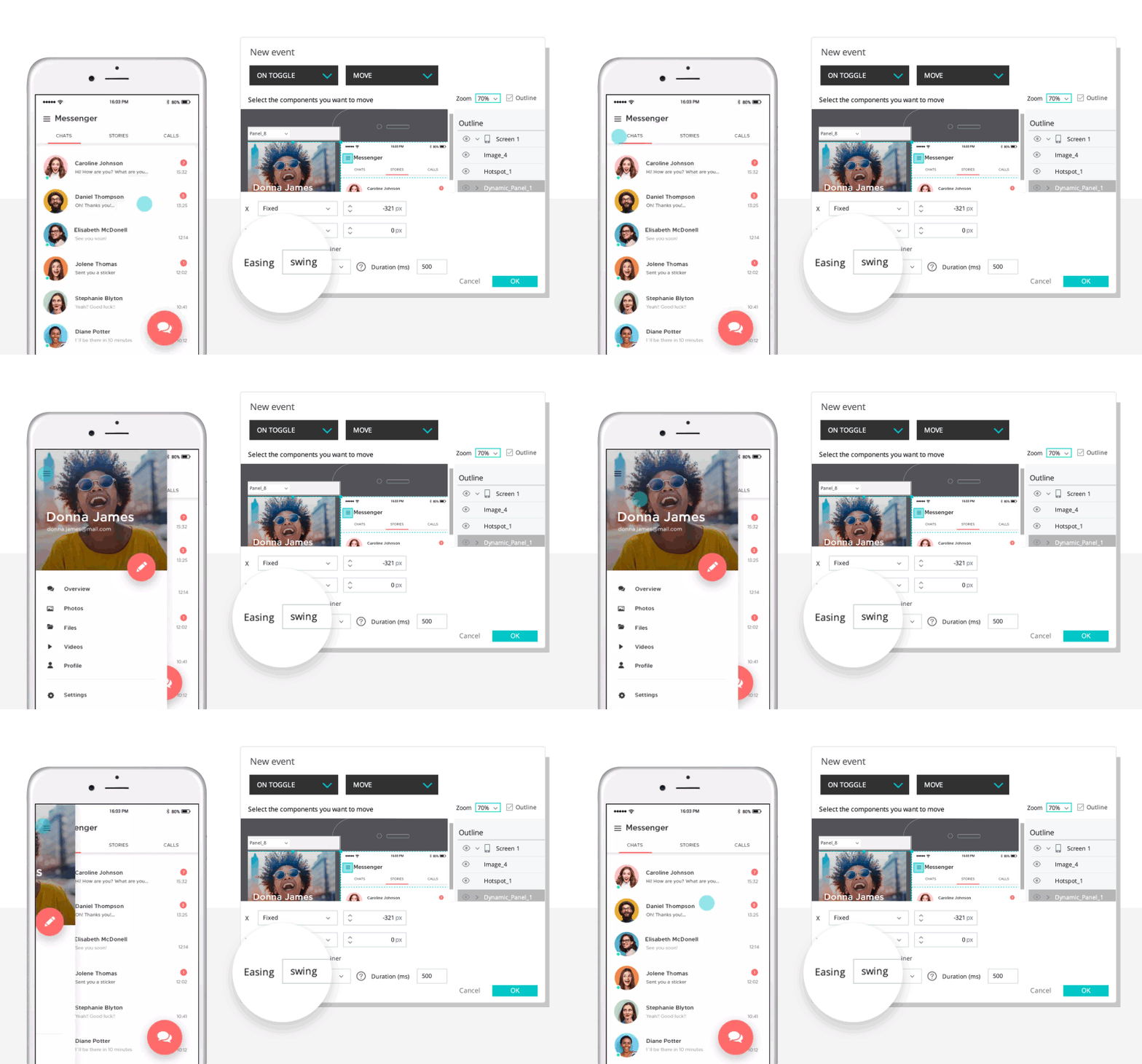
Now for the slide menu. Drag another Dynamic Panel onto the canvas, but make sure the panel is positioned to the left outside of the mobile interface. We place it outside the canvas because we need the panel to slide into view on command. Add your menu content to the panel.
Drag a menu icon widget from the widget palette and place it on your mobile interface. We need to add an Event to this icon so that when you tap it, the menu reveals itself. Go ahead and click your menu icon and add an “On Toggle” + “Move” event from the Events palette. Select your own effect from the Easing drop-down menu. Click OK.
So far, so good. Let’s move on.
Step three: Prototype a login form
Create a new screen from the Screens palette. Make sure you click your Template from the drop-down in the Dialog. Click OK.
Drag two input text field widgets onto your screen for the username and password fields and a button widget to log in.
You can add custom placeholder copy into the input fields from the Properties palette. Click the password input field UI element and change the type from ‘text’ to ‘password’ in the type option in the Properties tab. This will show an asterisk in place of words when the user types their password.
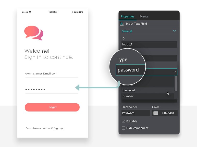
You can link your login button to the additional screens using a “Link to” event.
Step four: Create a chat screen
The chat screen is where most people will spend their time in a messaging app. What UI elements will we need to create and use for this step?
- Rounded chat bubbles
- Icons (i.e attach a photo)
Use a rectangle widget and a triangle widget to create your chat bubble widget.
Select the rectangle UI element. In the Properties tab, give it a border that matches the color of the widget and make it rounded. Drag a triangle widget to the canvas, resize it and place it on the side of the rounded rectangle. This is your chat bubble. Use a text widget to add copy. You can select all widgets, right-click and group these elements together.
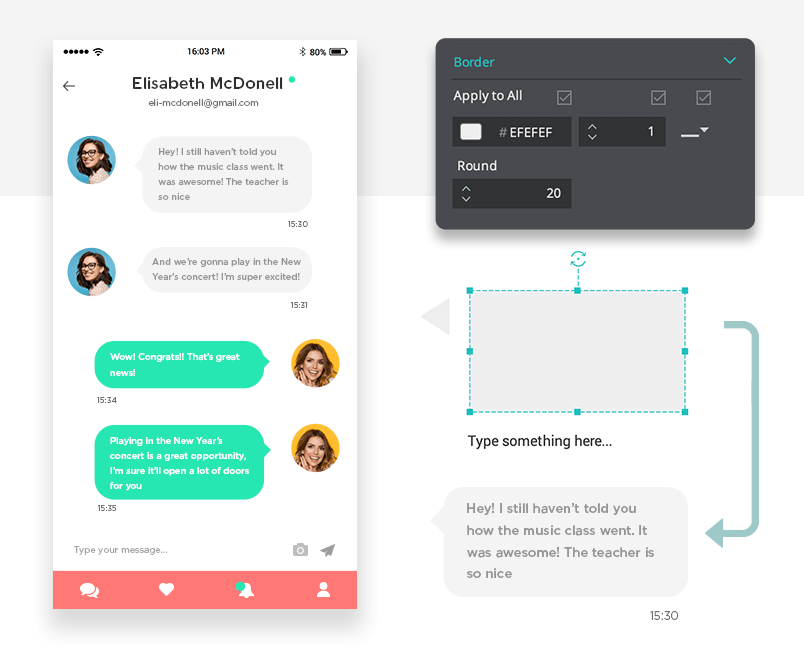
You can copy and paste the chat bubble several times to create a conversation. Make sure the colors of the two bubbles are different to highlight which person sends the message. Ours are green and gray.
For the icons on this screen, you can use the selection of iOS or Android icons that are pre-installed in Justinmind. You’ll need icons for:
- Back arrow icon
- Camera icon
- Send icon
Don’t forget to take a look at our free downloadable UI kit libraries, full of scalable and realistic icons for any context.
Step five: Create a contact list
Let’s create a new screen for your contact list. Name it ‘contact list’.
We need a Data List to create the contact list. To do this, create a new data Master from the Data Masters palette. Give it a name. In the Dialog, create 3 fields: image, name and email. Make sure the type for both name and email is text and file upload for the image.
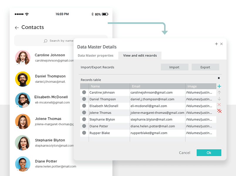
Now drag a Data List widget to your screen. A Dialog will appear. Give it a name and select your Data Master from the list. Add all the fields you created. Right-click the Data Master from the palette and select view and edit records. Here you can add your own data.
You can customize your list in the Properties palette to change the fonts, colors and layout to match our example.
Step six: Prototype a chat list
Every messenger app has a screen where you can see all the conversations you have going on at any one time. On this screen we will need:
- A Data Master to display chats
- A floating action button
- Tabbed navigation
Create your chat list
Add a new screen from the Screens palette. Select your template content.
To create your chat list, repeat the steps from step five. The chat list and the contact list, although have different uses, function the same when you create them.
Add a floating action button
Now we’ll deal with the floating action button.
Drag a rectangle widget onto the canvas and choose its color. Add an icon on top of the button so that users know what it will do. Now select both and group them into a Dynamic Panel. In the Properties palette, check ‘Display pin position options’ in the Position options. Select ‘Fixed’ for the Margin X and ‘Pin to bottom’ for Margin Y.
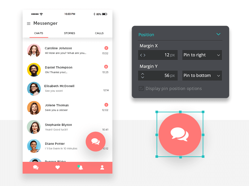
Now when the user swipes up and down the screen, the floating action button will stay in place.
Tabbed navigation
We’ll add tabs to this screen too. The tabs will show:
- Chats
- Contact statuses
- Calls
Create a tab using a Rectangle widget. Name them in the Properties palette. Position them horizontally next to each other with some space between the elements. Then drag another Rectangle widget below to represent background for our content.
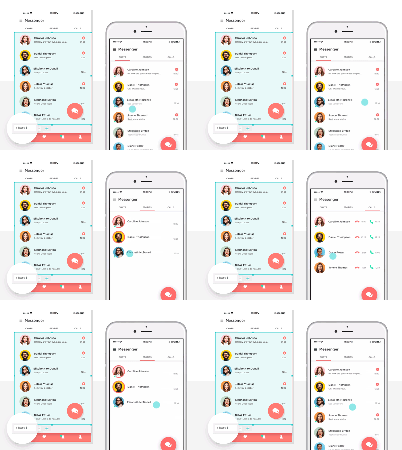
Group all the elements together in a Dynamic Panel. From the Outline, duplicate your panel 3 times. On the first Dynamic Panel add an “On Swipe Left” + “Set Active Panel” Event. Choose the second panel. Click OK. Repeat this for the additional tabs so the user can swipe easily between the panels.
Enjoyed the tutorial? We have another one on how to prototype a grocery app that you’ll love too.
How to design a messenger app – the takeaway
Messenger apps should be straightforward and easy to use. At a glance, users need to see what conversations they have going on. That’s the most important thing in a messenger app.
They also need to be usable: clearly defined areas, properly labelled fields and a minimal interface are just a few of the important elements you’ll need in your interface.
Related Content
 UX design portfolios are your chance to showcase your top skills and best work. Check out this post for awesome portfolio examples and websites!10 min Read
 Learn what paper prototypes are, how to make them and how they can help you design better products. Awesome examples and free templates inside!10 min Read
 In this comprehensive study, we dive deep into the world of web design tools, comparing features, pricing, ease of use, and more. Whether you're building a simple landing page or a complex e-commerce store, we've got you covered. Let's explore the best options and help you make an informed decision.30 min Read
