The Justinmind team redesigned the company website with low & high-fidelity prototyping and the SCRUM agile methodology. Blood, sweat and lots of coffee: read about the gains as well as the challenges of the project!
This spring, Justinmind spent some time revamping the company website, to make it more compatible with its users and with greater emphasis on our Enterprise product. In this post, we’ll take you through our agile SCRUM redesign process as well as what came out of it: the good, the bad and the prototyping in between!
SCRUM prototyping for the win
But wait. Why did we decide to combine prototyping with a SCRUM environment?
Basically, because they’re a great fit. As Sid Dane explains in his great SlideShare, prototyping fills several Agile niches:
- helps gather requirements
- validates requirements
- reduces risk
- simplifies complex concepts
Different types of prototypes fit into different stages of the SCRUM. You might favor rapid prototypes right at the start of the SCRUM cycle, moving on to iterated prototypes as the SCRUM evolves.
Why redesign Justinmind’s website?
So, back to our website make-over. The overriding factor that drove our redesign project was our users. What we discovered was that people were visiting our site wanting access to more information about our tool. We realized that something needed to change, to really give our users what they were asking for, and so began our research. We investigated the market to help us redesign our own site model for the benefit of the user. And so to the drawing board we went!
If you’re curious about our day-to-day SCRUM process, we explain it here. There are even some customized SCRUM cards free to download!
Organizing the SCRUM
In a similar way to Justinmind’s Product Development team structure, we decided to apply the SCRUM technique to our website redesign project: breaking it into small deliverables. We make progress in a series of sprints and iterations. At the start of a sprint, tasks are allocated and at the end, the new designs or features are evaluated, coded, and integrated into the live website.
Not sure about the difference between Agile versus Lean prototyping?
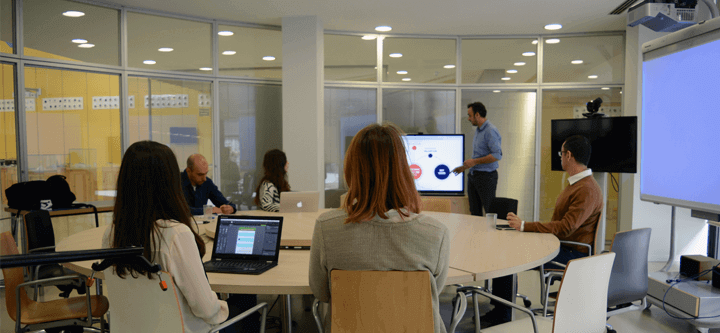
The project team was made up of Product Owner Pau, who represented the business side of the project, laid out the strategy, and guided the team through the project; Scrum Master Daniela, who helped team members to perform at their best by organizing the day to day tasks and by keeping the pace (!); Project UX Designer Susana, who headed the project’s designs, Justinmind’s Lead Designer Sergi, who oversaw the design framework, and Front End Developer Lluís, who took our design and content live.
“Our sprints were our guide, our road map to what the project required. They were fundamental to what we were trying to achieve.” Lluís
Project benchmarks
The project was divided up into monthly sprints, with tasks prioritized by what the overall strategy deemed most urgent. However, it soon became clear that long sprints wouldn’t fit the project’s nature, therefore the team started having weekly sprints and things dramatically improved. The team would offer suggestions in between sessions through Skype, and the occasional coffee break, or three! Constant communication between team members was a key variable when designing the new site, especially with the variety of iterations that we performed throughout the project.
The constant throughout our project? Well, it goes without saying: prototyping. Paper, low, medium, high, you name it, we did it. We do eat our own dog food, so Justinmind accompanied us along the way! Using a prototyping tool helped us to understand whether our solutions were the right ones, to clearly define the requirements, and to reveal errors and oversights. Moreover, it was a way of getting us all on the same page and aligning all of our different perspectives and tasks in the project.
The design turning point: the definition phase
“The website is more than just content; it’s the face of a product.” Pau
Once we had a general feel for the direction that our site redesign was going to take, we organized a series of meetings to define the basic concepts, objectives and requirements of our new website sections. We decided that we would begin by defining the new homepage, and redesign the features and their subpages. Next, we’d improve our navigation by adding a top menu bar and footer, with the intention of slowly phasing out the hamburger menu. Who needs the hamburger anyway? The next step will be to adapt other pages to the new strategy.
We had separate meetings for each section of the new site so as to focus on each individually and bounce ideas off of each other that would potentially help with the other parts.
With a multi-disciplinary team, a lot of strategy goes into meetings such as these. For example, perhaps a visual designer has an interesting idea about how a feature could be improved by changing the layout of a page. Nevertheless, the developer explains that this won’t be possible on the given budget, with the given resources or time constraints. This can be made ever more complicated when re-designing, as opposed to creating a new site from zero. Every possible scenario must be fully developed in order to understand where potential solution paths lie.
Design stage #1: the paper prototyping trail
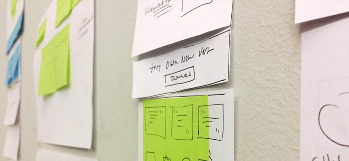
The first stage of our design life cycle was paper prototyping, or sketching, to define the new site features and concrete the information architecture of ideas. Paper prototyping is a basic technique to collect thoughts and ideas in an organized manner. It’s typically a concept sketch, set of drawings or a storyboard on paper, that are meant to show how your product will work.
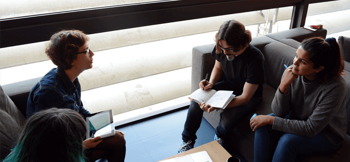
Our project’s UX Designer, Susana, got to work on getting our ideas onto paper so that we could visualize them and discuss them properly. With these sketches, we were able to explore our initial ideas through a new, concrete medium, show the intention behind each new feature idea, and, of course, create quick-and-dirty iterations! Here, we’d like to reiterate how important it is that all members of the team, including Development, are present at this point. Without their input, we would have ended up with lots problems during the coding stage.
Improve your Agile process with these 7 essential tools
Design stage #2: converting ideas to features through low-fidelity wireframing
The second step in the process came when we turned the sketches into basic, static digital wireframes with Justinmind. The first wireframes didn’t include any content or visual design elements, but were simply to demonstrate rough representations of our concepts to help us validate them early on. Our intention was to avoid spending bouts of time filling in the gaps, that we would inevitably need to tarmac over at a later stage. When we were happy with these initial low-fidelity wireframes, we slowly began to build them up into low-fidelity prototypes, eventually adding content and basic styling.
Design stage #3: project visualization through high-resolution design
Static wireframes and low-fidelity prototypes do not do the real design justice, so our next step was to create high-resolution designs of our features using Photoshop and Sketch. Here, the design team worked on optimizing the visual design features, UI elements and content.

“Re-design is re-work. It’s a much bigger job than starting from the ground up and shouldn’t be taken lightly.” Daniela
This was followed by validation of our lo-fi wireframes and scenarios. At this stage, we performed testing within members of the team, before creating high-fidelity iterations in preparation for development. Below, you can see a high-fidelity prototype example of our new site design:
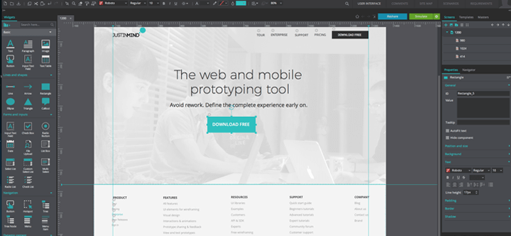
If you want to know more about creating a responsive design, we recommend this tutorial on how to make a responsive website prototype. You’ll only need 10 minutes to get through the whole thing!
Goodbye prototyping, hello Development
Our design team gave the redesign its visual flow, but equally important is how our development team relayed the data to support the business processes behind these designs. Whilst our design team was styling our redesign, Lluís, our Front End, was hard at work finding ways to meet all the requirements of the redesign. He worked through each feature that we had redesigned and developed its functionality into the structure of the new site.
Project takeaways: the gains
Prototyping is a process that helps to bring people together, discuss a problem and move towards solutions by materializing design assumptions in a visual and interactive way. Above all other things learned in this project, our team was able to put our belief in the importance of prototyping into practice.
Daniela describes prototyping as beyond the bounds of innovative design: “Normally, you’ll design, develop and deliver a project before you go back to consider possible improvements. But if working on a prototype of your final product, you can visualize the end result as much as possible before the heavy lifting has begun.”
Susana explains the collaboration benefits of prototyping: “Integrating a multi-disciplinary team can be treacherous. Everyone wants to have their say and there’s just not always time to get to all the little details. Collaborative prototyping enables everyone to see the changes being made, and ensure everyone is on the same page; for us, that’s essential.”
Project takeaways: the challenges
“Redesigning a website is like a game of chess. You make your move, see what comes next and just hope for the best.” Susana on design strategy
Despite the impending doom of recreating a website without reducing conversion rates, we did it! But that’s not to say that we didn’t have our own struggles along the way. Here are a few highlights of what we’ve learned from the project:
- Strategy: Take the time to accurately estimate the value of each task in a sprint or backlog, and prioritize accordingly. This is particularly noteworthy when working with new people in new positions. According to Stefan Billiet here: “The point of sprint planning is to get the team into a state where they feel comfortable committing to a given set of user stories, where they feel they know enough to get started.” Calculations should be made based on each member’s individual learning curve to accurately estimate timings, (where possible in a project). It’s not just down to the Project Manager, as Sam Barnes points out here, so don’t knock it off your project kick-off checklist!
- Always complete the fidelity spectrum of prototyping. We cannot stress enough how important each prototyping stage is (from low to high)! Without the lower stages, you can’t get to grips with the basic concepts of your site, and without high-fidelity, there’s no knowing if your content will adapt properly to the final layout. In our own words: “The way we see it, working on UX design without the content is a waste of time: it’s a short-lived love affair.”
- Developers should be included from the very beginning in order to give accurate feedback about the potential limitations of a project and to avoid labor-some rework. Understand that there are many variables when it comes to coding and many paths to get to the same result – not everything is black and white! See more on this here.
- Evaluate, evaluate and then…evaluate the project some more! After all, as Lluís says: “a web project is always live!”
We know that our process is not the only way to perform a website redesign. But if you’re working towards a similar goal, we strongly encourage you to include prototyping as a phase in the process! Tune in soon to hear more about our process in relation to the content phase of prototyping and the importance of project management!
Related Content
 Whether you're new to UX or aiming to advance your skills, this guide provides all you need to master use cases with expertise.18 min Read
 What is data visualization, and why is it useful? This post explains how turning complex data into simple visuals like charts and graphs helps you understand and use information better. It also gives easy tips to create clear and accurate visuals quickly and with less effort.27 min Read
 Got writer's block? Find 20 awesome user story examples to kick start your writing process and nail your product features.10 min Read


