How do you validate demand for your new product or features? The answer is simple: choose a smart user testing platform. Any suggestions? Yes, Validately!
The use of high-fidelity interactive wireframes and prototypes with usability testing is an effective way of getting feedback, however you need to do it the right way. Justinmind and Validately launched a new partnership in February 2016, and now all Justinmind PRO users can also try out Validately free of charge! In this guest post, Validately founder & CEO Steven Cohn, provides some tips on how to validate demand for your new product or features through user research. The article also includes tips on how to avoid common mistakes when performing usability testing.
We all know that creating a new feature or product that results in profound customer engagement is hard to achieve.
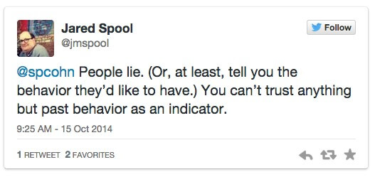
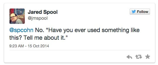
Jared Spool (a thought leader in UX and user research) explains why in his tweet below:
Usability Testing is a known and well documented process. But are there ways to test demand for a new product or feature before you build it?
Yes! So long as you do it properly. Here’s how to do so:
Asking “Would you?” is NOT enough
Let’s start by highlighting a common testing mistake:
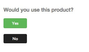
Unfortunately, asking a test respondent if he would use a product does not produce a reliable response. Jared’s above tweet partially explains the reason why. But the underlying reason why this question is an unreliable predictor of demand is that there is it doesn’t cost the test respondent anything to say “yes”.
You need to make “Yes” cost something
In everyday, non-testing life, saying “yes” is a trade-off decision. To say “yes” we have to first determine, “Is it worth really worth it to me?” As this is the same question that your users will ask themselves when your product (or feature) is released, you need to force that decision during testing too. There are three ways to make saying “yes” to a qualitative question cost something during a test.
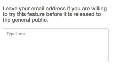
- Time: ask the test respondent to give you more of her time. If they are truly interested in the product (or feature), they will say “yes!” Here’s an example question:
- Reputation: ask the test respondent to share your product among their friends without compensation? If they are truly excited about your product (or feature), then they will gladly share with others. Here’s an example:
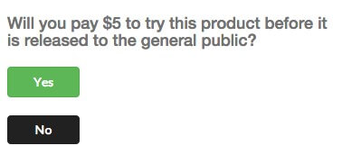
- Money: ask the test respondent to pre-pay for the product (or feature). Even charging a nominal amount is telling. Here’s an example question:#
What can demand validation testing tell us?
To be clear, this does NOT necessarily guarantee building a product (or feature) that customers will want to use. After all, I am sure that you have downloaded apps that you don’t use, or canceled a pre-paid hotel reservation. However, these tests are a great way to avoid poor product/feature implementation. Simply put, if a test respondent is unwilling to give you her time, reputation or money, then they doesn’t really want to use your product.
Past behavior is a good indicator
Another good validation of future demand is whether a test respondent has used a comparable product/feature in the past. Jared suggests asking this question:
The aim of asking this question is to better understand why a user “rented” a competing product. The “tell me about it” part tries to delve into what would make them switch to your product. What do they like or hate about the other product? Jared’s point is that you are unlikely to convince someone who doesn’t currently do an activity to pick it up. However, you can encourage them to switch from another product if your product satisfies a currently unmet need.
And of course, you will want to use Minimalist testing for these tests to validate which features a customer is going to say “yes!” to.
Demand Validation testing is the first step. To drive customer engagement, a product or feature must provide both value and be easy to use. Once you validate demand, you need to conduct usability testing as well. While observing usability tests, we’ve noticed some common mistakes.
Common Usability Testing Mistakes
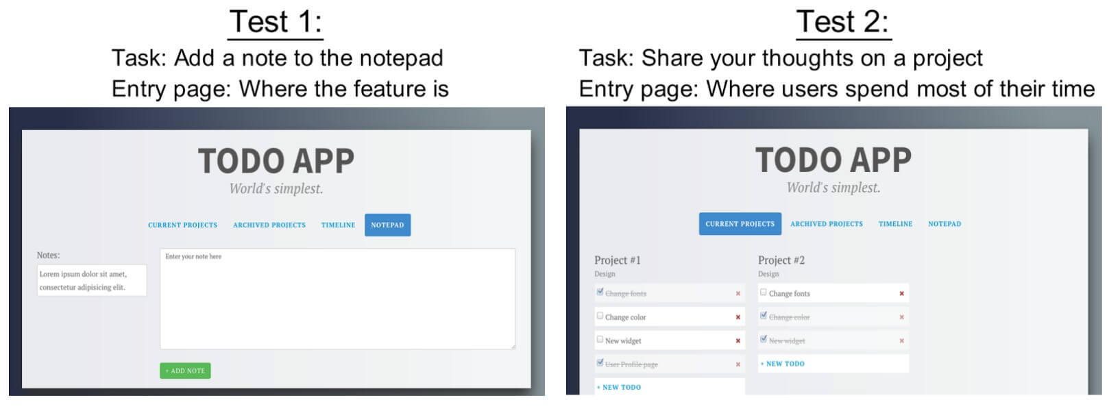
Below are two different test structures, with the same goal in mind. Try to determine the two differences before we tell you.
The key differences:
Did you guess the key differences between the tests? Read on to find out!
Phrasing of the “task”
The first big difference between the two tests is how the task is phrased. It’s a subtle difference, but the impact is significant.
- In Test 1, the task phrasing is very prescriptive. We even use the exact names that are in the product.
- In Test 2, the task phrasing is use case driven, i.e. “Share your thoughts on a project.”
Why is this important?
The phrasing of a task is important because new users come to your product to solve a problem that they have. The solution that you provide and how you label the path to that solution is what you are testing with a Usability test. However, if during your test, you are overly prescriptive with your task, essentially asking a ‘loaded question’, the results will be tainted. Test 1 tells the user where to click. Thus, it would be unclear whether a person is able to complete the task because the UX is intuitive, or because they just looked for buttons with the label “notepad” and “add note”, as we’ve used those words.
On the contrary, Test 2 is more conducive to how a user would normally think, i.e. with a problem to be solved in mind. In this case, the problem to be solved is “adding my thoughts on a project.” Therefore, successful navigation of the flow and completion of the task by a test respondent can give us confidence that the feature UX is intuitive.
Essentially, the task phrasing for a usability test should be use case driven. Avoid being overly prescriptive when you phrase a task, or you will end up receiving rhetorical answers.
The entry page
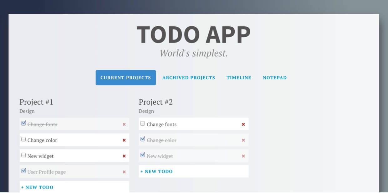
In this ‘toy’ app we’ve constructed, the “add note” feature is on the “notepad” page. But as most of the users who use the app spend time in the “current project”, we really need to test whether navigating from the “current project” page to the “notepad” page to add notes is intuitive for our customers.
This is especially important because the user task is to “share your thoughts on a project” as we noted above. By starting on the main page, we can find out if the user intuitively thinks to navigate to the “notepad” when they want to complete the use case of “sharing thoughts.”
If the entry point of a usability test starts the user on the page with the activity (as we did in Test 1), then you are not testing the user’s ability to navigate to the feature properly. You are simply testing if a user can perform an activity on that specific page.
Basically, a good usability test not only measures the ability of a user to complete a task, but also tests a user’s ability to complete common navigation flows to that task.
Here is how we’d structure a usability test for this feature:
- Who: As this is a new feature within an established product, test on actual customers.
- How many: 5 customers per start page (see below)
- When: At the prototype phase
- Where: Remotely to see if our customers can naturally do this before schedule an in-person usability test.
- Test intro: “We are planning to add a feature to the ToDo app to let you to share your thoughts on a project. Here is a prototype of that feature. Please use this prototype to give us feedback on this project with your teammates.”
- Test start page: Run a usability test that starts from the Current Projects page, the Archived projects page and the Timeline page as those are the three core navigation flows that our customers will have. We wouldn’t suggest running a test starting on the Notepad page.
So that’s it for now folks! We’re very pleased to announce that Justinmind and Validately will be joining forces later this month! So stay tuned for more details on the integration and for further UX updates. In the meantime, why not sign up for a Validately demo and if you haven’t already, download Justinmind to start improving your workflow!
Related Content
 UX design portfolios are your chance to showcase your top skills and best work. Check out this post for awesome portfolio examples and websites!10 min Read
 Learn what paper prototypes are, how to make them and how they can help you design better products. Awesome examples and free templates inside!10 min Read
 In this comprehensive study, we dive deep into the world of web design tools, comparing features, pricing, ease of use, and more. Whether you're building a simple landing page or a complex e-commerce store, we've got you covered. Let's explore the best options and help you make an informed decision.30 min Read

