Must-read mobile-friendly navigation tips. Prototype your side drawer design with Justinmind now
Implementing effective navigation UI design when mobile app prototyping is a must. Mobile users need to know where to go and how to get there at any point when using your app. In order to make your navigation both discoverable and usable, you need to design the right navigation pattern.
If you’ve got lots of content, your best bet is the side drawer. Commonly used by Android to display multiple links in mobile navigation, the side drawer reduces UI clutter and prioritizes important navigation destinations. Not to mention, it’s super simple to design and fits most mobile app layouts.
This post will guide you through side drawer design in your prototyping tool, discussing when to use navigation pattern and some must-have prototyping tips. So if you’re looking for intuitive, seamless mobile navigation, you’re in the right place! Let’s get started.
What is the side drawer?
The side drawer, also known as the slide menu, navigation drawer, or the “Left nav”, is a UI panel that contains an site or mobile app’s main navigation destinations.
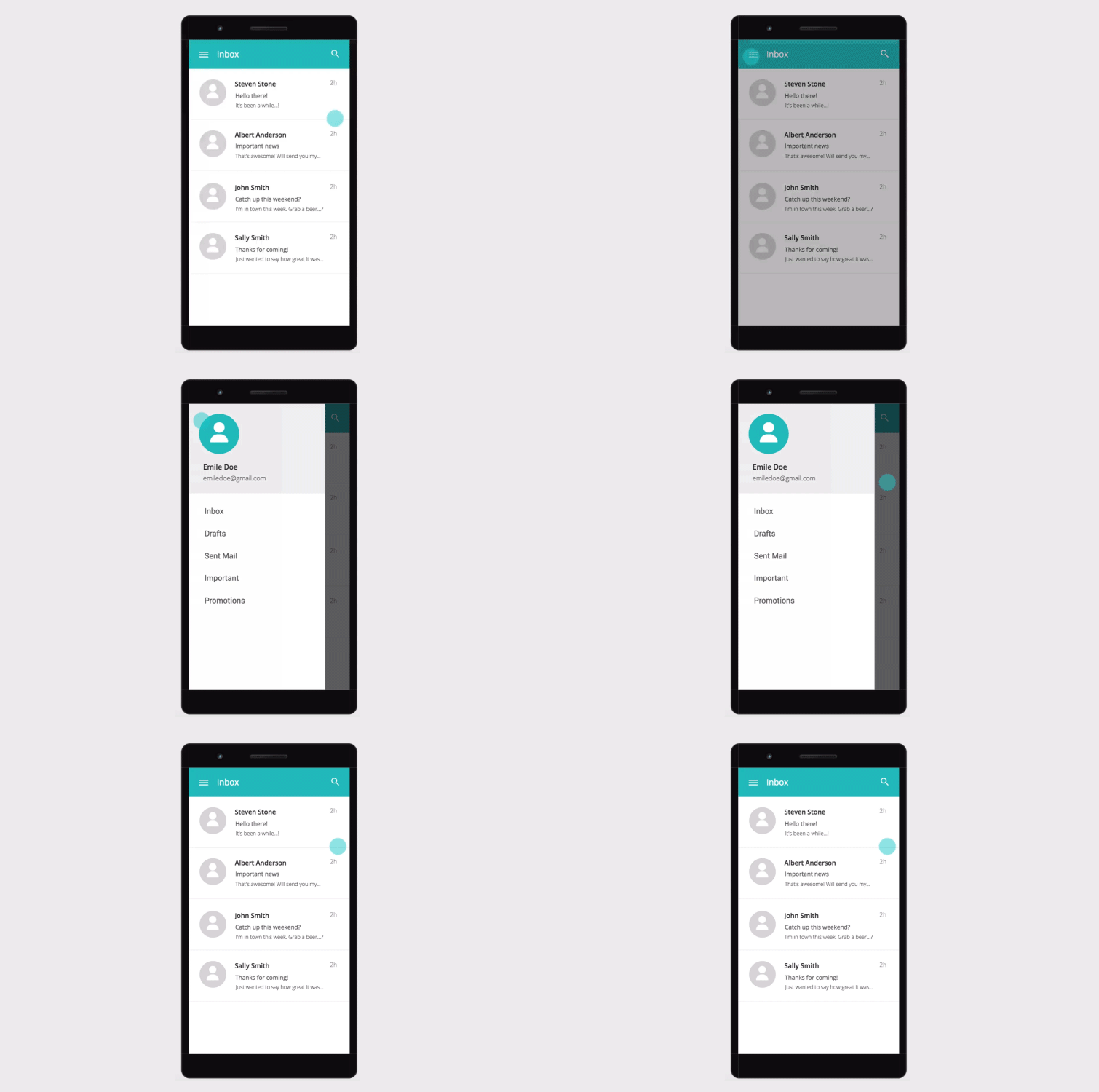
Usually hidden from view, the side drawer slides in from the left edge of the screen. It can be swiped with the mouse/finger or toggled open or closed with a Hamburger icon. Links are presented as multiple line items one below the other, in order of priority.
Types of side drawers in UI design
The side drawer is common navigation pattern used for interfaces with smaller screens, as it helps designers save on precious real estate. For instance, Android mobile users will be familiar with the type of side drawer that remains invisible until they slide or toggle it open.
However, this is just one type of side drawer use. Android defines other versions, including navigation patterns than can be used for tablet and desktop interfaces:
- Permanent side drawer – always visible and pinned to the left edge of the screen. This side drawer is recommended for desktop design
Spotify’s sidebar navigation is the perfect example of the Permanent side drawer at work:

- Persistent side drawer – collapsed by default and can be toggled open or closed by the user. It sits on the same surface elevation as the rest of the screen’s content. When open, it forces other content to adapt in size. This side drawer is recommended for any UI design larger than mobile (such as desktop, tablet and landscape mode)
- Mini variant side drawer – similar to the persistent side drawer, this drawer is hidden from view in its ‘resting position’. However, unlike the Persistent drawer that forces other elements to adjust, the Mini variant drawer expands in width in accordance with the UI’s content. This side drawer is recommended for apps that need quick selection access
- Temporary side drawer – most commonly used in mobile app design, the temporary side drawer toggles open or closed and opens on top of all other content
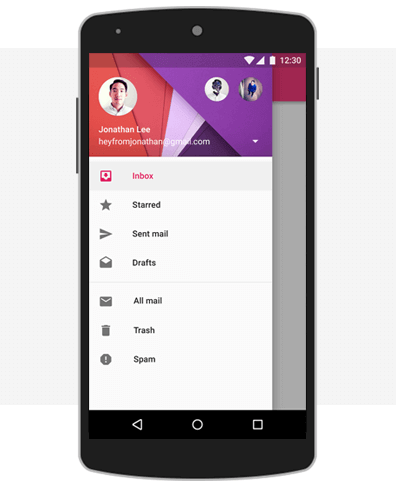
A great example of the Temporary side drawer in action on mobile is in Android’s Inbox by Gmail app. Primary actions (Inbox and Drafts) fill the top items and are followed by less frequently used items (Settings and Help & feedback).
Why use the side drawer in your mobile design?
The side drawer helps you optimize space when you have lots of navigation options to present to the user. This is one of the reasons it’s such a commonly-used navigation pattern in mobile app and tablet (small-screen) UI design, as Nick Babich mentions here.
Let’s take a look at some other usability benefits of designing a side drawer:
Remove UI noise for intuitive navigation flow
If your mobile app has a deep navigation structure, the user will need a way to move between navigation destinations without being distracted by visual clutter or complicated navigation paths.
The side drawer groups all navigation items under one root view. By consolidating items, rather than dispersing them across the UI, you’ll increase visibility. You’ll also reduce the cognitive load for the user as they’ll only need to focus on a single UI component.
Additionally, with no back button, the number of required user actions to complete a task is kept to a minimum.
Create hidden navigation for secondary actions
The side drawer allows you to save on valuable screen real estate by neatly storing secondary navigation links, such as user profiles, settings or contact pages.
Side drawers and slide menus are often used to house less important navigation links, which the user isn’t likely to use on a regular basis. They allow you to keep your most important features and navigation destinations front and center and de-emphasize the rest. You can validate them early on during the low-fidelity prototype phase and ensure you have a sound navigation before adding more details.
Naturally chunk content
By breaking down content into sub-categories, the side drawer forces you to chunk content. This is a great excuse to take a look at how you’re organizing your content and perhaps give your process a makeover.
As User Experience Specialist Kate Meyer advises, chunking content can help users process, understand and remember it better. She suggests taking a look at how you present content, in terms of sentence and paragraph length and visual hierarchy. Related items should be grouped together for optimal readability, scannability and accessibility.
By chunking your side drawer content responsibly, you can break down your pages and make it easier for users to navigate them. Read our post and learn how to chunk right by your content.
When not to use the side drawer
As a general rule of thumb, you should avoid the side drawer if your app has few navigation options. With a collapsed view by default, the side drawer reduces navigation discoverability. By implementing it unnecessarily, you run the risk of the user missing your navigation targets altogether. Out of sight, out of mind.
In fact some brands have seen user engagement as much as half due to side drawer navigation failure – so be aware. Remember, a clean design means nothing without usability.
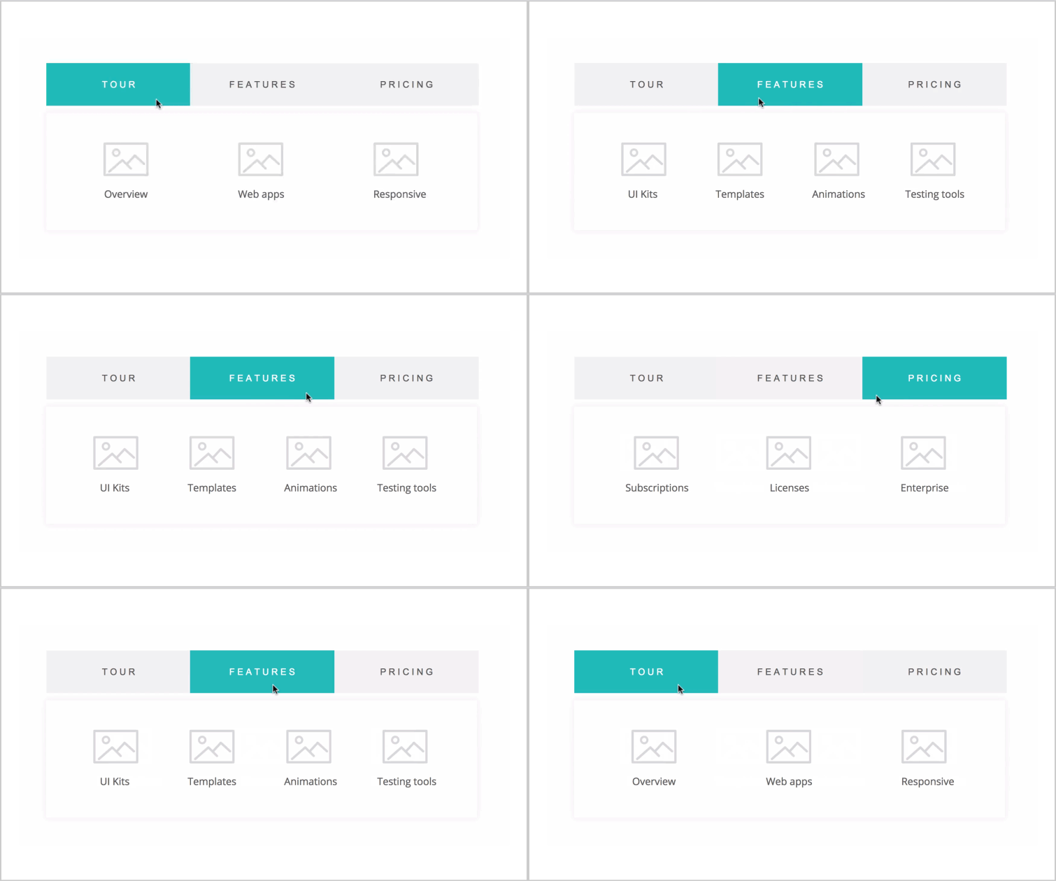
When you’ve got fewer navigation options, you’re better off designing a navigation bar or using tabbed navigation.
Up next: prototyping your side drawer with Justinmind
Creating a side drawer in your mobile app prototypes
Now we’ll show you have to create a side drawer for mobile with Justinmind. We’re going to reproduce the Inbox for Gmail, but the following steps can be customized as needed.
We’re going to use Dynamic Panels to create the side drawer in our example. Dynamic Panels are container widgets that hold other UI elements and control their behavior.
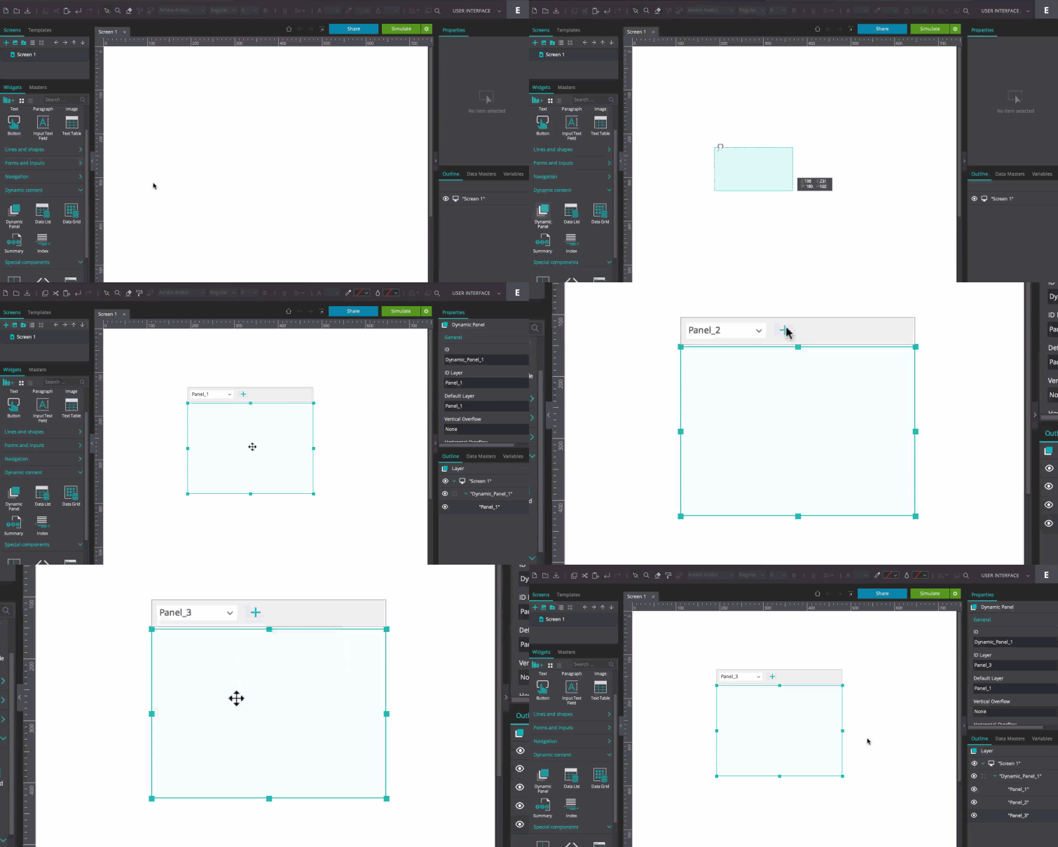
Step 1: download Justinmind and create a new mobile prototype
The first thing you’ll need to do is download Justinmind and create a new mobile app prototype. We recommend creating an Android prototype, because Android makes use of the side drawer more than Apple.
Step 2: create your app’s inbox view
To create inbox entries, drag a Rectangle from the Basic widget library to the canvas. Then go to the Properties palette and add a bottom border to it. This border will serve as the divider between inbox entries. In accordance with Android’s material design guidelines, all dividers should be full-bleed with 8dp padding above and below each divider.
Resize it to match our example and use Image and Text widgets to create the content (contact name, subject, avatar etc.) inside the inbox item. Use the alignment tools at the top of the canvas to position each UI element inside the Rectangle.
When you’re done, select all of the UI elements and group them together. Duplicate this group for as many inbox entries you want to display in your prototype.
To create your app’s header, add a Rectangle to the top of the canvas. Then, drag a Hamburger Menu icon from the Android Icons widget library on top of the Rectangle, to the left. It’s important to use the right navigation icon. We suggest the Hamburger, because it’s what users are familiar with and helps them reach the important features in an app.
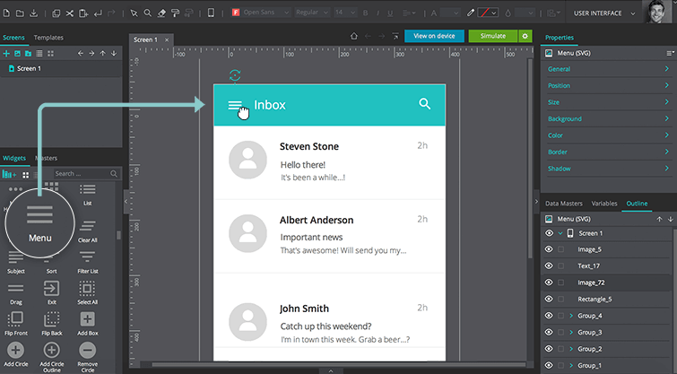
Customize your header so that it matches our example (e.g. add a Text box and rename it “Inbox” and a magnifying glass icon).
Step 3: create your side drawer
With Justinmind, you can either create your side drawer from scratch (easier to customize) or use our readymade the “Slide menu” screen example from the Android Phone widget library.
To create your side drawer from scratch, drag a Dynamic Panel to the canvas. Resize it so that it matches the height of the canvas, set the width to 305 pixels and place it on the left of the canvas. During simulation, it will slide inwards.
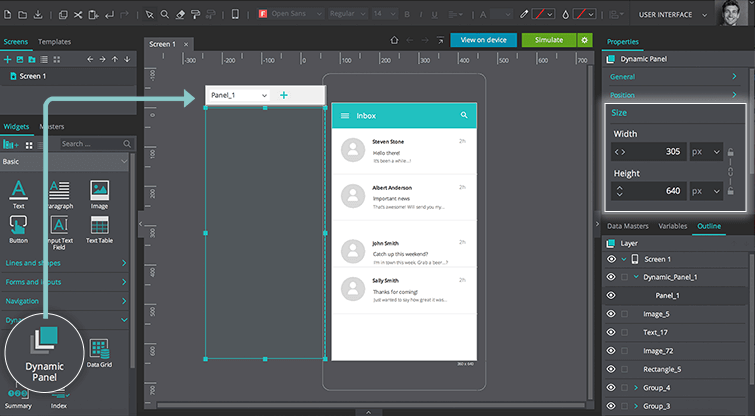
To create the content for your side drawer, drag Image and Rectangle widgets into the Dynamic Panel. Use them to create the side drawers, or Inbox menu items (e.g. Inbox, Outbox, Spam, Sent etc.) in our case. Use the alignment tools to ensure elements are evenly spaced.
Tip: consider how you arrange your Inbox menu items. Try to create a set of logical, relatable sub-headers that will guide users through their inbox.
Next, drag a Rectangle to the right of the canvas and change its color to black and transparency to 75%. Mark it as hidden, by checking the “Hide component” option. This will make the Inbox view appear deactivated when the slide menu slides onto the screen during simulation.
Step 4: make your side drawer interactive
You’ll need to add open and close events to bring your side drawer to life. So if you haven’t already, take a look at our Events palette here.
You’ll need to combine an “On Tap” + “Show” event with the Menu icon select with “On Tap” + “Move” event with the Dynamic Panel selected. This interaction will make the side drawer appear when the user taps the hamburger during simulation.
To hide the side drawer, combine another “On Tap” + “Move” event with the Dynamic Panel selected, with an “On Tap” + “Hide” event with the Rectangle selected.
Step 5: simulate your mobile app
Last but not least, click “Simulate” to try out your mobile app! Click the Hamburger icon to get started. Your side drawer should appear on-screen. Click the icon again and the drawer should disappear.
So there you go! Now that wasn’t so difficult was it?
Pretty soon you’ll be a side drawer design wizard, and will want to move on to more complicated website and app designs. When that time comes, head over to Justinmind Support, where you’ll find detailed tutorials on creating prototypes that will wow your team and your users. And don’t forget to download Justinmind if you haven’t already!
Related Content
 UX design portfolios are your chance to showcase your top skills and best work. Check out this post for awesome portfolio examples and websites!10 min Read
 Learn what paper prototypes are, how to make them and how they can help you design better products. Awesome examples and free templates inside!10 min Read
 In this comprehensive study, we dive deep into the world of web design tools, comparing features, pricing, ease of use, and more. Whether you're building a simple landing page or a complex e-commerce store, we've got you covered. Let's explore the best options and help you make an informed decision.30 min Read

