Breadcrumbs are known for their constant presence in ecommerce websites. But what makes them so popular? Read on to find out!
Breadcrumbs have been around for a while, with huge names in the UX sector – such as the Norman Nielsen Group – advocating for them since the 1990’s! Breadcrumbs have become a bit of a staple in ecommerce platforms, with the vast majority of us recognizing them immediately.
But why are they so popular? Are they a good fit to any website or app out there? And most important of all: how and why do they improve the experience for users? In this post, we’ll check out some of the theory behind breadcrumbs – so let’s get cooking.
Breadcrumb website navigation is a secondary type of navigation design that aims to improve the usability of the product. The way they achieve this is by making it clear to the user where he or she is within the product. This is a part of great usability: knowing where we are at all times.
This kind of secondary navigation scheme gets its name from the famous fairy tale of Hansel and Gretel, where the kids use breadcrumbs to remember their way in the woods. In modern times, these breadcrumbs do the exact same thing for users.
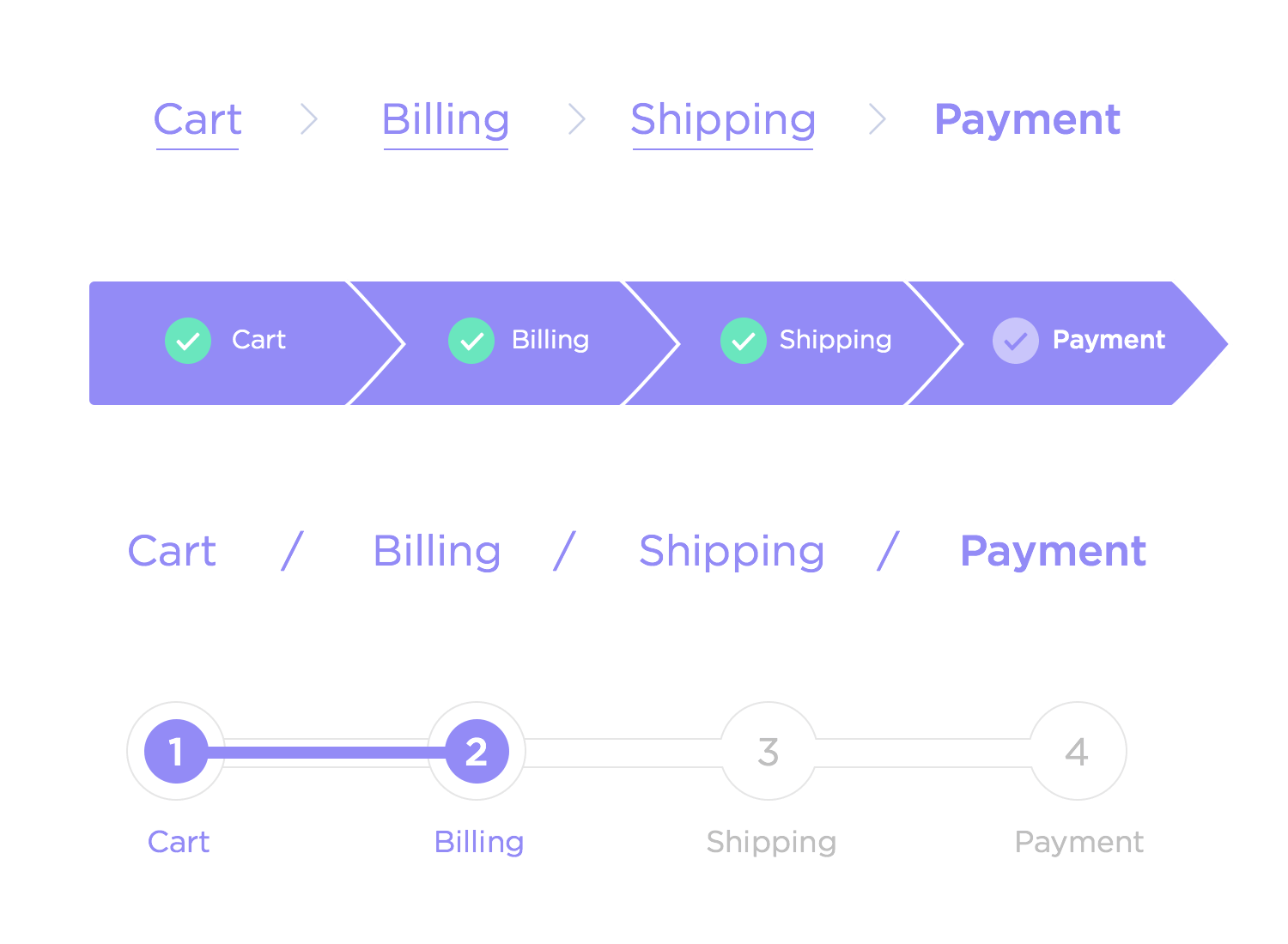
In broad strokes, this navigation scheme is pretty straightforward: several links in a horizontal line that illustrate where within a product the user is located. This can prevent users from feeling disoriented if they landed on a lower level page within a big and complex website, for example.
To summarize: Breadcrumbs are a secondary navigation scheme that should reflect the products’ information hierarchy.
Users have grown used to seeing breadcrumb website navigation, especially in large websites such as Amazon. But what makes them a nice feature to have in the product? Norman Nielsen makes a very strong argument as to why breadcrumbs are a definite positive.
Why is breadcrumb navigation so popular? Designers always seek to offer the best possible experience to users – and having breadcrumbs can be a powerful ally. Let’s go over some of the main reasons why many products enjoy breadcrumbs.
By now, most users will recognize breadcrumb website navigation schemes even if they don’t know what they are called. Thanks to big websites that have used them for years now, users almost expect to find breadcrumbs no matter what website.
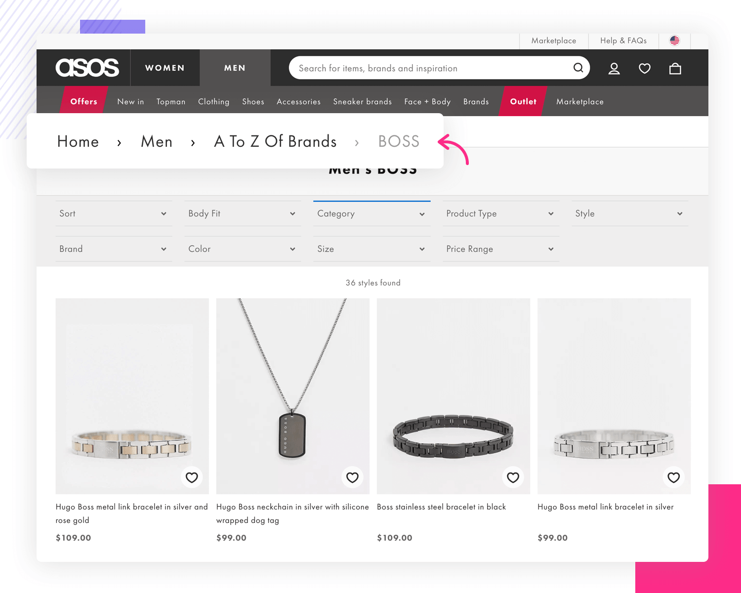
According to the Norman Nielsen Group, breadcrumbs haven’t changed since the 1990’s – and in part, that is why they are so powerful. It’s always a horizontal line with links that go from highest level to lowest level pages. The links are simple, with a single character separating each link – the symbol “>” is commonly used.
Since users are already very familiar with breadcrumbs, they understand their function immediately. This familiarity is a direct contribution to predictability, which means it’s one more thing about the website that users don’t have to learn.
This is a classic reason why many designers include breadcrumbs in their navigation design. It helps users understand their current location within the website – which is particularly helpful with big websites such as ecommerce platforms.
It also offers context as to what level the user is in, and where they can go from there. This is particularly helpful when users land on a product page of a t-shirt, for example, and wish to explore the category of t-shirts as a whole. This helps users not just feel more comfortable, improving usability, but it also works as a shortcut – which takes us to the next advantage.
There are those who say that navigation design is all about getting the user to the information they seek in the least amount of clicks possible.
That is widely debated, as decreasing the amount of clicks can sometimes drive designers to compromise the usability of the entire product. This kind of thinking can lead to designers trying to create shortcuts to every corner of the website in the homepage, for example.
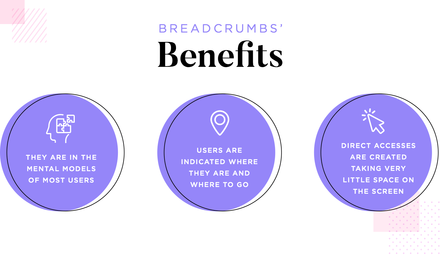
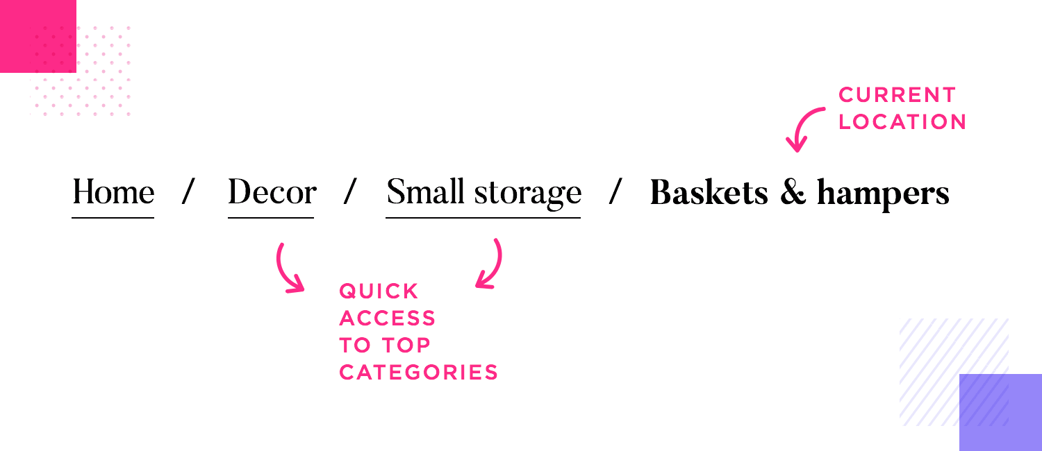
Breadcrumbs can be handy for this purpose, as they allow users to jump to larger categories and higher level pages in a single click. One of the big wins about this tactic is that by using breadcrumbs we create shortcuts that take up very little screen space, avoiding the cluttered feel.
Even though breadcrumbs tend to help usability, they’re not exactly a one-size-fits-all kind of feature. In truth, not all products will benefit from this secondary navigation scheme. So what makes a website breadcrumb-worthy?
The difference between products that could use breadcrumbs from the ones that don’t lies in their size and the type of content they hold.
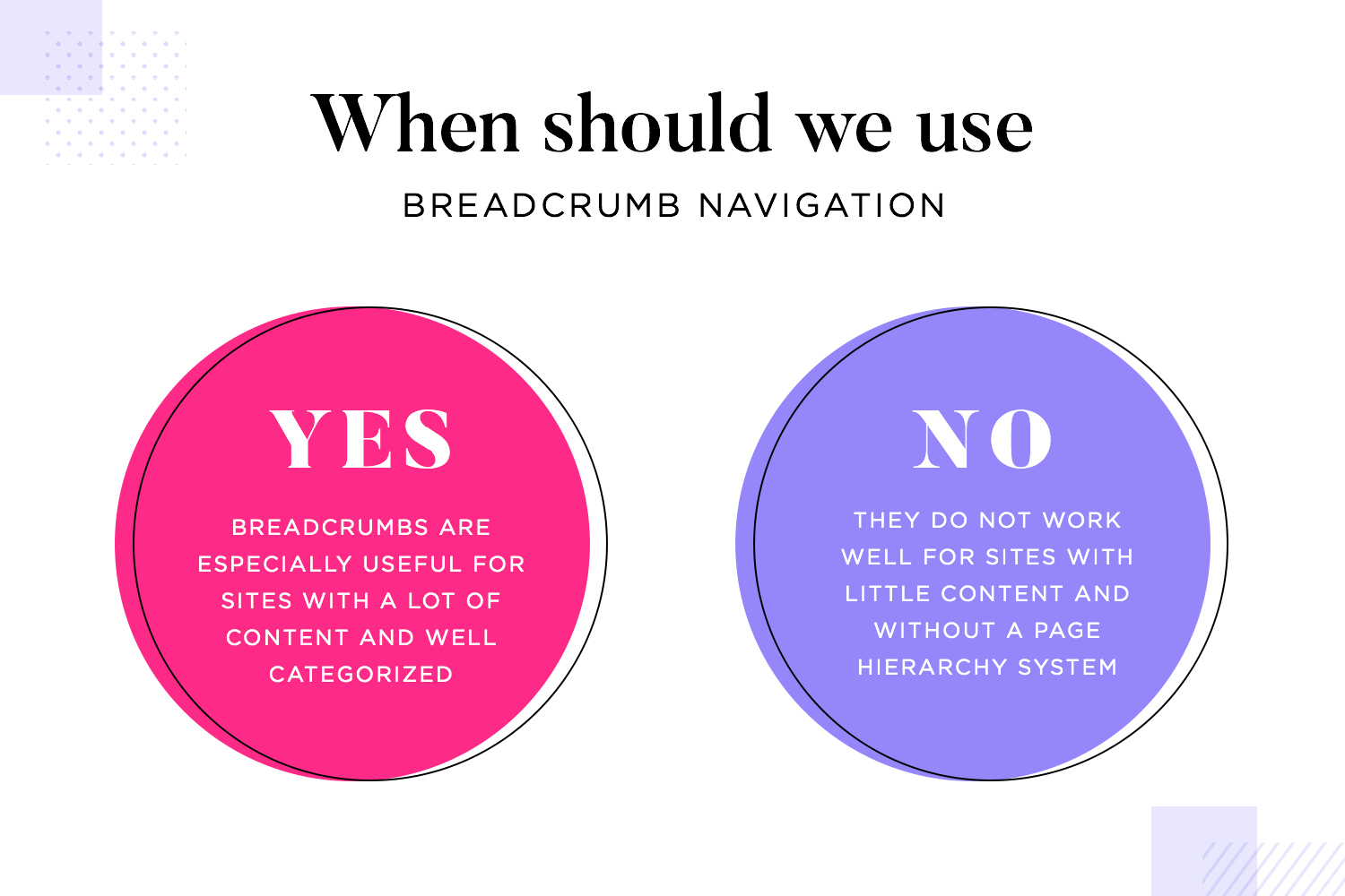
The type of websites that benefit the most from this navigation scheme are websites that have lots of content. It’s particularly good if that vast content is neatly organized into categories, so that the breadcrumb navigation is more straightforward for users.
Ecommerce platforms such as Amazon or regular retailers such as Asos, both use breadcrumbs. Both these websites have a wide array of items that fall into hierarchical categorization. For users, that means that they can jump to the high level categories with a single click, rather than going back with the browser and then finding the category link they want.
The reason why having categorization helps users is because it’s a logical sequence of going from the big pages (high level) to smaller ones (such as a product page).
On the other hand, websites that don’t benefit from breadcrumb navigation are those that don’t have too much content or don’t enjoy a hierarchical system of pages. That is, single-level websites shouldn’t have breadcrumbs because they have no logical grouping, no logical hierarchy.
Major tip: The thing with defining what products could use breadcrumbs from those that don’t need them is this: if it doesn’t add value, don’t include it.
If the design team decides to push forward with breadcrumbs in a single-level website, the links in the breadcrumbs won’t have a logical order. This will surely result in confused users who won’t understand the order the links are in. This will effectively damage your carefully planned navigation design and throw users off as they try to locate themselves within the product.
This is the most common type of breadcrumb, referring to the classic sense of reflecting the information hierarchy. By using location-based breadcrumbs, we offer users a view into which level of the product they are in.
These are a powerful tool if the product has more than two levels, as well as being very supportive for users who arrive into the website at lower level pages. This is a useful way to offer navigation to complex websites, such as support platforms that have a lot of content.
It can be slightly difficult to tell the difference between location and attribute-based breadcrumb navigation. The key difference is that while location-based breadcrumbs will show only levels of pages within the product, attribute-based will show categories that are increasingly broader.
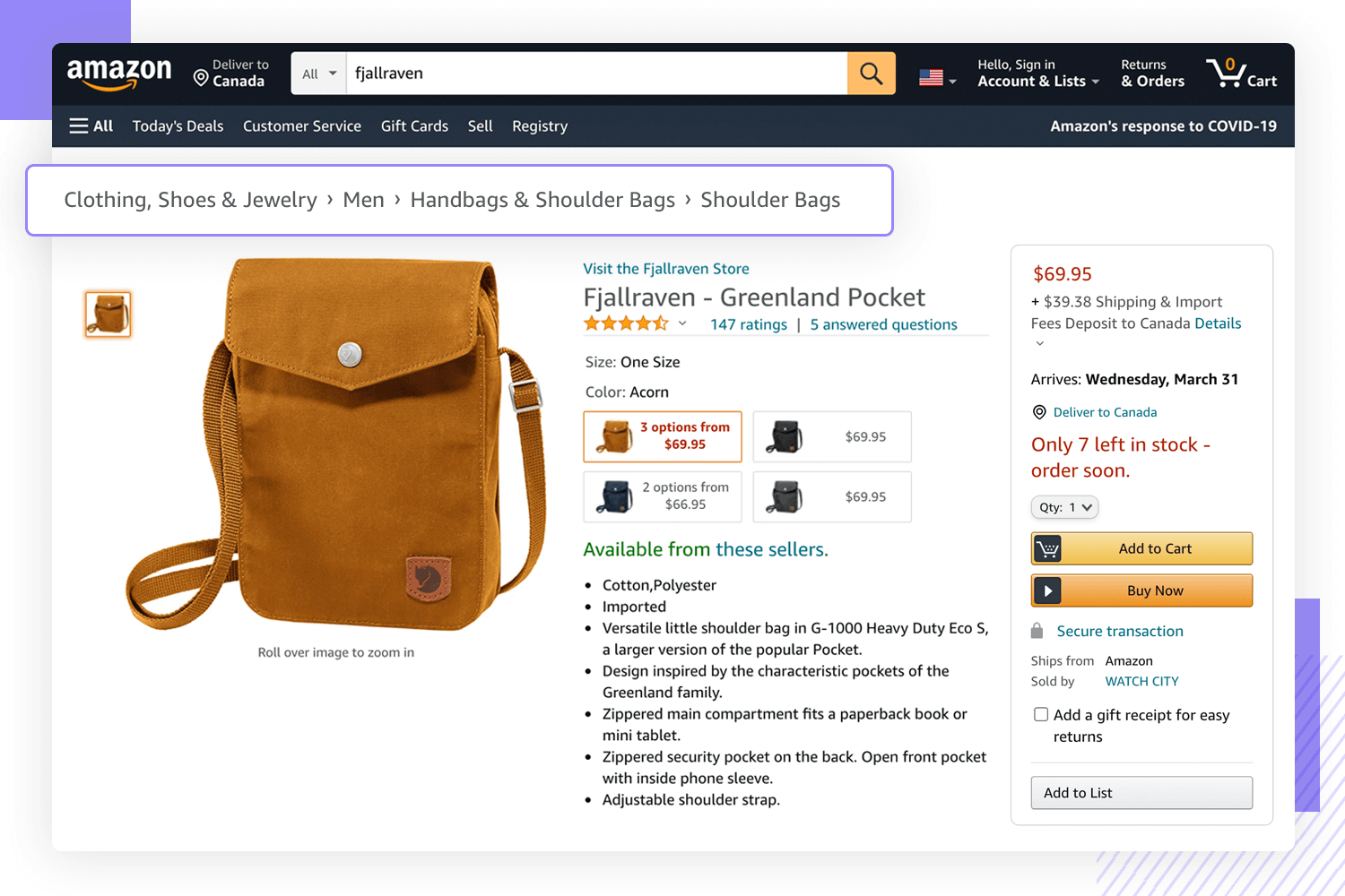
Big names of ecommerce use this kind of navigation scheme such as Amazon and Best Buy, and it’s not tough to see why. It makes exploring products much easier.
One of the great things about using this type of navigation scheme in ecommerce websites is that users can go up one category to explore the same type of product. For example, a person looking at a specific Bluetooth keyboard at Amazon can go to the listings of all available Bluetooth keyboards in a click.
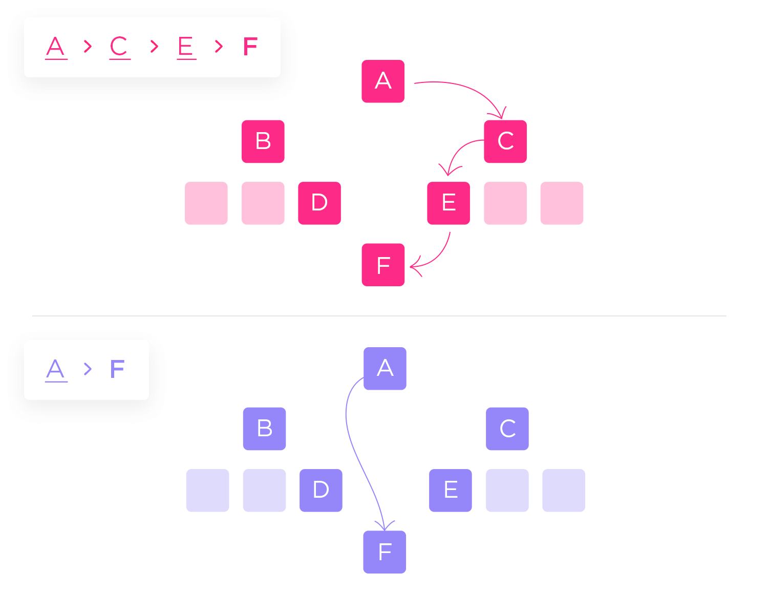
Curiously enough, path-based breadcrumb website navigation is the only type of this navigation scheme that does what Hansel and Gretel wanted in their tale. With this kind of navigation, we don’t consider levels or any type of category but rather the actual steps users have taken.
That means that the navigation scheme is fluid, and shows each user their own path. This kind of breadcrumb website navigation is the source of much debate in the UX design industry, however. The issue mainly arises from the fact that using path-based navigation can have very limited benefits.
From Oracle.
For example, users may be confused when seeing two different navigation schemes after arriving at the same page twice, using different paths. Another issue is that this scheme would mainly mimic the “Back” button of the browser itself, offering little added value.
On top of all that, there’s the separate issue that users landing directly on any page from a Google search won’t have breadcrumbs at all.
While this kind of navigation scheme can be very helpful to users, it’s not meant to act as an entire navigation solution for the product. It’s supposed to be an added bonus – a convenience feature. Trying to make your breadcrumb website navigation the primary means of moving around the product is problematic, to say the least.
Navigation design is a complex topic. You need to check a lot of boxes to offer users a truly usable product, which cannot be accomplished without some important navigation feature like a hamburger menu or a navigation bar.
As a secondary navigation scheme, it’s only logical that your breadcrumb navigation shouldn’t take up too much screen space or take away from the navigation bar. In other words: it should never be the focal point. You want it to be small, but visible. Most users are used to having breadcrumbs under the main navigation bar.
In short: You want the breadcrumbs to have a supporting role in the page design, with the primary navigation in the starring role. Make it discreet, but make sure it’s easy to spot.
You also want to mind the small details, such as choice of font and the space you allow between the links. You want to leave enough space between the links, so that users can easily perceive them as being several parts of the same element. Feel free to brush up on your Gestalt theory skills if you want to get this truly right.
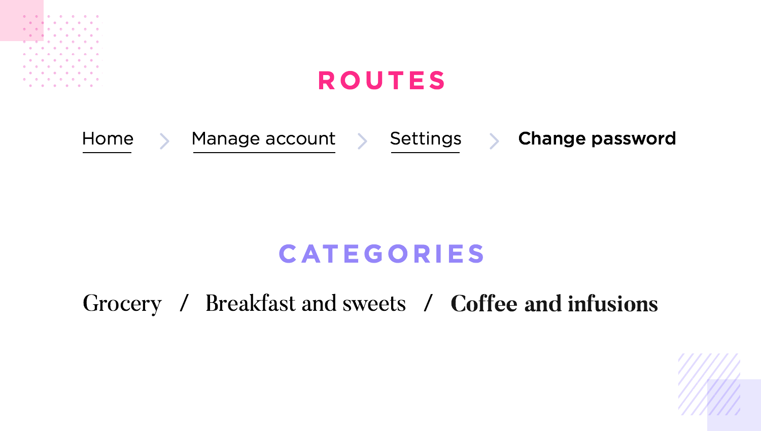
The separator element is also important, even if it is straightforward. Among the symbols that are most commonly used we can find slashes (/), arrows, and the greater than symbol.
Out of those, the only thing worth nothing is that the greater than symbol “>” implies hierarchy. Be mindful that if you’re using path-based breadcrumb navigation, for example, using this symbol can be misleading to users. Seeing an “About > Home”, for example, is possible for users who get to the About page straight from Google.
Smart design can very well kill two birds with one stone – having one feature accomplish two goals can be a great way to push usability levels up while avoiding clutter and confusion. When we use breadcrumb navigation to represent a process that has more than one step, they have the same function as a progress bar.
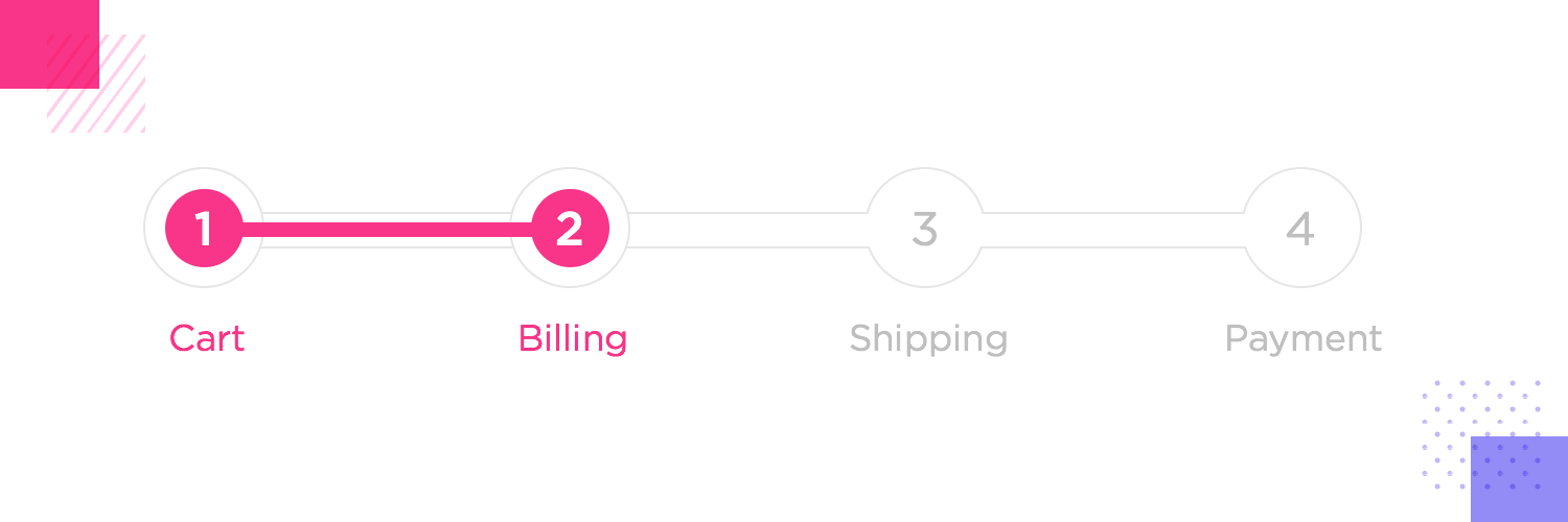
While they may not be a progress bar in the classic sense of the term, these breadcrumbs will work as a progress indicator that will help users see the light at the end of the tunnel.
Breadcrumbs work great because they are so easily recognizable. They are always a horizontal line with links that follow a logical order.
This familiarity and simplicity of breadcrumbs can be lost when the links need to be wrapped into more than a single line. By wrapping the links, we take the risk of making the page look cluttered. This is even more the case with mobile screens, where stacking lines of links takes up crucial space.
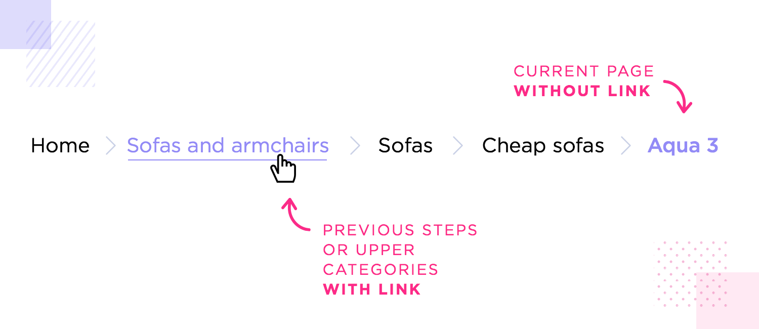
This may not be obvious to beginners. One of the strongest benefits of using breadcrumb navigation is that it helps users understand where they are within the entire website. Think of the breadcrumbs as a type of map around the product – including the current page is like adding a “you’re here” mark. It helps users grasp the context between the breadcrumbs.
With that said, it’d be a mistake to make that last breadcrumb a link. Users will only see it when they are already on that page, making it redundant to have a link there. This implies that you need to include a visual distinction between the clickable breadcrumbs and the last static one.
Yes, mobile design can be a delicate thing in general. It’s particularly the case with breadcrumb navigation, however, because there is still a lot of debate surrounding it. Should we include breadcrumbs in mobile design? Do they offer an improvement to the usability?
As it turns out, you can make an argument for both sides of this breadstick.
Some say that including breadcrumbs is not necessary, as mobile products shouldn’t need this additional means of navigation, to begin with. Another argument against using breadcrumbs is that for them to have a reasonable size, they’d take up screen space that would be better used for some other feature.
Original from Jeff Jimerson.
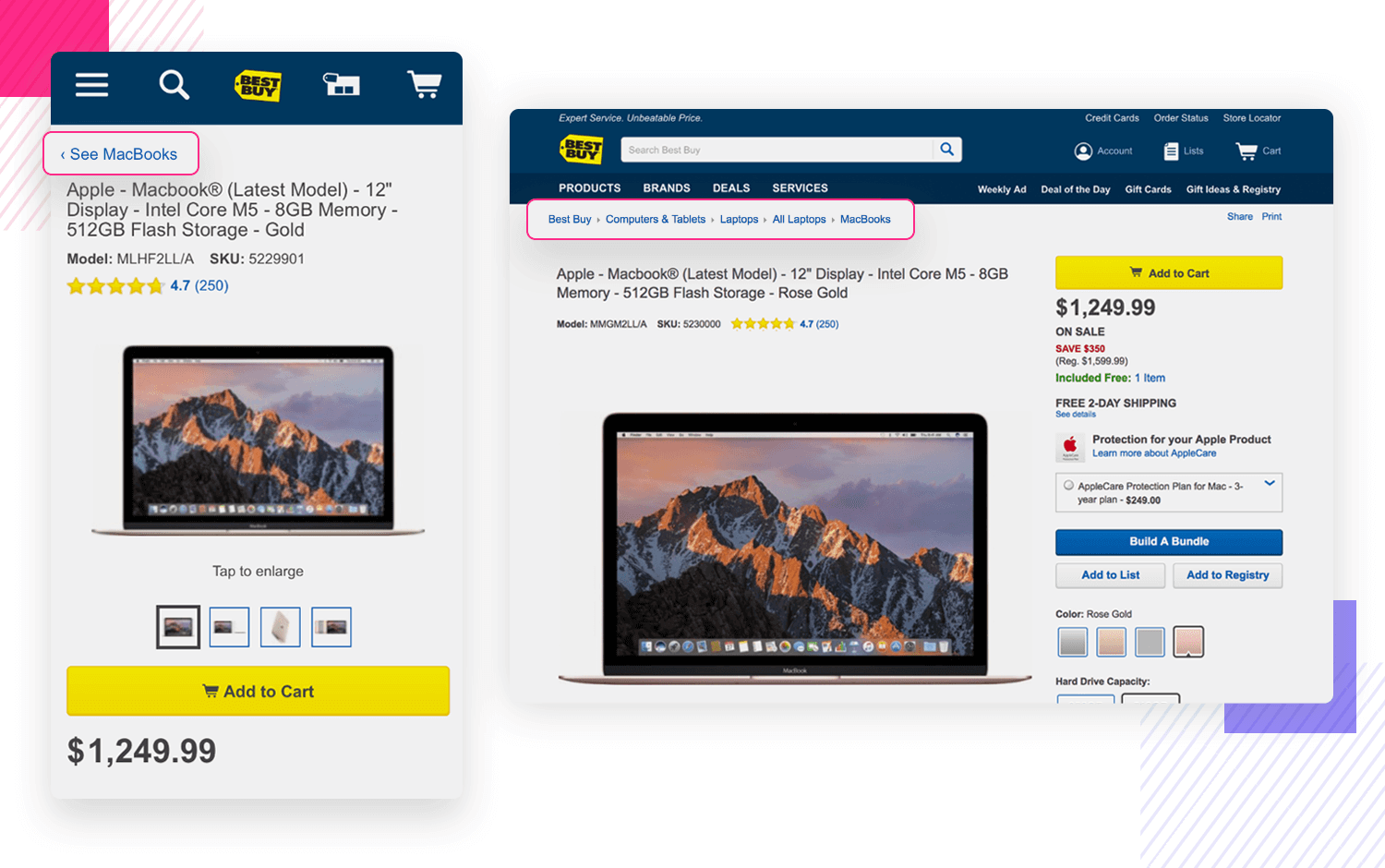
The defense for breadcrumbs in mobile devices is that they don’t have to take up too much space.
In fact, they don’t even have to show the entire path to where the user is, or all the categories. In this case, instead of showing the evolution of categories from the homepage all the way to Bluetooth keyboards, the page would show only a link to general blue tooth keyboards. That way, if the user landed on this page directly, they could still go to the higher level category.
If you want to know more about the practical aspects of creating a responsive mobile navigation design, check out this tutorial on how to create a responsive website prototype. The whole thing takes less than 10 minutes.
Here is a quick series of cases where breadcrumb navigation was implemented successfully. This goes to show that when used correctly, having breadcrumbs can truly add value to the user experience.
It’s not often that we can point to government-owned platforms with praise for the design. In this case, the State of Oregon got their breadcrumb navigation right by the use of clear visuals and great visual hierarchy. The website keeps things simple but it checks all the right boxes!

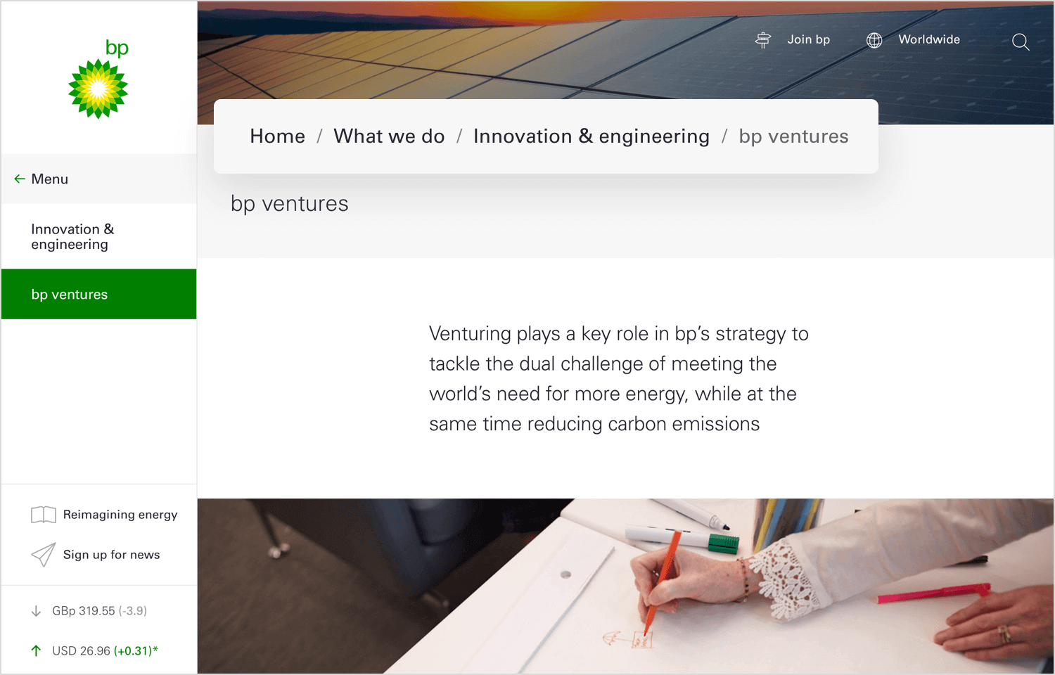
Regardless of how you feel about BP, there’s no denying that their use of breadcrumb navigation works. The website itself is all about negative space, strategic use of color and great layout. The website makes great use of space, with the breadcrumb navigation fitting in perfectly. We love that BP was careful to create a visual distinction between the last breadcrumb and the others, helping users see what they can click on or not.
Another great use of breadcrumb navigation. Lonely Planet uses a bright blue color and symbols between breadcrumbs that imply a hierarchy among the pages. It’s a classic use of breadcrumb navigation.

Here, we can see a more interactive type of breadcrumb navigation on Adidas’ website. Each breadcrumb responds to the mouse, changing states. This adds a level of interactivity to the general design, as well as making for a creative and memorable breadcrumb navigation scheme!

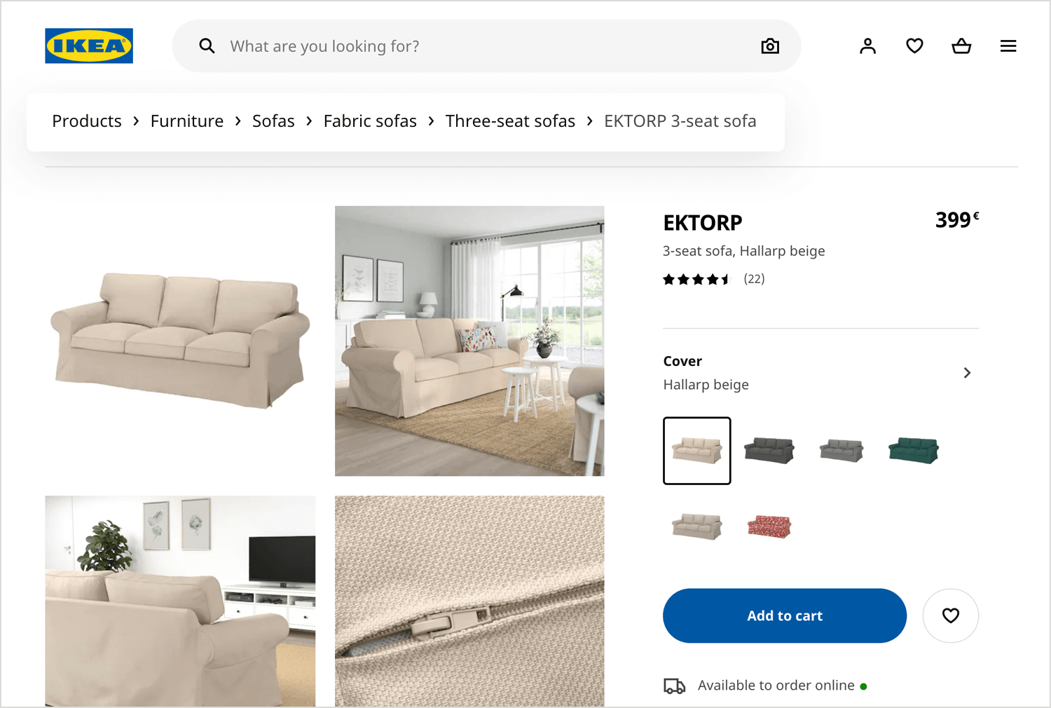
IKEA takes a more controlled approach to breadcrumbs. The individual breadcrumbs have a more discreet use of color, as opposed to Lonely Planet’s choice of eye-grabbing blue. Using very small symbols that showcase the hierarchy of the products. Much like Amazon, IKEA uses the breadcrumb navigation to encourage users to go back to bigger categories and explore new item options.
At the end of the day, breadcrumbs alone won’t make or break your product in the same way your primary navigation would. With that said, having a secondary navigation scheme can add true value to the product.
Good UX design is all about getting the details right for your users, and breadcrumbs can make a real difference in the entire experience. If you’re currently managing or creating a product that has a lot of pages and content, do consider adding breadcrumb navigation. Your users shall never resemble confused John Travolta!
