What’s the secret to designing expert e-learning platforms and online learning systems? Interactive prototyping with Justinmind
E-learning platforms and online learning systems (LMS) like Coursera, Lynda and Looop have become a staple of our digital lives. And it’s not just students or hobbyists who use app or desktop online learning platforms. Increasingly, companies both large and small are using e-learning platforms to boost work productivity and lower employee churn.
Create your own e-learning platform within a few moments.
All you need is the right tool.
Why? Could have something to do with Millennials. With the number of tech-savvy millennials in the workforce on the up, companies need to work harder than ever to attract and retain great talent and increase growth. Online learning is key to employee satisfaction as it helps onboard new hires, plus provide continuous training and support for individuals and teams. In fact, 69% of employees are more likely to stay put if their company offers an onboarding experience such as an online learning system, according to Click Boarding.
But what are the UI design principles behind professional-grade e-learning platforms? How you design your e-learning platform will directly impact the learning experience. When done right, you can create an opportunity for deeper learning with technology.
With an interactive prototyping tool like Justinmind, you can create meaningful e-learning resources and test them out on real users before code. Follow our instructional design tips on how to prototype a high-fidelity e-learning platform to create an optimal user experience for employees.
What is an e-learning platform?
E-learning is an online resource that enables learning and improves performance, typically in educational and corporate environments to inform and engage learners. An e-learning platform can usually be found in the main navigation of an organization’s website or internal intranet.
E-learning tools are primarily used to develop cognitive skills through interactive activities, but also interpersonal skills through role-playing and feedback. They typically complement conventional training in order to reach as many learners as possible.
Online learning is split into self-paced, non-facilitated and instructor-led, facilitated resources. Both include interactive e-lessons within a virtual classroom, electronic simulations and job aids. But whilst self-paced e-learning allows learners to progress based on their individual needs, facilitated e-learning is led by an e-tutor or instructor and is typically synchronous to allow for real-time interaction – though self-paced e-learning may also offer to track learner activity in a central database.
Bonus: check out our list of awesome research survey examples for some serious form design inspiration.
Why design an online learning platform?
“E-learning can offer effective instructional methods, such as practising with associated feedback, combining collaboration activities with self-paced study, personalizing learning paths based on learners’ needs and using simulation and games.” FAO
Online learning has many benefits, including:
- Reduces the time and resources needed for in-house training
- Gamifies the orientation process (learning about safety & quality, company targets etc.) can improve the new hire onboarding experience and reduce employee churn
- Reaches a wider audience than the traditional training and orientation processes
- Encourages team collaboration and facilitates real-time communication and participation, especially when workforce is distributed across a country or continent
- Improves knowledge sharing for techniques and tools
- Boosts productivity by allowing learners to progress at their own pace – fast learners may complete training sooner and those who need more time aren’t rushed
Prototyping an e-learning platform
Before you get started, you need to know what kind of online learning platform to prototype. This depends on the type of content your learners will interact with, and how they will interact with it.
For instance, will learners be accessing information on their desktop computers or on their mobile devices? If so, you’ll need to design responsively. Will they have internet access in order to connect to a cloud-based platform? Will they be working in a self-paced e-learning environment where data is collected and organized centrally?
To determine the requirements of your platform, what knowledge gaps it needs to fill and who your target audience is, perform a round of user research.
Side note: feel free to check out our post on prototyping methodologies and discover other ways to transform your e-learning platform idea into a real-life project.
Wireframing the layout of your e-learning platform
Your platform should be designed around the high-level learning objectives mapped out in the user research stage. Once you’ve identified your objectives, you can start to sketch out the main layout of your e-learning space. It might follow an order such as the following:
- Login screen
- Homepage, with links to the following:
- My Profile
- Courses, with links to the following:
- Getting Started
- My Courses
- Tips and Practices
- Evaluation
- Get involved (user forum)
- FAQs
Designing your e-learning login experience with Justinmind
Users need to be able to access your e-learning platform. It’s time to create your login experience.
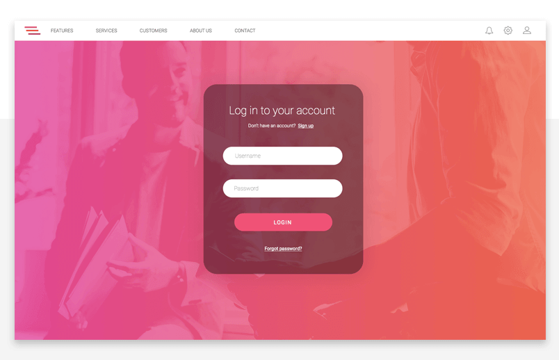
In Justinmind, create a new web prototype with our website prototyping tool. You can customize the height and width of your prototype when you’ve selected the type of template you’ll be using, or stick to the predefined specs (1024 x 768 pixels).
The blank canvas you see in front of you is where you’ll create your login screen. Keep things simple – no noise, no clutter. Remember, people are here to learn. To make your login experience snappy, just stick to the essentials. Use input text fields to create the username and password fields. Then, the placeholder option in the Properties tab to create meaningful labels that will guide users through the process.
With Justinmind, you can create error messages for when the user needs to correct information in order to log in. You can also enable the user to tab between input fields. To make your login process interactive, you’ll need to add events and conditions.
Need more login inspiration? Check out our favorite login forms.
Prototyping your e-learning homepage
Your e-learning homepage is arguably the most important section of your e-learning platform – the area where your users will navigate to and from between tutorials and knowledge bursts. Design it well, and you’re on your way to creating a delightful learning user experience.
Choosing the right navigation pattern
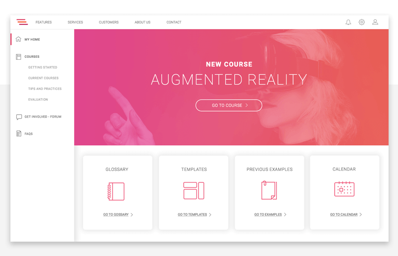
The most important component of your homepage is your navigation flow. Navigation should be coherent and user-friendly.
In our example, we use Justinmind’s text table widget to a vertical drop down menu. This is a great way to present and distributed large amounts of content visually without overwhelming the user. To reproduce our example, create a new screen in the Screens tab and label it ‘Home’. Then, drag the text table widget to the canvas and change the number of columns and rows in the Properties tab in accordance with the number of main menu options you wish to display in your e-learning platform.
Use another text table if your main menu options have multiple targets (in our example, the Courses section is divided up into Getting Started, My Courses, Tips and Practices and Evaluation). Finally, add a new screen for each menu target.
When your layout is all set up, it’s time to add events. The main function of your navigation flow relies on linking screens together. To connect two screens, simply drag the UI element (in this case, the relevant cell within the text table) to the screen that it corresponds to.
You make also want to add ‘Change Style’ events to make your navigation menu more coherent. For instance, you could change the color of the cell when a user clicks on it, to offer some visual feedback.
Prototyping the e-learning platform’s UI design
We’ve kept things clean-cut with a large hero image, links to the main sections of our platform. Customize your homepage UI as you like – but make sure you focus on usability and accessibility. Our homepage includes a slideshow, a single Call To Action (CTA) and cards designed using Justinmind’s expandable and collapsible grid feature.
Adding media and interactive elements to your e-learning platform
When onboarding new users, you want to make it easy for them to discover the features and sections of your website or app. It’s the same with onboarding/training new hires with e-learning tools. A great way to keep learners keen and engaged is by making your resources interactive.
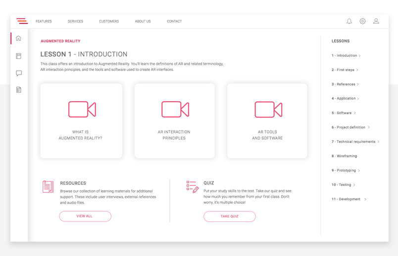
Luckily, Justinmind makes it really easy to create engaging web content perfect for an online learning space. You can embed videos and HTML content for visual learning, create loading animations using variables to communicate to users when things are taking longer than expected or that their request has been acknowledged, and you can even create interactive forms with check boxes and radio buttons – perfect for new hires who need to take quizzes or fill in details during orientation.
In one of our tutorial pages (see below), we’ve paired a selection of videos with some instructions. Below this, users can click to take a quiz and test themselves on what they’ve learned.
Prototyping an e-learning platform: the takeaway
Creating a learning website for knowledge sharing and ongoing development of skills and abilities is not the only way to prepare an employee for the work ahead. However, it can boost productivity, engage learners and ultimately improve retention in the workforce.
E-learning is a visual resource that helps improve the onboarding experience as well as provide constant training opportunities. Create your online learning tool with Justinmind and improve employee satisfaction in no time. 
Related Content
 UX design portfolios are your chance to showcase your top skills and best work. Check out this post for awesome portfolio examples and websites!10 min Read
 Learn what paper prototypes are, how to make them and how they can help you design better products. Awesome examples and free templates inside!10 min Read
 In this comprehensive study, we dive deep into the world of web design tools, comparing features, pricing, ease of use, and more. Whether you're building a simple landing page or a complex e-commerce store, we've got you covered. Let's explore the best options and help you make an informed decision.30 min Read

