5 ways to optimize your web search patterns with predictive search, visual cues and interactive prototyping
Designing an effective and user-friendly search pattern is key to helping your users get around your site and find the content they need. If your website supports large amounts of information, it is essential that your search pattern helps users quickly locate specific content.
Designing your search pattern with highly visual and interactive prototyping tool, like Justinmind, will help you visualize and validate your design assumption early on. Read on to see how with our 5 search pattern design best practices.
Which web search pattern should you design?
There are many search patterns to choose from. Blue Fountain Media has a great key describing all the different web search patterns available. Here’s a summary:
- Exact search – the simplest yet most widely used pattern. Keyword matching is paired with a stemming algorithm to reduce the number of search results a user receives upon searching.
- Faceted search – this allows users to refine a selection of search data with attributes such as ‘sort by’ and ‘color’. Data is sorted and grouped into tags.
- Parametric search – this presents multiple options using checkboxes, dropdowns and sliders.
- Best first – based on the assumption that the user wants to see the most relevant items first, constructed using a relevance score.
- Linear pagination – this option is used when the search data won’t fit on one page, such as items in an eCommerce site. Variations on this pattern include inline paging and progressive loading.
- Autocomplete/autopopulate/autosuggest – will help the user by either filling in a partial query or suggesting or populating terms after the user has typed an initial amount of characters into the search bar.
Choosing a search pattern really depends on your users’ goals and expectations. Performing user research at the beginning of your web design project will help you choose the appropriate design patterns so that you can provide the best possible user experience.
But deciding on your search pattern is only the beginning. You also need to think about making your search pattern as effective as possible, i.e. how to get the user to their end goal as quickly and comfortably as possible. Here are our five best practices to help you implement search effectively in your web prototypes.
Get up to speed with all things navigation design here.
1— Make your web search pattern noticeable
Search pattern aesthetics
Most web search patterns include a search box. Most users are on the lookout for the search box when they need to find something specific in a content-heavy interface.
Displaying your search box prominently is essential and can be the fastest route to discovery for users. To keep things familiar for the user, stick to a well-known search box style. Use a combination of input fields and submit buttons.
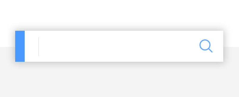
If you’re looking for a minimalist search pattern, use a search bar with a single input field and search icon. Just make sure that you use an icon that will make it easy for the user to find your bar. What you want is the magnifying glass, which boasts universal recognition from users.
Justinmind has a wide selection of UI widgets to help you create the perfect search box or bar. Drag and drop input elements and UI icons and screens including the magnifying glass, check boxes and radio buttons to your prototype and line them up perfectly with our grid system – just like in Photoshop.
Search pattern location
Users have certain expectations when it comes to how they search your website, so make sure that your search features are where they expect to find them. Position you search UI elements according to past behavior and use a heat map tool, such as Crazy Egg, for guidance.
According to A. Dawn Shaikh and Keisi Lenz’s usability study, the search box or bar is expected to be at the top of a website, above all, on the far right.
Placement of other search features, such as filters and search results, should also be accounted for. The number of search results you have will determine how you should display them. If you only have a few, a grid system with large images might be an idea – here’s a tutorial on how to create an expandable and collapsible grid with Justinmind. If you have lots, consider pagination or list, using Justinmind’s data list feature.
Check out our tutorial on how to prototype a chatbot.
2— Give feedback in your search pattern through visual cues
Your search pattern should help the user find what they are looking for as quickly as possible. Using visual cues will help users scan your content – search and search results alike.
Adding placeholders to your search box can serve as helpful hints to user about what information is needed. But keep those placeholders short! Our short term memory is shorter than you might think. Including a simple ‘Search’ label can make a big difference to a user’s search experience. With Justinmind, you can easily add placeholders to your input fields.
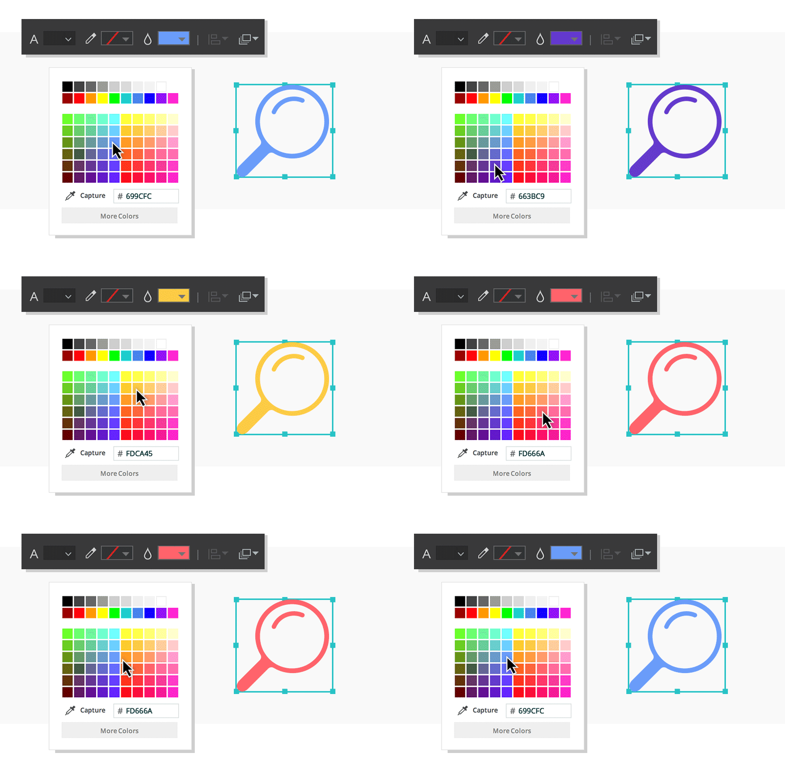
When it comes to your search results, put important information in a different color. If you’re designing an eCommerce site, you might highlight items currently in stock or only available in-store with contrasting colors. With Justinmind, it’s really easy to change the color of different UI elements using SVG vectors.
3— Opt for search functionality that favors the user
Usability is critical to your search pattern. If your users can’t work it, they won’t get any further than your homepage.
When it comes to your main search feature – the search box or bar – consider using an actual search button. Whilst younger users are accustomed to hitting ‘enter’ to realize their search query, it might not be so instinctive for others.
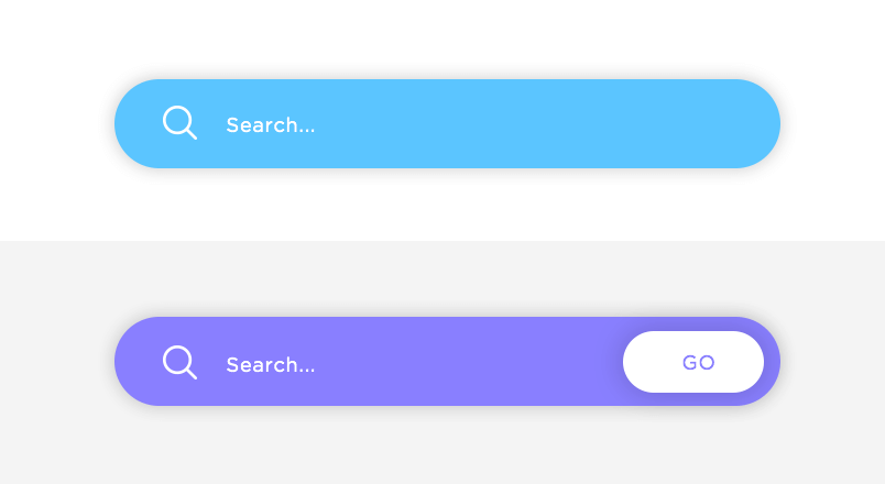
Having a button that users can see and interact with will ensure that their search query is executed.
User testing to see who your main audience is will help you create a search pattern relevant to their needs. Justinmind is integrated with all the major usability and user testing tools, including UserTesting, UserZoom and Loop11. You can link your prototypes directly to these sites to get your user tests off the ground in no time.
4— Guide your users through your web search pattern
Often users don’t know what to search. They know what they are looking for, but don’t know how to go about retrieving that content. That’s why your job as designer is to guide them through your search pattern.
Helping users to construct a search query will not only make their task quicker, but it may save them some frustrating moments. There are a few ways to do this, one of which is predictive search. Predictive search uses the initial characters the user enters to predict what their query is going to be with options in a dropdown list. Here’s an example of the predictive Google search feature:
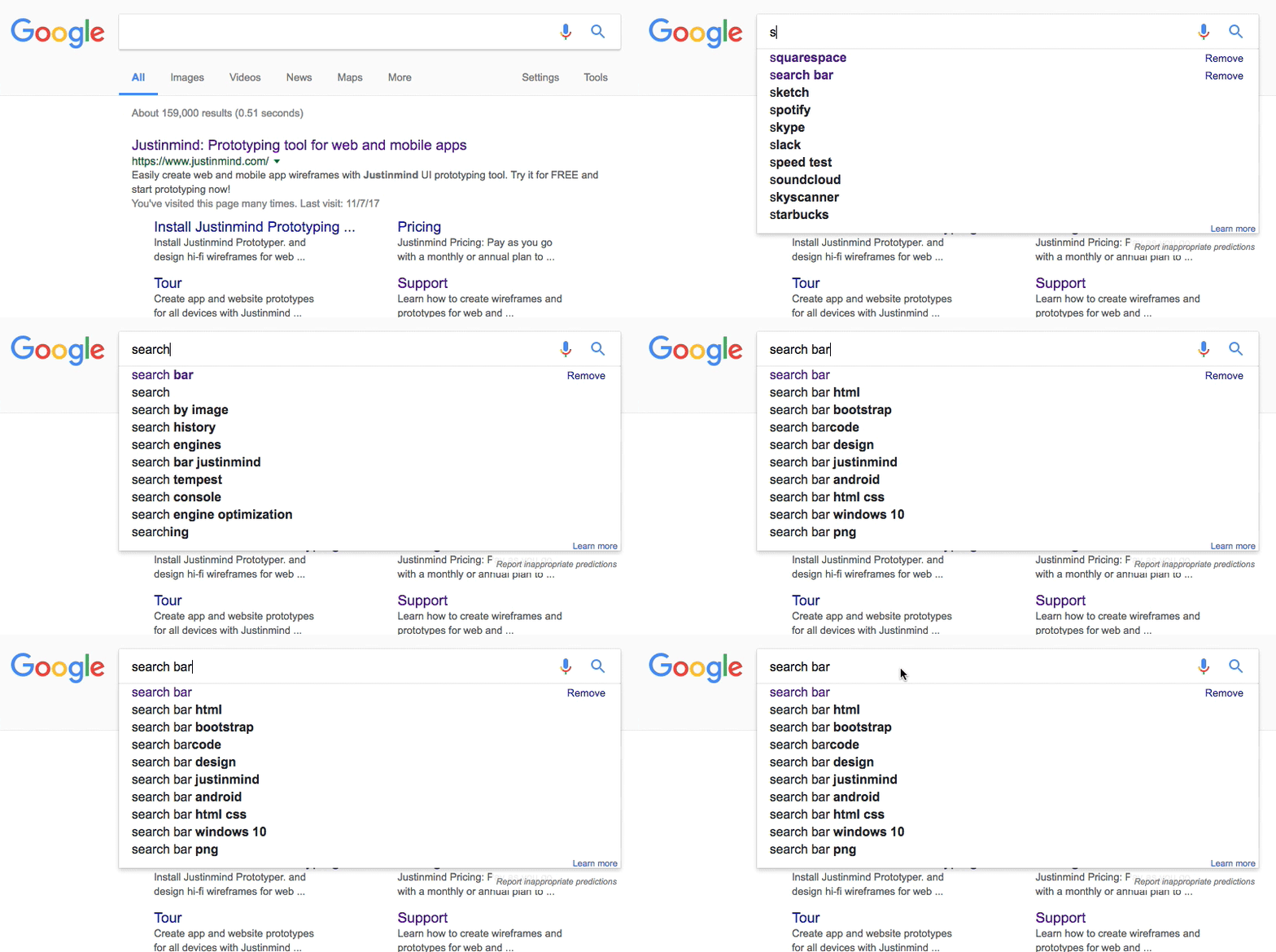
You can create a real-time predictive search with Justinmind. Using our data-driven prototyping features, you can trigger a search based on the user’s initial search query.
5— Save your users time with search filters
The search experience can be overwhelming for users. When search queries come back as irrelevant or the system can’t process so many results at once, users may feel somewhat defeated. Sorting or narrowing data down can help the user put order into their search and make the experience more enjoyable. This is where filtering and sorting features come in handy.
Remember, sorting and filtering are different concepts. Sorting only rearranges the results according to the selected preferences such as, ‘Price – low to high’ or ‘Most relevant’. In contrast, filtering data is more powerful as it allow the user to limit the number of results and reduce clutter. For instance, common filters found in ecommerce sites include maximum/minimum price, brand, size and color.
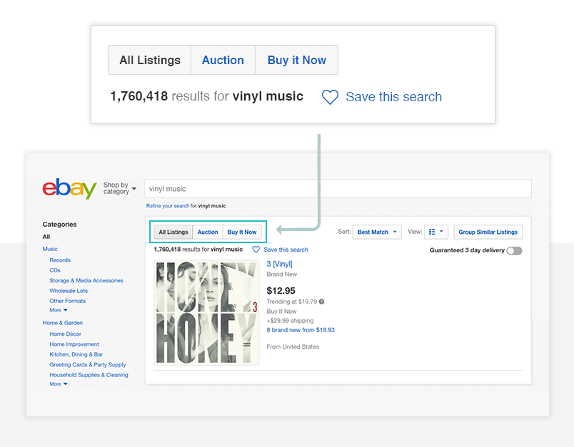
There are lots of ways create search filters in your web prototypes with Justinmind. You can create searchable lists, check boxes and radio buttons, sliders and dropdown selections. You could also divide data into tabs, like eBay’s easy filtering tabs.
Best practices for designing your search pattern: the next step
So there you have it! 5 search pattern best practices. Now it’s time to get prototyping. No matter how great your pattern looks on paper, translating it to a visual and interactive prototype is the only way to visualize your ideas in context and test out your design patterns.
Justinmind is a leading wireframing and prototyping tool. Its visual and interactive features will help you design amazing search patterns. Download it now and see for yourself!
Related Content
 UX design portfolios are your chance to showcase your top skills and best work. Check out this post for awesome portfolio examples and websites!10 min Read
 Learn what paper prototypes are, how to make them and how they can help you design better products. Awesome examples and free templates inside!10 min Read
 In this comprehensive study, we dive deep into the world of web design tools, comparing features, pricing, ease of use, and more. Whether you're building a simple landing page or a complex e-commerce store, we've got you covered. Let's explore the best options and help you make an informed decision.30 min Read


