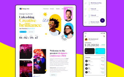
Web design has come a long way in the past 20+ years.
Memorable UI design elements from 1990s websites include text documents strung together by inline links, background images sliced up into tables, and flash animation splash pages. Flash forward to the early 2000s and CSS comes to life along with JavaScript for page layouts. Now in the 2010s, prominent design features include the mobile web, minimalist navigation systems and smart technologies.
Start designing new websites today. Enjoy unlimited projects.

So what’s been the biggest change of all? They’re finally designed for the user. UX principles help make sure that our websites are accessible and a delight to interact with, right off the bat with website wireframes.
But as we all know, it wasn’t always like that. With that in mind, let’s journey back to a time before user-centered design principles, the Nielsen Norman Group and Justinmind’s awesome wireframe tool. In our post, we take a look 10 of the worst websites of the 1990s ever to be designed. Cue the laughter!
Penny Juice is a fruit juice concentrate for kids.
Although the Penny Juice website has since been updated, we’re looking at the site circa 1999. On entering the 90s website, visitors are prompted to choose which version of the site they wanted to view: HTML or Flash. If you choose Flash, you’re greeted with a menu and an interactive background with floating clouds, spinning coins and animated words.
If you’re able to reach the Reviews page (we say ‘if’ because the 90s site lacks any real navigation system), this is what you’re met with:
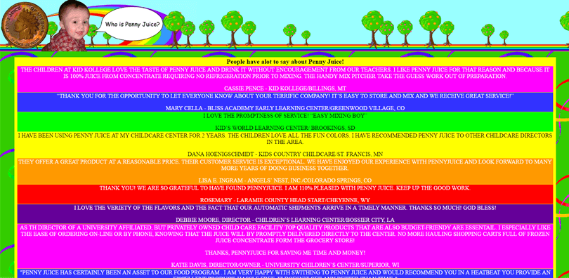
Reviews are split up into garishly-colored blocks of all-capitalized, Times New Roman text. And check out that Comic Sans text bubble in the top right-hand corner. We can feel our Design Lead’s eyes on us as we write.
If you need some information on how to avoid these mistakes in your own design, check out our post on UI wireframes.
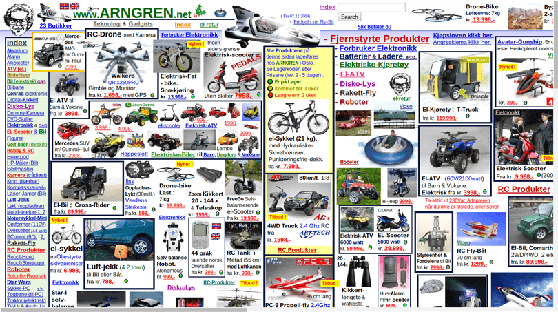
We give you Arngren. The most shocking thing about this 90s website is that it’s still around. Is it catalog, directory or some kind of online store? Who knows?
To anyone looking for something in particular on this site, we salute you. You can browse Arngren’s content by scrolling both vertically and horizontally. But hold on a second. With the thousands of cut-and-pasted low quality images and blue and red hyperlinks, trying to find anything on this site is next to impossible.
Start designing new websites today. Enjoy unlimited projects.

This is Sixties Press*. As James Duval rightly points out, this site looks like it was designed by a six-year-old in 1995. It was actually designed by English author Barry Tebb, whose intention for this 90s website was to promote and sell poetry books. We can’t imagine he sold many.
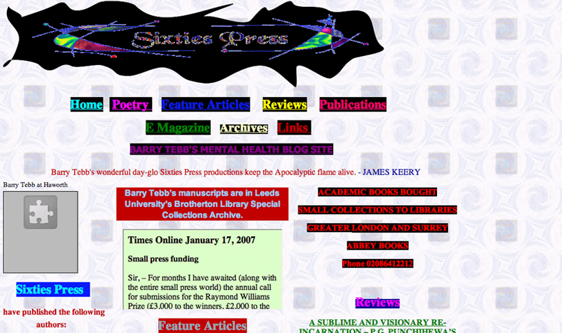
Let’s take a look at the site’s Homepage. The header features a 90s-themed vector set on a questionable, squiggly black shape. The background is no better – a dated two-dimensional symmetrical pattern that looks like it’s been borrowed from a cult culture blog.
Finally, let’s talk about the navigation buttons, all with brightly colored text and again that black background. But who needs buttons when all of the site’s content is displayed on the Homepage?
*This version of Barry’s site is no longer around. And good riddance! Take a look at the new and improved site here.
The Internet 1996 World Exposition is a sort of encyclopedia of Internet history from 1996 for artists, engineers and corporate executives. With a huge amount of subpages, this 90s website is a fount of knowledge.
As for the site’s decor, we’re not convinced. Let’s start with the Game of Thrones-style vertical navigation bars. Whose idea were the duo-tone banners of different lengths? And the same icon for each navigation destination? Rookie mistake.
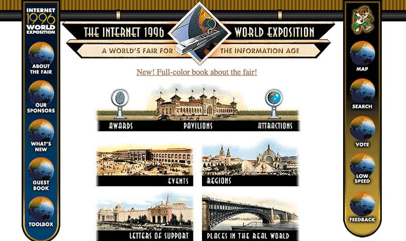
Next up, fonts. You’ll find a mash up of Times New Roman, retro Art-deco and Arial, as well as upper and lower-case.
-1/10 for readability for this 90s site! Learn more about making your site readable here.
Aliweb is considered the world’s oldest search engine. Search for your content via the Search bar or via the categories provided below.
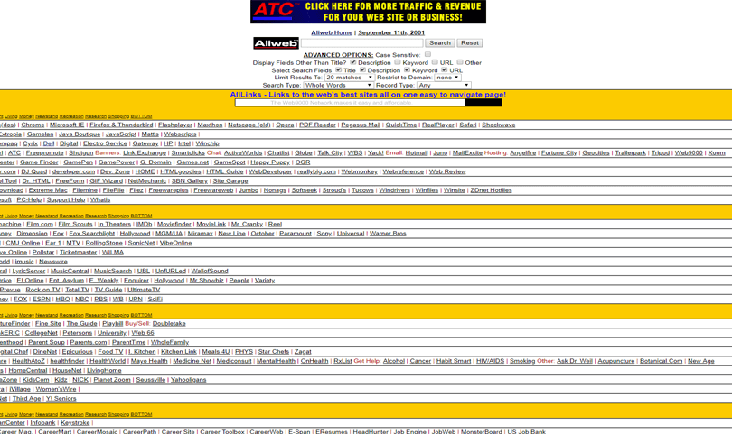
There’s nothing particularly wrong with this 90s website, if you’ve got your magnifying glass handy. Lines and lines of small-text category links are broken up by red vertical bars, set against a garish yellow background – a real treat for the eyes! If only they had read our guide on list UI design…
Aliweb reminds us of the Submit to Reddit screen of the old Reddit site:

Thank goodness for the Reddit redesign right?! This is exactly why today, design teams invest time slowly evolving their designs from low-fidelity prototypes to refined high-fidelity ones. The user experience is carefully tested and validated at every turn.
This is a page taken from the United States Geological Survey website in 1994.
The first thing that catches our eye is the number of red links on-screen. UI designers, if you don’t know how web accessibility design works, it’s time to get educated or go home.
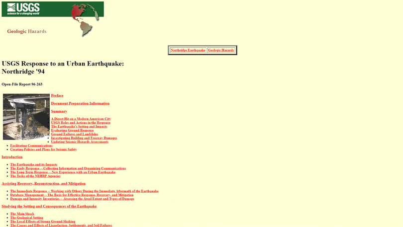
As our own Cassandra Naji reminds us, “usable hyperlinks are the essence of good user experience”. Links need to be instantly recognizable to be readable. For instance, the color red is used for warnings and errors, and should never be used to visualize a navigation link. Blue remains the color with the strongest perceived affordance of clickability.
The UI layout of this 90s website is another usability killer. USGS’ over-zealous use of bulleted links combined with the all left-aligned content (classic 90s single-column text) is making us squirm. Moving on!
Ok folks, we’re onto the big leagues now. Hello Amazon 1995, you beautiful disaster.
Way back before it become the world’s go-to eCommerce site for everything and anything, Amazon was a bookseller with a much more basic approach to web design.

Before the mega menus, interactive carousel and search bar with a drop down, Amazon.com didn’t look much different to any other 90s website. We can’t take our eyes off that hyperlink in italics though – what a specimen! And personal notification service – tell us more!
Also, note the old Amazon logo. It features a snaky, river-like path over a stylized letter “A” on a faux marbled background. This relic was put to bed in 2000, making way for the famous Amazon.com with a curved arrow beneath it.
Start designing new websites today. Enjoy unlimited projects.

In all fairness, the 1997 version of Apple.com doesn’t look all that bad – in fact, it looked decent compared to other websites in the mid-90s. The 1997 Homepage features:
- Clear vertical navigation design, with links and scrollbars
- The date in the top right-hand corner (in case you don’t know what day it is)
- A layout that followed the standard design trends of the era (e-mail newsletter format including important and informative topics in the center of the Homepage and interesting reads on the right sidebar)
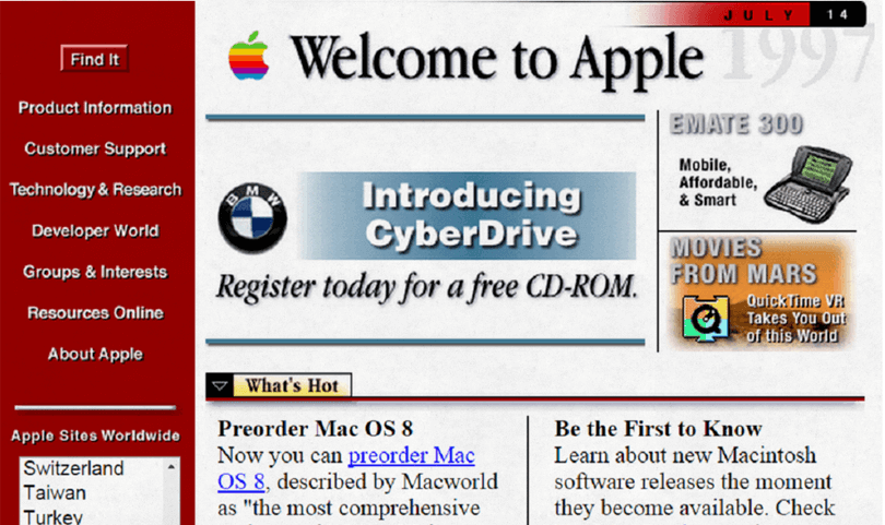
The site is also rocking the old Apple rainbow logo (1976-1998) – which was awesome.
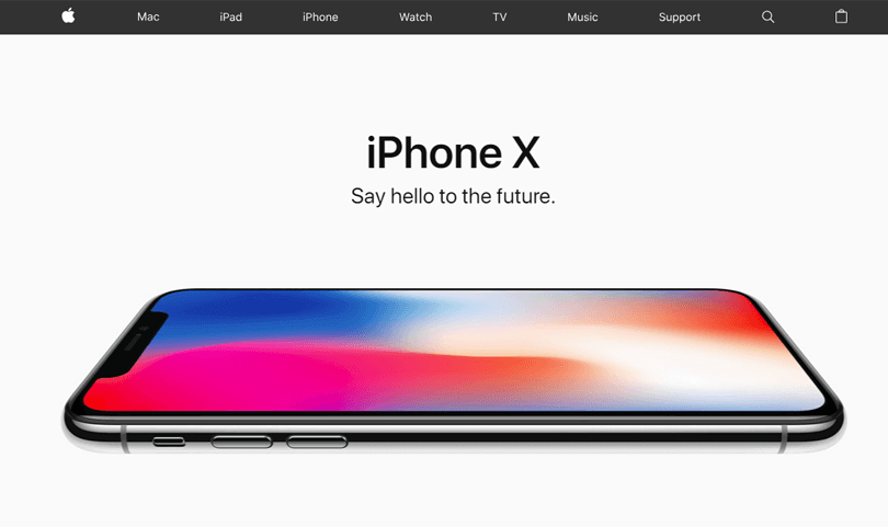
But let’s be clear, the 90s website bears no relation to the modern site. Fast-forward to 2018, and Apple’s site is uncluttered and stunning:
While its crimson background reminds us a little of the KFC food packaging, the 1999 Coca-Cola website is anything but tasty.
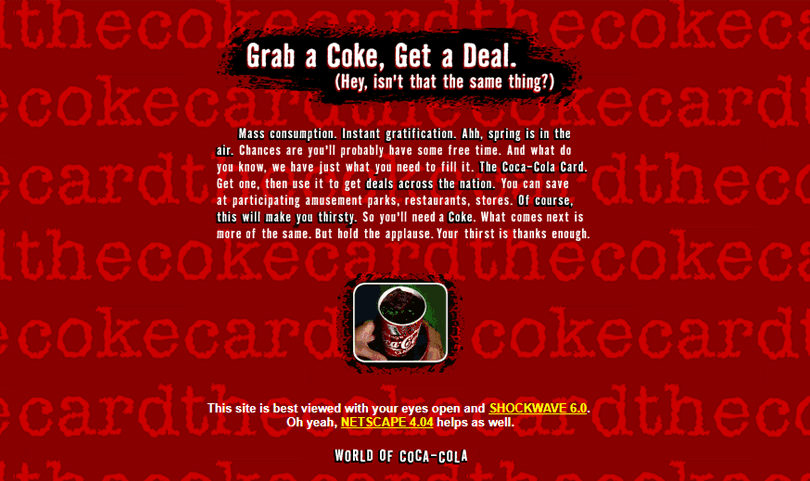
The interactive version of this site is no longer available. But judging by the static version of this 90s website you see before you, you can probably imagine what moving version of this theme would look like.
Also, where’s the logo? A teeny-tiny image of a hand grasping a cup of Coke isn’t exactly what we’d call branding.
Oh well, at least the text is center-aligned!
Last but not least, we have the 1996 Disney site.
We’re drawn to the site’s double bottom navigation system – a must-have navigation system for 90s websites. On the one hand you’ve got your whimsical wave of navigation links. On the other, you’ve got your bottom navigation bar, which looks a little odd with its links displayed in that brown/maroon color.
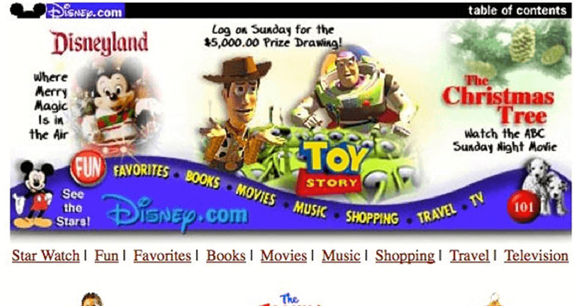
Disney also seems to have gone all out on fonts in the 90s, employing over six different fonts just for the Homepage!
And yes, we are the logo police. Check out poor Mickey Mouse!
These vintage 90s websites are truly awful. But what can we learn from them?
Well, technology is always evolving, and our websites need to reflect those changes. As a designer, you need a well-defined process to redesign a website.
Here’s our two cents on redesigning 90s websites:
- Always run usability tests on your current site before performing redesign. This will help you determine whether the project warrants a full redesign or if a few tweaks here and there will do the trick
- If it’s not already, your website needs to be content-first to provide the best UX. The primary goal of any website it to deliver valuable content to its audience, to help them complete a goal.
- Use a prototyping tool to help you visualize your design and validate your design assumptions with real users.
Justinmind would be our first choice 😉
And if you’re looking to redesign your website, this UXers survival guide to website redesign post should be your next read. Good luck to you!
PROTOTYPE · COMMUNICATE · VALIDATE
ALL-IN-ONE PROTOTYPING TOOL FOR WEB AND MOBILE APPS
Related Content
 Crafting landing pages that convert doesn't have to be tough. Here’s our snapshot of 30 landing page examples with awesome UX that nailed it!12 min Read
 How important are lists in UI design? How much do they affect usability and what’s the best way to design them? In this guide, we'll explore the elements that make up a great list UI design and look at some inspiring examples!15 min Read
 UI design examples that bring some serious inspiration. From parallex scrolling to delicate animations - this list has it all to get you inspired!8 min Read


