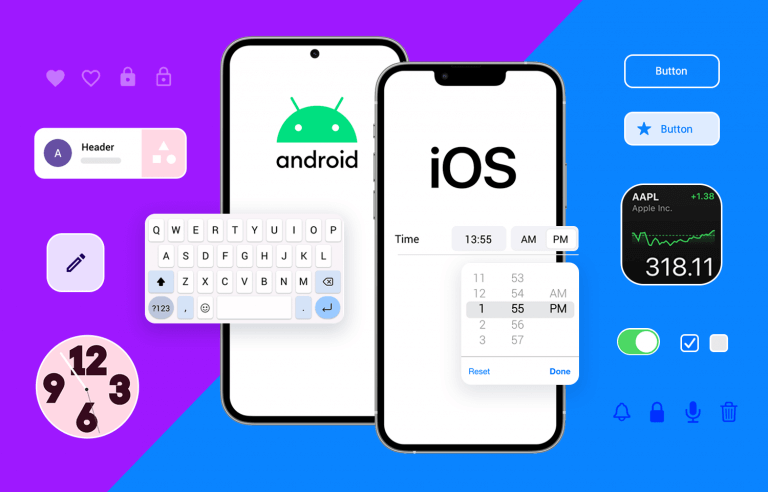
From iPhone 13 and Samsung Galaxy S22 templates to updated UI kits for both Android and iOS, the new version is all about keeping up with the times
The new Justinmind 9.8 is here and it’s all about giving you the latest device templates so you can design realistic mobile app simulations. This means that all the hottest mobile and tablet devices have been added to Justinmind and bring their native behavior to the table.
Try free Justinmind 9.8!Start designing and prototyping mobile apps
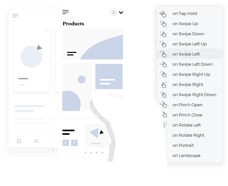
But the news doesn’t stop there! Justinminds UI design tool also brings you updated UI component libraries for both Android and iOS. Thus, giving you all the tools you need for a cutting-edge app design! Let’s take a closer look.
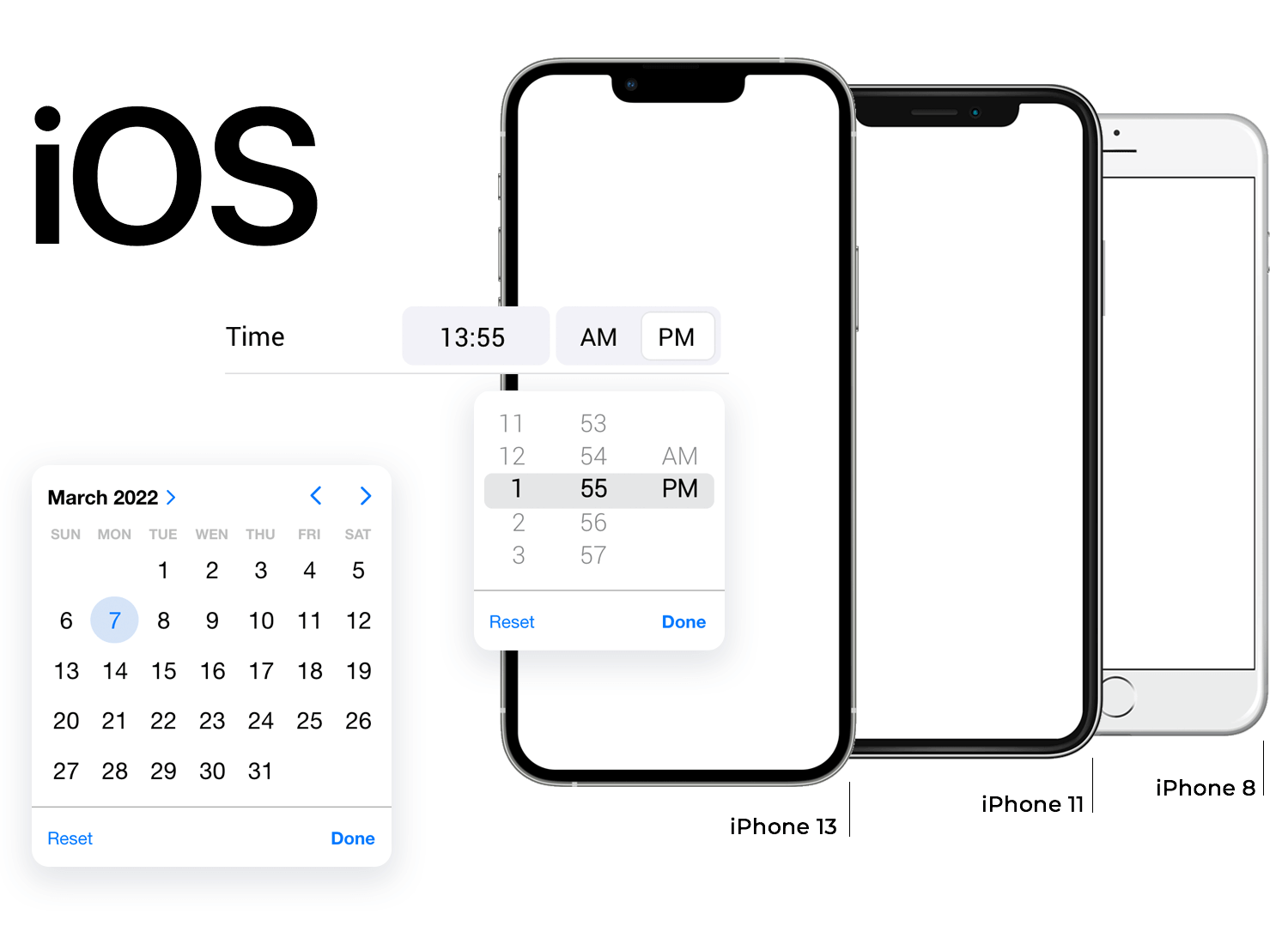
In the new version, Justinmind brings you updated devices to choose from in your next project. In the case of iPhones, for example, we’ve added the iPhone 13 in all its variations as well as the 11. In case you’re looking to design an app for a previous version of this type of device, you can still choose to use the iPhone 8.
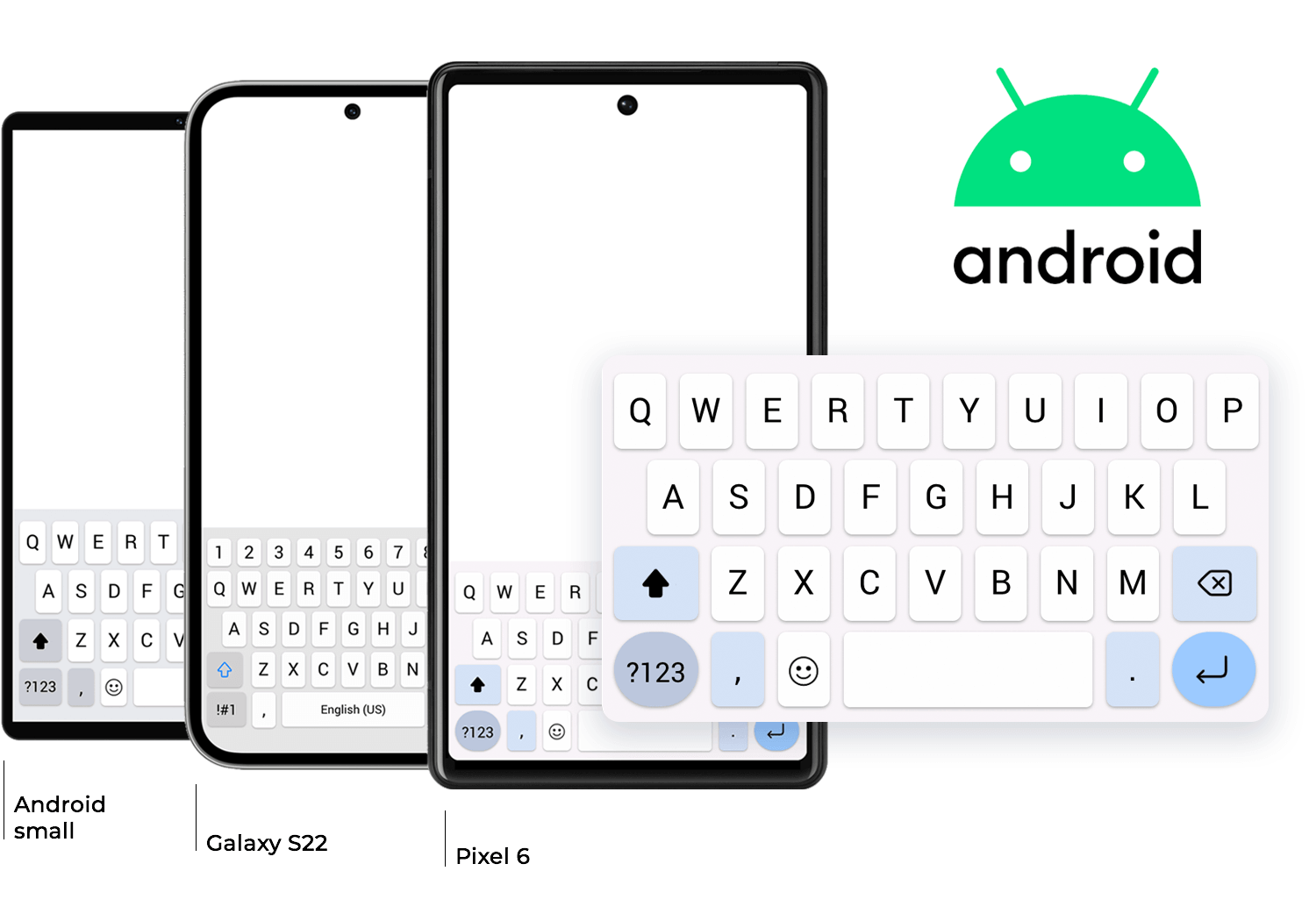
As for Android-based devices, you can now choose to use the Galaxy S22, or the Pixel 6. If you were looking for another type of Android device, you can choose to stick to a broader device template of large or small Android.
When it comes to tablet devices, Jutinmind brings you updated screen resolutions while also adding new device templates. This includes the iPad Pro 12.9”, as well as the smaller iPad Pro 11”. You also have the freedom to choose the iPad Mini 8.3” or the classic iPad with 9.7”. This device category also brings a broader device template of an Android Tablet in case you weren’t looking to create an iOS app.
Getting into other types of devices, Justinmind 9.8 also brings you updated device templates of the Surface Pro 8 as well as the latest Apple Watch.
Each device template brings the native behavior to the simulation. That means that native keyboards open when an input text field is selected, reflecting how that device would behave in real life. Other examples of updated native behavior include things like date, checkboxes or radio button components.
The updated and improved Android UI kit is all about capturing the look and feel of Material Design 3. This means that all the colors, structures, and styles faithfully follow the current guidelines for a classic Android app design. As always, all components come with built-in basic interactions, allowing you to forget about simple feedback to user actions and focus on getting your ideal design out there!
The new Android UI kit includes everything you could ever need for a modern Android design, including over 350+ icons that come in two styles: filled in and outlined. Even more exciting is the fact that the icons are paths now, which allows you to change their design in any way you want. Gone are the days when you could simply change the icon color and size – now you can create something truly unique.
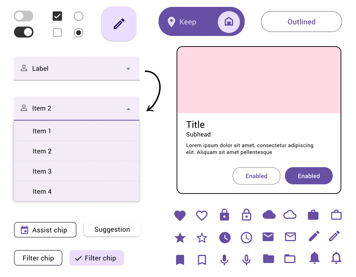
Other fresh additions to the UI kit include Chips, which you can use to categorize, filter, and can double as an input field. Cards come in several sizes and shapes, individually as well as in a grid so you can save time while designing.
The updated iOS UI kit brings you everything you need to create apps that Apple fans will enjoy. The UI kit follows the latest guidelines from Human Interface Guidelines, following the evolution of the classic Apple style. Enjoy everything from forms, dialog boxes, all the buttons you can handle as well as bars, menus, and tabs. The iOS UI kit also brings you iPad components.
The iOS UI kit now also includes all iOS icons that you could need, ranging from social media and navigation to Apple Maps and e-commerce icons. Don’t worry about having to look for an additional icons UI kit – you got it all right there in the main library!
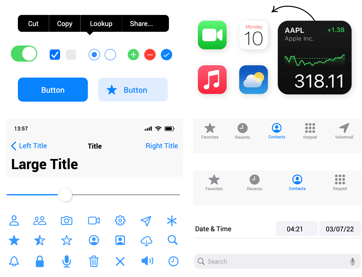
Another huge advantage of this UI kit is that all components have built-in feedback, which means that radio buttons can be selected, toggle switches do switch and basic interactions in form fields are already done. Enjoy the creative process of creating something new and forget about the small stuff!
- If the font is included in the project the confirmation message doesn’t repeat itself.
- Text format shortcuts fixed.
- User fonts rendered in Safari have been fixed.
- Fixed some bugs in the Table widget.
- Browser focus changes correctly when one clicks Play.
- Guides when one zooms in fixed.
- Guides are saved correctly.
- New widgets with a dynamic panel in a new library are created correctly.
- The quality of SVGs in design components has been improved.
- Scenario connectors work again when in a simulation.
- Some crashes have been fixed.
PROTOTYPE · COMMUNICATE · VALIDATE
ALL-IN-ONE PROTOTYPING TOOL FOR WEB AND MOBILE APPS
Related Content
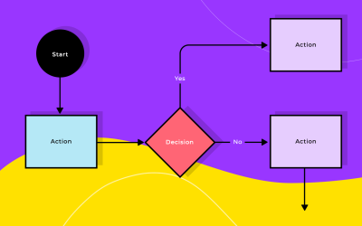 Justinmind has just launched a powerful new feature: the user flow diagram tool. You can now map out the entire user experience directly within your projects. This expands Justinmind’s capabilities beyond prototyping and design, offering a more comprehensive solution.4 min Read
 This update includes a native version for Apple Silicon, new devices and other usability improvements for a more efficient design process.3 min Read
 Justinmind 10.2 includes SSO, a new Figma plugin, updated iOS UI library, improved Masters and more, including shared Fonts for a more efficient workday.5 min Read
