Website mockups help you save money while boosting the UX of your final product. Find out how in this guide and check out our awesome website mockup examples!
What exactly is a mockup? How is it different from a wireframe and a prototype? How on earth do you put one together? These are exactly the types of questions we’ll be examining in this guide to designing a website mockup.
Aside from looking at the fundamental aspects that a website mockup comprises, we’ll also look at how to design one in a mockup tool, along with the benefits it can bestow you, your team and your final product. We’ve also thrown in some sources of inspiration to help you bust through that creative block!
In the world of web design, a website mockup is a high-fidelity simulation of how a website will look. Website mockups combine the structure and logic of a wireframe but with the images, graphics and UI elements that the final product will have.
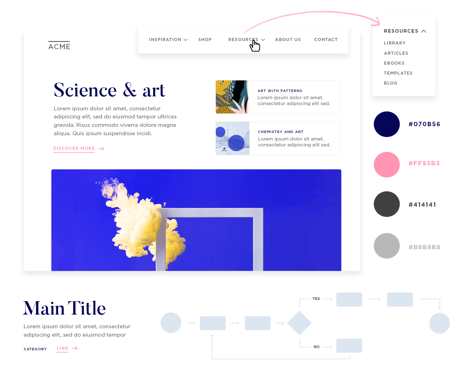
However, while website mockups don’t include the transitions and usable functions you’ll see in a prototype and in the final product, they generally include basic navigation and interactions. Simply put, mockups help us define:
- Information architecture: how you organize your website’s information logically and hierarchically
- User flow: how the user will interact with your website and the navigation UX
- Visual hierarchy and layout: how all the elements appear on your webpages, their size and position relative to one another and the spacing between
- Color: nearly always contain the color scheme you’ll use in the final product
- Typography: contain the exact fonts types, sizes and boldness that your final product will have
- Images: Use SVGs and high quality images that mirror exactly the ones you’ll include in your final product
- Interaction:
In short, website mockups help you to define all the important factors of your product to ensure the best UX possible before expensive coding begins. Because at that stage, any changes you make will be paid for in arms and legs!
There are many reasons why it’s a good idea to design a website mockup. The short answer is that it gets your product to the market more efficiently, reduces development costs and increases the chances of its long term success. Here’s how:
When you put together a website mockup, you get to see whether your design really works or not, both in functional terms and aesthetically. They allow you to iterate on your designs until you achieve perfect aesthetic harmony.
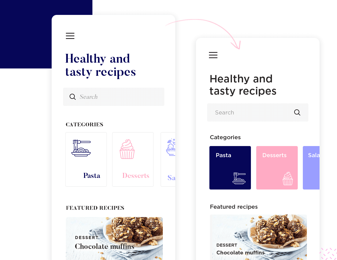
Building a website screen mockup can help you unmask visual components that don’t fit, before you arrive at the final, developed product. At the mockup stage, you are already assessing the visual hierarchy between elements.
Website mockups also give you the opportunity to get valuable feedback from clients and stakeholders before any coding begins. Presenting them client with a hi-fidelity, clickable website mockup is an excellent way to convince them that your design approach is right for their product.
You also get the opportunity to carry out a batch of user testing, helping ensure that you’re designing your product in a way that’s user friendly for your target user personas. This will prevent huge development costs later on, in addition to post-release bug fixing and constant updates.
Website mockups bridge the gap between cross-functional teams as a communication device and ensure a smooth design handoff. The handoff process is a vital moment in product development. It’s when you hand the final design to developers, complete with the assets and guidelines they’ll need to code your mockup into a living, breathing product.
A complete website mockup, ideally combined with a design system that includes a style guide, design specifications, patterns and components, aids developers by ensuring there are no uncertainties in the product.
There’ll be less back and forth between design and development because everyone will have the info they need and you’ll avoid expensive reworks down the line.
There’s no point designing a website mockup if it’s not going to be for anybody. Keeping your user in mind while using your website mockup tool will help you design a successful, relevant website faster. That’s why many of the following steps lean heavily on user testing and research.
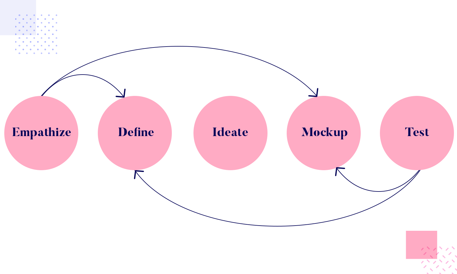
Here at Justinmind, we’re firm believers in the Agile methodology. It goes like this: define a minimal viable product, create your mockup, test with users, fix problems and test again until the users are happy.
However, before you even dream of designing a website mockup, there are a few important questions you should answer.
What is your website for? Yes, it might sound obvious, but how many cases have you heard of where a website started out with one purpose and audience, then ended up pivoting the other way after development?
Asking this important question can save a lot of time later on. Pivoting at this stage and completely changing your idea is fine and absolutely forgivable.
That leads us on to user research. When you think you have a clear idea of what the main goal of your website will be, that’s when it’s time to go out there and ask your potential users if they have a real need for it. It may turn out that they need something else, causing your idea to pivot. Online surveys, along with coffee shop interviews are great for identifying what the market is crying out for.
Once you’ve identified the problem that you aim to solve for people with your website, you then need a concrete idea of who your user personas (your site’s main users) will be before you begin work on your website mockup. You can gather this sort of information in the user research stage, aggregate the data and create a single persona from the masses.
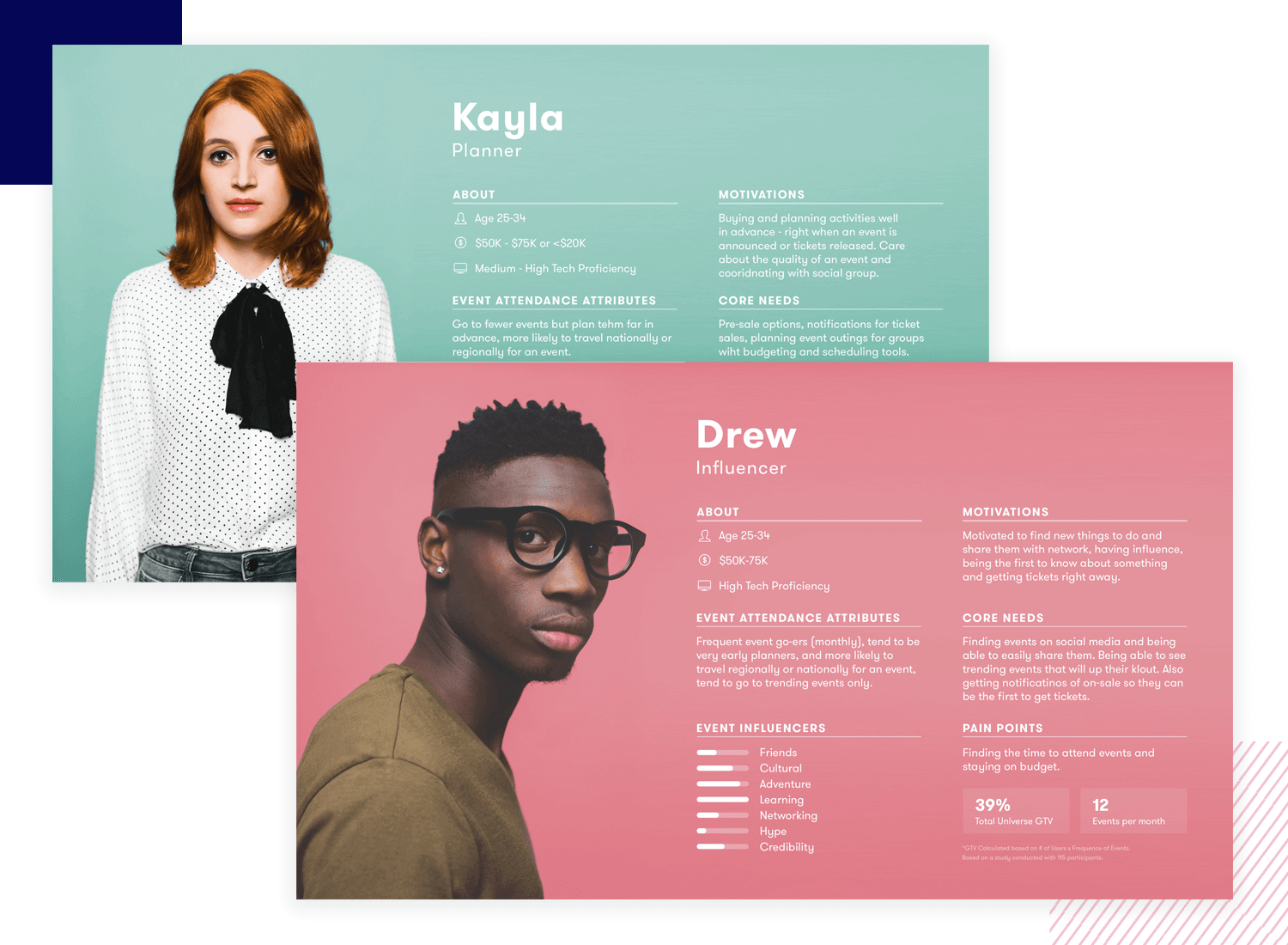
The amount of personas depends on your project but remember: the fewer you have the better. It’ll be easier with two to three personas in mind when designing your website mockup rather than 20, and it’ll make the final product more cohesive.
Now that you’ve got your user personas, before you go head-first into designing a website mockup for them, make sure that you have your information architecture well thought out. Why not invite people who fit those personas in for a card sorting test?
Card sorting is a type of user testing that helps determine the optimum sitemap for your users. Doing it at this stage will help you determine the best way to organize the information on your site so that your users can easily find it, leading to an awesome user experience.
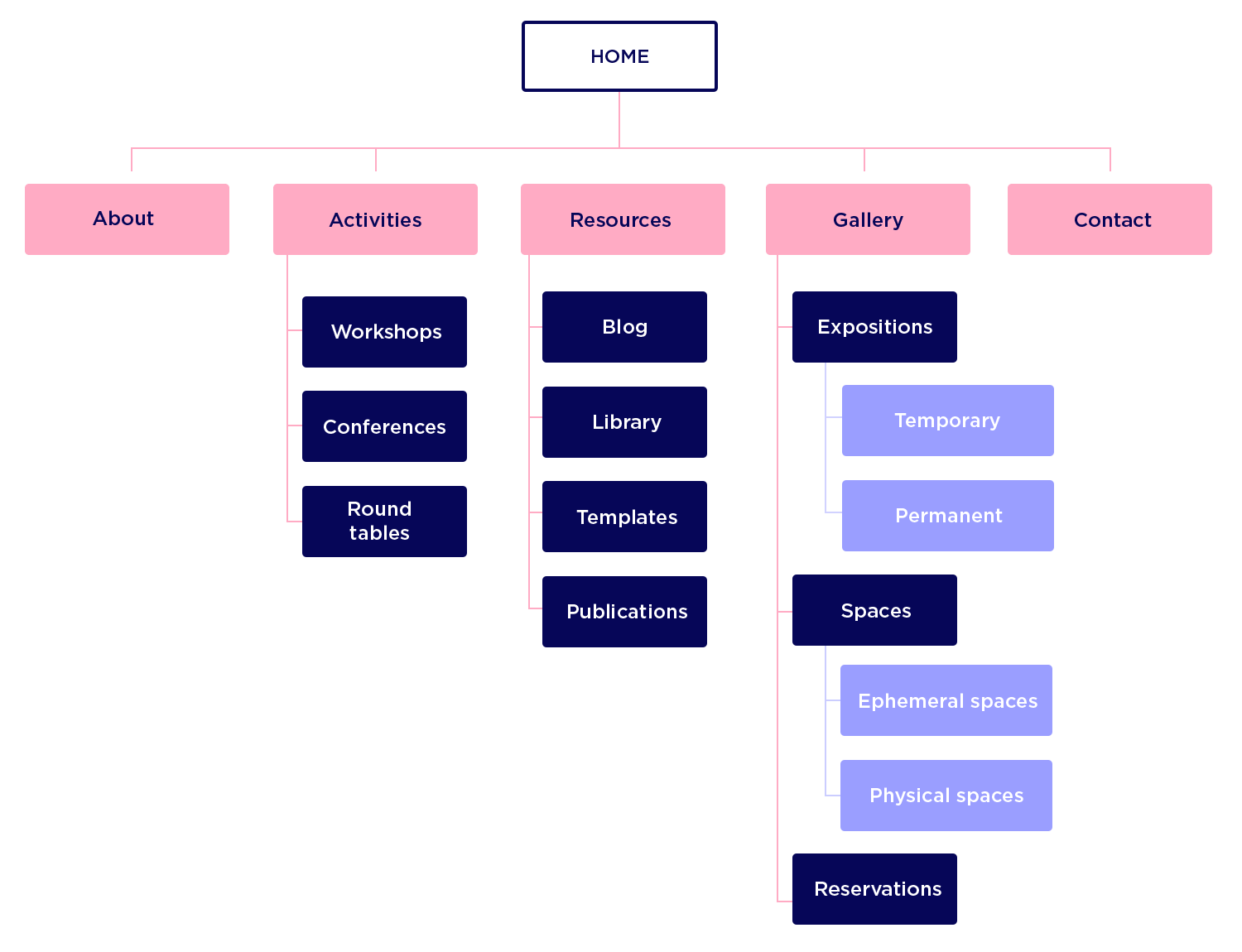
Now that you have all that important information from your user research phase, you can roll up your sleeves and start designing your website mockup.
There are two main ways of starting your website mockup: either start with a wireframe or jump straight into designing a mockup. Here at Justinmind, we recommend the first option to get a clear schematic of what elements appear on the screen, where they are – their positions in relationship to one another, and what they do.
In this step-by-step guide, we’re going to assume that you’ve already got a schematic prepared, complete with your structure, UI layout, hierarchy and functionality already mapped out. So let’s begin with making it all look pretty!
Pay special attention to the design of your navigational elements and calls to action. They need to be clear, easy to understand and bold but never overpowering.
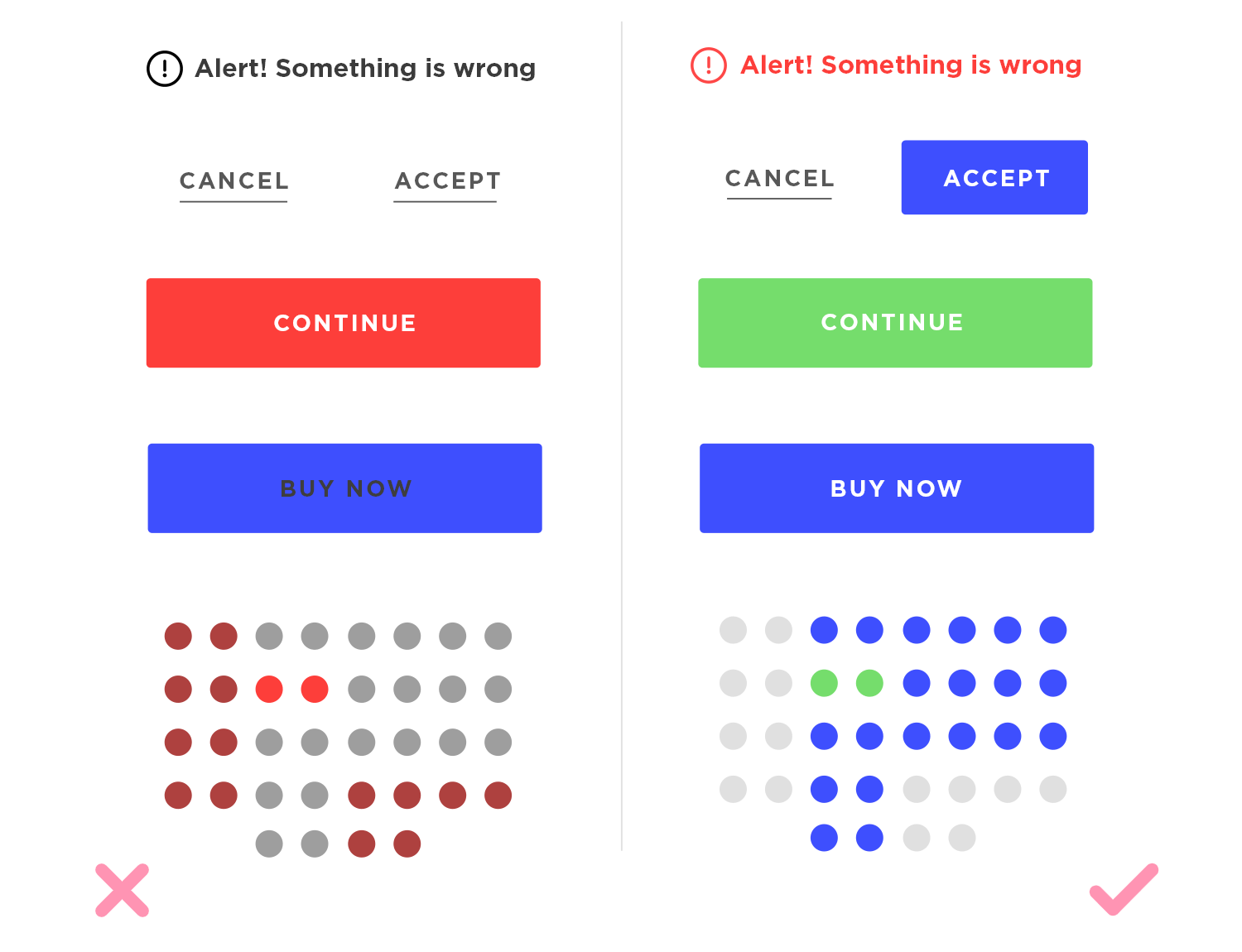
Visual hierarchy, such as the placing of labels next to relevant fields and the grouping of related topics together in lengthy input fields can make for better readability. Make sure you think about different button design concepts, sizes, shadows and how they’re going to be used.
Color psychology plays a key part in the user experience and can have a profound emotional effect on users. It makes sense to choose a color scheme that provides great UX, while making your brand more memorable.
Color can provide the elements of your website with a sense of contrast and hierarchy, making it more intuitive to use, as well as adding to the eye candy. On the flipside, getting your color choices wrong can sink your product from the very instant a user sees it.
An obvious example would be making your CTA buttons red, a color generally associated with deletion and errors.
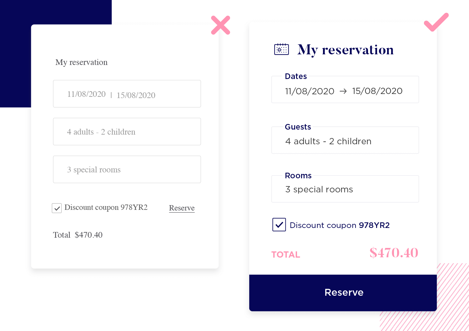
We recommend using a color combinations tool like Adobe Color CC to find complementary colors to use in your website or app mockup.
When it comes to images, quality is essential. Remember – your mockup should reflect your final product as closely as possible. You should always aim for high-quality PNGs or SVG files. In fact, with Justinmind you can take full advantage of our integration with Photoshop to design eye catching, pixel-perfect interactive PSD mockups!
For UI elements, it’s always a good idea to stick with UI kits so that users are already familiar with the design language you’re using. There are many UI kits available for download on the Justinmind website for web, iOS and Android, as well as numerous free icon sets and templates.
Typography is a great tool for directing your users’ focus, improving overall comprehension and determining the hierarchy of elements and text in your website mockup.
However, too many fonts can clash and lead to a jarring experience. As a general rule of thumb, you should aim to have no more than two or three different fonts at play in your website mockup. Simply alternating the size and boldness of your font, helps create define contrast and hierarchy.
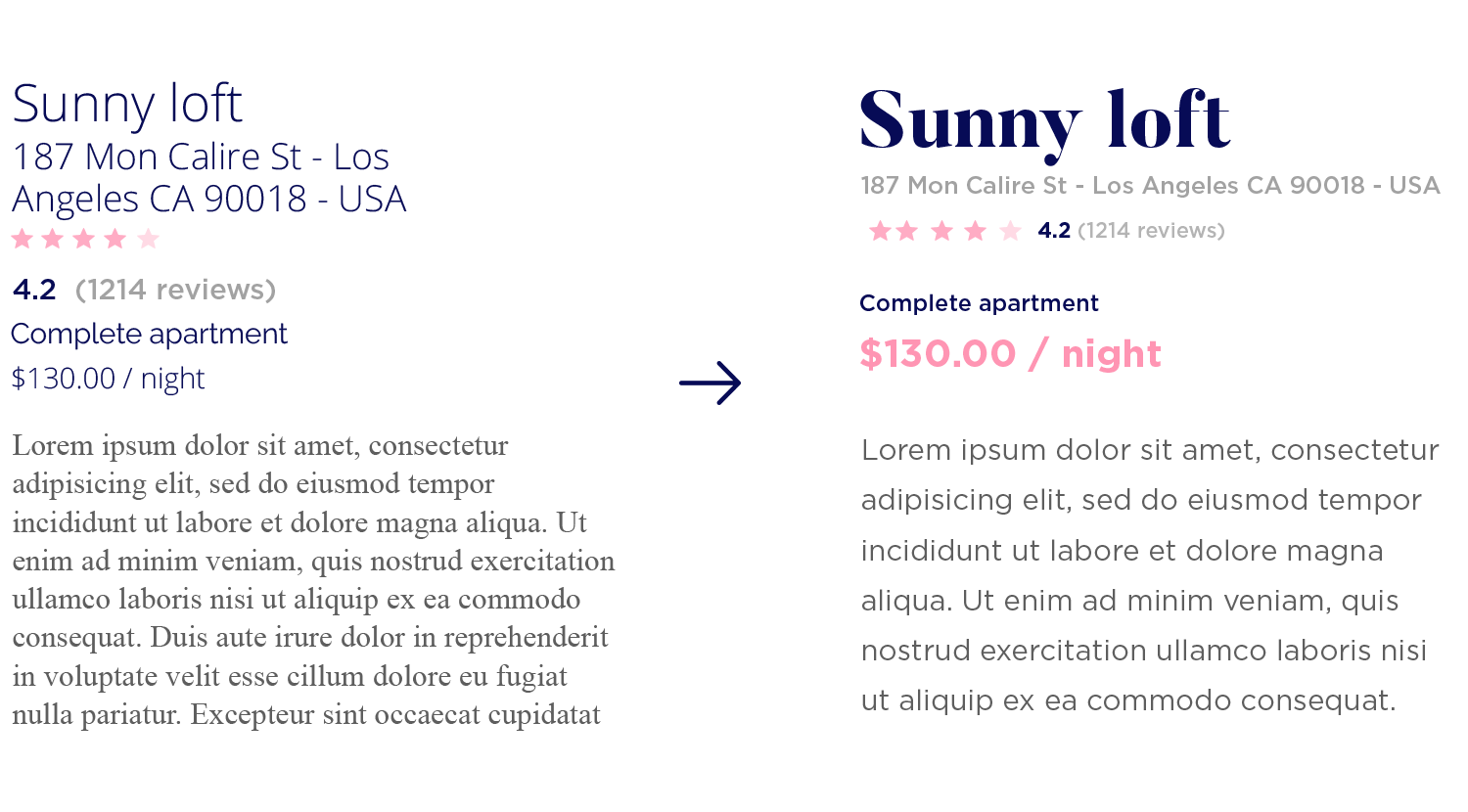
Aim for line spacing of 140-180% for any body text you include in your website mockup.. For headings, titles and microcopy, make sure that your text is never cramped!
When we talk about content in website mockups, we usually refer to both text and imagery. Thinking about content early on is a good idea because it often impacts the layout and design of your website mockup.
How much content you decide to include in the mockup stage depends on the type of website you’re designing, and the minimum information your users will need for testing, which we’ll go into more detail about below.
However, filling in the content areas of your product with text and images will generally help the user to see exactly how the product will look when it’s complete. While it is possible to just stick Lorem Ipsum in every text box, we do recommend trying to use real headings and title texts to aid the overall comprehension of your website mockup and to understand the function of each screen.
Once you’ve got the graphical design of your website mockup sorted, it’s time to add in some interaction design. As we said before, we believe a mockup should be clickable, otherwise it’s going to be much less effective at communicating ideas to stakeholders, for user testing and collaboration with developers.
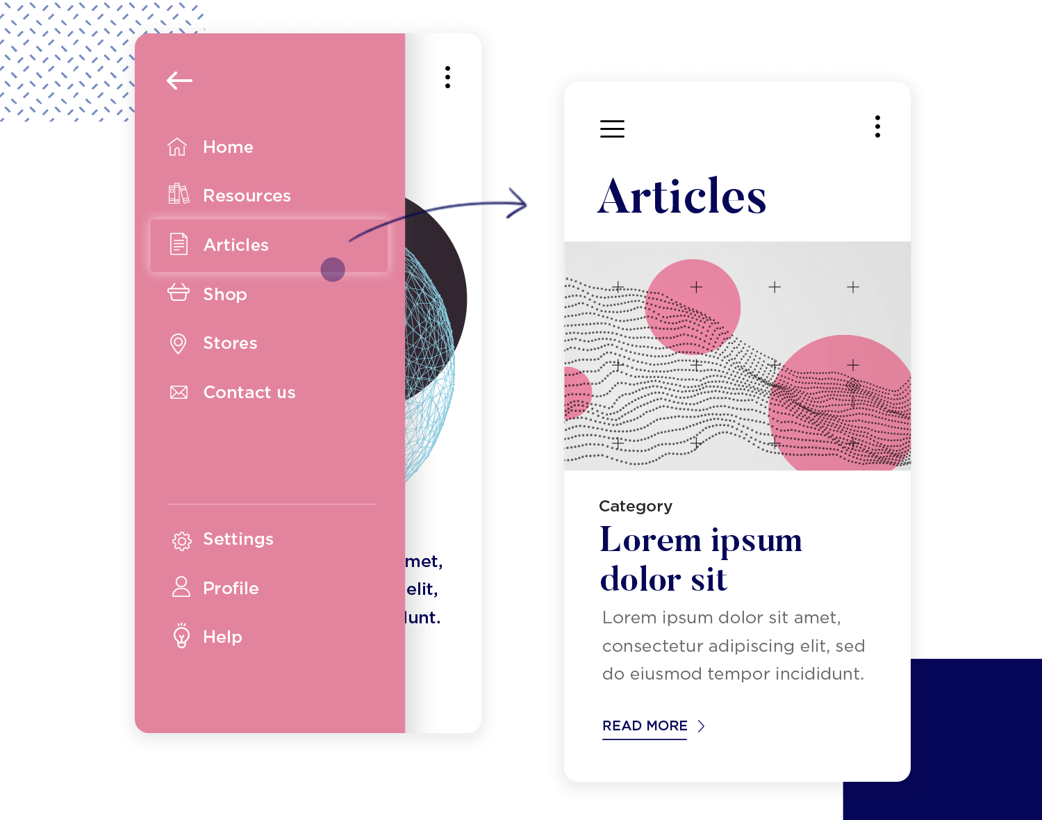
When you add interaction to your website mockup, focus on the basic navigation within the product, not on its advanced functions. You should aim to add enough interactive elements so that a user can explore the website mockup, easily passing from page to page.
A user flow is a path that a user follows, from entry to exit, as they navigate their way through your website mockup. You can map these out in accordance to how your user personas would navigate your website. Here are some examples:
“Jenny logs into her social media photo app, checks her feed, likes two photos and publishes one of her own.”
“Tom enters a website content page from Google, reads an article, clicks on a call to action and registers.”
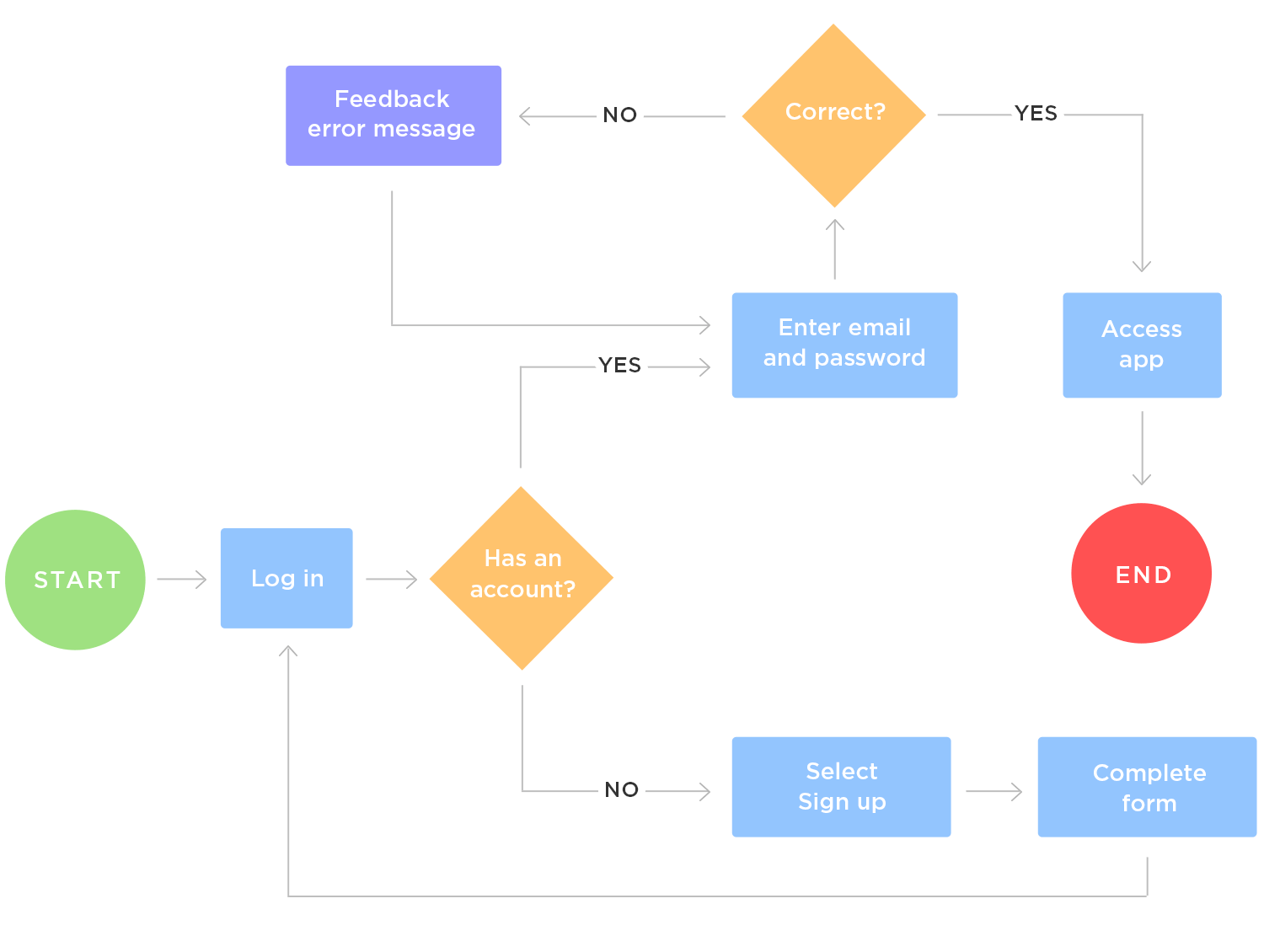
For each user flow you’ve established, order the pages of your website mockup and add in the navigational interaction design needed for the user to achieve their goal in the mockup.
Once you have your layout, visual design and basic interactions established, it’s time to start user testing. You can do user testing on your website mockup in lots of different ways. However, we agree with Usability Geek’s take on their post on website usability testing, that there are 3 main categories of usability testing: explorative, assessment and comparative.
- Explorative: used early in product development to assess the effectiveness and usability of a preliminary design or mockup, as well as users’ thought processes and conceptual understanding.
- Assessment: used midway in product development or as an overall usability test for technology evaluation. Evaluates real-time trials of the technology to determine the satisfaction, effectiveness, and overall usability.
- Comparative: compares two or more instructional technology products or designs and distinguishes the strengths and weaknesses of each.
User testing on a clickable website mockup should focus on the explorative side. The idea is to test the mockup to see how easily your users understand the design.
This step is simple, but often needs to be repeated several times. Take your user feedback and make the appropriate fixes in your website mockup. Then test again. The bottom line is: the earlier you fix problems and iterate, the cheaper it will be.
The final stage of website and app mockup design is to hand it to the development team, so they can start to code the product. But it’s not as straightforward as simply sending them the mockup and saying “Have fun!”.
You need to make sure that you supply your developers with the relevant functional specification documentation, such as stylesheets, project scope, sitemaps, user flows, user requirements, etc.
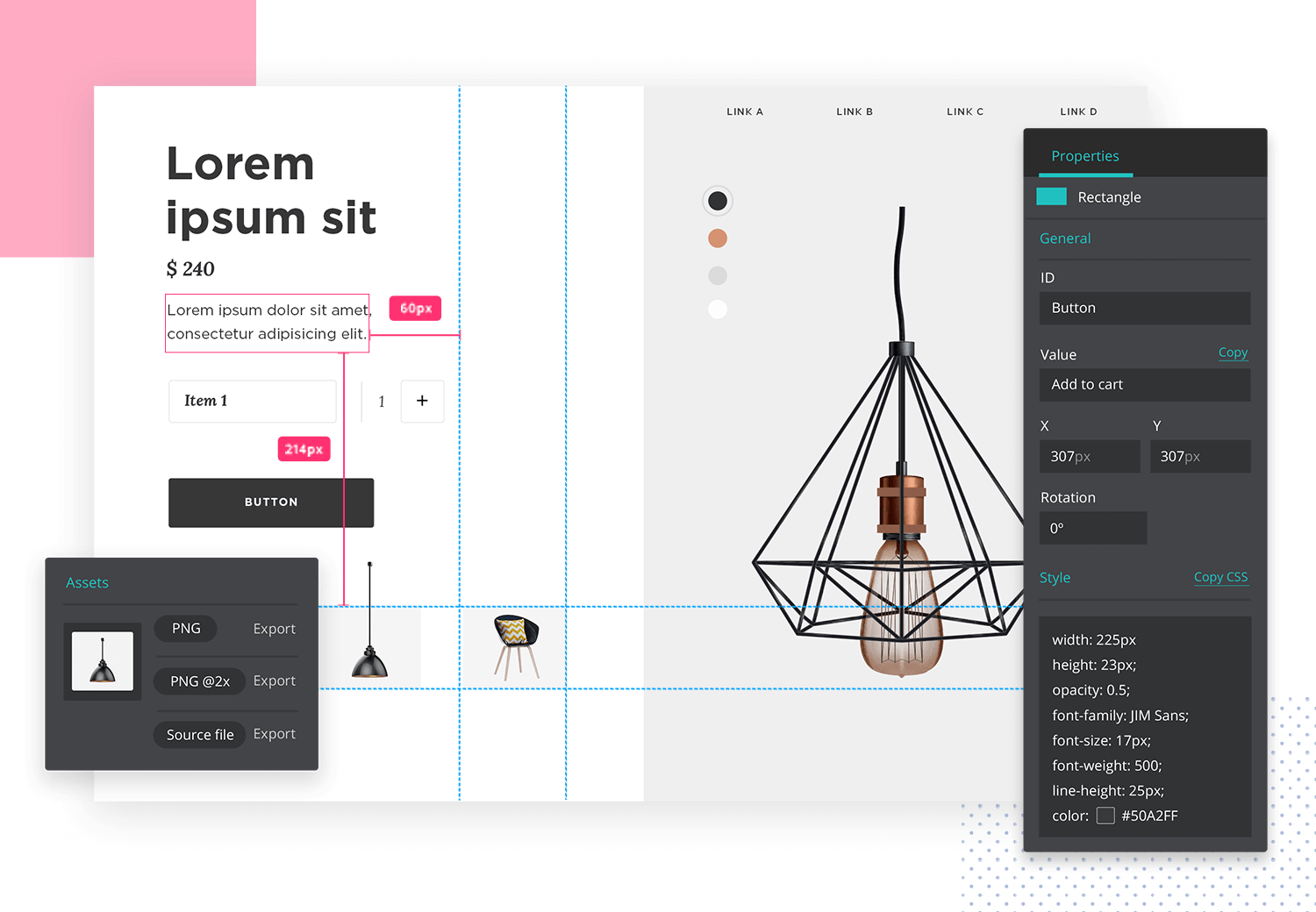
Thankfully, the Justinmind mockup tool lets you generate this functional specification documentation in just a few clicks after creating your website mockup!
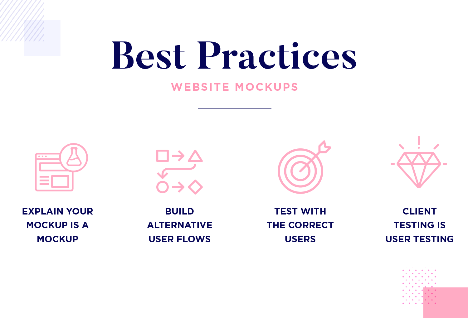
Ensure that your users and stakeholders are aware of what the mockup actually provides, in terms of interactivity. For instance, if a video doesn’t play and they can’t actually register for a lifetime supply of your floor cleaner, make sure that’s clear when presenting your mockup!
Go back to your user personas and make sure you’re testing with people who fit the user types you already defined.
Put simply, there’s no point asking someone who’s not interested in the main goal or subject of your website mockup.
Build your website mockup with various potential user flows, not just one. This provides you with more actionable insights into how your users explore and interact with your product. It also opens areas for discussion with your users about navigating the product.
You should consider client testing to be a form of user testing. Make sure that client testers have clear instructions before they start testing. Just because it’s their product in the end, don’t take the other three tips for granted when you hand them a mockup to test!
In this selection, we present some of Justinmind’s free website mockup examples that can significantly enhance your design workflow. These free website mockups provide an array of styles and layouts, catering to various design preferences and project requirements. From minimalist and clean designs to more intricate and dynamic layouts, these website mockup templates are perfect for showcasing your creative vision to clients or stakeholders. Browse through and choose the one that speaks to you. We love them all!
This webshop primeface mockup features an e-commerce platform tailored for online shopping, with a clean and modern aesthetic. The homepage includes a prominent logo and navigation bar, leading to various product collections and detailed product pages. The user experience in this website mockup example is streamlined with easy transitions from product selection to checkout.
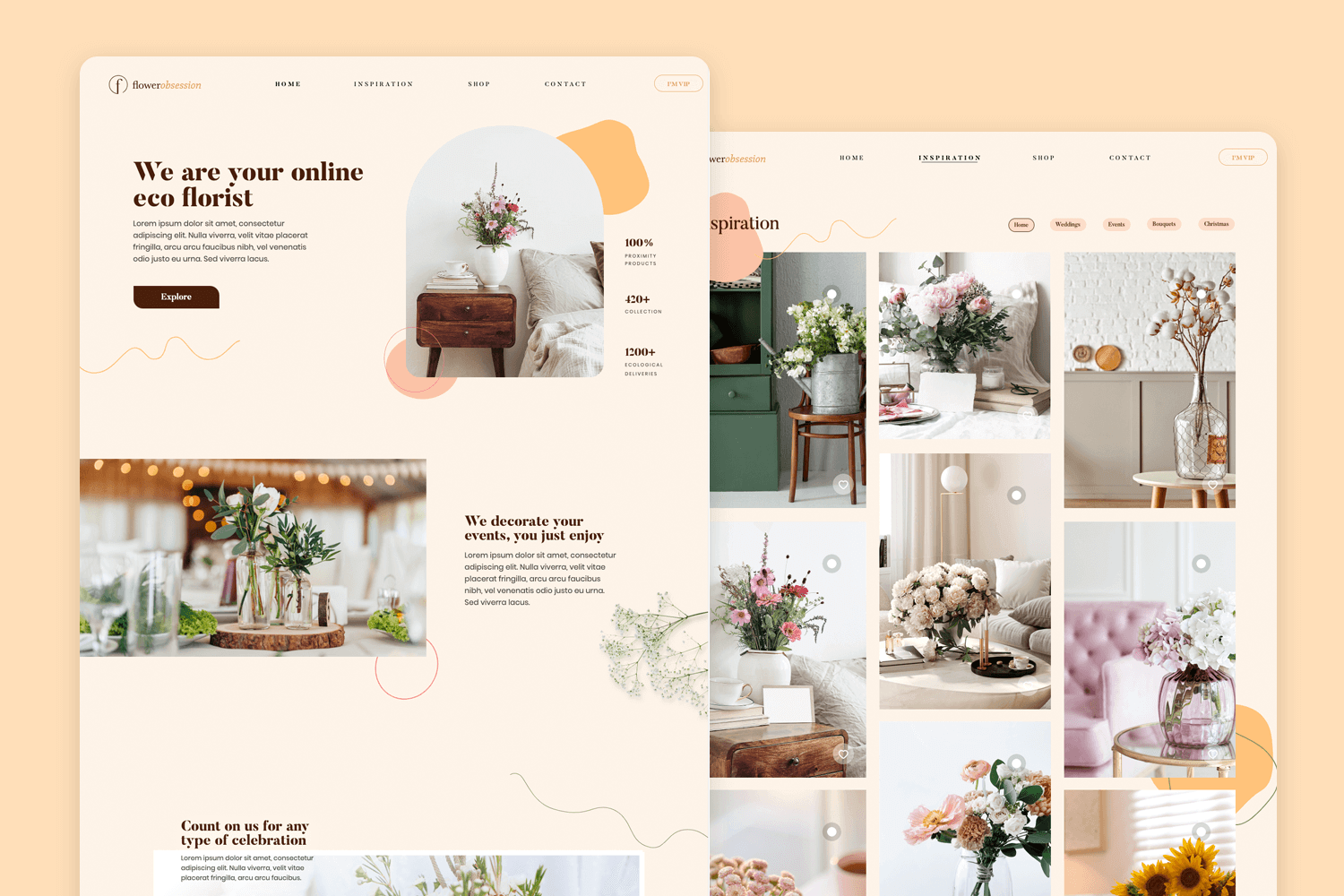
Floral services can benefit from this florist mockup with a modern and elegant look. The website mockup design emphasizes ease of use, allowing customers to browse floral arrangements, view product details, and seamlessly proceed to checkout.
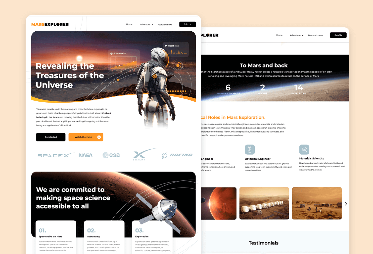
The Mars Explorer mockup is designed for Mars exploration enthusiasts with a fully responsive and engaging layout. The overall website mockup design is modern, approachable, and fosters excitement about space exploration, making it a perfect hub for space enthusiasts to connect and stay informed.
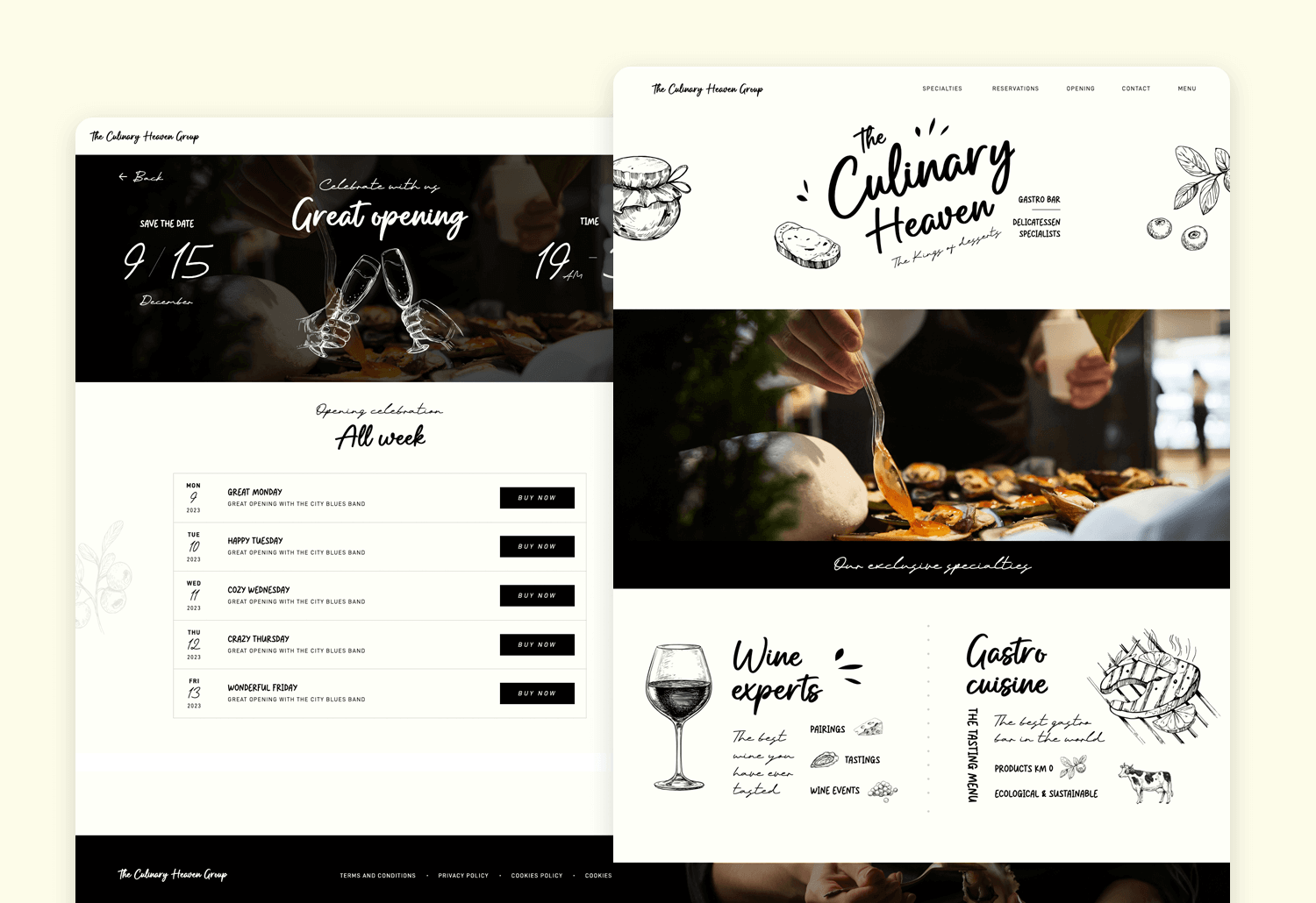
This eye-catching restaurant landing page mockup is designed with a friendly and easy-to-use layout. You’ll see a clear logo and simple menu at the top. The design is clean and welcoming, making it easy for anyone to get the information they need quickly.
This beauty product e-commerce mockup presents the fundamental elements of a successful webpage. This website mockup template’s intuitive layout enables users to navigate effortlessly, beginning with the breathable menu bar, followed by a clear call-to-action banner, and ample social proof to enhance your brand’s credibility.
This lively travel agency mockup highlights an exciting range of travel adventures through captivating visuals. Each element is meticulously designed to inspire designers and offer a clear perspective of the website’s possibilities. Feel free to select this free website mockup example for your creative inspiration!
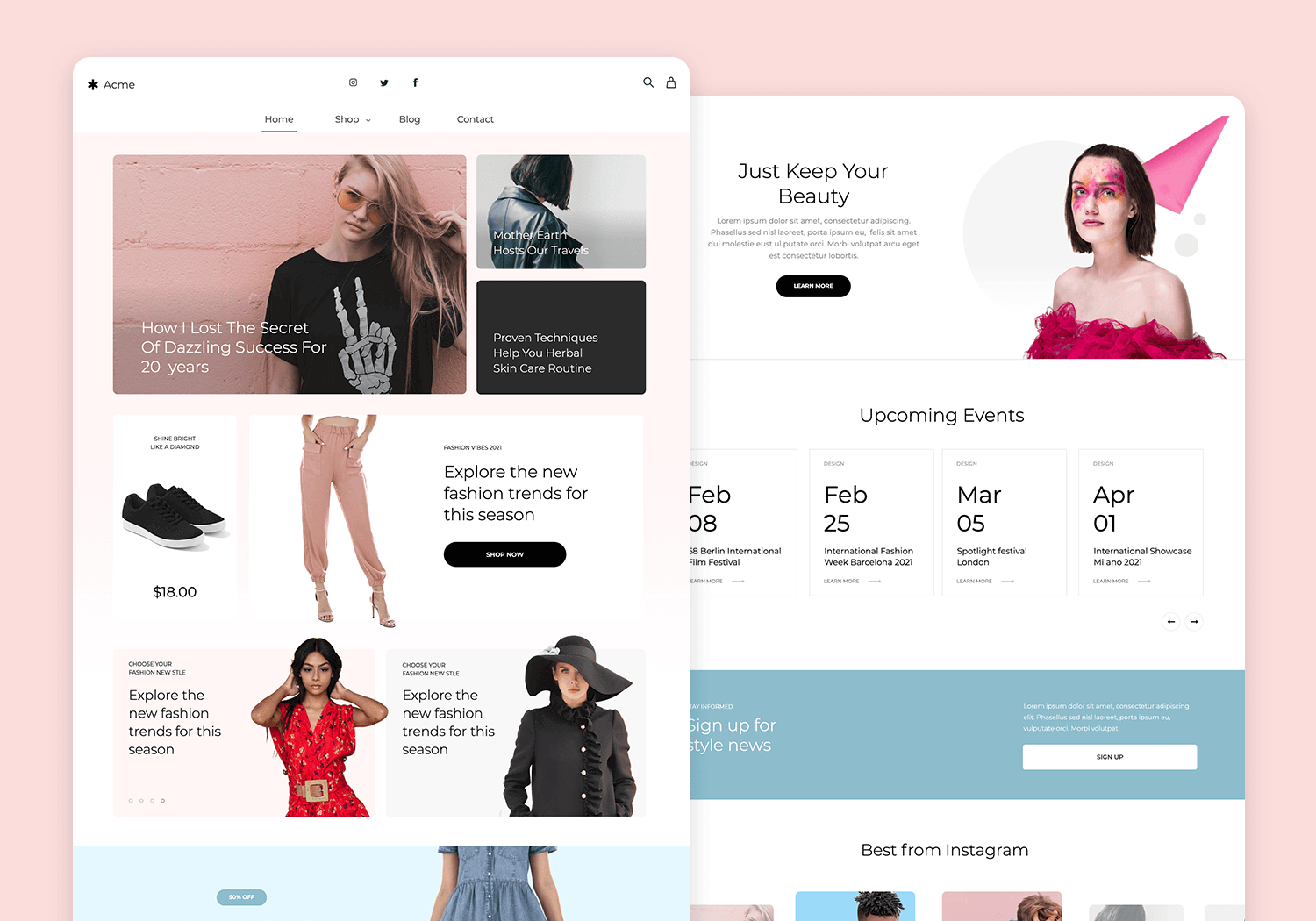
Consider this fashion e-commerce mockup as a runway for your fashion brand! Every element is meticulously curated to showcase your clothing and accessories in the most stylish light, providing designers and entrepreneurs with a blueprint for a successful e-commerce experience. Get inspired by this website mockup template and take your fashion brand online in style!
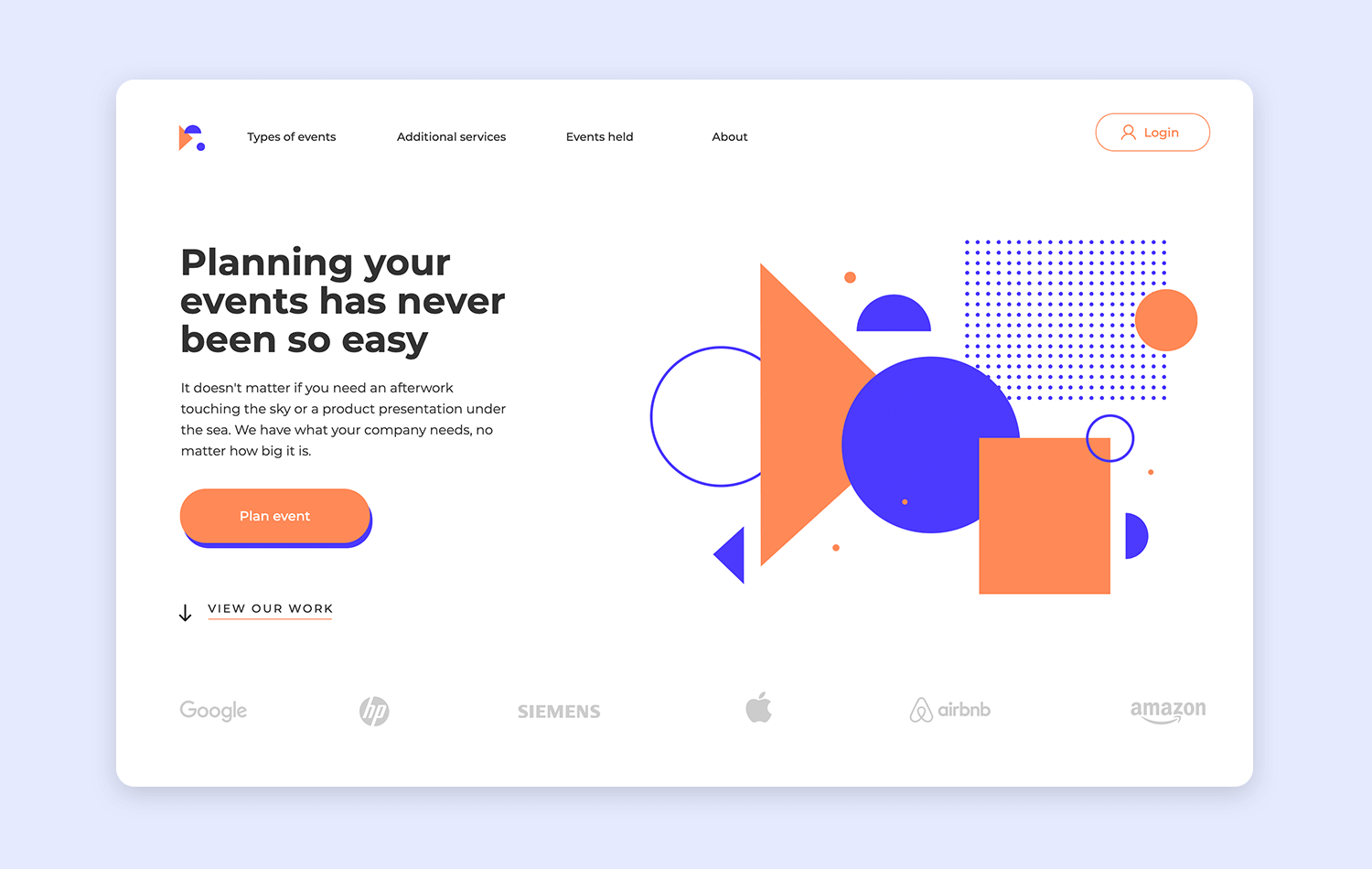
Dive into a world designed to showcase your ability to craft dream-worthy experiences with this website mockup example. The event planning template is thoughtfully curated to illuminate your expertise, providing event planners and aspiring entrepreneurs with a roadmap to a captivating website.
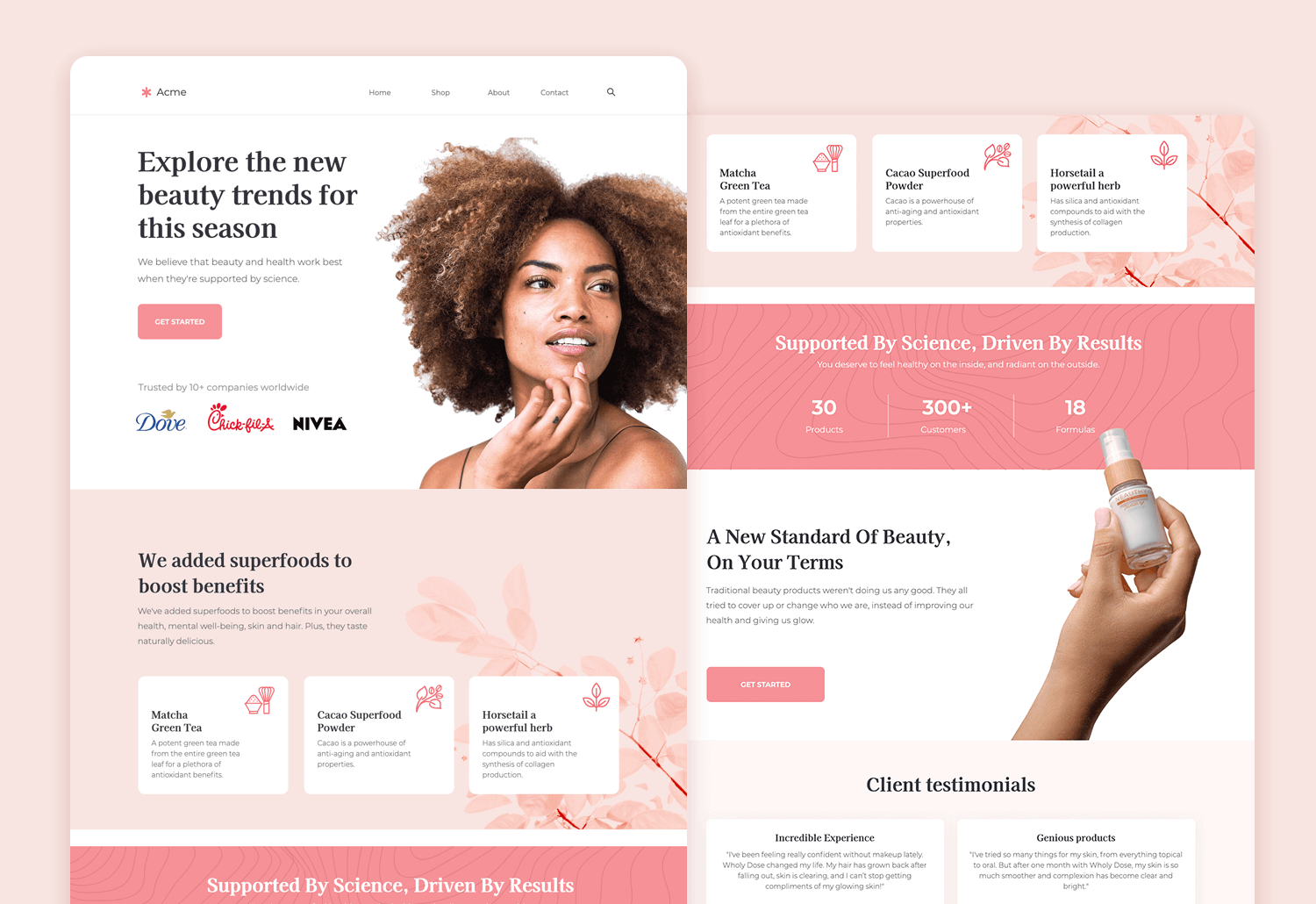
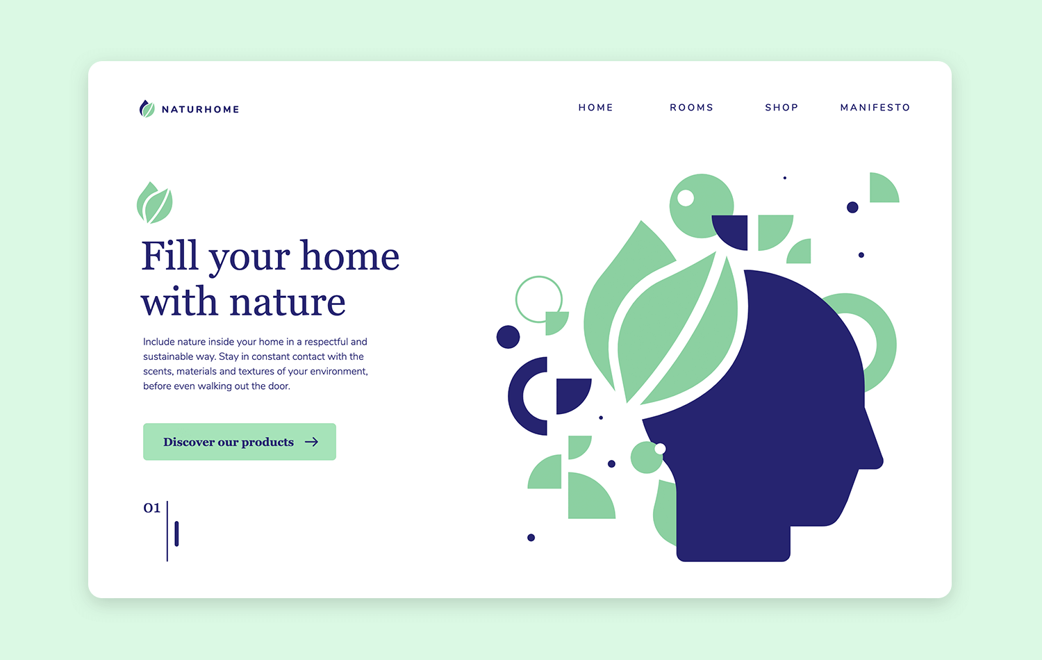
This free plant website mockup template serves as a blueprint for plant enthusiasts and aspiring entrepreneurs, guiding them towards creating a website that lets their plant passion take root. Let this design inspire you to cultivate a thriving online presence for your leafy haven.
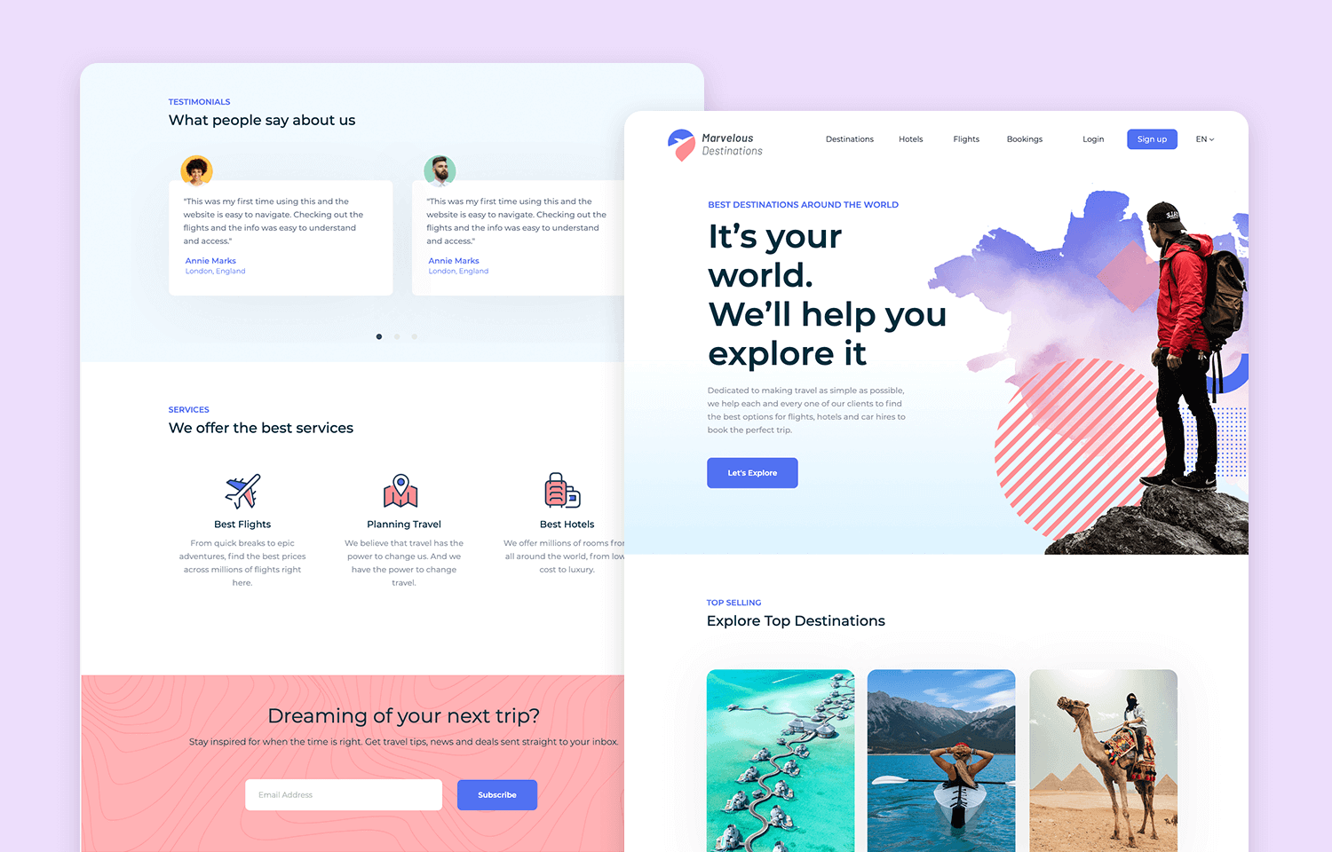
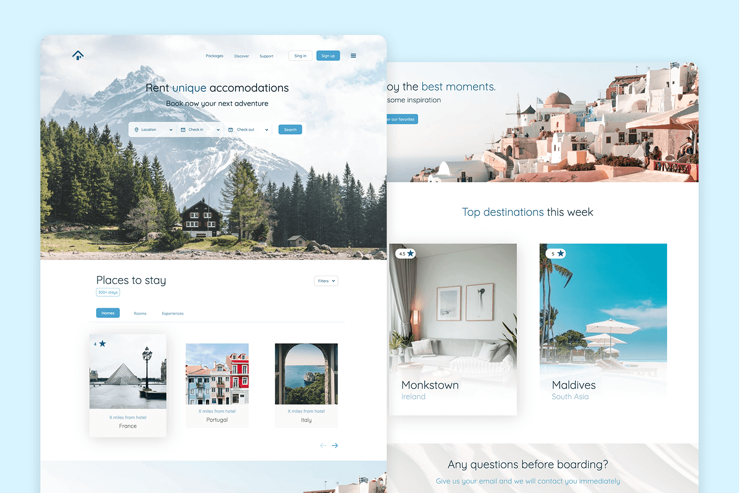
This vibrant travel accommodation mockup showcases Marvelous Destinations, inviting users to explore a world of thrilling expeditions and explorations. Every element in this website mockup design is thoughtfully crafted to provide designers with a clear vision of the website’s potential.
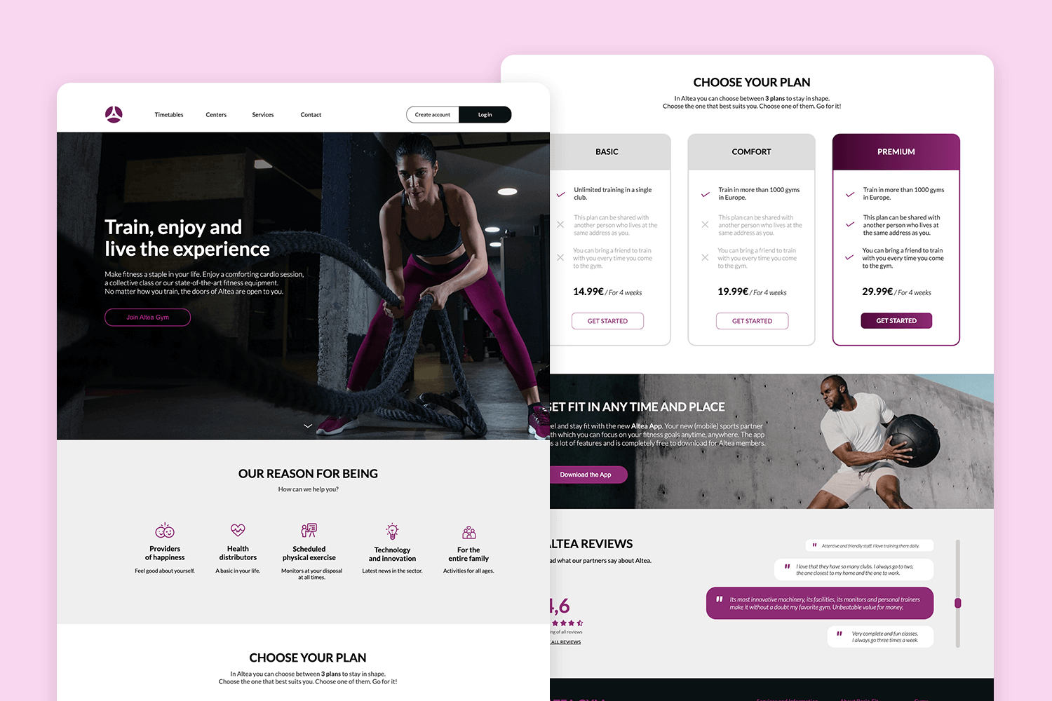
Imagine your dynamic fitness center brought to life online with this inspiring fitness center web template. Every element in this website mockup example pulsates with energy, motivating potential members to step up their game.
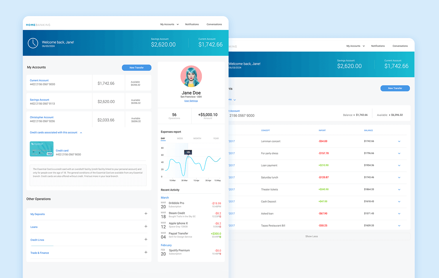
This free home banking web mockup goes beyond flashy graphics and gimmicks. It prioritizes clean design and intuitive functionality, allowing users to navigate easily through their accounts, complete transactions, and access financial tools with confidence.
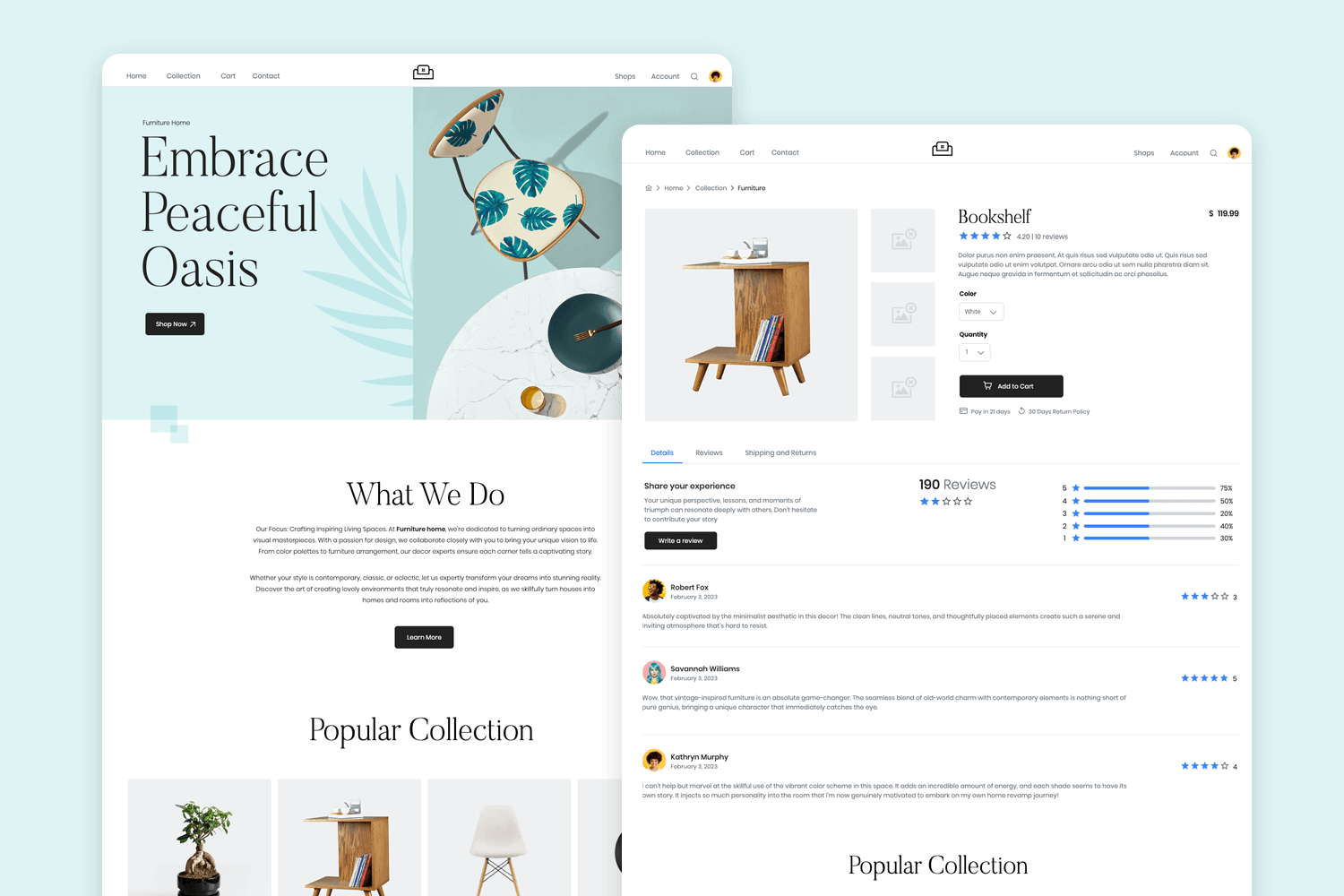
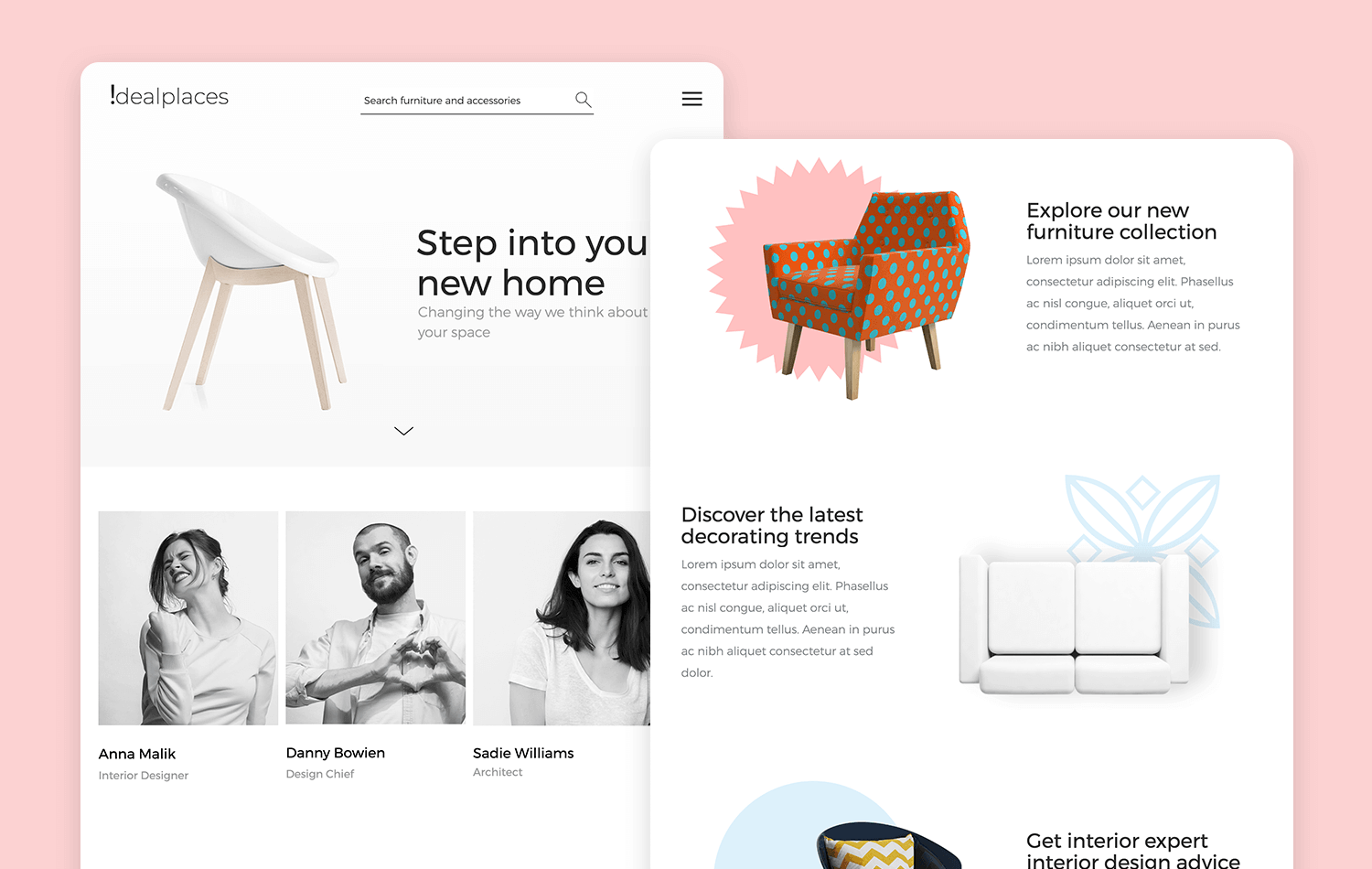
Say goodbye to cluttered layouts and never-ending product grids. This furniture website mockup emphasizes visual storytelling, painting a vivid picture of your furniture within exquisitely designed rooms. Picture captivating images that ignite inspiration and evoke a longing to craft a similar haven of comfort and style in this mockup design.
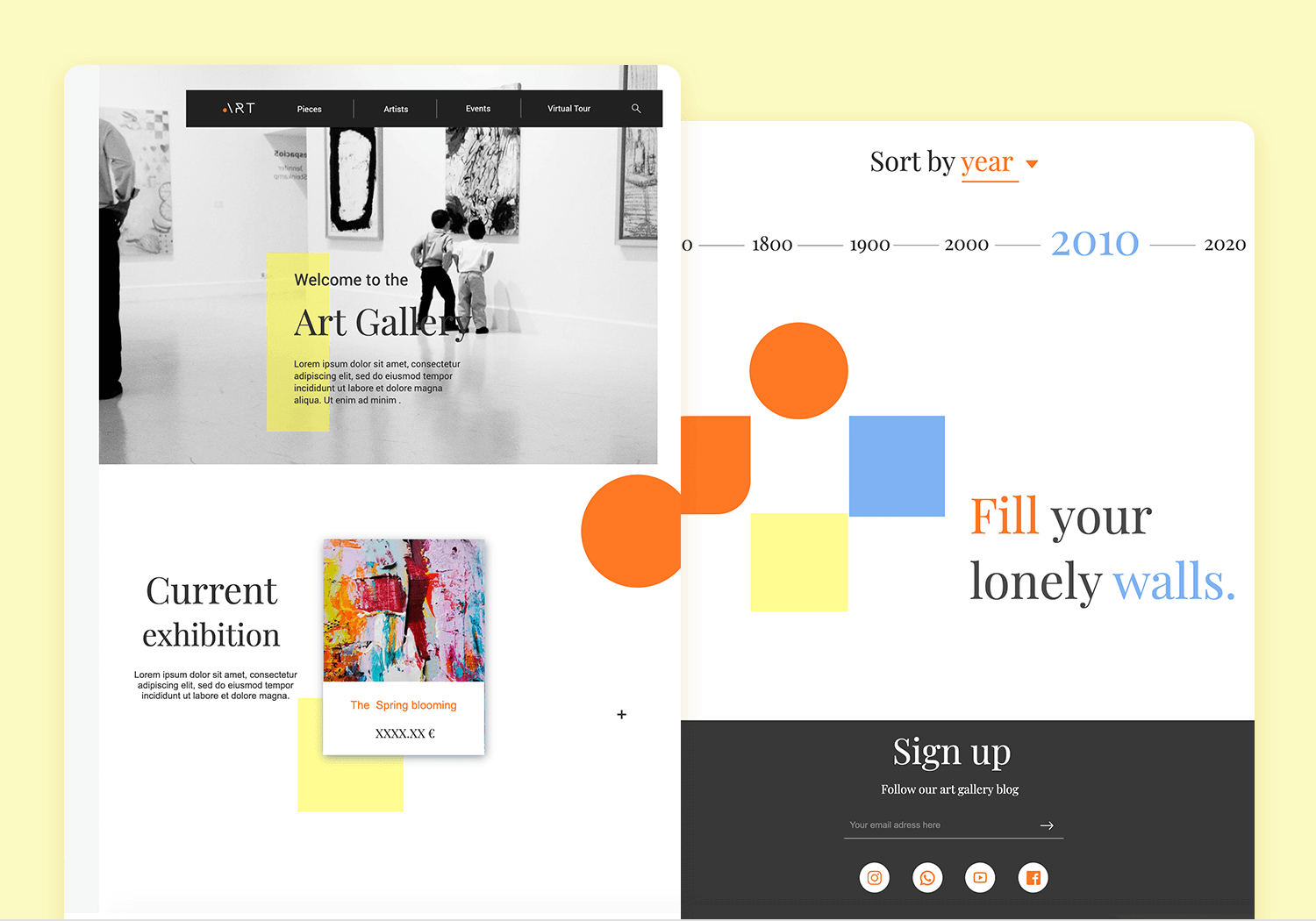
This art gallery web mockup offers an interactive journey. Imagine 360-degree views of captivating sculptures, behind-the-scenes glimpses into artist studios, and even curated virtual tours of your exhibitions. Use this website mockup template and enhance your art gallery’s image in no time!
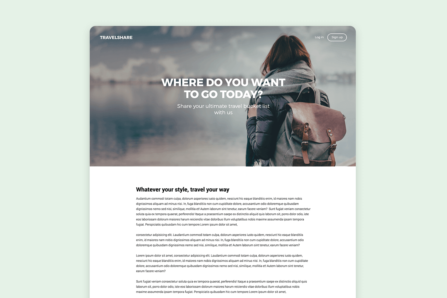
The flight booking website template is designed with the elegance of a travel brochure, showcasing the breathtaking destinations you offer. Each element in this free website mockup example – from vibrant photos to concise descriptions – is curated to transport potential travelers to their dream getaways.
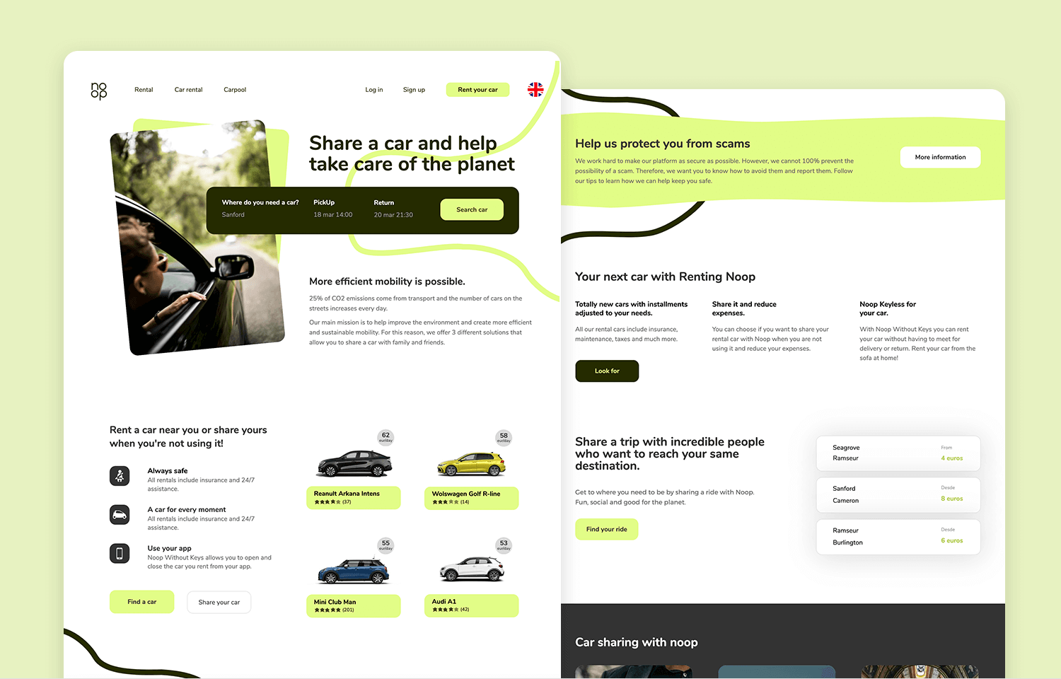
Car rental and sharing companies can highly benefit from this car rental web template. This website mockup example provides all the information needed to help users find and reserve a vehicle of their liking. Users can also put their cars up for rental using the same platform.
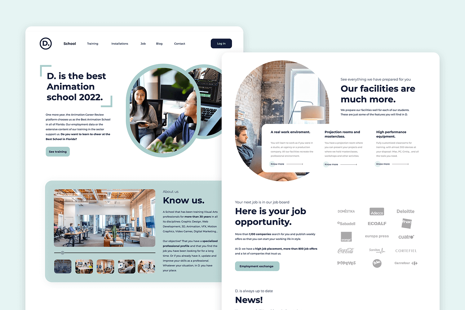
If any website needs a seamless user interface design it would be for a design school. This free design school web template ensures that students and teachers can effortlessly navigate through the information presented. Get this website mockup example now!
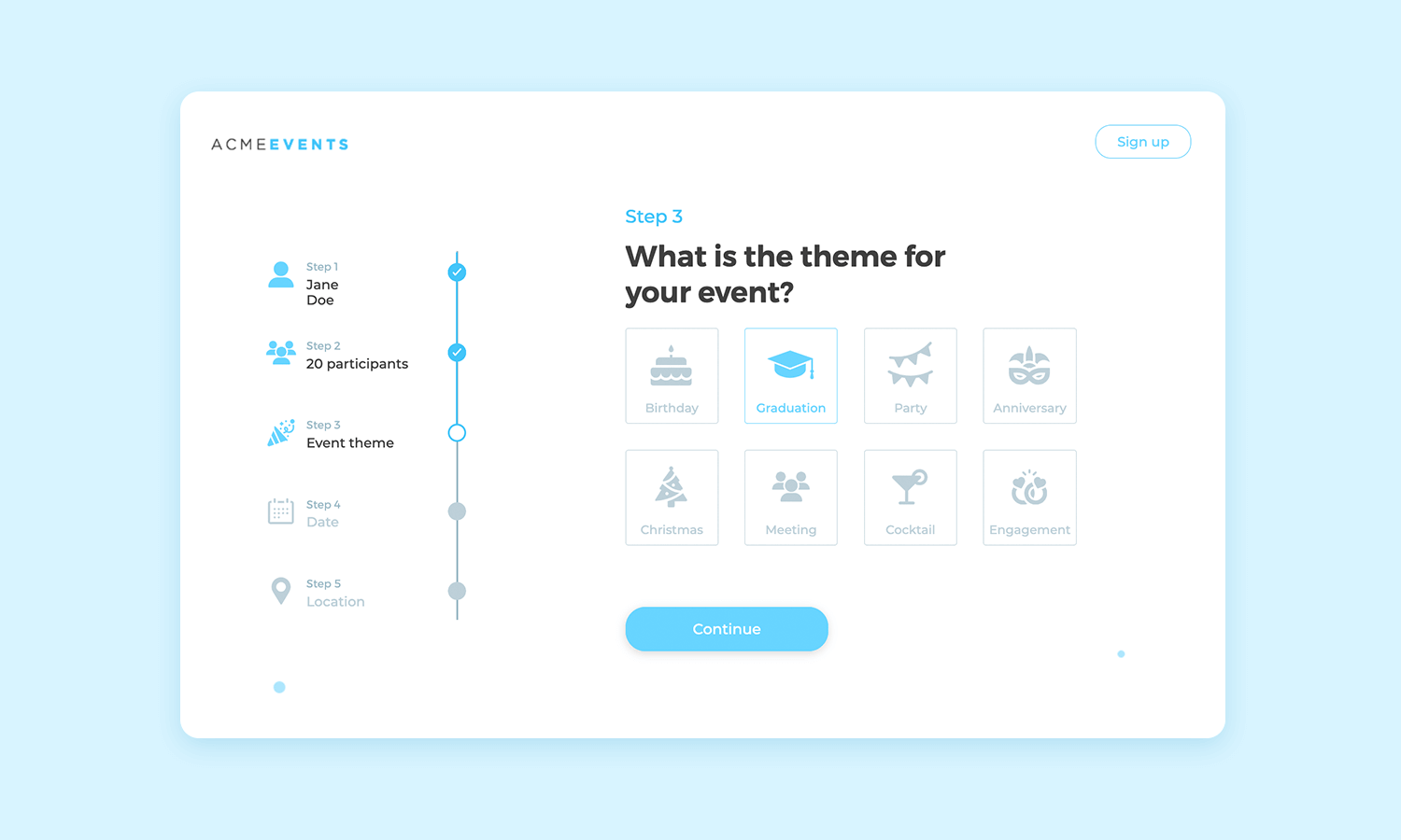
Need help finding an event planning platform template? This website mockup example exhibits all the elements that you need to make your platform a success among users. It’s simple design allows for easy navigation.
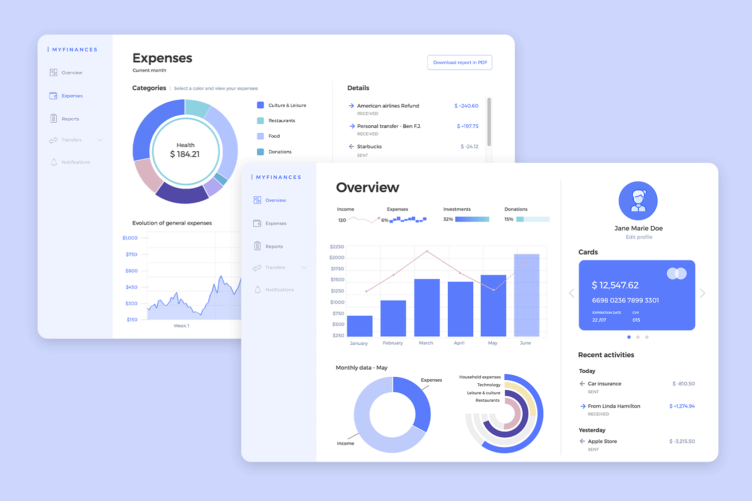
Visual clarity is key. Charts, graphs, and icons are strategically placed in this finance web mockup to provide instant insights into your finances. We use clean and minimalist design principles in this website mockup design to present your financial data in a clear and concise manner.
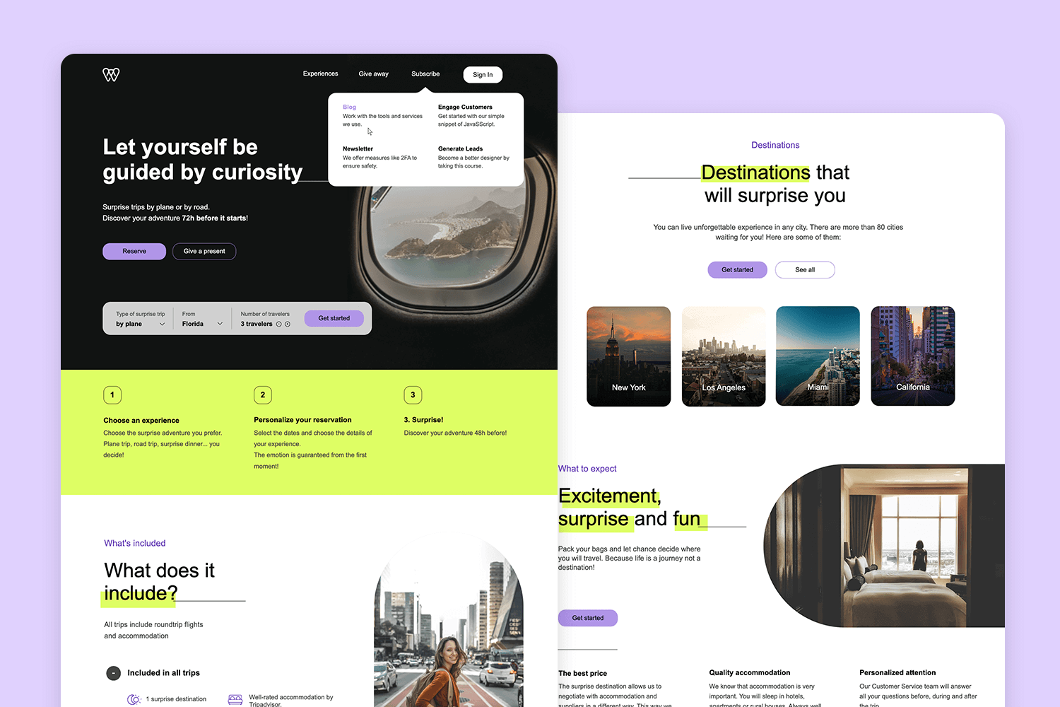
This website mockup example is designed for a travel booking site, perfect for UX/UI designers looking for inspiration. The layout is responsive and user-friendly, featuring a clear logo and a straightforward navigation bar. The design exudes cleanliness and modernity, ensuring users can swiftly locate the desired information.
Looking for a project management sign-up page mockup? You’re in the right place. We’ve created this website mockup example to help designers understand the key elements needed for an effective, lead-generating sign-up form.
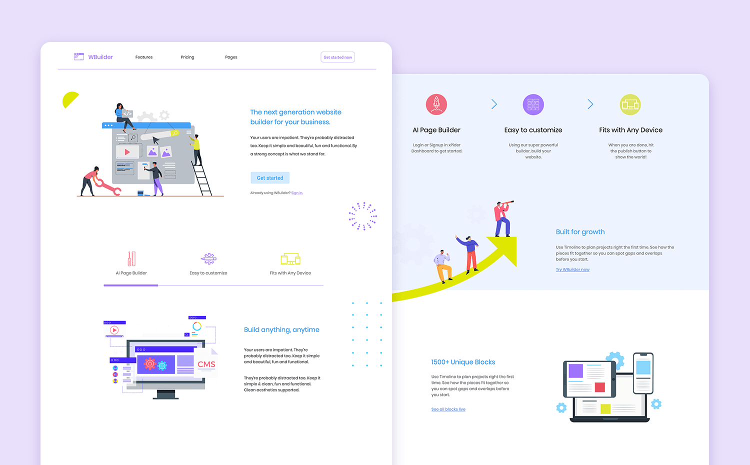
Perfect for UX/UI designers, this free website builder showcases essential elements needed for an engaging and user-friendly design. Explore how you can integrate clear navigation, modern aesthetics, and functional layouts to enhance the user experience using this free website mockup.
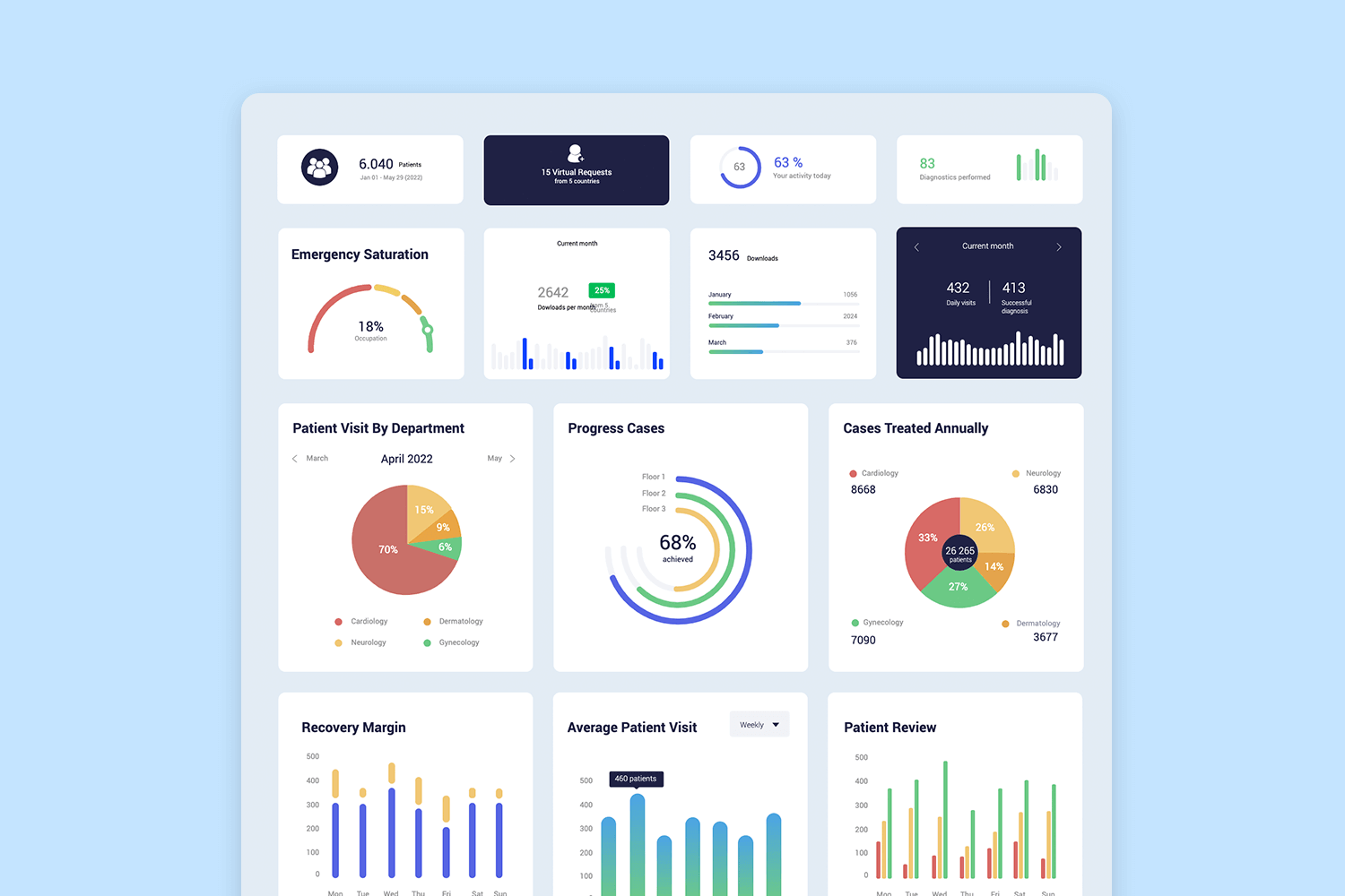
Our charts and infographics design template is perfect for creating engaging charts and infographics. It is made with the intention of helping UX/UI designers visualize data effectively while maintaining a sleek and modern look. Explore this free website mockup to see how you can incorporate clear and informative charts into your designs, making data presentation both attractive and user-friendly.
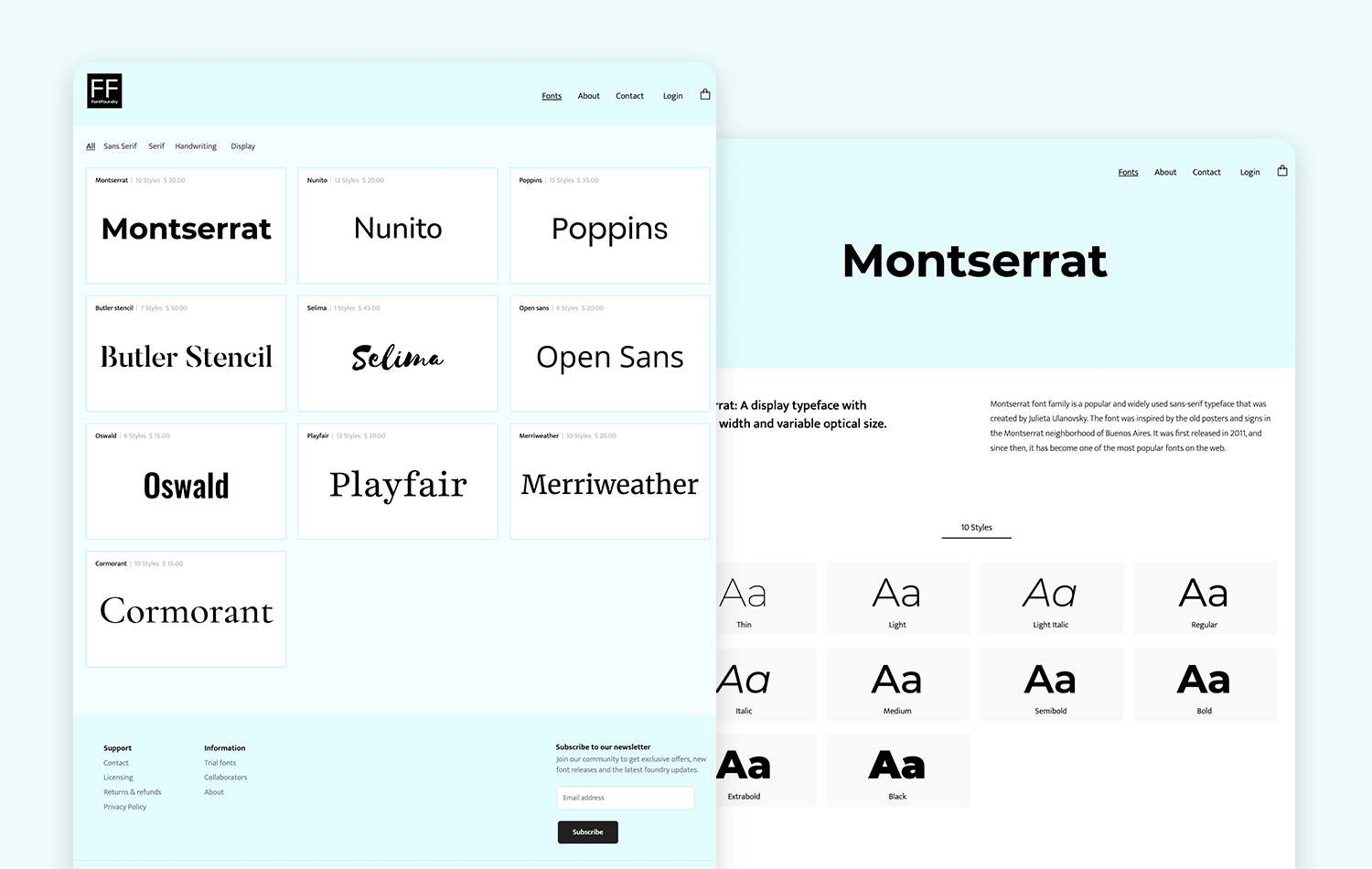
With clear navigation and an engaging layout, this website mockup example is ideal for showcasing fonts and typeface collections effectively. Get inspired by this font finding web template so that you can also design an intuitive and attractive site that enhances user experience and engagement.
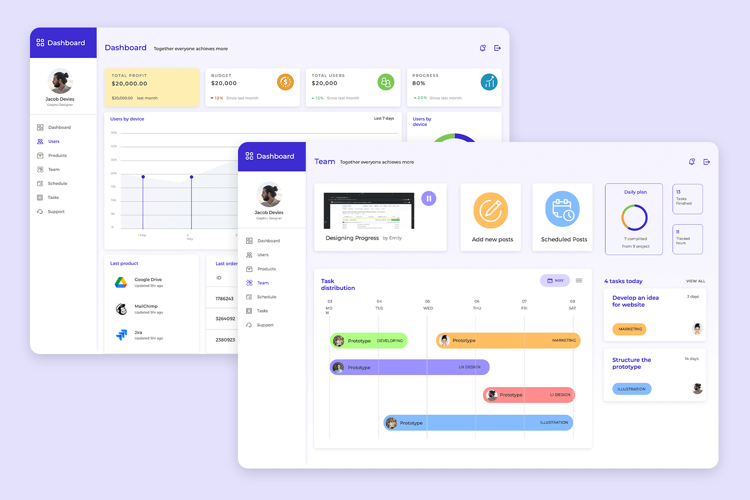
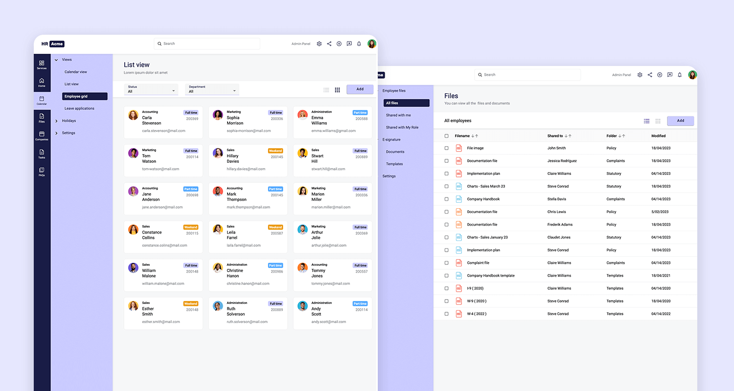
Our free website mockup is perfect for designing an HR web app with Angular Material. This design offers a sleek and modern interface, ensuring an intuitive user experience. It includes essential features such as services, home, calendar, files, companies, tasks, and FAQs, all organized in a user-friendly layout.
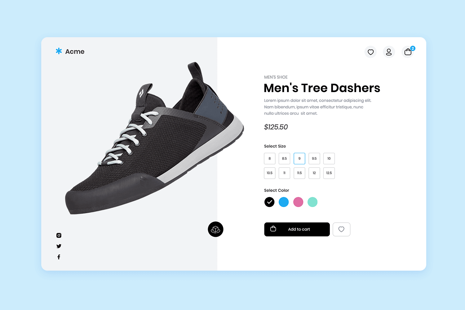
Packed with essential features like product showcases, shopping cart integration, user profiles, search functionality, and secure checkout options, this free shoe shop website template ensures that your shoe store website is equipped with everything needed to thrive in the digital marketplace.
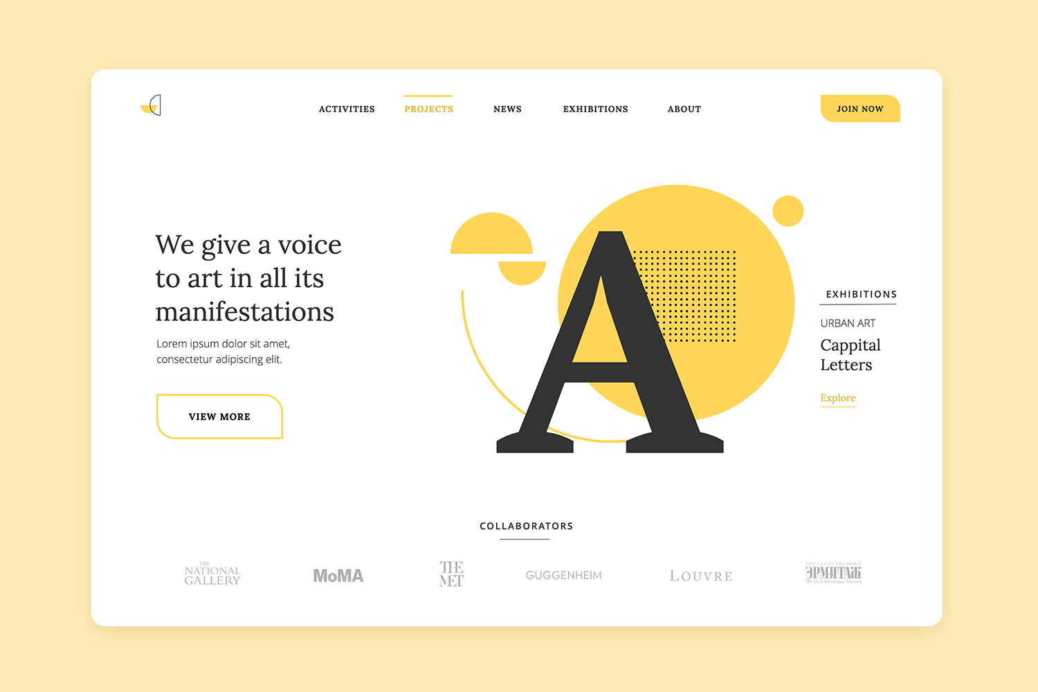
Whether you’re promoting a gallery opening, selling original artwork, or sharing behind-the-scenes glimpses of your creative process, this art agency website template provides the perfect platform to captivate your audience and leave a lasting impression.
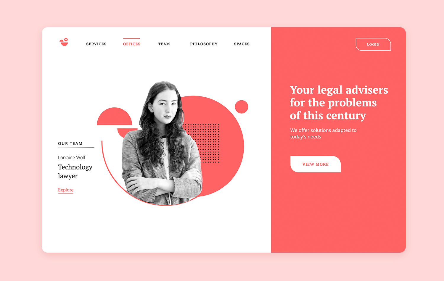
Our free web template for legal services is tailor-made to help you establish trust and credibility with potential clients. You can learn how to showcase your firm’s areas of expertise, introduce your team of experienced attorneys, or provide valuable legal resources—all through our versatile website mockup example.
Embark on a journey of intuitive navigation with our free website mockup, meticulously crafted for designing a seamless vertical website navigation experience. This vertical web template offers a sleek and modern interface, ensuring effortless exploration and accessibility for users.
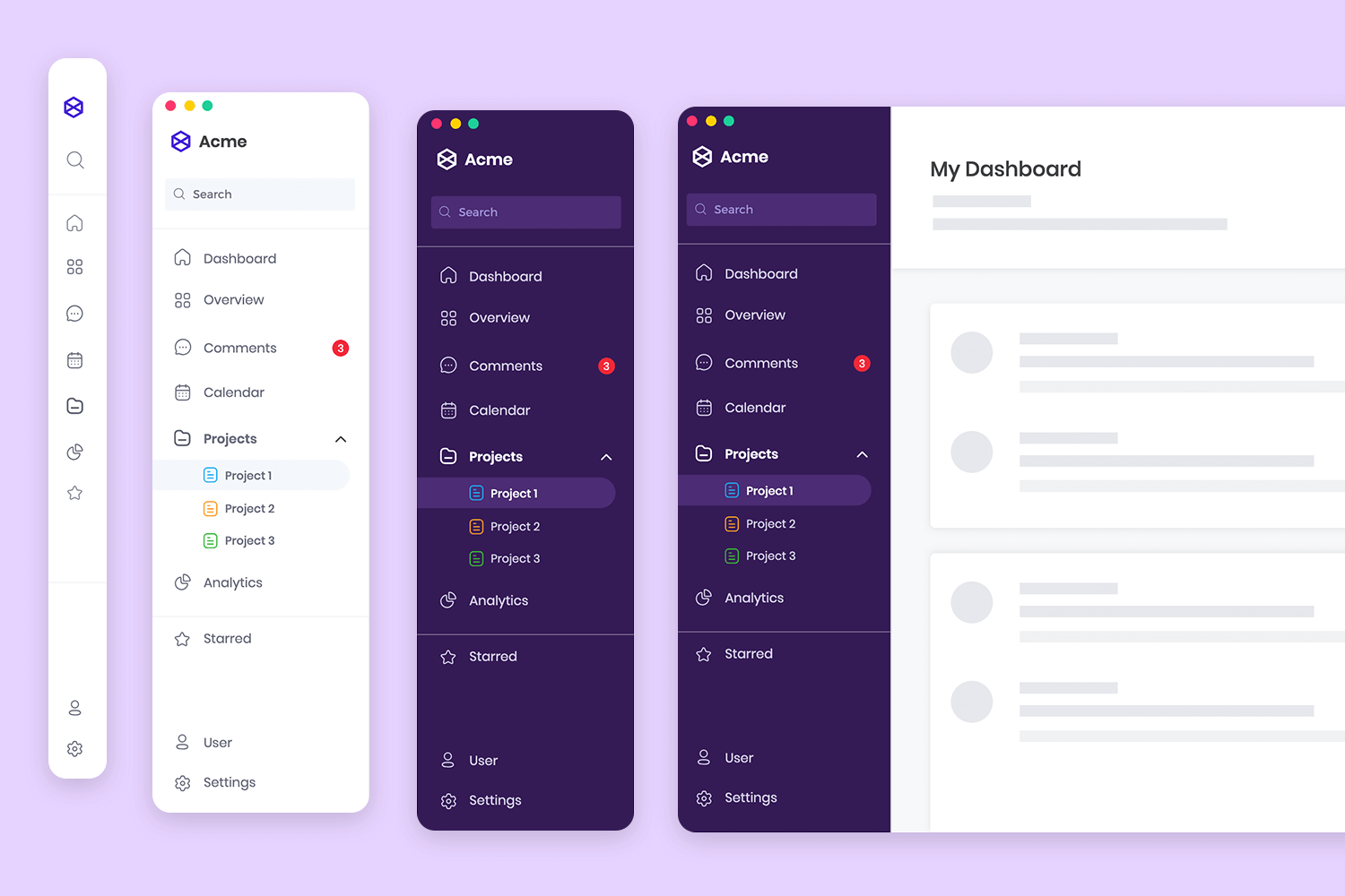
Our trip planning web store template is packed with all the essential functionalities. These include itinerary planning, accommodation booking, destination exploration, packing lists, and FAQs, every aspect is thoughtfully organized in this website mockup example for optimal user engagement.
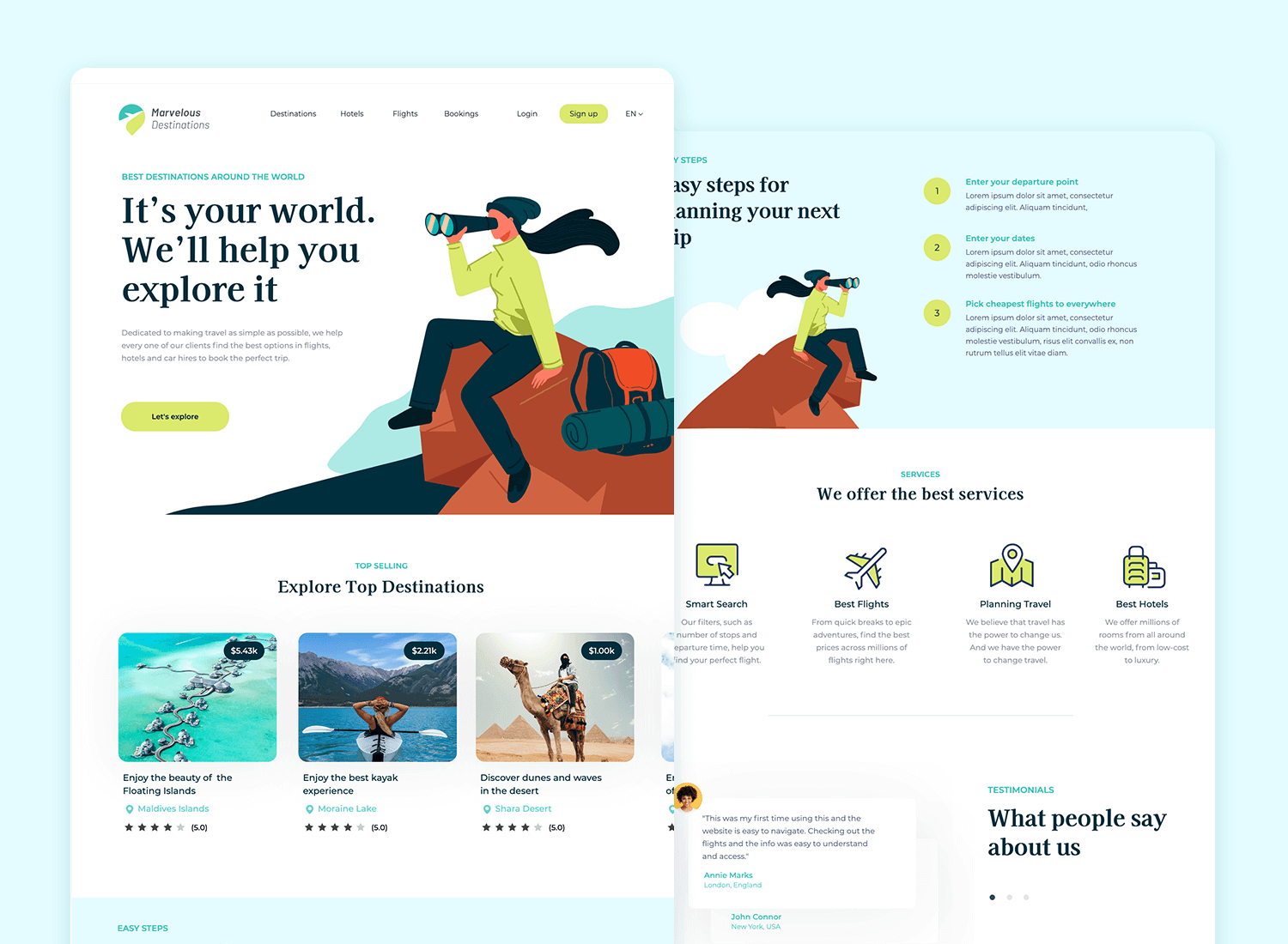
Our selection of website mockups covers a comprehensive range of scenarios, ensuring that you can find the perfect template for your needs. Explore our curated list to discover the best free and paid website mockups that can transform your design process and bring your ideas to life.
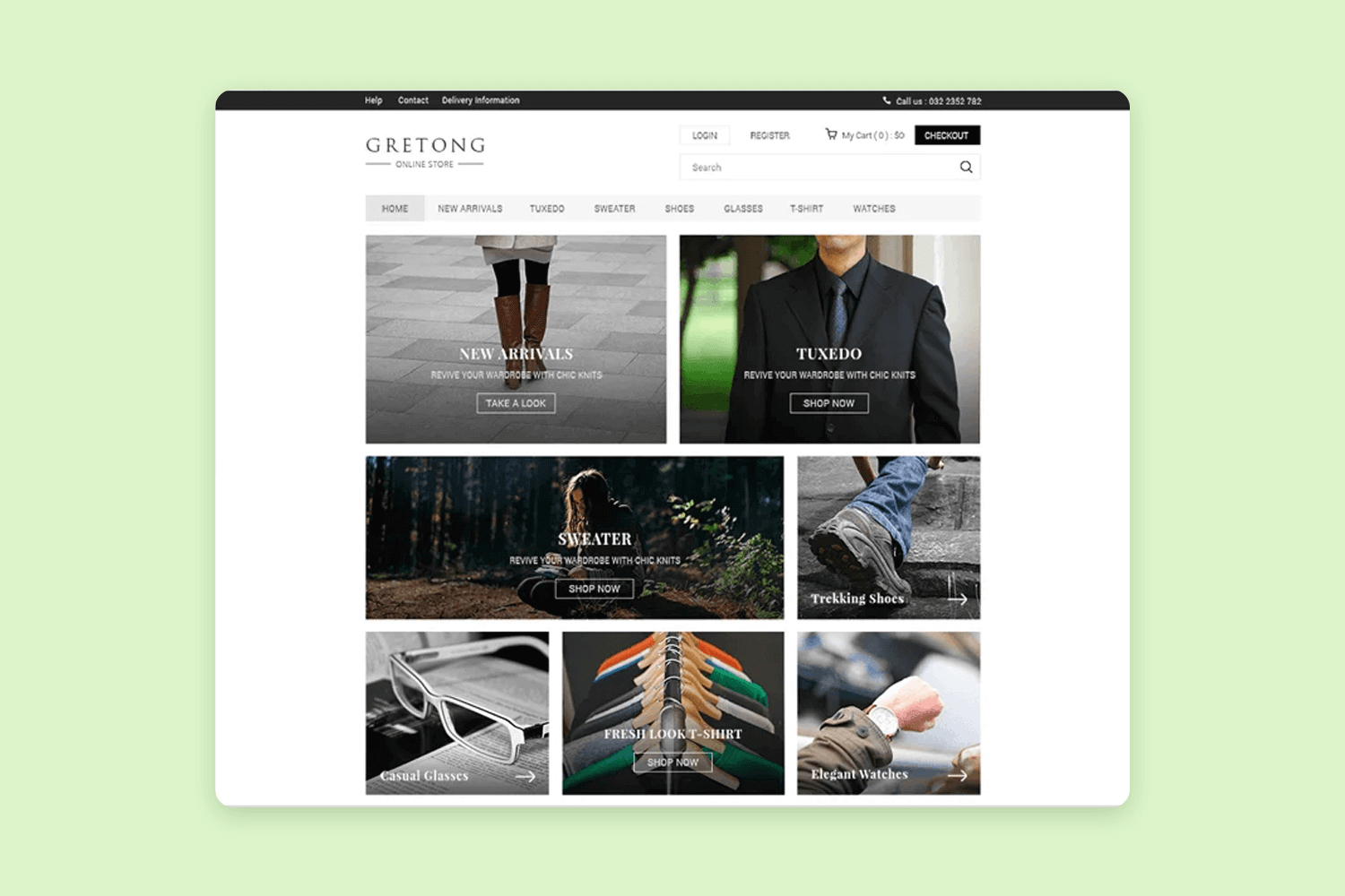
Gretong presents a free, responsive e-commerce PSD mockup template. Highlighting a flat design, appealing color scheme, and contemporary grid arrangement, it offers a fresh perspective on online shopping interfaces.
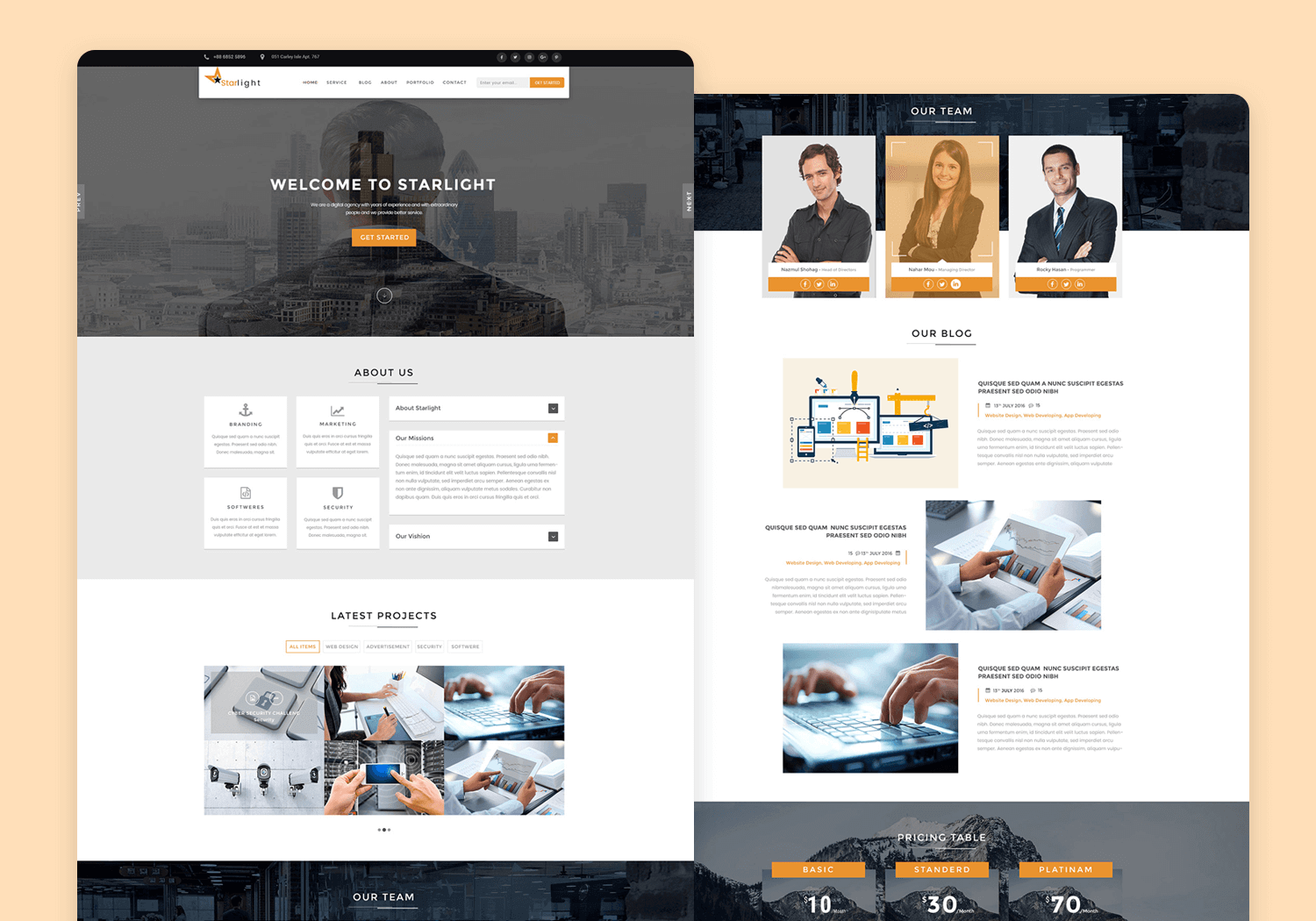
The Starlight Corporate Portfolio PSD Template is a free, downloadable resource designed for showcasing corporate portfolios. Built on a 12-column grid (1170px), this template is meticulously organized with grouped layers, making it easy to customize.
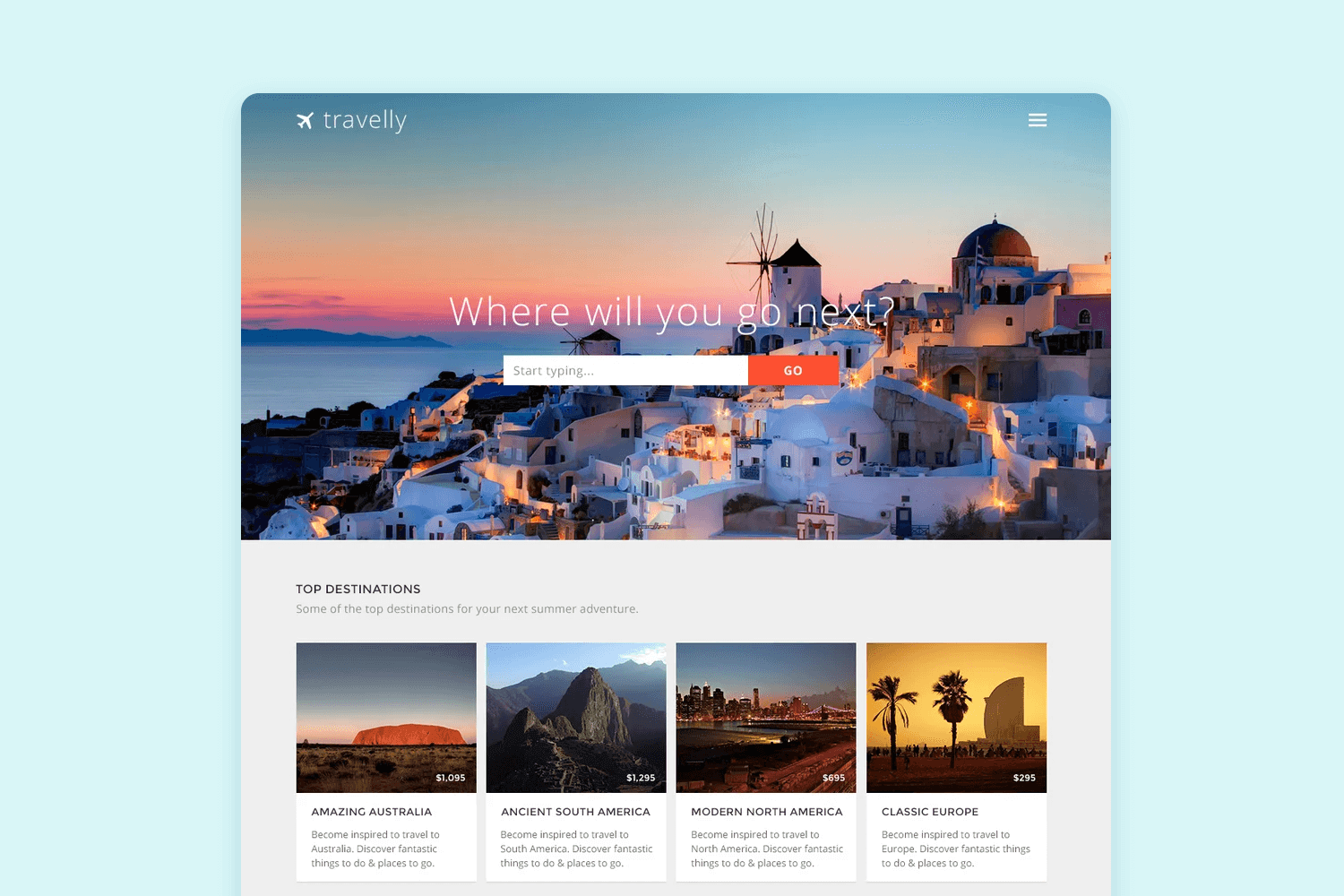
Travelly offers a complimentary PSD mockup template designed for the homepage of a travel website. It begins with a striking hero image accompanied by a search box, followed by a section showcasing top destinations through four cards. Additionally, it includes a travel advisory segment below for added convenience.
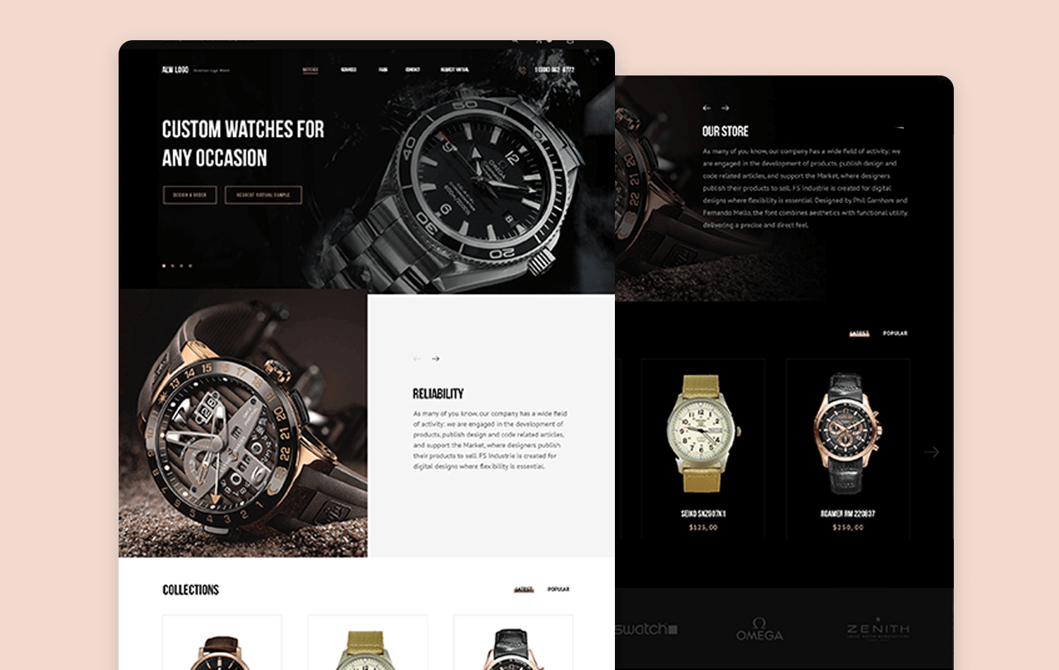
The Watch Free PSD mockup by Vlad Musienko is a versatile template designed for showcasing watch designs. It features multiple styles within one PSD file, allowing for easy customization by toggling layers. Download it to elevate your design portfolio with high-quality visuals.
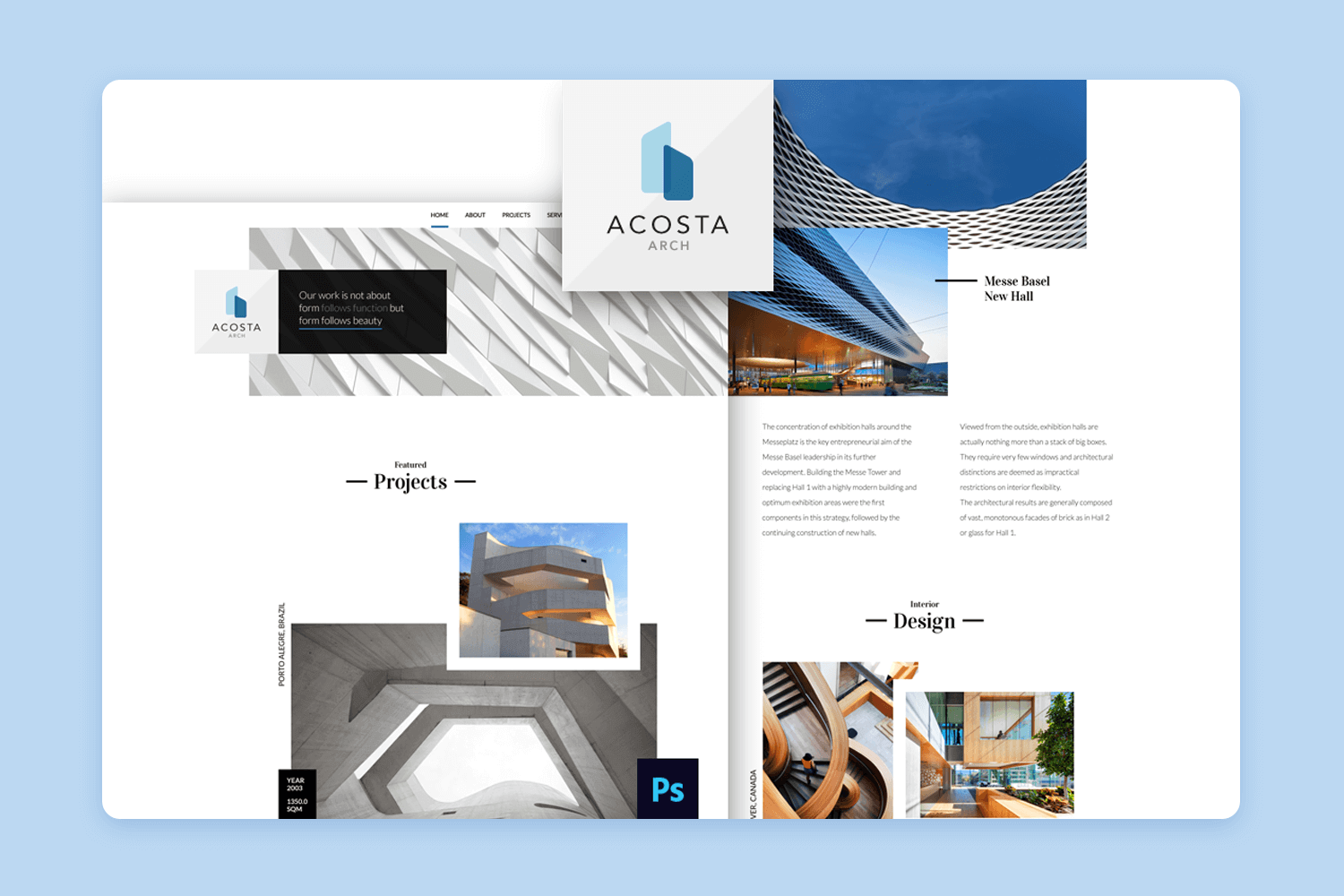
Super Drone offers a stylish, one-page PSD mockup template in both black and white themes, perfect for showcasing drone technology websites. Ideal for integrating into various projects, this mockup is versatile and modern, providing a professional look for any drone-related website.
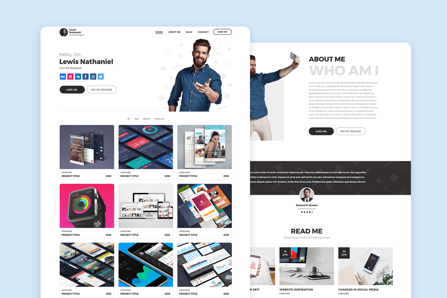
As the name suggests, free PSD & XD designer portfolio template is a free responsive website mockup template aimed at designers. Add in your own text and images and you can be ready to create your mockup in minutes!
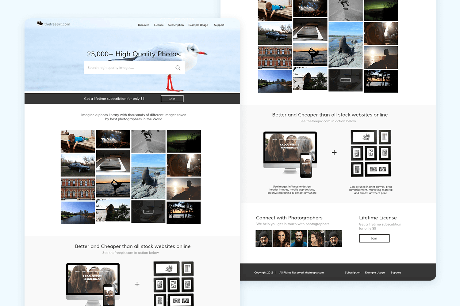
Here’s a responsive website mockup template crafted for the homepage of a stock photo site. Its contemporary design and professional appearance offer an ideal option for creating a mockup that embodies a light, modern aesthetic.
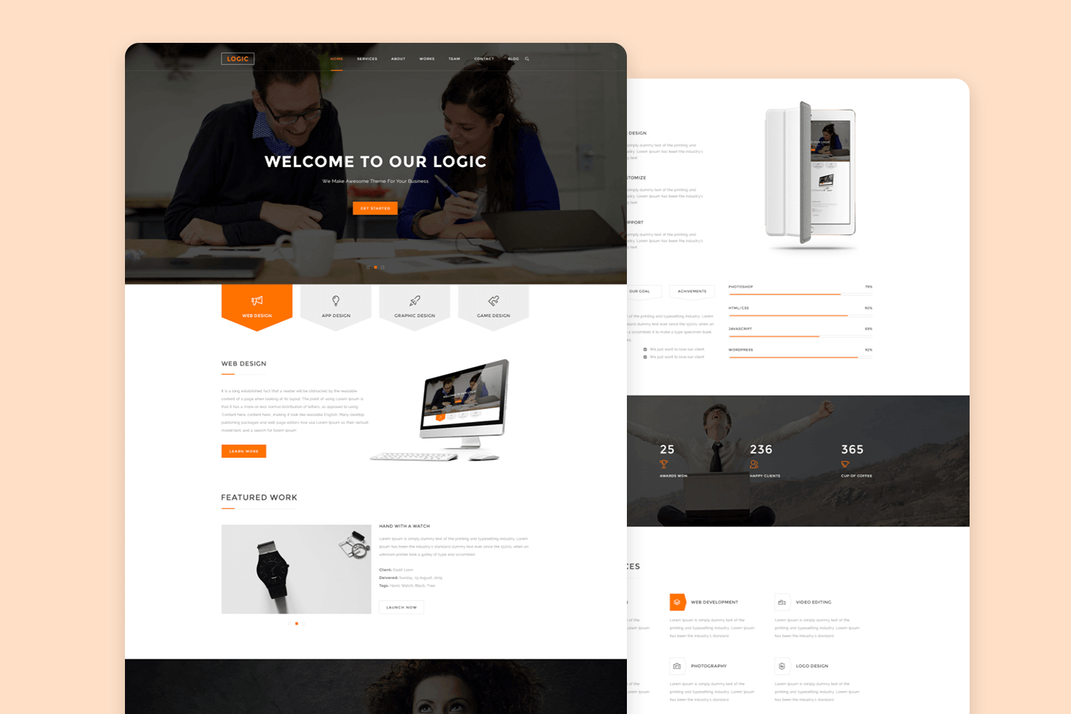
The free multipurpose business PSD template is a versatile and professionally designed resource suitable for various business needs. Based on a 1170px bootstrap grid system and utilizing RGB color, this template is well-organized with neatly layered elements, making it easy to edit and customize
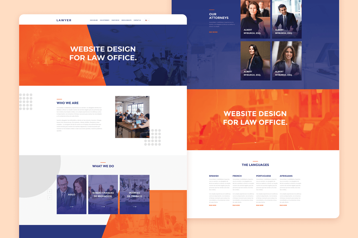
Lawyer is a website mockup template designed for a law firm and provided free of charge. We appreciate its fusion of vibrant colors and flat design elements, creating a contemporary and inviting appearance.
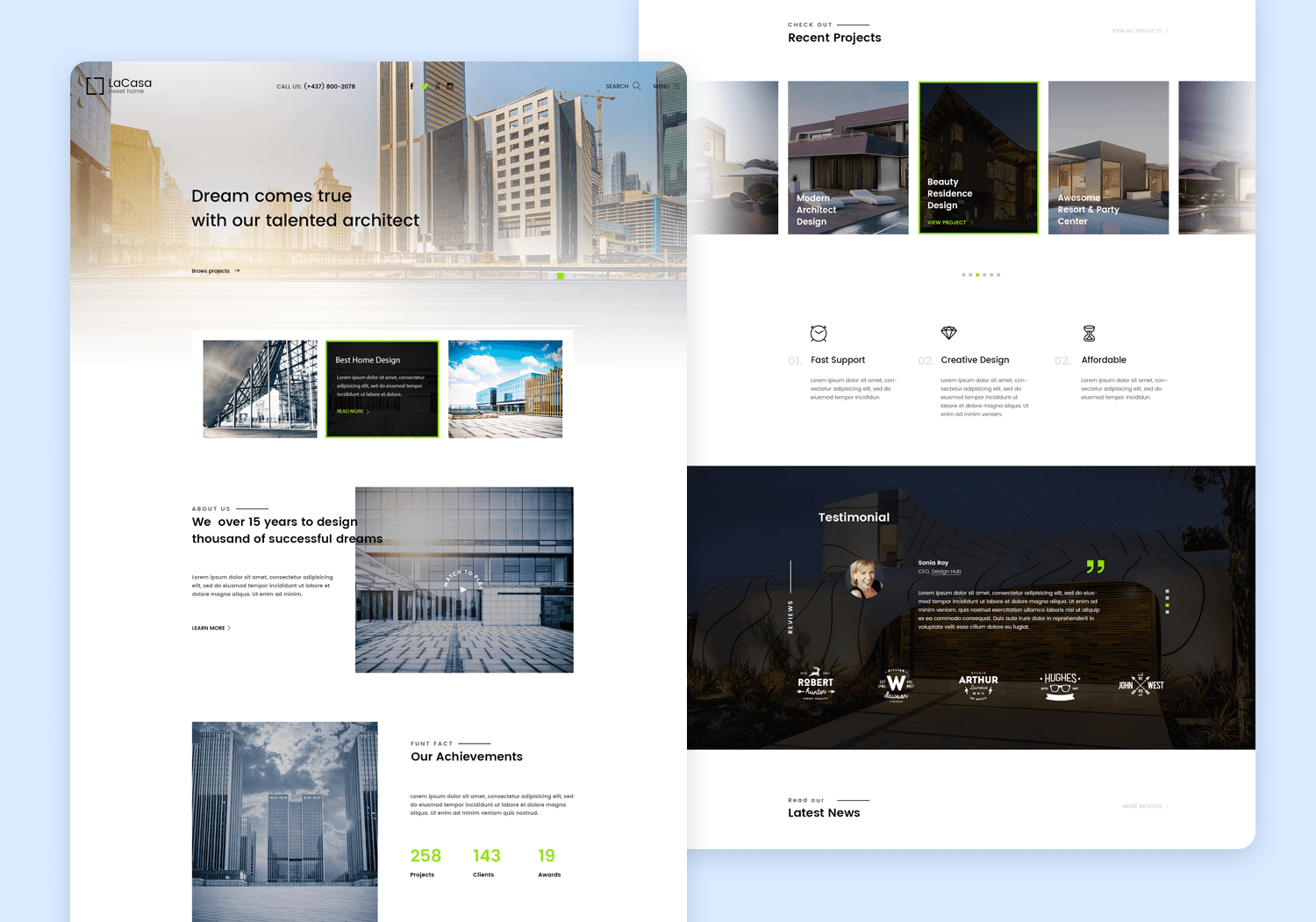
La Casa is an exquisitely elegant free website mockup template for a real estate website. It’s also a fully responsive HTML 5 template (it includes layered PSD file, HTML and CSS).
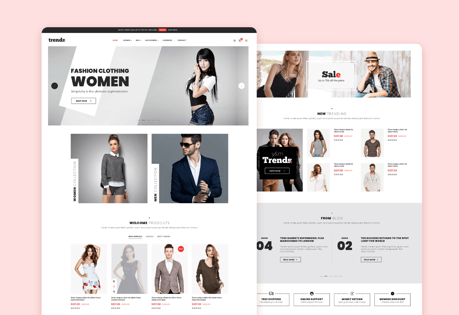
Trends is a responsive PSD mockup template tailored for e-commerce websites, compatible with Bootstrap. Crafted to suit a range of e-commerce scenarios, it showcases a contemporary, minimalist design and offers access to free web fonts and icons.
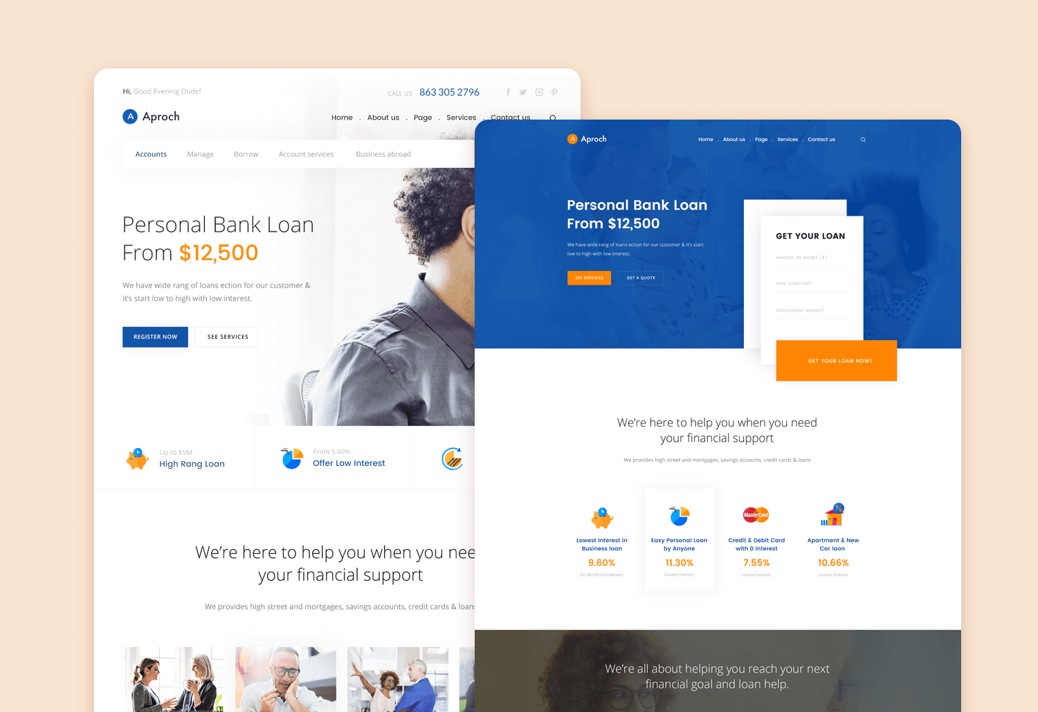
Approach is a responsive mockup template available in PSD format, specifically crafted to aid in the creation of comprehensive banking website mockup examples. Utilizing a 1170px bootstrap grid, it ensures exceptional visual hierarchy and provides two distinct homepage styles. Moreover, it integrates Google fonts for added customization options.
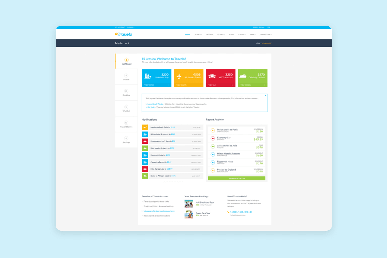
Travelo offers a collection of 113 PSD mockup templates covering various facets of the travel industry, encompassing hotels, flights, car rental, and cruise booking. With an array of features including 12 unique homepage styles, 7 distinct search styles, and 3 diverse profile dashboards, it provides comprehensive resources for designing travel-related interfaces.
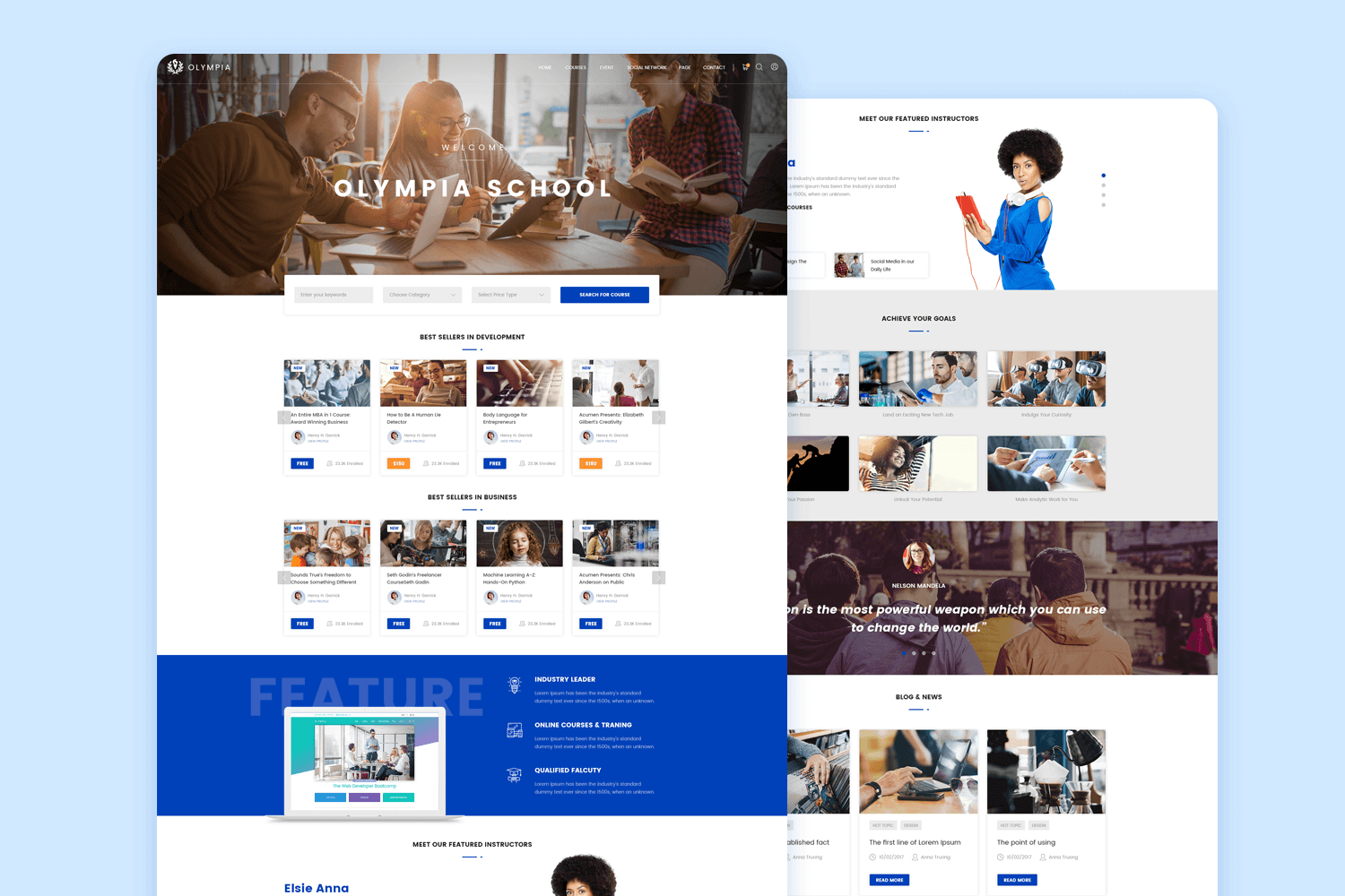
Named Olympia with ingenuity, this premium mockup template caters to education institute websites. It includes 31 PSD files for various pages and is constructed using a Bootstrap 1170px grid, ensuring compatibility and ease of use.
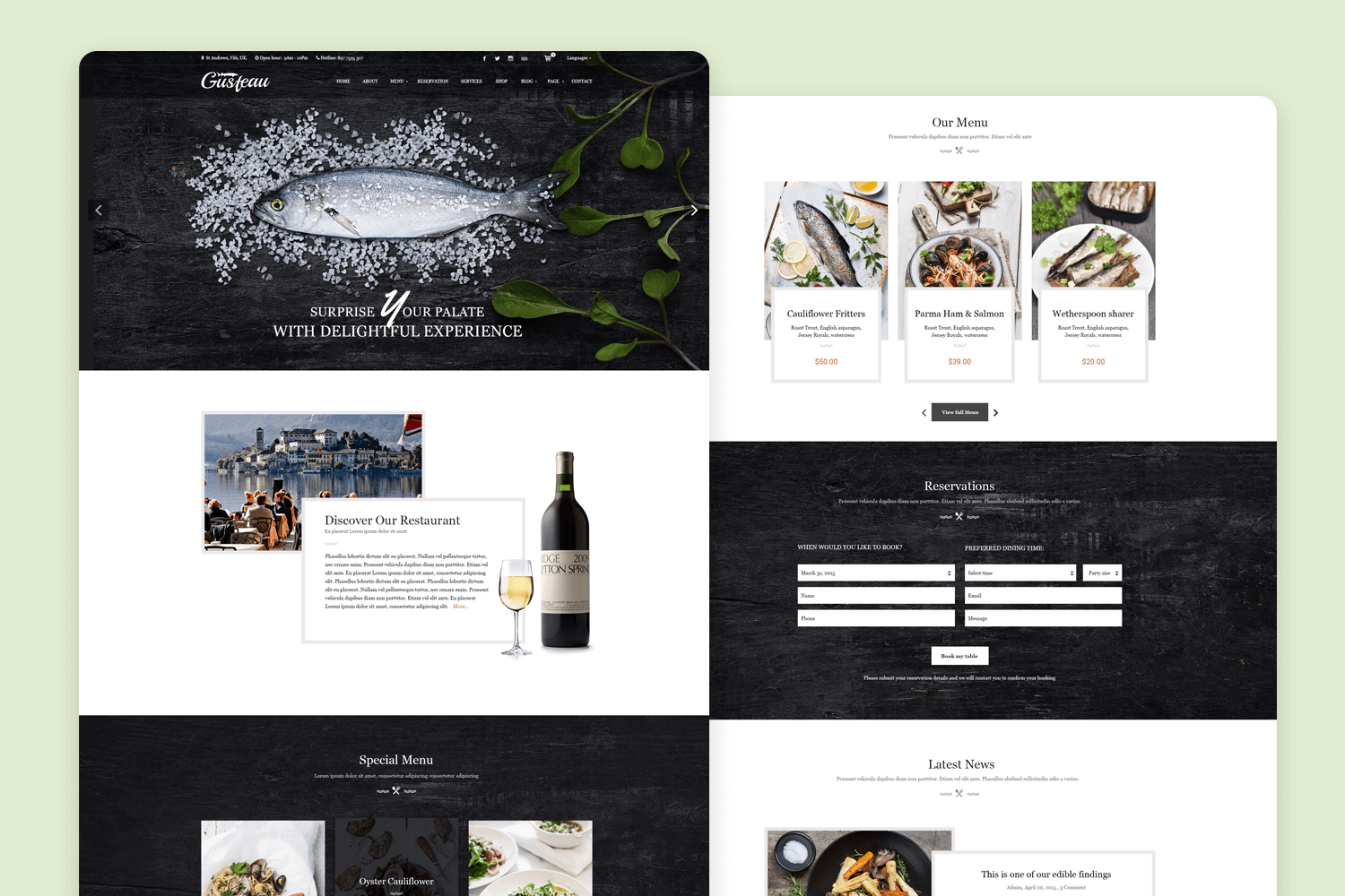
Gusteau is a responsive website template tailored for restaurant websites with integrated blogs. With 18 fully-layered PSD files, it offers flexibility for customization, allowing you to craft mockups for various pages such as the homepage, reservations, about, blog, menu, and more.
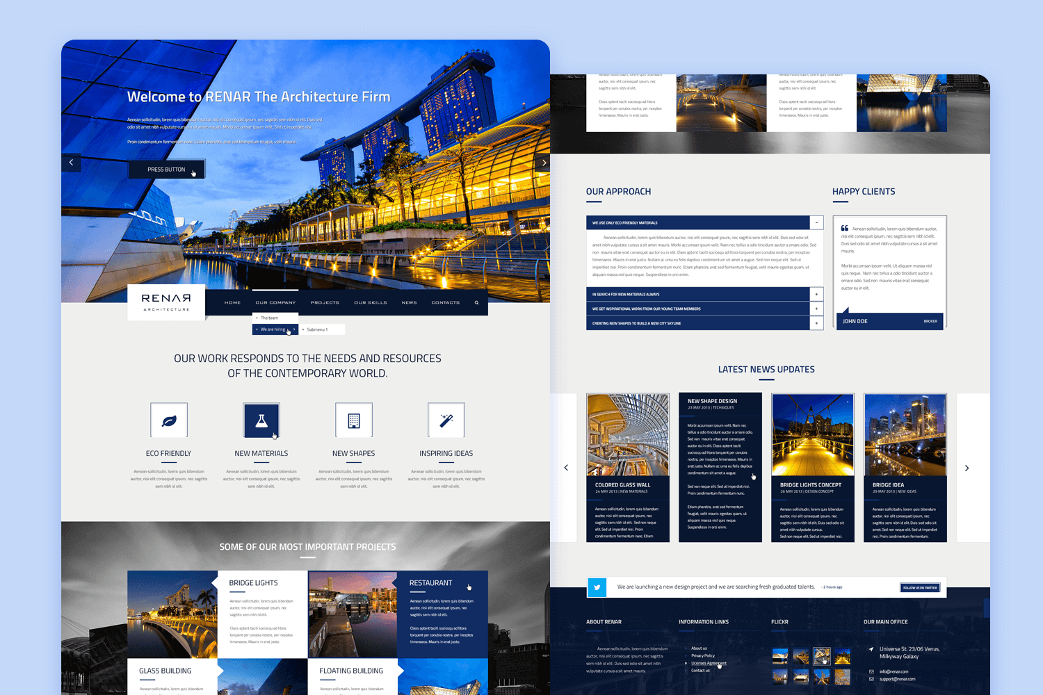
Renar is a comprehensive and fully responsive website mockup template designed primarily for architects but adaptable for various other businesses as well. This versatile template offers 2 color versions and includes 23 PSD files along with font and icon files, providing ample resources for crafting customized web designs.
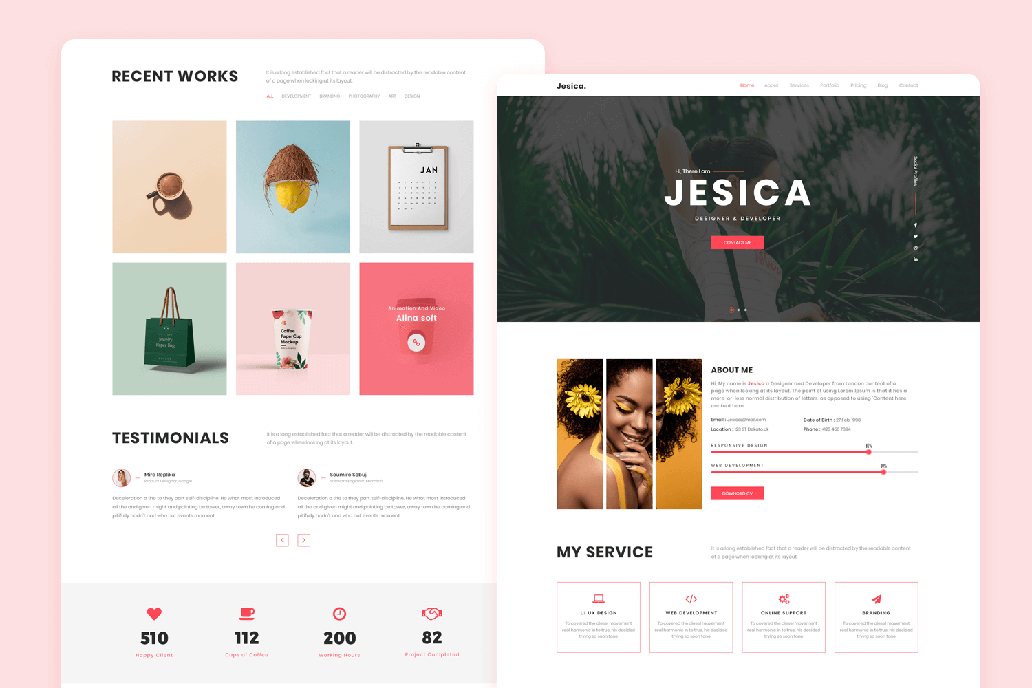
Jesica is a set of PSD-based website mockup templates tailored specifically for use as profile pages, catering to designers, artists, freelancers, UX professionals, and similar fields. It comprises 4 PSD files, incorporates free icons, offers a selection of 4 headers, and provides additional customizable elements, making it a versatile option for personal branding and portfolio showcasing.
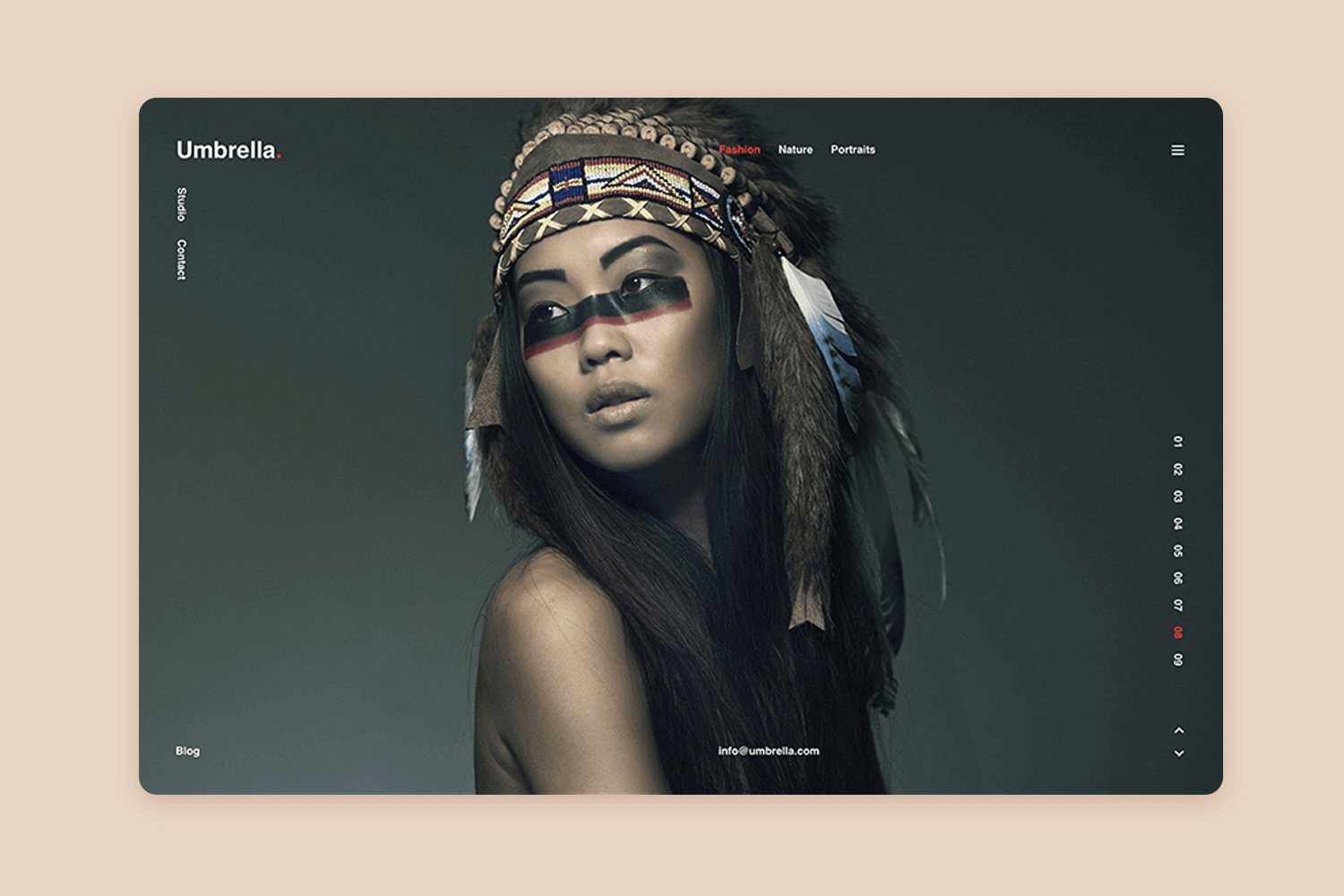
Umbrella stands out as a contemporary and highly professional responsive website mockup template designed specifically for photographers and photo-centric websites. With both PSD and Sketch files included, Umbrella ensures versatility and accessibility. Additionally, it boasts 100% responsiveness and offers free fonts and icons, enhancing its appeal for seamless customization and usage.
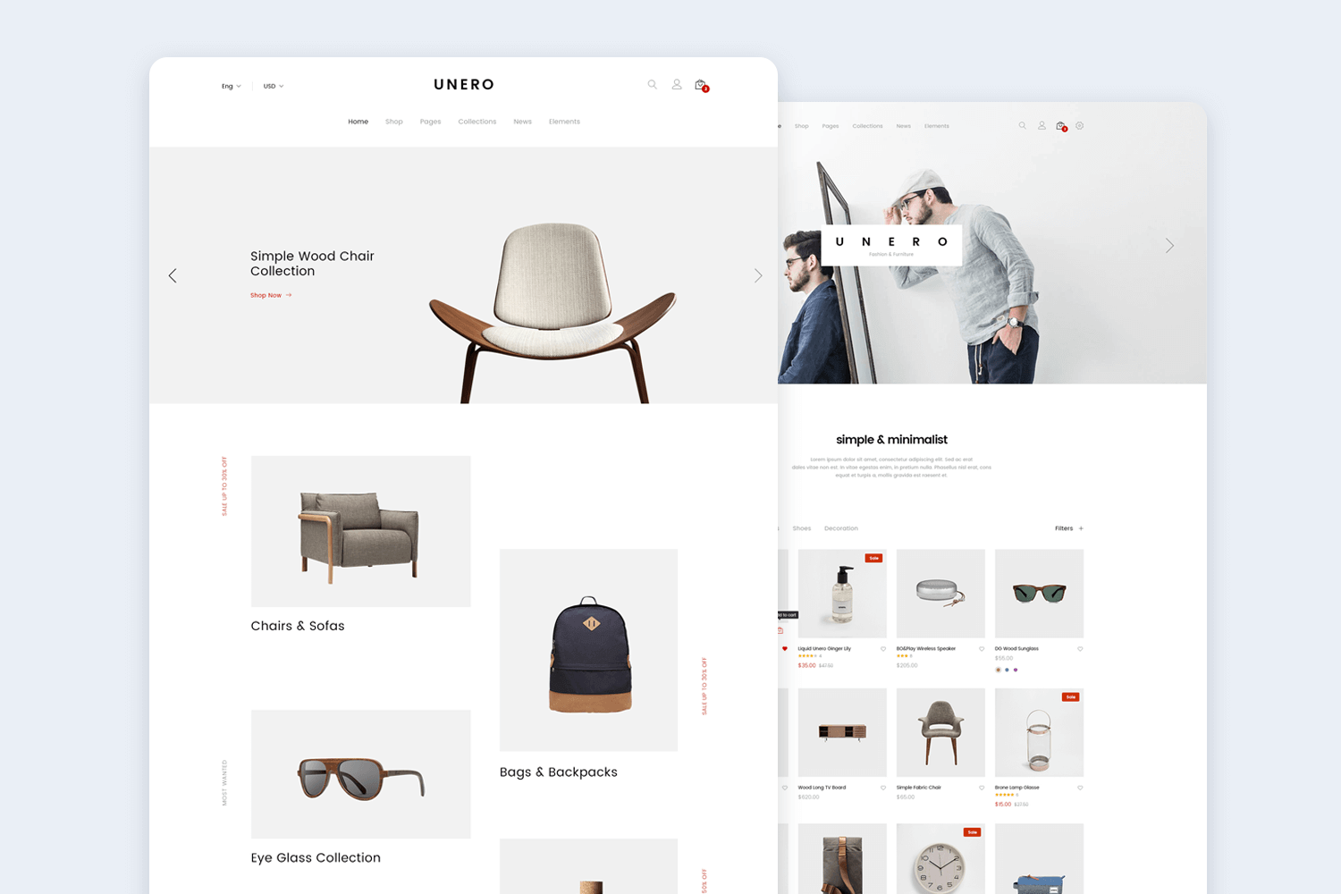
Unero presents a minimalist website mockup template tailored for online shopping. With 69 PSD files included, it offers a comprehensive range of options for crafting fully-responsive web mockups. Built on a grid system, Unero ensures sharp visuals across all devices.
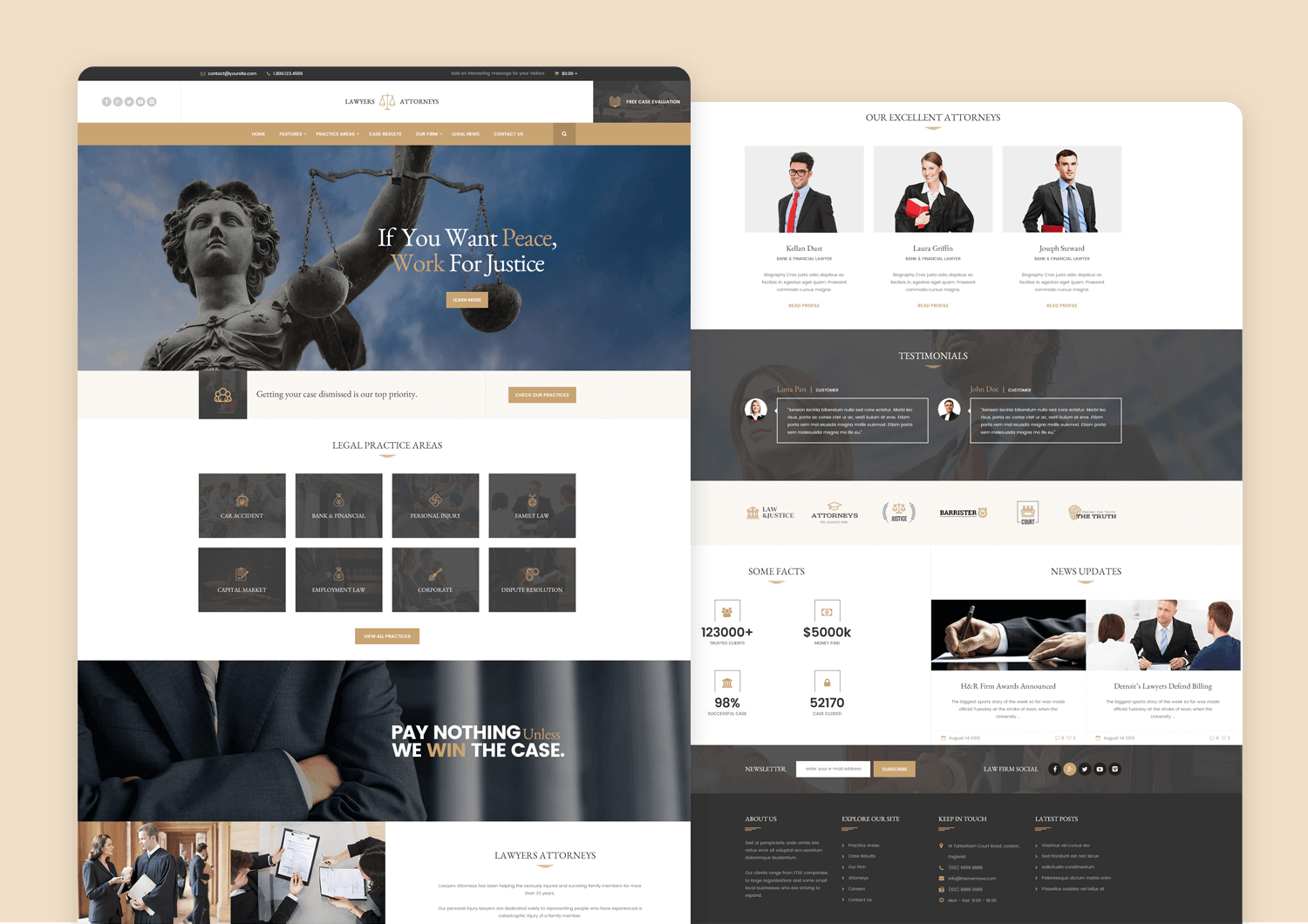
For a classic approach, Lawyer Attorneys offers a responsive website mockup template with 4 distinct designs and 5 page types across 17 PSD files. Built on a 1170px Bootstrap grid, this template uses free Google Fonts and also includes a collection of free icons for added customization options.
Website mockups are a smart idea if you’re looking to cut costs and bring your product to market faster with the best guaranteed usability. They’re also a great way to incorporate UX into your design early, making sure you’re constantly working with your target users in mind from the start.
Furthermore, website mockups help bring your team together and are a great way of boosting both collaboration and communication between design and development. Presenting a website mockup is also a great way to get validation and buy-in from stakeholders. Project managers and clients alike will understand where your design is headed and why.
Lastly, in the age of mobile-first indexing, not implementing responsive design from the start when creating your website is virtual and financial suicide. Mockups help you incorporate this practice into your designs from the start, while the project’s still cheap, warm and fuzzy.
